Case study · Empire
Empire
An interactive sales centre touchscreen for home builder Empire's Imagine community, letting buyers filter home designs, explore the neighbourhood and email their favourites.

01 — Context
Sales centre touchscreen design for a community still being built
Empire is a home builder, and Imagine is one of its new communities: detached homes with large porches, planned walking trails and parks, close to the Buffalo border. Like most new-build projects, much of what buyers are being asked to imagine does not exist yet when they walk into the sales centre.
Empire asked us for sales centre touchscreen design that would bring the whole project to one screen: every home design, the lot options, the planned community features, the surrounding area and the floorplans. It needed to be self-guided, so a visitor could browse comfortably while waiting for a sales rep, and useful to the rep during a conversation.
We designed the full user interface, from the attract screen to the email overlay.
02 — Navigation
Three big buttons and nowhere to get lost
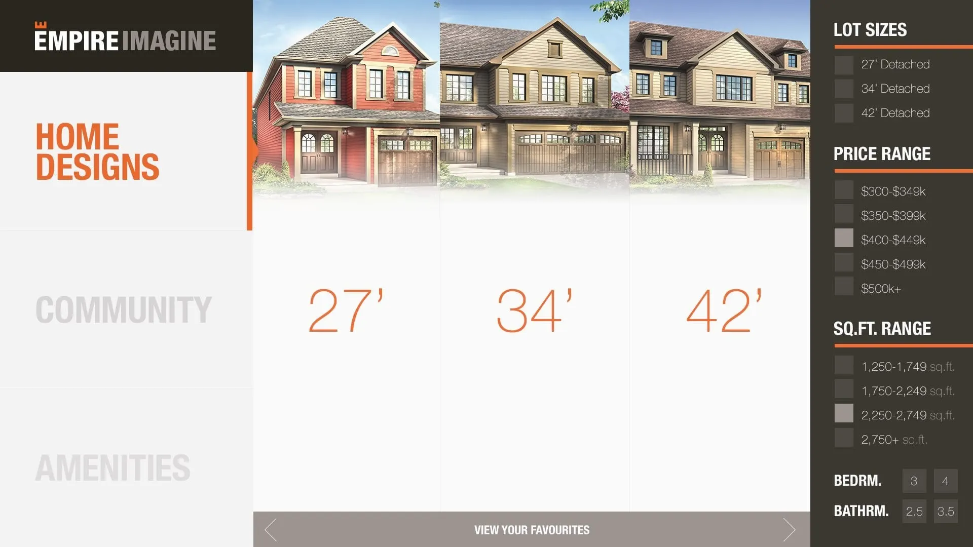
A sales centre kiosk is used standing up, by people who have never seen it before, often with children in tow. There is no training and no patience for menus. So we reduced the whole experience to three destinations, set in large type down the left side of every screen: Home Designs, Community and Amenities.
The active section turns orange and gains a pointer that runs into the content, so a visitor always knows where they are. Everything else stays in the same place on every screen. Back and Next controls sit along the bottom edge, where hands naturally rest on a large display.
The visual language is simple on purpose: a charcoal-brown header carrying the Empire Imagine wordmark, warm orange for actions and the active state, and light greys for the canvas. Headlines are set in a bold condensed sans serif that stays readable from a few steps back. The welcome screen leads with a black-and-white photo of a child, the word IMAGINE in huge pale-grey letters, and a line that sets the tone: Turn imagination into reality.
03 — Home designs
Filter by the way buyers actually shop
Buyers rarely start with a model name. They start with a budget and a lot size. The Home Designs section opens on Imagine's three detached lot widths, 27', 34' and 42', shown as large numbers under a rendering of a typical home on each.
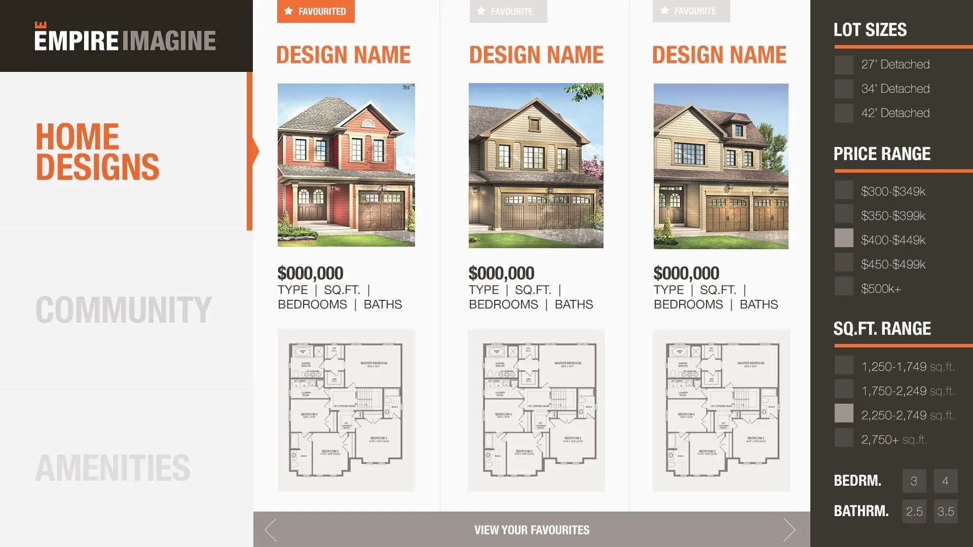
A dark filter panel on the right lets visitors narrow by lot size, price range, square footage range, bedrooms and bathrooms. The results update into side-by-side columns, each showing a rendering, price, type, square footage, bedroom and bath counts, and the floorplan, so homes can be compared at a glance.
Every design can be marked as a favourite with a single tap, and a View Your Favourites bar along the bottom gathers them into one list for later.
04 — Detail and follow-up
From browsing to a conversation
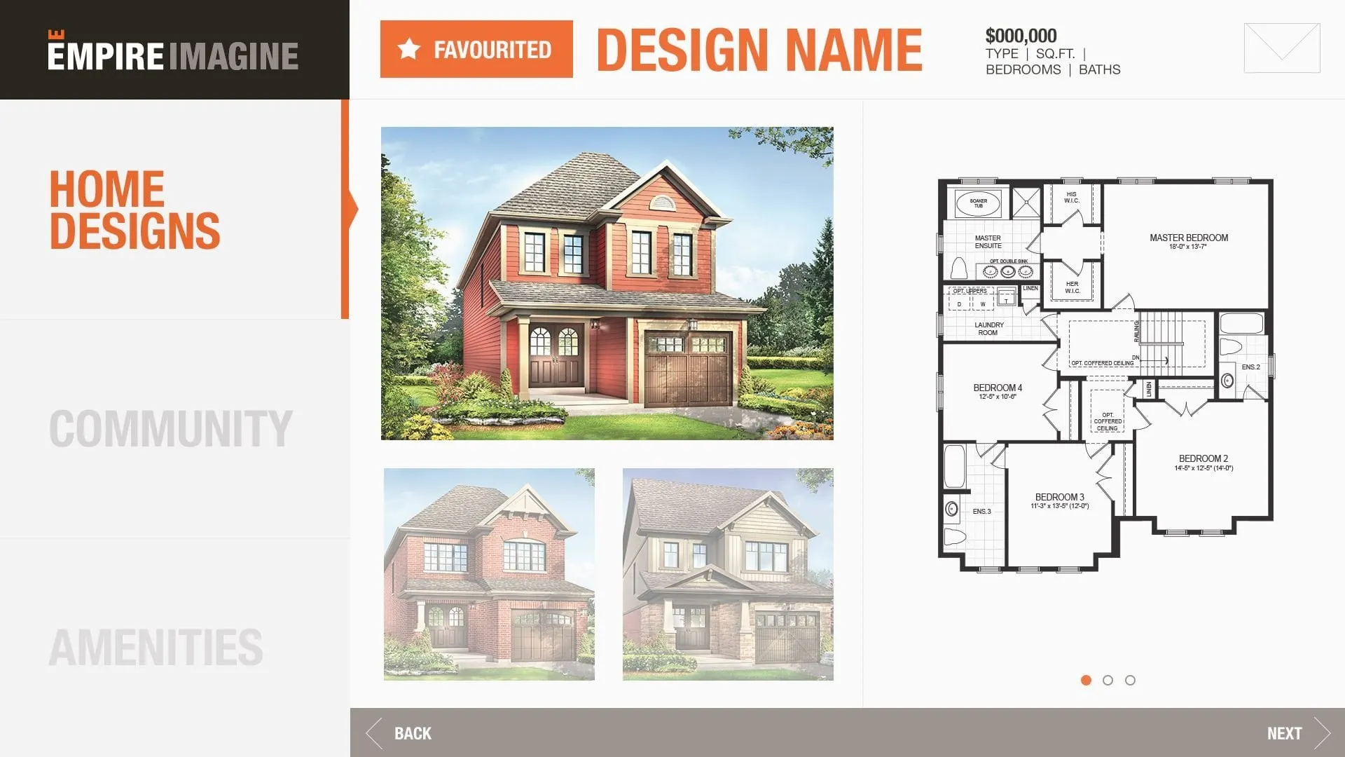
Tapping a design opens a detail screen with a large rendering, alternate elevations underneath and a full floorplan on the right, labelled room by room. A Favourited tag sits beside the design name so visitors can see what they have already saved.
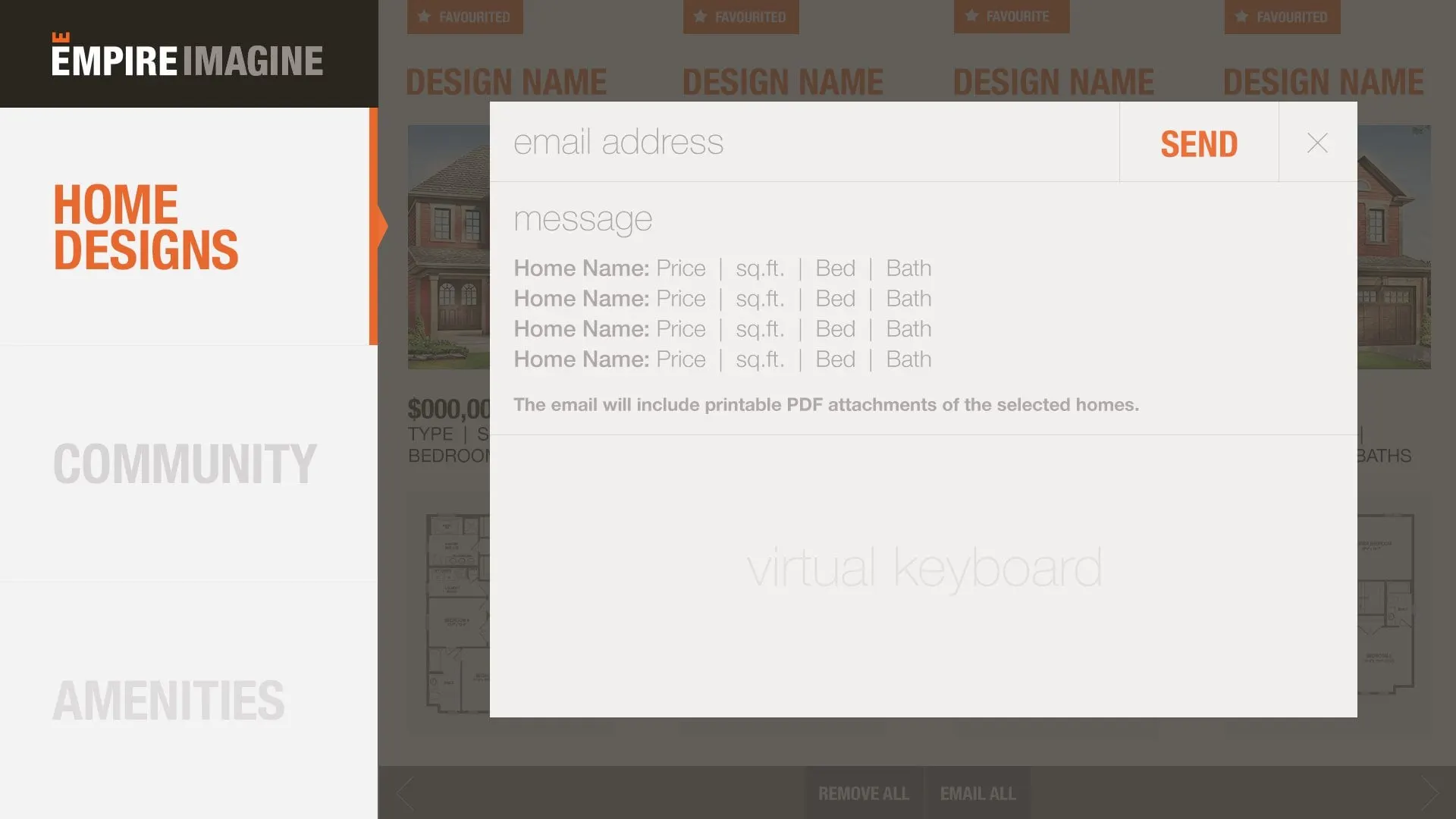
The feature we were most deliberate about was the email overlay. From the favourites view, a visitor can type their email address on an on-screen keyboard and send themselves a summary of the homes they liked, with printable PDFs of each attached. That small step turns a casual browse into something the buyer takes home, and gives the sales team a natural reason to follow up.
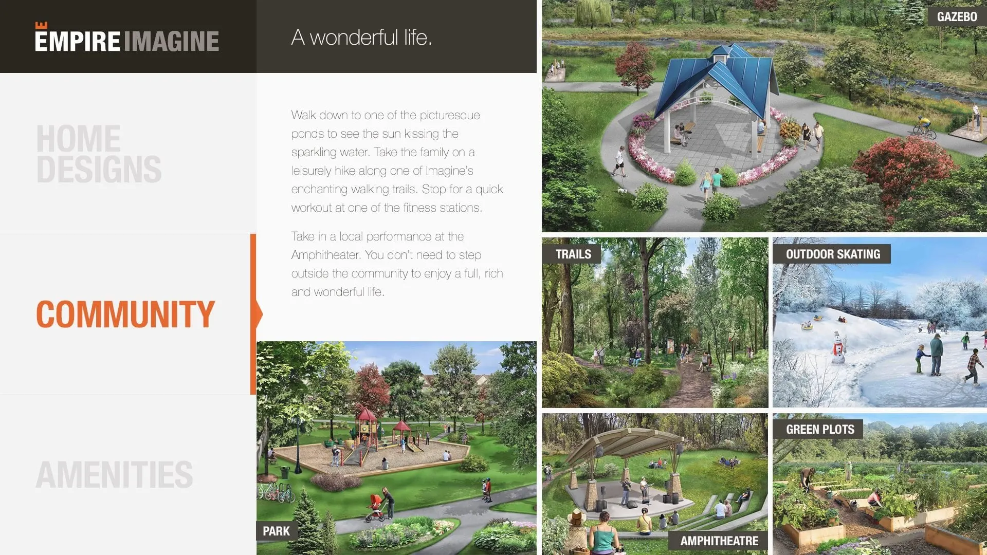
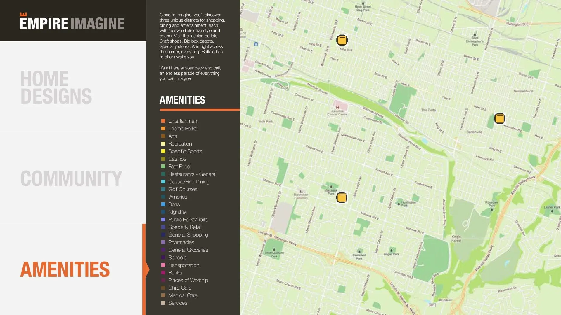
Beyond the homes themselves, the Community section uses a collage of renderings to show what life at Imagine will look like: a gazebo by the water, walking trails, outdoor skating, green plots, a park and an amphitheatre. The Amenities section pairs a short introduction to the wider area with a map and a colour-coded legend covering everything from wineries and golf courses to schools, pharmacies and medical care.
05 — Outcome
The whole project, at arm's length
The finished touchscreen gives Empire's sales centre a single, self-guided tool that covers homes, community and neighbourhood, and ends with the buyer holding their shortlist. It is a good example of how graphic design and interface thinking work together in real estate sales, where the product is often still a rendering.
We have designed for several home builders and developers, including the websites for Glen Agar in Etobicoke and SF3 Condos in Pickering.