Case study · SF3 Condos
SF3 Condos
A responsive website for SF3, a waterfront condo by Chestnut Hill Developments at Frenchman's Bay in Pickering, Ontario, selling a resort-style lifestyle by the lake.
01 — Context
Condo website design that sells the bay, not just the building
Chestnut Hill Developments was preparing to launch SF3, a new condominium at Frenchman's Bay in Pickering, Ontario, on the north shore of Lake Ontario. The building was formerly known as San Francisco Condos, and SF3 is the third phase of that community.
Pre-construction condos are sold before they exist, so the website has to sell a future: the view, the amenities and the neighbourhood. Chestnut Hill asked us for a responsive, beautiful site that would highlight the features of the building and make the case for buying in Pickering. Our condo website design focused on one job above all, getting interested buyers to register.
The site's copy made the audience clear: city dwellers in Toronto looking for more work-life balance without giving up an easy commute. So the site had two stories to tell. First, why life on the bay is worth the move, with its marina, beaches and waterfront trails. Second, why it is practical, with highway, GO Transit and VIA Rail connections back into the city. Everything in the design serves one of those two stories.
02 — Design
White space, water and one clear button
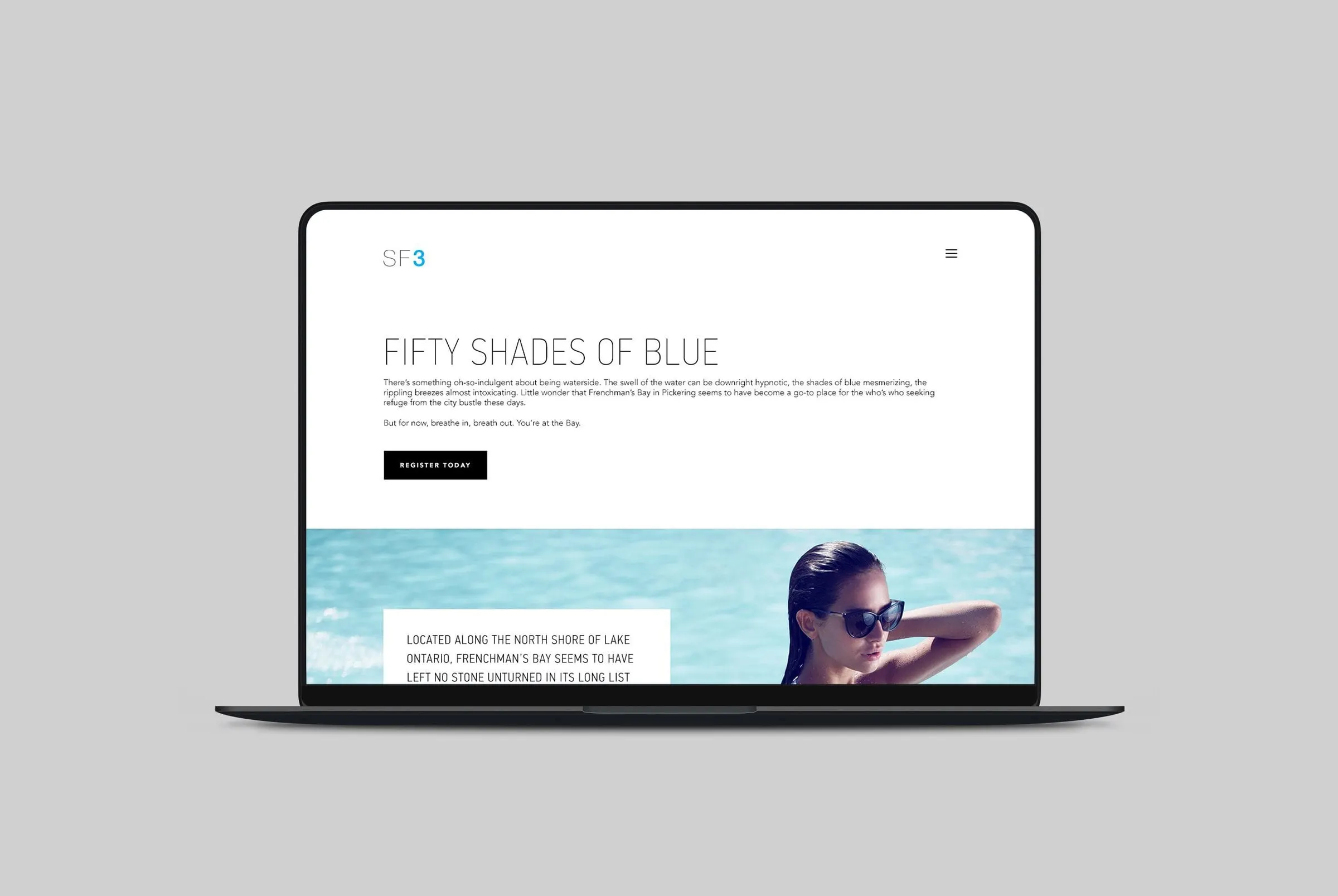
The SF3 identity is spare: thin grey letters with the 3 picked out in a bright aqua. We matched that restraint across the site. Headlines are set in tall, light, uppercase sans serif type, body copy stays small and airy, and the pages are mostly white. That leaves the colour to come from the photography: pool water, lake views, sunsets and sailboats.
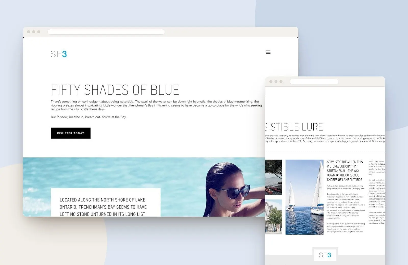
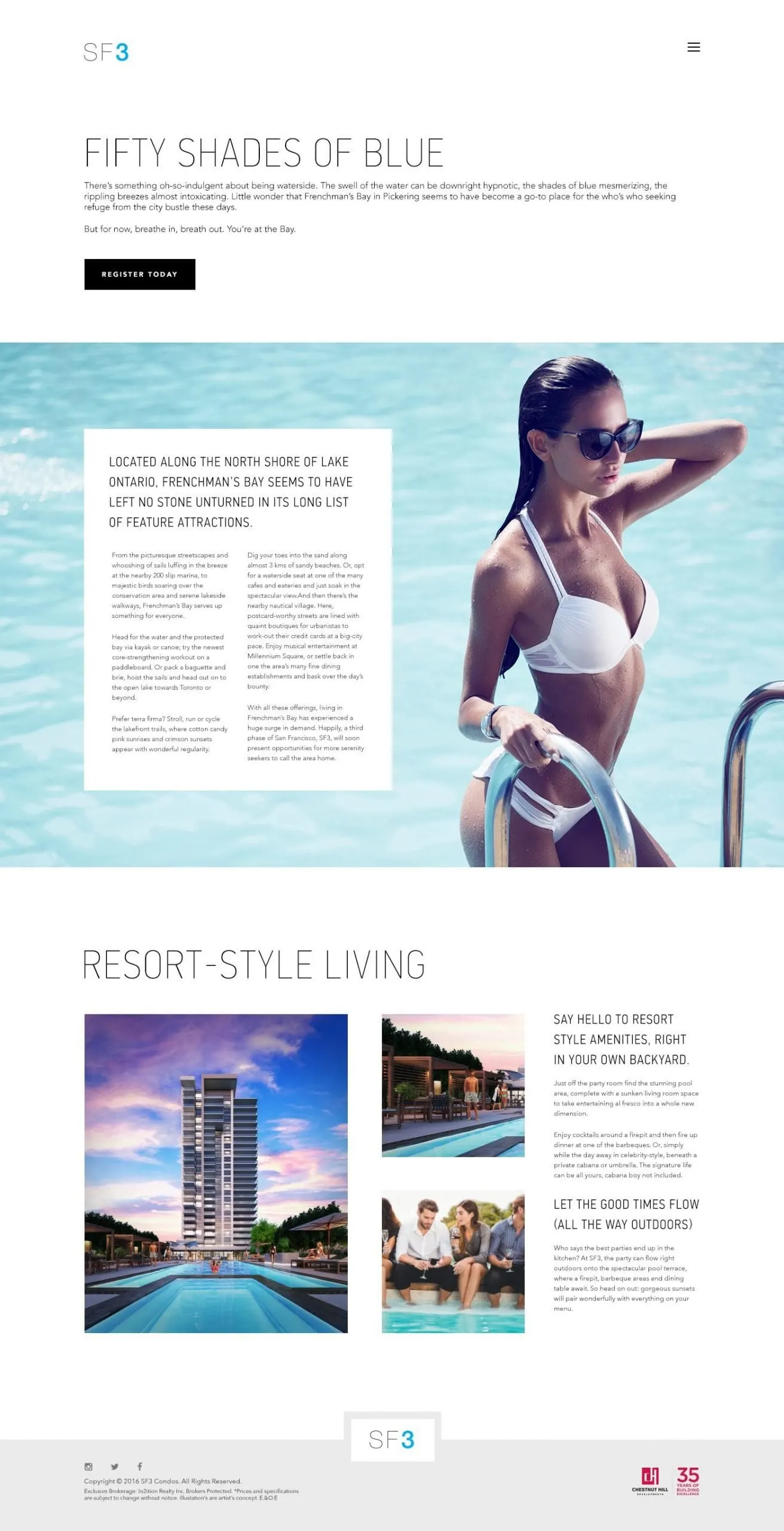
The homepage leads with the headline Fifty Shades of Blue and a black Register Today button, the one action we wanted every visitor to take. Beneath it, a full-width poolside image carries a white text panel describing Frenchman's Bay and its attractions, followed by a Resort-Style Living section that pairs a rendering of the tower and pool deck with photos of the terrace and short descriptions of the amenities.
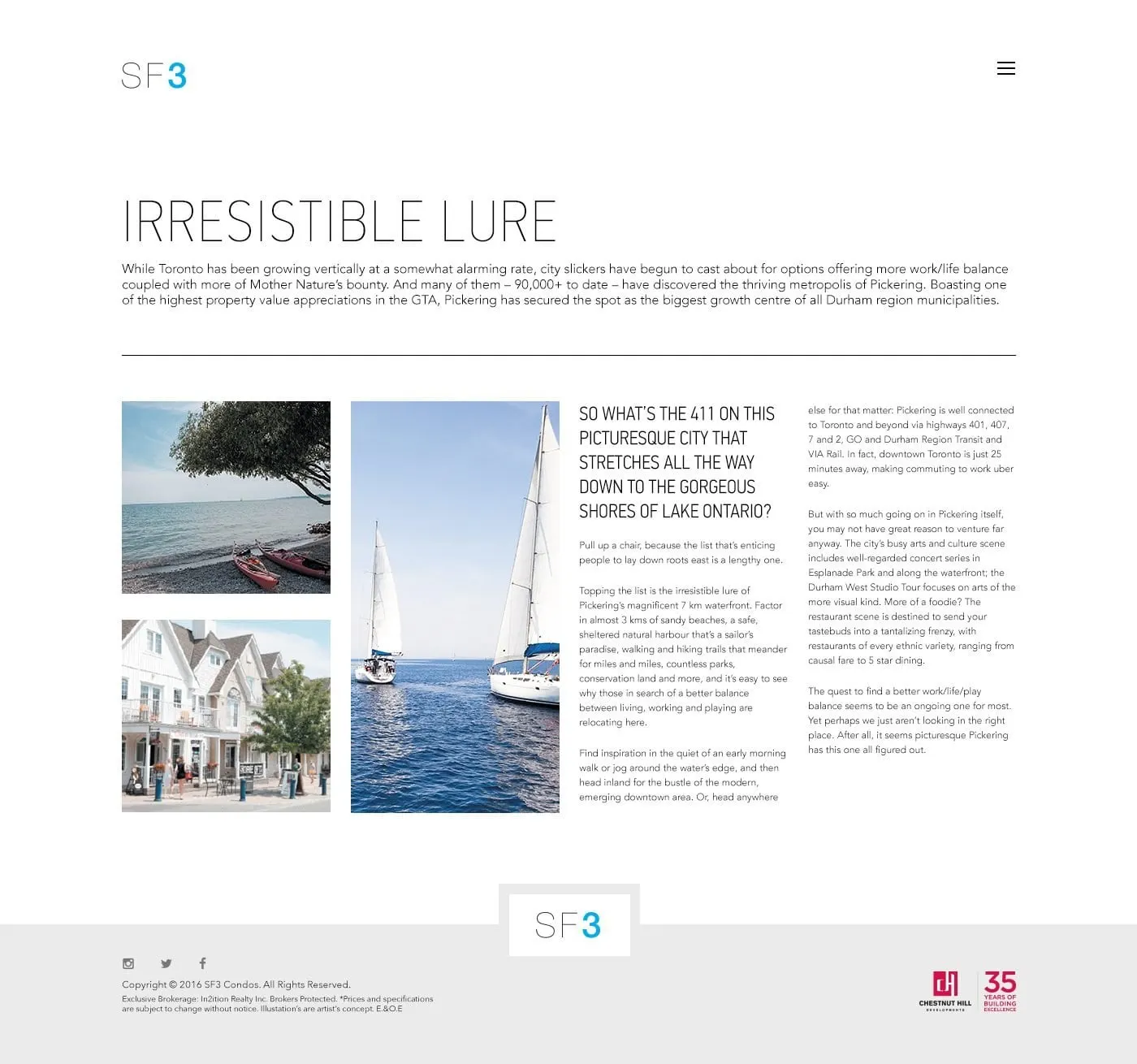
A second page, Irresistible Lure, makes the case for Pickering itself: its waterfront, beaches, trails and transit connections to Toronto, laid out as a magazine-style spread with a tall sailboat image at its centre. A simple footer carries the SF3 logo and Chestnut Hill's mark.
03 — Outcome
A lifestyle site built to collect registrations
The finished website design gives Chestnut Hill a launch site that feels like a holiday and works like a sales tool. Every section leads back to registration, and the responsive website development means the same experience holds up on a phone as well as on a desktop, wherever a buyer first comes across the project.
Real estate is a category where a website should make people feel something, and SF3 leans into that. We have designed for several builders and developers, including the Glen Agar website for Minto Communities and a sales centre touchscreen for Empire's Imagine community.