Case study · Ardor Health
Ardor Health
Brand identity for Ardor Health, a healthcare startup bringing mental health care and addiction recovery together, with a website now in design.
01 — Context
Mental health and addiction recovery, under one roof
Ardor Health is a healthcare startup built on a simple idea: mental health care and addiction recovery work better together. Many people living with addiction are also managing anxiety, depression or trauma, and Ardor brings that care into one place instead of sending people between separate services.
A new healthcare brand has a hard job. It has to feel credible to clinicians and referral partners, and safe and hopeful to someone taking a very difficult first step. Ardor came to us for brand identity design that could do both, and we are now designing the website.
02 — The mark
A dragonfly for change that lasts
The name Ardor means warmth and passion, and we wanted the identity to feel exactly that: warm, steady and human. The wordmark is set in an elegant high-contrast serif, and the O becomes a dragonfly in flight. Dragonflies spend most of their lives underwater before they emerge and fly, which makes them a quiet, hopeful symbol of transformation, the heart of recovery.
We kept the symbol inside the wordmark rather than beside it, so it reads as one confident name instead of a clinical logo with an icon attached. It is the same restraint we write about in why literal logo marks fall short: suggest the idea, don't illustrate it.
03 — Imagery & colour
Soft desert light, not hospital white
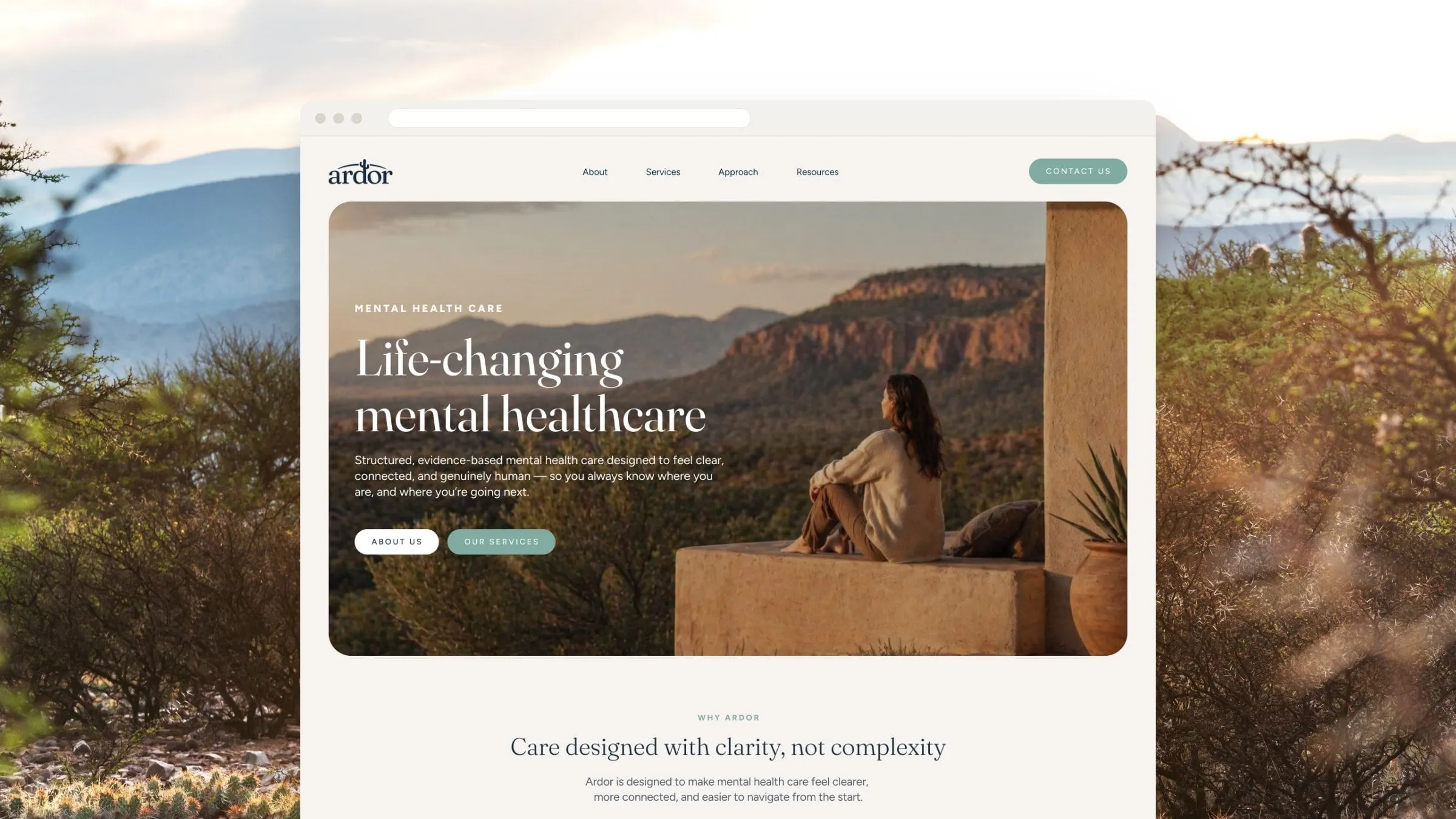
Most healthcare brands default to blue and white. For Ardor we went to the desert: dusty pink skies, sage greens, sand and a deep plum. The palette feels calm and grounded, and it gives the brand room to be warm without becoming soft or vague.
Photography follows the same direction, with wide, open landscapes and wildflowers blooming in dry ground. The images say what the brand believes, that growth is possible in hard places, without ever showing a stock photo of a therapy session.
We see the same need across healthcare branding: patients decide whether to trust a provider long before they read the credentials. It is why we approach new practices like emerging brands first.

04 — Website
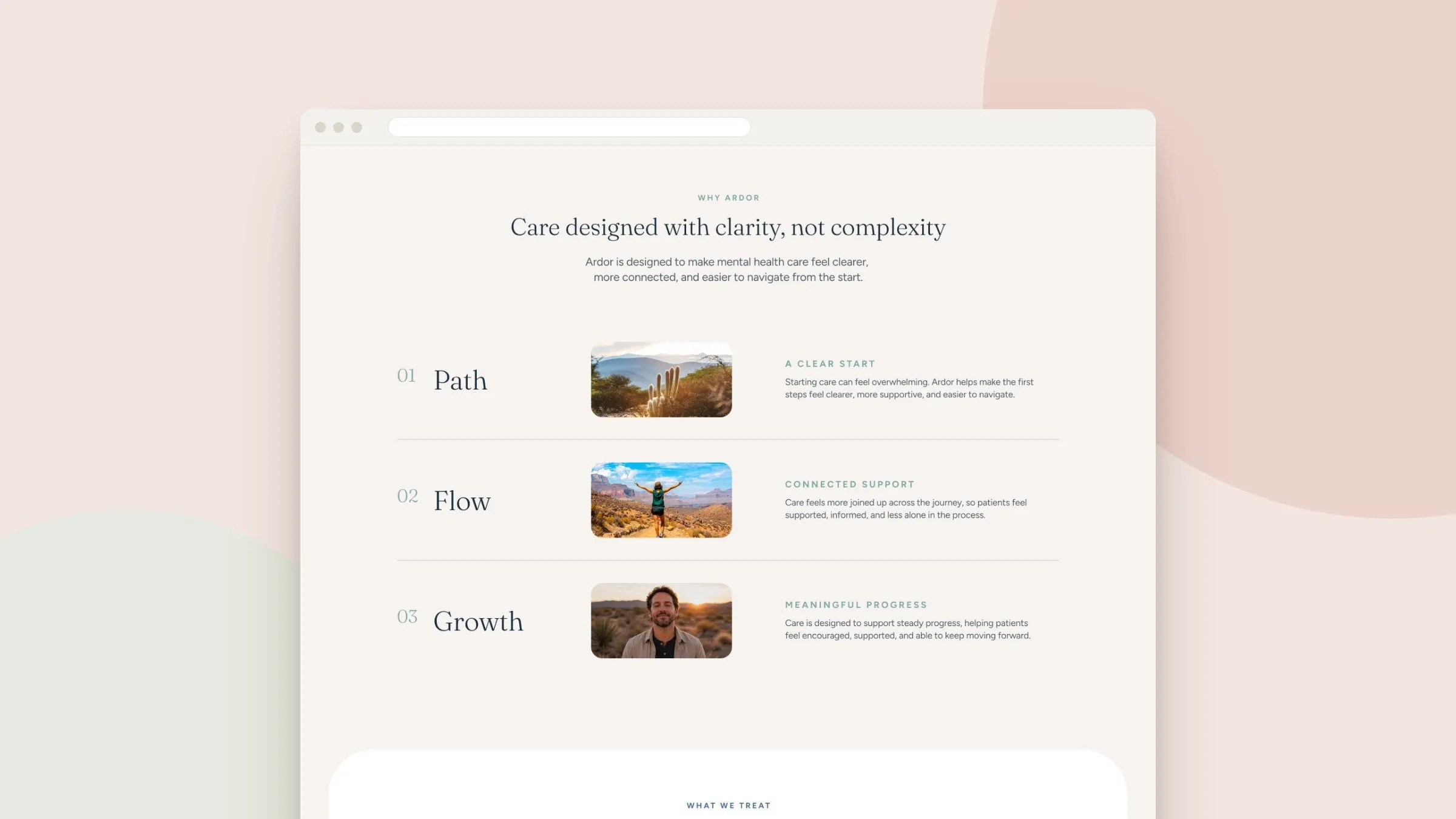
A website designed for the first step
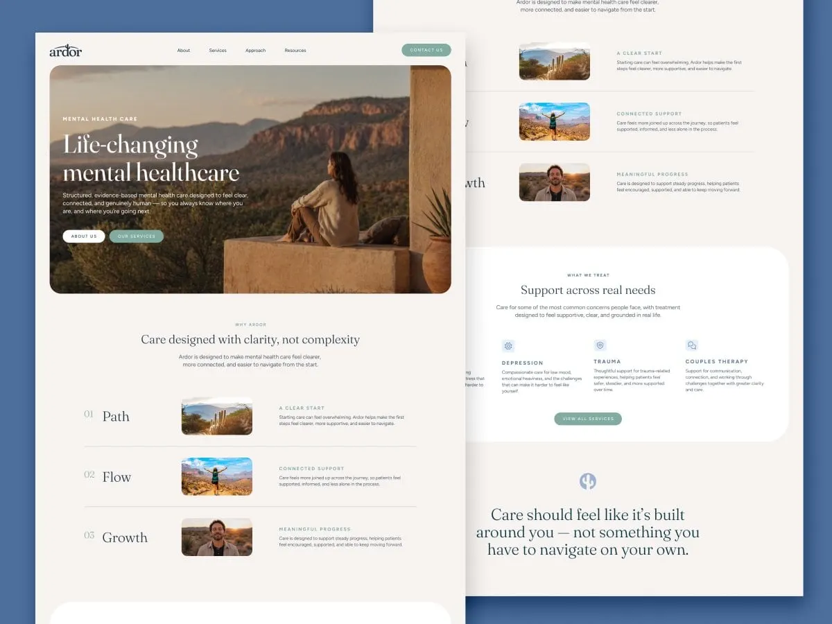
We are now designing Ardor's website. The goal is a site that feels like the brand: calm, clear and reassuring, with straightforward paths for people looking for help, families supporting someone, and professionals making referrals.
It builds on what we have learned designing mental health websites for clients like Guidelight Health, Diverge Health and Rosalie Hall, and on the principles in why healthcare websites lose patients. You can see more of our approach on our website design page.
What we delivered
- 01Brand strategyPositioning for a combined mental health and addiction recovery provider.
- 02Wordmark & dragonfly symbolA serif wordmark with a dragonfly integrated into the O.
- 03Colour & imagery directionA desert-inspired palette and photography style.
- 04Website design (in progress)A calm, accessible site for patients, families and referrers.