Case study · The Trust (Trust Insurance)
The Trust
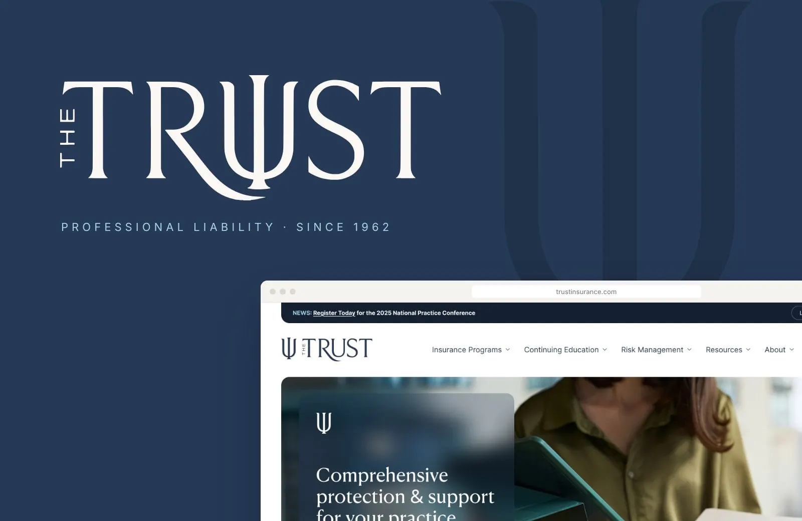
A logo evolution and a new website for The Trust, a provider of professional liability insurance, continuing education and risk support for psychologists since 1962.
01 — Context
Insurance for psychologists, by people who get it
Since 1962, The Trust has provided professional liability insurance, financial security and risk management programs for psychologists across the United States. Based in Rockville, Maryland, it's overseen by a board of psychologists and insurance experts, and it goes well beyond a policy: APA-approved continuing education, live webinars and workshops, and the Advocate 800 program, which gives policyholders confidential risk consultations at no extra cost.
The Trust asked us to refresh a mark that psychologists have known for more than six decades and to rebuild a website that had grown to hold all of that. We handled both, which is exactly why branding and web design work best together.
02 — The mark
An evolution, not a reinvention
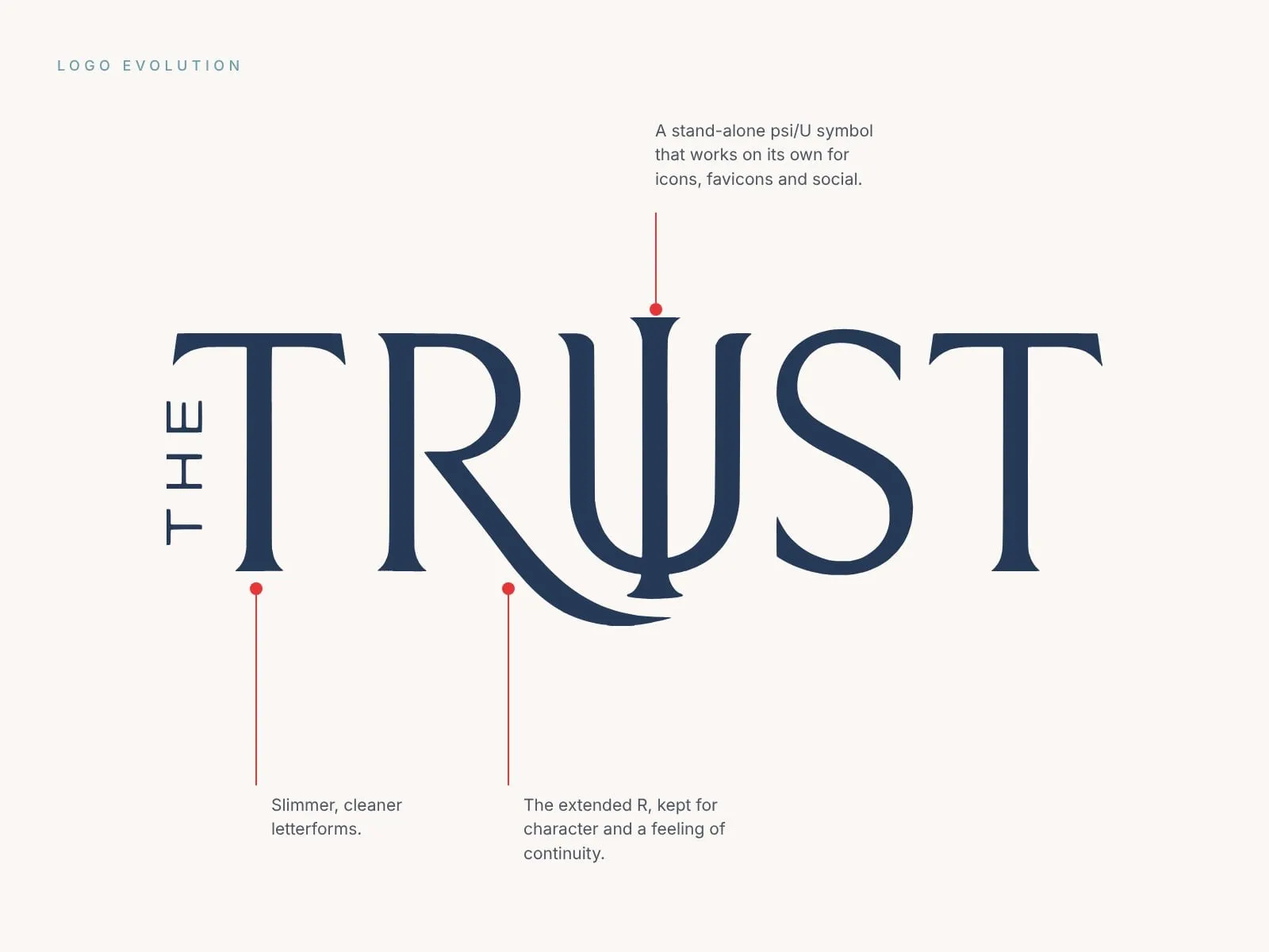
A 60-year-old logo carries real trust, so our job was to keep its character and lose the friction. The refined wordmark uses slimmer, cleaner letterforms and more generous spacing. We kept the extended R, which gives the mark its sense of flow and continuity.
At the centre is the psi, the Greek letter that stands for psychology. We redrew it as a dual-purpose shape: it reads as the U in TRUST, and it also stands on its own as a symbol for favicons, social avatars and anywhere the full name won't fit. Our brand identity work is often like this: respect what people already recognize, then make it work harder.

03 — Colour and type
Grounded, clear and human
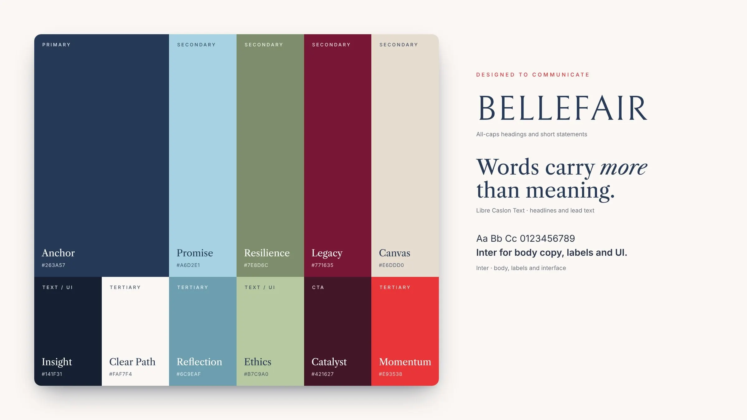
The palette is anchored in a deep navy we named Anchor, with Promise blue, Resilience green, Legacy wine and a warm Canvas neutral around it. A bright Momentum red is saved for the moments that matter, like Start my quote. Every colour has a job, so the site and the marketing stay consistent without feeling rigid.
Type does the same balancing act. Bellefair handles all-caps statements, Libre Caslon Text brings a literary, trustworthy tone to headlines, and Inter keeps body copy and the interface easy to read on any screen. Soft, rounded shapes replace hard corners throughout, so the brand feels welcoming without feeling casual.
04 — Applications
From the business card to the feed
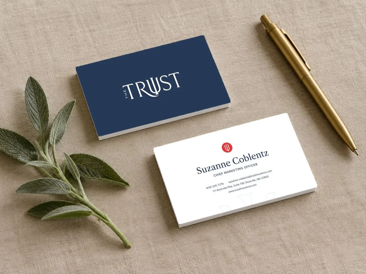
We put the system to work on business cards and a set of social and digital ads. The navy card carries the full wordmark; the back uses the psi in a Momentum red circle as a small, confident seal.
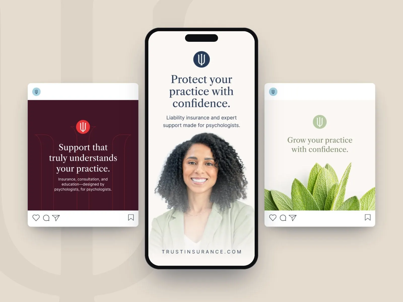
The ads lead with real people and plain promises, like Protect your practice with confidence, and use the oversized psi as a quiet graphic device in the background. They're simple to adapt for new campaigns, CE announcements and conference season.
05 — The website
A site organized around a career
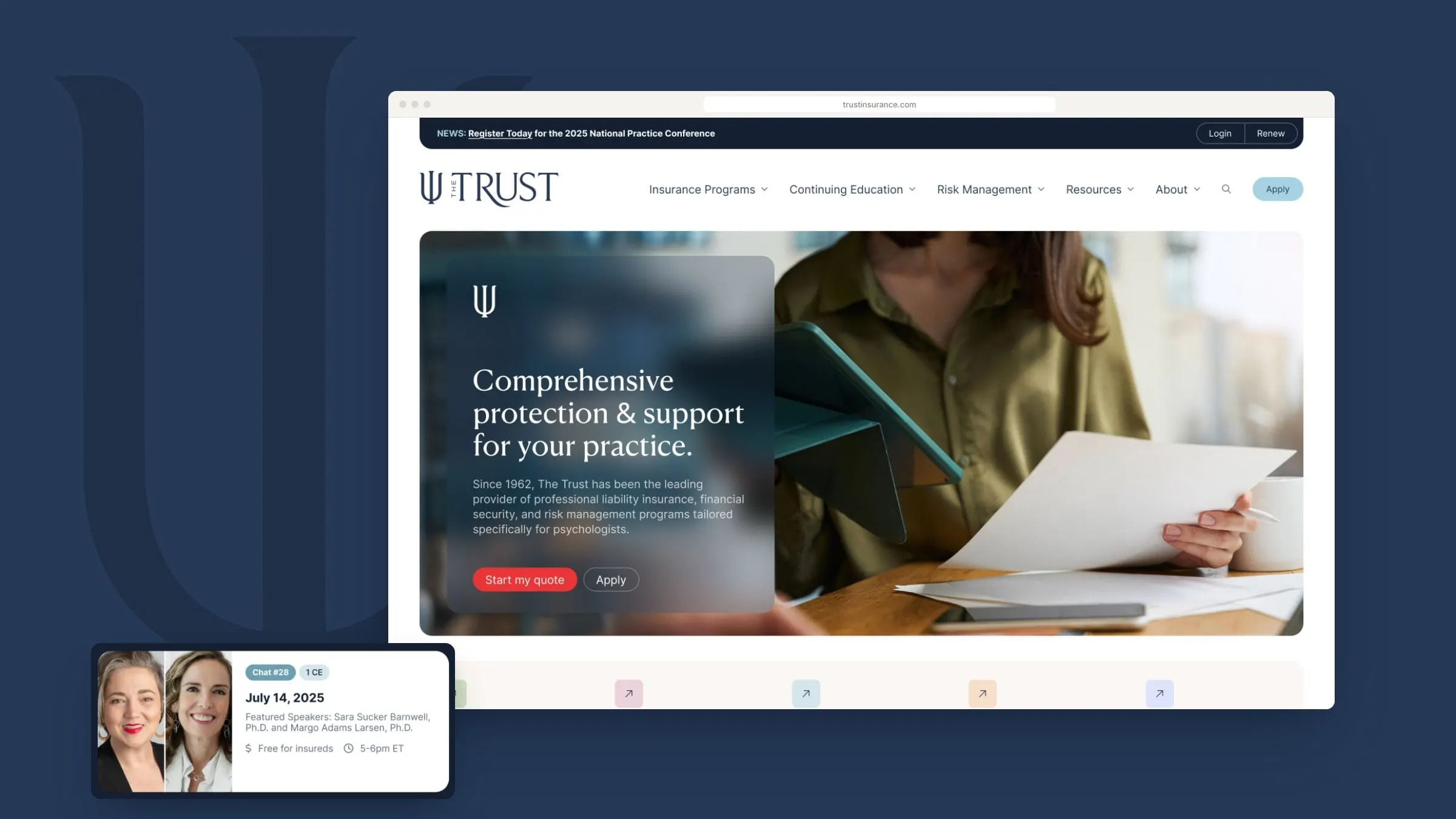
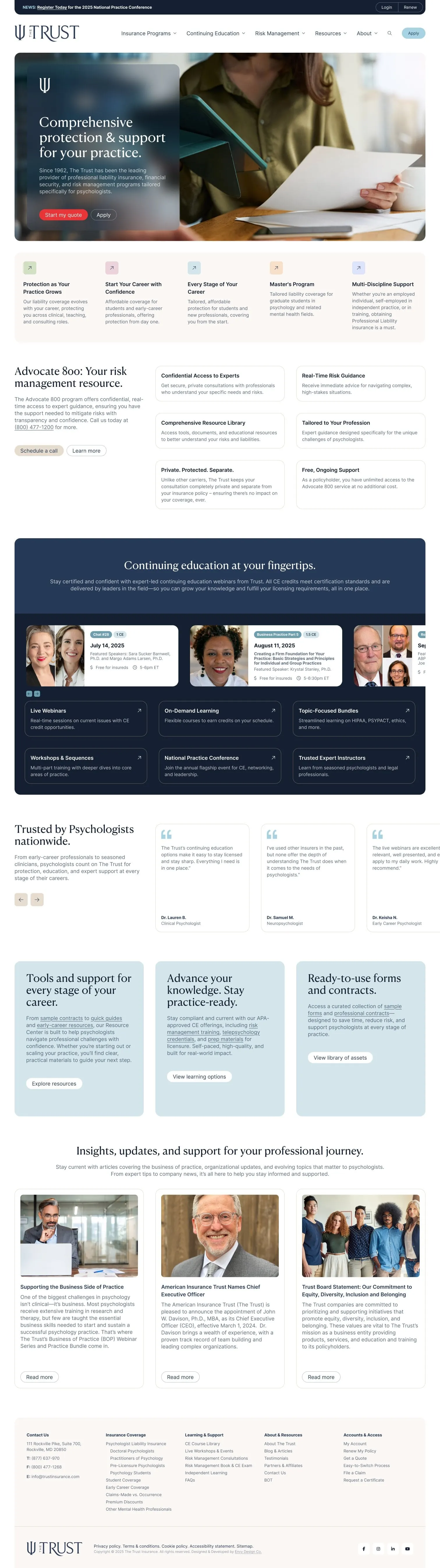
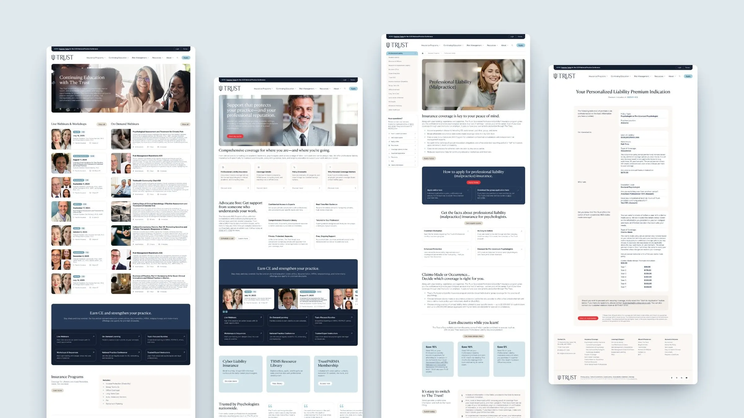
The old way into insurance sites is a list of products. Psychologists don't think that way; they think about where they are. So we mapped the information architecture around career stages: psychology students, pre-licensure psychologists, master's-level practitioners, licensed psychologists and allied health professionals, each with a dedicated landing page that speaks to their situation.
From there, a clear navigation splits the site into Insurance Programs, Continuing Education, Risk Management, Resources and About. In Figma we designed more than 60 desktop pages and states, from insurance templates and the CE calendar to a glossary, a document library, careers and a full component page for the development team.
06 — Key features
Quotes, CE and support, without the maze
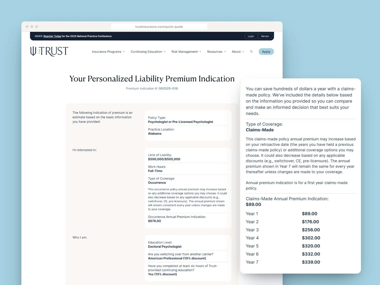
The biggest decision on any insurance site is the quote, so we made it feel like a conversation. The Quick Quote flow asks a few plain questions and returns a personalized premium indication, with occurrence and claims-made options side by side and a year-by-year view of the claims-made premium.
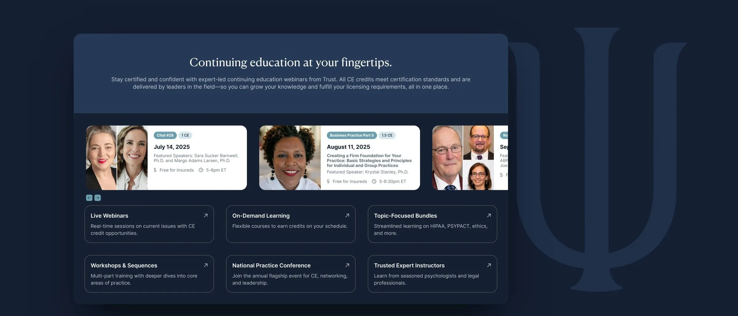
Continuing education gets its own hub with live webinars, on-demand bundles, workshops and the National Practice Conference, and Advocate 800 sits right on the homepage so policyholders know help is a phone call away. It's UX design in service of a calmer decision.
07 — The result
Familiar, but finally at ease online
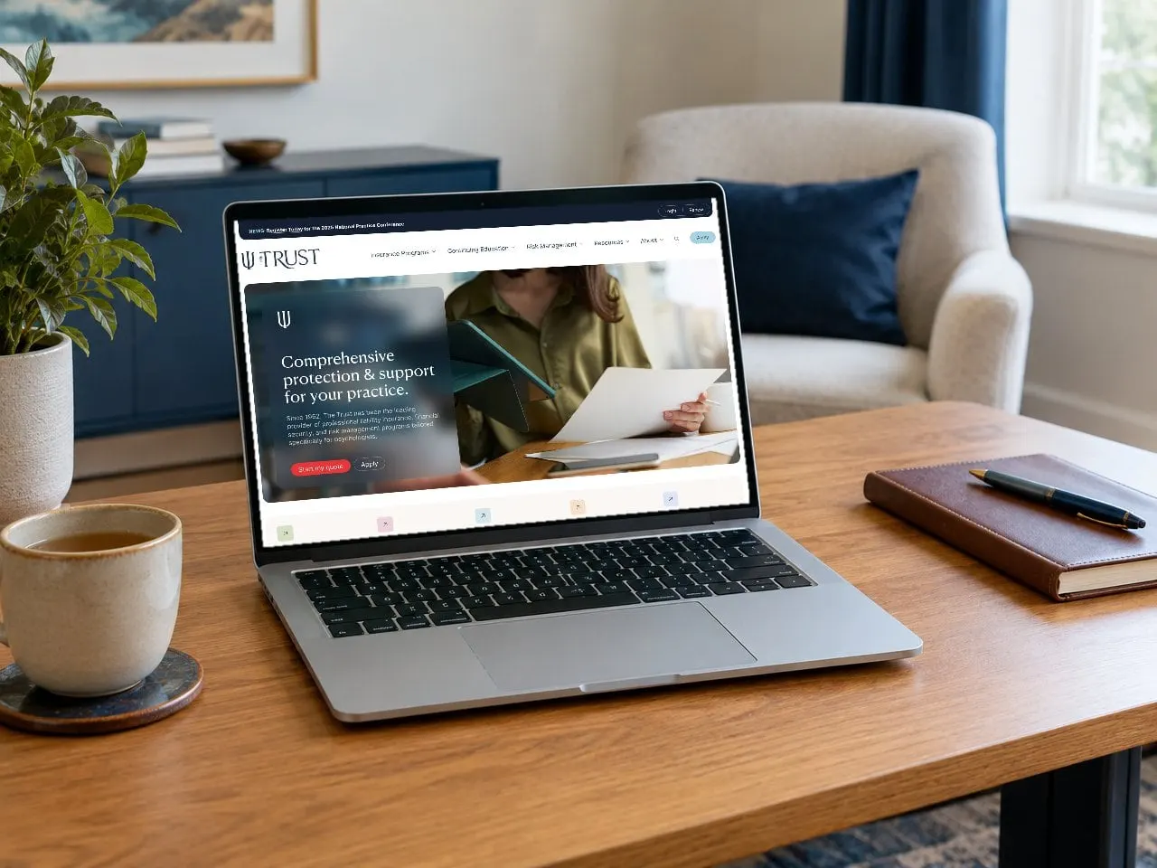
The Trust now has a mark that still looks like The Trust, only lighter, clearer and more flexible, and a website that meets psychologists where they are in their careers. Insurance, education and risk support finally live in one place, with a quote flow that respects how big that decision is. And because the psi now works on its own, the favicon, the social avatar and the business card seal all feel like one family.
If you're in a regulated, trust-heavy business, see more of our finance and insurance work, including Tribal Custom Insurance and Kennion Benefits.
What we delivered
- 01Logo evolutionA refined wordmark and a stand-alone psi symbol that keep six decades of recognition.
- 02Colour and type systemAn eleven-colour palette and a three-typeface system for print and screen.
- 03Social and digital adsFeed and story ads built on the new graphic devices.
- 04Business cardsStationery that puts the wordmark and psi seal to work.
- 05Website design60-plus desktop pages, organized by career stage, with a full component library.
- 06UX and quote flowQuick Quote, premium indication, applications and thank-you states.
- 07Website developmentA build that brings insurance, CE and resources together.