Case study · Rosalie Hall
Rosalie Hall
A website for a non-profit supporting young parents.
01 — Context
Non-profit website design for young families in Toronto
Rosalie Hall is an accredited children's mental health centre that has served Toronto communities since 1914. From its home in Scarborough, it supports pregnant and parenting youth aged 12 to 25 and their children with prenatal support, early learning and child care, parenting groups, high school education, counselling and live-in treatment — all free.
The organization asked us for a non-profit website design that matched the warmth of the people inside the building. The goal was simple to say and harder to do: a nervous 17-year-old should be able to find the right program in a few taps. We took on the website design and build, reorganized the content, and rewrote the service pages so each one answers the questions families actually ask.
02 — The home page
Four doors in, sorted by what a visitor needs
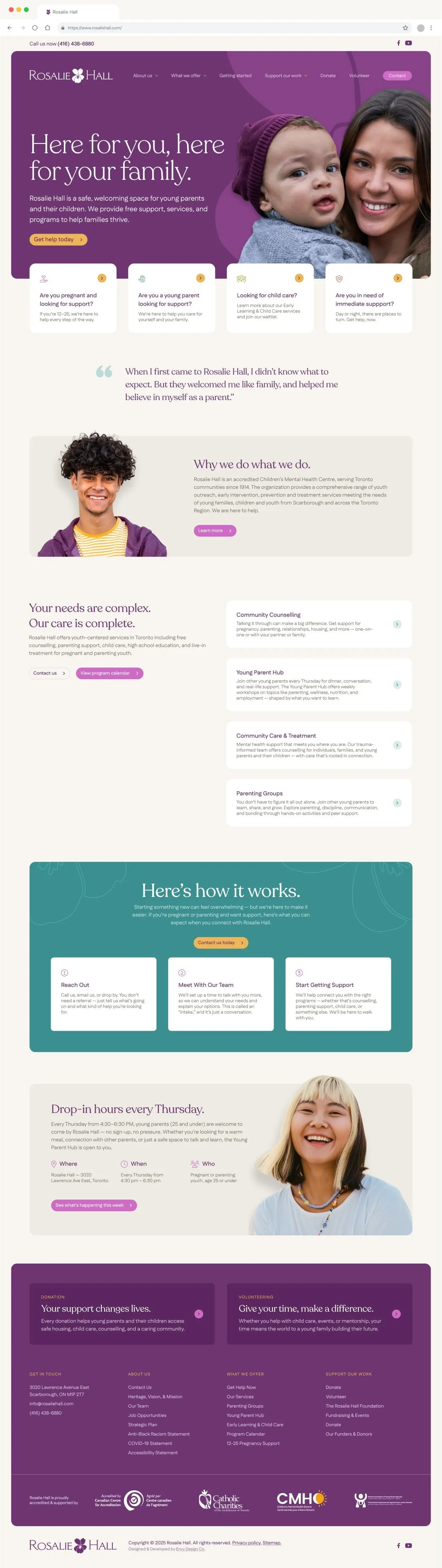
Most people who land on Rosalie Hall's site arrive with one urgent question. So instead of leading with the organization, the home page leads with the visitor. Directly under the hero sit four cards: Are you pregnant and looking for support?, Are you a young parent looking for support?, Looking for child care? and Are you in need of immediate support? Each one routes straight to the right program, and the last points to help that is available day or night.
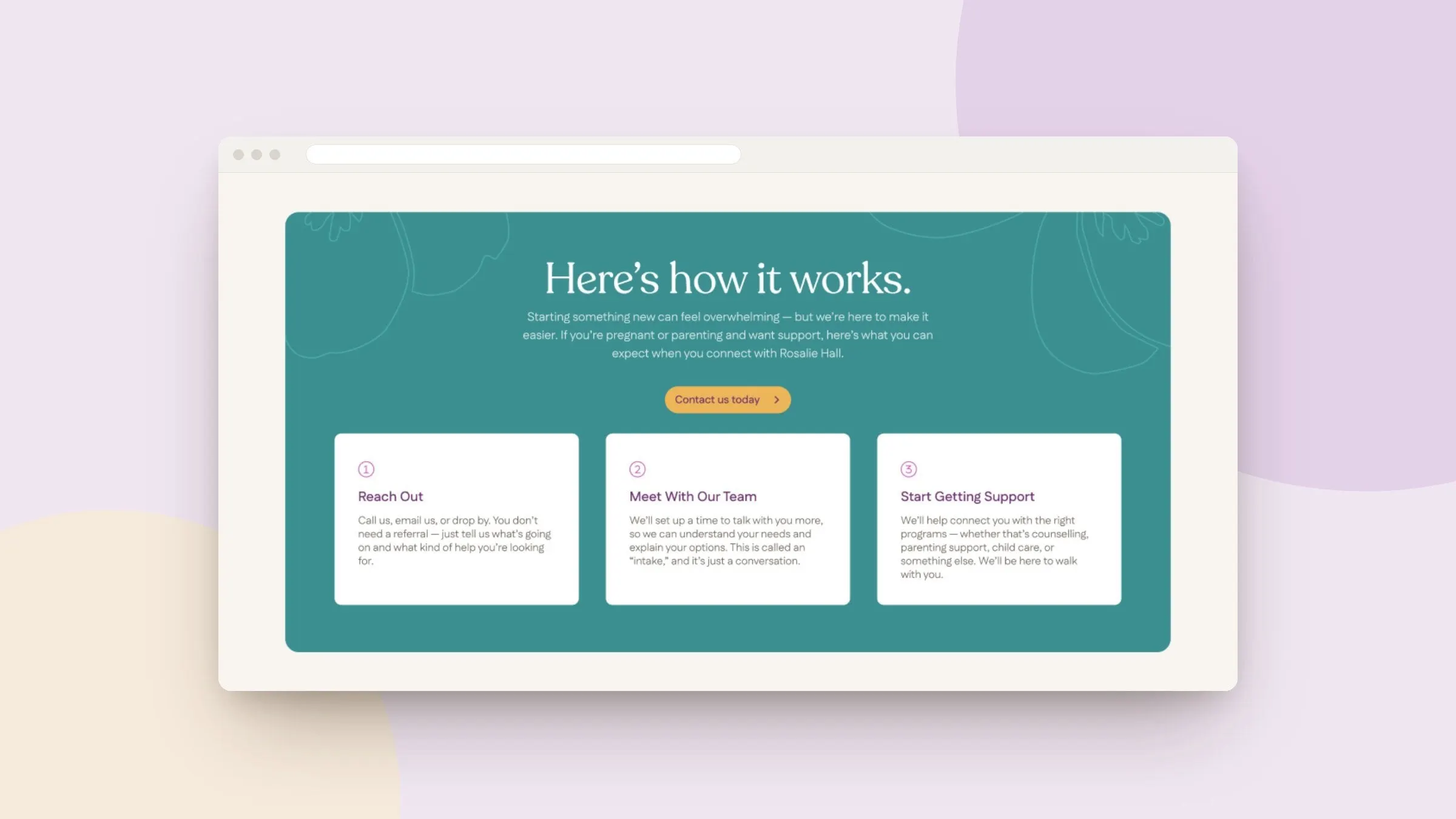
Below that, a testimonial from a young parent does the reassuring that a mission statement can't, followed by a short "Why we do what we do" story and a clear list of programs — Community Counselling, the Young Parent Hub, Community Care & Treatment and Parenting Groups. A teal "Here's how it works" band then walks first-time visitors through what happens when they reach out. The phone number stays pinned in the top bar on every page.
Visually, the site pairs the Rosalie Hall wordmark and violet flower with a deep plum hero, warm cream backgrounds, soft pink and marigold buttons, and a friendly serif for headlines. It feels calm and grown-up without feeling clinical — important for an audience that is often wary of institutions. The UX and interface design keeps tap targets large and cards simple, because many of these visitors will arrive on a phone.
03 — Program and support pages
Service pages that answer when, where and who
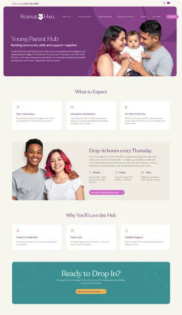
Rosalie Hall runs a lot of programs, and each one has its own rules about age, schedule and how to join. We gave every program page the same predictable structure so visitors learn it once. The Young Parent Hub page is a good example: a short intro, a "What to Expect" row (peer connection, interactive workshops, on-site child care), then a single panel for the Thursday drop-in with Where, When and Who laid out side by side. It ends with "Why You'll Love the Hub" and a big "Ready to Drop In?" call to action. No referral needed, and the page says so.
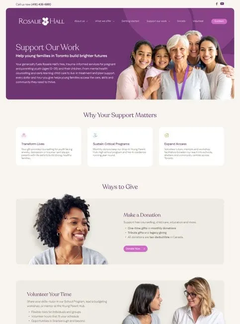
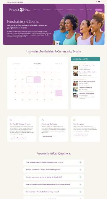
The organization also depends on donors and volunteers, so the site has to work for a second audience. The Support Our Work page explains why giving matters, then offers clear ways to give — monthly or one-time donations, tribute gifts, legacy giving — and a volunteer section for tutors, mentors and workshop leaders. Fundraising & Events adds an events calendar, a list of upcoming community events and an FAQ about peer-to-peer fundraising and sponsorship.
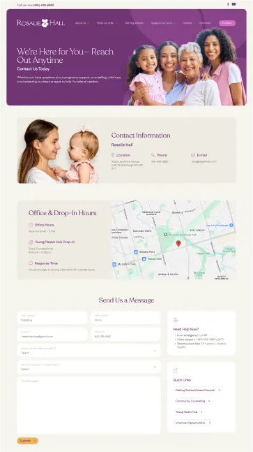
The Contact page carries the most care. Alongside the form, map, and office and drop-in hours, a "Need Help Now?" panel lists emergency and crisis numbers, so someone in distress never has to fill in a form first. We developed the site as a fully custom build — see our website development work — with the events calendar and form built into the same templates.
Their communication, attention to detail, and commitment to measurable outcomes made them feel like genuine partners rather than just a vendor. They are terrific.
04 — Writing and accessibility
Plain words, readable pages, real people
Much of this project was content work. We rewrote headings as the questions visitors are already asking, cut jargon, and kept paragraphs short enough to read on a bus. Body text sits on light cream panels with strong contrast, buttons say exactly what they do, and the navigation groups everything under About us, What we offer, Getting started and Support our work. Those choices follow the same principles we cover in our guide to healthcare website accessibility and WCAG 2.2.
Photography matters too. We chose images of young parents, grandparents and kids who look like the families Rosalie Hall serves across Scarborough and the GTA, and we avoided anything that felt like a clinic waiting room. The result is a site that a teen parent, a donor and a social worker can each use with confidence. If you work in the non-profit sector, our recent work for Guidelight Health shows a similar approach to care-focused design.

What we delivered
A redesigned, custom-built website for Rosalie Hall.
- 01Website designHome page, program pages, Support Our Work, Fundraising & Events and Contact.
- 02UX/UI designAudience-first navigation, needs-based entry cards and a consistent program page structure.
- 03Website developmentA custom build with an events calendar and contact form.
- 04Content creationRewritten service pages and plain-language headings for young families.