Case study · Diverge Health
Diverge Health
A brand built from the ground up — identity, positioning and visual system.
01 — Context
Healthcare startup branding with the mission up front
Diverge Health empowers primary care practices to deliver the highest quality care to underserved patients. It supports physicians with resources such as community health workers and clinical support, helping practices extend their reach to the people who most need them.
As a healthcare startup, Diverge needed everything: a position in the market, a clear point of difference, and an identity to carry it. We led the healthcare startup branding from the ground up, working with the team to define what set them apart, then built a logo, a website and a set of presentations and corporate collateral around it.
The brief from the team was clear. The brand had to speak to the communities Diverge serves, feel warm and inviting, and above all stay focused on the mission.
02 — Identity
A mark about choosing a different path
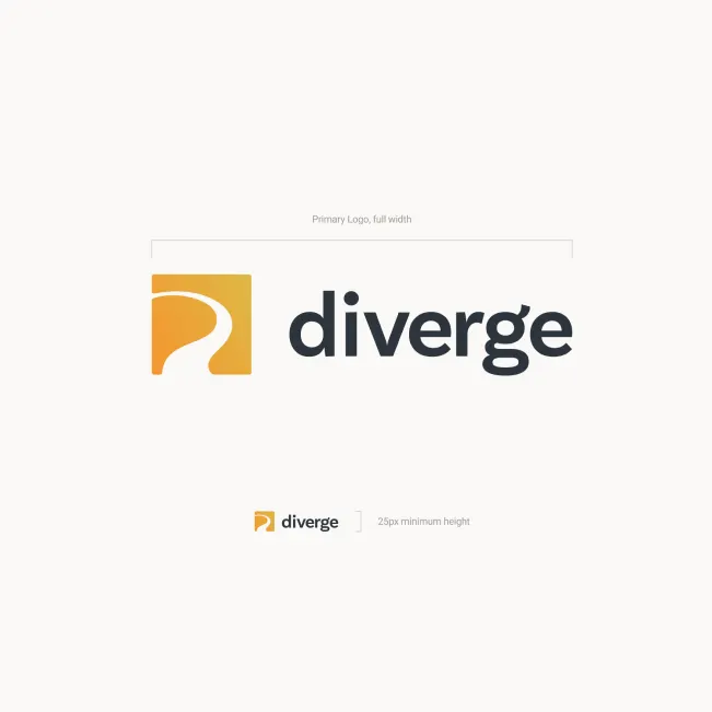
The name Diverge suggests a departure from the usual route, so we built the brand identity around that idea. The logo is a rounded square in a warm orange-to-yellow gradient, cut by a single curving white path that bends away from the expected direction. Beside it, a lowercase wordmark in a friendly, rounded sans serif is set in deep slate. Lowercase keeps it approachable; slate keeps it credible.
We specified how the logo behaves at every size, including a minimum height for digital use, so the mark stays crisp from a presentation title slide down to a website header.
The gradient also gives the brand a ready-made accent colour. On the website, the same golden yellow picks out quotation marks, small benefit icons and the main call-to-action button, so the logo's warmth carries through to every page without adding a second brand colour to manage.
The supporting system is upbeat but grown-up. Warm golden accents and big quotation marks bring energy. An elegant, high-contrast serif sets headlines and pull quotes, adding a human, editorial tone. Photography focuses on real families and multi-generational moments, reflecting the patients Diverge's partner practices serve.

03 — Website and collateral
One story for patients, providers and payors
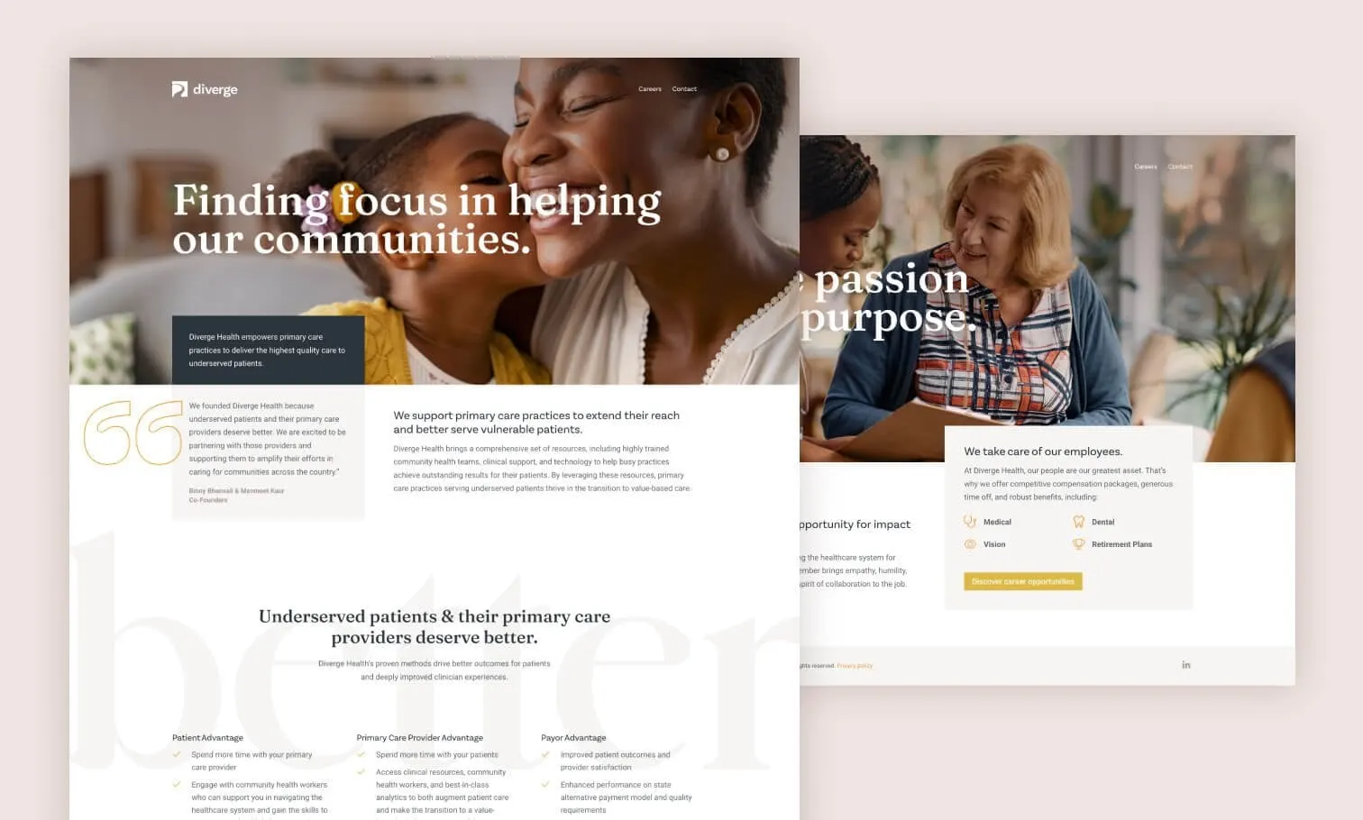
Diverge has to persuade several audiences at once, so the website design spells out the value for each. After a hero headline, Finding focus in helping our communities, the homepage carries a founder quote and a section titled Underserved patients & their primary care providers deserve better, with a large, faint better set behind it. Three columns follow: the patient advantage, the primary care provider advantage and the payor advantage.
A careers page applies the same system to recruiting, with a section on how Diverge takes care of its employees, including medical, dental, vision and retirement plans. We handled the website development as well, and carried the identity into PowerPoint presentations and corporate collateral so every touchpoint tells the same story.
The result is a brand that a growing team can apply on its own: one mark, one accent colour, one headline typeface and a clear photographic point of view.
For more mission-driven healthcare work, see our brand and website for Conceive Health.
What we delivered
- 01Brand positioning and identityPositioning, points of difference, logo, colour, typography and photography direction.
- 02Website design and developmentHomepage, careers and supporting pages, designed and built.
- 03Presentation designBranded PowerPoint templates and decks.
- 04Corporate collateralSupporting materials in the new identity.