Case study · Synapse
Synapse
A brand refresh, brand guidelines, custom website and print collateral for Synapse Health, a U.S. company transforming durable medical equipment (DME).
01 — Context
A healthcare brand refresh for a company in growth mode
Synapse Health works in durable medical equipment (DME) — the equipment patients need during a stay in a skilled nursing facility, in hospice or at home. The company was founded in 2016 to fix what it calls a fractured DME ecosystem, and today it connects prescribers, health plans, suppliers and patients across the U.S. through a set of technology-driven solutions.
Synapse was expanding quickly, with several distinct solutions and audiences, and needed a brand that could hold all of them together. They asked us for a healthcare brand refresh that could carry a growing company, and then stayed with us as their ongoing design partner for the website, print collateral, medical forms, direct mailers and more.
The brief came down to one tension: Synapse needed to look credible to health plans and clinicians, and approachable to patients and caregivers, at the same time.
02 — The mark
A symbol built on connection
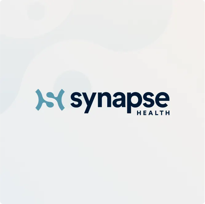
A synapse is the point where two signals meet, and that idea became the logo. The new symbol is two curved brackets facing each other with a fluid S running between them — an abstract form that reads as an S and an H for Synapse Health, and as two sides being joined.
We drew it with soft, rounded terminals so it feels human rather than clinical, then paired it with a heavy, lowercase wordmark and a spaced-out "HEALTH" beneath. The result works at very different scales: as a full lockup on a homepage header, as a standalone symbol on a navy square for social avatars and app icons, and as a small, quiet mark at the top of a letterhead.
The symbol also became a system. Recoloured, it identifies each Synapse product line, which lets the company add new offerings without designing a new logo every time.

03 — Colour & guidelines
A palette with room for every product
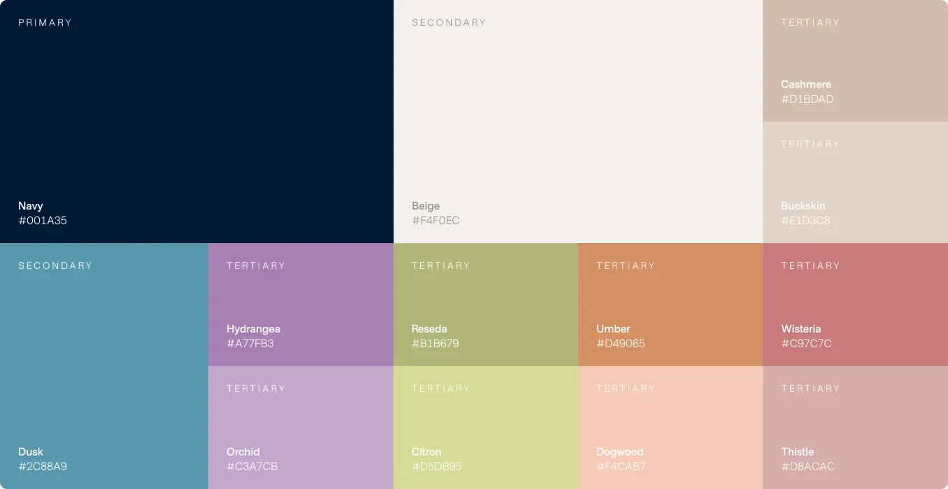
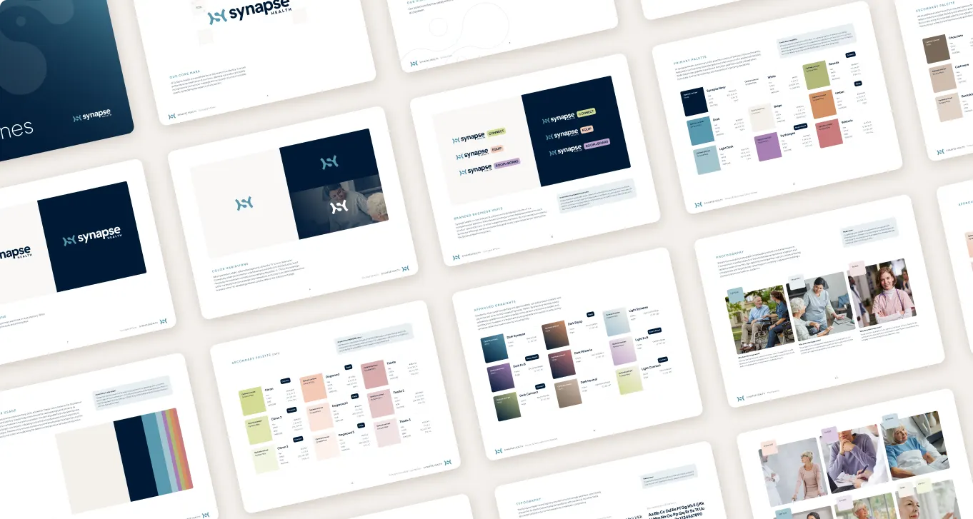
The colour system is built in tiers. Navy (#001A35) is the primary, carrying authority for health plan and provider audiences. Beige (#F4F0EC) and Dusk (#2C88A9) are secondary, giving pages warmth and a calm, recognizable blue.
Then come the tertiaries in light and dark pairs: Hydrangea and Orchid, Reseda and Citron, Umber and Dogwood, Wisteria and Thistle, Cashmere and Buckskin. These muted, earthy tones are what make the brand feel caring rather than corporate, and each product takes one — Synapse Equip in umber and dogwood, Synapse Connect in reseda and citron, Synapse Room+Board in hydrangea and orchid.
We documented all of it in brand guidelines: logo usage, the symbol on light and dark backgrounds, product lockups, colour values, gradients and photography direction favouring warm, candid images of patients and caregivers. With a guide in hand, Synapse's internal teams and outside vendors can produce materials that match, which matters for a company growing this quickly.
04 — The website
A website that explains DME to four audiences
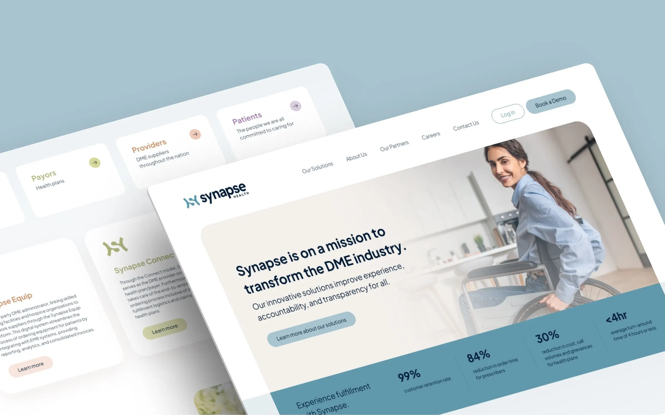
The fully customized website had to serve prescribers, payors, providers and patients — people with very different questions. Our website design starts with a clear statement on the homepage, "Synapse is on a mission to transform the DME industry," over a photograph of a smiling woman in a wheelchair, followed by a band of headline figures and direct paths to Log In and Book a Demo.
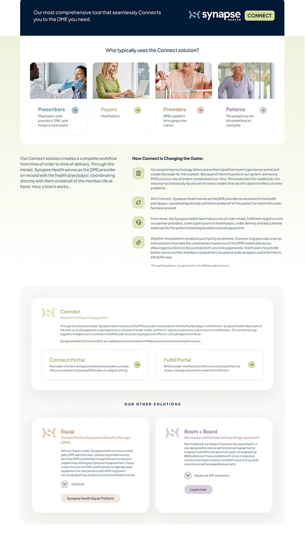
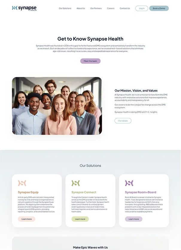
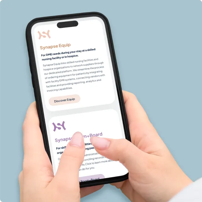
Each solution gets its own colour-coded card using its product symbol, so visitors learn the product family at a glance. The Connect page opens by asking "Who typically uses the Connect solution?" and answers with four photo cards, one per audience, before walking through how Connect works step by step with simple icons. The About page introduces the team, mission, vision and values, and closes with the same solution cards so no page is a dead end.
We built every layout to stack cleanly on phones, where the rounded cards and generous type keep long explanations readable with a thumb. Doing the identity and site together meant the brand was designed for the screen from day one — something we cover in why branding and web design should happen together.
05 — Beyond the screen
One brand across print and digital
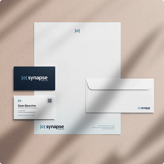
Since the refresh, we have supported Synapse's expansion with a steady flow of client and internal touchpoints: business cards, letterhead and envelopes, branded print collateral, medical forms and direct mailers. Each piece draws from the same navy, beige and dusk foundation, with product colours stepping in where a specific solution is being promoted.
That consistency is the real deliverable. Whether a health plan opens a proposal, a nurse fills out a form or a patient's family visits the website, they meet the same Synapse.
Synapse sits alongside our other healthcare work, including brand and web projects for Oasis Health Care and Steadfast Health.
What we delivered
An ongoing design partnership with Synapse Health.
- 01Brand refreshNew symbol, wordmark, product lockups and tiered colour palette.
- 02Brand guidelinesLogo, colour, gradient and photography rules for internal teams and vendors.
- 03Custom websiteHomepage, About and solution pages designed for four audiences and mobile.
- 04Print collateralStationery, medical forms, direct mailers and branded collateral.