Case study · Oasis Health Care
Oasis Health Care
A brand built from the ground up for Oasis Health Partners: logo, brand guide, stationery, sell sheets and website for a patient-first provider serving rural America.
01 — Context
Healthcare branding for a patient-first provider
Oasis Health Partners is a patient-first health care organization on a mission to serve rural communities across America. It partners with primary care providers, helping them succeed in value-based care so they can spend more of their time with patients.
When Oasis came to us, it had a mission but no brand. This was healthcare branding from a blank page: a visual identity and everything that flows from it, from business cards, letterhead, envelopes and a series of sell sheets through to the design and development of the website. Its audiences are physicians and practice leaders, who need to trust a partner with their patients and their revenue, and the patients those practices serve, who need to feel cared for. We built a brand identity that could speak to both.
02 — Identity
A ring of leaves and a palette that feels like relief
An oasis is a place of rest and renewal, so we leaned into growth rather than clinical imagery. The mark is a ring of small leaves, open and circular, that suggests growth and renewal without a single medical symbol. It sits beside a light, elegant serif wordmark set in capitals.
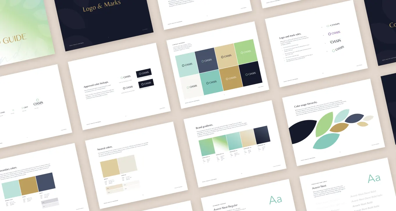
The palette avoids the hospital blues and reds of most health brands. Soft mint and fresh green carry the warmth; deep navy brings authority; muted gold adds a touch of distinction for names and accents. Brand gradients blend mint into green for backgrounds and cards. Avenir Next handles everything from headings to body copy.
We documented all of it in a full brand guide: logo and mark rules, approved colour lockups, primary, secondary and neutral colours, gradients, colour hierarchy and typography. That guide is what lets the Oasis team, and anyone it works with, keep the brand consistent as it grows.
03 — Collateral
Sell sheets that explain value-based care plainly
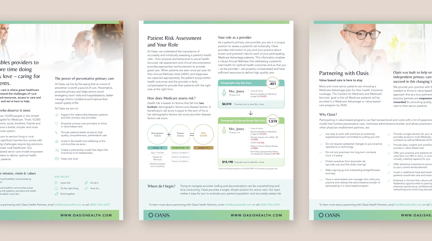
Oasis sells a complex idea to busy physicians. The sell sheets had to make it simple. We designed a series with a shared structure: a mint header band, a clear headline, short sections with subheads, and a green footer with the contact details and oasishealth.com.
One introduces the power of preventative primary care and Oasis's mission and values. One walks through patient risk assessment, using an illustrated example to show how documentation affects a risk score. One sets out the case for partnering with Oasis, with a checklist of what providers gain. Each one can be handed over after a meeting or sent ahead of one. That is marketing collateral design doing a sales job.
The stationery follows the same rules: a white letterhead with a scatter of leaves at the top and a gradient bar at the foot, and navy envelopes with the mark in mint.
04 — Website and ongoing work
One brand from business card to website
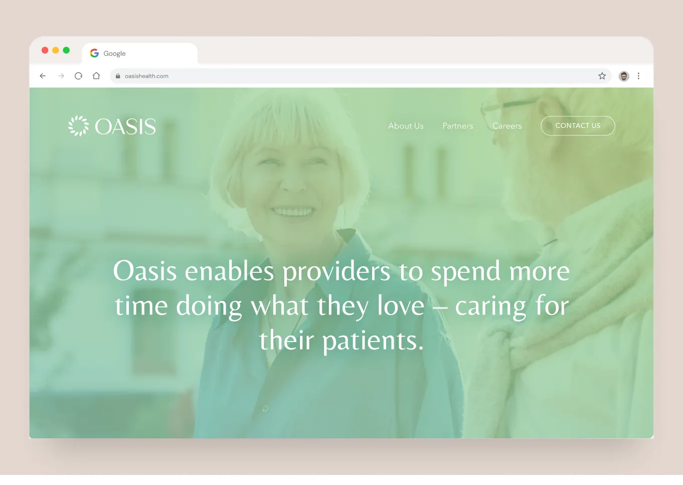
The website brings the system online. Its hero shows a smiling older couple under a soft mint wash, with one sentence: "Oasis enables providers to spend more time doing what they love – caring for their patients." Navigation is short (About Us, Partners, Careers) with Contact Us set apart as the main action. Our website design kept the same calm spacing and typography as the print pieces, so a provider moving from a sell sheet to the site feels no change in tone.
We continue to support the Oasis team, building on the foundation we created together. For another healthcare brand, see our work with Release Point, or read why a cohesive brand matters.
What we delivered
A complete brand for Oasis Health Partners, from the first sketch to a live website.
- 01Logo and identityLeaf-ring mark, wordmark, palette and typography.
- 02Brand guideLogo rules, colour lockups, gradients and type.
- 03StationeryBusiness cards, letterhead and envelopes.
- 04Sell sheetsA series explaining preventative care, risk assessment and partnership.
- 05WebsiteDesign and development of the Oasis website.