Case study · Steadfast Health
Steadfast Health
A brand built from the ground up for Steadfast Health, a substance use disorder treatment provider: logo, palette, business cards, presentation slides and a custom website.
01 — Context
Care for recovery that lasts
Steadfast Health supports people with substance use disorder (SUD) on the way to lasting recovery. Its model meets patients wherever they enter the system, from hospital and ER consultations to outpatient care, with same-day virtual or walk-in appointments and services like peer recovery support, medication management and behavioural therapy.
As a new organization, Steadfast had no brand at all. They needed an identity that would feel trustworthy to hospital partners and clinicians while staying warm and judgment-free for patients and families. Our Steadfast Health branding work covered the whole system: logo, colour, typography, business cards, presentation slides and a fully custom website.
That's two very different audiences. A hospital administrator wants to understand the care model, the partnerships and the evidence behind it. A person looking for help, or a parent searching on their behalf, wants to know that they'll be treated with dignity and that getting started is easy. Every design decision below was tested against both.
02 — Identity
A guiding star for a long journey
The name says a lot: steady, reliable, there for the long haul. Our branding and identity design turned that into a four-point star set inside a circle broken into four arcs. It reads as a compass point or a guiding star, something to navigate by, while the open circle suggests support that surrounds a person without closing them in.
We drew the star with soft, curved sides so it feels gentle rather than sharp, and set the wordmark in a rounded lowercase sans. Lowercase was a deliberate choice. In a field where stigma is a real barrier to care, the brand needed to feel approachable before it felt clinical.
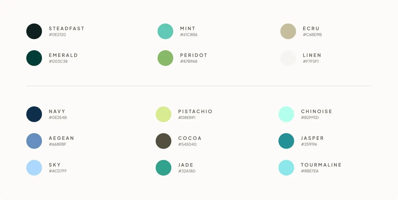
The palette starts with a near-black green called Steadfast and a deep Emerald, then lifts into Mint, Peridot, Ecru and Linen. A secondary range of blues, greens and Cocoa gives designers room for charts, icons and diagrams. Headlines use a sturdy serif that feels grounded and human; supporting text stays in the clean sans.
We also built the mark to work at every size. The full-colour version leads on light backgrounds, the white icon sits cleanly on mint or teal, and the star alone works as a favicon, a social avatar or a bullet in a diagram, which is exactly how it's used on the website.
03 — Website
A website that explains SUD care without the jargon
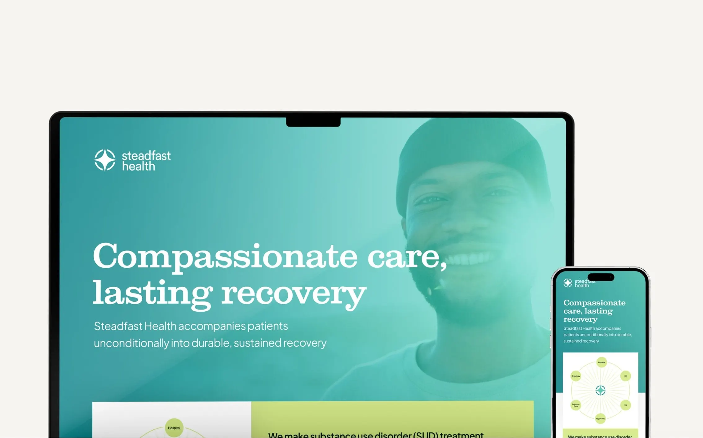
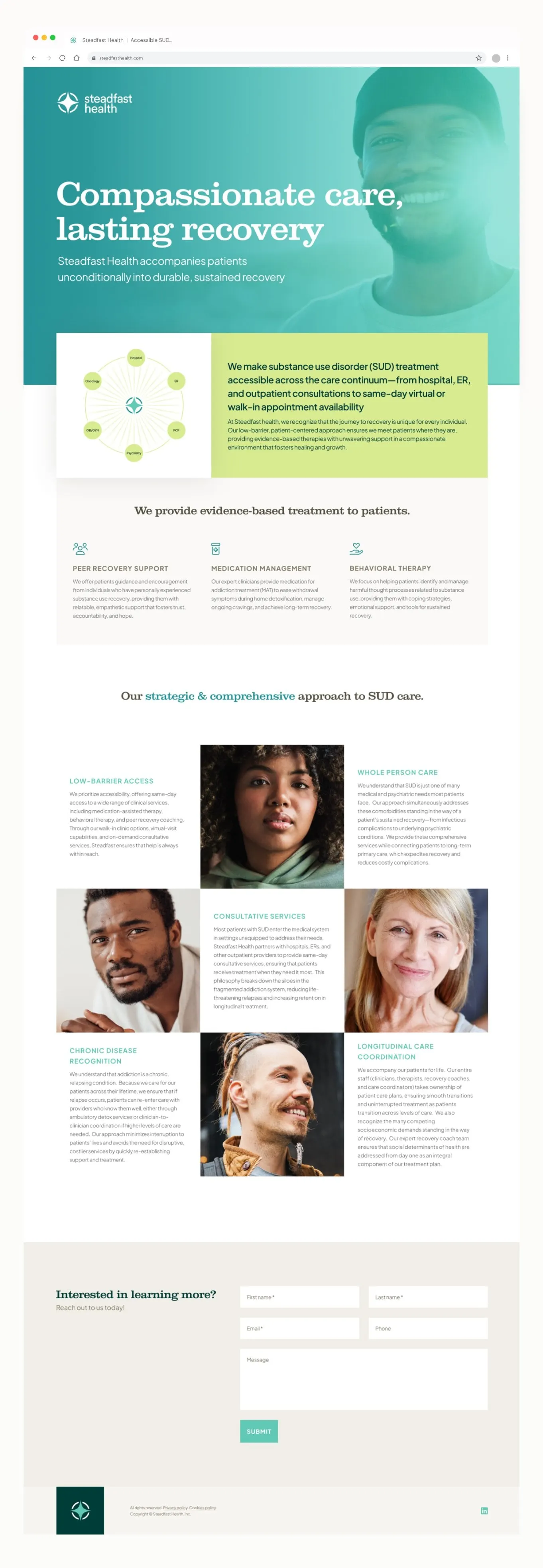
Our website design opens with a teal hero, a smiling patient and the line "Compassionate care, lasting recovery." Directly below, a lime green panel states plainly what Steadfast does, next to a diagram that places the Steadfast star at the centre of a ring of care settings: hospital, ER, primary care, psychiatry, OB/GYN and oncology. Hospital partners can see the model in a glance; patients see that help is available wherever they are.
Three simple icons introduce the core treatments. Then a grid of portraits and short text blocks walks through the approach: low-barrier access, whole person care, consultative services, chronic disease recognition and longitudinal care coordination. Alternating faces and words keeps a dense clinical story readable, and it puts real people at the centre of every section.
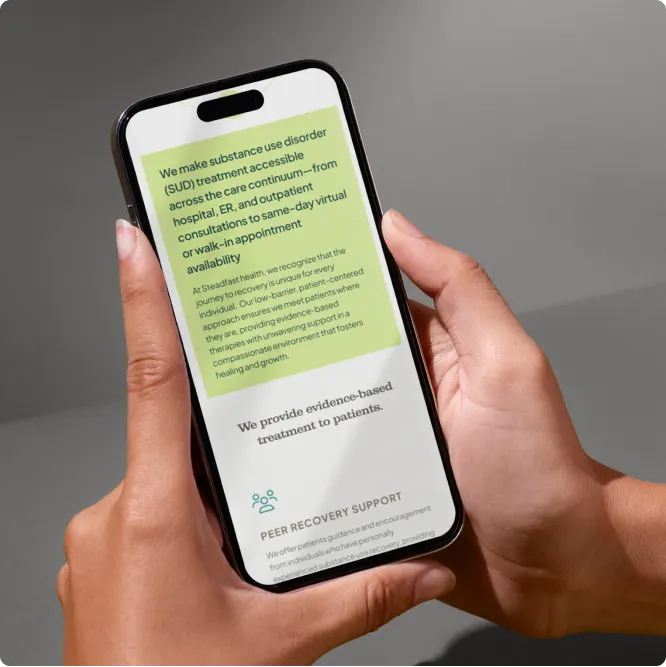
The mobile layout keeps the same order and the same lime highlight, so the key message lands first on a phone. For practices thinking about this kind of clarity, our article on medical website copy that converts covers the thinking page by page.
04 — Collateral
One system from boardroom to business card
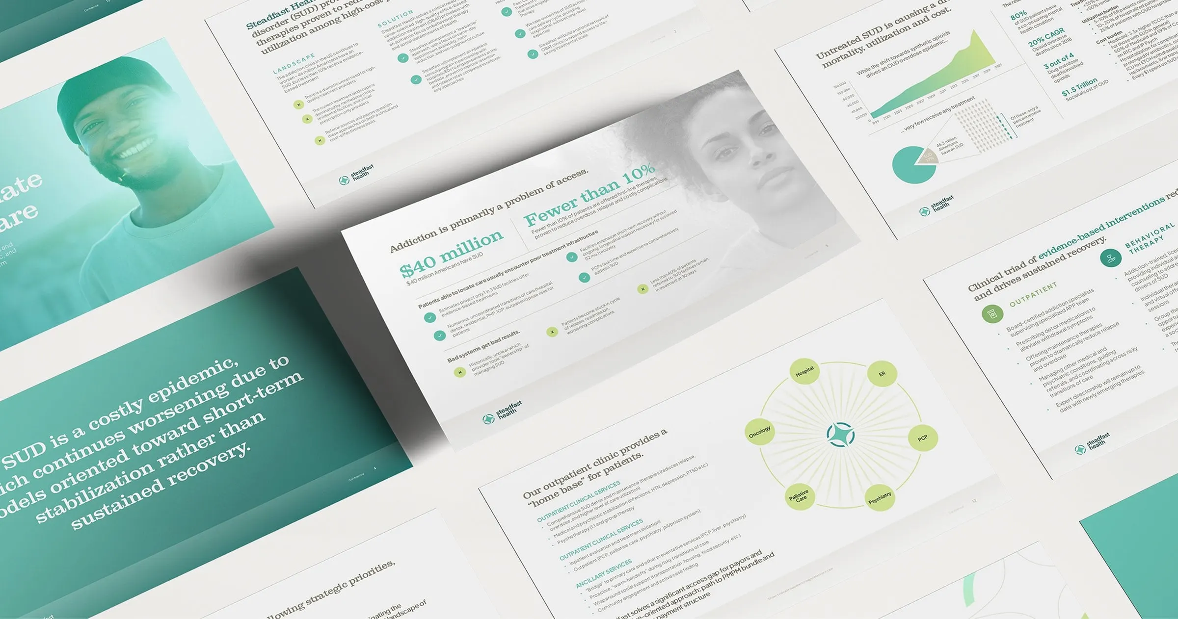
Steadfast works closely with hospitals and outpatient providers, so the brand had to hold up in a meeting as well as online. We carried it into a set of presentation slides that use the same serif headlines, teal and lime blocks, data charts and the care-continuum diagram from the website. A partner who sees the deck and then visits the site gets the same story, told the same way.
For print, the business cards pair a dark teal front with the reversed logo and a white back with a subtle pattern of interlocking circles, a mint web address bar and the full colour mark. They are small pieces, but they're often the first thing a referral partner holds.
The result is a cohesive healthcare brand that gives Steadfast clarity, trust and accessibility at every touchpoint. For another new healthcare brand we built from scratch, see Guidelight Health.
What we delivered
A complete brand launch for a substance use disorder treatment provider.