Case study · Skylight Health
Skylight Health
Brand identity and website for Skylight Health, a Nashville company making specialty care better for patients, health plans and specialists.
01 — Context
A health company starting from day one
Skylight Health is a Nashville company with a simple mission: make specialty care better for all. It lines up health plans, employers and clinicians around high-quality specialists, then coordinates the patient's journey so referrals don't stall and nothing falls through the cracks.
The idea came from co-founder and CMO Dr. Doug Smith, who struggled to get specialty care for his own daughter despite being a physician. When Skylight officially launched in August 2025, with $13M in funding led by Valtruis alongside Andreessen Horowitz, it needed a name in the market, an identity and a website ready for investors, partners and patients. We designed the brand identity and the website together, the approach we explain in why branding without strategy is just expensive art.
Skylight Health at a glance
From launch to growth
- Official launch
- 2025Announced in August 2025 in Nashville.
- Launch funding
- $13MLed by Valtruis, with Andreessen Horowitz and Allen & Company.
- Brand colours
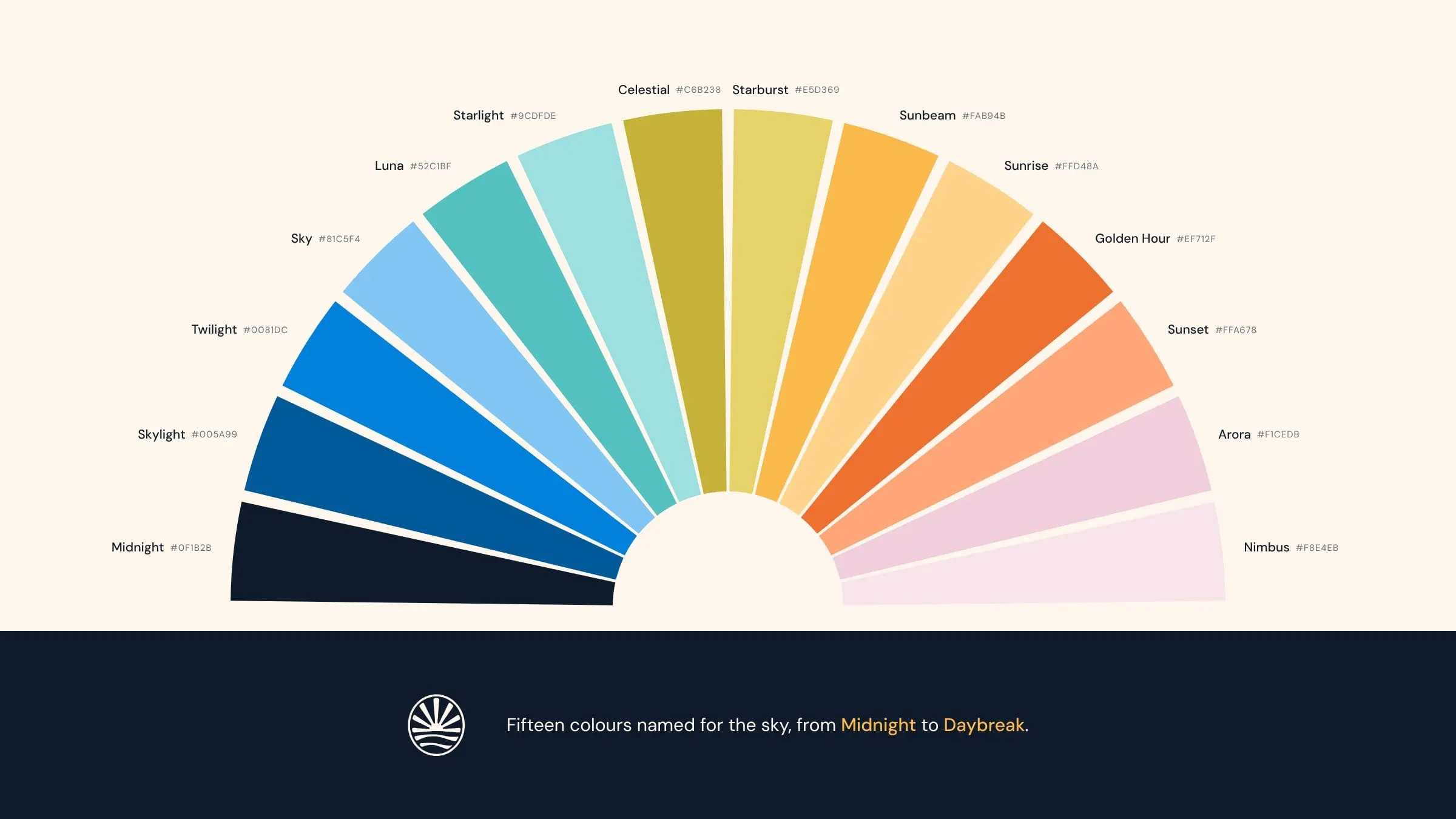
- 15Each named for the sky, from Midnight to Daybreak.
02 — Identity
A sunrise over the horizon
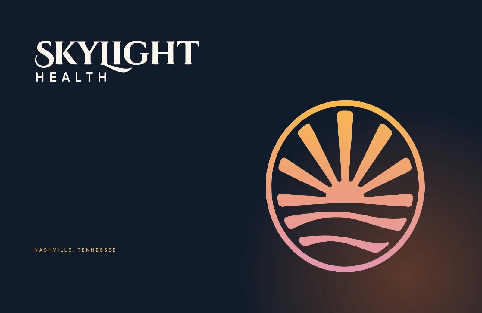
Healthcare brands tend to reach for crosses, hearts and stethoscopes. Skylight's name pointed somewhere more hopeful. The mark is a sun rising over gentle waves, held inside a circle: a new day for patients who have been waiting too long for care.
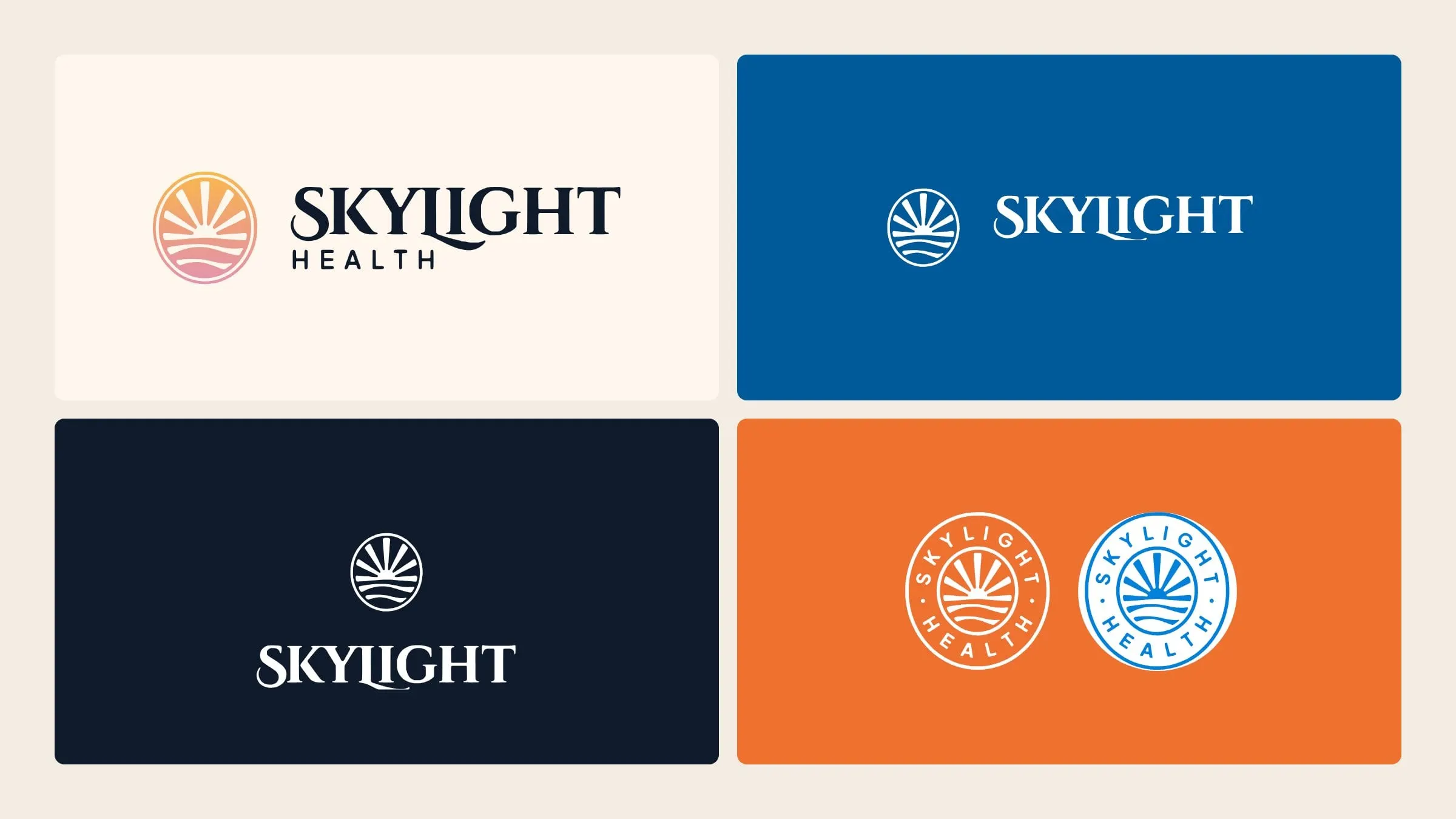
The wordmark pairs a confident serif with a few graceful flourishes, most noticeably the L tucked under the I. It feels established enough to sit beside health plans and hospital systems, but warm enough to talk to patients. A round seal with SKYLIGHT HEALTH set around the sunrise gives the brand a stamp for social, documents and events.
03 — Colour
Fifteen colours named for the sky
The palette follows the sky through a full day. Skylight blue, Daybreak cream and Midnight navy are the primaries. Twilight, Golden Hour and Sunbeam add energy, and a set of softer tertiaries, from Luna to Nimbus, gives designers room for charts, illustrations and campaigns without leaving the brand.
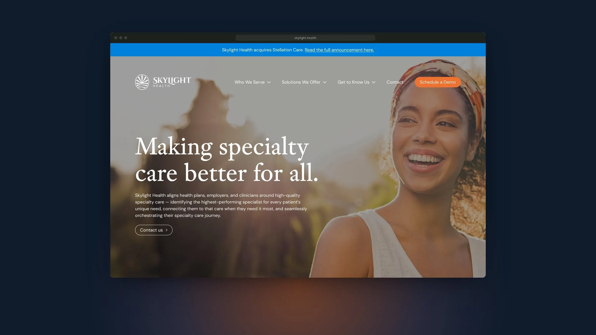
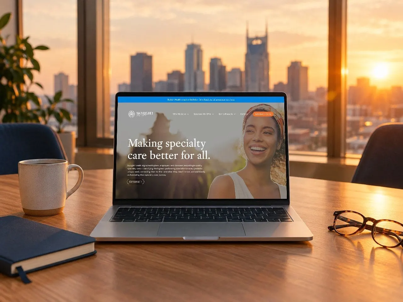
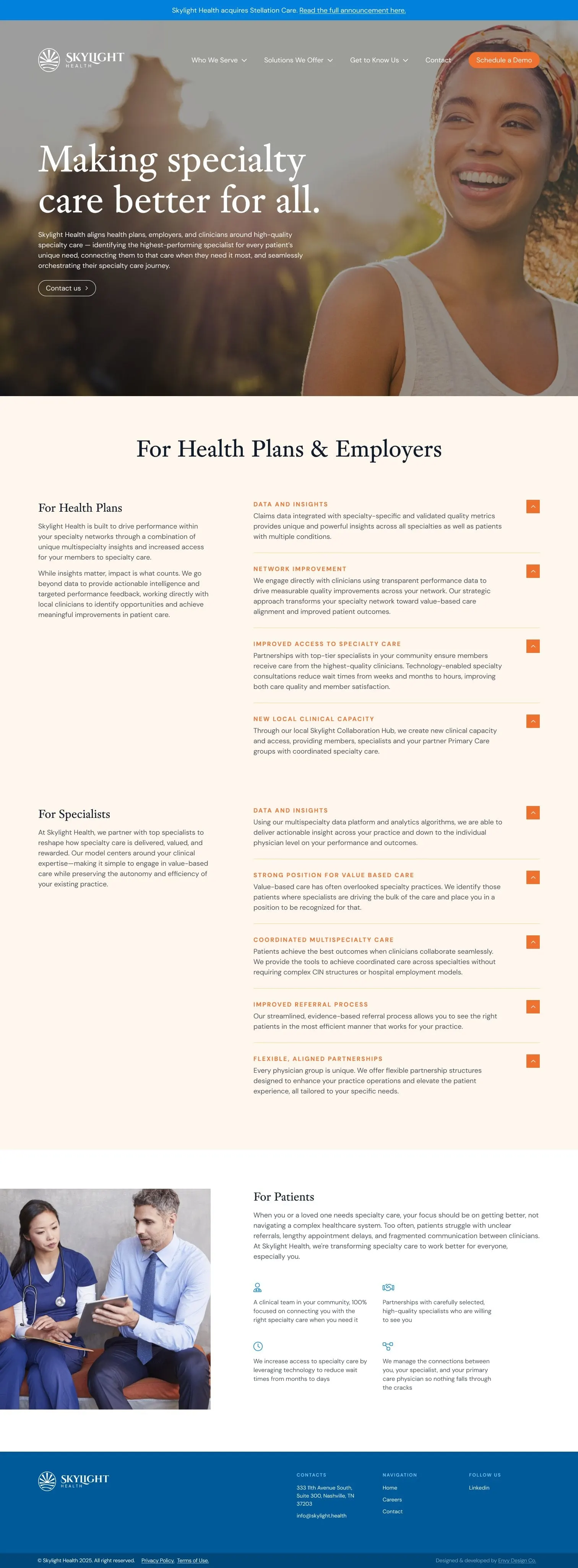
On the website, Daybreak keeps long, information-rich pages calm. Golden Hour orange is saved for the things that matter: the Schedule a Demo button and the arrows that open each answer.
04 — The website
Three audiences, one clear story
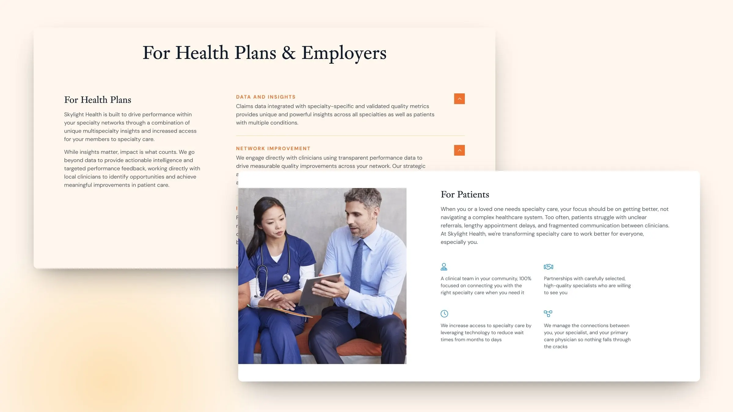
Skylight talks to three very different groups: health plans and employers who buy the service, specialists who join the network, and patients who simply want to see the right doctor sooner. The homepage gives each one its own section, in plain language.
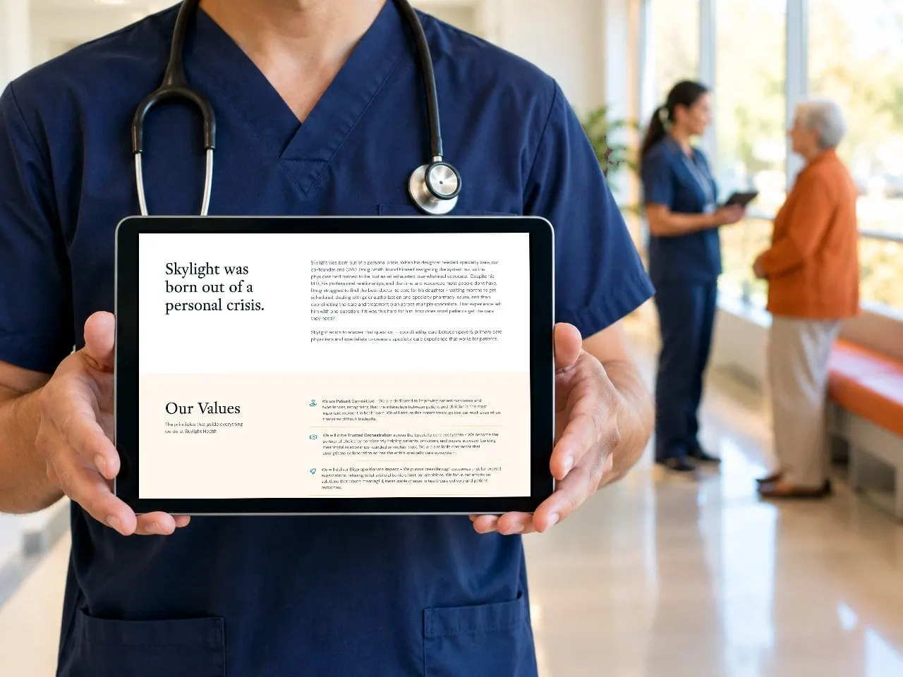
Health plans and specialists each get a short summary on the left and expandable answers on the right, covering data and insights, network improvement, referrals and value-based care. Readers can scan the headlines or open the detail. Patients get a warmer section with four simple promises and icons. A slim announcement bar across the top carries the latest company news, and the About page tells Doug's story.
05 — Growing with the company
A site that keeps up with the news
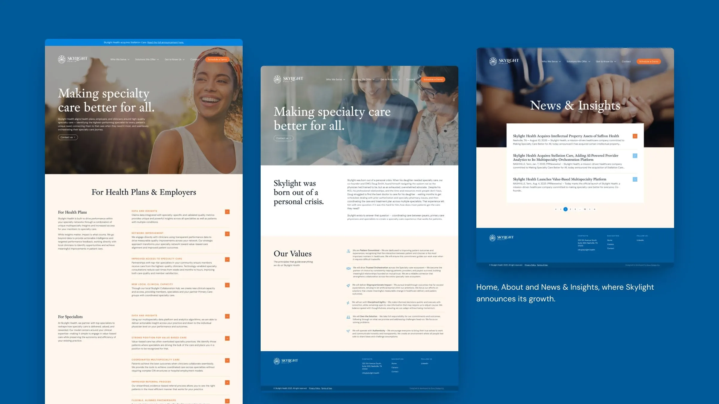
Startups move quickly, and Skylight has. In January 2026 it acquired Stellation Care to add AI-powered provider analytics to its platform. The website has grown alongside it. Website 2.0 brings together a refreshed homepage, a values-led About page, a team page and a News & Insights section for announcements, all built from the same components so new pages arrive looking finished.
We designed and developed the site and keep shaping it as the company grows. It's a good example of how a website can tell a company's story as it unfolds.
06 — The result
A brand that looks like it belongs
Skylight went to market looking like the company it's becoming: credible enough for health plans and investors, warm enough for patients, and flexible enough to keep growing. The sunrise, the sky palette and a clear, audience-first website give a young company a consistent presence from its homepage to its press announcements.
See more of our healthcare and startup work, including Diverge Health.
What we delivered
Brand identity and an evolving website for a funded specialty care company in Nashville.
- 01Brand identitySunrise emblem, serif wordmark, circular seal and logo variations.
- 02Colour systemFifteen named colours across primary, secondary and tertiary roles.
- 03Website designHomepage, About, team and News & Insights pages for three audiences.
- 04Website developmentA component-built site that grows with each announcement.