Case study · Bosanac Heating & Electric
Bosanac Heating & Electric
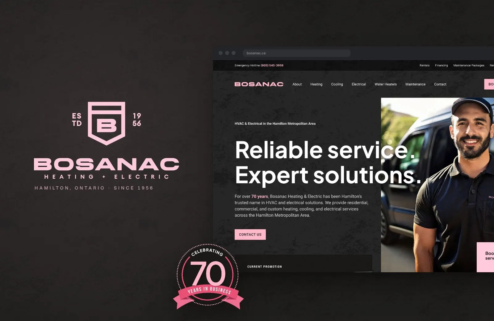
A bold black-and-pink rebrand, 70th anniversary badges and a new website for Bosanac Heating & Electric, a Hamilton HVAC and electrical company since 1956.
01 — Context
Seventy years in Hamilton, ready for the next seventy
Bosanac Heating & Electric has been keeping Hamilton homes and businesses warm, cool and powered since 1956. The team handles residential, commercial and custom heating, cooling and electrical work across the Hamilton Metropolitan Area, from Ancaster and Dundas to Stoney Creek and Grimsby, with 24/7 emergency service.
With its 70th anniversary on the horizon, Bosanac asked us for a full rebrand and a new website. The goal was simple to say and hard to do: look like the established, trusted company it is, while standing out in a category where almost every truck, logo and website is blue and red. We handled the brand identity, the anniversary marks and the website design and build.
The project in numbers
Built on 1956
- Year Bosanac was founded
- 1956A Hamilton name for seven decades.
- Logo concepts presented
- 3Energy in motion, structured and precise, and the shield.
- Communities on the service map
- 18Listed on every page, from Ancaster to Winona.
- Dedicated service pages
- 10Heating, cooling, electrical, water heaters and more.
02 — Colour
Out of the blues and reds
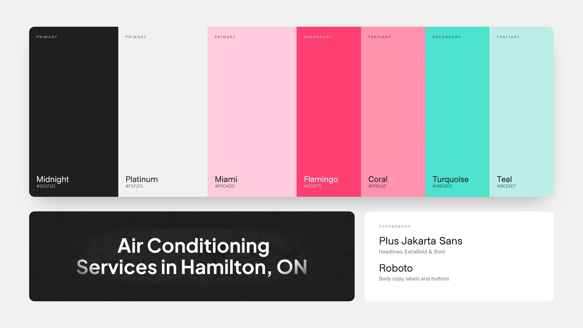
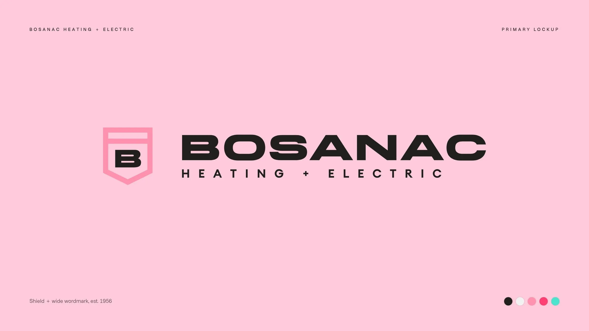
Walk down any street and you can guess the colours of the next HVAC van: blue for cool, red for heat. We went the other way. The new palette pairs Midnight black and Platinum with a confident Miami pink, backed by Coral and Flamingo for warmth and Turquoise and Teal for a crisp, cool accent.
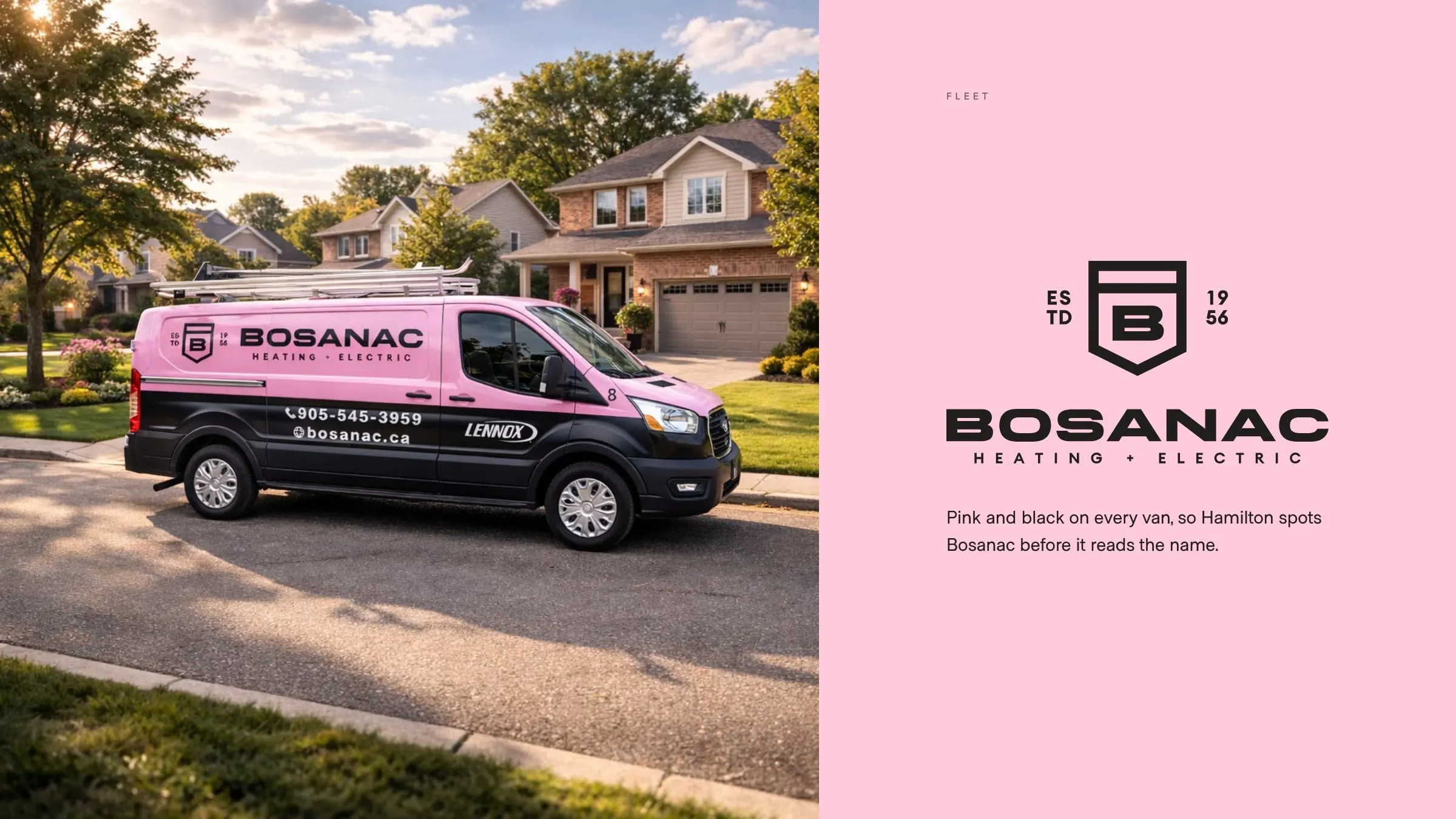
Black keeps it serious and professional. Pink makes it impossible to miss. Together they give a 70-year-old company a look that's bold without feeling like a gimmick, and that works as well on a uniform as it does on a website. It's a good example of how branding pays off when it helps people remember who to call.
03 — The mark
A shield with a B at its heart
We presented three logo directions. Bosanac chose the shield: a structured B inside a protective crest, paired with a wide, industrial wordmark and "Heating + Electric" spaced out beneath it.
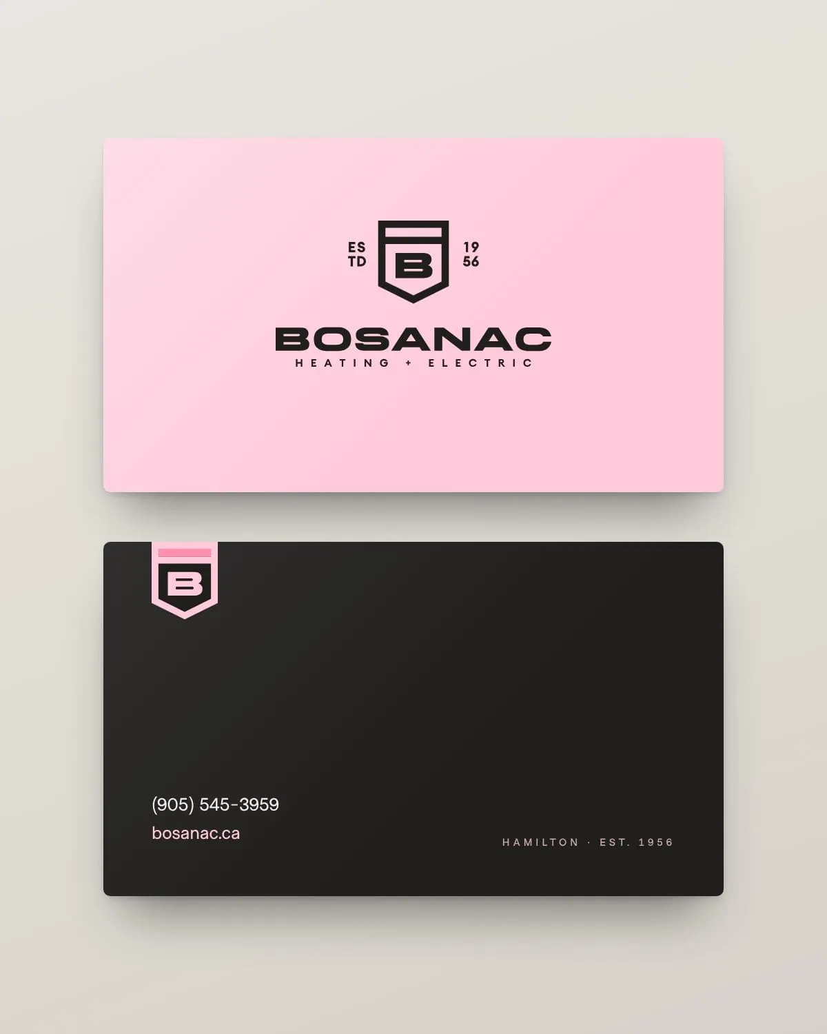
The shield says what a good contractor should: you're protected, and the work will last. It also gives the brand a mark that holds up on its own, small on a shirt pocket or big on the side of a van. A stacked version adds "Estd 1956" either side of the crest, putting the company's history right in the logo.
Business cards flip between Miami pink and Midnight black, so the system shows up the same way in someone's wallet as it does in their driveway.
04 — The website
Dark, textured and easy to book
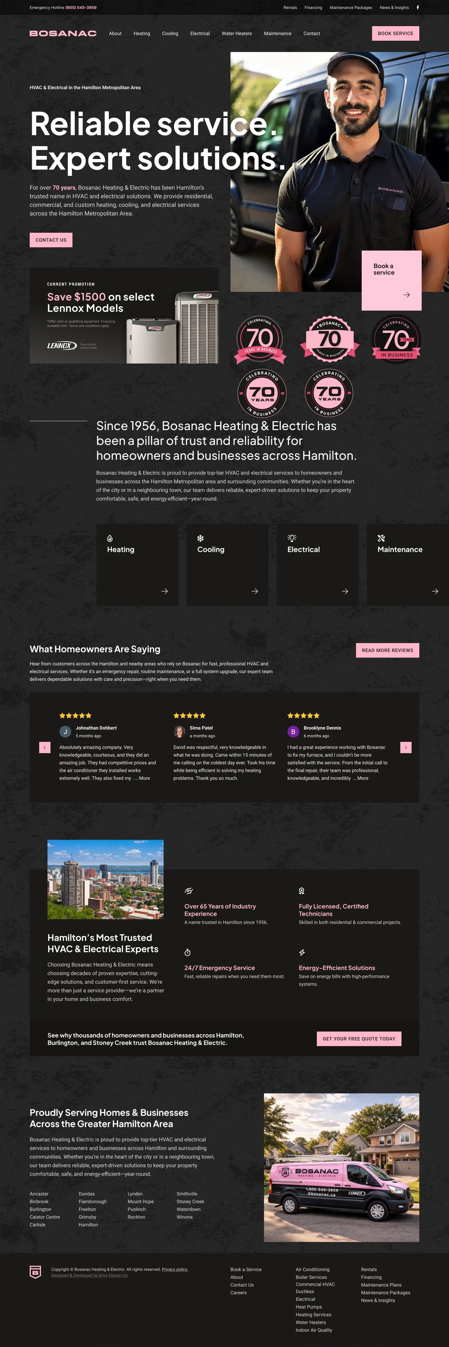
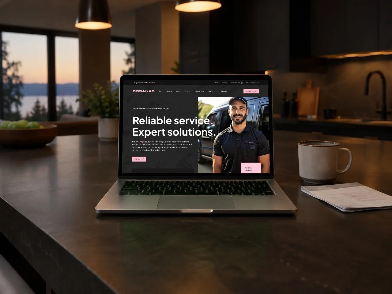
The new site takes the brand's black and pink and gives it some grit: a dark, textured background, crisp white headlines in Plus Jakarta Sans, and pink saved for the things that matter, like the emergency hotline, "Book service" and the current promotion.
The homepage gets straight to the point. "Reliable service. Expert solutions." sits next to a real technician in a Bosanac polo, with a Lennox promotion, the four core services, reviews and the full service area following close behind. Every page ends with the same list of communities and a clear call to action, so nobody has to hunt for a phone number. We go into more detail on this in why HVAC websites don't convert.
05 — Service pages
One page for every job
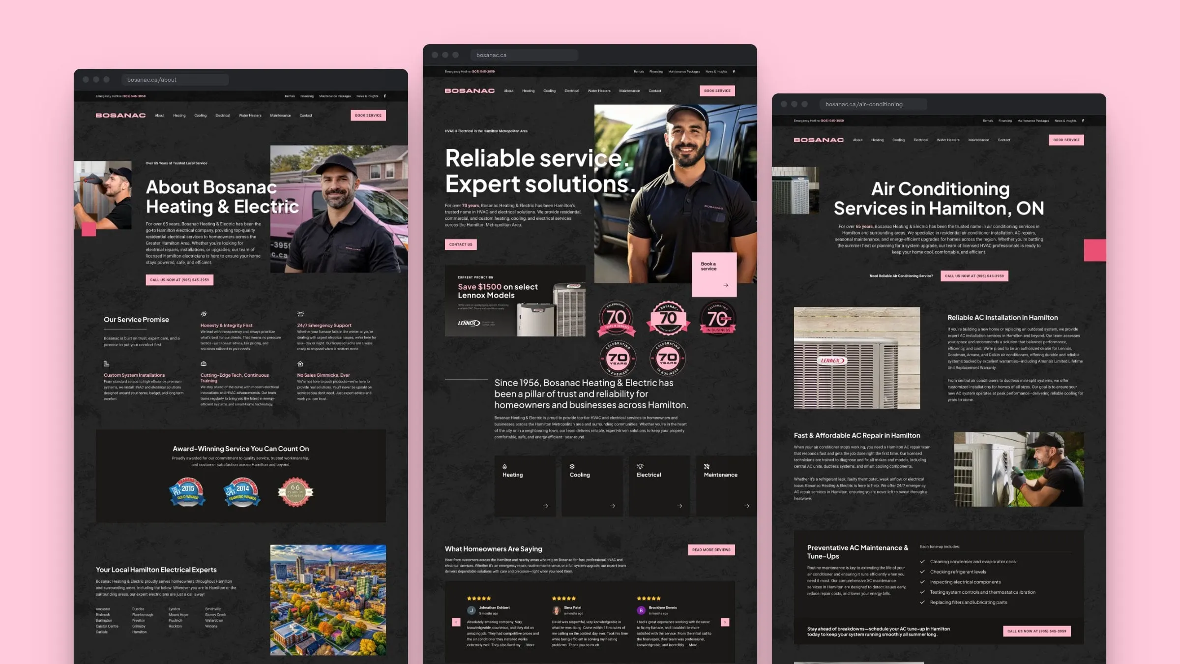
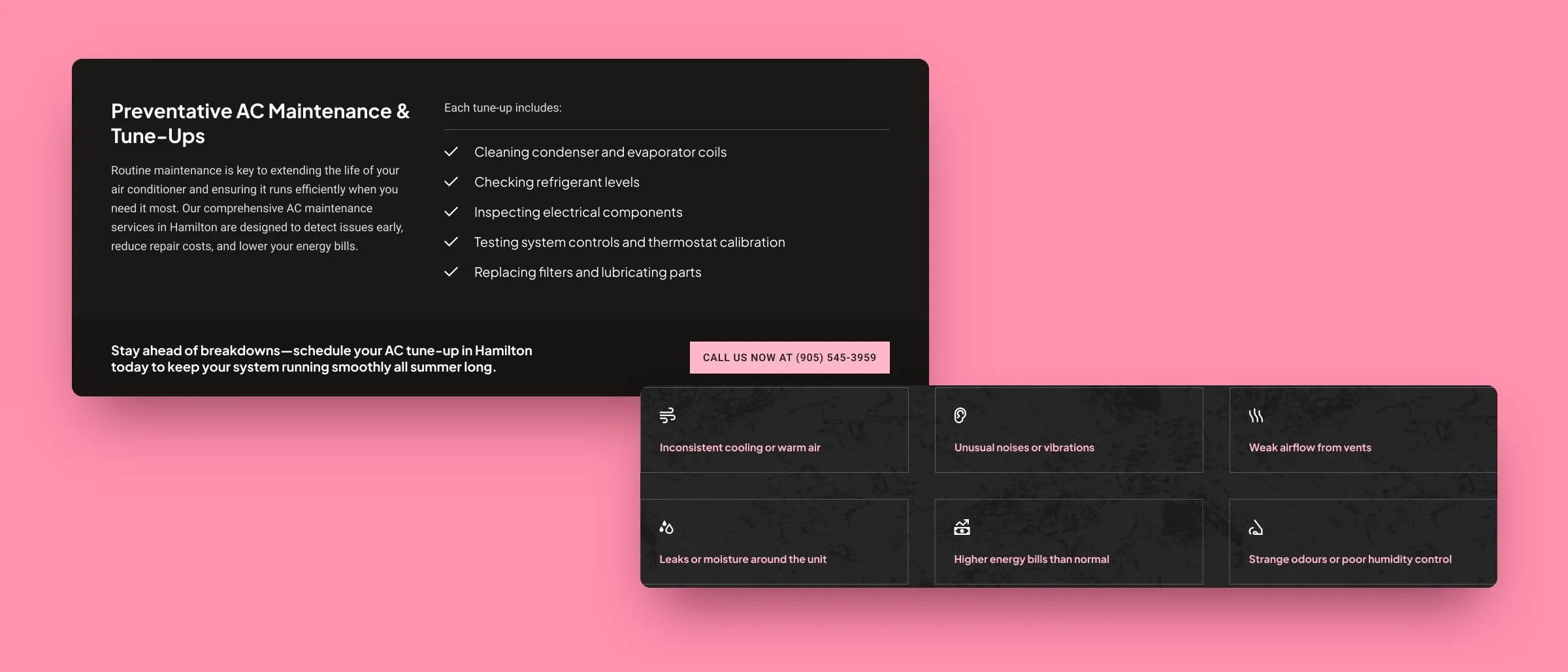
People don't search for "HVAC". They search for a furnace repair, a heat pump quote or someone to look at a leaking water heater. So we built a dedicated page for each of Bosanac's services: heating, air conditioning, boilers, heat pumps, ductless systems, water heaters, indoor air quality, duct cleaning, electrical, and commercial and custom HVAC.
Each one follows the same rhythm: a clear local headline, installation and repair sections, a maintenance checklist, the warning signs to watch for, protection plans, FAQs and the service area. It's the structure we recommend in HVAC service pages that rank, and it makes the site easy to grow. Financing, rentals, maintenance plans, careers and a blog round out more than 20 page designs.
06 — Seventy years
An anniversary worth wearing
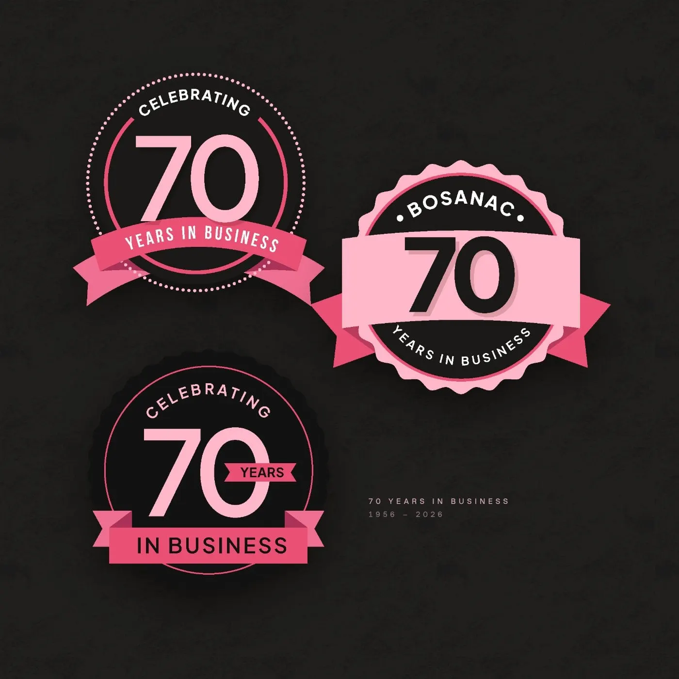
Seventy years in business deserves more than a line of copy. We designed a family of anniversary badges in the new palette, from a ribboned "Celebrating 70 Years in Business" seal to a scalloped Bosanac crest, ready for the website, social posts, stickers and the fleet.
They sit right under the homepage hero, so the first thing a new customer learns is that Bosanac has been doing this since 1956.
07 — The result
A Hamilton classic, impossible to miss
Bosanac now looks as confident as its track record. The shield and pink-and-black palette tie together the vans, the cards, the anniversary marks and a website that makes booking a service easy from any page.
If you run a heating, cooling or electrical company and you're tired of blending in, take a look at our trades and HVAC work, including the AC Thermal project. As a Lennox preferred vendor, we know this industry well.
What we delivered
- 01Brand identityThree logo concepts and the final shield mark, wordmark and stacked Estd 1956 lockup.
- 02Colour systemA Midnight, Platinum and Miami pink palette with coral, flamingo, turquoise and teal accents.
- 03Anniversary badgesA family of 70 Years in Business marks for web, social and print.
- 04Business cardsPink and black cards built on the new identity.
- 05Website designMore than 20 page designs, including 10 dedicated service pages.
- 06Website developmentA fast, easy-to-update site with booking calls to action on every page.