Case study · Props2
Props2
App UI design for Props2, a Nashville tech startup: onboarding, profiles, venue pages, a score badge system and a full component kit built on the brand we created for them.
01 — Context
App UI design for a Nashville startup's next step
Props2 is a tech startup based in Nashville, Tennessee. We had already developed its brand identity: a slim, friendly wordmark finished with a top hat perched on the 2, and a compact p2 monogram. The next step was to carry that brand into the product itself.
The team asked us for app UI design and the general interface elements its website would need. That meant designing the first screens people would see, the screens they would use every day, and the system underneath that would let the Props2 developers build new screens without coming back to us for each one.
Our aim was an app that felt as warm and a little playful as the brand, while staying calm and easy to use.
02 — The system
A muted palette with clear jobs
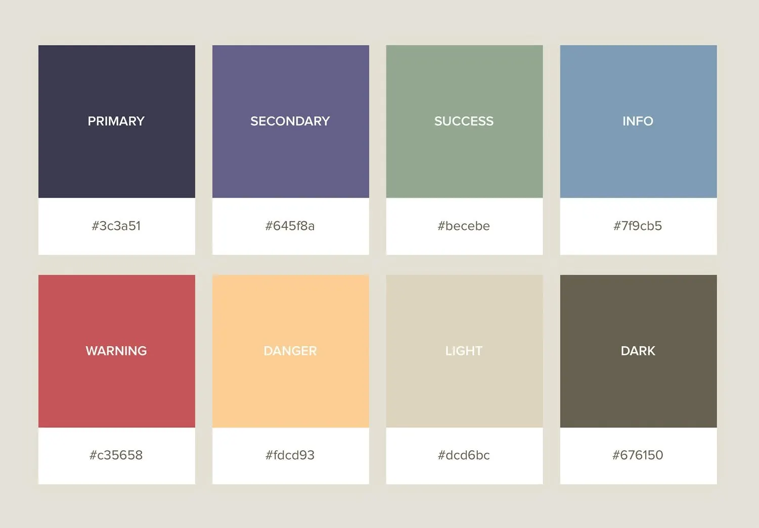
Before drawing many screens, we defined the parts. The palette is built from eight colours, each with a named role: a deep navy primary, a dusty purple secondary, sage for success, a soft blue for information, a muted red for warnings, a warm apricot, a light beige and a dark olive-brown. They are softer than typical app colours on purpose. Props2 is a social product, and we wanted it to feel relaxed rather than loud.
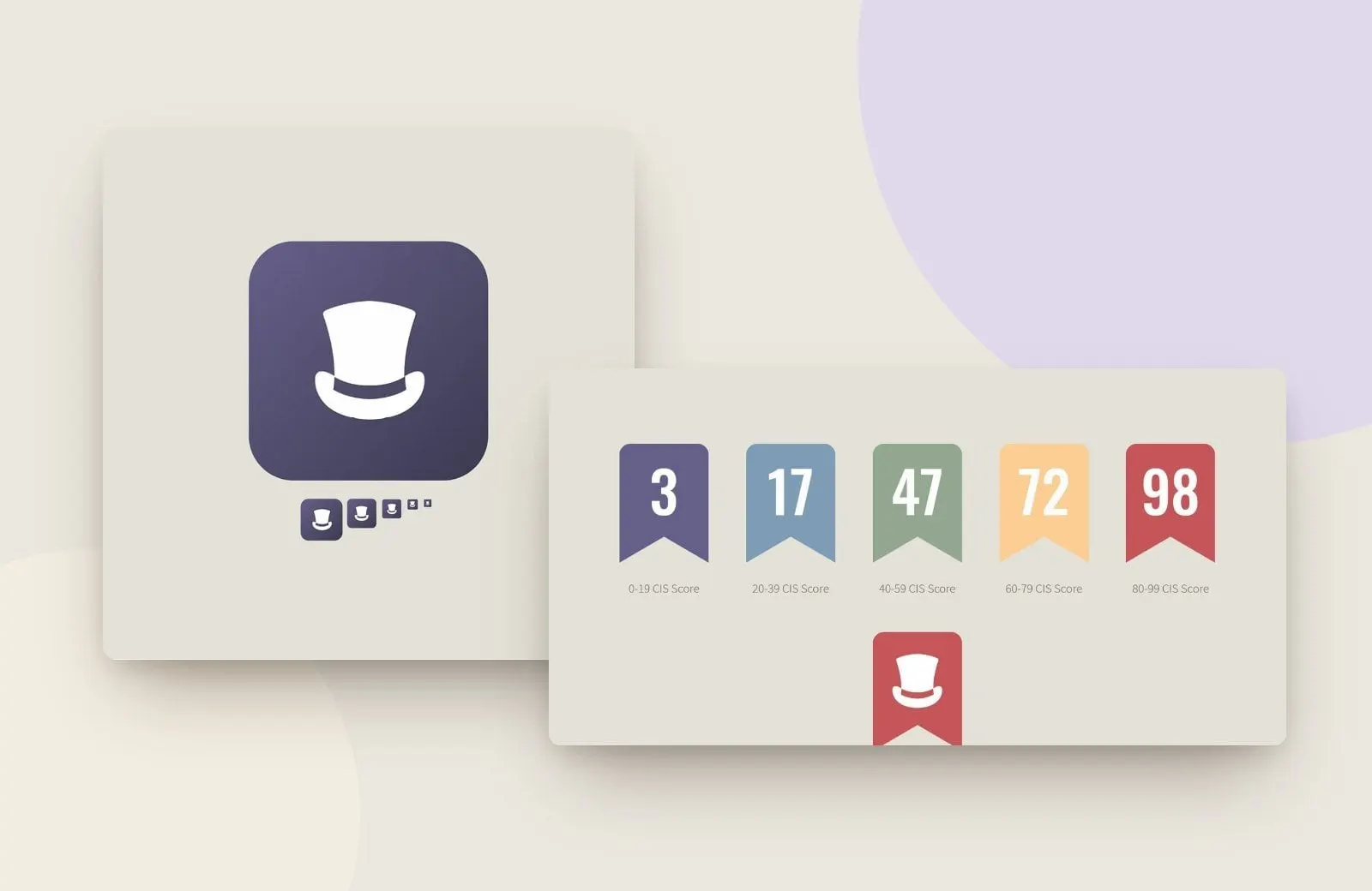
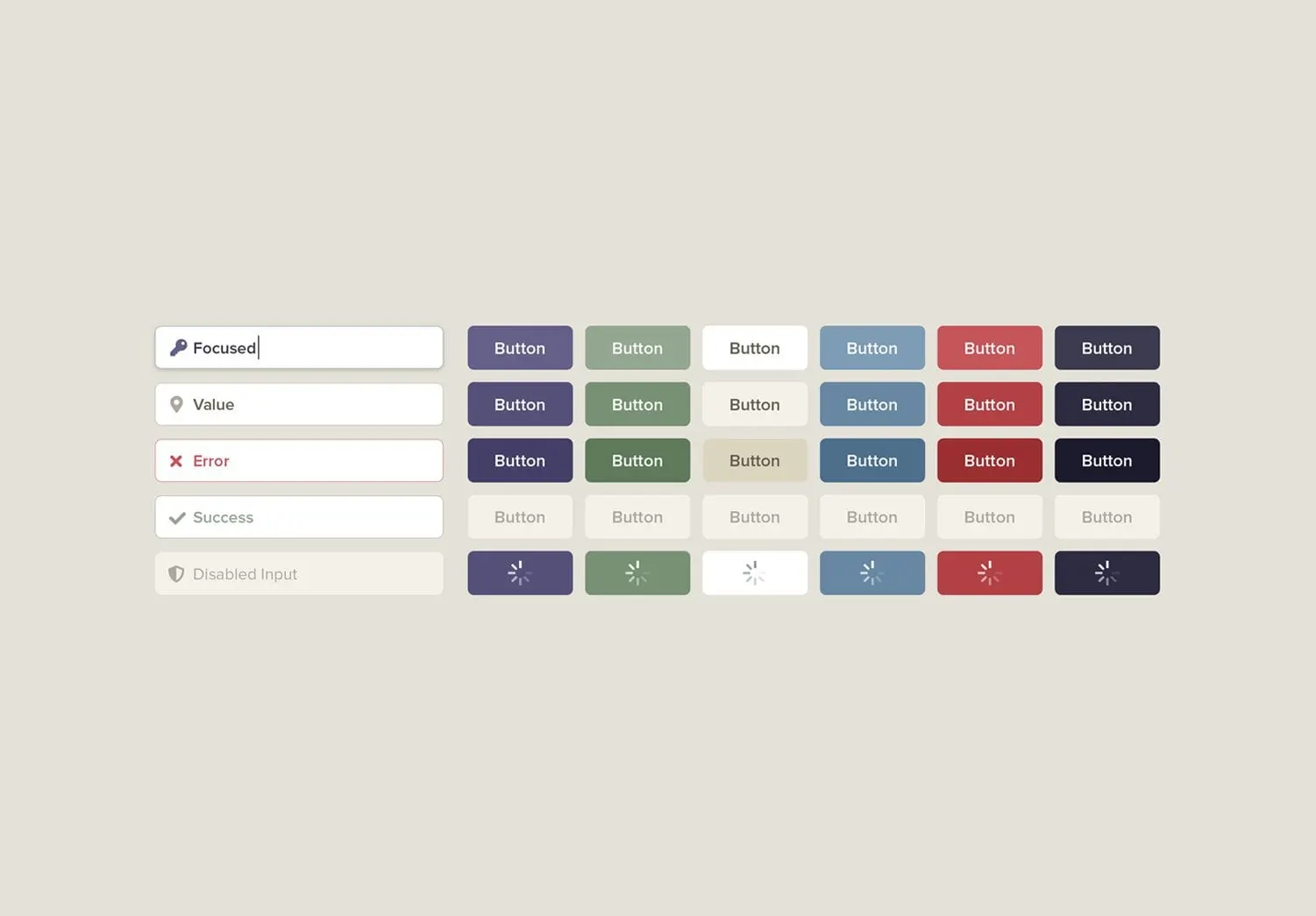
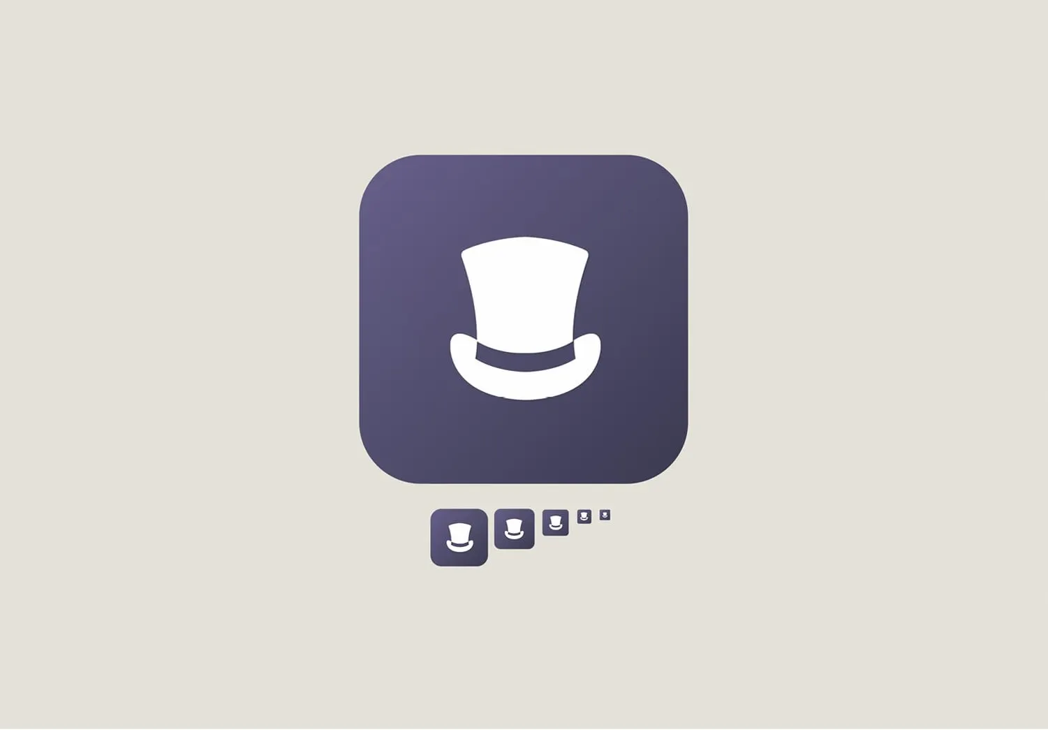
From the palette we built a component kit: input fields in focused, filled, error, success and disabled states, and buttons in every colour in three shades plus disabled and loading states. The app icon takes the top hat from the logo and sets it in white on a purple gradient square, tested down to the smallest sizes a phone will show.
That kit is the part of the project that does the most long-term work. It lets the Props2 team design new screens and the website's interface elements from the same pieces, so the product stays consistent as it grows.
03 — Screens
From first launch to everyday use
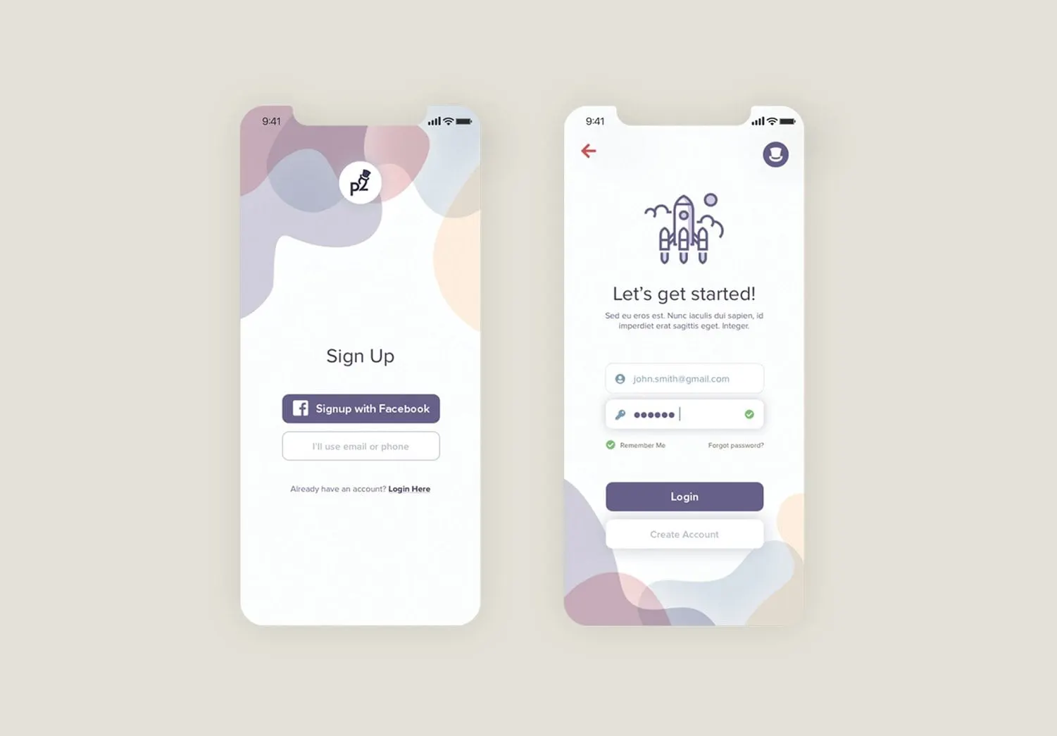
The splash screen keeps it simple: the Props2 logo, a loading indicator and a cluster of soft, translucent shapes in the brand colours. Those shapes carry through the onboarding slides, where line icons such as a location pin and a trophy introduce what the app does.
Sign up offers Facebook or email and phone, with a clear route back to log in. The login screen adds a small rocket illustration and a friendly Let's get started! headline, and shows the input states from the kit in use.
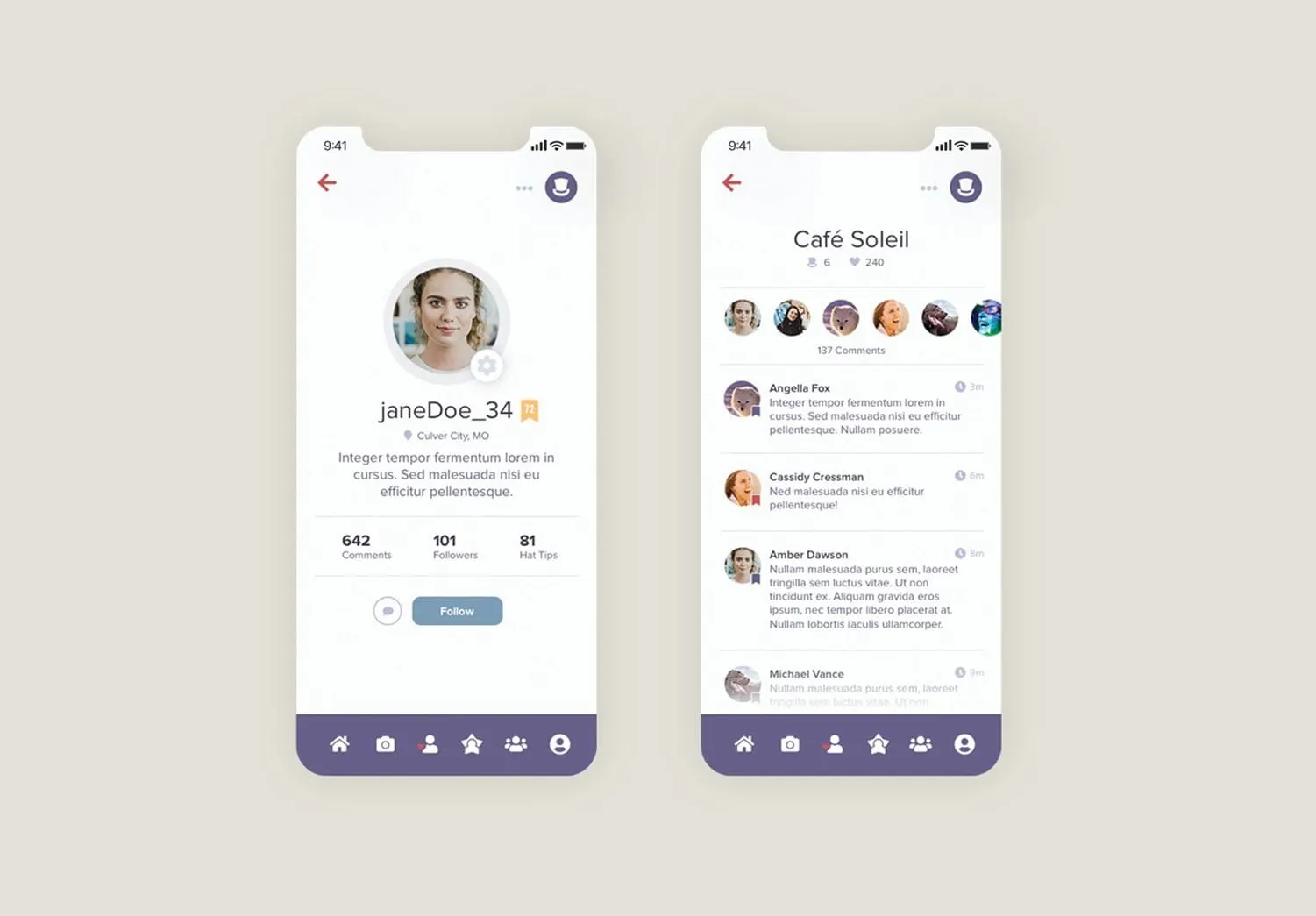
Inside the app, a profile screen puts the photo, username and location at the top, with counts for comments, followers and hot tips underneath and a single Follow button. Venue pages, like the Café Soleil example, show visitors' avatars across the top and a comment feed below. A purple tab bar anchors every screen.
04 — Details
Badges and icons that speak the brand
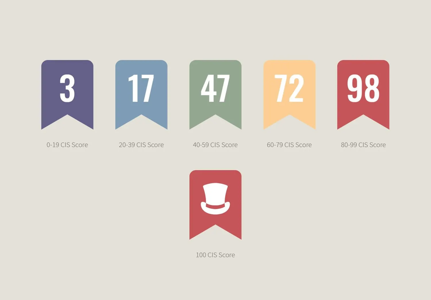
Two smaller pieces carry a lot of personality. The first is a set of ribbon badges for the app's CIS score. Each range of scores gets its own colour from the palette, from purple for the lowest range to red for the highest, and a perfect score of 100 replaces the number with the top hat. It is a small reward that ties the scoring system straight back to the logo.
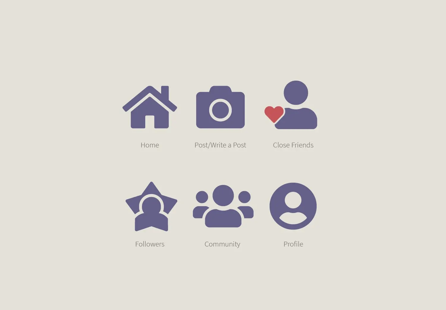
The second is a custom navigation icon set: Home, Post, Close Friends, Followers, Community and Profile. They are solid, rounded shapes in the secondary purple, with a red heart on Close Friends as the only accent. Drawing them ourselves, rather than using a stock set, kept the weight and corner radius consistent with the logo and the buttons.
It is the kind of brand-to-product handoff we enjoy most in our UX/UI design work with startups and emerging brands. For another app project, see our Mary Kay app design, and for why identity and digital work belong together, read why branding and web design should happen together.