Case study · Mary Kay
Mary Kay
An iPad-only recruiting app for Mary Kay Canada that helps independent consultants walk potential recruits through the company, its products and the business opportunity.
01 — Context
Mary Kay iPad app design for a consultant-led conversation
Mary Kay Canada sells through a national salesforce of independent beauty consultants. Those consultants also do the recruiting, usually one conversation at a time, over coffee or at a kitchen table. The company wanted a better way for them to show a potential recruit what the opportunity actually looks like.
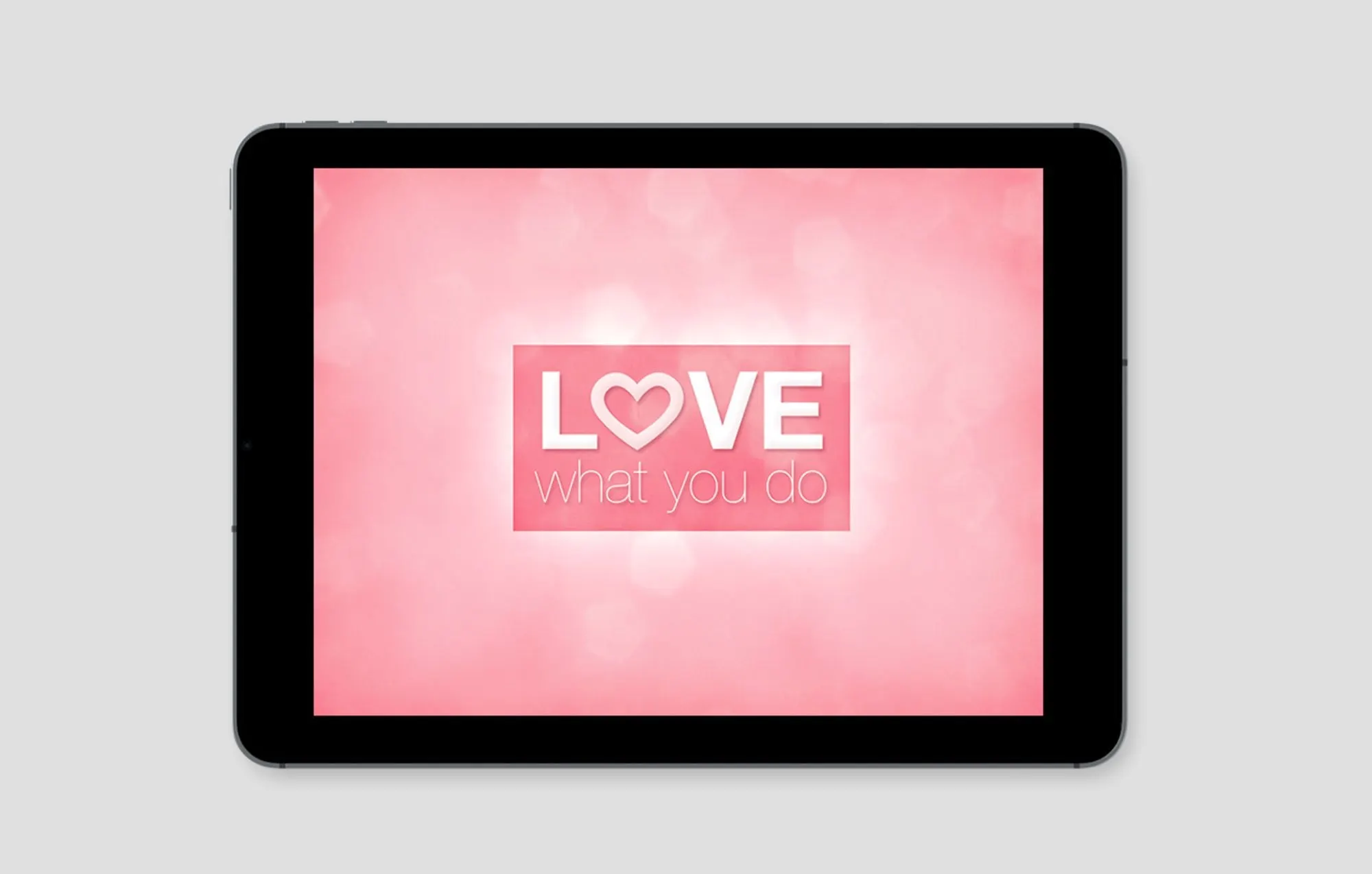
Our answer was a Mary Kay iPad app design built for one device and one moment: a consultant sitting beside someone who is curious, swiping through the story together. We handled the UX/UI design and development of the app, which Mary Kay Canada put to work across its Canadian salesforce.
The brief was not to sell lipstick. It was to help a stranger picture herself running a business, and to give the consultant a calm, polished way to lead that conversation without a script.
02 — Structure
Eight chapters a consultant can steer
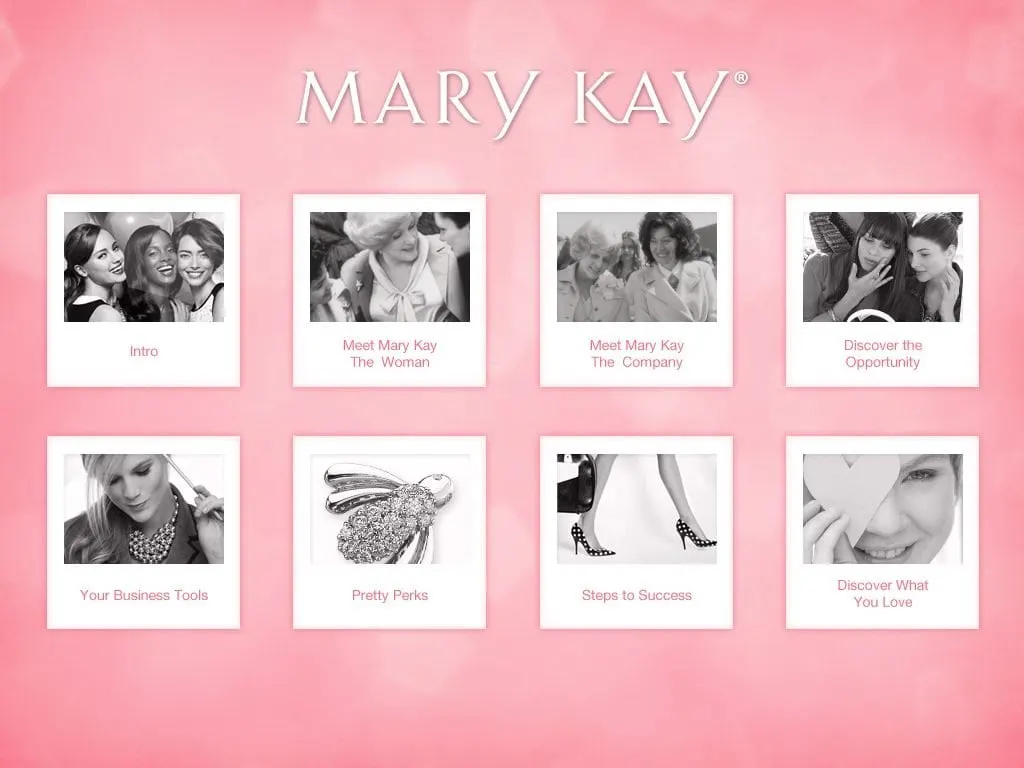
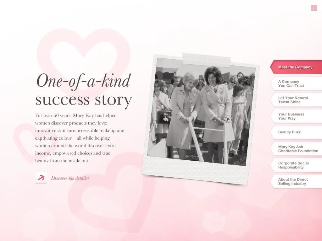
A recruiting conversation never runs in a straight line. Some people want the history first; others go straight to the money. So we organized the app into eight chapters that sit on a single home screen as Polaroid-style tiles: Intro, Meet Mary Kay The Woman, Meet Mary Kay The Company, Discover the Opportunity, Your Business Tools, Pretty Perks, Steps to Success and Discover What You Love.
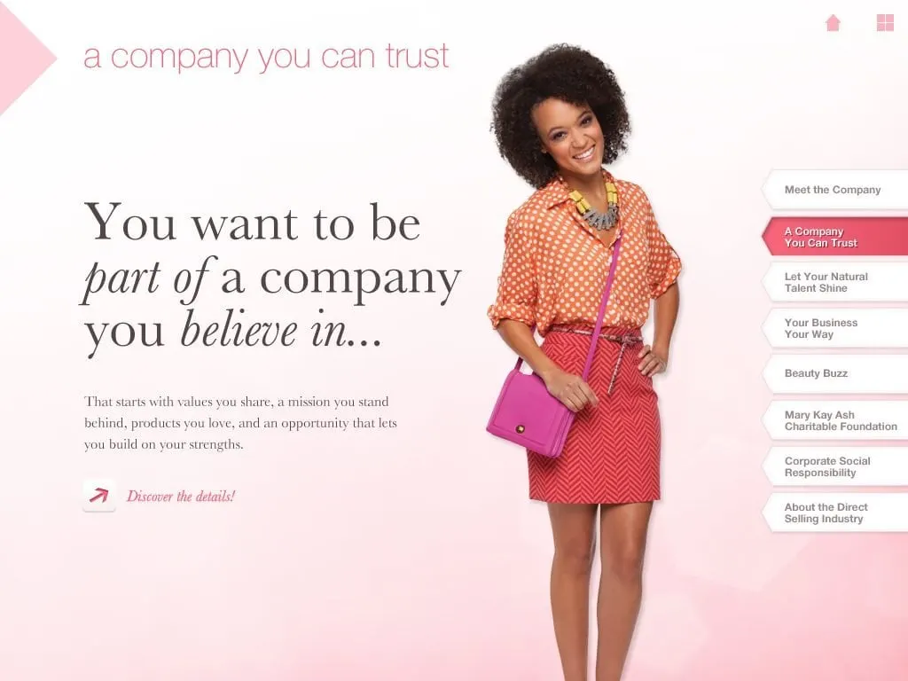
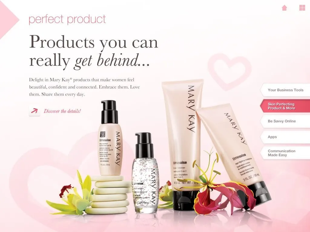
Inside each chapter, a stack of tabs on the right edge lets the consultant jump between topics such as A Company You Can Trust, Beauty Buzz or the Mary Kay Ash Charitable Foundation. A home icon and a grid icon in the corner always lead back out. The consultant can follow the recruit's questions instead of forcing her through a fixed deck, which is the main thing that separates a tool like this from a standard presentation design.
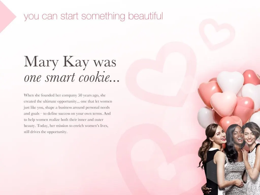
Every chapter opens the same way: a short lowercase label, a large serif headline with one italic phrase, two or three sentences of body copy and a single Discover the details prompt. Once a recruit has seen one screen, she knows how to read the rest.
03 — Personal
Letting recruits find themselves in the story
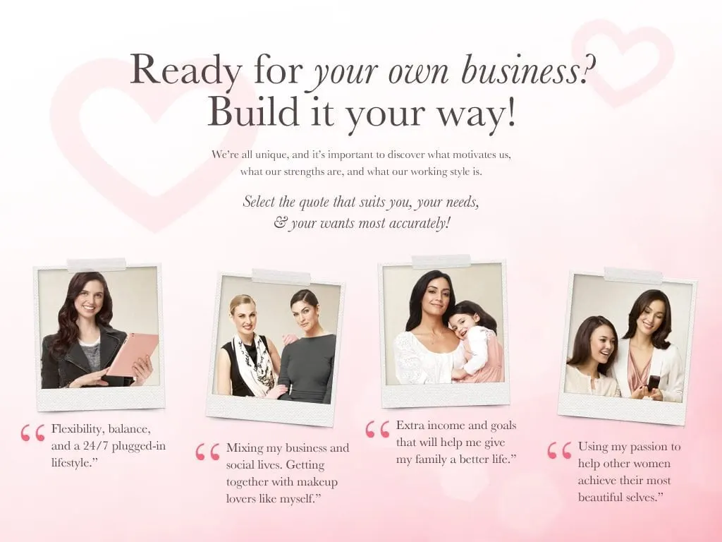
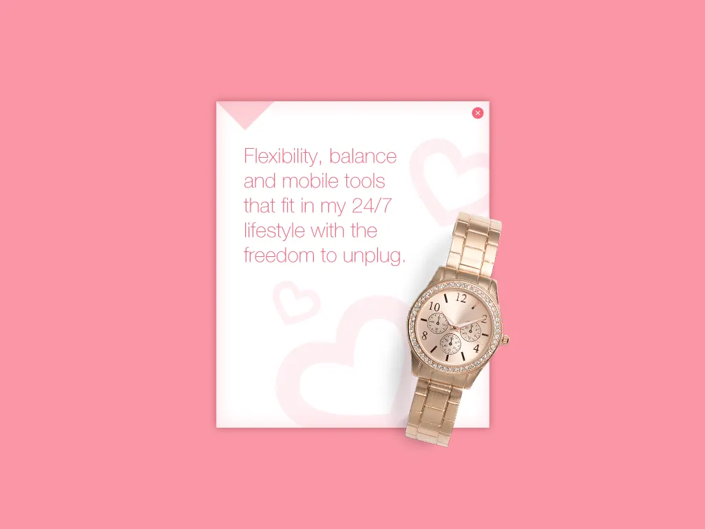
The most important screen in the app asks a question instead of making a claim: Ready for your own business? Build it your way. Four portraits sit above four short quotes, from flexibility and a 24/7 plugged-in lifestyle to extra income for the family to helping other women feel beautiful. The recruit taps the one that sounds most like her.
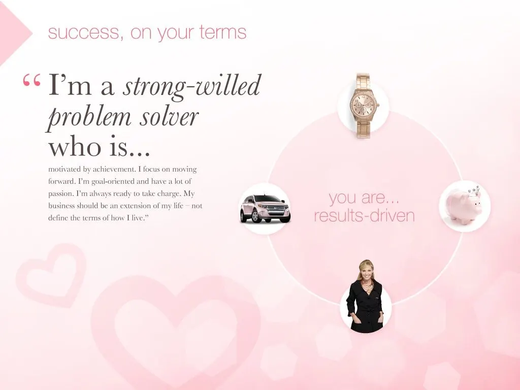
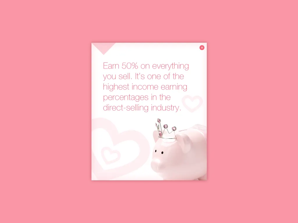
Each choice opens a profile screen. One reads You are results-driven, with the motivations arranged in a circle of objects: a rose gold watch, a pink car, a piggy bank and a confident businesswoman. Tapping an object opens a small note card that explains how the business supports that motivation.
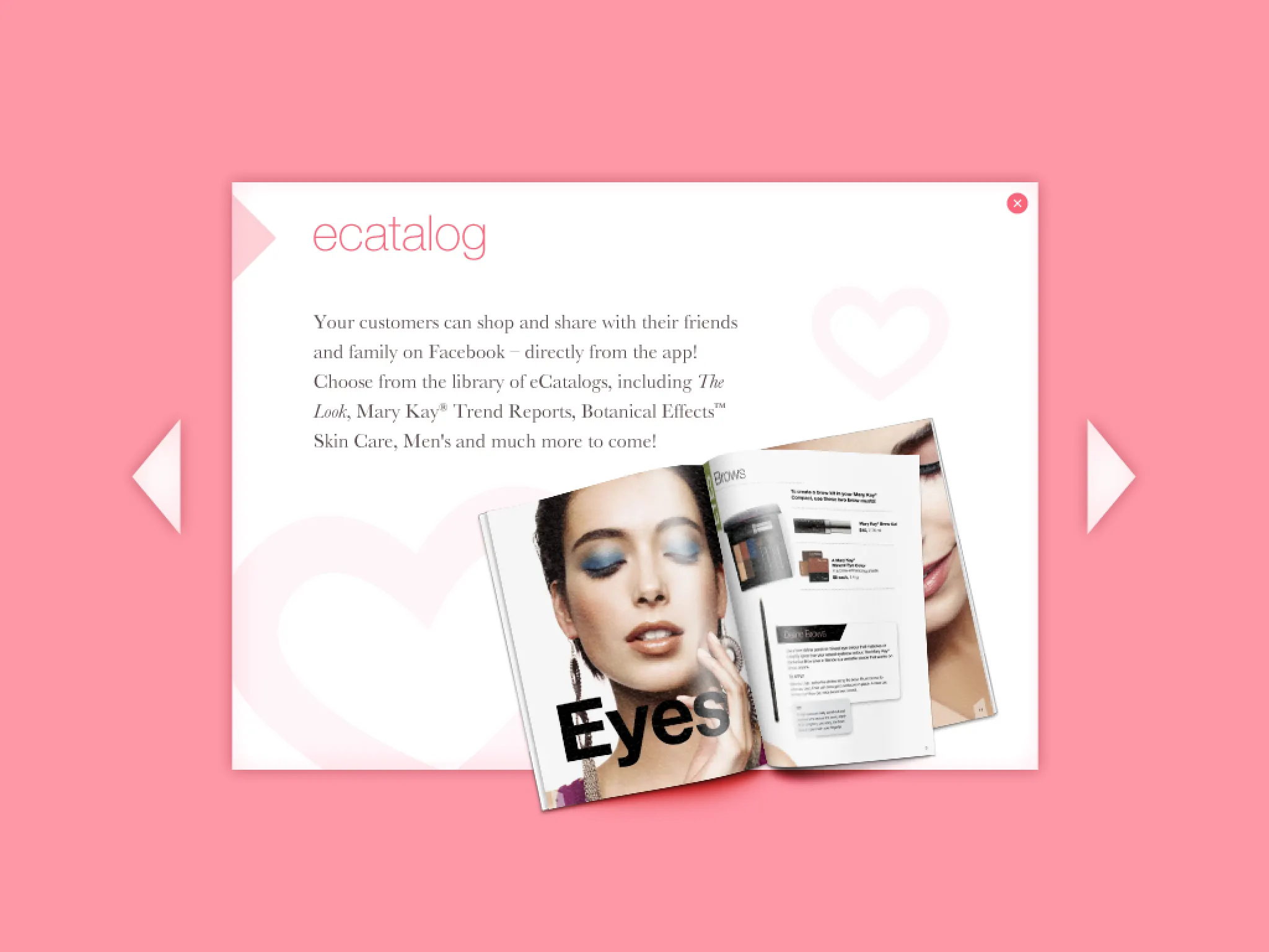
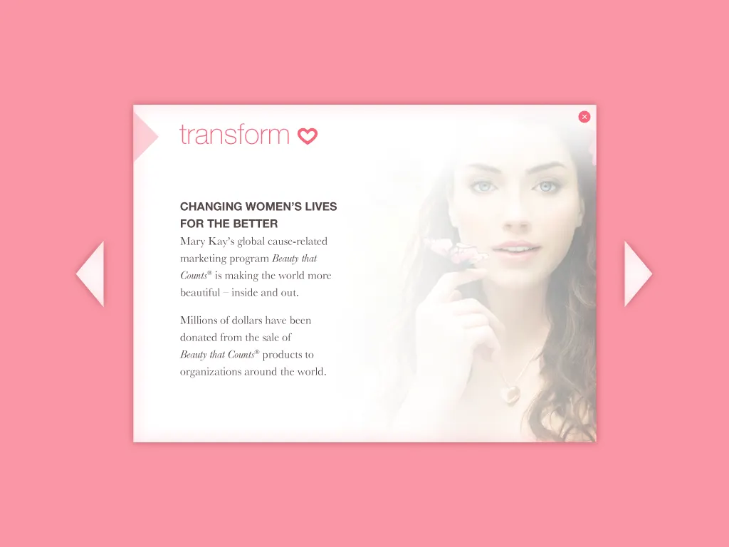
This was a deliberate choice about designing for the audience rather than the brand. People join a direct-selling company for very different reasons, and a recruit who sees her own reason reflected back is far more likely to keep listening. The same pop-up note pattern carries the eCatalog library and the Beauty that Counts cause-related program, so new content can slot in without a new layout.
04 — Tools
Showing the business, not just the products
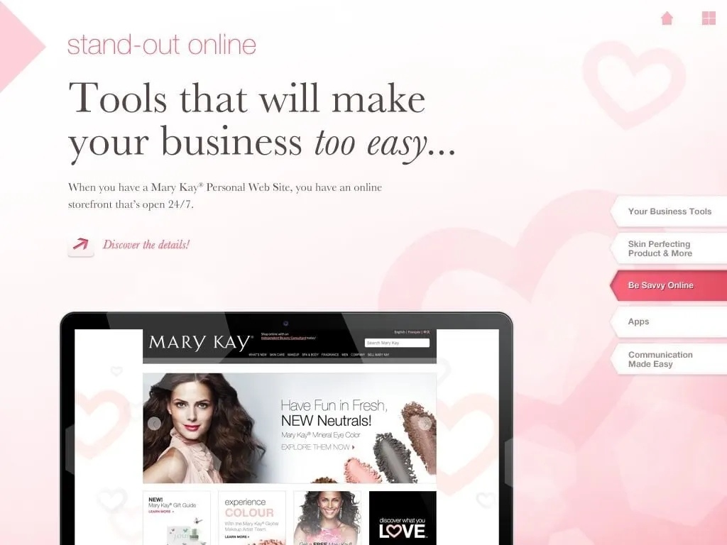
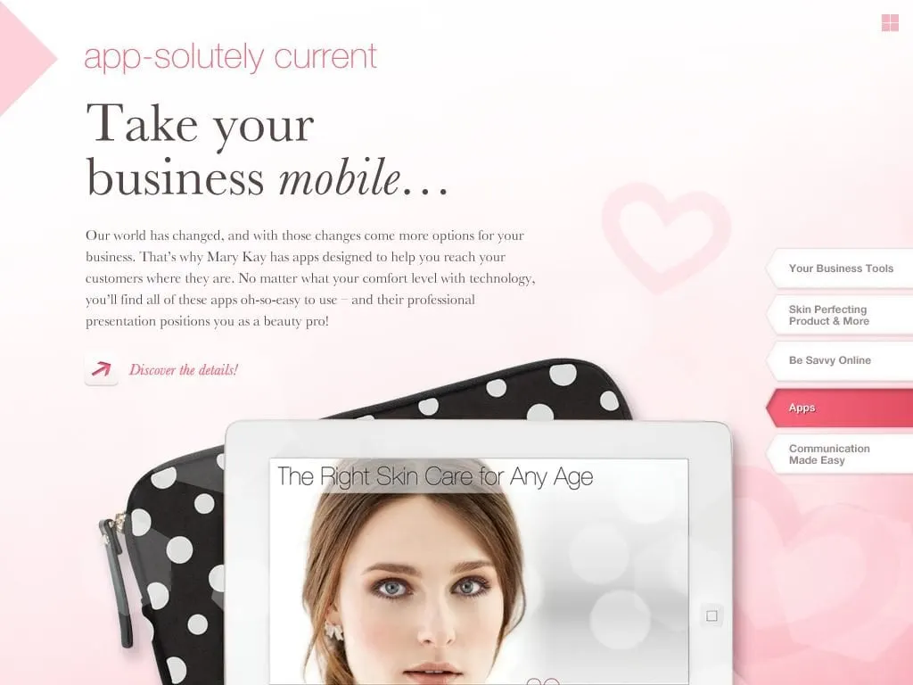
Recruits often ask the practical question: what would I actually use day to day? The Your Business Tools chapter answers it with real screens. Stand-out Online shows the Mary Kay Personal Web Site as an online storefront that is open 24/7. App-solutely Current presents the company's own mobile apps on a tablet in a polka dot case. Communication Made Easy and the eCatalog library round it out.
Putting the tools inside the tool mattered. A recruit watching a consultant run her pitch from an iPad is already seeing the mobile, flexible business the copy describes. It is a small piece of storytelling through design that does more than any bullet list could.
05 — Craft
Soft pink, serif italics and a personal touch
The visual language had to feel unmistakably Mary Kay while staying quiet enough for long conversations. We worked in a soft pink field washed with translucent hearts, then saved a stronger coral for the pop-up backdrops and active tabs so they read as a different layer. Headlines are set in an elegant serif with italic accents, while section labels use a light, lowercase sans serif in pink.
Photography is framed as taped Polaroids throughout, including black-and-white archive shots of Mary Kay Ash, which gives a corporate history the warmth of a personal scrapbook. That same graphic design system carries from the splash screen to the last note card, so the app feels like one object in the consultant's hands. For more of our work with beauty brands, see our Oil of Olay packaging project.
What we delivered
An iPad-only app for Mary Kay Canada's salesforce, designed and developed by Envy.