Case study · OddChefs
OddChefs
Brand look and full platform design for OddChefs, a Toronto and GTA marketplace for booking home chefs, with user, chef and admin flows designed from scratch.
01 — Context
A private chef, booked like a table
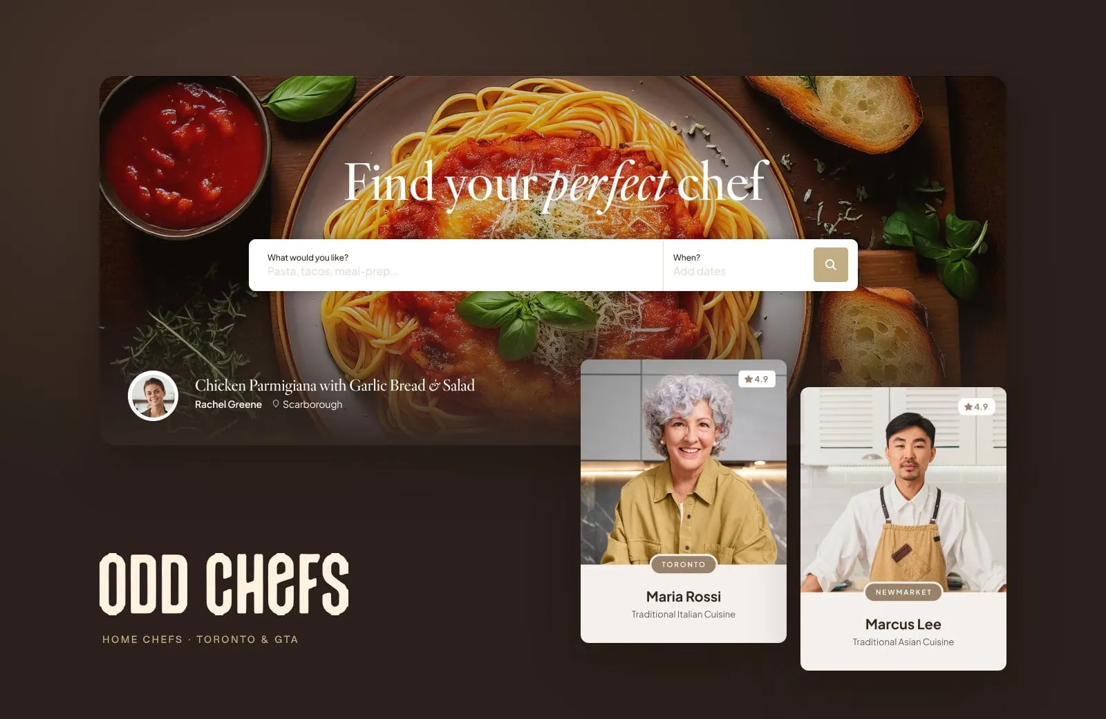
OddChefs connects people in Toronto and the GTA with home chefs who cook in your kitchen: a Thai dinner for six in Newmarket, Italian comfort food in Toronto, French classics in Mississauga. The cooks aren't always restaurant chefs. Many are passionate home cooks bringing the food they grew up with, which is exactly the point.
A marketplace like this has three audiences at once. Diners need to find a chef they trust and book them without a dozen emails. Chefs need a place to build a profile, publish a menu and manage orders. And the OddChefs team needs to vet every chef and dish before it goes live. We designed the brand look and the whole platform, from the first search to the admin panel.
02 — The look
Warm, editorial and a little odd
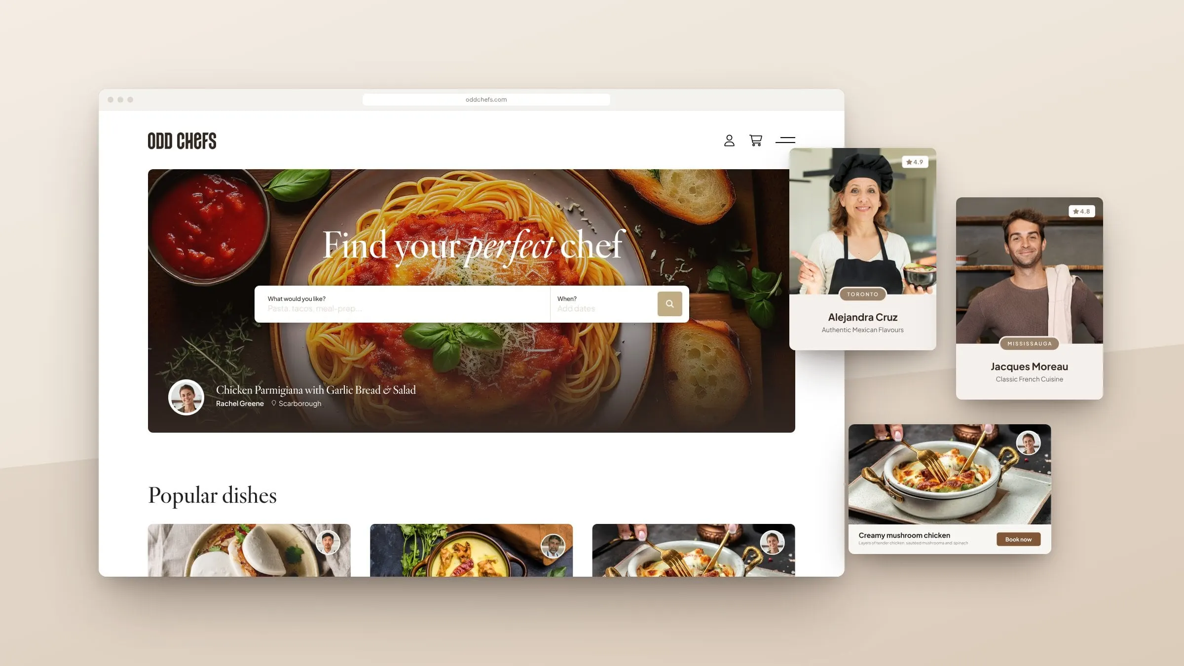
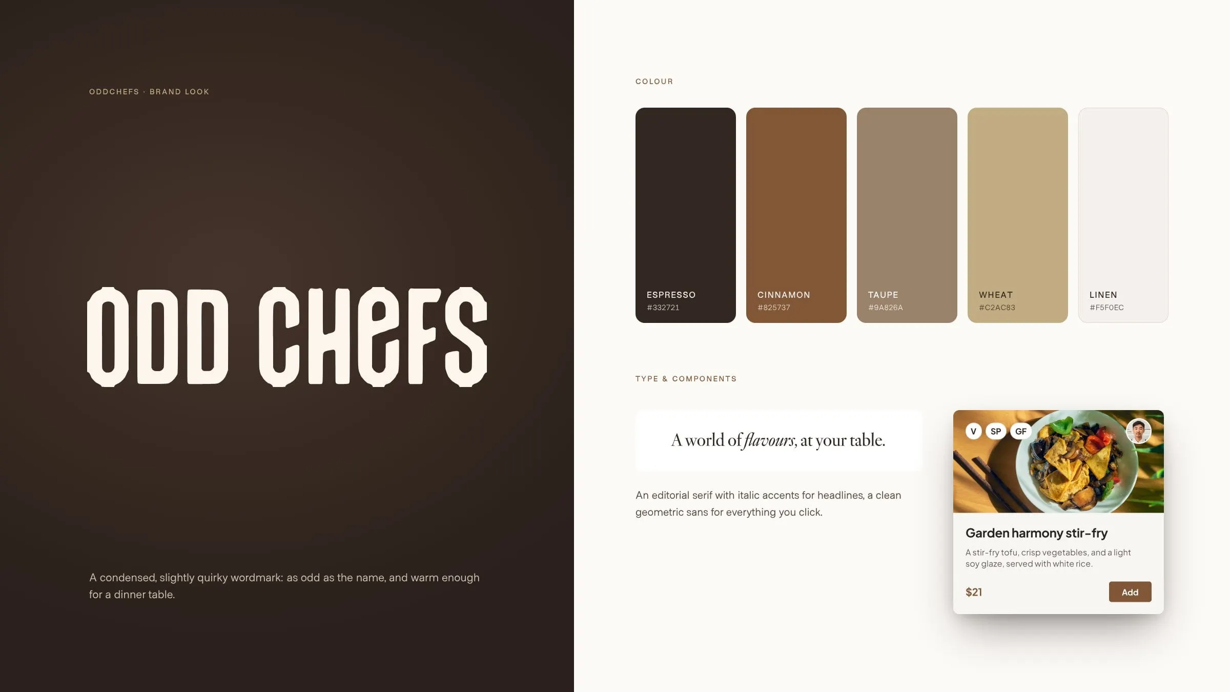
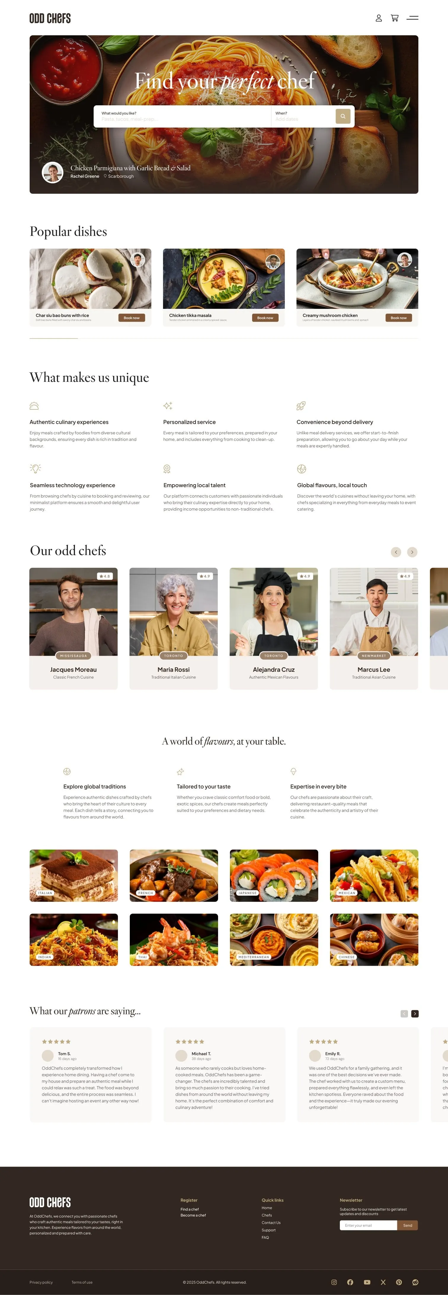
The name gave us permission to have some fun, so the wordmark is a tall, condensed letterform with a quirky lowercase e. Everything around it is calm: an espresso, cinnamon and wheat palette taken from the kitchen, plenty of linen-coloured space, and an editorial serif with italic accents for headlines, so "Find your perfect chef" reads more like a food magazine than an app.
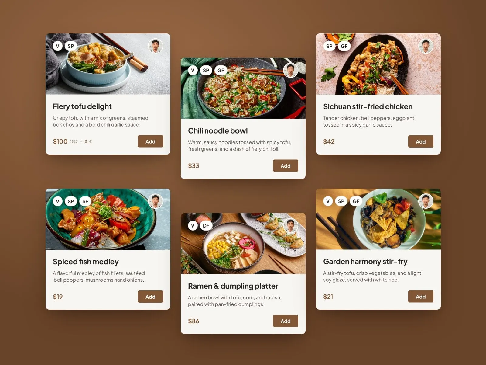
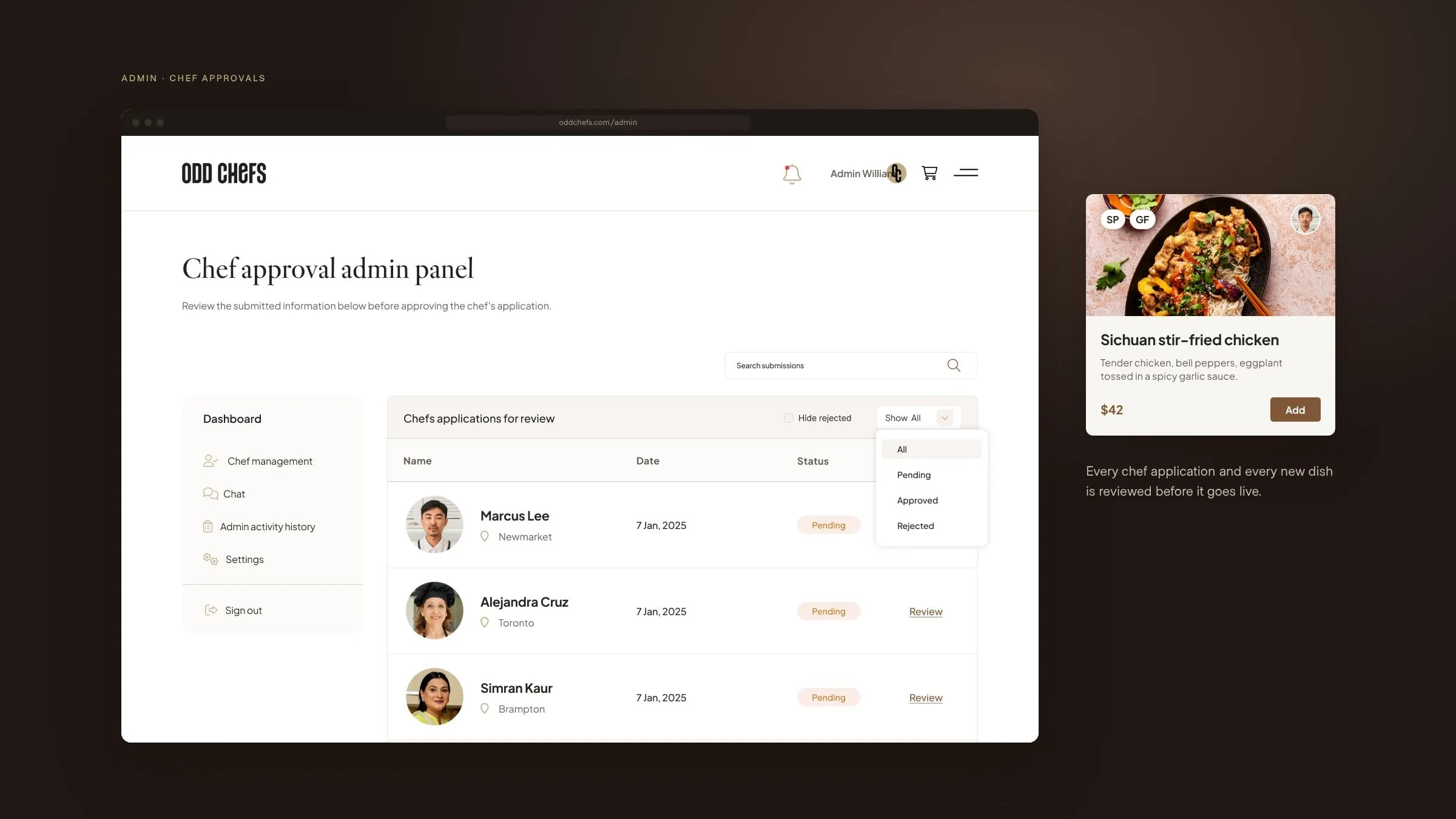
Food photography carries the colour. Dish cards put the plate first, with the chef's face in the corner and small dietary tags (vegan, gluten-free, dairy-free, spicy) in the other, so you know who's cooking and whether you can eat it before you read a word. It's the kind of brand and website working together that a new marketplace needs to earn trust fast.
03 — Booking
From craving to confirmed
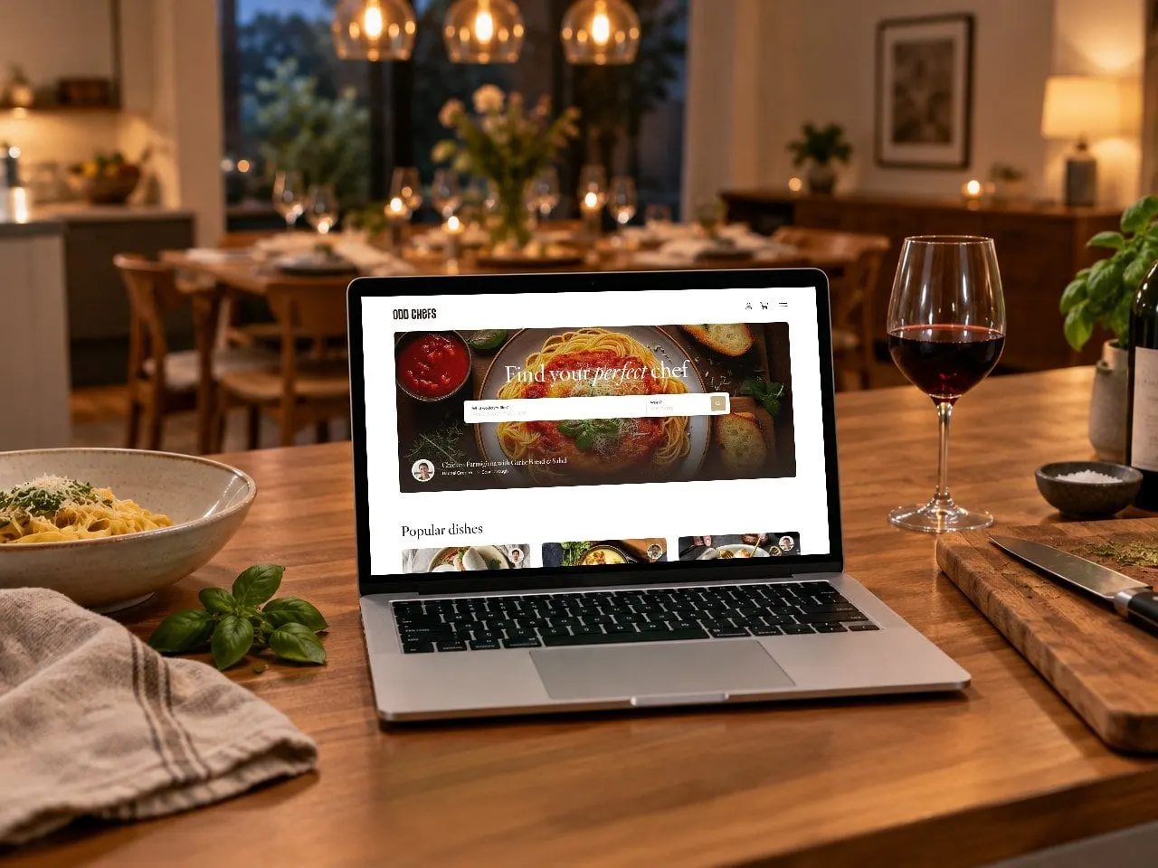
The homepage starts with the question people actually ask: what would you like, and when? From there, search lets diners filter chefs by city, cuisine, dietary needs, rating, price and even whether they'll supply the ingredients.
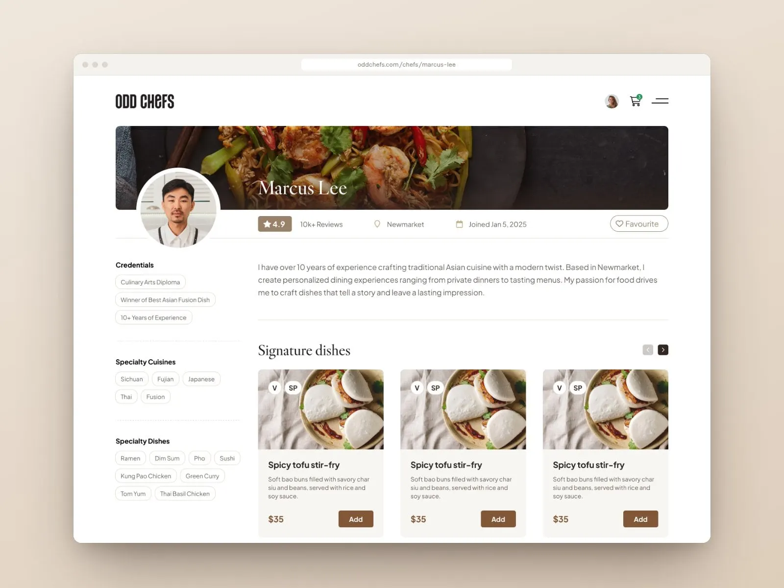
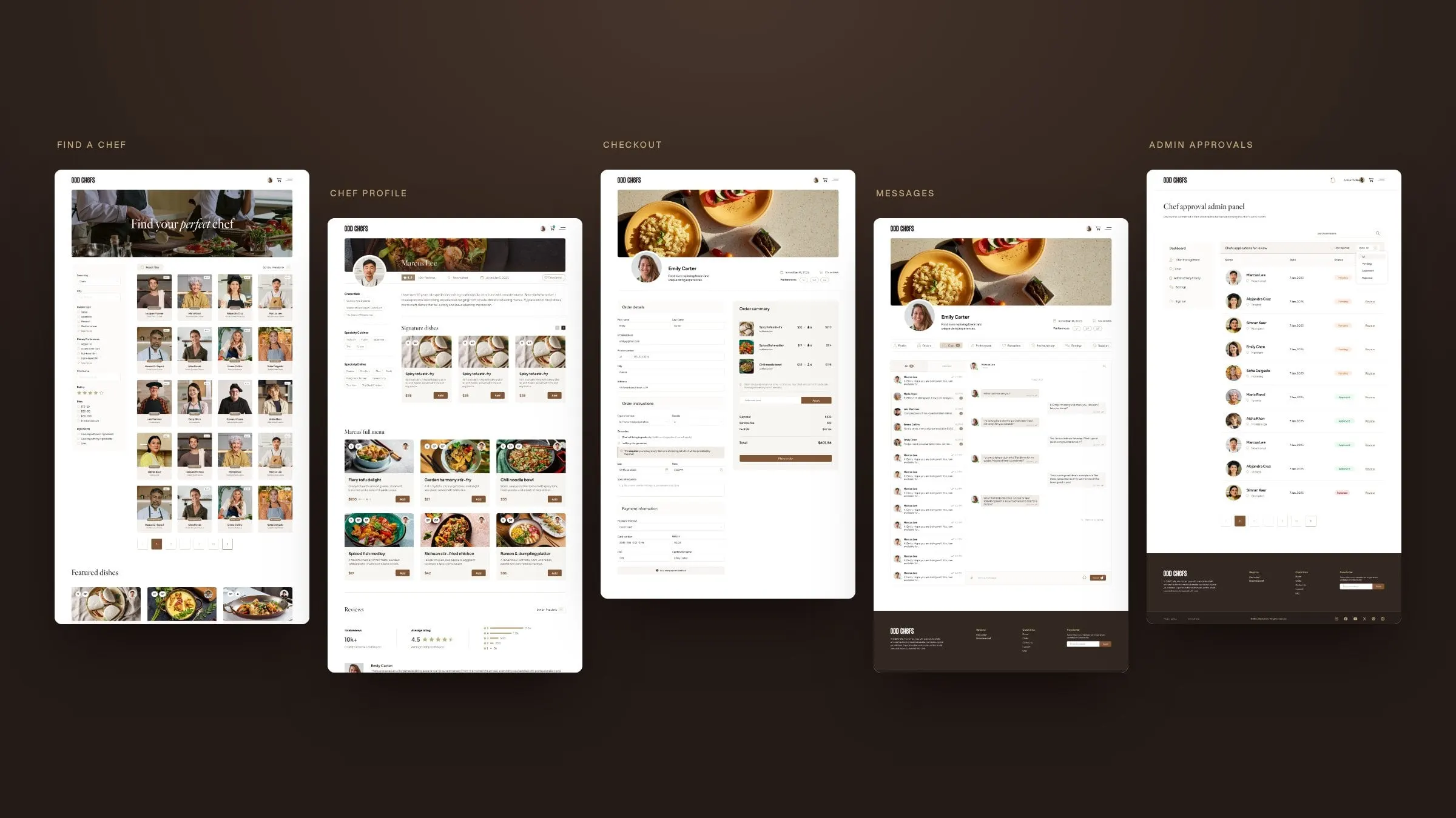
Each chef gets a public profile with credentials, specialty cuisines, signature dishes, a full menu and reviews, plus a booking panel at the bottom. Menu cards show the price per guest, so a $25 dish for four reads as $100 before it hits the cart. Good UX/UI design here is mostly about removing doubt.
04 — Chat and checkout
Talk it through, then book it
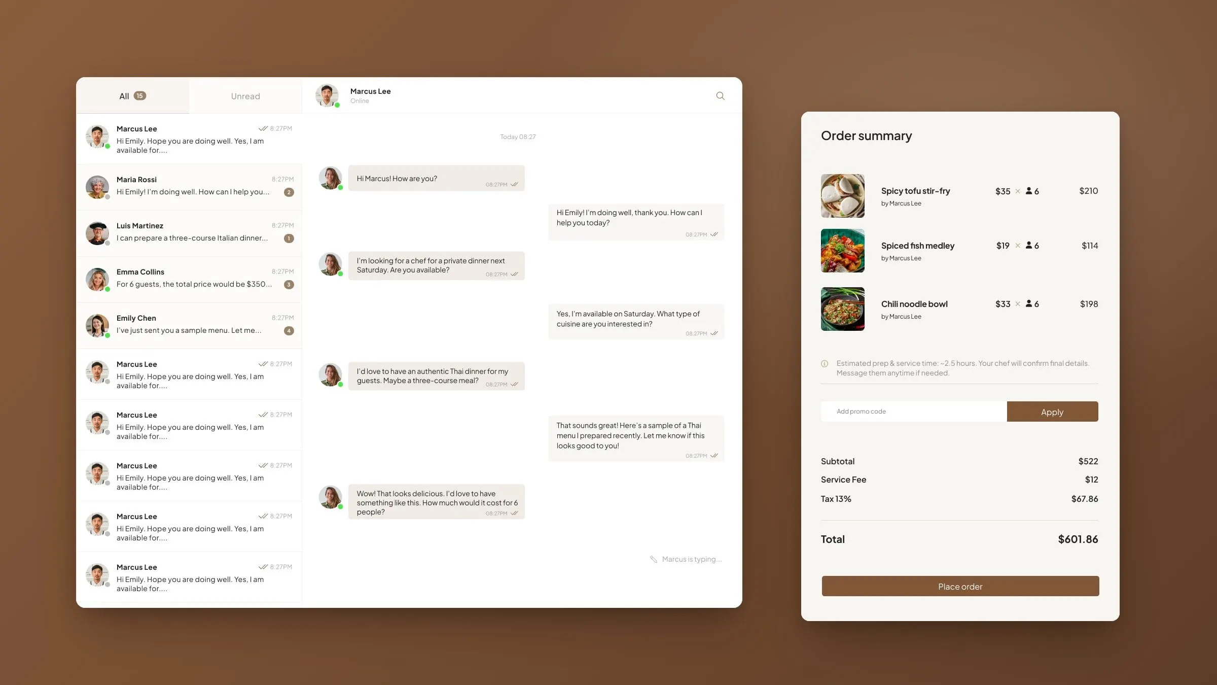
Hiring someone to cook in your home is personal, so we built conversation into the platform rather than pushing people to email. Diners and chefs each get an inbox with unread counts and online status, and a chef can share a sample menu right in the thread.
Checkout is shaped around a real dinner, not a parcel. Diners choose the type of service and number of guests, then decide who handles groceries: the chef brings the ingredients for an added fee, or the chef sends a shopping list. A date, a time, special requests and an order summary with Ontario's 13% tax finish it off.
05 — Chefs and admin
Three sides of one marketplace
For chefs, we designed a pre-screening application, a profile editor, a page for adding dishes, orders, chat, preferences, settings and support. For the OddChefs team, admin panels list every chef application and every new dish with a pending, approved or rejected status, so nothing reaches diners without a review.
All told, that's more than 30 page designs plus pop-ups for sign-up, log-in and email verification, and a set of transactional emails, all in one consistent system. Clear visual hierarchy keeps even the busiest tables readable, and it's the backbone of good platform design.
The platform
Designed from the first search
- Page designs
- 30+Across diner, chef and admin flows.
- Sides to the marketplace
- 3Diners, chefs and the OddChefs team.
- Cuisines on the homepage
- 8From Italian and Japanese to Mediterranean and Chinese.
06 — The result
A marketplace that feels like a dinner invitation
OddChefs now has a brand look and a complete, build-ready platform design: warm enough to sell a night in, and structured enough to run a two-sided marketplace with proper vetting behind it. Every screen speaks the same visual language, from the homepage hero to the admin table.
Launching a new marketplace or app? See more of our work for startups and emerging brands, or our food work for Brazen Chef.
What we delivered
- 01Brand lookWordmark, warm kitchen palette and an editorial type pairing.
- 02Platform UX/UI30+ screens across diner, chef and admin flows.
- 03Website designHomepage, search, chef profiles, contact and legal pages.
- 04Booking and checkoutMenus priced per guest, grocery options, chat and order summary.
- 05Admin toolsChef pre-screening and approval panels for chefs and dishes.
- 06Email templatesTransactional emails in the same visual system.