Case study · Brazen Chef
Brazen Chef
Box design concepts for Brazen Chef's whetstone knife sharpening set, sold on Amazon: four directions from bold black and coral to natural kraft.
01 — Context
Amazon product packaging design for a whetstone set
Brazen Chef sells a whetstone knife sharpening set on the Amazon marketplace. Online sellers live and die by first impressions, but with Amazon the first physical impression happens on the customer's doorstep — when the box comes out of the shipping carton. Brazen Chef wanted that moment to feel like a premium product, not a commodity.
The brief was to explore a few different box designs for the set, so the team could choose a direction that suited their price point and audience. Our Amazon product packaging design work focused on a slim, flat box that protects the stone and ships efficiently, then used every visible surface to tell people what's inside and who made it. It's a compact packaging design project, but each decision about colour, type and material changes how the product feels in the hand.
02 — Four directions
From premium black to honest kraft
We built every concept from the same parts: the Brazen Chef wordmark in condensed coral and charcoal capitals with its knife-tip notch, the product name WHETSTONE in a light, widely spaced sans-serif, and the descriptor "premium knife sharpening set." Changing the material and layout around those parts let Brazen Chef compare genuinely different moods.
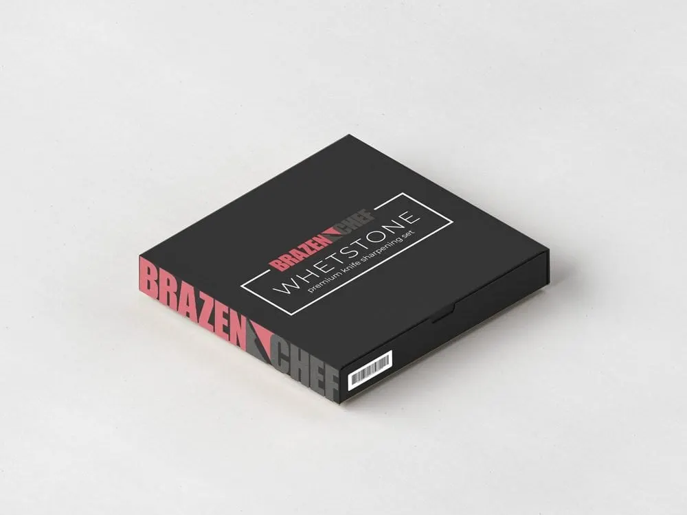
Black. A matte black box with WHETSTONE in a thin white frame on the lid, and the logo running huge along the side panel. It reads as a gift-worthy tool, the kind you'd leave on the counter.
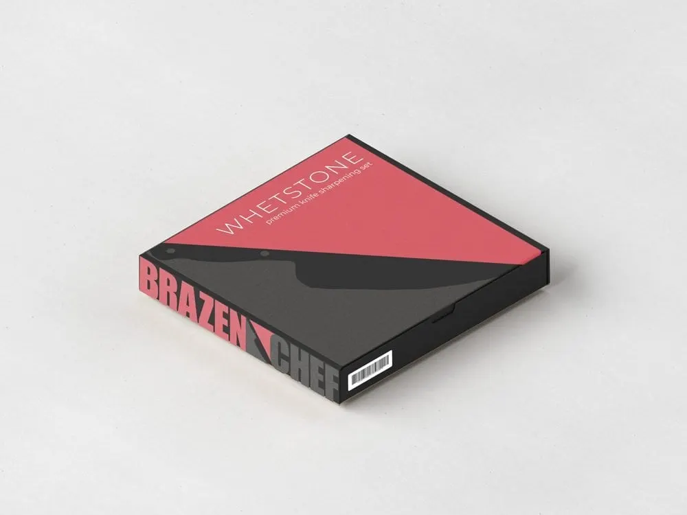
Split. The lid is cut diagonally into coral and charcoal by the silhouette of a chef's knife — the most graphic option, and the one that would stand out in an unboxing video.
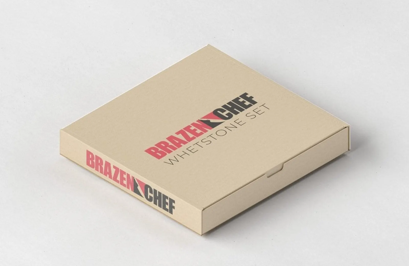
Kraft logo. A natural corrugated kraft box with the full logo and "Whetstone Set" on the lid. Simple, sturdy and down to earth.
Kraft minimal. Kraft again, but with only the quiet WHETSTONE title on the lid and the logo turned vertically along the side, for a more crafted, artisan feel.
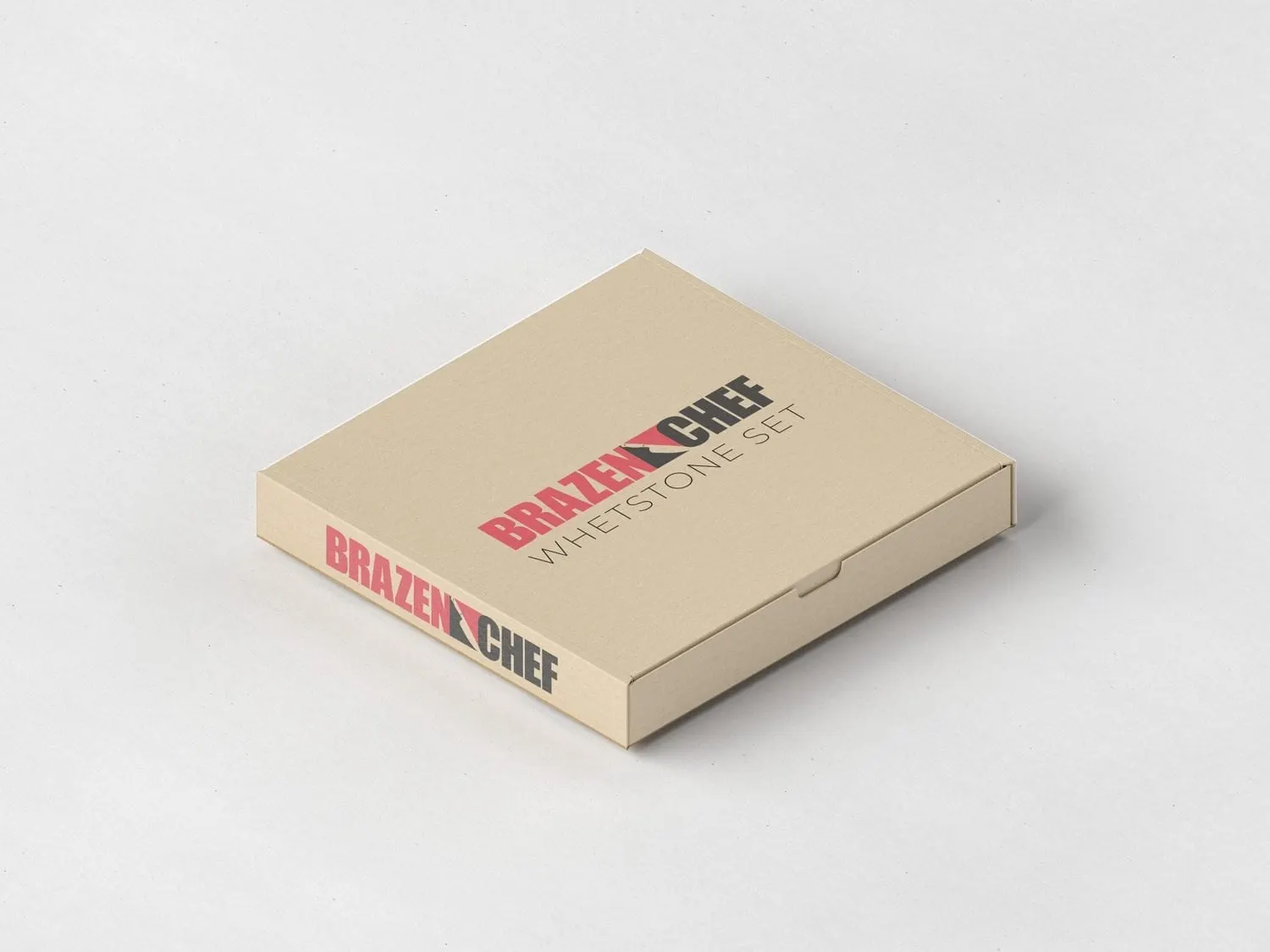
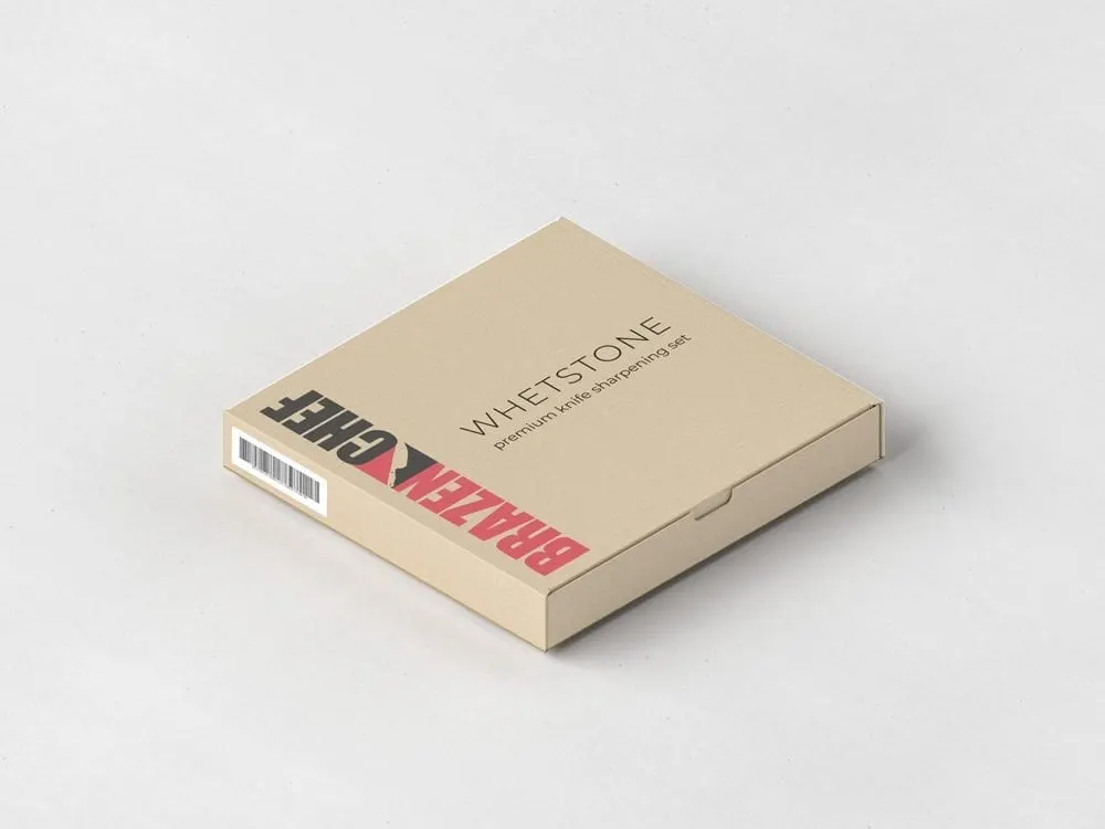
03 — Built for e-commerce
Small details that matter in a marketplace box
Marketplace packaging has practical requirements that a retail shelf box doesn't. Every concept keeps a clean white barcode panel on the side, placed so it never fights with the logo. The side panels carry the brand in oversized type, so the product is identifiable from any angle in a warehouse bin or a customer's drawer.
We kept the palette to coral, charcoal, black and kraft so whichever direction Brazen Chef chose would match its logo colours and look consistent in product photos and listings. That kind of discipline is part of our wider graphic design approach, and it's why consistent packaging builds trust over time — a point we make in why having a cohesive brand matters.
For more packaging work, see our Mistral packaging style guide and the brand and packaging we created for Esme + Sita.
What we delivered
Packaging concepts for the Brazen Chef whetstone sharpening set.