In the digital space, you have just seconds—sometimes less—to capture a visitor’s attention. A glance determines whether someone stays or leaves, explores or exits. But what truly makes one website instantly engaging while another gets ignored?
It’s not always about bold colors or clever copywriting. Behind the scenes, there’s a deeper, often underestimated design principle that quietly influences where users look, what they click, and how they feel as they browse. This is the hidden force that separates a high-performing website from one that frustrates and confuses—and many brands overlook it entirely.
For businesses aiming to stand out online, especially in the Canadian market, this concept is crucial. Whether you’re working with a graphic design agency Canada or partnering with a Canadian branding agency to shape your online presence, mastering this principle is what gives your website clarity, focus, and real impact. Even the most stunning visuals or clever messaging can fall flat without it.
So, what is this essential ingredient that every experienced Canadian web design agency and Canadian graphic design agency builds into their process—often before the first pixel is placed? Let’s take a closer look at the design strategy that drives conversions, keeps users engaged, and transforms websites into powerful digital experiences.
What is Visual Hierarchy in Web Design?
Visual hierarchy refers to the arrangement of elements on a webpage in a way that naturally guides the viewer’s eye. It’s a design principle that establishes an order of importance through size, color, contrast, spacing, and other visual cues. When done right, visual hierarchy intuitively guides users, helping them know where to look first, what to focus on, and how to navigate the website efficiently—without even thinking about it. It’s like the silent guide that makes your site’s design intuitive and pleasant to use.
Think of it like a store layout—when you walk into a store, the most important items are placed front and center or at eye level. Similarly, in web design, the most critical elements should be easy to find. This principle is central to the work of any graphic design agency Canada and Canadian graphic design agency, as they strategically use design techniques to shape the user’s experience.
Why Does Visual Hierarchy Matter?
Improved User Experience
The goal of any website is not just a positive user experience (UX), but a lasting one. By guiding users effortlessly through your site, visual hierarchy ensures they stay longer, reducing bounce rates and boosting engagement. When users land on a site, they should immediately understand what to do and where to go next. A well-implemented visual hierarchy facilitates this by structuring content so that users can find information quickly and easily. Whether it’s the headline, a call to action (CTA), or a product image, prioritizing these elements ensures users engage with them first.
Increased Conversion Rates
The effectiveness of a website is ultimately measured by its ability to convert visitors into customers or leads. By directing attention to the most important parts of your site—like CTAs, key products, or services—visual hierarchy drives conversions. A Canadian branding agency understands this principle and integrates it into a site’s design to make sure the brand message is clear and compelling.
Enhances Content Comprehension
Web visitors often skim content rather than reading it word for word. A well-designed visual hierarchy helps them process information in chunks, guiding them from one point to the next. Through effective use of headings, subheadings, bullet points, and images, a Canadian web design agency ensures that users can scan through the content without feeling overwhelmed.
Aesthetic Appeal and Credibility
How a website looks can make a huge impact on how users perceive your brand. A cluttered or disorganized page will frustrate visitors, while a well-designed layout with a clear visual hierarchy exudes professionalism. The role of a Canadian graphic design agency is crucial in ensuring that the visual design not only meets industry standards but also represents the brand’s ethos and identity.
Key Elements That Influence Visual Hierarchy
A Canadian branding agency can use various design elements to establish a solid visual hierarchy on your site. These elements include:
1. Size and Scale
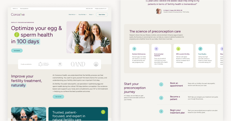
Larger elements naturally attract more attention than smaller ones. This is why your website’s most important features—such as your headline or CTA—should be larger than less important content. For example, on a homepage, the main header should be the largest text, followed by subheadings, and then body text.
2. Color and Contrast
Color can be used to highlight key areas and create a sense of importance. A graphic design agency Canada will often use contrasting colors to make essential elements stand out. For instance, using a vibrant color for your CTA button will make it pop against a more neutral background, prompting users to take action.
3. Spacing and Alignment
Spacing (or white space) around elements can emphasize their importance. A Canadian web design agency can skillfully use space to isolate significant features, making them more noticeable. Proper alignment also contributes to a clean, organized layout that reinforces the hierarchy and guides the viewer’s eye logically through the content.
4. Typography
The choice of font, its size, weight, and style all contribute to visual hierarchy. The most important content, such as headlines or key information, is often displayed in bold or larger fonts. A Canadian graphic design agency will use typography to structure content, ensuring it’s readable and that each element of the page serves its purpose.
5. Imagery and Visual Cues
Images, icons, and videos play a crucial role in directing attention. A strategically placed image can draw attention to a specific product or service, while icons can guide the user to different sections of the site. Effective imagery helps break up text and create a more engaging visual flow.
Common Mistakes in Visual Hierarchy and How to Avoid Them
Overcrowding Your Pages
A frequent mistake in web design is overcrowding a page with too much information, which can overwhelm users and make it difficult to focus on anything. To prevent this, a Canadian web design agency will carefully curate the content and ensure that there’s a clear separation between important and secondary elements.
Ignoring Mobile Design
As mobile browsing continues to dominate, visual hierarchy needs to adapt. A design that works well on a desktop might not translate seamlessly to mobile. A Canadian branding agency will ensure that the mobile experience maintains the same hierarchy while adjusting for smaller screens.
Neglecting User Behavior
A mistake some web designers make is assuming they know what’s best for users without considering user behavior. A Canadian graphic design agency will use analytics to understand how users interact with a site and adjust the visual hierarchy accordingly.
Inconsistent Design
Inconsistent use of fonts, colors, and sizes can create confusion for users. A Canadian web design agency will ensure that visual elements follow a consistent pattern throughout the site, reinforcing the structure of the visual hierarchy.
How to Build Effective Visual Hierarchy on Your Website
Crafting a strong visual hierarchy isn’t just about good looks—it’s about creating a seamless, intuitive experience that moves users toward action. A thoughtful layout, informed by both design principles and user behavior, helps ensure that visitors see what matters most, when it matters most. Here’s how to build that kind of hierarchy—especially with the guidance of a trusted Canadian web design agency.
1. Define Your Key Messages
Before jumping into design, identify the content that should command attention. Whether it’s your main offer, a critical CTA, or a lead-generating contact form, your design must reflect your goals. A strategic Canadian branding agency will help clarify your priorities early, so your design can emphasize them through size, placement, and visual weight. This early clarity sets the foundation for a hierarchy that guides user flow without confusion.
2. Design for the F-Pattern
Most users scan websites in an F-shaped pattern—starting from the top left, then across, then scanning down the left margin. Designing around this pattern helps position important elements like CTAs, product highlights, or key headlines where users are naturally looking. A skilled graphic design agency Canada will use this scanning behavior to place content where it’s most likely to be noticed—boosting engagement without forcing attention.
3. Be Consistent
Consistency builds trust and reduces user friction. Fonts, button styles, heading formats, and spacing should remain predictable throughout the site. Disjointed visual language can make your site feel unpolished, even if your services are top-tier. A professional Canadian graphic design agency applies brand standards across all touchpoints, creating a unified experience that reflects credibility and professionalism.
4. Use Visual Cues Wisely
Visual cues—like directional arrows, contrasting buttons, or focused imagery—can gently lead users to high-value actions. These subtle nudges are key to drawing attention to CTAs, next steps, or deeper content without overwhelming the user. With help from an experienced Canadian web design agency, these cues are integrated purposefully, aligning with both your brand and user flow.
5. Test and Improve
Design isn’t one-and-done. Real users often behave differently than expected, which is why ongoing testing is crucial. Tools like A/B testing, heatmaps, and analytics reveal how users actually interact with your site. A forward-thinking Canadian branding agency can guide this iterative process—refining layouts and improving clarity based on actual behavior, not guesswork.
Why You Need a Professional Canadian Web Design Agency
Building a website with a well-structured visual hierarchy is far from a simple task. It’s about understanding user behavior, making smart design choices, and ensuring that your site not only looks appealing but performs effectively. Achieving this level of design mastery requires knowledge, experience, and expertise—qualities that a professional Canadian web design agency brings to the table.
Visual hierarchy is a powerful tool that guides users’ attention to the most important elements of your site. A Canadian branding agency can help you strategically prioritize content through the use of color, typography, and layout, ensuring a seamless user experience that aligns with your business objectives. Whether it’s highlighting your products, encouraging sign-ups, or enhancing your calls to action (CTA), the right visual hierarchy can increase conversions and foster trust with your audience.
At Envy Design Co., a leading graphic design agency Canada, we specialize in designing websites that not only look stunning but are optimized to engage and convert visitors. Our team of experts understands the importance of every element on a page—from the size and placement of buttons to the use of whitespace and fonts. We know how to balance design and functionality to ensure your website delivers a smooth and intuitive experience across all devices.
Partnering with a Canadian graphic design agency like Envy Design Co. ensures that your site is more than just visually appealing; it becomes a powerful tool that drives business growth. Our experience and commitment to excellence help us create websites that elevate your brand and improve performance, offering you a competitive edge in the ever-evolving digital landscape.
Conclusion: The Power of Visual Hierarchy
Visual hierarchy is at the core of every effective website. It organizes information in a way that naturally directs attention and makes navigation intuitive. For Canadian businesses competing in a fast-paced digital world, a clear and purposeful hierarchy isn’t optional—it’s essential.
From the moment a visitor lands on your site, your layout, font choices, color contrasts, and visual cues all work together to influence perception and guide actions. When these elements are used strategically, your website becomes more than just an online presence—it becomes a conversion engine.
A professional Canadian web design agency like Envy Design Co. understands how to turn design into impact. By aligning design elements with your business objectives, we help ensure that every part of your site serves a purpose—boosting engagement, building trust, and driving results.
In today’s digital-first environment, visual hierarchy is the key to creating websites that are not only beautiful but also effective. Whether you’re looking to enhance your brand, improve user experience, or increase conversions, working with a design partner that understands these principles can make all the difference. With Envy Design Co., your website becomes a strategic asset that delivers lasting value.


