Case study · Montcalm Community College
Montcalm Community College
A pathway-led website design for Montcalm Community College in Sidney, Michigan, with mobile layouts and a full component library.
01 — Context
A college site that starts with the student
Montcalm Community College is a public community college in Sidney, Michigan, founded in 1965, with a second campus in Greenville. It offers associate degrees, certificates and job-training programs, transfer pathways to four-year universities, dual enrollment for high school students, and a busy campus life with NJCAA athletics.
College websites easily end up organized around the institution, with prospective students, current students, alumni and community members all digging through the same menus to find their part. The brief was a website design that puts each of those audiences on their own clear path, brings real campus photography and the school’s green and gold forward, and works just as well on a phone.
02 — Structure
Four pathways, one front door
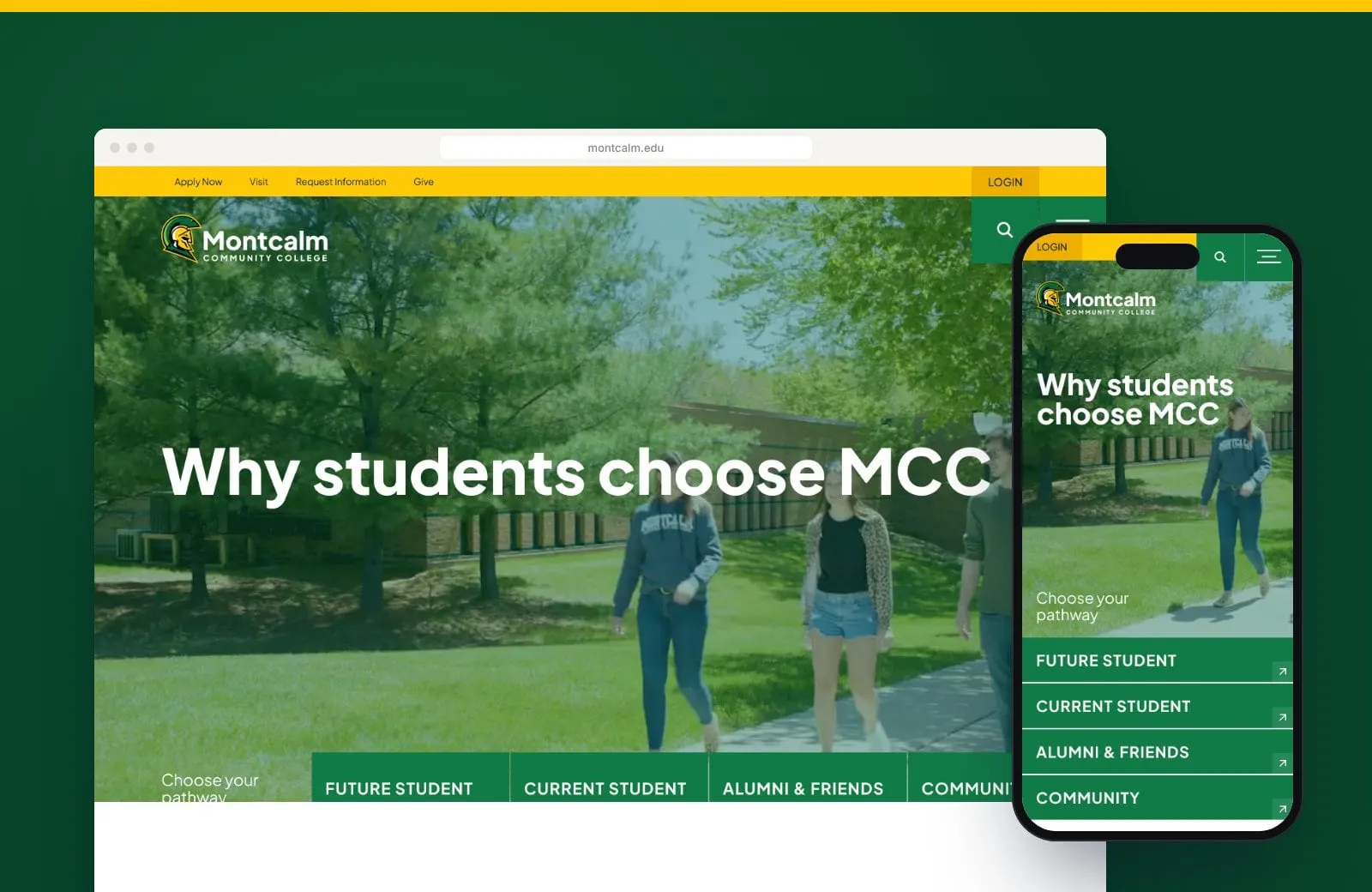
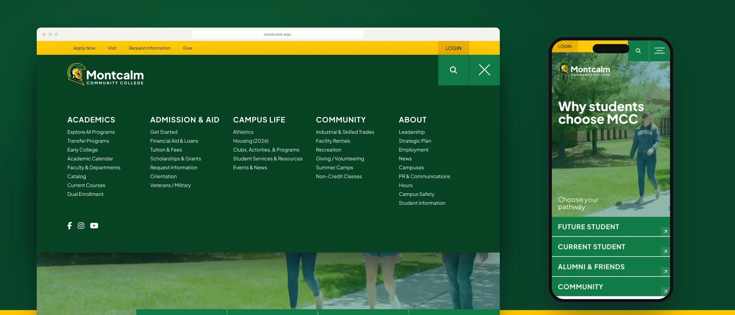
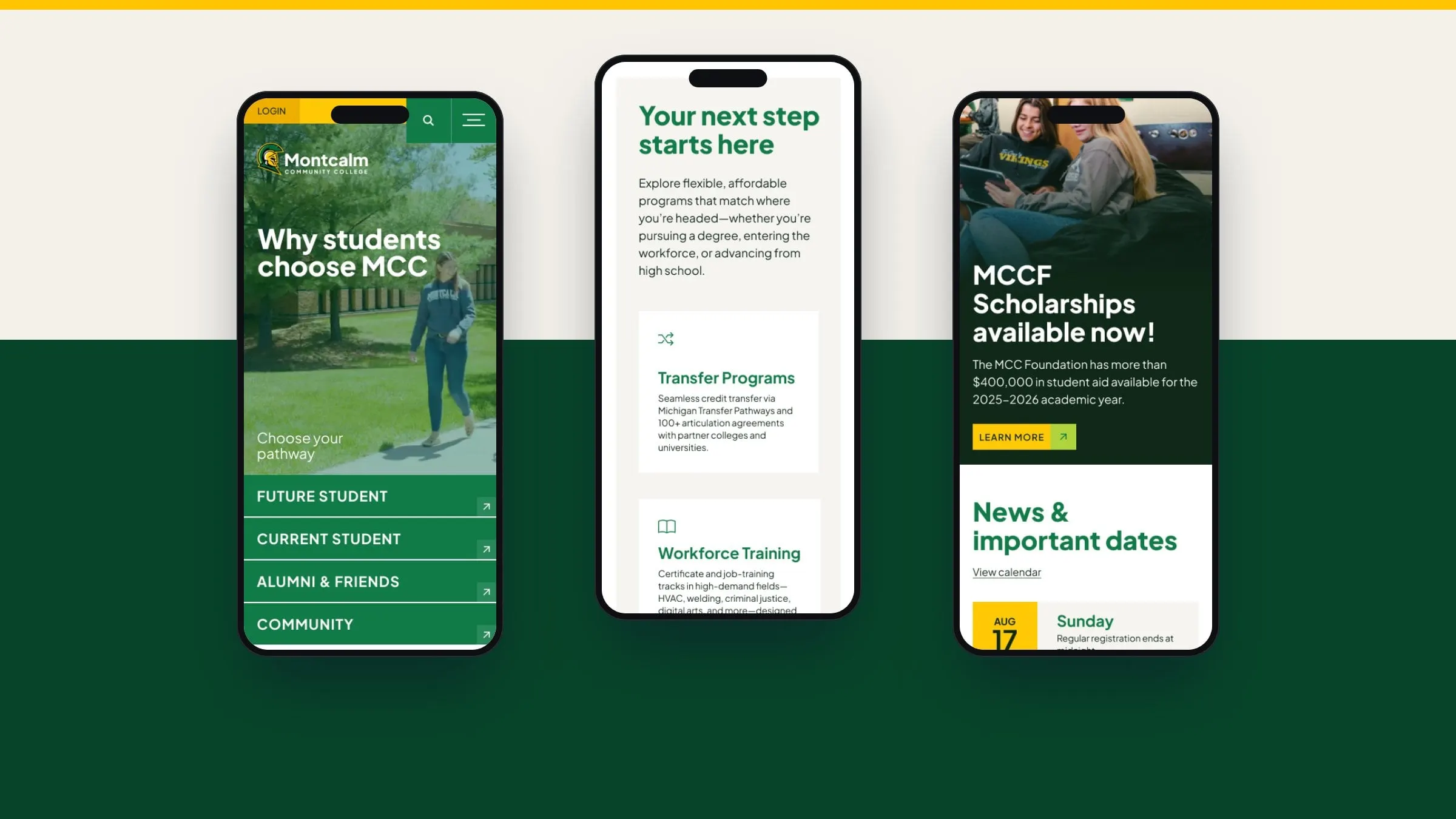
The homepage opens with a campus photo hero and a simple question: choose your pathway. Four large buttons, Future Student, Current Student, Alumni & Friends and Community, sit right at the bottom of the hero, so every visitor can self-select in one tap. Behind them, a full-screen mega menu organizes everything into Academics, Admission & Aid, Campus Life, Community and About.
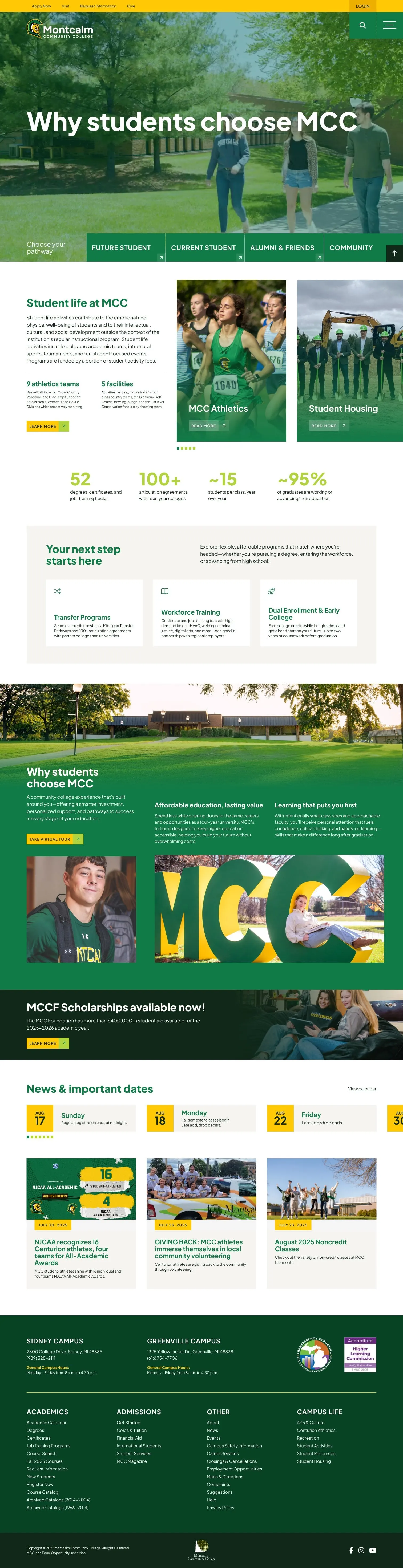
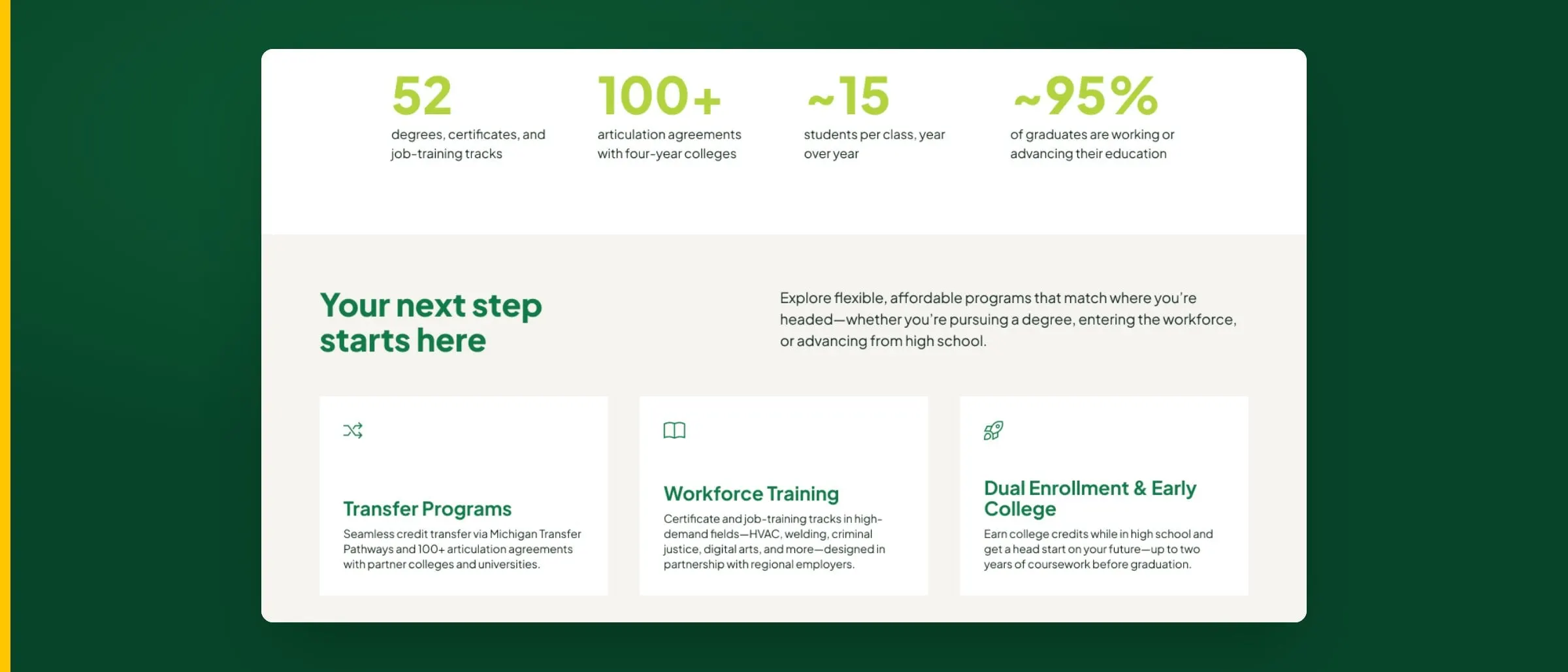
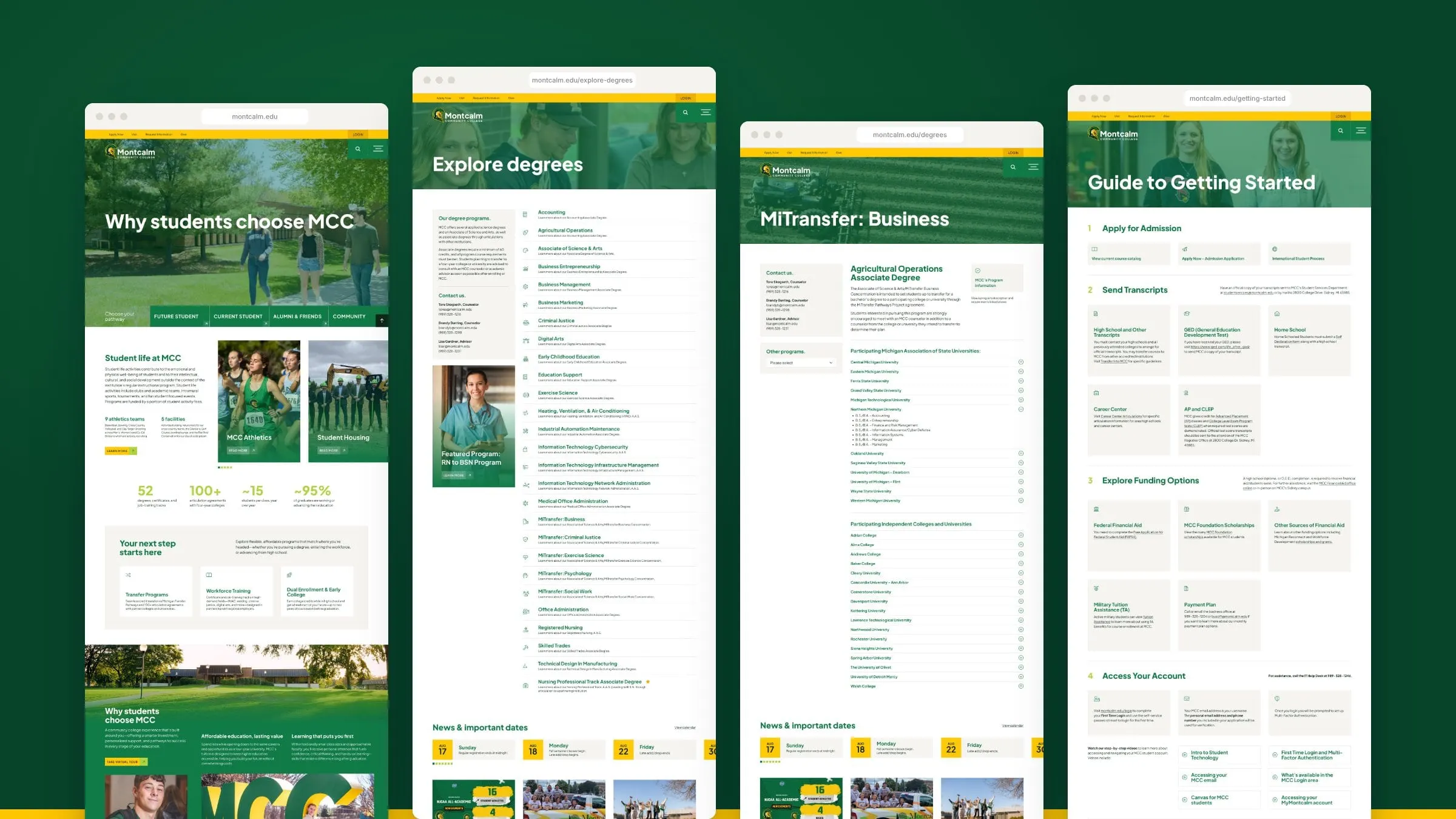
The rest of the homepage tells the story in short sections: student life and athletics, the college’s key numbers, next steps for transfer, workforce training and dual enrollment, scholarships and the latest news and dates. It follows the same principles we cover in what makes a great homepage.
03 — Programs
Finding a program without a catalogue
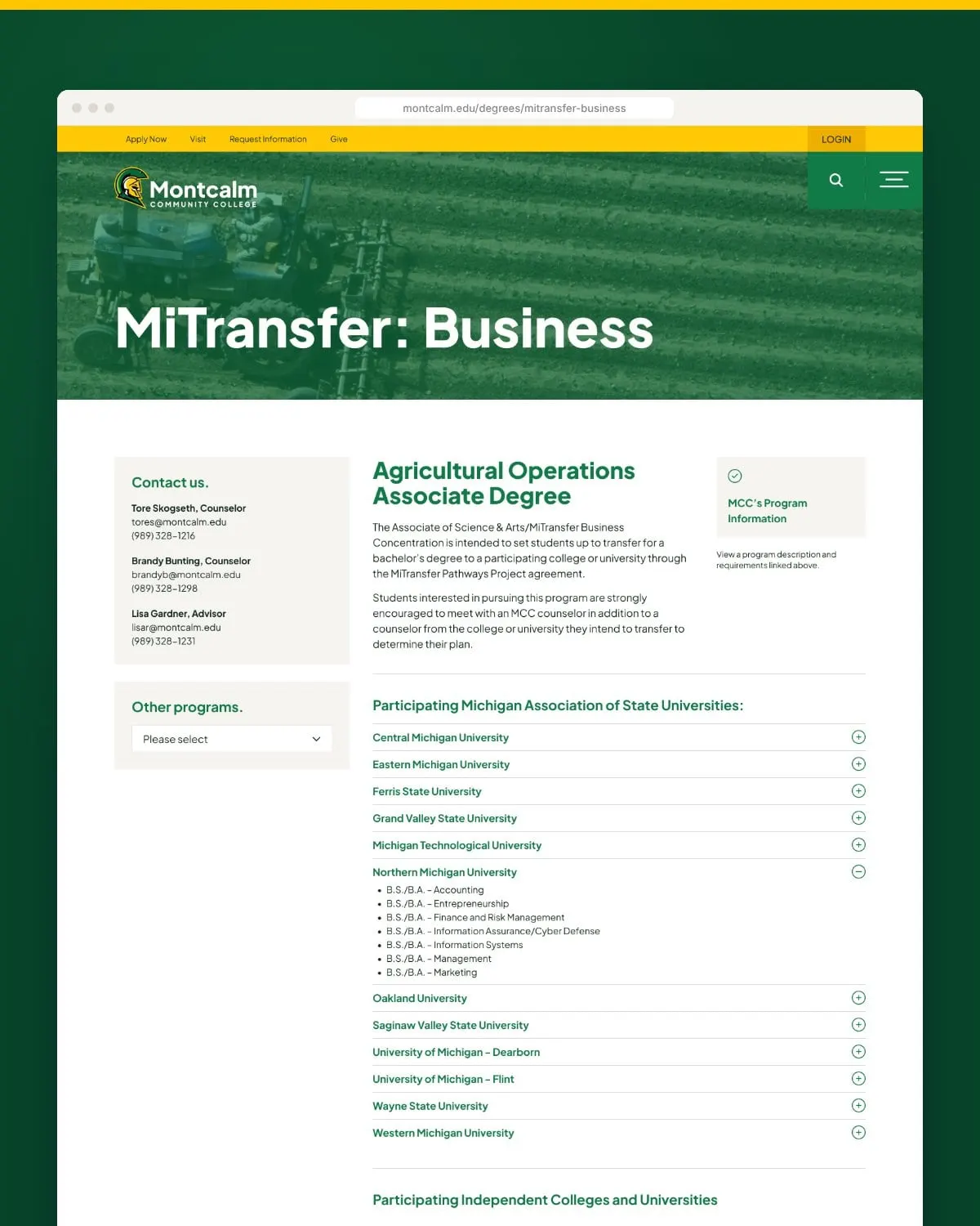
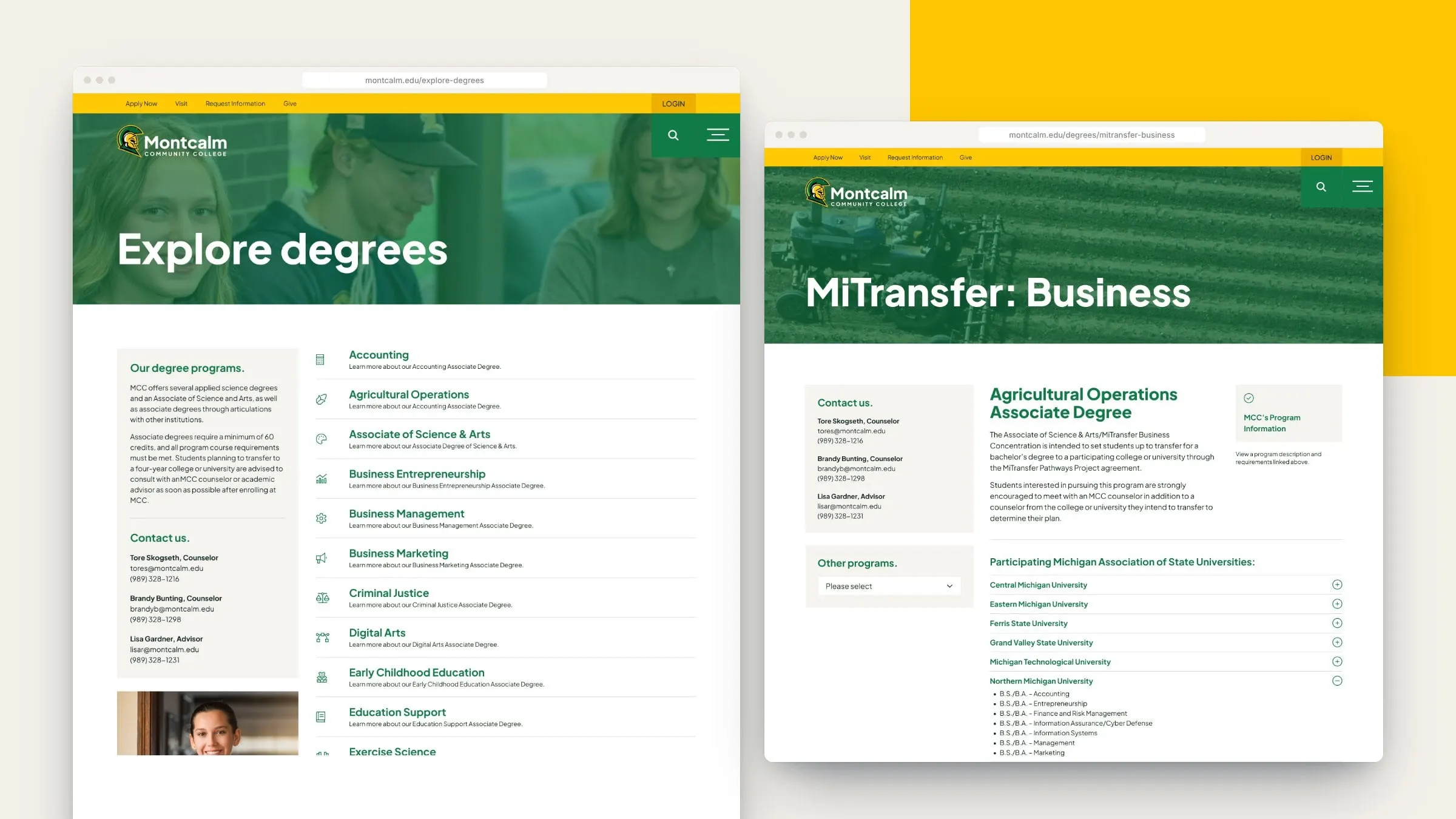
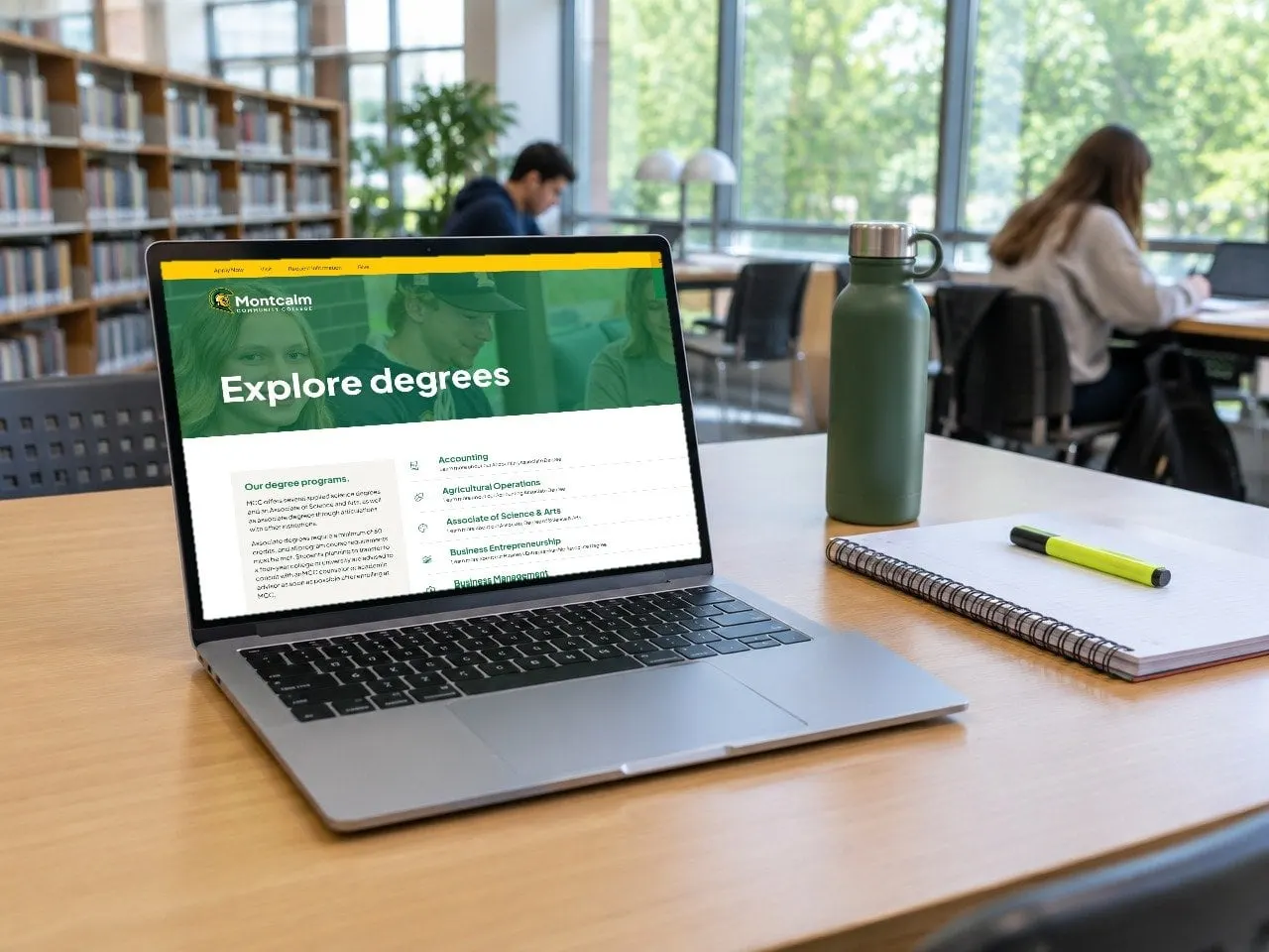
Explore Degrees lists every program in one scannable column with a short description and an icon, from accounting and agricultural operations to nursing, skilled trades and IT, alongside a featured program and contacts for counselling. Each degree page then explains the program, shows who to talk to and, for transfer degrees, lists every participating Michigan university in an expandable list.
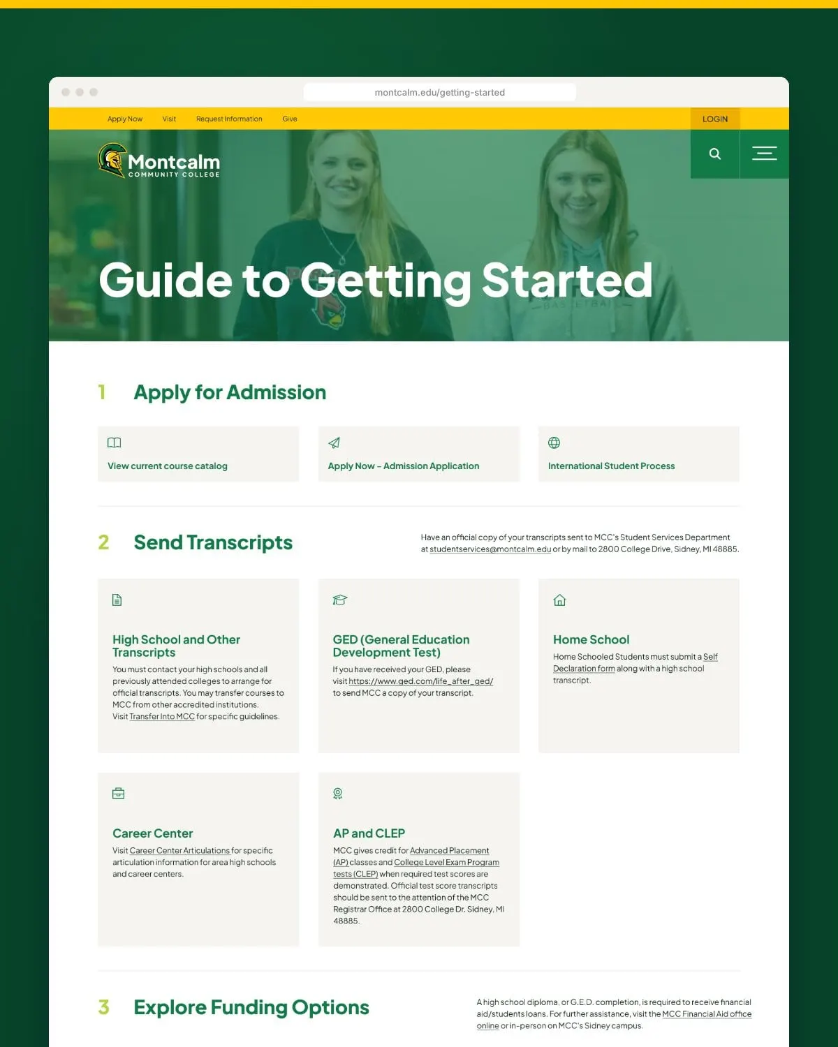
The Guide to Getting Started turns enrolment into ten numbered steps, from applying and sending transcripts to funding, orientation, registering and buying textbooks, each with direct links to the right forms and offices. Clear UX and UI design matters most on pages like this, where a confused student simply gives up.
Templates
Built for real decisions
Every template shares one component library, so new programs and pages can be added without new design work. Sidebars, accordions, tables, calendars and cards all follow the same rules.
For more education work, see our education and learning projects, including Academic Opportunity of Arizona and Further Learning Group.
04 — Mobile
Designed for the phone in their pocket
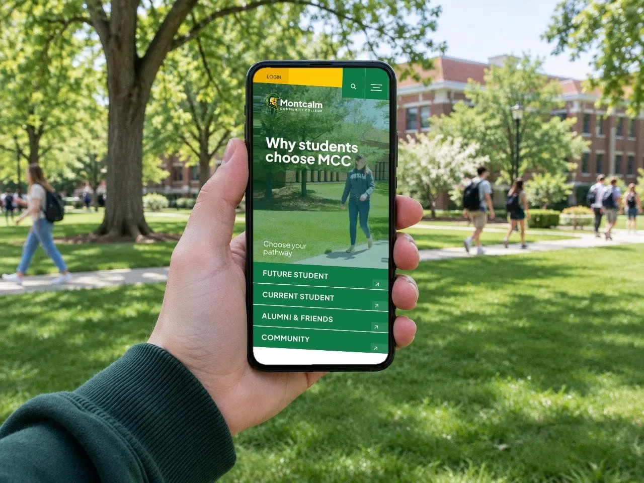
Many students will meet the college on a phone first, so the key templates were designed at mobile size too, not just squeezed down. On mobile the pathway buttons stack into a full-width list, stats and cards run in a single column, and the news and dates slider stays thumb-friendly. A separate mobile mega menu and search keep navigation simple on a small screen, while the mobile header keeps Login, search and the menu one tap away.
It’s why we believe in mobile-first design for any organization whose audience is young and on the move.
On campus
From the quad to the library
Whether a student is checking a deadline between classes or comparing programs in the library, the experience is the same: clear, green and gold, and easy to act on.
What we delivered
A pathway-led website design for a Michigan community college.