Case study · Further Learning Group
Further Learning Group
A lighter, airier look and a new website for Further Learning Group, a distance and classroom education provider with a portfolio of design and creative brands.
01 — Context
One group, many education brands
Further Learning Group was established in 2004 to make learning more accessible through distance learning and classroom-based teaching. Today it offers qualifications in interior design, garden design, fashion design, photography and digital marketing to students in the United Kingdom, Ireland and Australia, through a portfolio of education brands.
The executive team came to us with a clear goal: a website that would tell the group's story in a polished, elegant way without losing its voice. The challenge was the brand portfolio. Each school already had its own colours and personality, and the parent brand had to sit above all of them without competing. Our Further Learning Group website design answered that with a new look and feel that is light, airy and deliberately neutral.
02 — Look and feel
A neutral foundation with strategic colour
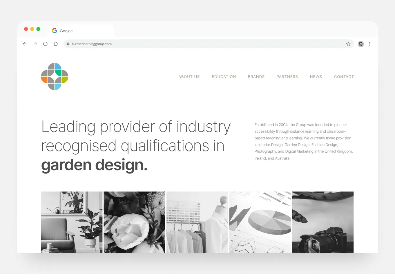
Working alongside the team, we established a refreshed visual direction as part of our branding and identity work. We stripped the palette back to white space, soft greys and a warm taupe, and set type in a light, open sans-serif. That restraint is what lets the group's mark do its job: a cluster of quarter circles in grey with accents of orange, teal, blue and lime green, each hinting at a different part of the portfolio.
The neutral base is a foundation, not a limit. Because the parent brand doesn't claim a strong colour of its own, the team can pull colour strategically from its existing brand library whenever a page focuses on a particular school or subject. Interior design can feel like interior design; photography can feel like photography; and the group still looks like one organization.
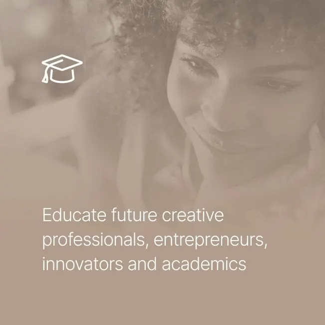
Imagery follows the same logic. On the homepage, a strip of black and white photos represents each discipline: a living room chair and plants, a peony, a rack of garments beside a dress form, printed charts and a camera. Elsewhere, warm, toned photography of students learning at home pairs with simple line icons like a graduation cap, so the brand feels personal rather than institutional.

03 — The website
A homepage that says what the group does in one line
Our website design keeps the homepage focused. A short navigation (About Us, Education, Brands, Partners, News and Contact) maps directly to the questions prospective partners, students and staff ask. Below it, a large, light headline states the group's position as a leading provider of industry-recognised qualifications, with the subject area in bold, followed by a short paragraph on the group's history and reach.
The generous white space is deliberate. A minimal layout makes a broad portfolio feel organized and calm, and it gives each brand room to appear in its own colours without the page feeling crowded. We explore that balance in our article on minimalism in web design.
The result is an education website with a modern, confident tone that still sounds like Further Learning Group. For other education projects, see our work for South 49 apprenticeship training and Academic Opportunity of Arizona.
What we delivered
A refreshed visual direction and website for an education group.