Case study · Moms Tribute
Moms Tribute
An investor pitch deck for Moms Tribute, a California start-up building an online community for busy moms, told through the story of one mom named Jenn.
01 — Context
Investor pitch deck design for a mission-driven start-up
Moms Tribute is a start-up registered in Pleasanton, California. Its idea is a shared, nurturing online community for moms that brings convenience and removes chaos from everyday family life: calendars, reminders, budgeting tools, forums and more in one place.
The founders were heading into investor meetings and needed more than a spreadsheet with slides on top. They asked us for investor pitch deck design that would tell their story, make the problem feel real and still give investors the numbers they expect. We designed the full deck as a piece of presentation design built for a live pitch.
The challenge was balance. A deck about family life can easily turn sentimental, while a deck about subscriptions and revenue can turn cold. Moms Tribute needed both in the same meeting, and investors needed to follow the logic from the first slide to the last. Our plan was to let the story earn attention first, then let the data confirm what the audience already felt.

02 — Story
Meet Jenn, the customer investors remember
Instead of opening with market size, we opened with a person. Jenn is a busy mom, and the deck follows her from overwhelm to relief. Her first slide, Jenn's Story, sets the promise: how technology can help this busy mom catch her breath.
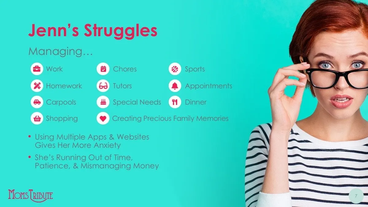
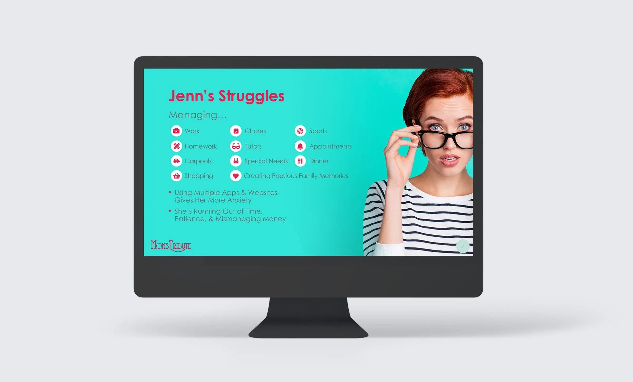
Jenn's Struggles then lays out everything she is managing, from work, chores and homework to carpools, tutors, appointments and dinner. Each item gets a small pink icon so the list reads as a pile-up rather than a paragraph. Two short bullets name the real problem: juggling multiple apps and websites adds anxiety, and she is running out of time, patience and money.
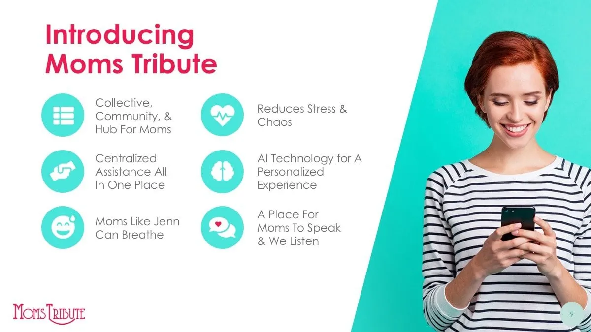
The turn comes on a single full-bleed slide: If only she had an easy way to manage it all. The same icons scatter across the turquoise background on dotted lines, a visual echo of the title slide. By the time Moms Tribute is introduced, the audience already knows who it is for and why she needs it.


03 — Evidence
Market data that reads at a glance
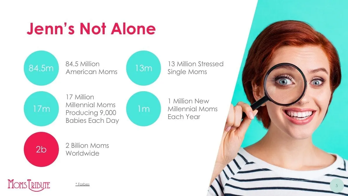
Once the story has done its work, investors want proof. The Jenn's Not Alone slide turns the client's market research into five numbered circles, each with a short label beside it, and the cited sources stay on the slide. A single pink circle is reserved for the largest figure so the eye knows where to land first.
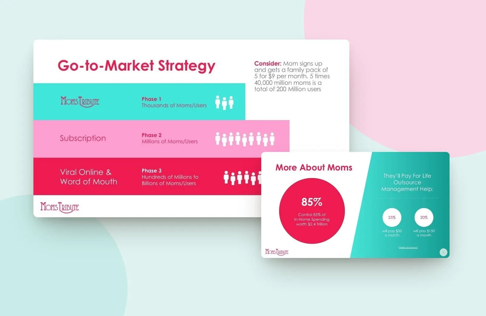
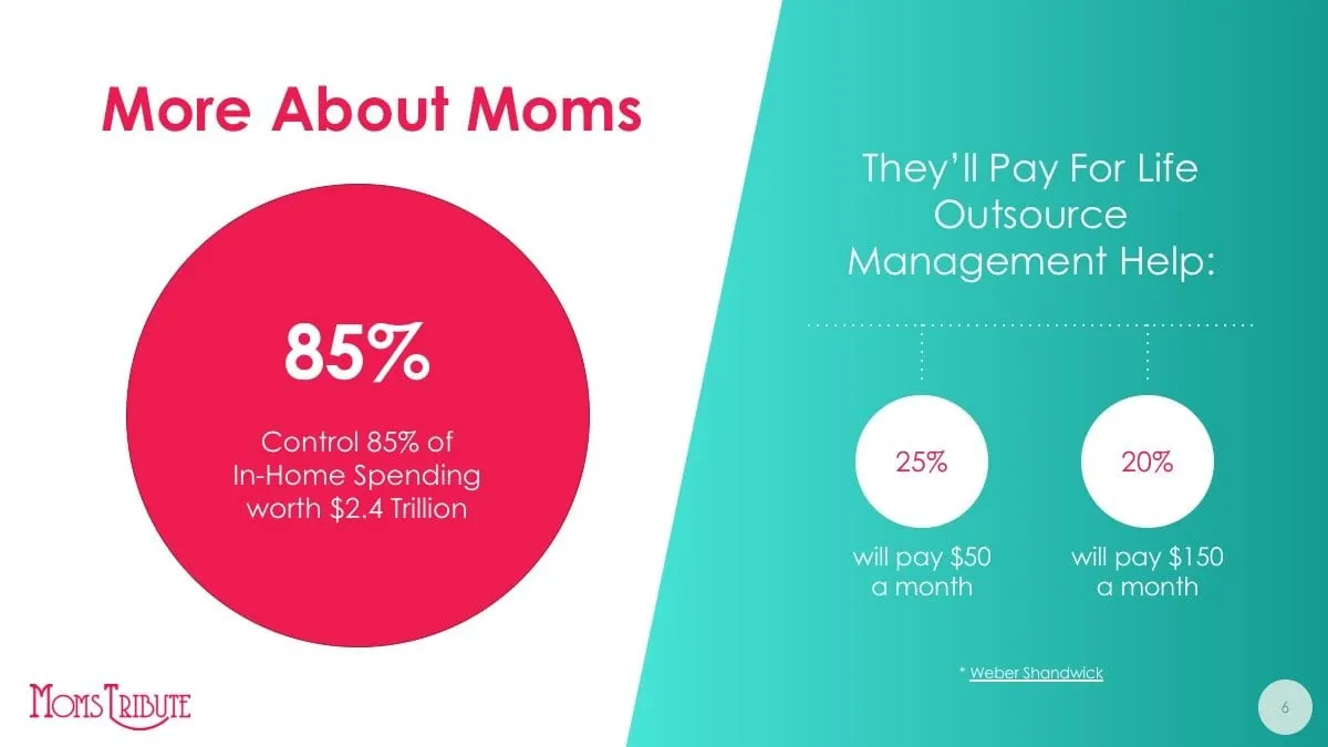
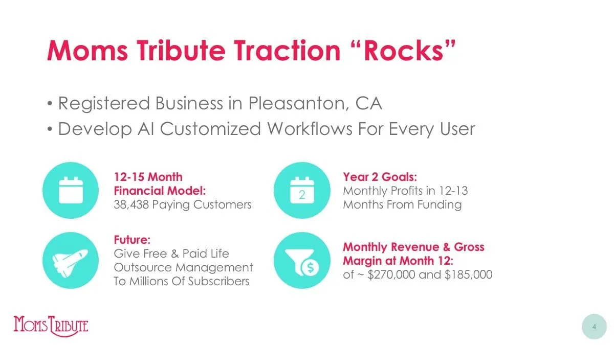
More About Moms follows the same logic with one oversized statistic on the left and a simple branching diagram on the right for what moms say they would pay for help. On the traction slide, the business details sit beside four icon callouts: the financial model, year two goals, monthly revenue targets and the long-term vision. All figures are the client's own; our job was to make them legible from the back of a meeting room.
This kind of work sits close to our infographics practice. Every chart had to survive being shown on a projector, printed as a leave-behind or flipped through on a laptop after the meeting.
04 — Craft
A bold palette built for a start-up brand
Moms Tribute arrived with a decorative, art deco style wordmark in raspberry pink. We built the deck around it with a confident turquoise as the main field colour, the raspberry for headlines and emphasis, and a softer pink as a supporting tone. Headlines are set in a bold geometric sans serif, with lighter weights for body copy, so slides stay friendly without losing structure.
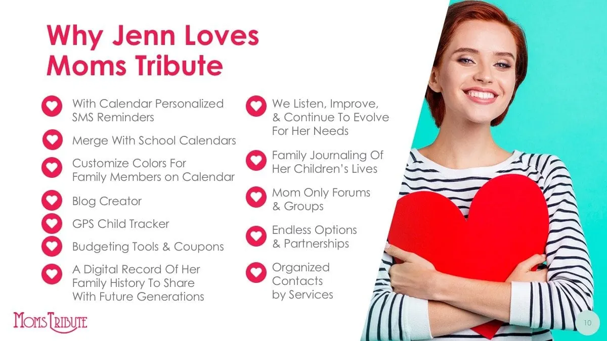
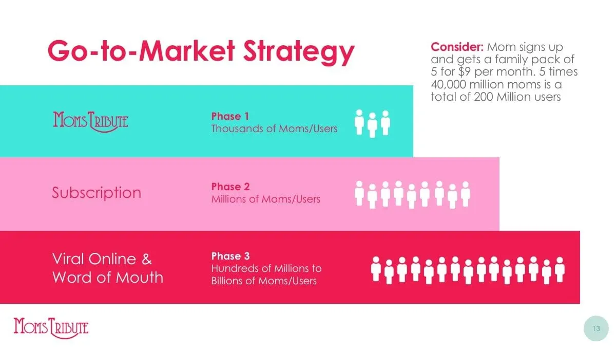
Photography of the same woman in a striped top runs through the deck, which turns stock imagery into a recurring character. White circular icons, dotted connector lines and diagonal photo crops repeat from slide to slide, giving the founders a consistent system they can extend as the business grows. The go-to-market slide stacks three coloured phases from subscription to word of mouth, a simple way to show scale without a dense chart. A small page number and the logo sit in the same corners on every slide, so the founders always know where they are when they skip ahead to answer a question.
Founders building an emerging brand often face this same mix of story and numbers. For a similar approach in a very different market, see our AgFuse pitch deck, and read how storytelling through design moves people to act.
What we delivered
A complete investor pitch deck for Moms Tribute, ready for live meetings and follow-up.