Case study · AgFuse
AgFuse
An investor pitch deck for AgFuse, a social and information network for agriculture professionals, pairing the brand's leaf mark with clear, field-fresh data slides.
01 — Context
Pitch deck design for an agtech start-up
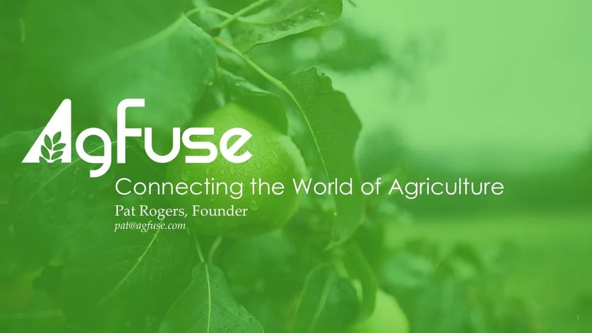
AgFuse describes itself as the first digital information and social network that connects professionals in agriculture. Members get tools, news, educational content and networking through a website and iOS and Android apps, all aimed at farmers who are often geographically isolated from the industry around them.
The founder was preparing for investor meetings and asked us for pitch deck design that brought three things together: the AgFuse logo, the company's data and an unmistakably agricultural feel. We designed the deck end to end as a piece of presentation design, from the title slide to the milestones timeline.
The audience was technology investors, not farmers. The deck had to make a rural, practical problem feel urgent and investable to people who may never have spent a day on a farm, without losing the warmth that makes AgFuse feel like a community. It also had to work in two modes: projected in a meeting room with the founder talking over it, and read alone afterwards by an investor deciding whether to take a second call. That meant every slide needed a headline that could stand on its own.
02 — Narrative
From isolated farms to a connected network
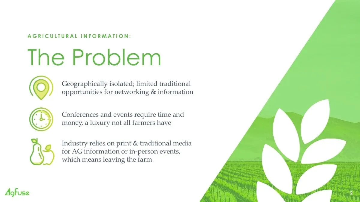
The deck follows the classic investor arc, and each step got its own visual treatment. The Problem slide uses three simple line icons, a location pin, a clock and a piece of fruit, to explain why farmers miss out: they are geographically isolated, conferences cost time and money, and the industry still relies on print and in-person events that mean leaving the farm.
The Solution slide answers with a large cut-out leaf that fills the left side of the frame, the AgFuse name picked out in green and four feature icons for tools, news, educational content and networking. It is the moment the deck shifts from grey reality to green opportunity.
Market Size then puts a single statistic in a translucent panel over a wheat field, with its source cited underneath. One number, one image, one idea per slide keeps the pace brisk and gives the founder space to talk.
03 — Proof
Making product, revenue and progress easy to follow
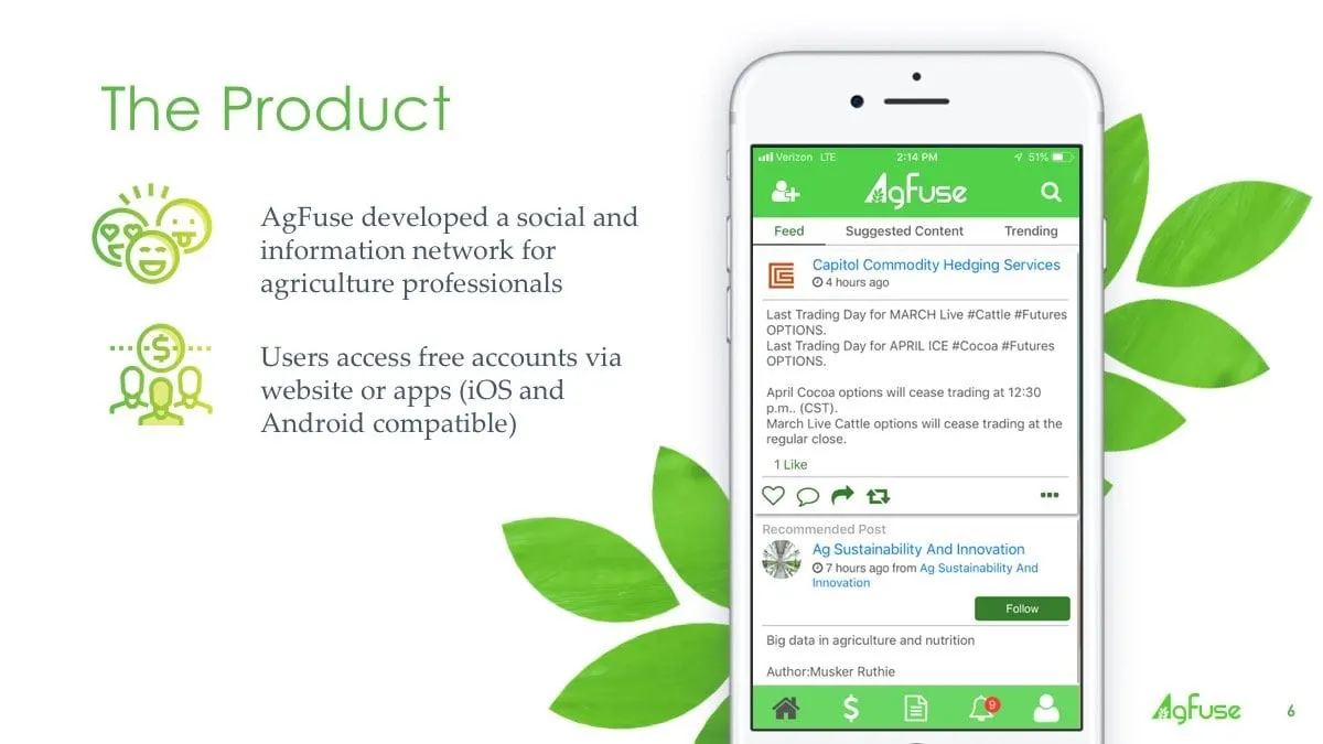
Investors want to see the product, and AgFuse had a real one. Rather than describe it, we placed the live app feed on a phone mock-up, with posts from commodity hedging services and agricultural sustainability groups visible on screen. Beside it, two short points explain who it is for and how members get access.
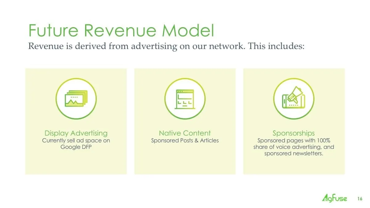
The Other Tools slide shows why farmers would open the app every day: commodity market quotes, news and local weather updates, linked by a bracket to a single line about driving daily use. The Future Revenue Model breaks advertising into three equal pale green cards, display advertising, native content and sponsorships, so the business model reads in seconds.
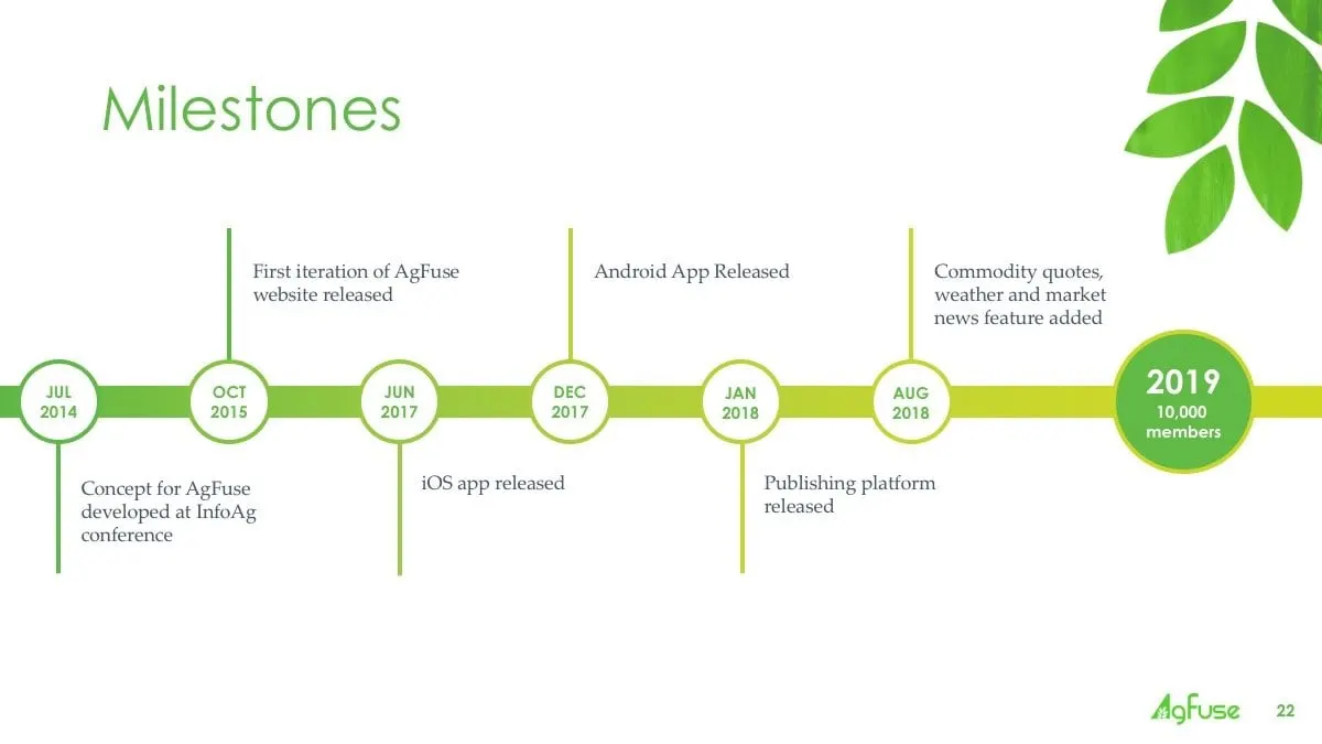
The Milestones slide turned the company's history into a horizontal timeline, from the concept developed at the InfoAg conference through the website, iOS app, Android app and publishing platform launches. A larger green circle at the end marks where the company stood when the deck was made. Turning dates and figures into diagrams like these is close to our infographics work, and it lets a founder answer the question of traction with one look.
04 — Craft
A palette grown from the logo
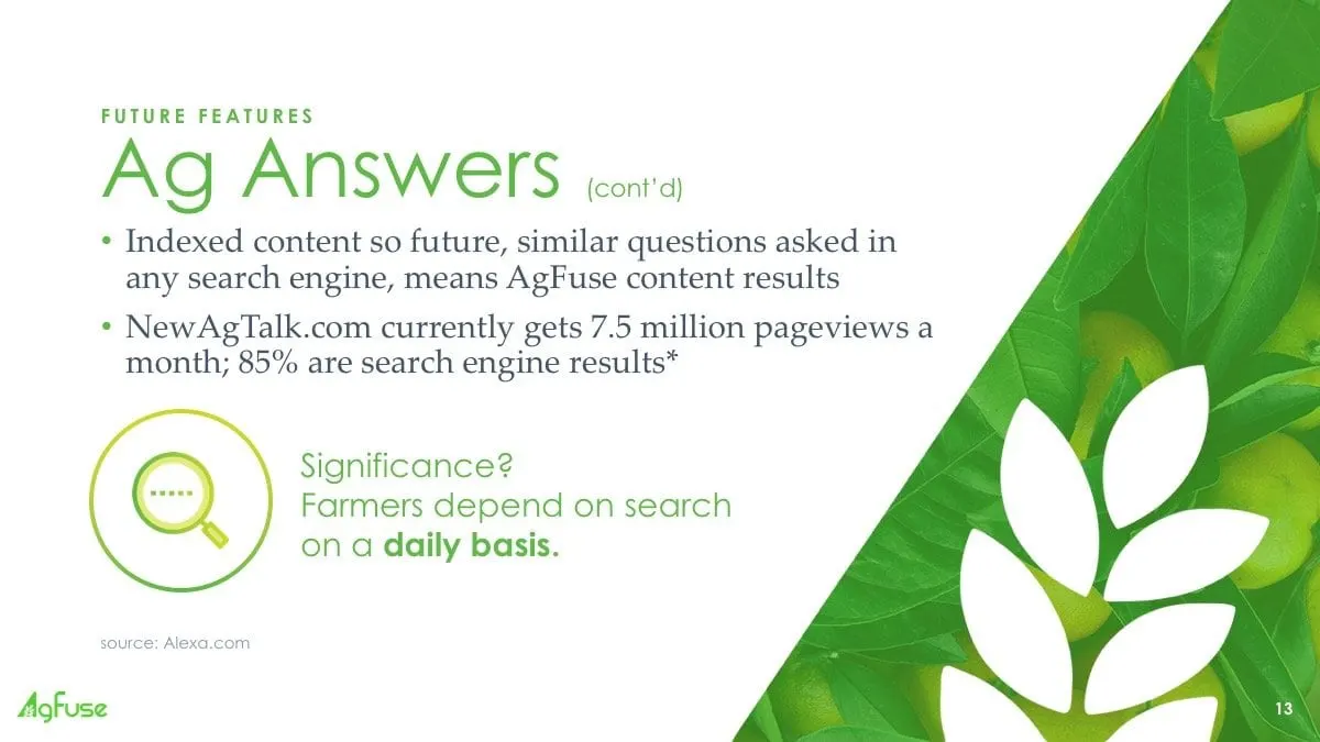
The AgFuse logo carries a small sheaf of leaves inside the letter A, so we let that idea lead. Fresh leaf greens and soft lime tints make up the palette, with charcoal for occasional emphasis. Large painted leaves and close-up photography of crops, fruit and fields frame the content slides, while the busiest data slides stay mostly white so numbers have room to breathe.
Headlines are set in a light geometric sans serif with letter-spaced green eyebrows such as Key Features and Future Features. Body copy switches to a classic serif, which gives the deck a slightly editorial, trustworthy tone. Every icon is drawn in the same green outline style, and the logo and page number sit in the same corner throughout.
The result is a deck that feels rooted in agriculture but reads like a technology company. For another founder story told through slides, see the Moms Tribute investor pitch deck, or the BioGas deck for a different take on an industry presentation. Start-ups looking for help with their own story can see how we work with emerging brands.
What we delivered
A complete investor pitch deck for AgFuse, built on the existing logo.