Case study · Oil of Olay
Oil of Olay
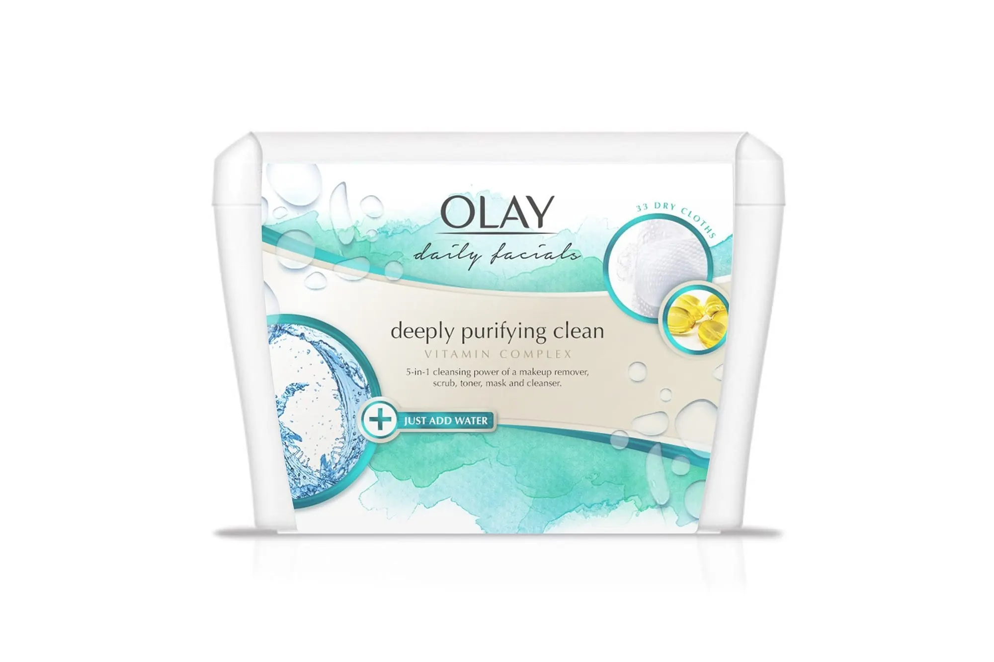
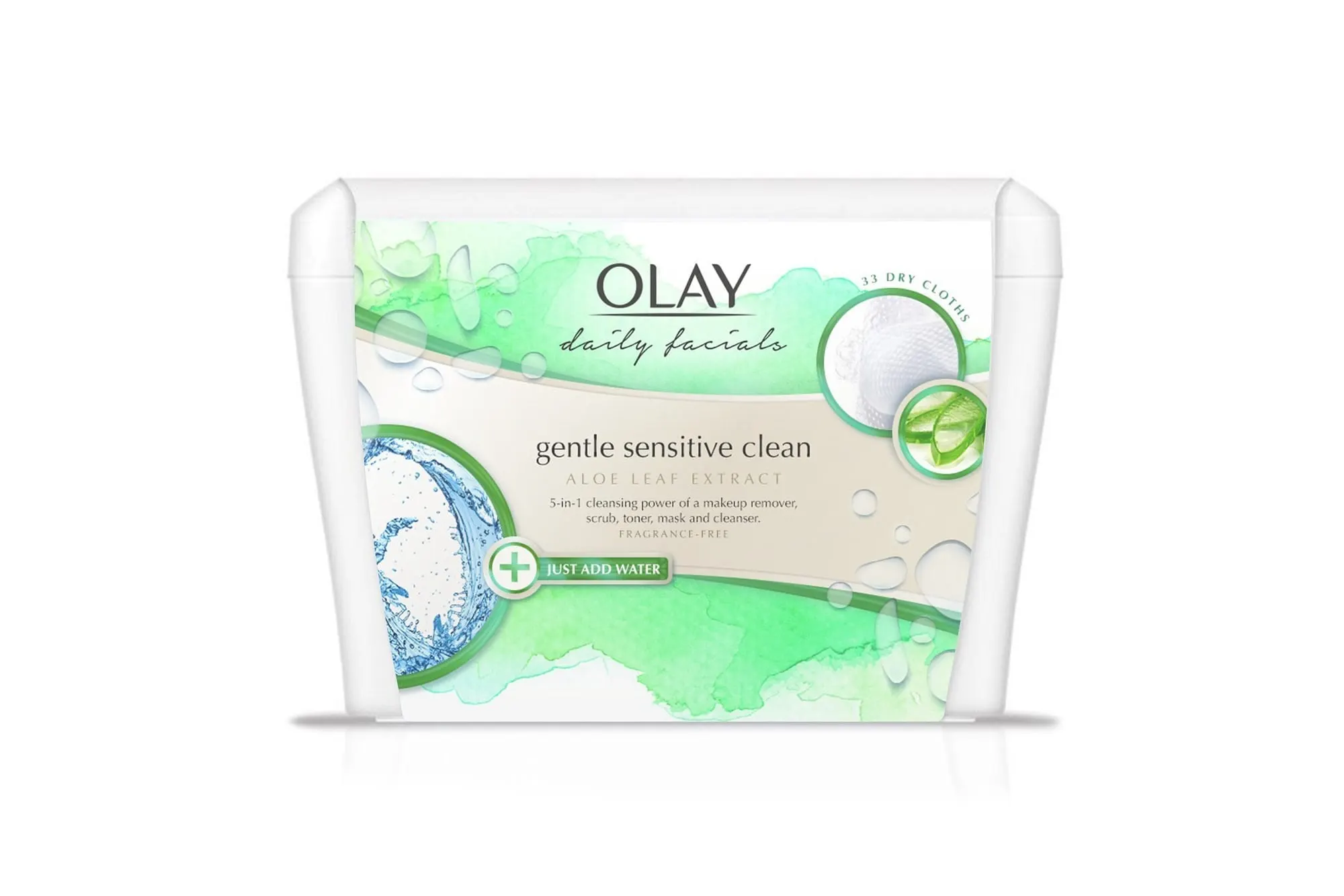
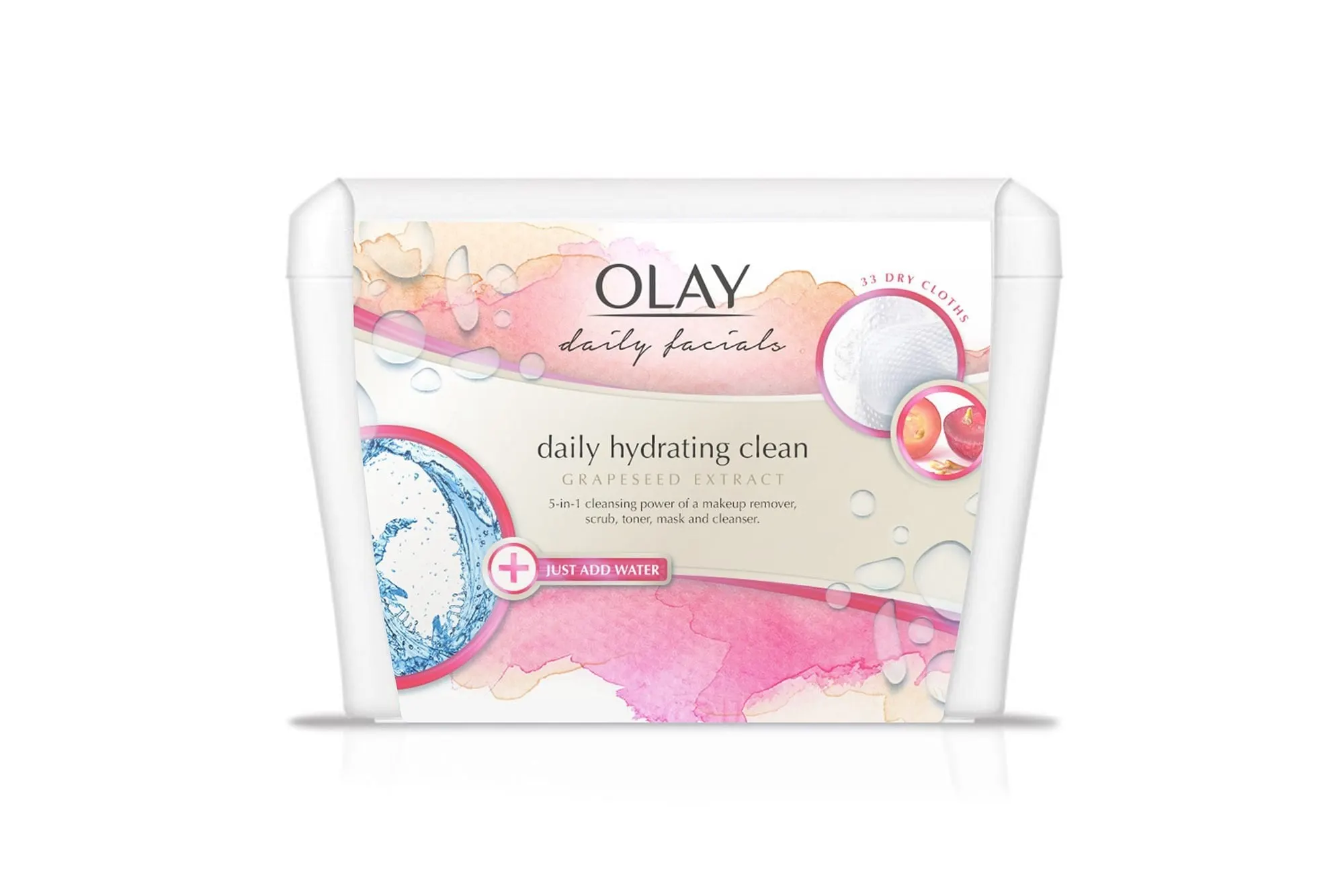
Packaging designs for three Olay Daily Facials dry-to-wet cleansing cloth variants, each with its own watercolour colourway and ingredient story.
01 — Context
Skincare packaging design for Olay Daily Facials
Olay Daily Facials are dry-to-wet cleansing cloths: they come dry in a tub and lather when you add water, combining the work of a makeup remover, scrub, toner, mask and cleanser. Olay was looking for a rejuvenated perspective on the packaging for this line, which includes formulas with aloe leaf extract, grapeseed extract and a sensitive skin option.
Our role was focused and specific: skincare packaging design for the front label of the Daily Facials tub, working within Olay's established brand. The OLAY wordmark and the "daily facials" script were given; our job was everything around them — how each variant looks, how it is told apart from its siblings on a shelf, and how quickly a shopper understands what the product does.
02 — The system
One layout, three colourways
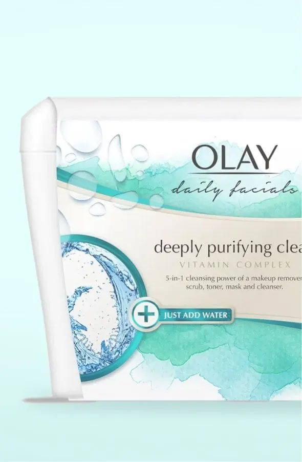
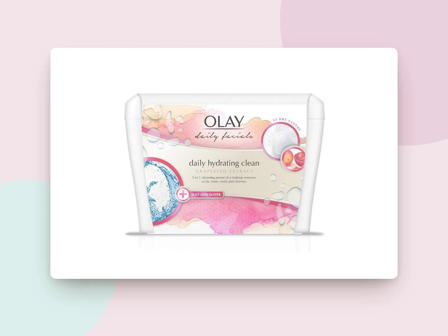
Cleansing cloths are often bought quickly, from a crowded shelf, by someone who already knows which version they want. That made colour the most important tool. We built one shared layout and gave each formula its own watercolour wash: soft green for gentle sensitive clean with aloe leaf extract, cool teal for deeply purifying clean with vitamin complex, and warm pink for daily hydrating clean with grapeseed extract.
Watercolour suits the product. It suggests water, softness and skin without looking clinical, and it lets each colour bleed into the white tub rather than sitting on it as a hard band. Scattered clear water droplets across the label reinforce the "add water" moment and add a little dimension.
Everything else stays fixed, so the family reads as one line: the brand block at top centre, a cream banner carrying the variant name, ingredient and benefit line, and the same placement for every badge and icon.
03 — The details
Explaining dry-to-wet at a glance
The format is the hardest thing to communicate: a shopper might not realize these cloths start dry. So the left side of every label holds a circular splash of water framed in the variant's colour, with a "Just Add Water" badge and a plus sign directly beneath it. It is the first thing the eye lands on after the brand.
On the right, a matching circle shows the textured cloth itself, curved text notes the 33 dry cloths inside, and a smaller inset circle shows the hero ingredient — an aloe leaf, vitamin capsules or grapes. Benefit copy is set in a light serif in the cream banner: "5-in-1 cleansing power of a makeup remover, scrub, toner, mask and cleanser," with "fragrance-free" added on the sensitive version.
The goal was a label that answers three questions in a few seconds: which Olay is this, what is it for, and how do I use it.
04 — The result
A refreshed, distinct product family
The finished designs give the Daily Facials line a refreshed presentation that sits comfortably within the Olay brand, while making each skin need easy to find. Because the layout is a system, the same print design structure can take on a new colourway and ingredient if the range grows.
Packaging is a specialty of ours — we were recognized as a top global packaging design company in 2024. For more, see the luxe-look packaging and style guide we created for Mistral and our brand and packaging work for Esme + Sita.
What we delivered
Packaging designs for the Olay Daily Facials tub.