Case study · Marcel Digital
Marcel Digital
A rebrand and a results-led website for Marcel Digital, a Chicago B2B digital marketing and web development agency founded in 2003.
01 — Context
Twenty years in, ready for what's next
Marcel Digital is a Chicago B2B digital marketing and web development agency, founded in 2003. Its teams cover SEO, paid media, web development, analytics, content and conversion rate optimization, and they work as one integrated group rather than a row of silos.
After two decades of growth, the brand still looked like the agency Marcel used to be. Marcel asked us to rethink the identity from the ground up and then rebuild the website around the work it's proudest of. We took the identity through four rounds of concepts in spring 2025, then carried the chosen direction into a new site.
02 — The mark
A legacy, rewired
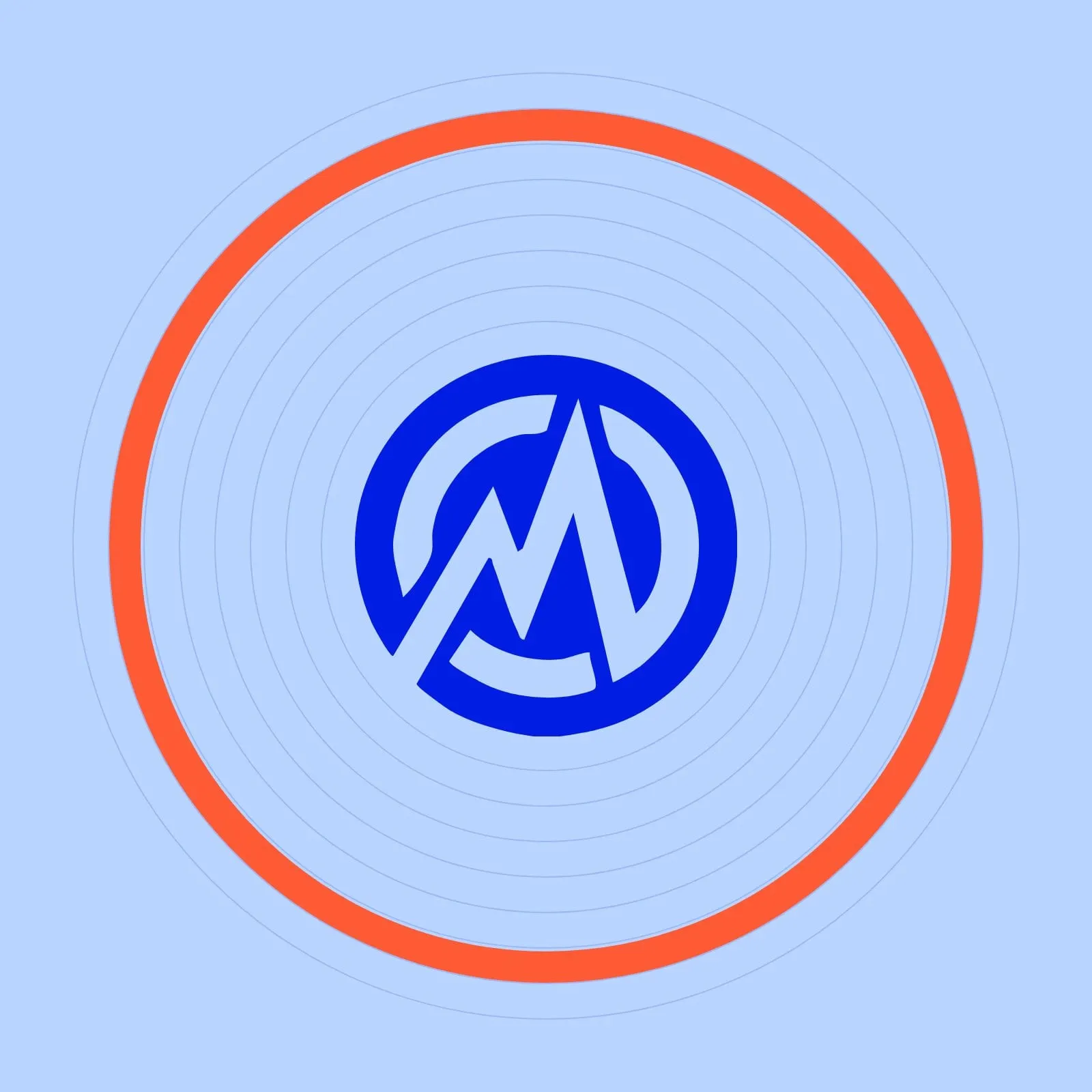
Marcel already had a shield-style icon with real equity, so the strongest move was to evolve it instead of starting over. We redrew the mark with cleaner lines and a sharper M that rises like a growth chart inside an open circle, bold enough to work as a social avatar or favicon on its own.
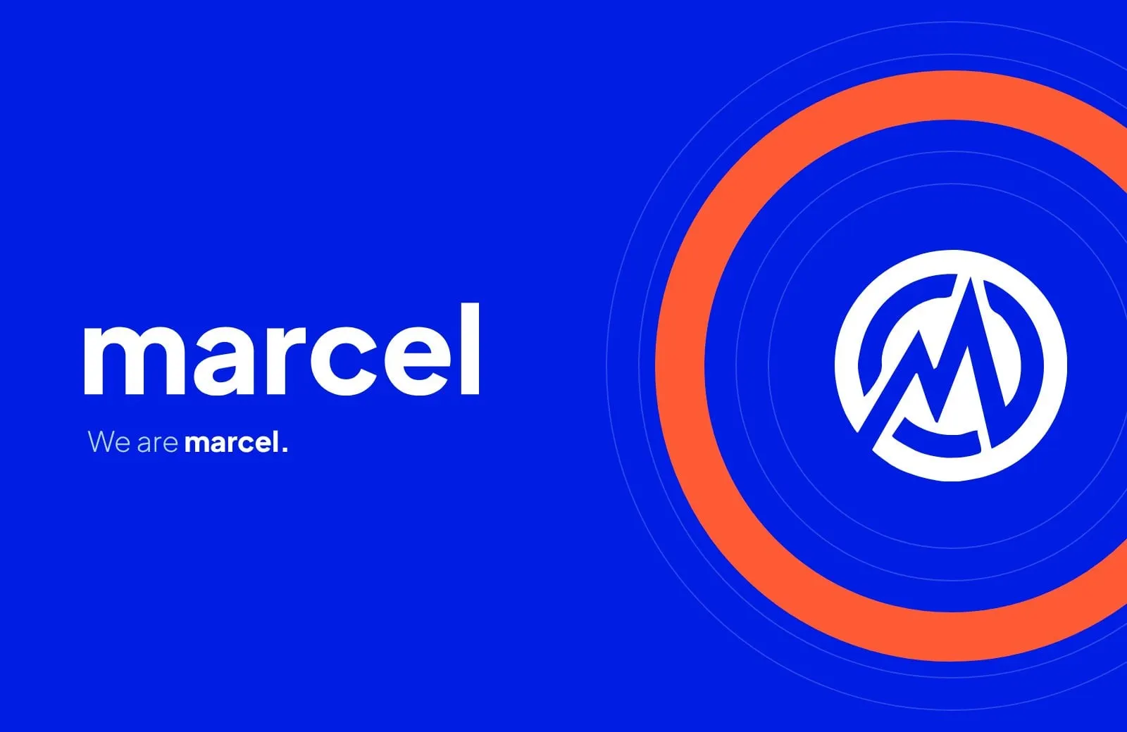
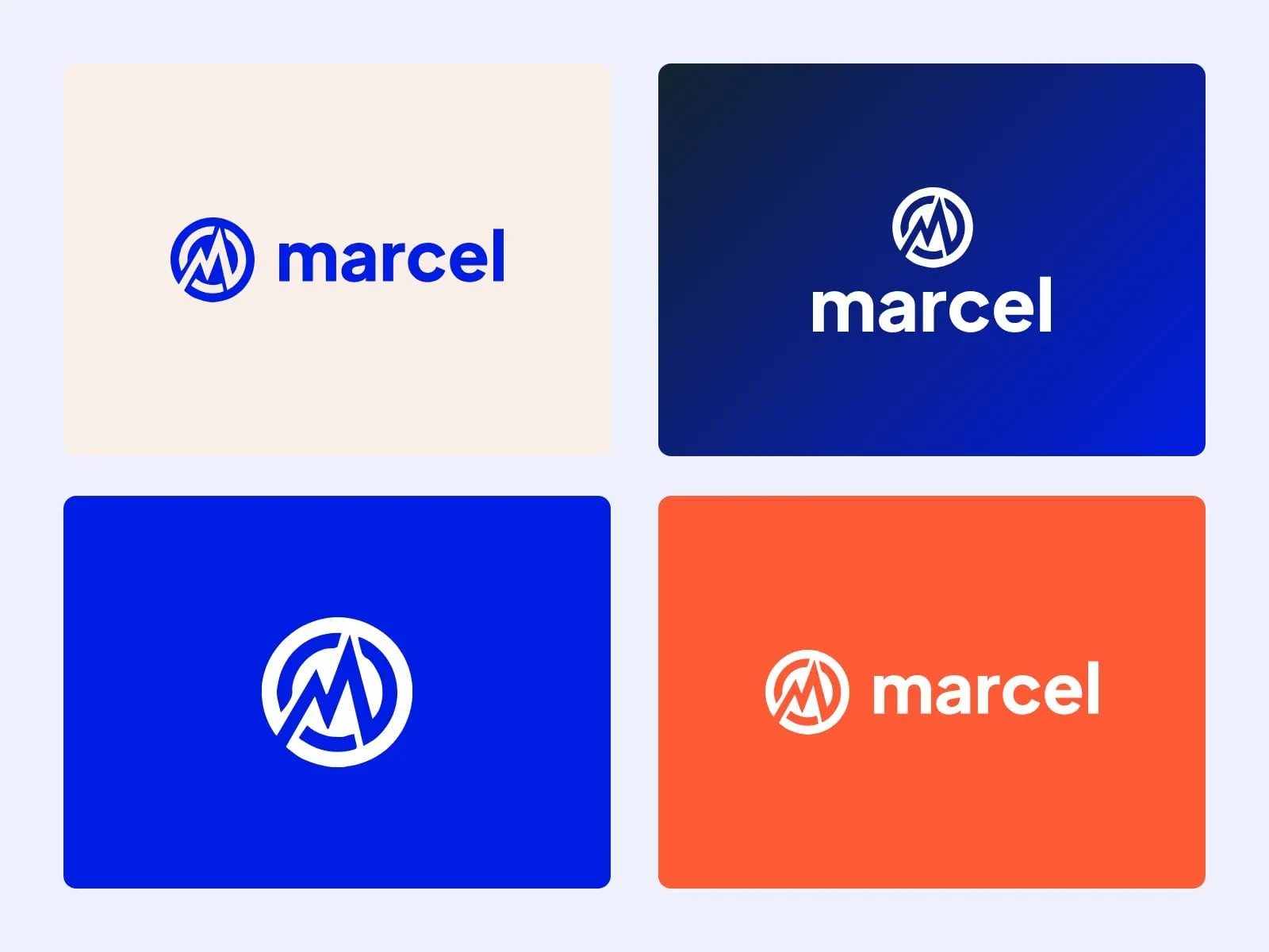
Paired with a confident, rounded sans, the system flexes: the full marcel digital lockup when clarity matters, or simply marcel, which lets the brand speak with the confidence of a name people already know. Around it sits the line that sums up the agency: We are Marcel. The period is deliberate. Marcel is the full sentence.
03 — Colour and type
Blue with a spark in it
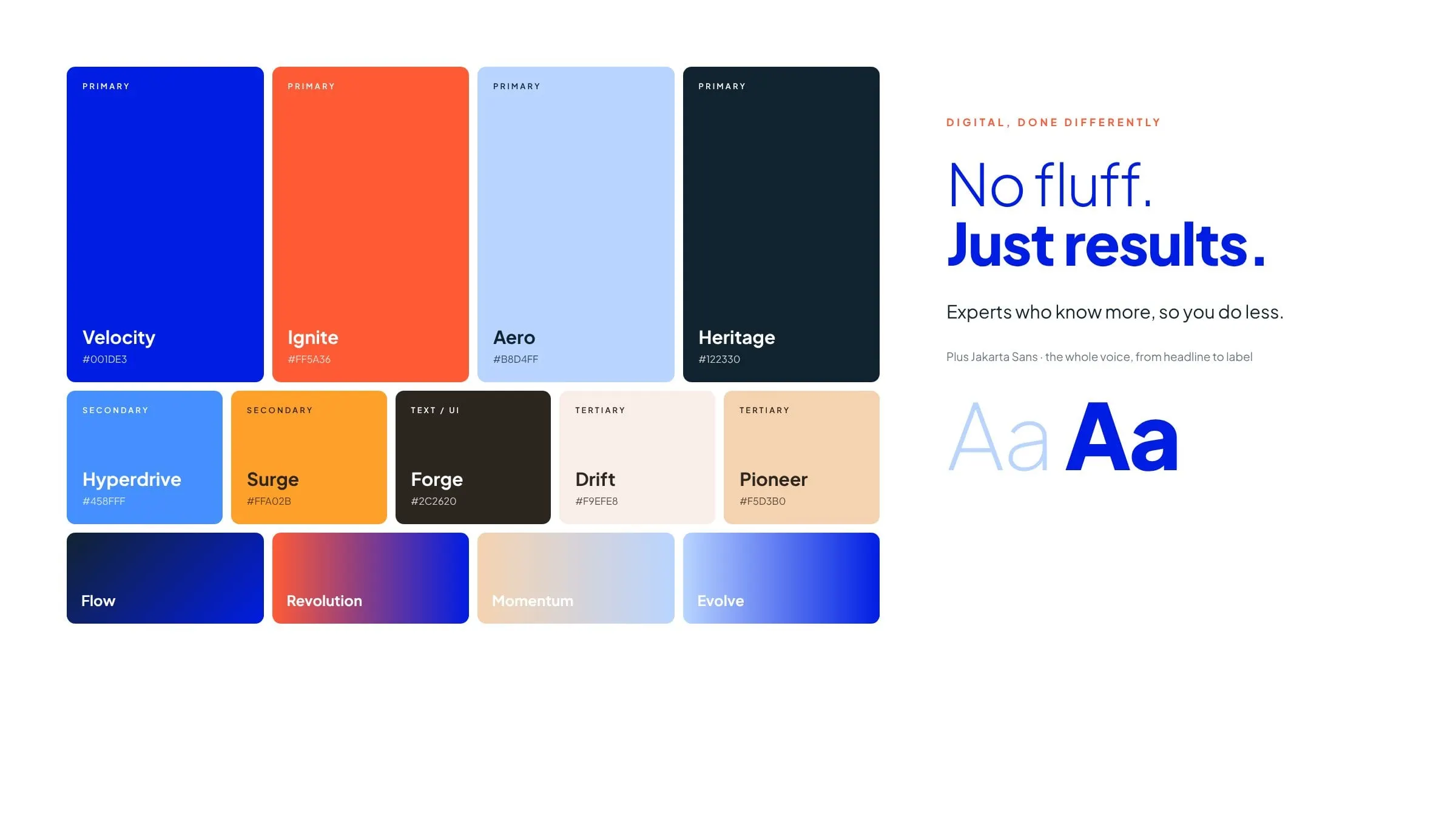
Velocity, an electric blue, carries the brand and gives Marcel instant presence in a crowded, saturated digital space. Ignite, a blood-orange, is the spark: buttons, highlights and the orange ring that frames photography across the site. Heritage, a near-black navy, grounds everything, while Aero, Drift and Pioneer bring lighter, warmer moments.
Gradients like Flow and Revolution add movement without clutter. For type we chose a single family, Plus Jakarta Sans, which is precise enough for dashboards and case-study data but has rounded, human details. Light and extra-bold weights side by side give Marcel its voice: No fluff. Just results.
04 — In the world
Candid, direct and unmistakably Marcel
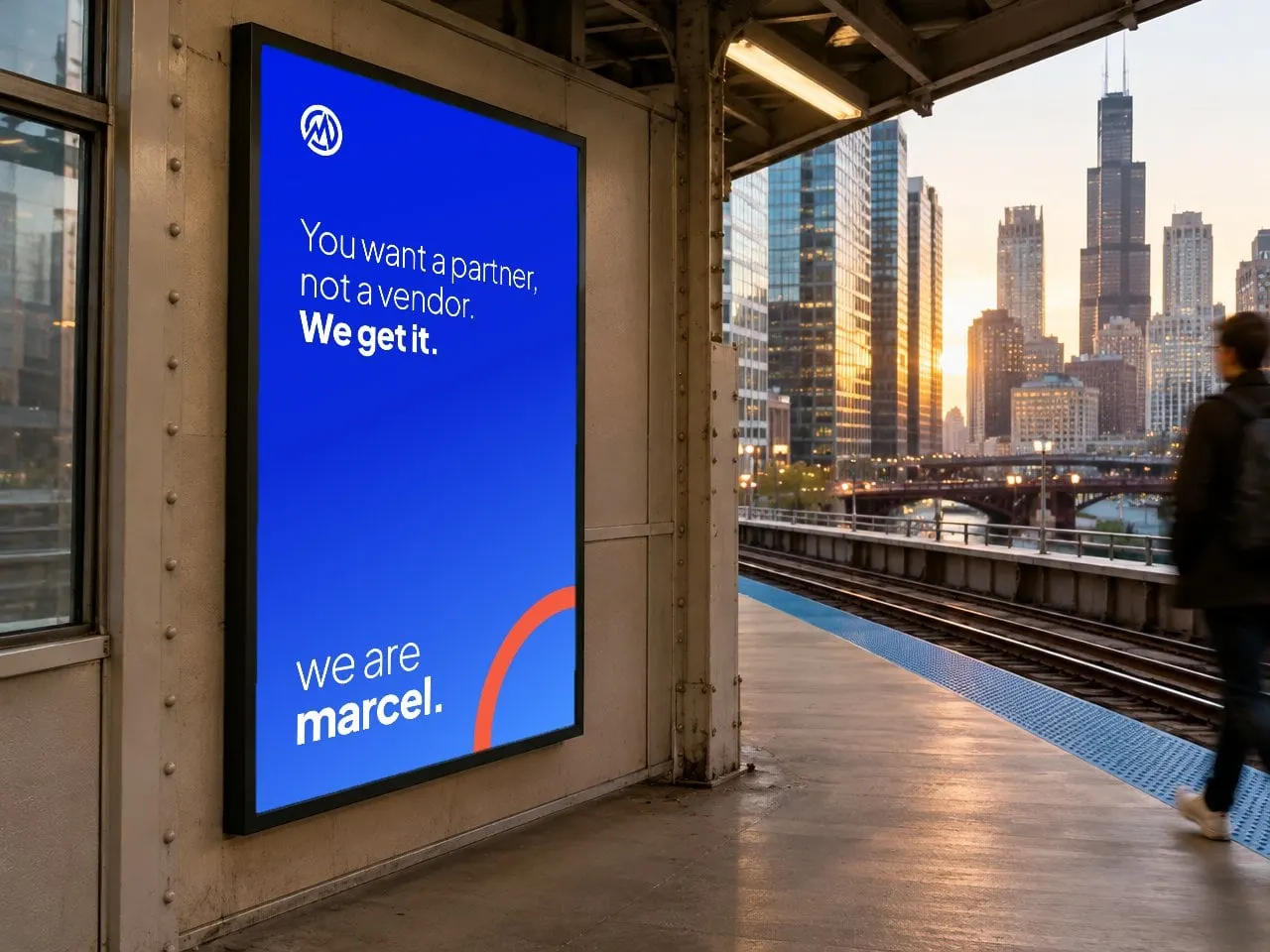
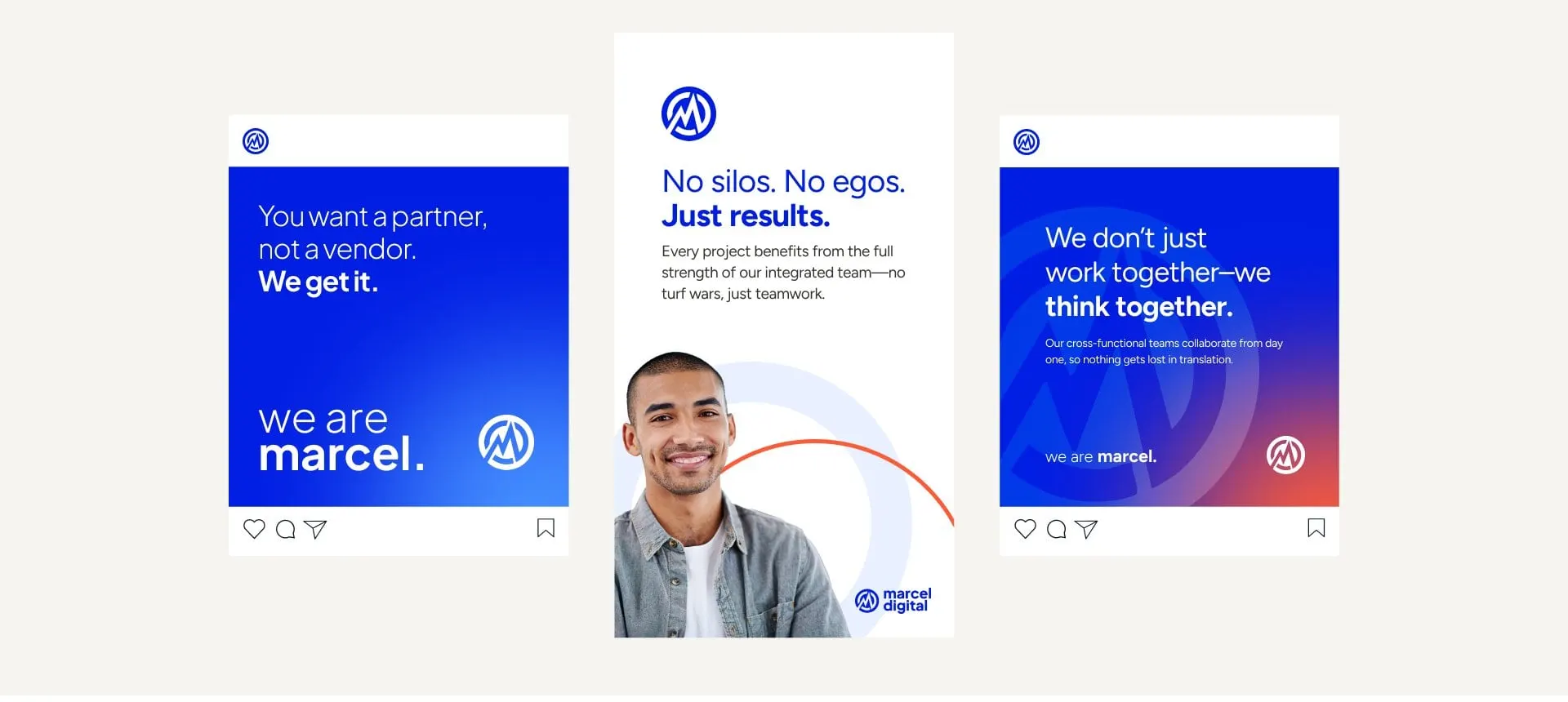
We put the identity to work on a social system built around Marcel's straight-talk messaging: You want a partner, not a vendor. We get it. Each post signs off with the same line, and the icon and orange ring do the rest.
The same language scales up to out-of-home and down to a favicon without losing its character. It's a good example of why a cohesive brand matters: every touchpoint sounds like the same confident team.
05 — The website
A site that leads with results
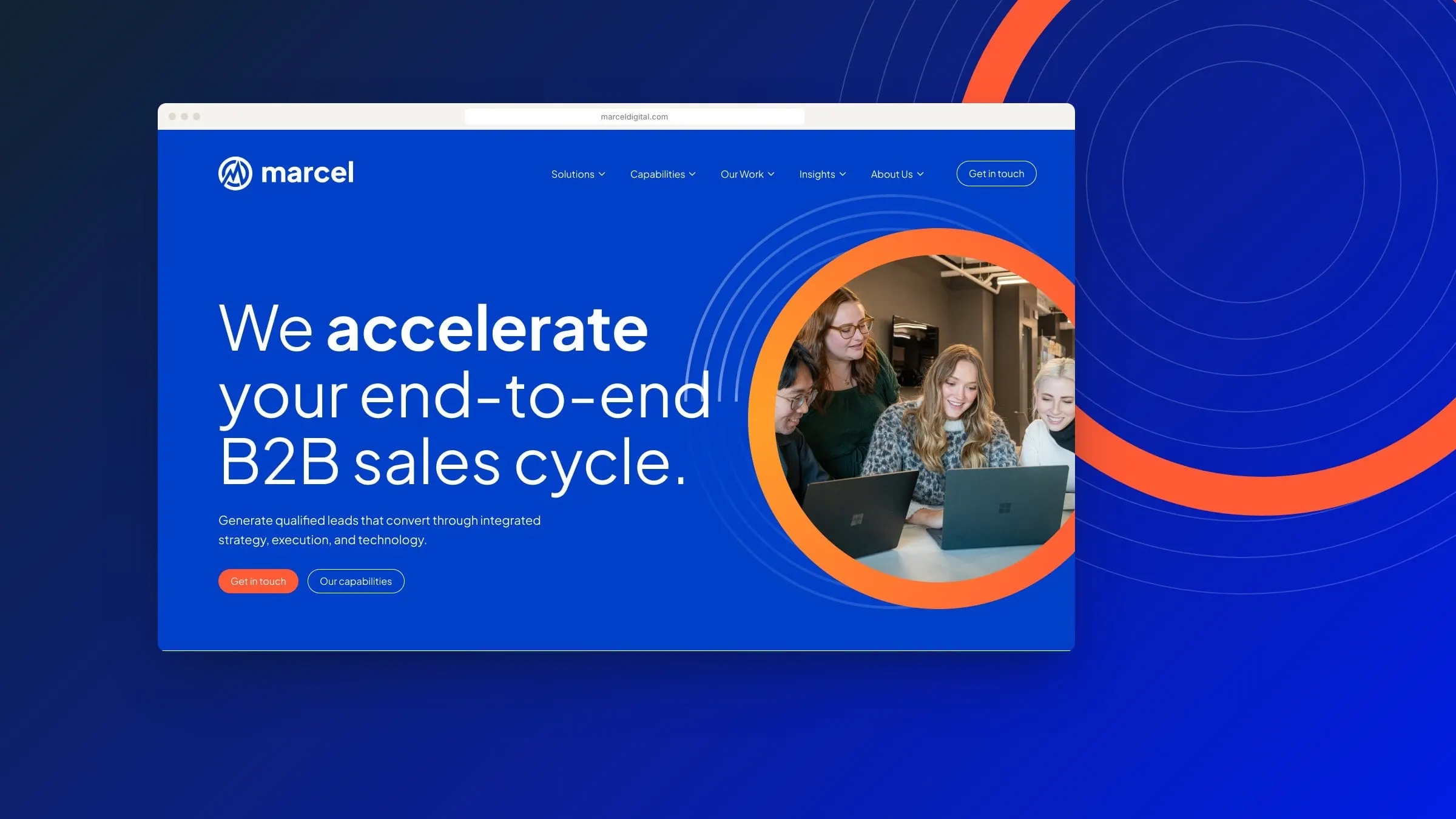
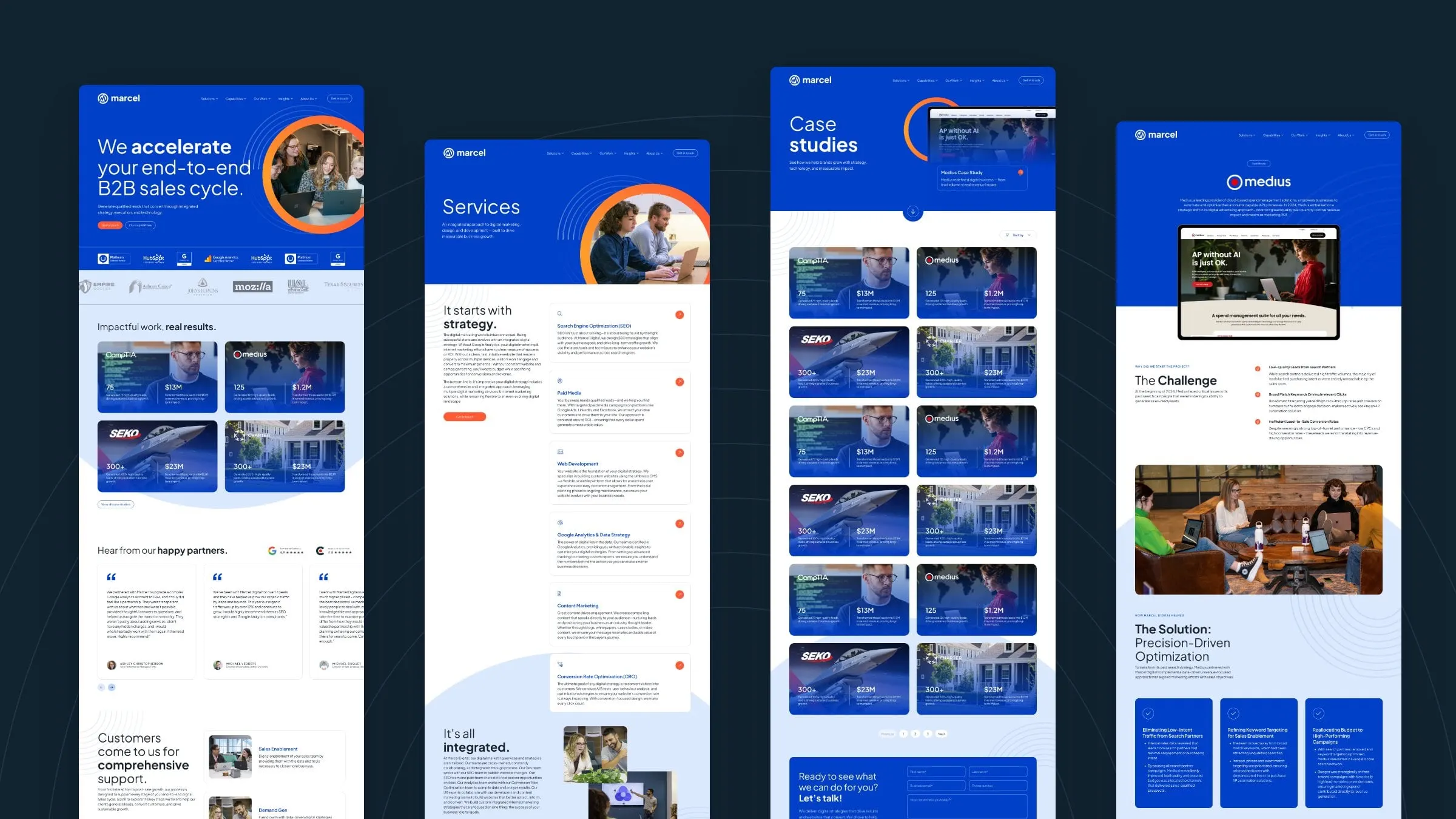
For a B2B agency, the work is the pitch. The homepage opens with a clear promise (We accelerate your end-to-end B2B sales cycle) and moves straight into impact cards that pair client logos with hard numbers. Partner badges, testimonials, a full-funnel services story, insights and Marcel's community work follow, ending with a simple contact form.
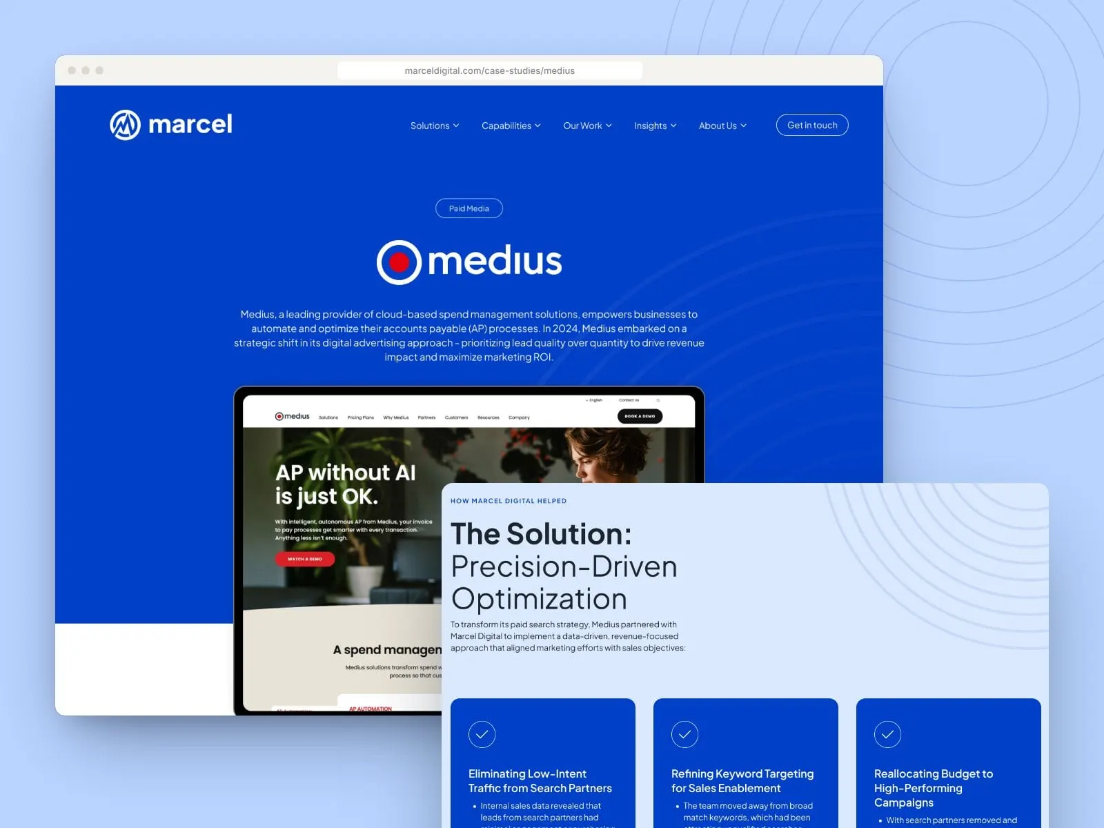
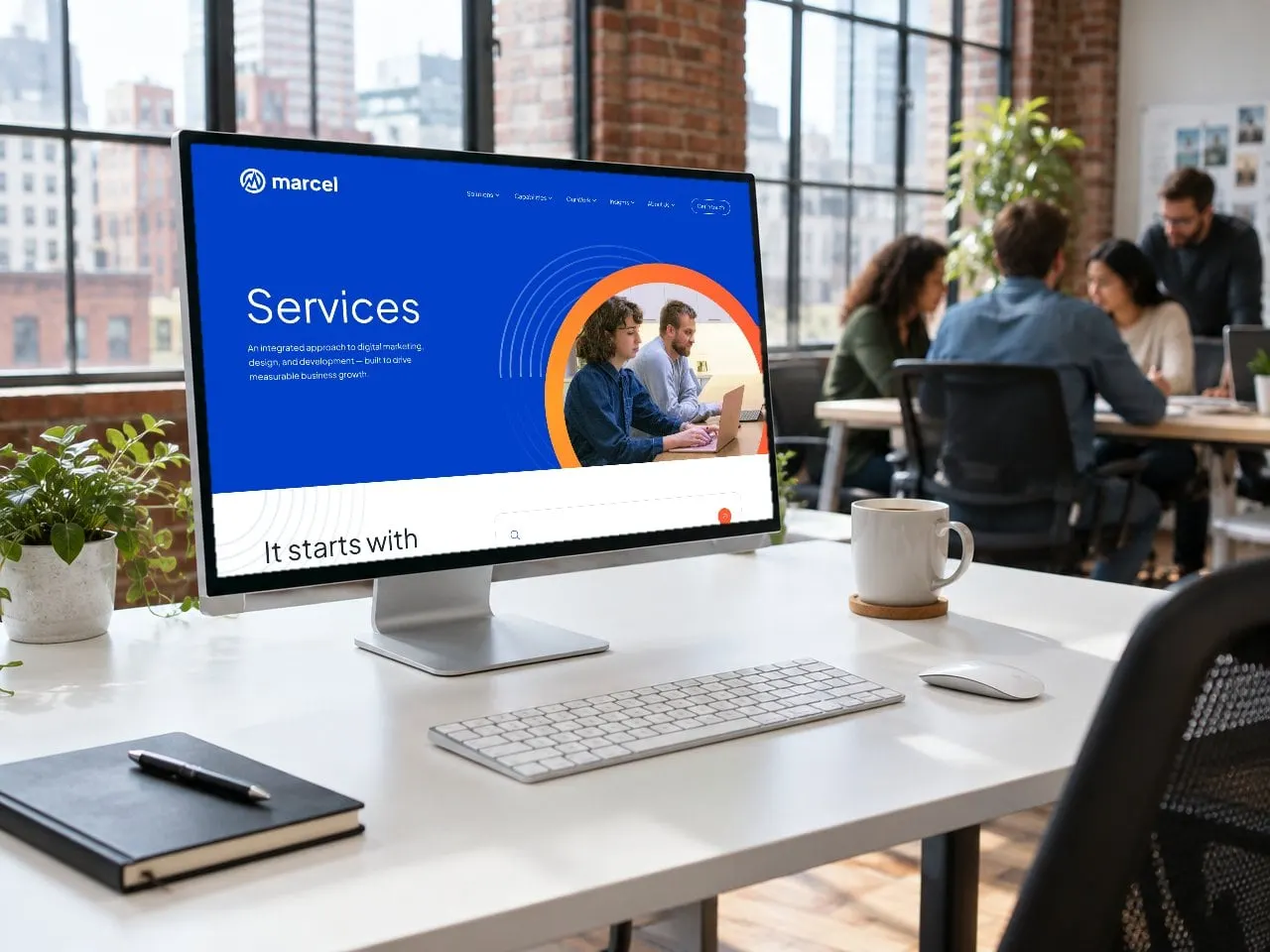
Behind it we designed the Services page and a single-service template, a filterable case study archive, and a case study template with a library of modules (challenge, solution, results and conclusion) so the team can build rich stories without starting from scratch. It's UX design that turns proof into a page structure.

06 — Case studies
A template built for proof
Each case study follows the same story arc a sales team would tell in a meeting: who the client is, the challenge, the solution and the results. Big headlines mix light and bold weights, solution steps sit in bold blue cards, and the results land as plain, scannable outcomes.
The module library means Marcel can publish new stories quickly and keep them consistent, which matters when storytelling is what turns scrolls into sales.
07 — The result
We are Marcel.
Marcel now has an identity that honours its history and finally sounds like the agency it is today: candid, energetic and confident about results. The website puts that work front and centre, with templates the team can grow into.
For more on how a brand and a site support each other, read why branding and web design should happen together, or see another agency rebrand in our True Interactive case study. More professional services work is here.
What we delivered
- 01Brand identityFour rounds of concepts, then a refined icon, lockups and the We are Marcel. line.
- 02Brand sheetLogo, colour and type rules on a single page.
- 03Colour and type systemVelocity, Ignite, supporting colours, four gradients and Plus Jakarta Sans.
- 04Social templatesFeed and story posts built on Marcel's voice.
- 05Website designHomepage, services, service template, case study archive and single.
- 06Case study module libraryReusable challenge, solution, results and conclusion modules.