Case study · Lateral Kindness
Lateral Kindness
Brand identity and an e-learning and e-commerce website for Lateral Kindness, an Indigenous-led workshop that helps communities and organizations respond to lateral violence with traditional values.
01 — Context
Traditional values, put into practice
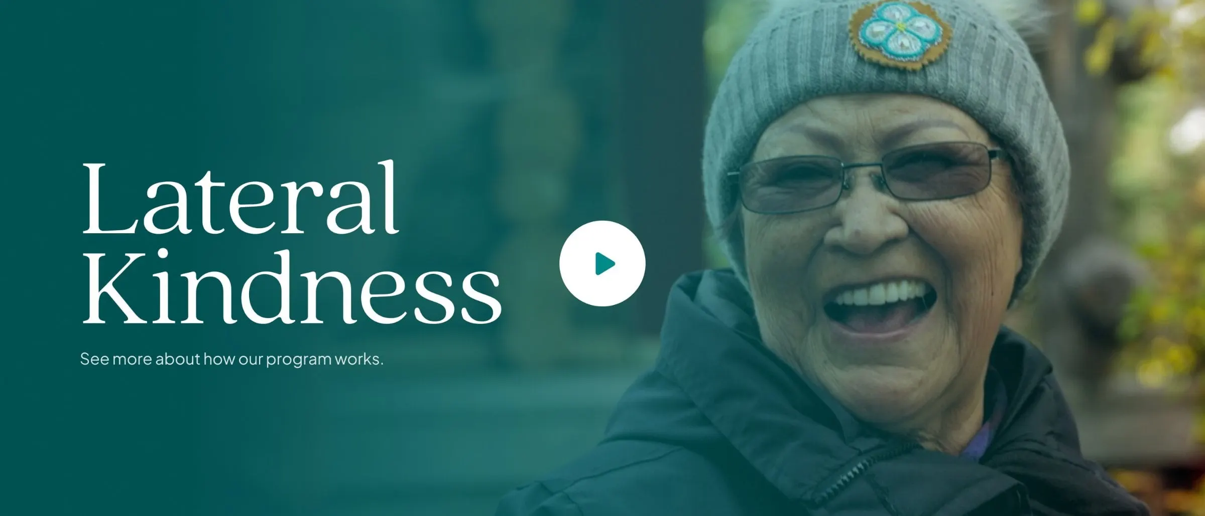
Lateral violence is one of the biggest barriers to healing and unity in Indigenous communities: the gossip, exclusion and harsh words that people direct at those closest to them. Lateral Kindness is a workshop that gives people the skills to respond differently, grounded in traditional values of respect, love and responsibility.
It began in 2013, when co-founders Marilyn Yadułtin Jensen and Thomas Shepherd were asked by the Kwanlin Dün First Nation in Yukon to run a lateral violence workshop. It has since been delivered for First Nations, governments and non-profit organizations from Yukon and British Columbia to Ontario, Newfoundland and Alaska. As it grew into a full program with courses and a shop, Lateral Kindness asked us to build the brand around it and a website to carry it.
02 — Identity
Playful, yet structured
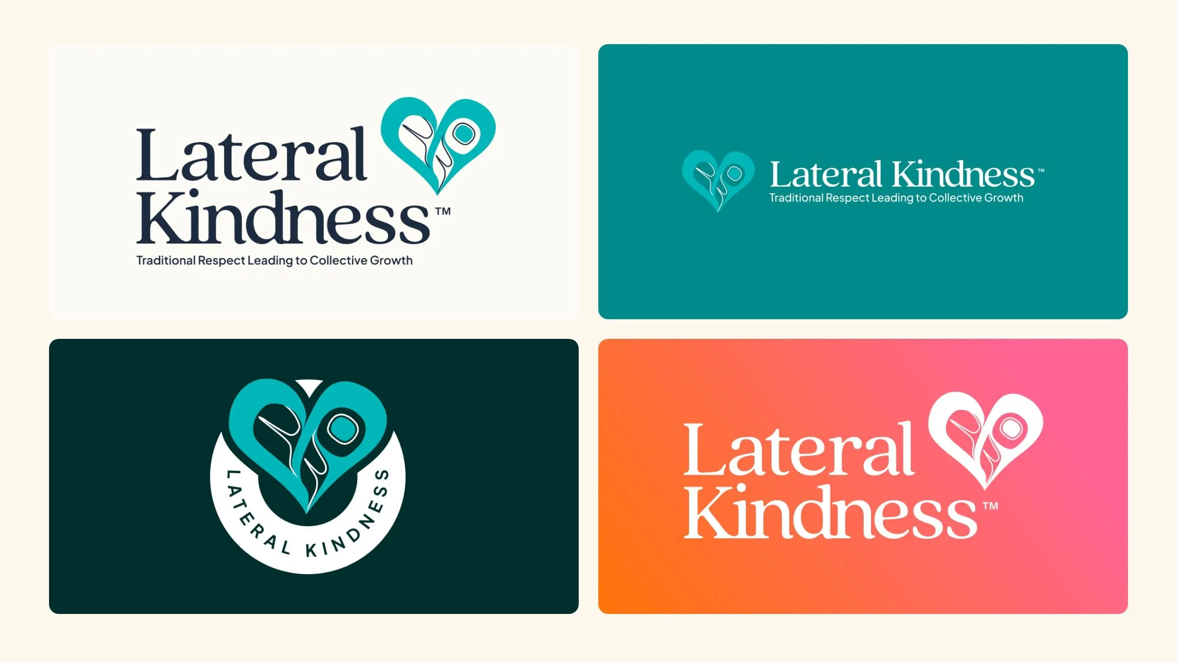
At the heart of the brand is a formline heart created by Tlingit artists: first by Blake Lepine, then updated by Guna Jensen in 2024. Our job was to give that mark a home. We paired it with a slightly rounded, friendly serif that feels trustworthy without being formal, and built a family of lockups: stacked, horizontal with the tagline, and a circular badge for social and merchandise.
We developed the identity over two rounds of concepts, so the founders could react, refine and land on something that felt like theirs. It's the kind of brand identity work where listening matters more than drawing.
03 — Colour
Welcoming, vibrant and a ray of sunlight
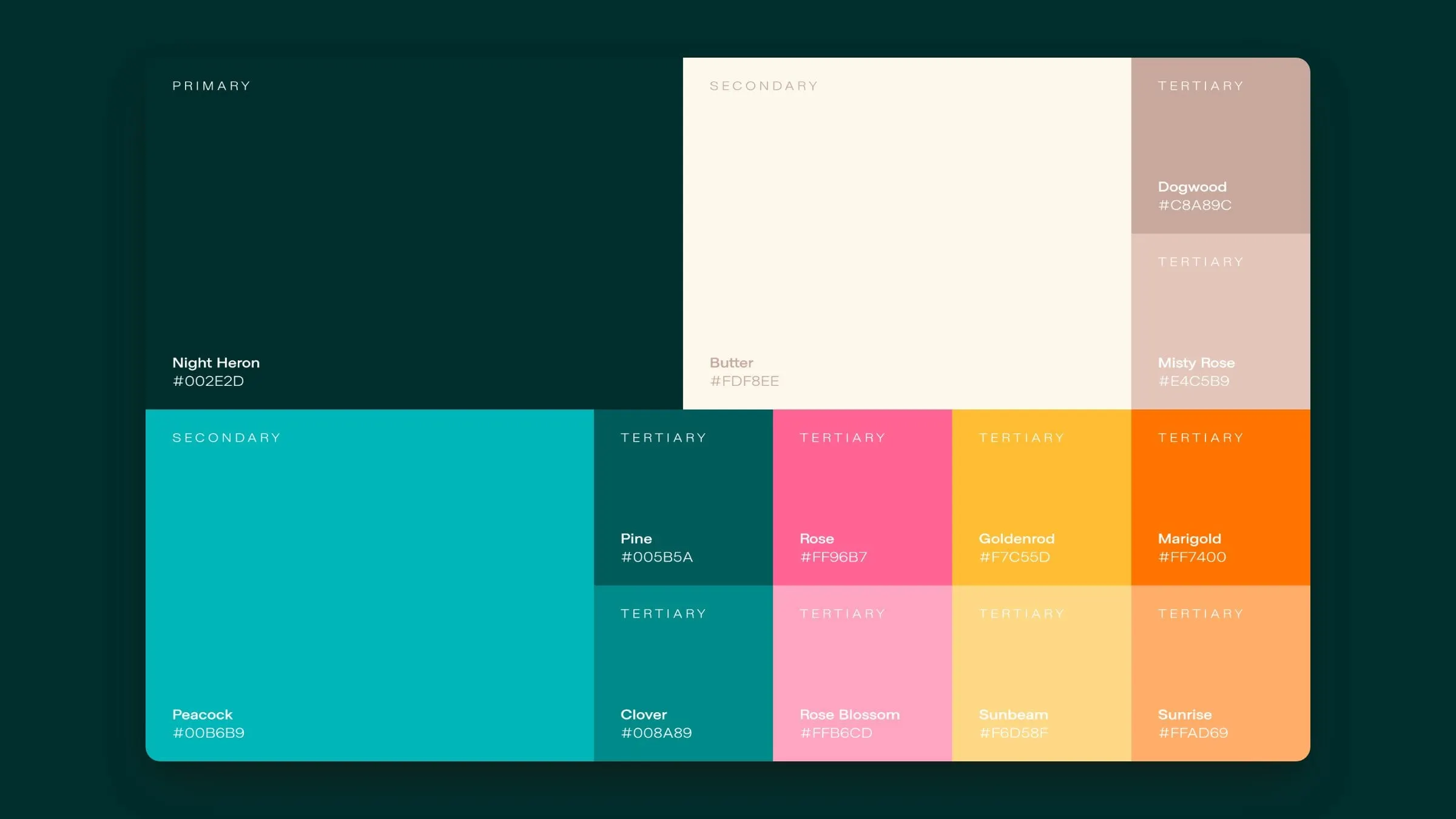
Rather than the safe blues of most training providers, the palette leans into jewel tones: Night Heron, a deep green, and Peacock teal as the core, softened by warm neutrals like Butter, Dogwood and Misty Rose. Accents of Rose, Goldenrod and Marigold bring the warmth, and on the website they blend into a sunrise gradient that runs through headlines and section dividers.
The result is a brand that feels hopeful and grounded at the same time, which is exactly the shift the workshop asks of its participants.
04 — The courses
Four levels, one path
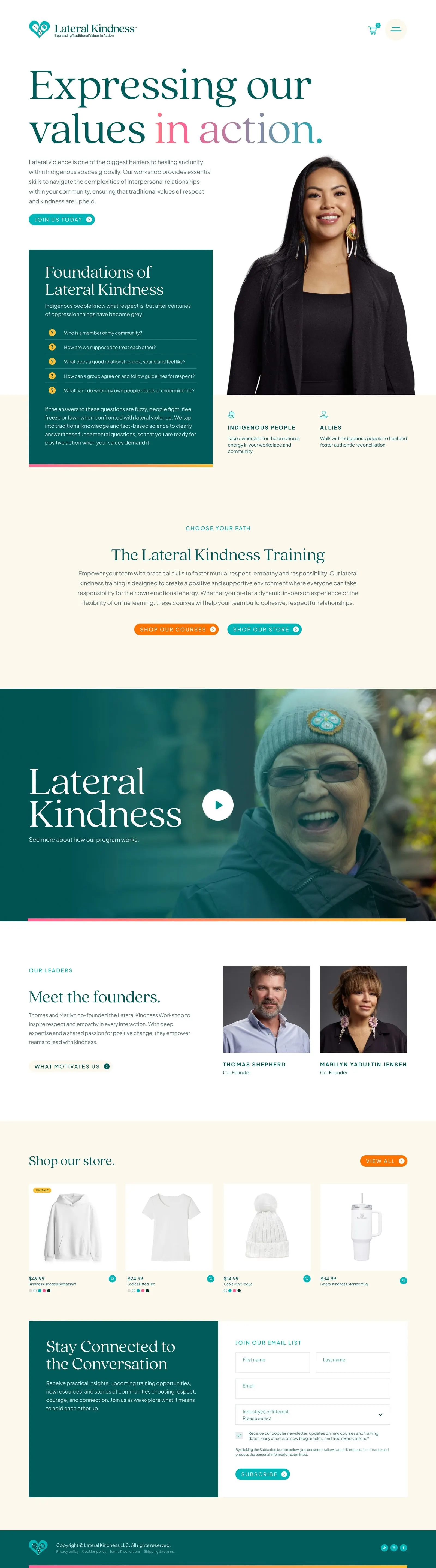
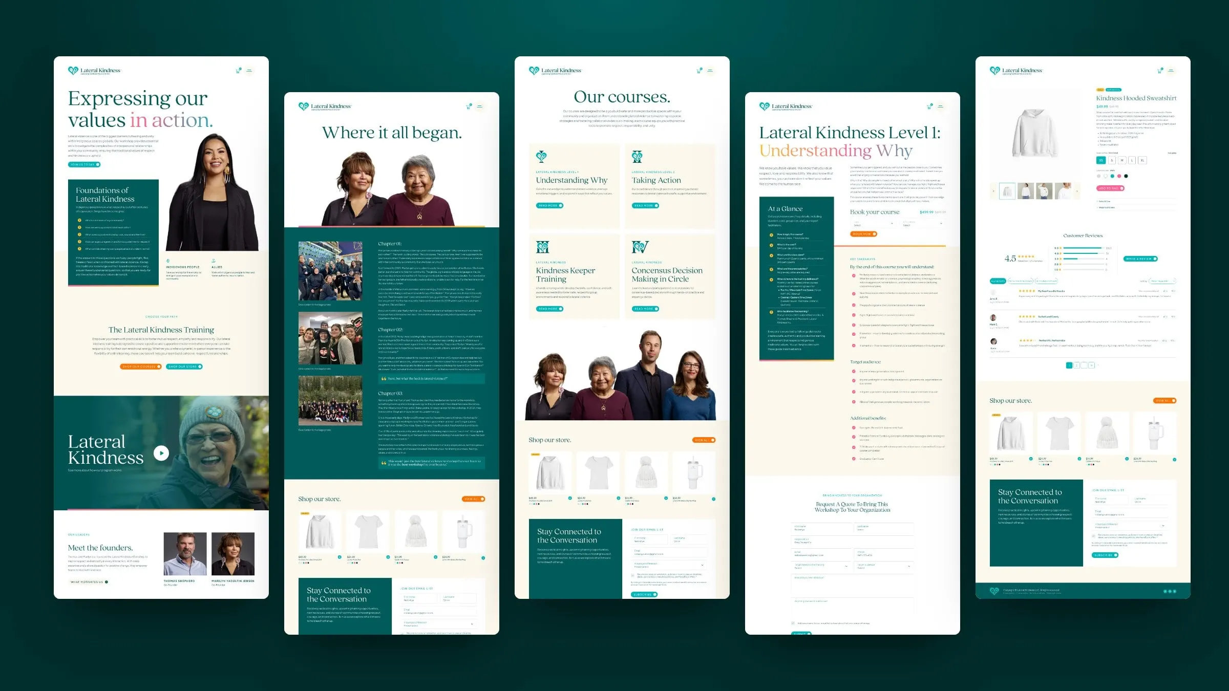
The program is organized as a path: Level 1, Understanding Why; Level 2, Taking Action; Kindness Keeper Training; and Consensus Decision Making in Circle. Each has its own icon, built from the heart mark and a Roman numeral.
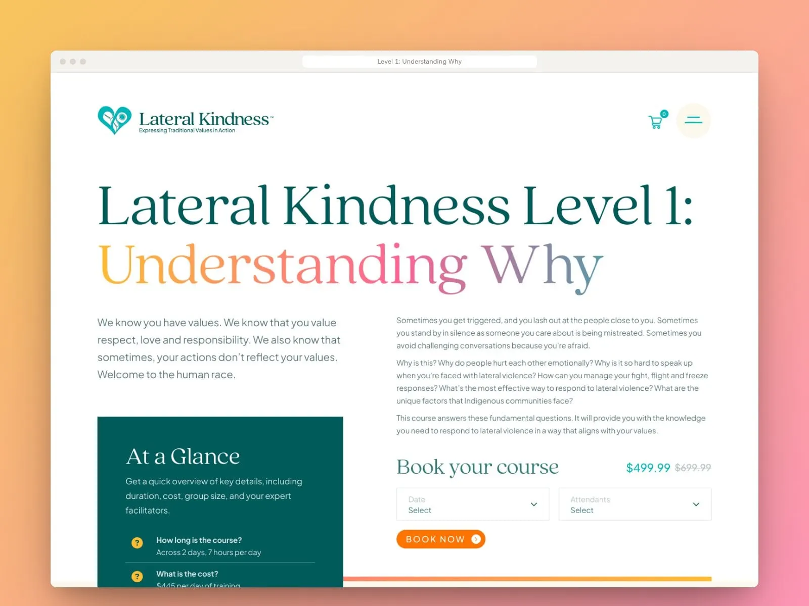
Course pages answer every practical question up front in an "At a Glance" panel: how long it runs (Level 1 is two days, seven hours a day), the cost, class sizes of up to 12, how it's delivered across time zones and who facilitates. Key takeaways, target audiences and a booking panel follow, plus a form for organizations that want to bring the workshop in-house.
05 — Website
A story, a classroom and a shop
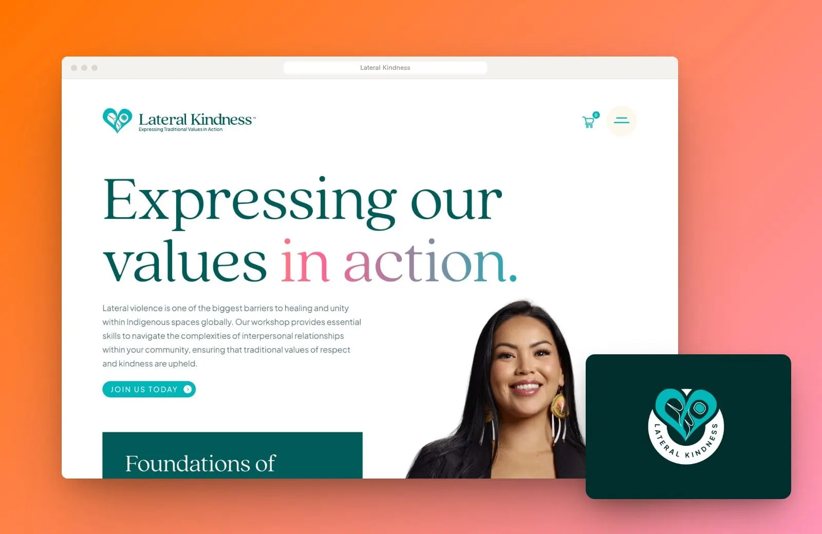
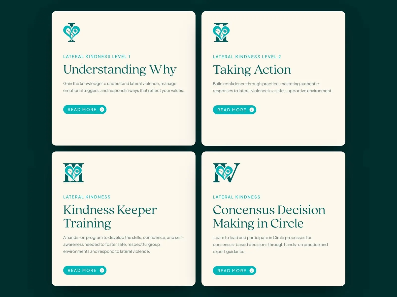
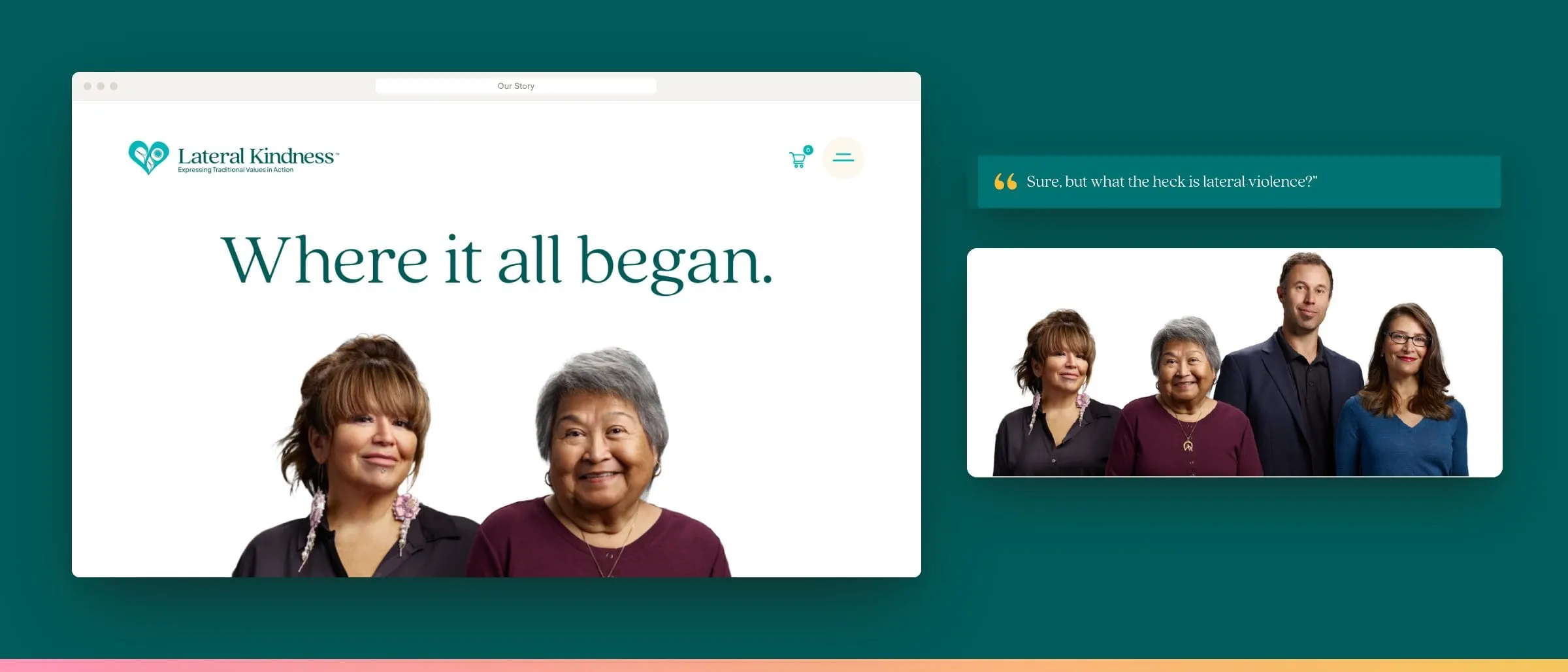
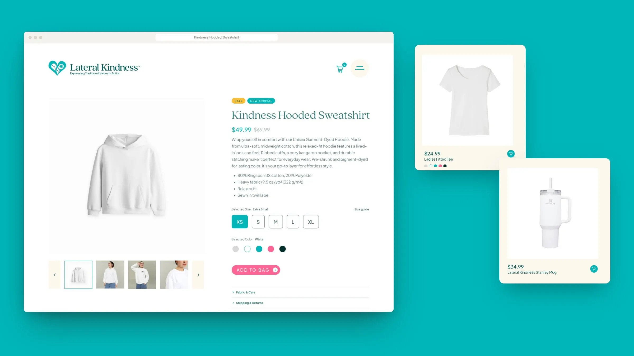
The website has three jobs. It tells the story: Our Why, Our Story and About Us pages share how the workshop began in the founders' own words, from a call from the Kwanlin Dün First Nation to the question that started it all. It sells the courses, with leveled course pages and booking. And it runs a shop of Lateral Kindness merchandise, with product pages, cart, checkout and accounts.
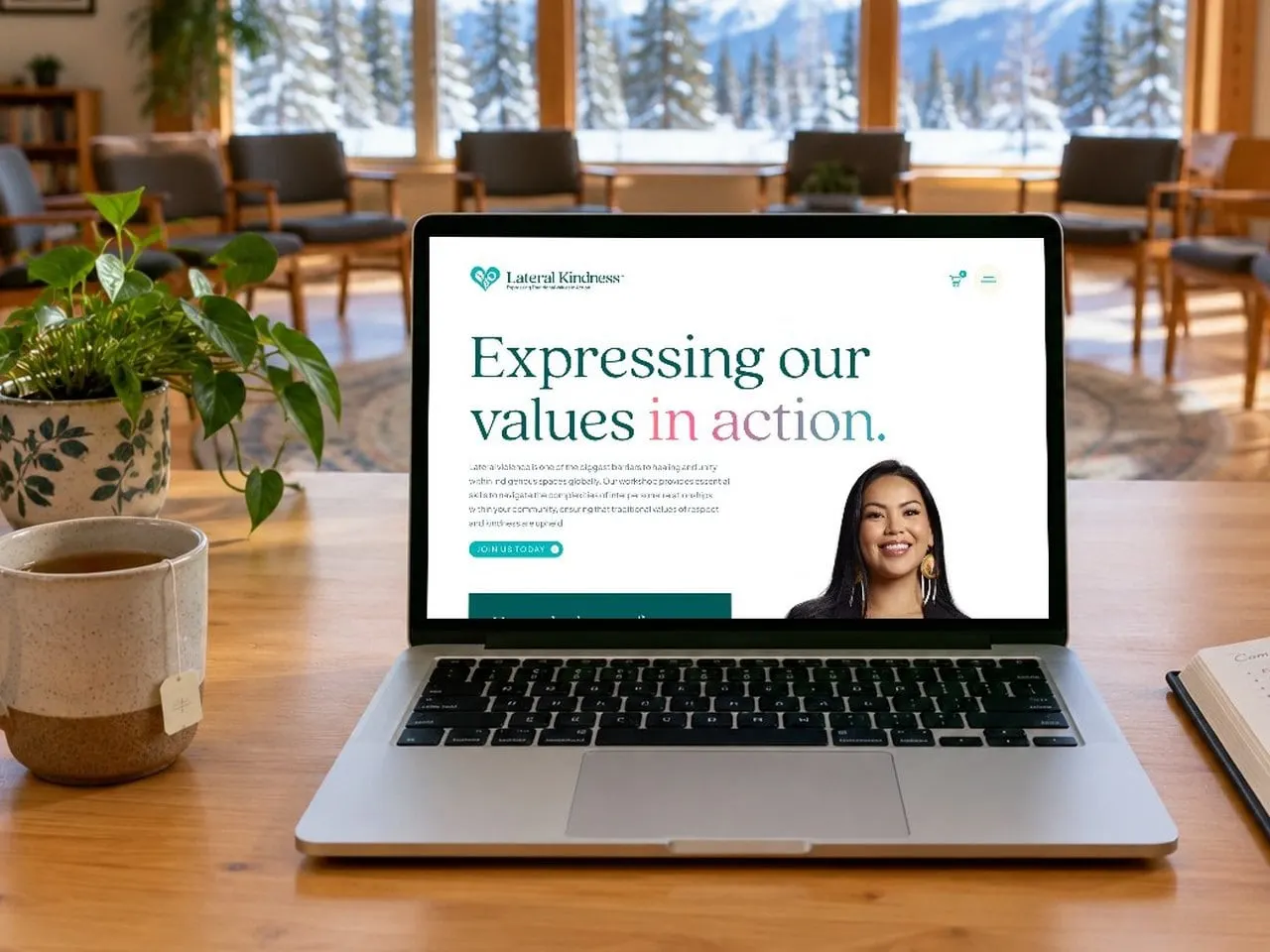
All of it shares one calm, editorial system: big serif headlines, lots of warm cream space, real portraits instead of stock, and the sunrise gradient tying sections together. For more on why we design brand and site together, read this guide.
The project
Built around the program
- Year the workshop began
- 2013With the Kwanlin Dün First Nation in Yukon.
- Courses on the path
- 4From Understanding Why to decision-making in Circle.
- Page designs
- 20+Story, courses, shop, cart, checkout, account and more.
- Rounds of identity concepts
- 2Refined with the founders.
06 — The result
A brand that practises what it teaches
Lateral Kindness now has an identity and website as warm and respectful as the workshop itself: rooted in Indigenous art and values, clear about what each course offers, and ready to welcome new communities, organizations and allies. We also designed social images to carry the brand onto Lateral Kindness's channels.
See more of our work in education and learning, including Further Learning Group.
What we delivered
- 01Brand identityWordmark, lockups and badge built around the Tlingit heart mark, over two concept rounds.
- 02Colour and typeA jewel-tone palette with a sunrise gradient and a friendly serif pairing.
- 03Website designStory, course and shop pages in one editorial system.
- 04Website developmentCourse booking pages and a request-a-quote form for organizations.
- 05Online shopProduct listing, product pages, cart, checkout and accounts.
- 06Social imagesBranded social graphics for launch.