Case study · Johnson & Johnson
Johnson & Johnson
An internal presentation for Johnson & Johnson's Project Ruby, Designing the Future of Pain Care, built to make a dense strategy story clear, structured and on brand.
01 — Context
Corporate presentation design for Project Ruby
Johnson & Johnson is one of the world's best-known healthcare companies. Internally, a team was working on Project Ruby, an initiative with the working title Designing the Future of Pain Care. They needed a presentation that would share the project's approach, findings and direction with colleagues across the business.
We were brought in for corporate presentation design: to take the team's content and build a classic, on-brand presentation that displayed its data clearly. The strategy, insights and wording belonged to Johnson & Johnson; our job was structure, hierarchy and visual clarity.
Internal decks like this have a tough audience. Senior leaders see dozens of presentations, and they are quick to tune out when a slide is crowded or the argument is hard to follow. Project Ruby had a lot to say, from consumer insight to growth strategy, so the design had to carry a long, layered story without ever feeling heavy.
02 — Structure
Four questions that organize the whole deck
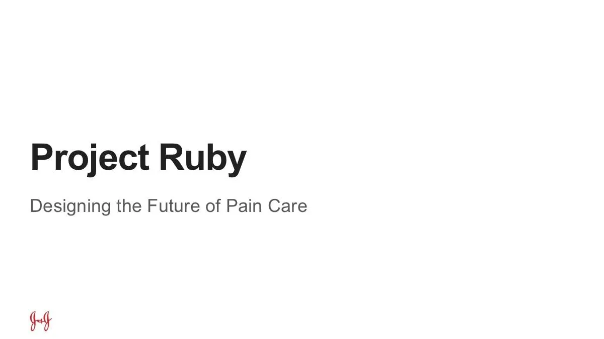
The content was organized around four critical questions: Our Challenge, Our Vision, Our Results and Our Future. We made those questions the backbone of the deck. A Project outcomes slide lists them as a numbered agenda, each with its plain-language question beside it, so the audience knows exactly where the presentation is going.
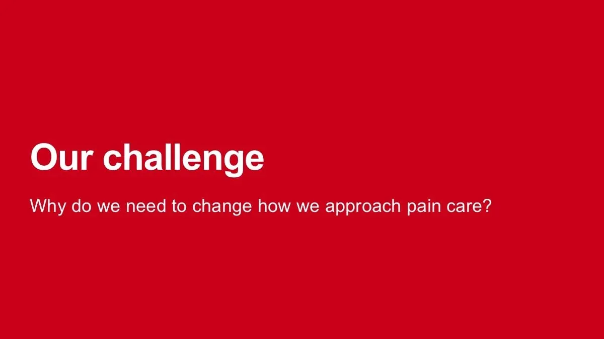
Each section then opens with a full-bleed divider slide in a solid brand colour, carrying only the section title and its question. In a long internal meeting, these dividers act as resting points. They signal a change of topic, give the presenter a natural pause and make it easy to jump to a section when someone asks a question.
The title slide is deliberately quiet: Project Ruby in bold black type, the subtitle in grey and the J&J monogram in the corner. The same monogram, a small Project Ruby label and the page number sit at the foot of every content slide.
03 — Clarity
Turning strategy into readable frameworks
Most of the deck is frameworks rather than charts, and frameworks are where internal presentations usually fall apart. A framework pasted as bullet points loses its shape; the relationships between ideas disappear. We gave each one a layout that matches its logic, and kept generous white space around it so the slide never competes with the presenter.
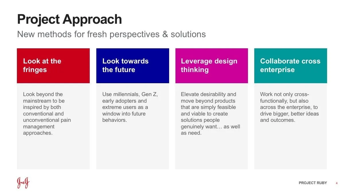
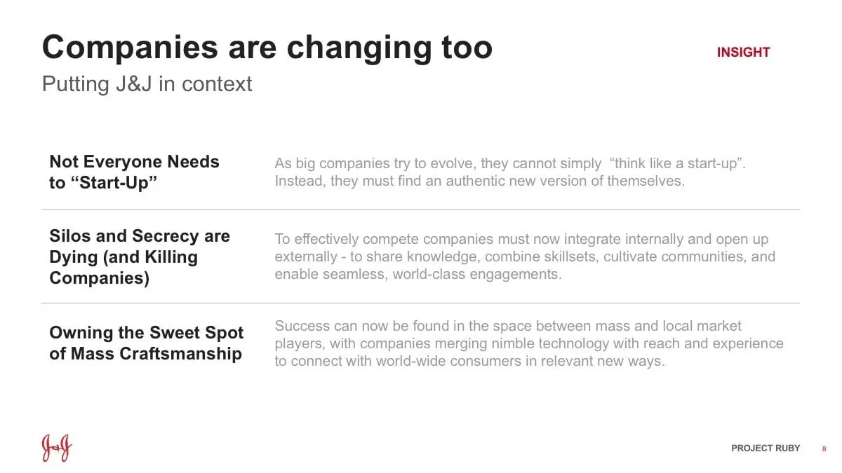
The Project Approach slide sets out four principles, Look at the fringes, Look towards the future, Leverage design thinking and Collaborate cross enterprise, as four equal columns, each with its own colour header. Insight slides such as Companies are changing too use a simple two-column table with bold statements on the left and supporting detail in grey on the right.
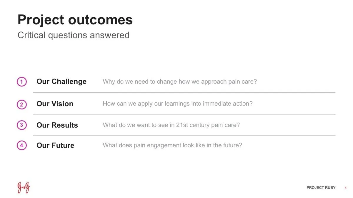
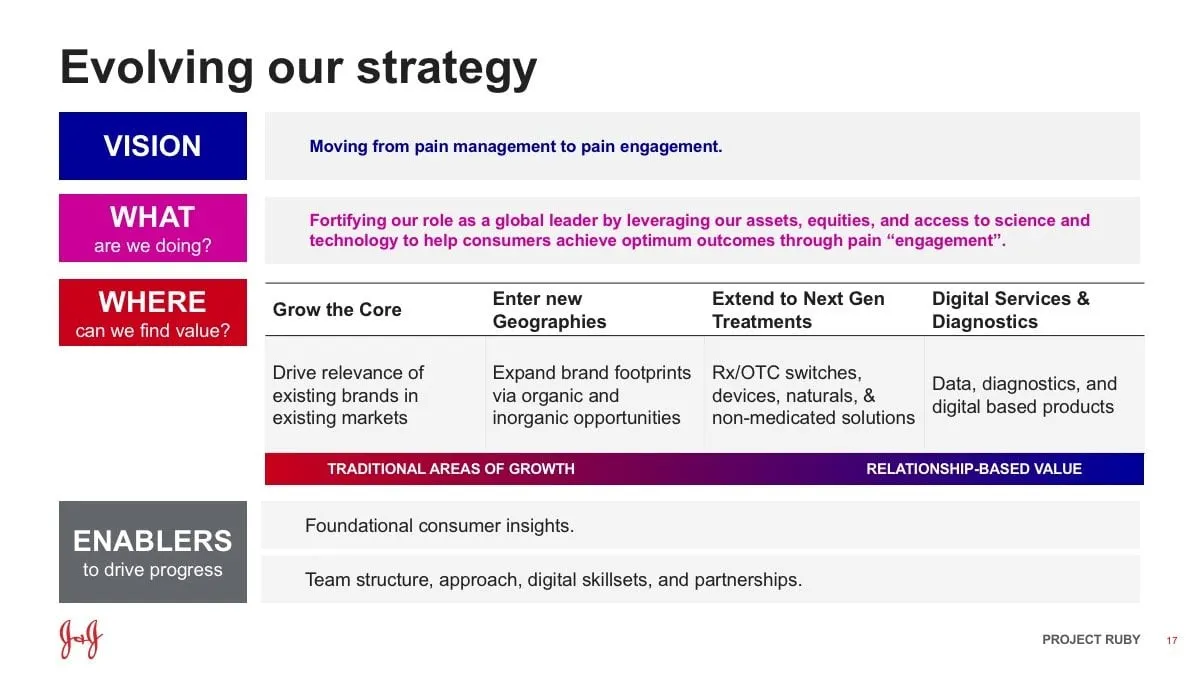
The more complex slides needed more structure. Digital services and diagnostics maps core treatments, devices and digital tools against a scale from alleviate to recover to prevent, with each bar's length showing how far it reaches. Evolving our strategy stacks Vision, What, Where and Enablers as coloured labels down the left, so a dense page of strategy reads top to bottom in a few seconds. This is the same thinking we bring to infographics: decide what the viewer should understand first, then build the layout around it.
04 — Craft
Classic, on brand and built for a large organization
Working inside a global brand means respecting its rules. We kept to a white background, the signature Johnson & Johnson red and a clean grotesque sans serif in bold black for headlines and grey for subtitles. A small set of accent colours, deep blue, magenta and teal, is used only to separate ideas, never for decoration, and each colour keeps its meaning wherever it appears. We built it in PowerPoint with consistent layouts, so any new slide the team adds can follow the same system.
The result is a deck that feels at home next to any other Johnson & Johnson material while making Project Ruby's content easier to follow. It is the kind of corporate communication design that large teams rely on but rarely notice, which is exactly the point. Teams in healthcare and other regulated fields often need this balance of brand discipline and clarity. For similar work, see our Visa Blueprint booklet and slides, or the Rémy Cointreau presentation.
What we delivered
An internal Project Ruby presentation for Johnson & Johnson.