Case study · Esme + Sita
Esme + Sita
Brand identity, packaging and sales materials for Esme + Sita, a Toronto maker of organic seed bars and health powders, built from the ground up for launch.
01 — Context
Building a health food brand from the ground up
Esme + Sita is a Toronto health food manufacturer making organic seed bars and health powders from ingredients like turmeric, moringa and ginger. When the company was preparing to launch in October 2018, it had products and a vision but no brand. It needed everything: a name treatment, logo, organic food packaging design, business cards, sales boxes, sell sheets, advertising and a website.
The founders wanted the brand to honour their roots. The products are made with ingredients from India, and they wanted that heritage to be felt, not just stated in the fine print. At the same time, the brand had to be modern, clean and easy to understand on a busy health food shelf.
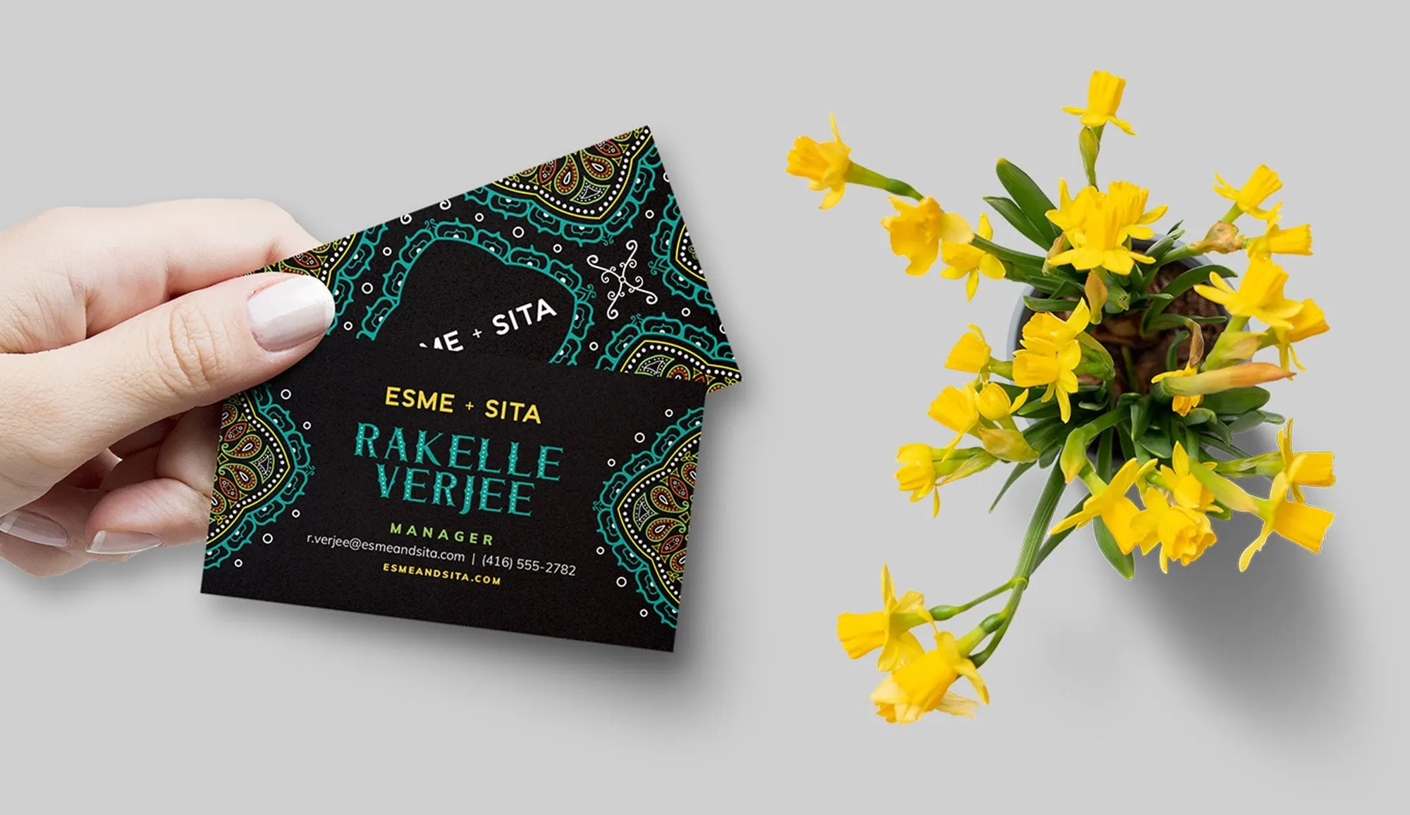
We started with the brand identity. The Esme + Sita wordmark is set in simple, spaced capitals with a small plus sign between the two names, which keeps it calm and legible. Around it, we drew intricate mandala and paisley patterns in teal, orange, green and gold on a deep black ground. The pattern carries the heritage. The wordmark keeps it contemporary.
02 — Packaging
Packaging that stands out on the shelf
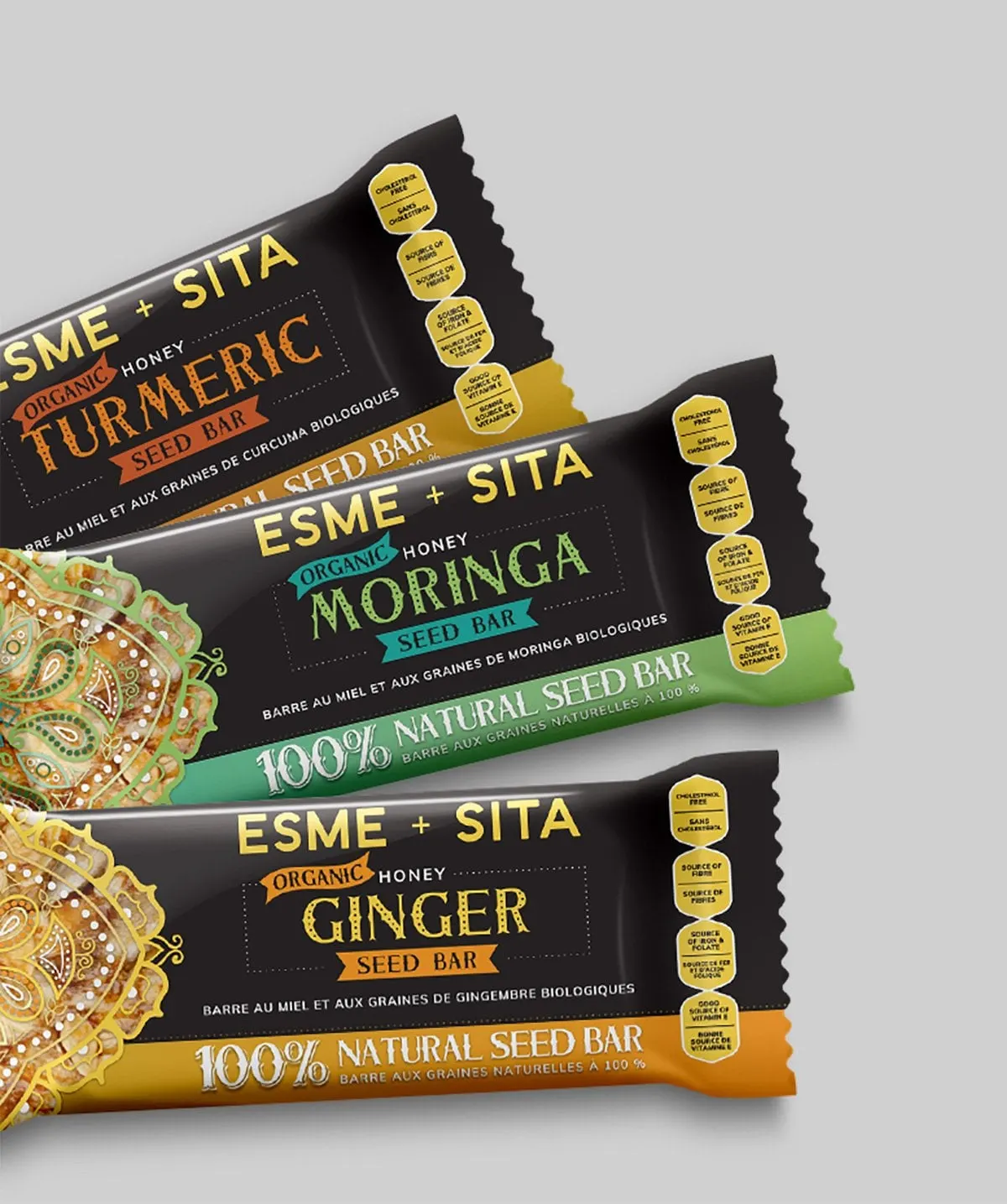
Most organic snacks lean on kraft paper, white space and pale greens. For our packaging design, we went the other way. A black wrapper with gold type and bright pattern gives Esme + Sita a premium, giftable feel and makes it instantly recognizable next to competitors.
Each seed bar flavour gets its own colour: orange for Turmeric, green and teal for Moringa, golden yellow for Ginger. A slab-serif flavour name sits inside a dotted frame with "Organic" and "Seed Bar" on small ribbon banners. A bold "100% Natural Seed Bar" band runs along the bottom. Down the side, gold hexagon badges call out benefits like cholesterol free and source of fibre.
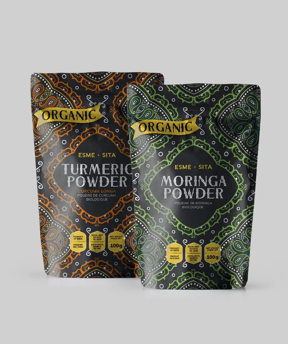
The 100g powder pouches extend the system. The pattern covers the whole pouch in the flavour colour, and a gold Organic ribbon sits at the top corner. Every panel is bilingual in English and French, ready for Canadian retail.
03 — Sales materials
Sell sheets that speak to buyers
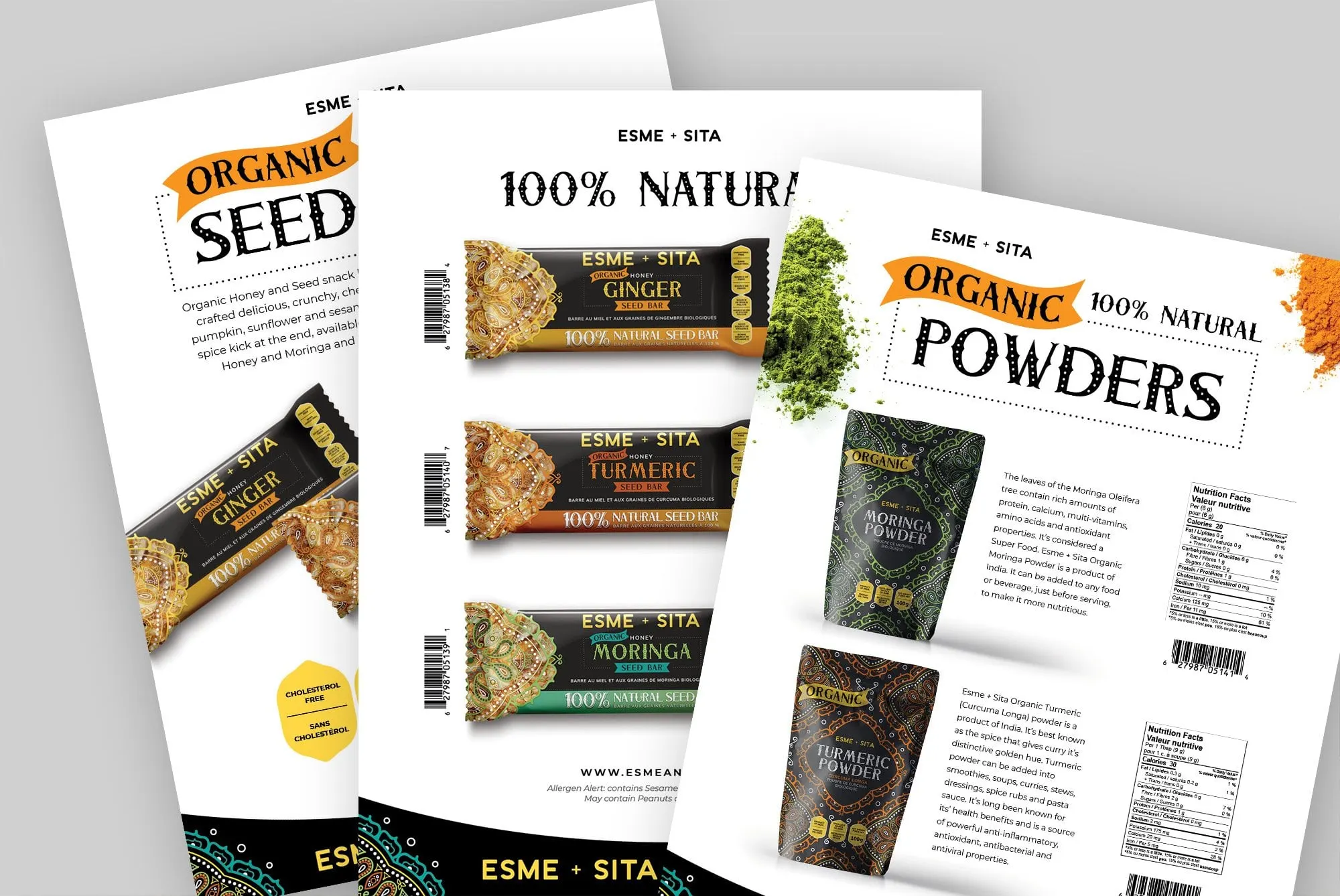
A new food brand has to convince retailers before it can reach customers. We designed a set of sell sheets that put the products front and centre for store buyers: one for the seed bars, one showing the full 100% Natural bar range, and one for the organic powders.
The sheets switch to a white background so product photography, nutrition facts and barcodes are easy to read, while the patterned black footer and ribbon headlines keep them on brand. Short descriptions explain what each product is and how to use it, such as adding moringa or turmeric powder to smoothies and sauces.
Together with the business cards, sales boxes and marketing collateral, the sell sheets gave Esme + Sita one consistent look across everything it needed for launch. For more food and beverage work, see our Artisan Kettle sell sheet, or read our before and after packaging refresh for a craft soda.
What we delivered
A complete launch kit for a new organic food brand.