Case study · SimplyO3
SimplyO3
A refreshed brand look and sales toolkit for SimplyO3, a family-run ozone equipment company: operator's manuals, a trifold brochure, flyers, business cards and a trade show booth.
01 — Context
Medical equipment branding that earns trust
SimplyO3 is a family-run company that manufactures, sells and supports ozone equipment, with an address in Grand Ledge, Michigan. Its customers range from practitioners to home users who are buying a medical device for the first time, often after a lot of research. Like many businesses in healthcare, it sells on confidence as much as on features.
The company wanted to polish its logo and overall look and feel. The goal was to convey cleanliness, safety and trustworthiness, with a more clinical presence. That is the heart of good medical equipment branding: before anyone reads a specification, the design has to tell them this company is careful. We refined the brand identity and then carried it through every piece the team uses to sell.
02 — Tone
Starting with the operator's manuals
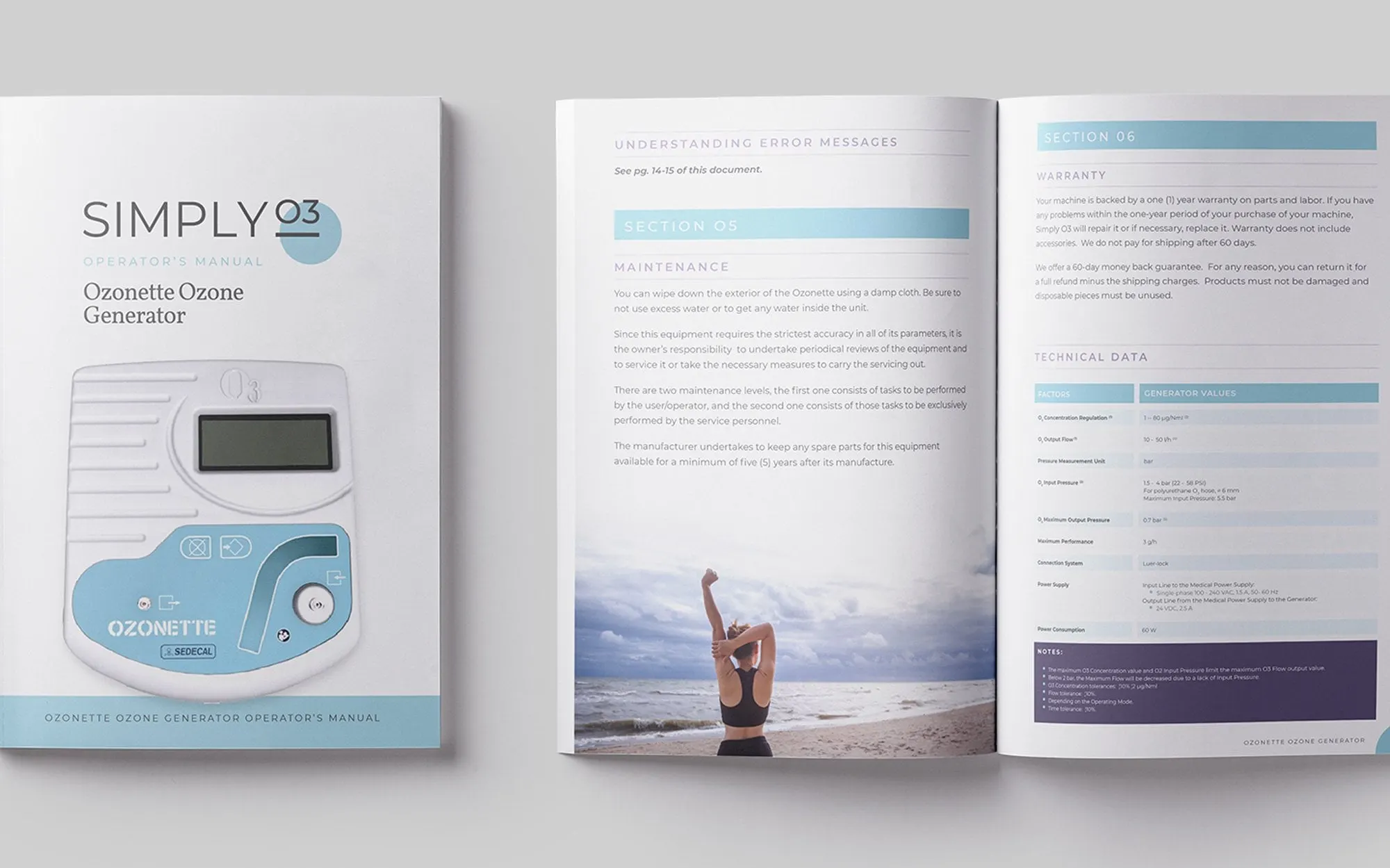
The first deliverable was a set of three user manuals for three different devices. It was an unusual place to start a brand project, and a useful one. Manuals are where a customer meets the product most closely, and they forced every decision about type, colour and hierarchy to work hard on real content.
We built the palette on colour theory: soft greys, calm blues and touches of purple, colours people associate with clinical spaces and care. The SIMPLY wordmark is set in clean, spaced capitals with O3 tucked into a pale blue circle. Inside, section headers sit in tinted bars, technical data lives in tidy tables and lifestyle photography softens the pages between maintenance steps and warranty terms.
This publication design work gave the client a clear picture of where the brand was heading, and every piece that followed borrowed from it.
03 — Sales tools
A brochure and flyers for two audiences
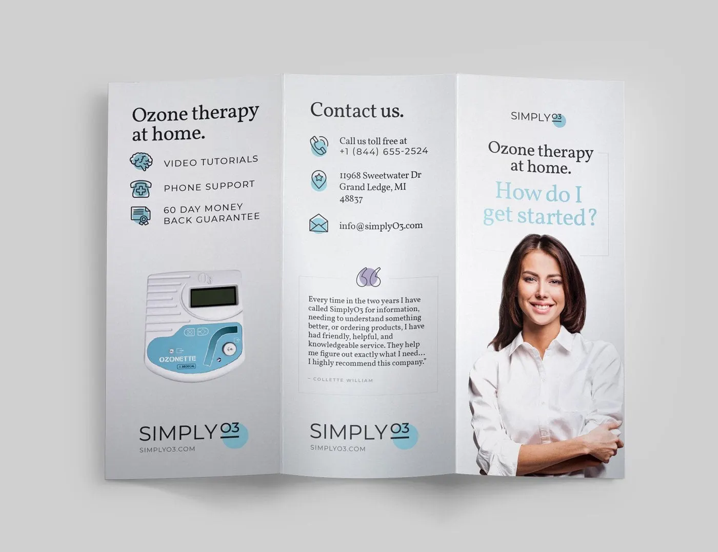
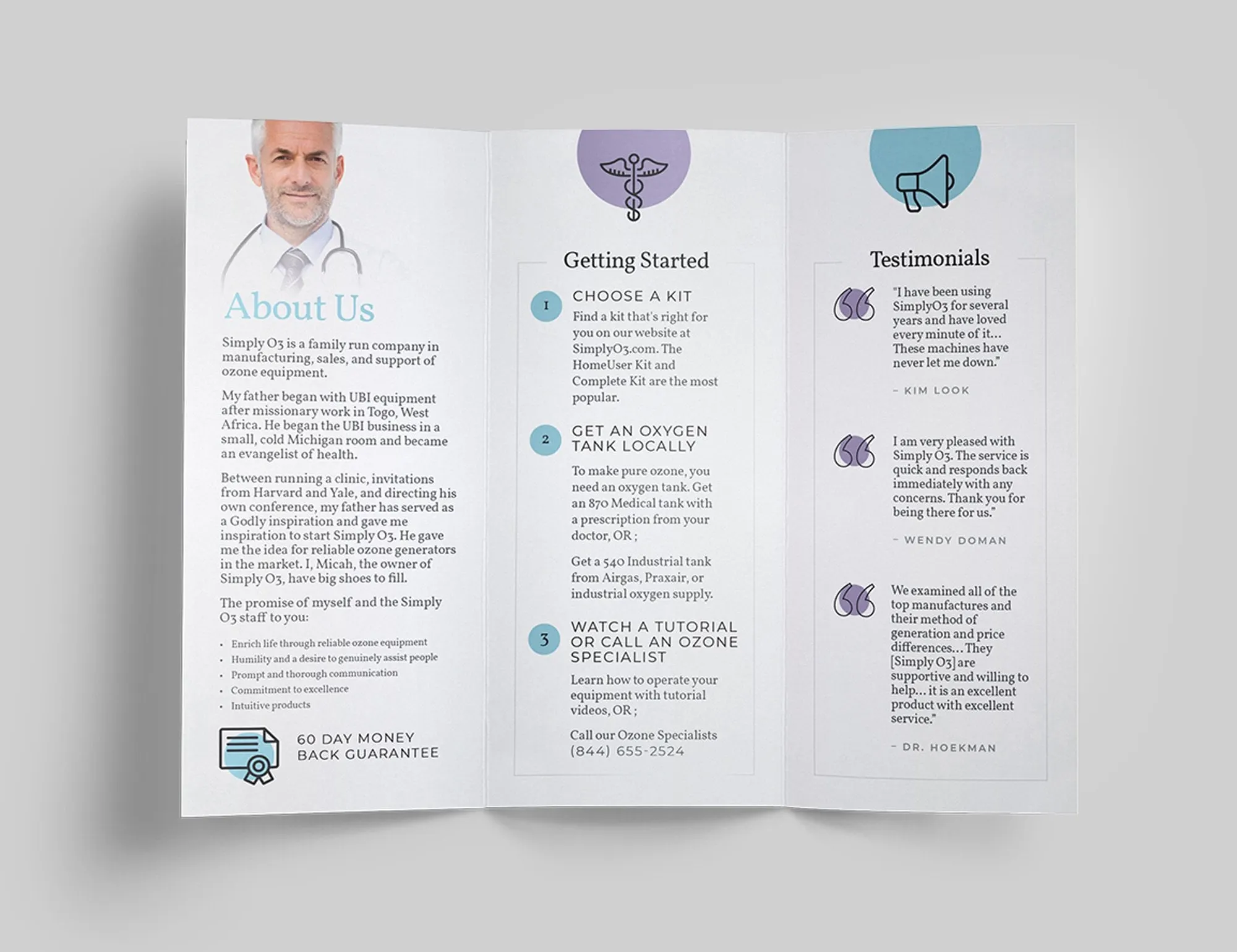
The trifold brochure speaks to home users. Its cover asks a simple question, Ozone therapy at home. How do I get started?, and the inside answers it with three numbered steps: choose a kit, get an oxygen tank locally, and watch a tutorial or call an ozone specialist. An About Us panel tells the family story behind the business, and a column of customer testimonials sits under a soft circular icon.
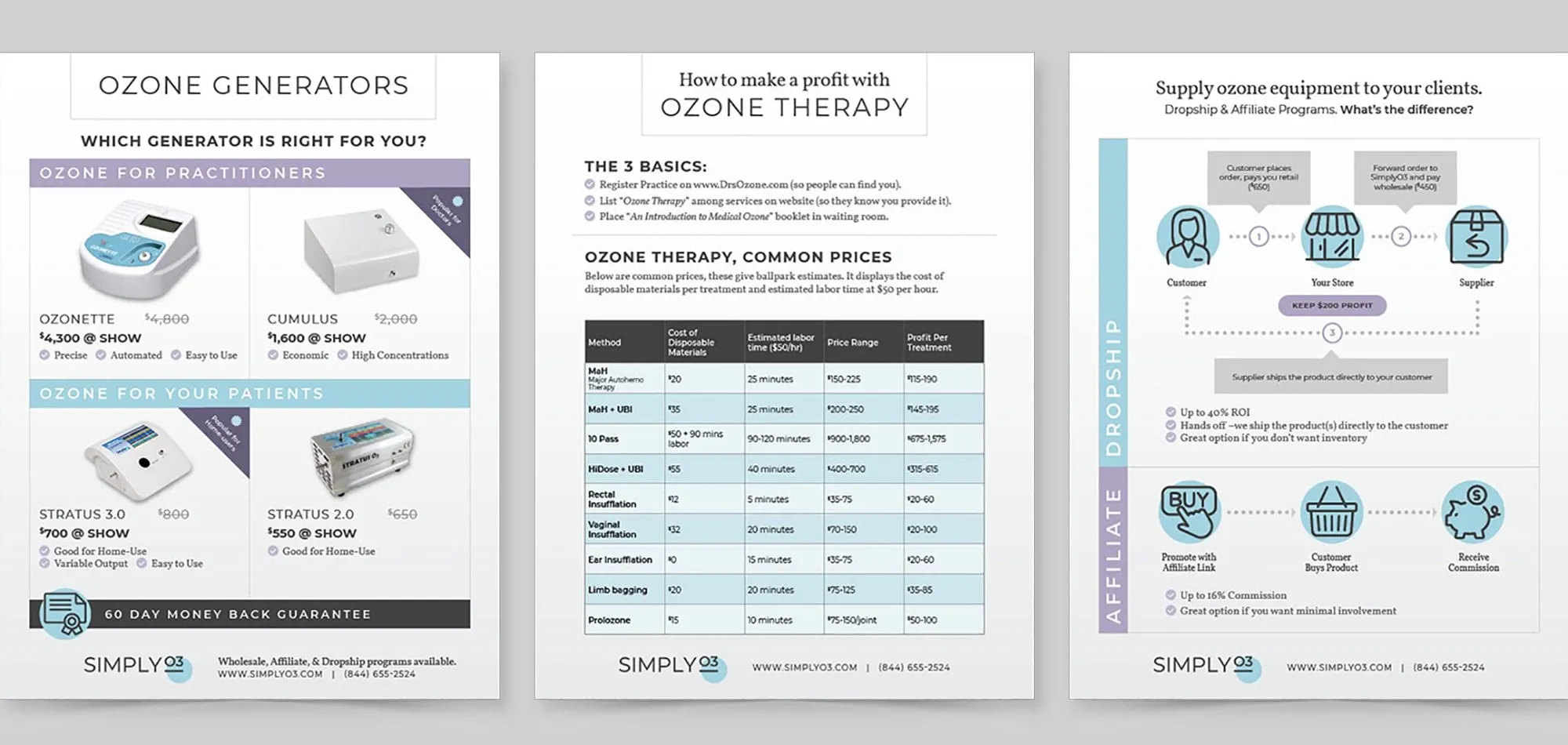
The flyers serve practitioners and resellers. One compares ozone generators for practitioners and for patients, another sets out common ozone therapy treatments in a clear pricing table, and a third explains the difference between dropship and affiliate programs with a simple flow diagram. Each uses the same headers, purple and blue bars and footer, so they work as a family of sales collateral.
04 — In person
Business cards and a trade show booth
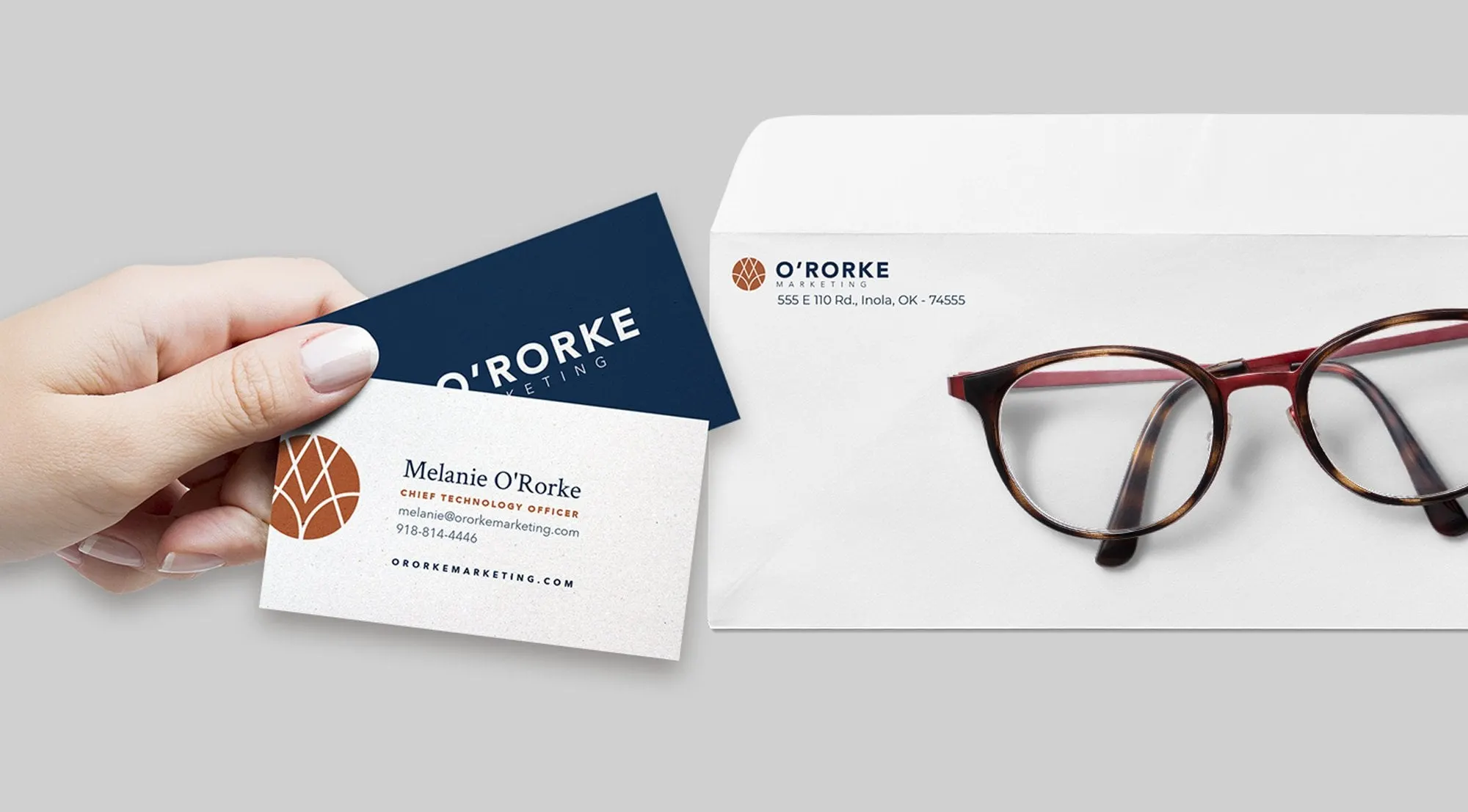
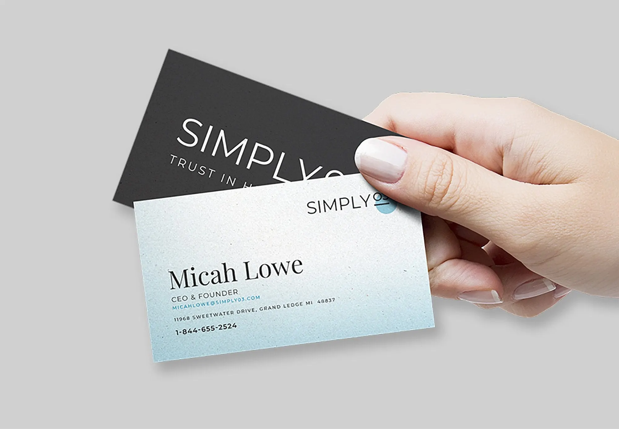
The system finishes in the places where SimplyO3 meets people face to face. Business cards come in two versions: a dark grey front with the wordmark and a pale blue, softly textured back with contact details set in an elegant serif.
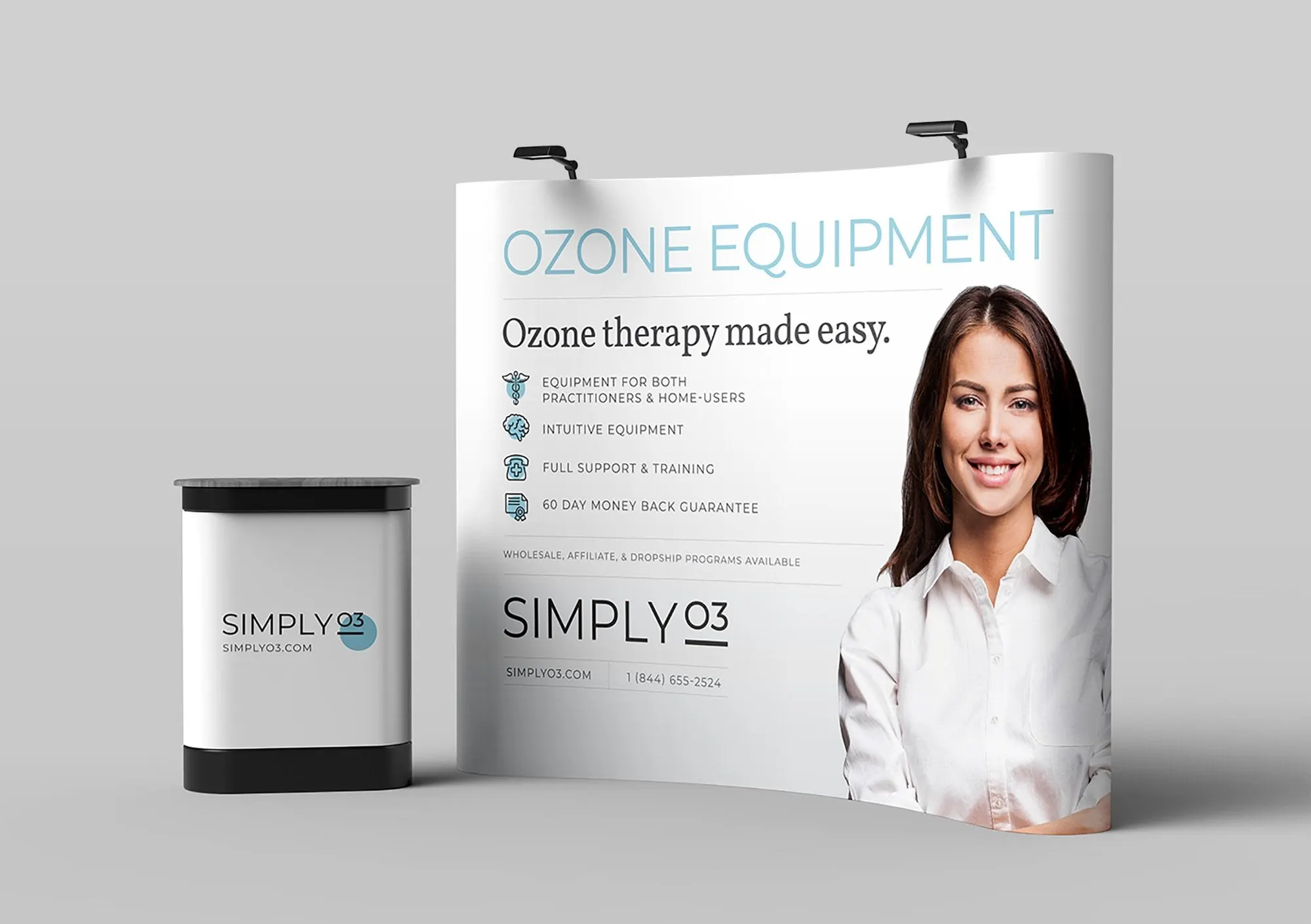
For events, we designed a curved pop-up backdrop and matching counter. OZONE EQUIPMENT runs across the top in light blue capitals, with the line Ozone therapy made easy and four short benefits underneath. The layout is built to be read from across an exhibition hall, with the brand and phone number at the bottom where visitors look as they approach. Like our Greenwave brochure, it shows how one consistent look makes a small company feel established. Our trade show design service picks up from there.
What we delivered
A refined look and feel for SimplyO3, applied across print and events.
- 01Logo and look and feelRefined wordmark, clinical colour palette and typography.
- 02Operator's manualsThree user manuals for three different devices.
- 03Trifold brochureA getting-started brochure for home users.
- 04Flyers and business cardsSales flyers for practitioners and resellers, plus business cards.
- 05Trade show boothCurved backdrop and counter graphics.