Case study · Carrie Ann Berkenbosch
Carrie Ann Berkenbosch
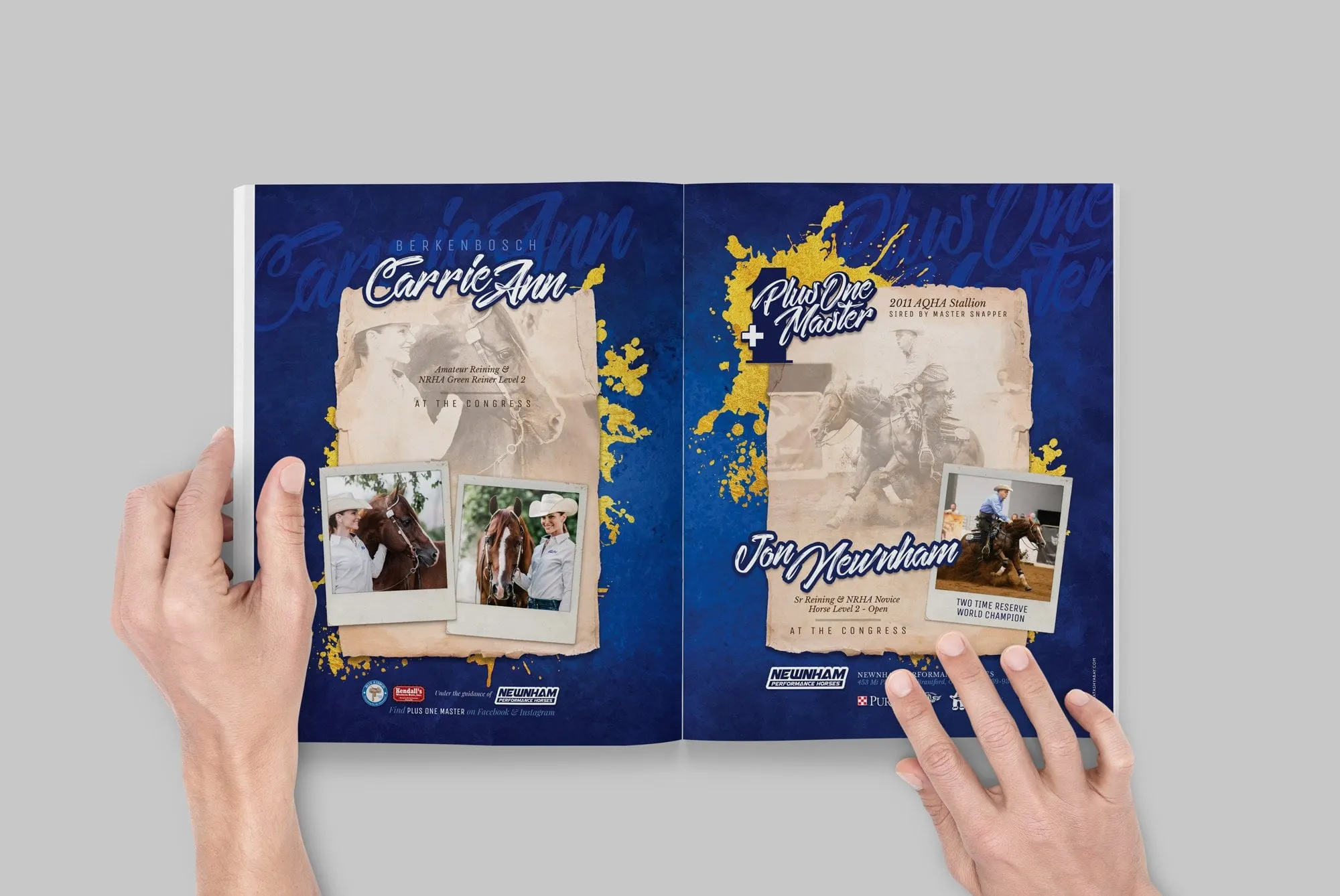
A two-page magazine ad spread promoting reiner Carrie Ann Berkenbosch, her AQHA stallion Plus One Master and their upcoming shows at the Congress.
01 — Context
Equine magazine ad design for horse and rider
Carrie Ann Berkenbosch competes in amateur reining with her American Quarter Horse stallion, Plus One Master. Ahead of their shows at the Congress, she wanted an advertisement that would promote the stallion, herself and their upcoming classes together.
In the horse show world, magazine ads do a specific job. They introduce a horse to breeders and fellow competitors, show who is riding and training it, and build recognition before everyone arrives at the show grounds. Our equine magazine ad design had to carry two stories at once: Carrie Ann as an amateur rider, and Plus One Master shown by his trainer, Jon Newnham of Newnham Performance Horses in Brantford, Ontario. We designed a two-page spread so each story could have its own page while reading as one piece of print design.
02 — Layout
Two pages, one story
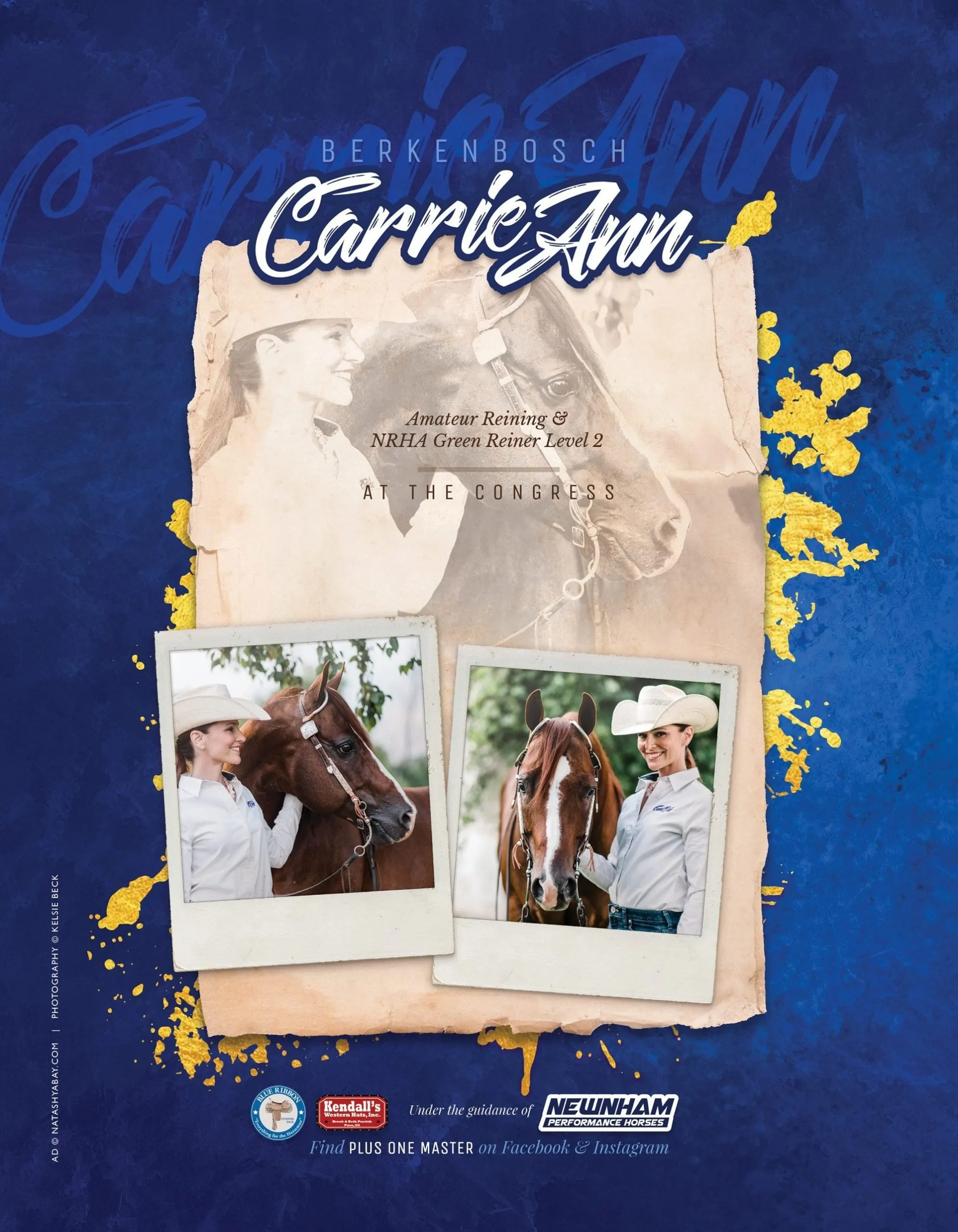
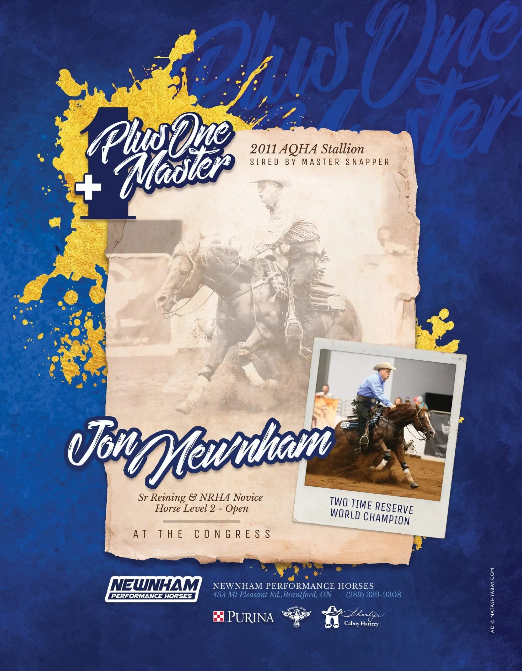
Both pages share the same structure, which is what ties them together. A deep, textured royal blue background carries splashes of metallic gold. At the centre sits a torn, aged parchment panel with a faded sepia photograph, and over it, Polaroid-style snapshots add colour and personality.
The left page belongs to Carrie Ann. Her first name is set in a bold brush script, with Berkenbosch in spaced capitals above it and an oversized ghosted version of the script behind. Her classes, Amateur Reining and NRHA Green Reiner Level 2, sit in italic serif type, followed by At the Congress. Two warm, candid photos show her with the stallion.
The right page belongs to Plus One Master. His name is paired with a large numeral one and a plus sign, a simple graphic play on the name. Beneath it, the stallion's breeding details, a sepia action shot of a sliding stop and a Polaroid captioned Two Time Reserve World Champion introduce Jon Newnham and his class.
03 — Craft
Western heritage with a modern edge
The visual style mixes the traditions of the sport with energy that stands out on a magazine page. Parchment and sepia nod to Western heritage, while the brush lettering and gold splatter feel current and confident. Blue and gold give strong contrast that holds up in print, and a consistent sponsor bar at the foot of each page credits the barn and partners without cluttering the design. Because each page works on its own, the left or right half could also stand alone as a single-page ad if a publication or show program called for one. We kept every key detail, name, class and venue, large enough to read at a glance while someone flips through a show issue.
A clear call to action, Find Plus One Master on Facebook and Instagram, gives readers somewhere to go next. It is graphic design grounded in the details of a niche audience. For more of our equestrian work, see the PleasureHorse.com ads, our project for Winning Edge Equine Services and Stallion Compare.
What we delivered
A two-page magazine advertisement for Carrie Ann Berkenbosch and Plus One Master.