Case study · StallionCompare
StallionCompare
Social content and graphics for a growing platform.
01 — Context
A marketplace that didn't fit a template
StallionCompare.com is a Canadian platform that helps breeders research and compare stallions across Quarter Horse, Paint Horse, Appaloosa and other registries, with stallions filtered by discipline, from halter and reining to cutting, roping and ranch. Owners can list a stallion for free, and breeders get a single place to weigh their options before booking a breeding.
That kind of product doesn't come in a box. Stallion Compare needed a bespoke web presence with real functionality, a brand that let the horses be the stars, and a set of social media templates that could keep the community up to date. We delivered all three, and this Stallion Compare website design case study walks through how they fit together.
02 — Brand identity
Navy, gold and a monogram that frames the horse
The equine world has a visual language of its own: show ring tack, silver conchos, polished leather and serious money. Our branding and identity design aimed for that same sense of quality without slipping into western clichés.
The logo pairs a bold SC monogram in warm gold with a clean StallionCompare wordmark. The letterforms are wide and open enough to work as a window, so the monogram can be filled with photography, as in the version showing two horses nose to nose. That gave the brand a flexible signature that always puts a horse front and centre.
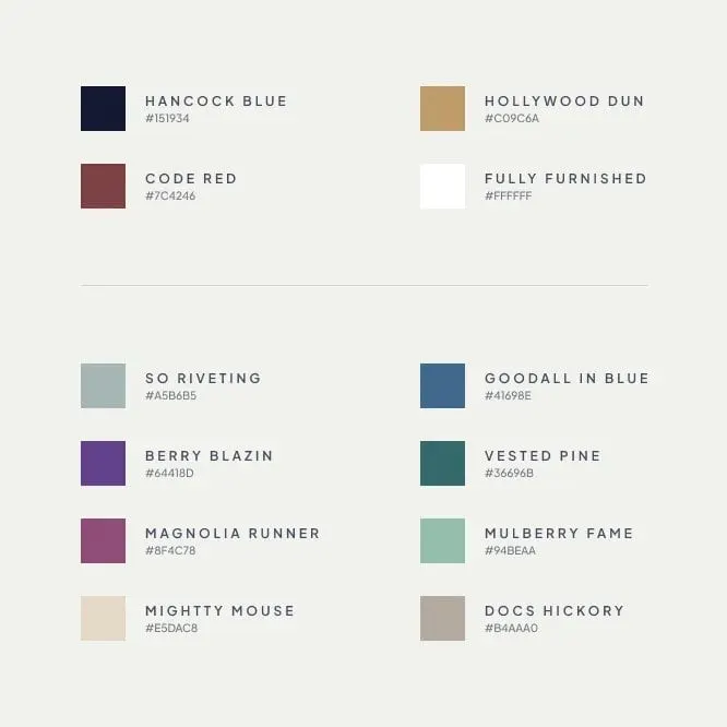
The core palette is Hancock Blue, a deep navy, with Hollywood Dun, a soft gold, plus Code Red and white. A secondary set adds muted blues, purples, greens and neutrals. Every colour carries an equine-inspired name, including So Riveting, which is also the name of a stallion on the platform. Type pairs a high-contrast serif for headlines and stallion names with a quiet sans for details and navigation.

03 — The platform
Stallion Compare website design built for browsing and comparing
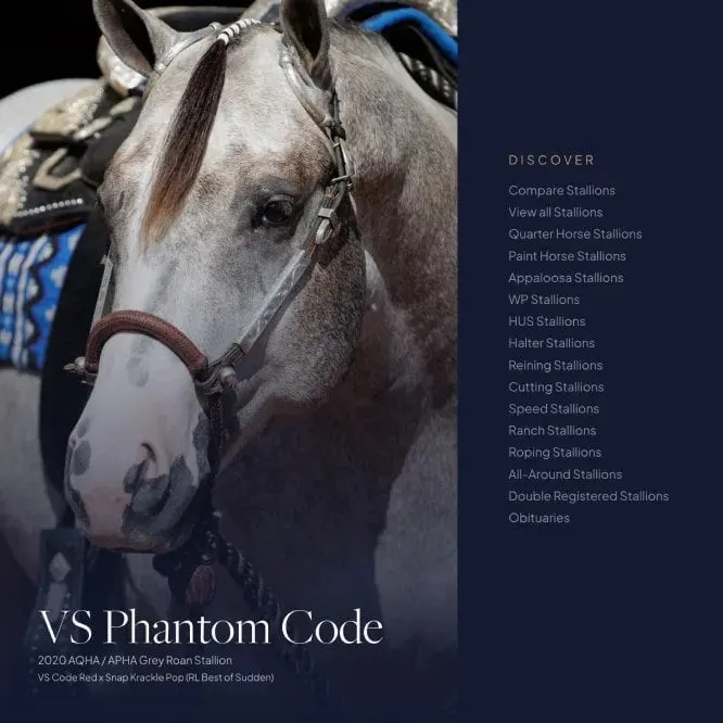
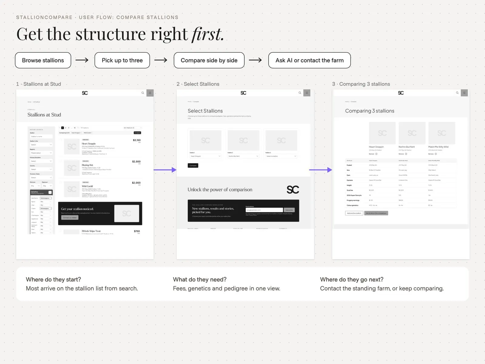
Our website design started with how breeders actually search. Some arrive knowing a bloodline; others want to see every reining stallion available. So the navigation is organised by breed and discipline, with a Discover menu that runs from Compare Stallions and View all Stallions through Quarter Horse, Paint Horse and Appaloosa categories to Halter, Reining, Cutting, Speed, Ranch, Roping, All-Around and Double Registered stallions.
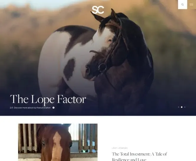
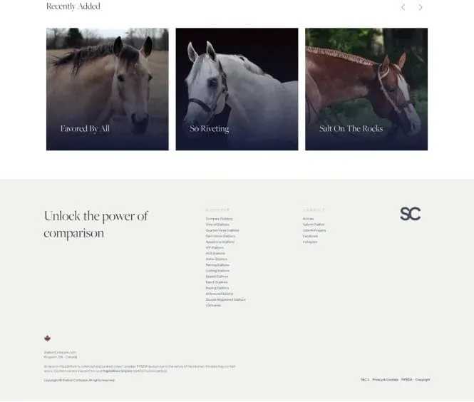
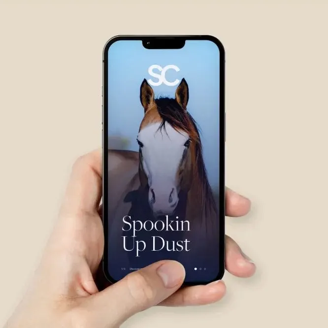
The homepage leads with full-width photography of featured stallions, their names set large in the serif, with a short link to discover more. Further down, a Recently Added carousel shows new listings as photo cards, and the footer repeats the full category list under the line "Unlock the power of comparison."
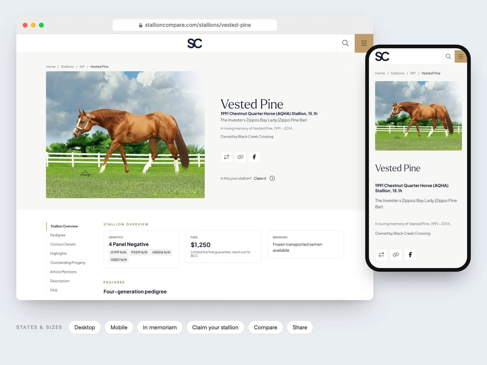
Behind the scenes, the website development was where much of the work lived. The site is packed with customizations specific to this marketplace, including comparison tools, stallion profiles, submission forms and filtering by international availability. A lot of the UX and UI design effort went into keeping that depth from feeling heavy: generous white space, one accent colour, and photos doing the talking.
04 — Content and community
Editorial pages and social templates that keep people coming back
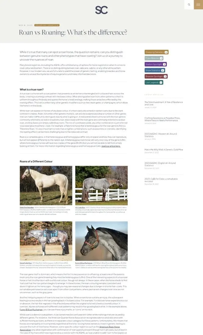
A comparison site is only useful if people return to it, so the platform includes a full editorial section. Articles such as a deep dive on roan versus roaning are set like a magazine, with a clear headline, a lead paragraph, photo grids of example stallions with captions, and a sidebar of colour-coded categories: Grasping Genetics, Press Release, Stallion Spotlight, Show Statistics, Breeder Spotlight and Lost Legends. Each category borrows a colour from the secondary palette, so the brand system does practical work.
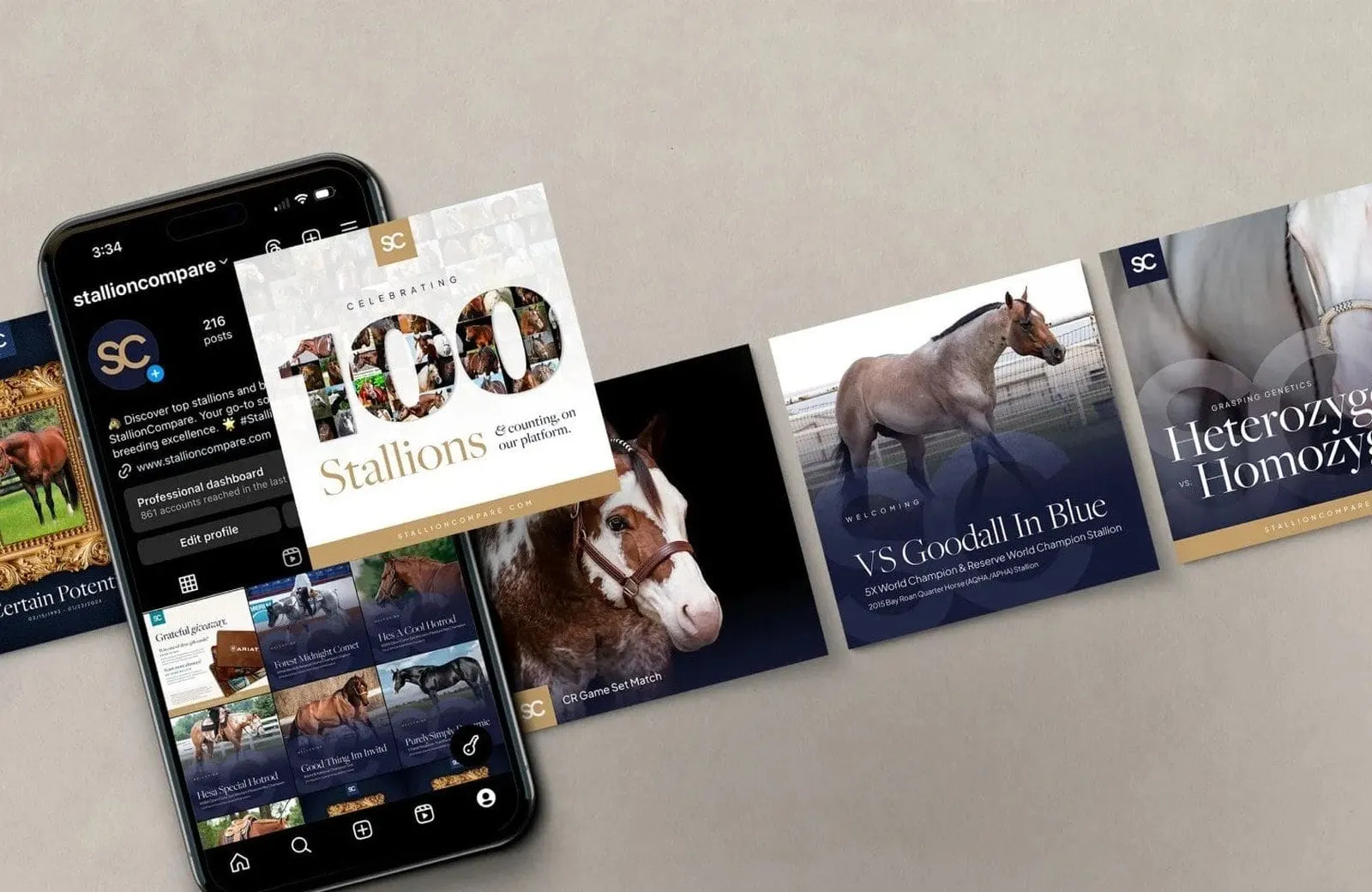
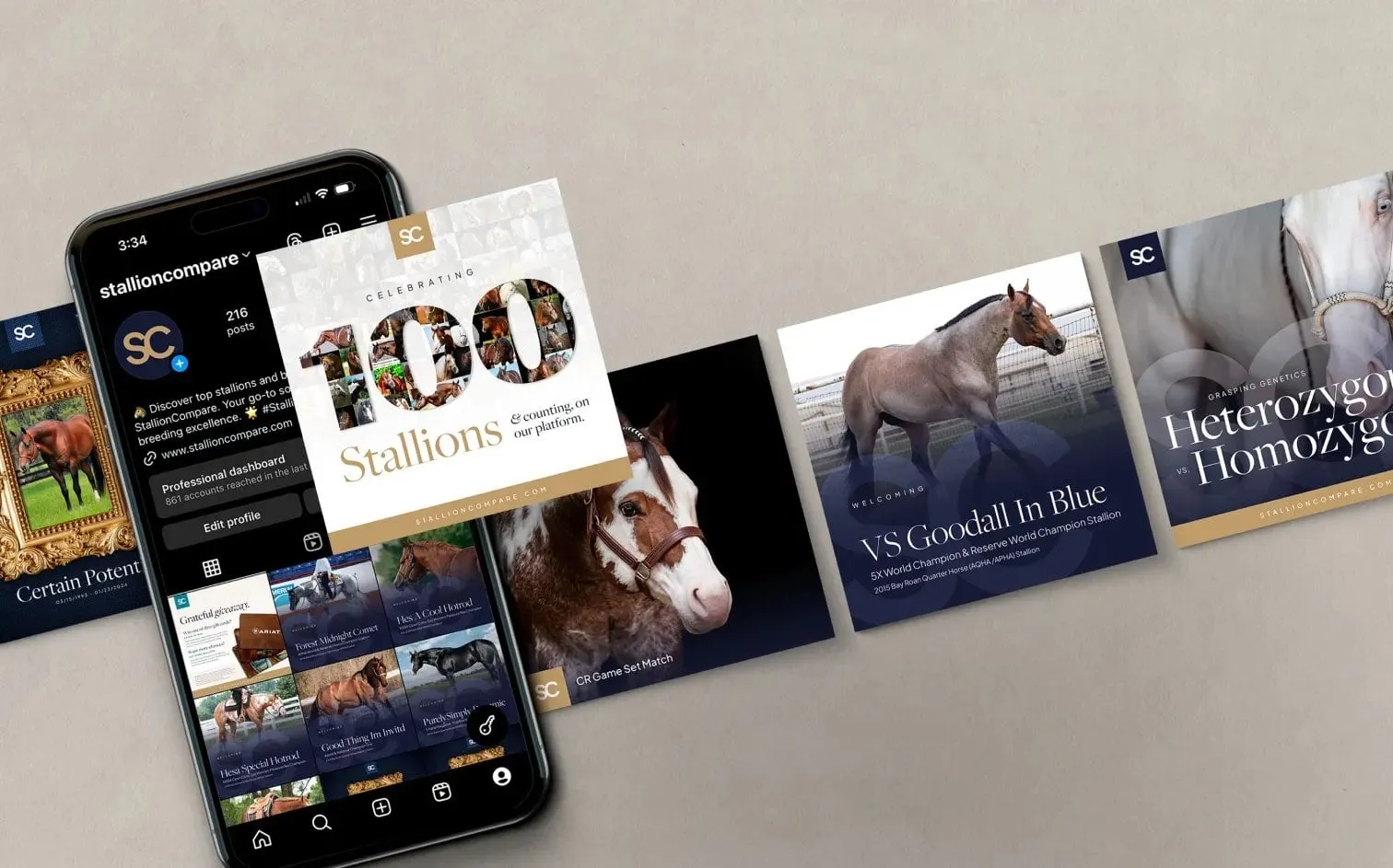
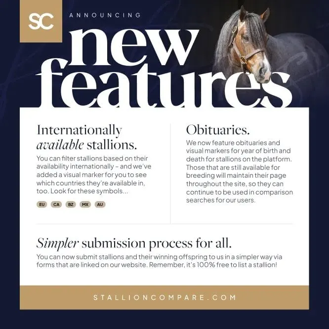
For Instagram and other channels, our social media design gave the team a set of reusable templates: stallion welcome posts, educational carousels on topics like heterozygous versus homozygous, milestone graphics, and feature announcements. The new-features post explains international availability badges (EU, CA, BZ, MX, AU), stallion obituaries and a simpler submission process, all in the same navy, gold and serif type as the website.
Because the brand, site and social were designed together, every touchpoint looks like one company. We've written about why branding and web design should happen together, and this project is a good example. For more equine work, see our identity for Winning Edge Equine Services.
What we delivered
A complete brand and digital platform for a growing equine marketplace.
- 01Brand identitySC monogram, wordmark, named colour palette and type system.
- 02Website designHomepage, stallion browsing, editorial and mobile layouts.
- 03Custom developmentA marketplace build with comparison, filtering and submission features.
- 04Social media templatesReusable post designs for announcements, spotlights and education.