Case study · Asterisk Marketing
Asterisk Marketing
A brand refresh and a lead-generating website for Asterisk Marketing, a Hamilton agency that helps real estate agents and teams win more buyer and seller leads.

01 — Context
Lead generation, for one industry only
Asterisk Marketing is a Hamilton, Ontario agency that has been helping real estate agents and teams generate buyer and seller leads since 2017. Its work is PPC, SEO, local service ads, remarketing, Google Business Profile optimization and content, and it does all of it for one industry.
That focus is the agency's biggest strength, but the old brand didn't say it. Asterisk asked us to refresh the identity and rebuild the website so agents would understand within seconds who it's for and why it works. We presented two brand directions; the team chose Clarity Point, which we then carried through the identity, the marketing and a new site.
02 — The mark
An asterisk that points at what matters
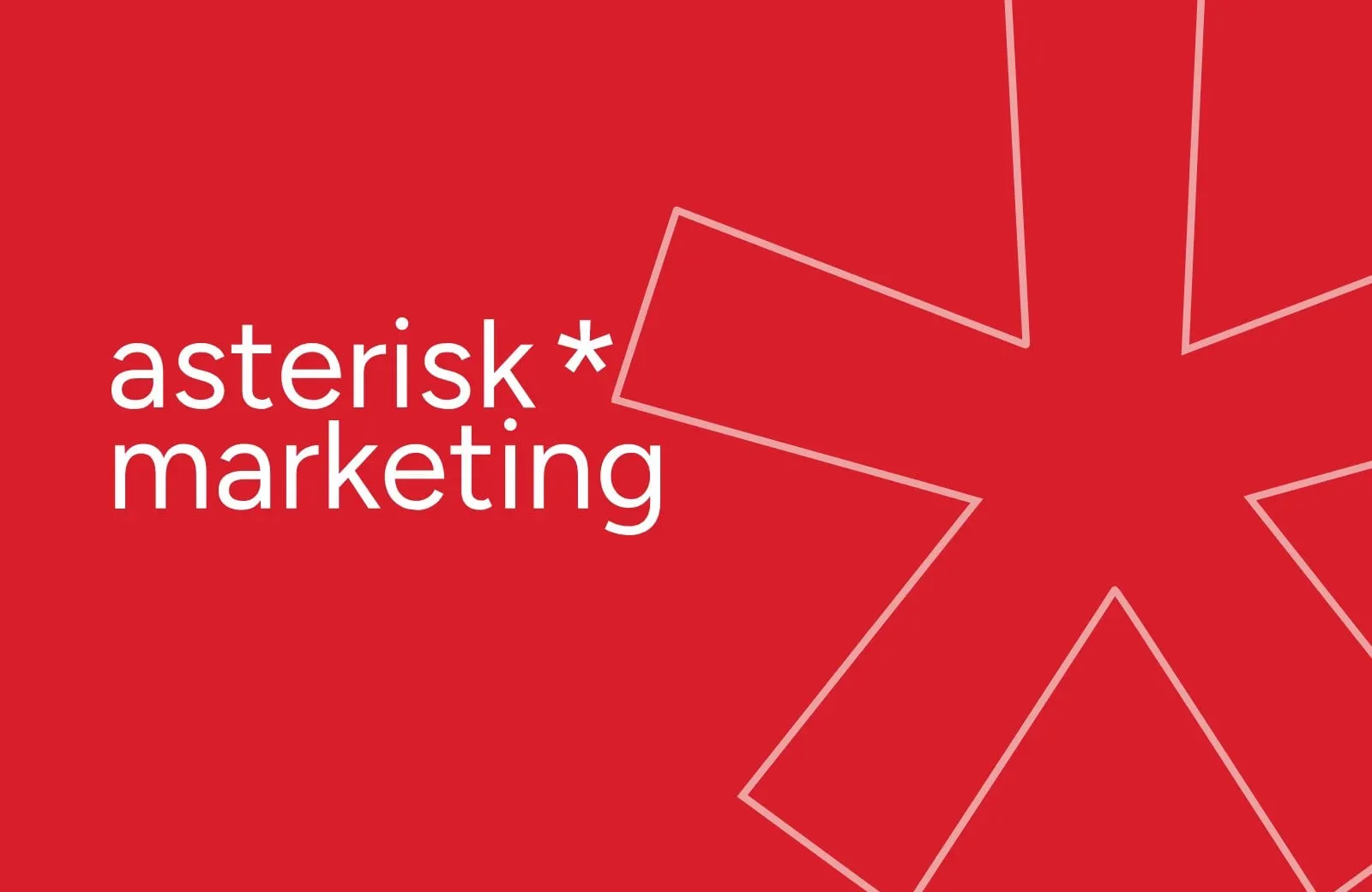
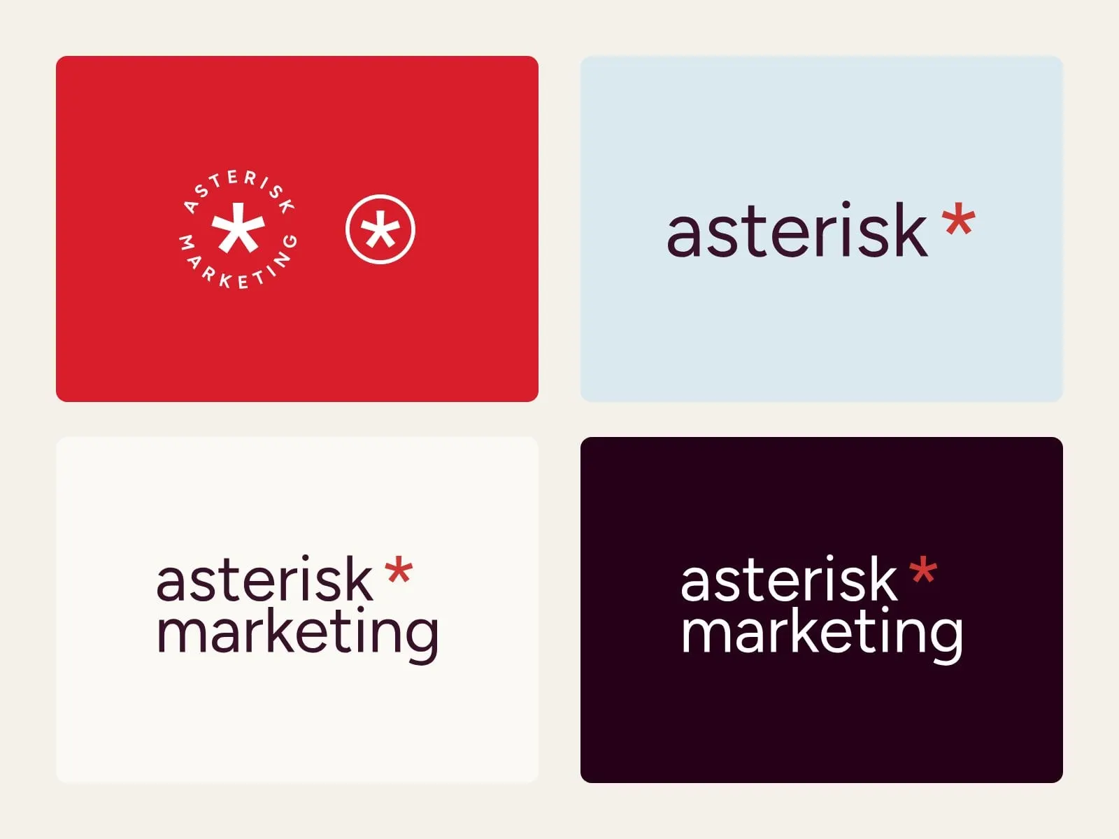
An asterisk is a footnote that says look here. That's exactly what a good marketing partner does, so we made it the hero of the brand. The refreshed wordmark is set in a clean geometric sans, all lowercase, with a Momentum Red asterisk riding at the end like a signature.
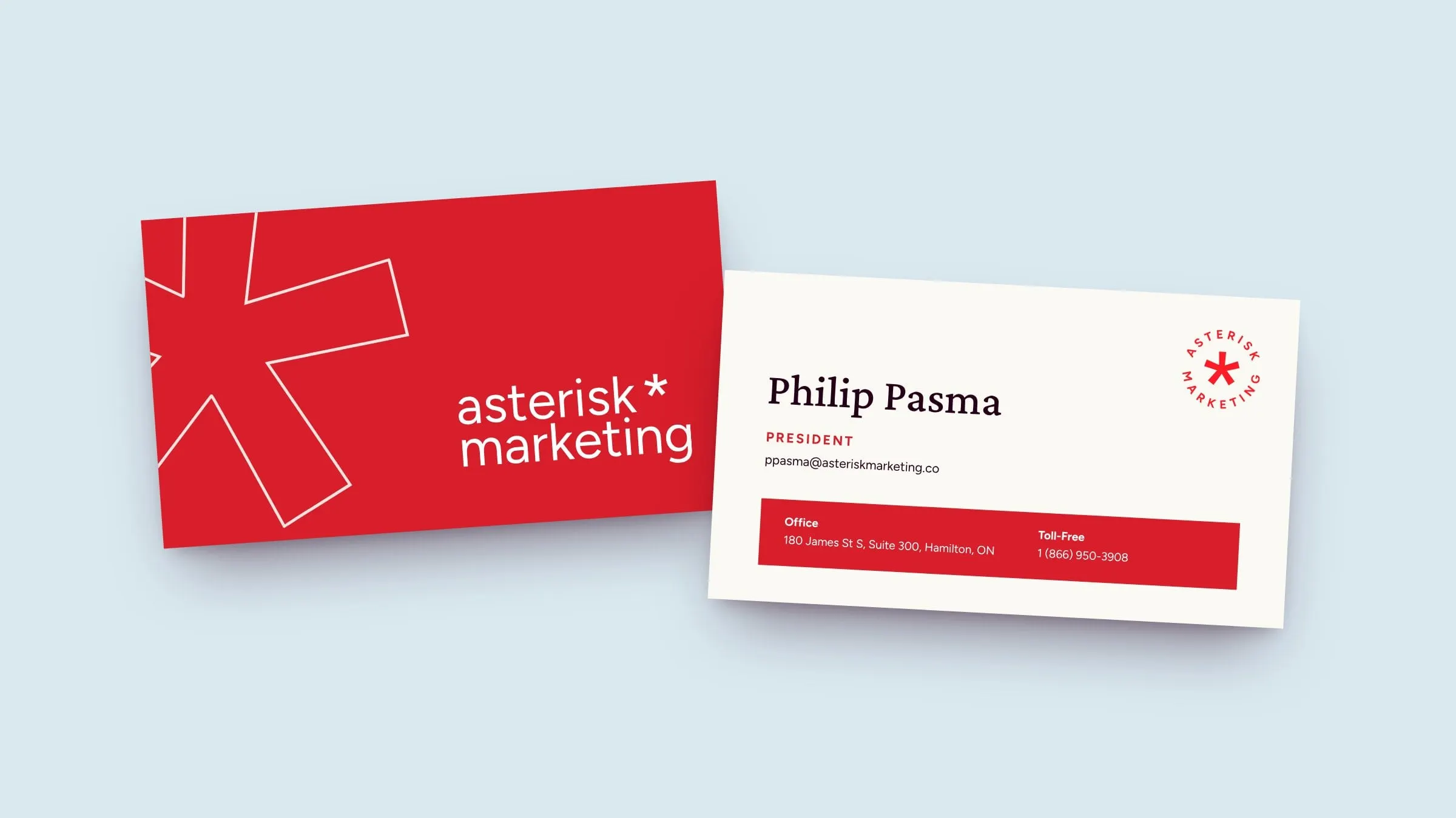
The system flexes from a stacked lockup to a single line, a circular badge that reads asterisk marketing around the mark, and the asterisk on its own for avatars and favicons. As a graphic device, the asterisk becomes an outline that frames photography, crops into layouts and sits behind solid red squares, so the brand stays recognizable even with the name nowhere in sight.

03 — Colour and type
Warm, confident and a little bit loud
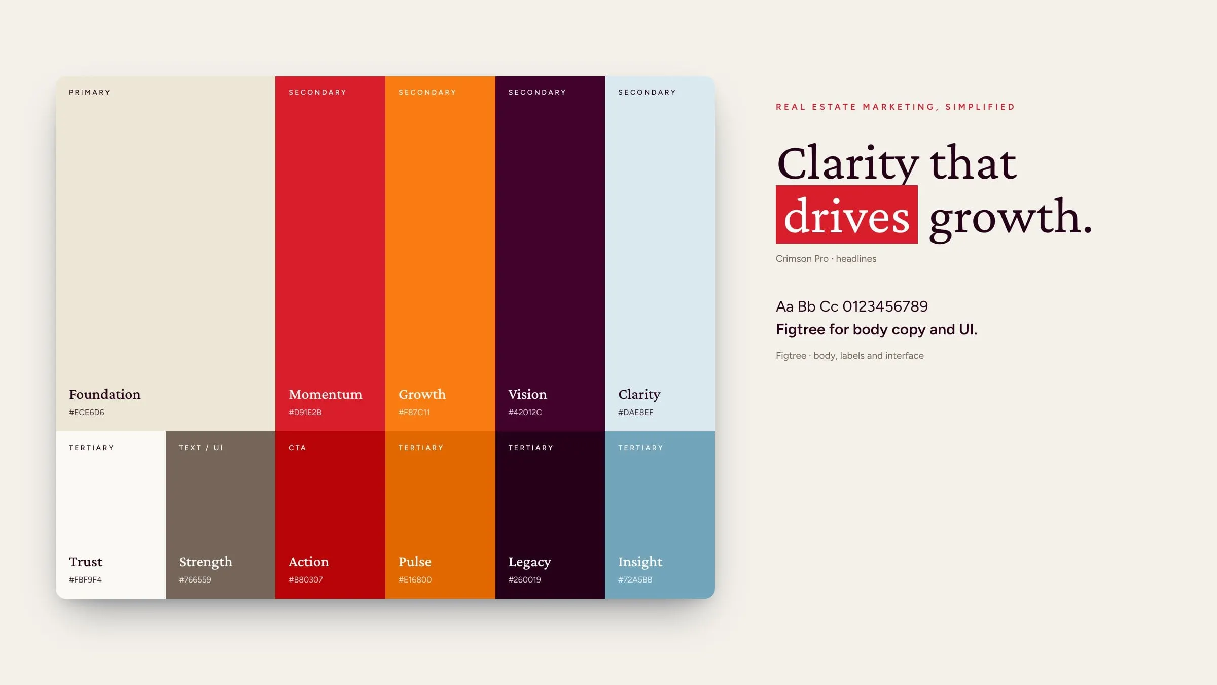
Real estate is a relationship business, so the palette starts warm. Foundation, a soft cream, gives everything room to breathe. Momentum Red carries continuity with Asterisk's existing identity and does the shouting, with Growth orange and a deep Vision burgundy for contrast and Clarity blue to cool things down.
Headlines are set in Crimson Pro, a refined serif that feels credible and a little editorial, often with a single phrase highlighted in a red block, like a marker on a listing sheet. Figtree, a friendly geometric sans, handles everything else. The combination lets Asterisk sound expert without sounding corporate, which matters when your audience is agents who'd rather be selling homes.
04 — Campaigns
Ads that look like the agency they sell
A lead-generation agency is judged by its own marketing, so we designed a set of social and digital ads that show the system working at full volume: testimonials, real estate imagery seen through the asterisk, and short, punchy headlines with a red highlight.
The vertical story ad (Finally, a true partner.) is built for the place agents actually scroll: their phones, between showings. It's a simple template the Asterisk team can reuse for new offers, guides and testimonials.


05 — The website
A site that earns the click
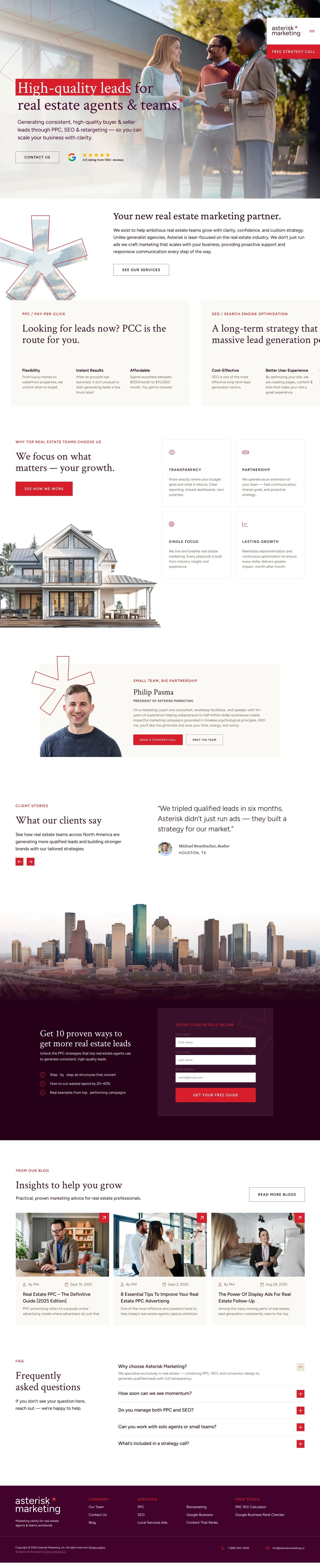
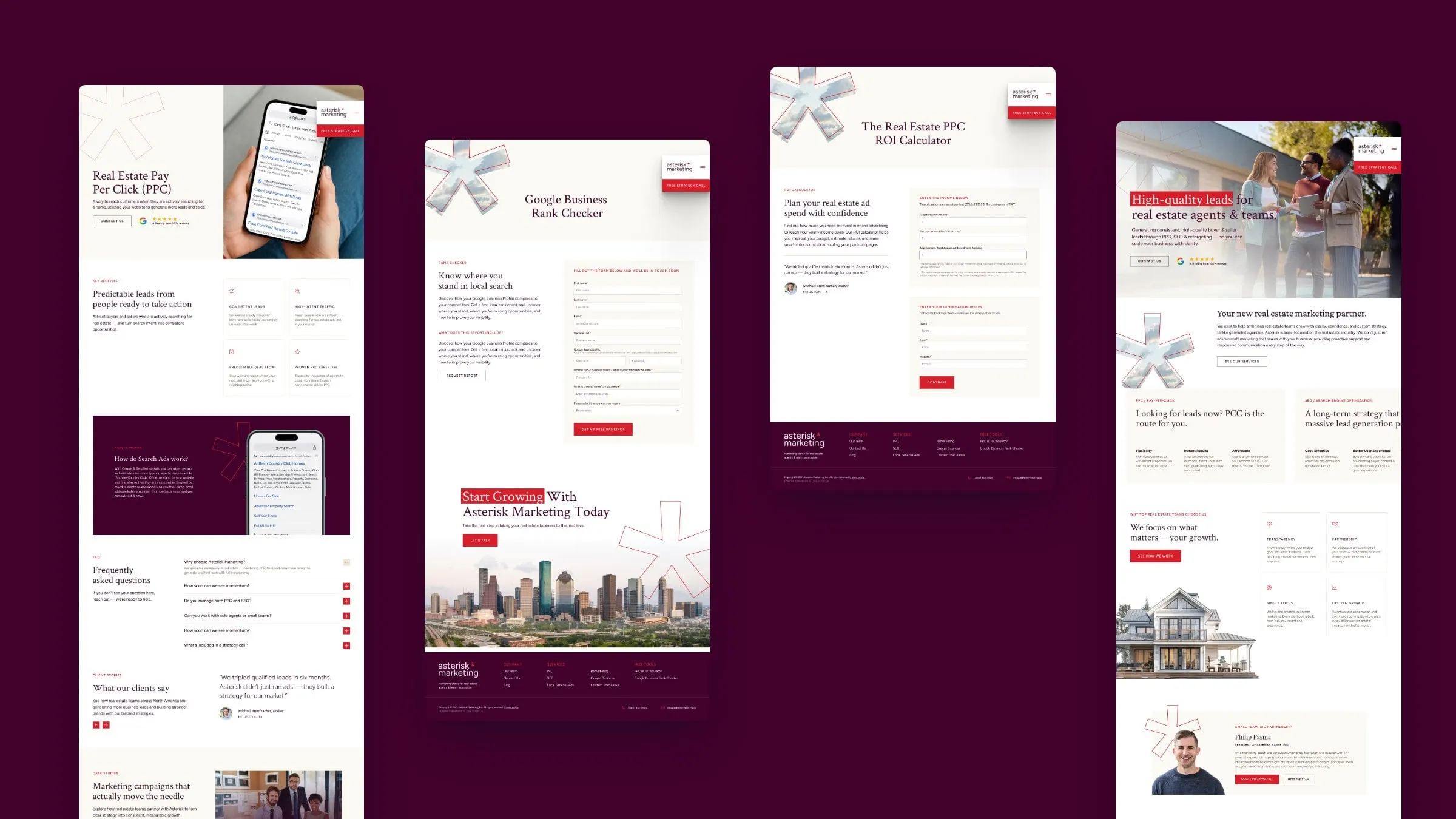
Asterisk sells leads, so the website had to work like one of its own campaigns. We designed around 30 pages and states: a homepage that leads with High-quality leads for real estate agents and teams, a page for each service (PPC, SEO, remarketing, display ads, content and Google Business Profile optimization), case studies, a blog, team and referral pages, and a set of forms for onboarding and account requests.
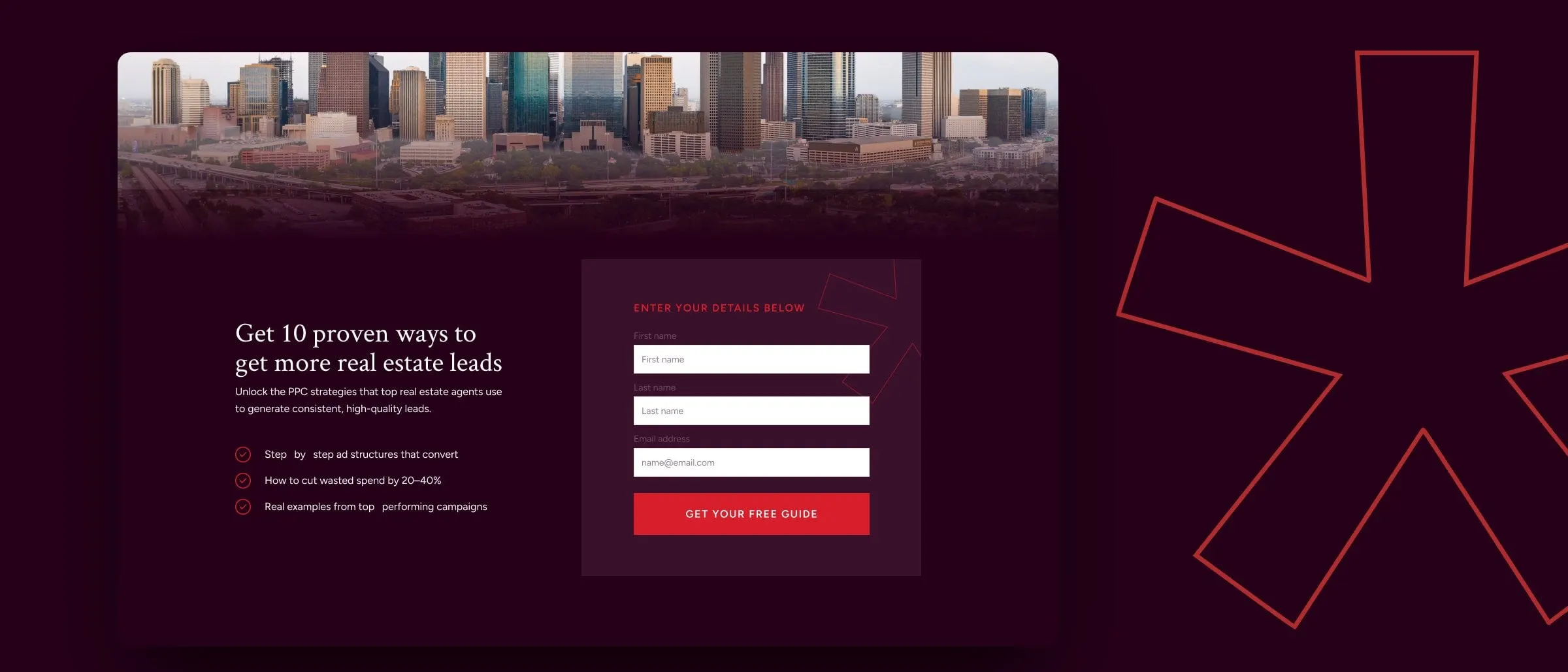
Every page ends at the same place: a free strategy call. Clear calls to action, real testimonials and a downloadable guide on getting more real estate leads keep agents moving. It's the thinking behind turning clicks into clients, applied to an agency's own site.
06 — Free tools
Tools that start the conversation
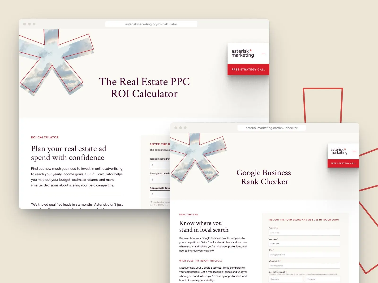
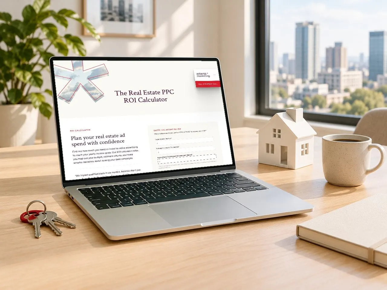
The smartest lead magnets are useful. We designed two free tools into the site. The Real Estate PPC ROI Calculator lets an agent enter a target income and average commission and see roughly what they'd need to invest in ads to hit it. The Google Business Rank Checker shows how an agent's profile stacks up against local competitors and delivers the report by email.
Both give agents something real before they ever book a call, and both hand Asterisk a warm, qualified lead. It's UX design working as a sales tool.
07 — The result
Clearer brand, sharper funnel
Asterisk now looks like the specialist it is. The red asterisk gives the agency a mark people remember, the palette and type feel warm but sure of themselves, and the website turns that clarity into a funnel, with tools, a guide and a free strategy call at every turn.
For more on why identity and site should be built side by side, read why branding and web design should happen together. We've also helped other marketing teams find their footing, like O'Rorke Marketing. See more professional services work.
What we delivered
- 01Brand refreshTwo directions, then a refined wordmark, badge and asterisk symbol.
- 02Colour and type systemAn eleven-colour palette with Crimson Pro and Figtree.
- 03Social and digital adsFeed and story templates for testimonials and offers.
- 04Business cardsA bold red front and a clean cream back.
- 05Website designAround 30 pages and states, from service pages to case studies and forms.
- 06Free toolsA PPC ROI calculator and a Google Business rank checker.
- 07Website developmentA build ready for new services, posts and case studies.