Case study · O’Rorke Marketing
O’Rorke Marketing
A new logo, brand guidelines, website and stationery for O'Rorke Marketing, a marketing services company in Inola, Oklahoma.
01 — Context
A marketing company brand identity that looks established
O'Rorke Marketing is a marketing services company based in Inola, Oklahoma, offering design, market research, website development and management, social media management and web hosting. The team came to us wanting an updated logo that felt modern yet approachable, and that would stretch across all the marketing materials they planned to produce. In short, they needed a marketing company brand identity that would practise what they preach.
As a small company, they wanted a professional, almost corporate presence without losing warmth. The new identity had to hold up on everything from a business card to a website, and it had to be simple enough for the team to apply consistently. The project grew from a logo into a full system: brand identity, a brand guide, a website, and print collateral including business cards and envelopes.
02 — The mark
A logo that works whole or in part
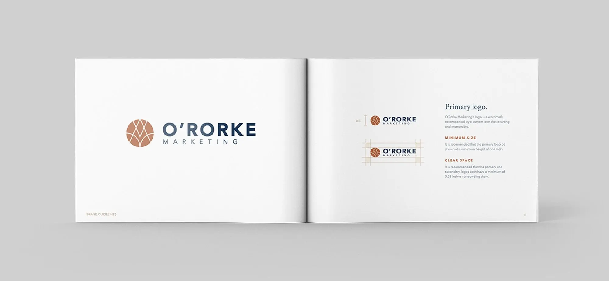
The primary logo pairs a wordmark with a circular mark. O'RORKE is set in strong navy capitals, with MARKETING letter-spaced beneath in copper. The mark is a copper circle cut by white lines that form a stylised letter M, which echoes the name and reads as something woven together.
We designed the two parts so they can separate cleanly. The full logo leads in the brand guide and on the envelope; the mark stands alone in the website header and on the front of the business card. That flexibility was central to the brief, because the client wanted brand recognition from the whole logo or just one portion.
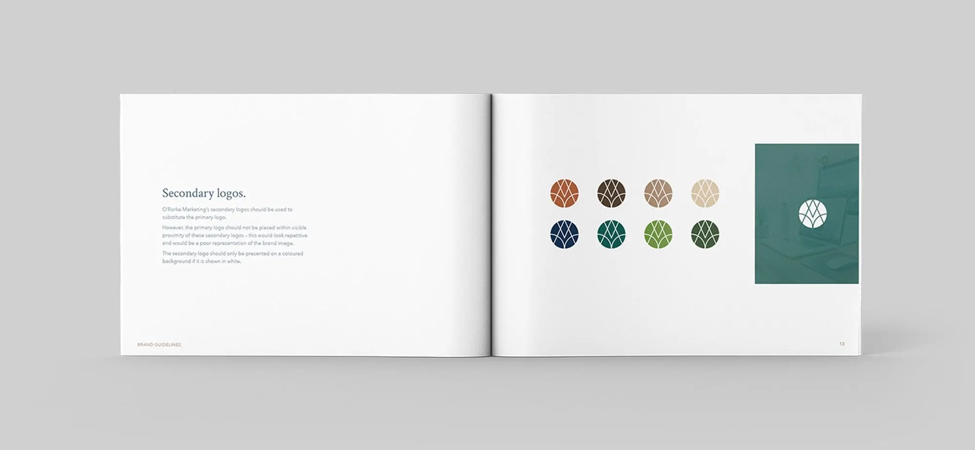
We documented all of this in a set of brand guidelines. The guide sets a minimum size and clear-space rules for the primary logo, and shows the secondary mark in eight colours: copper, brown, tan, sand, navy, teal, green and forest. It also explains when the mark can be placed on a coloured or photographic background. Rules like these keep a logo consistent as more people use it. We cover the practical side in our guide to using your logo files.
03 — Website and print
Carrying the brand into every touchpoint
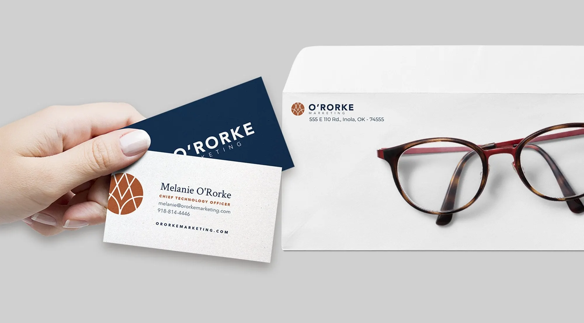
For the stationery, we kept things simple and confident. The business cards use a navy back with the wordmark reversed out in white, and a white front with the copper mark, the person's name in serif, a copper title and contact details. The envelope carries the full logo and the Inola address in the corner.
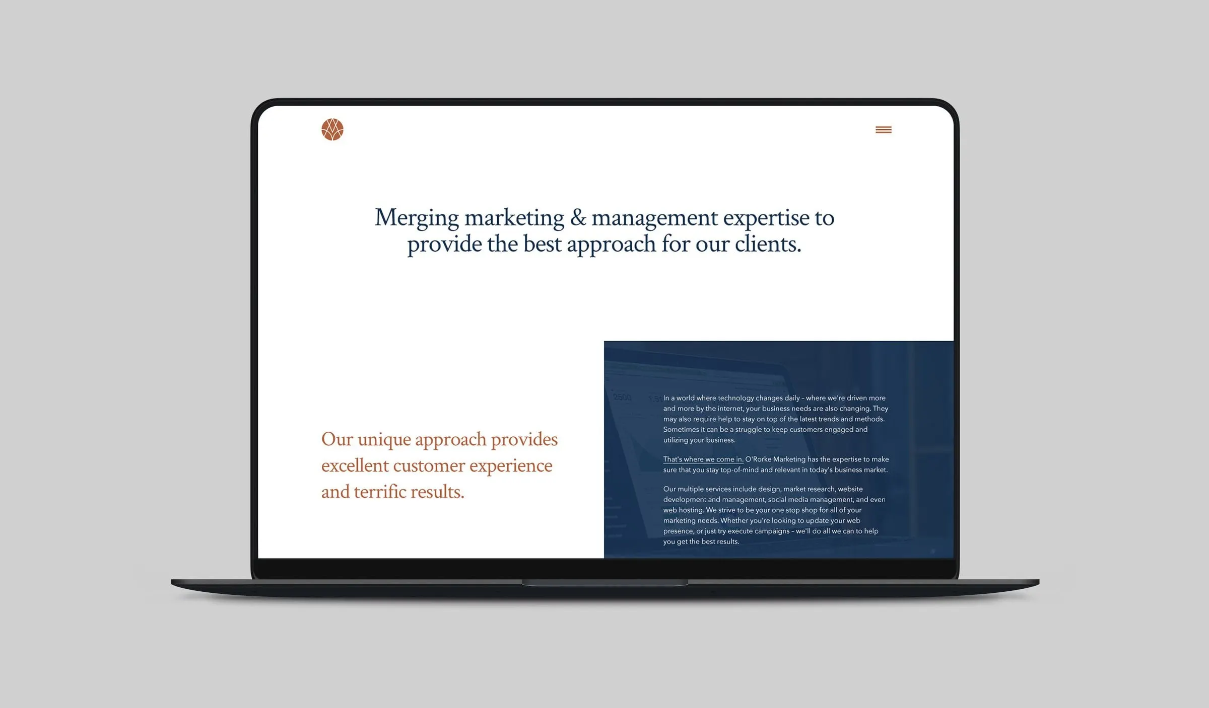
The website design uses the same palette and type pairing. A navy serif headline, "Merging marketing & management expertise to provide the best approach for our clients", leads into copper subheadings and a navy panel that lists the firm's services. Generous white space lets the copy breathe and keeps the site feeling as clean as the logo.
The result is a small professional services firm with a brand that looks considered at every scale, from a business card to a full web page. For another marketing agency identity, see our work for True Interactive Digital Marketing.
What we delivered
A complete identity system for a growing marketing firm.