Case study · Kunaferia
Kunaferia
Branding, packaging and a full brand guide for Kunaferia, a maker of Syrian kunafa that brings a heritage dessert into a modern, premium brand.
01 — Context
A beloved Syrian dessert, ready for a bigger stage
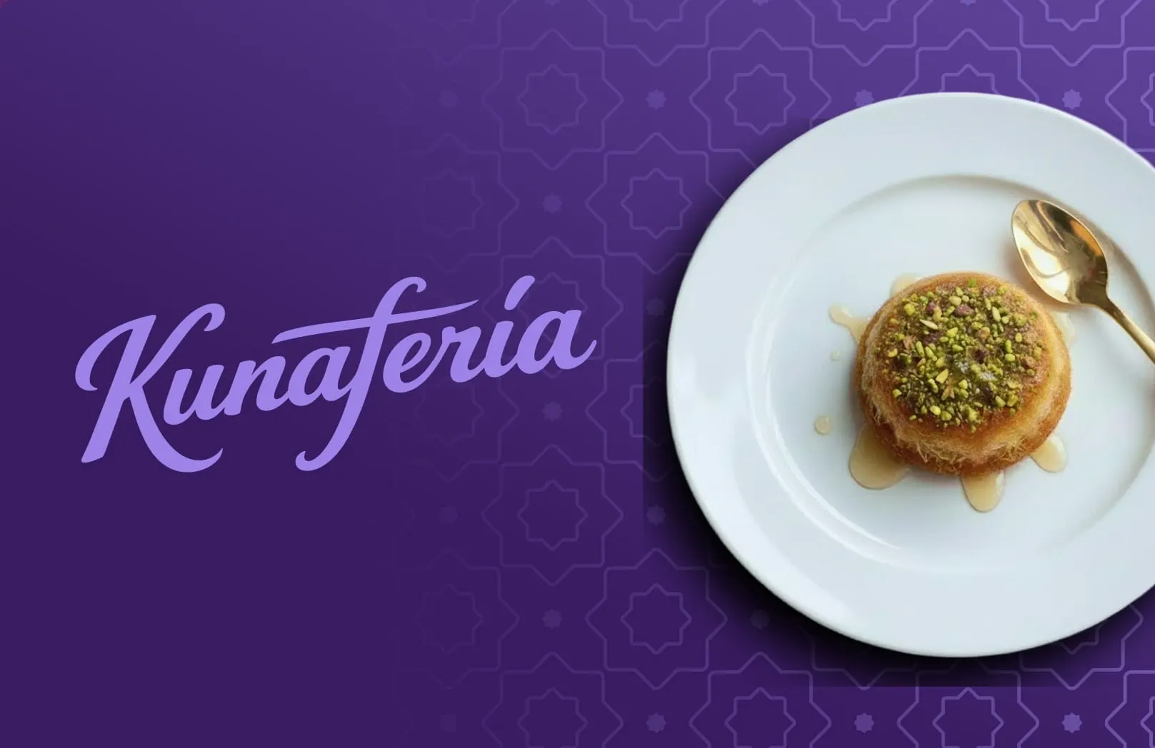
Kunafa is one of the most loved desserts in the Middle East: crisp, golden pastry, soft cheese or cream, warm syrup and a generous crown of pistachio. Kunaferia makes Syrian kunafa and wanted a brand that would let it stand beside any premium bakery or dessert brand, without losing the warmth of the homemade original.
We built the whole system: brand identity, packaging, and a complete brand guide, all designed to grow with the company.
02 — Identity
A script wordmark with a baker's hand
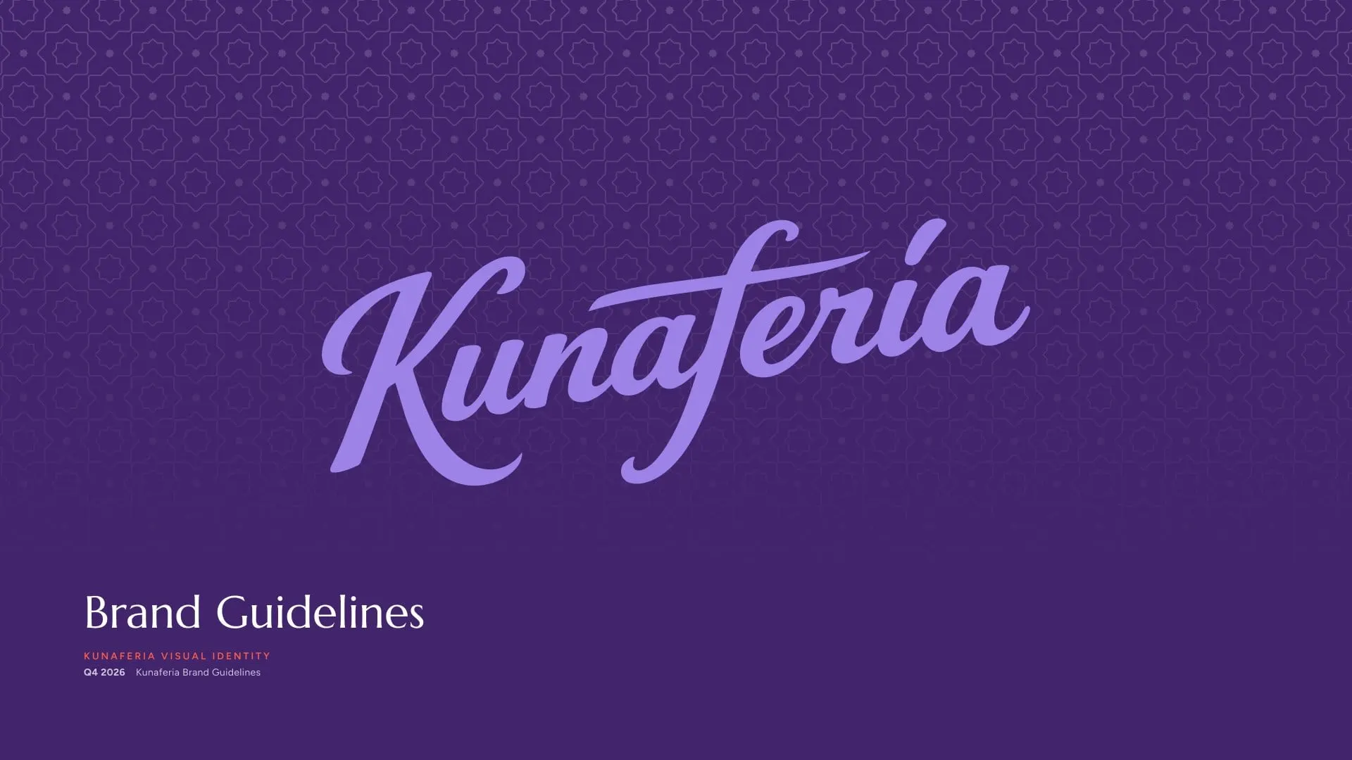
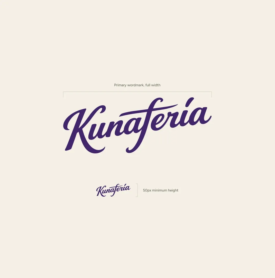
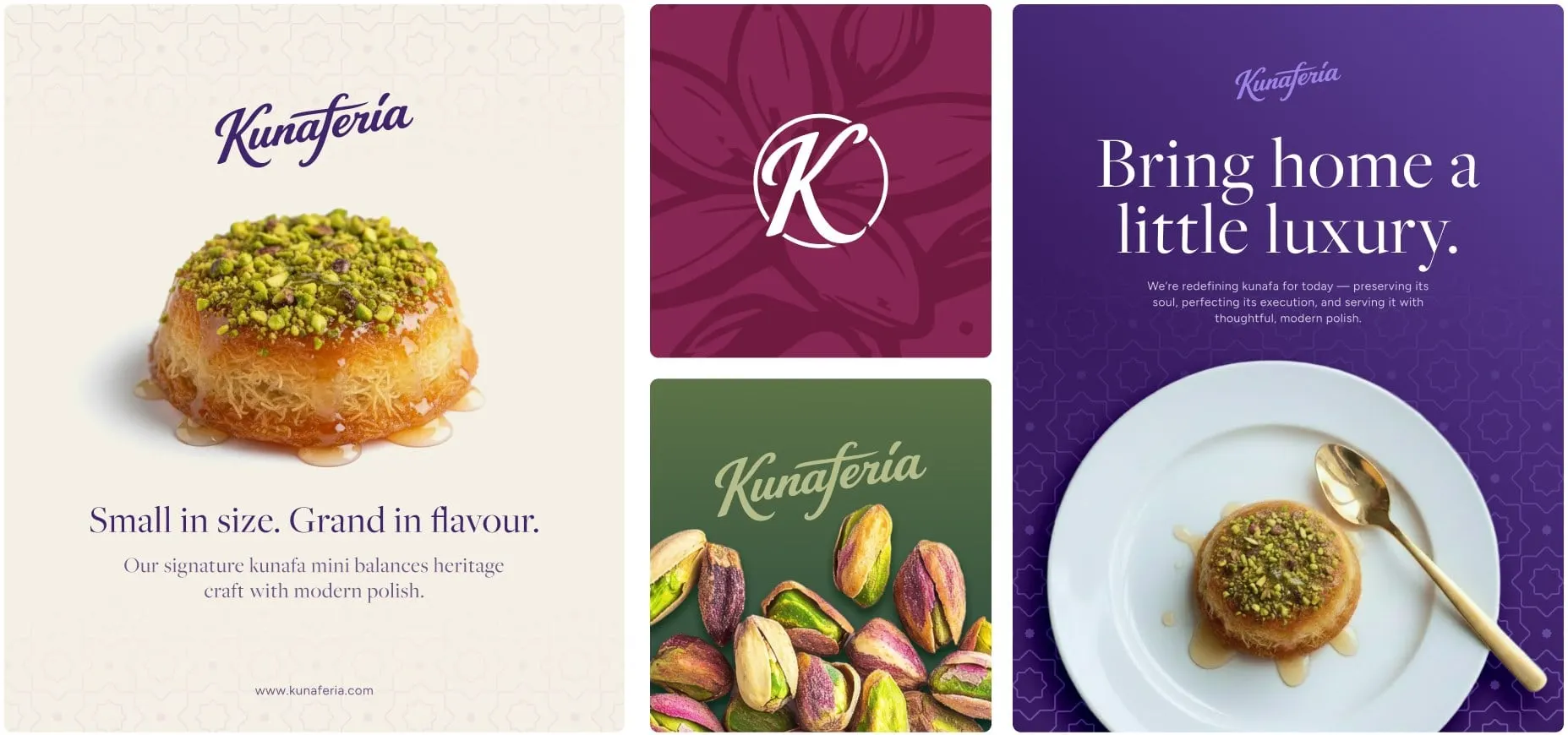
The primary logo is a flowing, hand-drawn script. It has the warmth of something made by hand, with enough polish to sit on a premium box or a trade show wall.
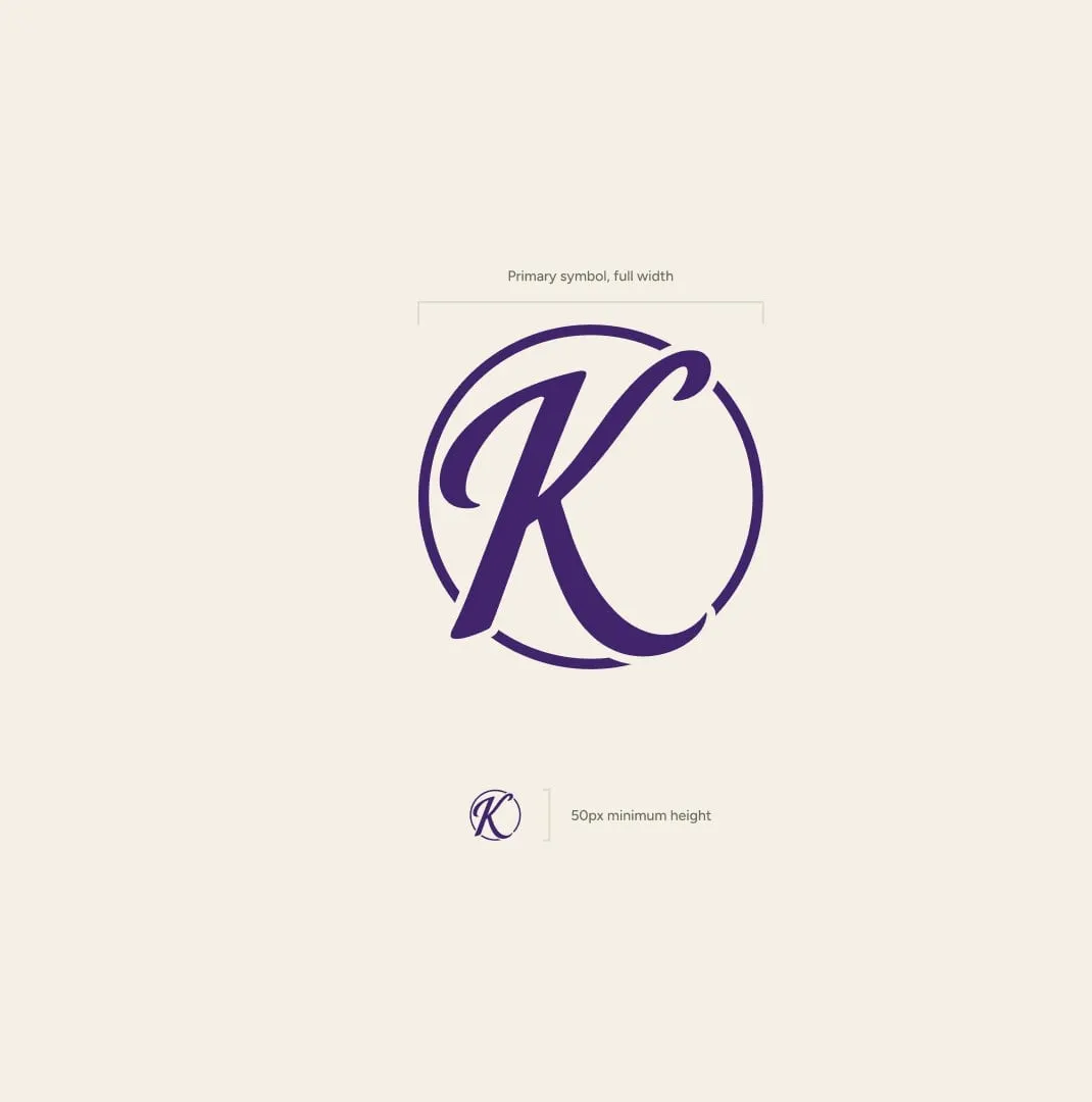
For tighter spaces we drew a symbol: a script K inside an open circle. It works as a seal on packaging and a social avatar, and carries the brand even when the full name has no room.
A wordmark like this is about character, not illustration. We explain why in why literal logo marks fall short.
03 — Colour
Jewel tones taken from the dessert itself
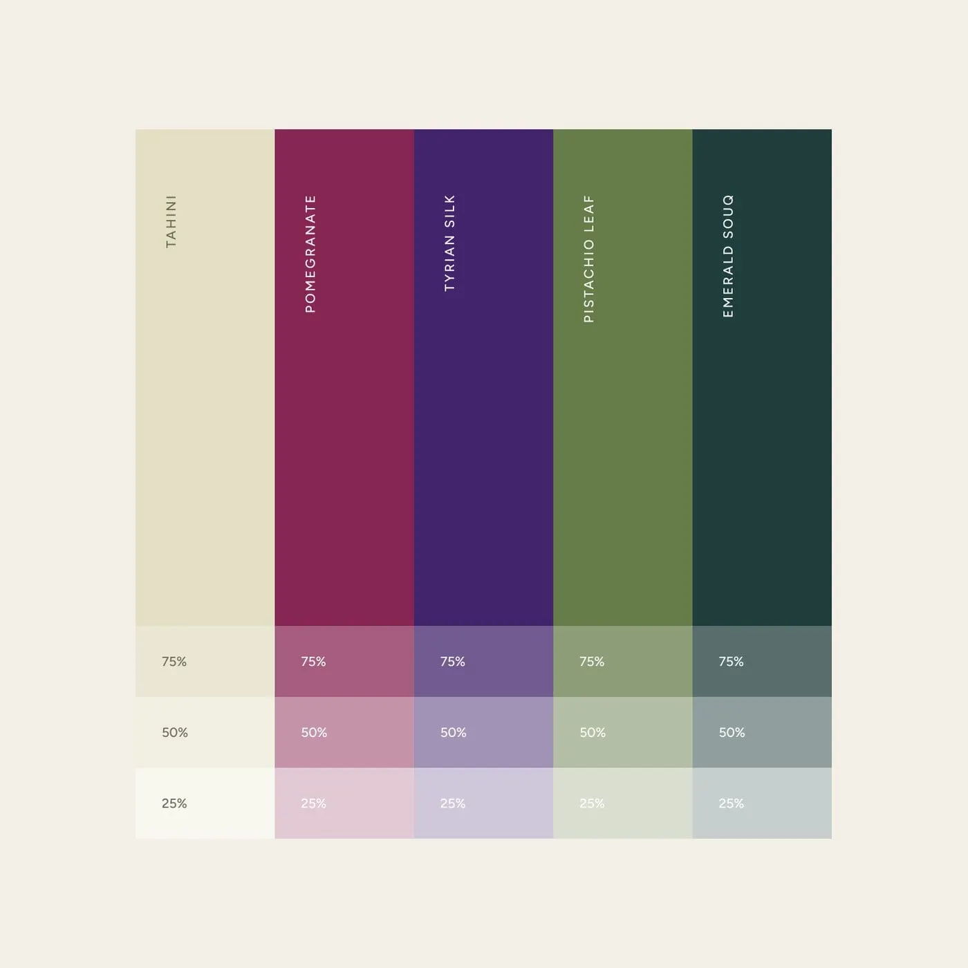
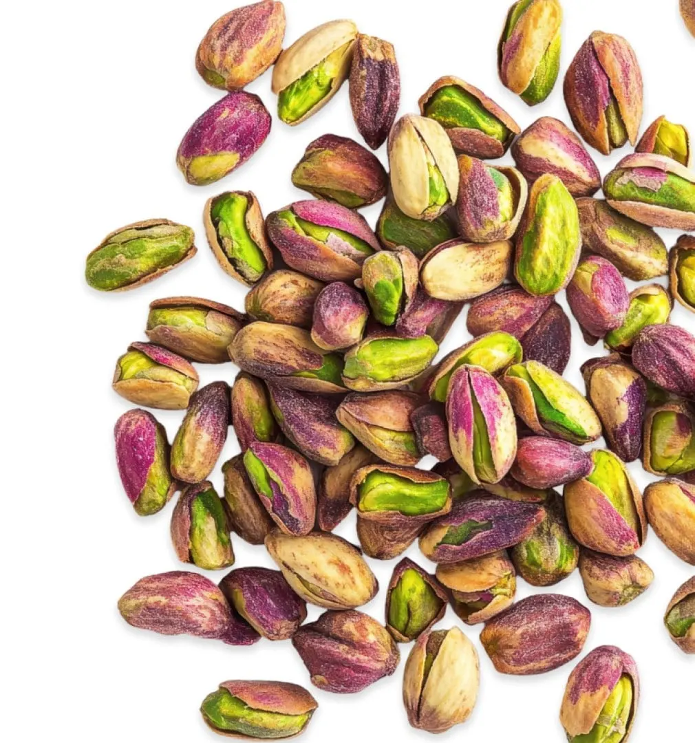
The palette comes straight from the ingredients and the setting kunafa is served in. Tahini is the soft, warm foundation. Pomegranate, Tyrian Silk, Pistachio Leaf and Emerald Souq add the depth and richness, so the brand feels luxurious without feeling cold.
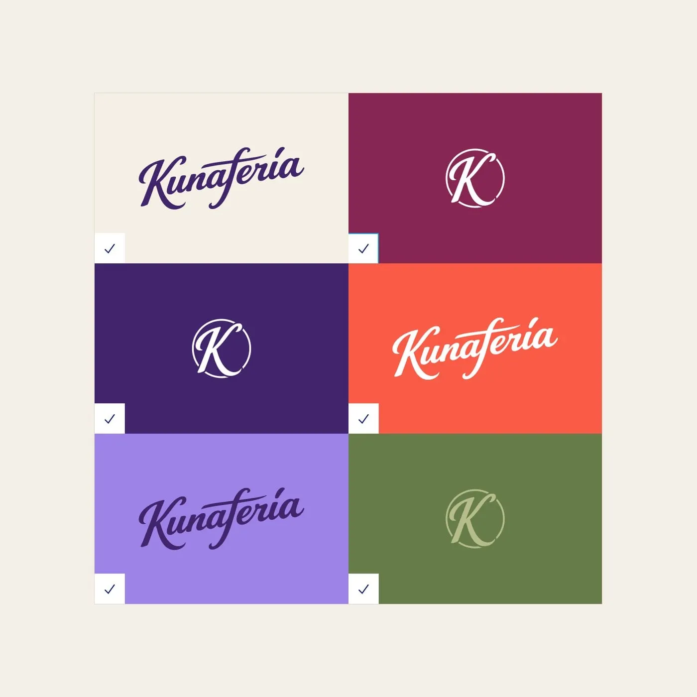
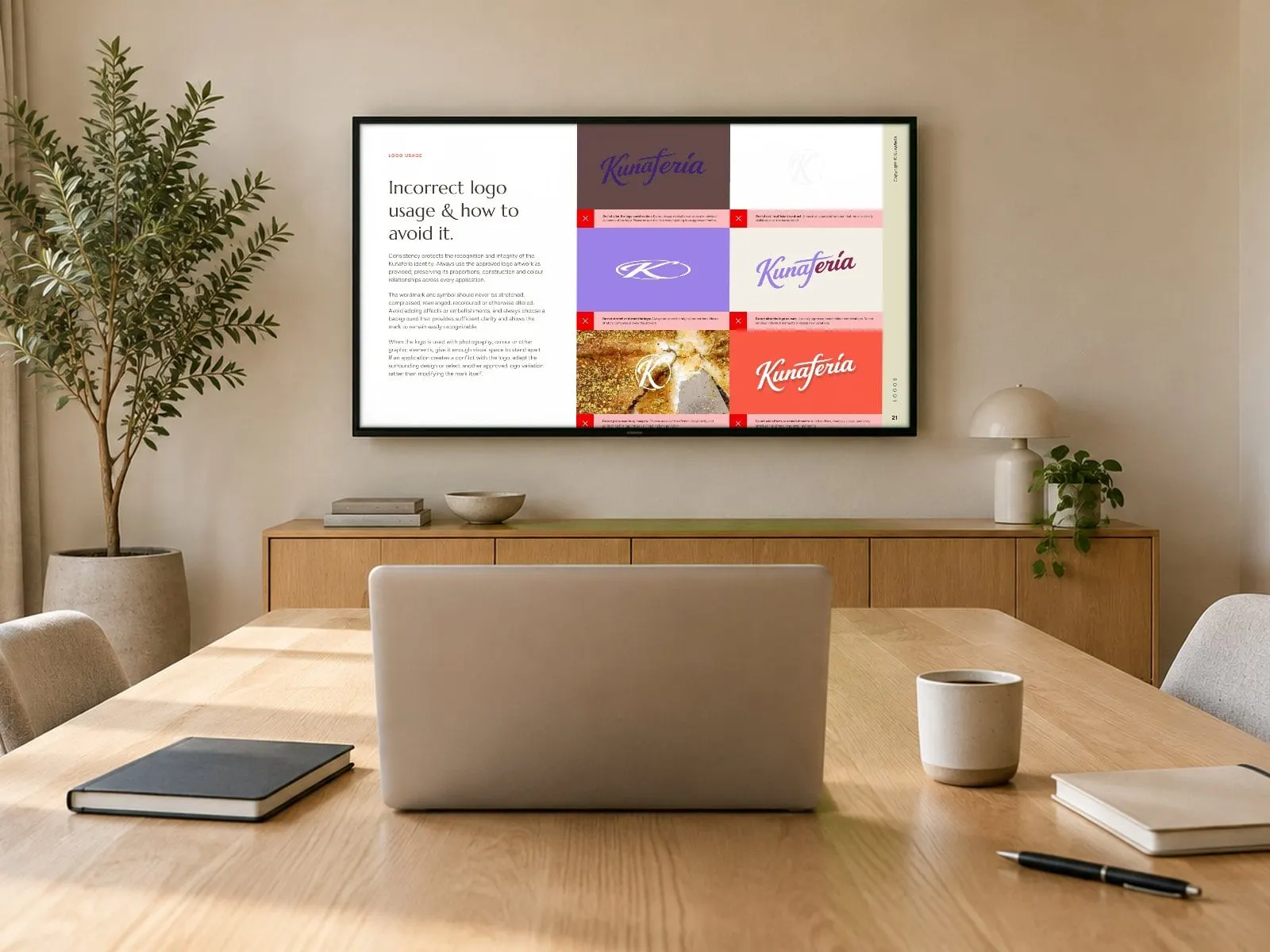
The guide spells out which logo goes on which colour, with approved pairings for light and dark backgrounds, so every application stays legible and on-brand, from a sticker to a storefront.
04 — Packaging
Packaging that sells the first bite
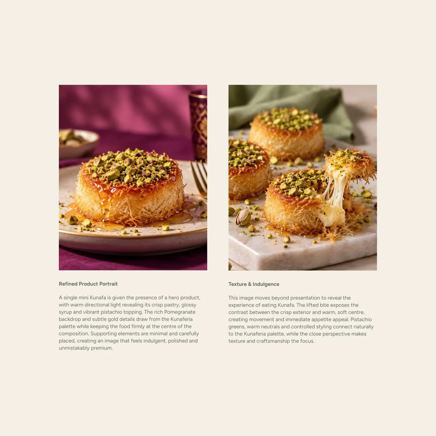
With the identity in place, we carried it onto Kunaferia's packaging. The brand's jewel tones, script wordmark and K seal make the product easy to spot on a shelf, and photography of the dessert does the rest.
Food brands win or lose in that first glance. See more of our food and beverage branding, our packaging design work for Brickhouse Smokery, or how branding affects the bottom line.
05 — Brand guide
A brand guide built to keep it consistent
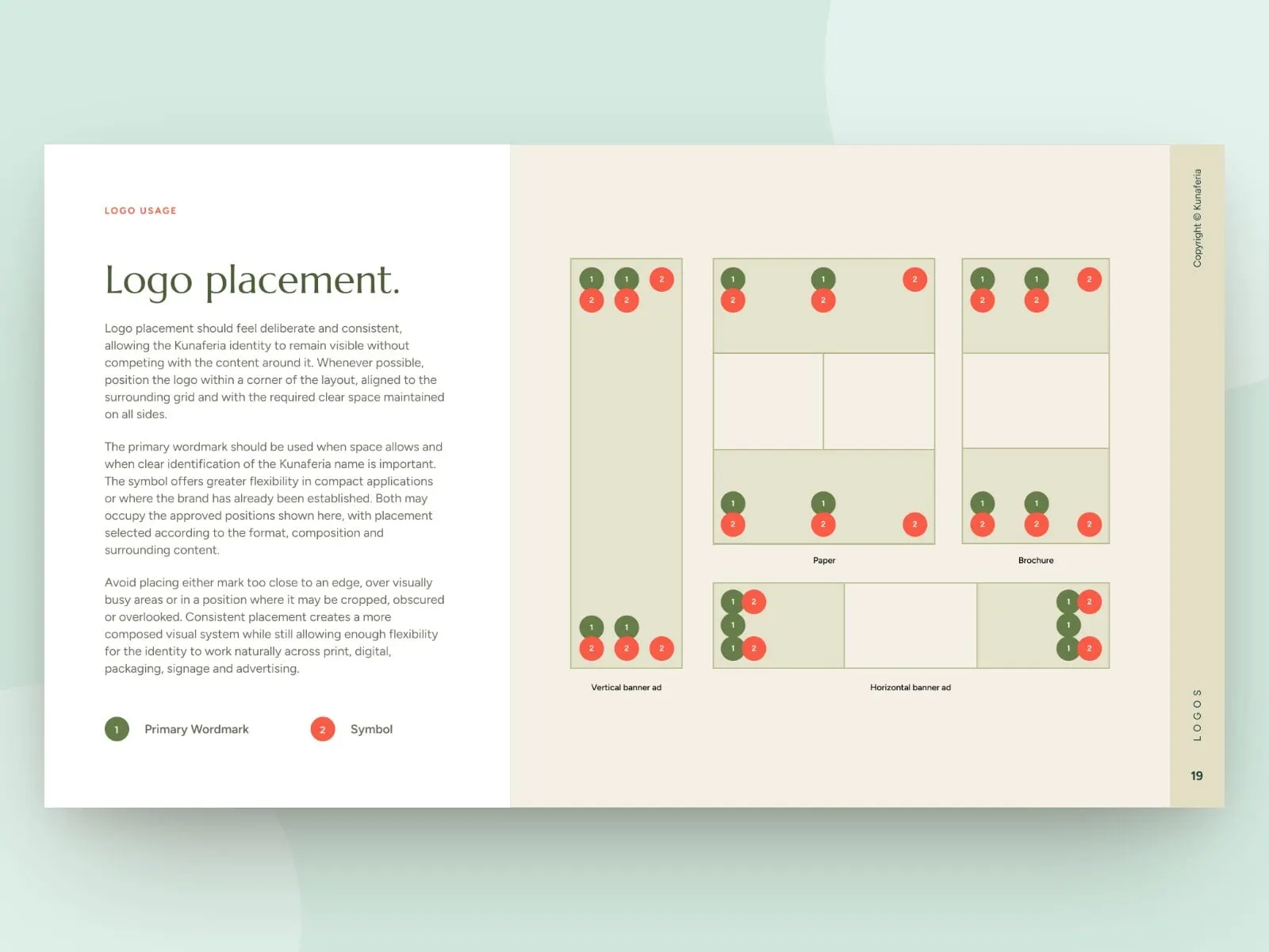
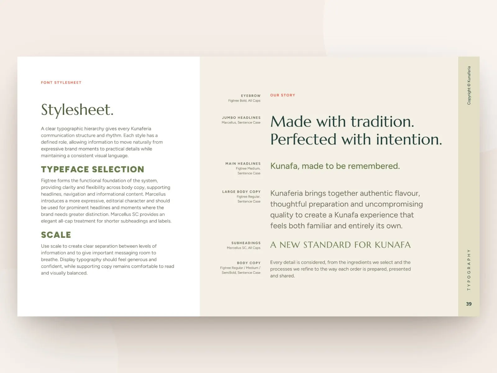
Kunaferia's promise is that every kunafa is exceptional, every time, and the brand needed the same discipline. The brand guide covers the vision, mission and values, logo use and clear space, the core and extended palettes with digital and print colour codes, typography, iconography and a photography benchmark.
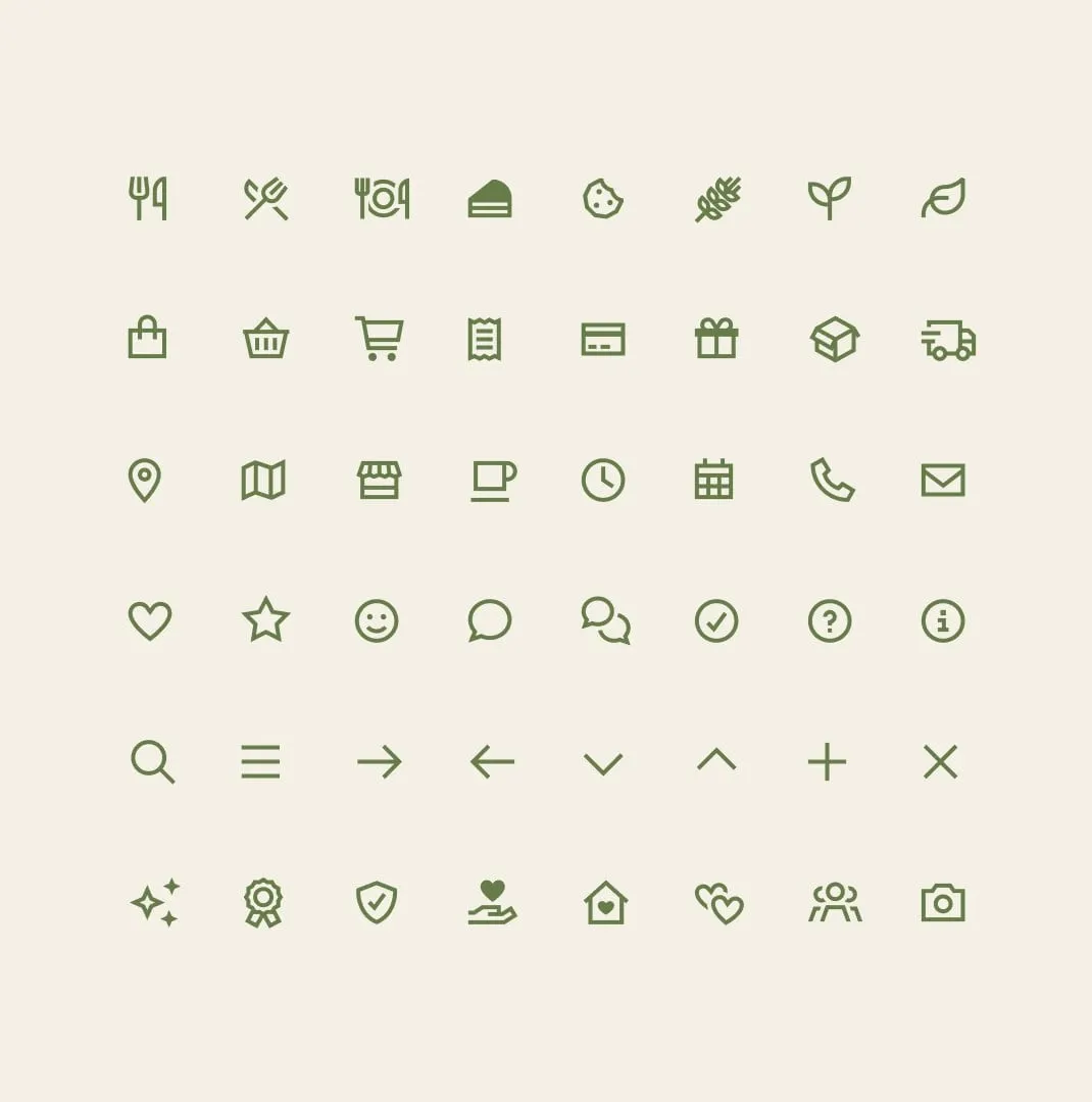
A matching icon set handles menus, ordering and wayfinding, so new materials can be produced quickly without drifting from the brand. It is the kind of system we recommend in why a cohesive brand matters.
What we delivered
- 01Brand identityScript wordmark, K symbol and logo system.
- 02Colour & typographyA jewel-tone palette with print and digital specifications.
- 03Brand guideVision, values, logo use, colour, type, icons and photography.
- 04PackagingPackaging designed to stand out on the shelf.
- 05Icon setCustom-styled icons for menus, ordering and wayfinding.