Insights · Branding
What to Include in Brand Guidelines (With Examples)

The short answer: good brand guidelines cover six things: your logo and how to use it, your colours, your typefaces, your imagery style, your voice, and real examples of the brand applied to things like your website, social posts and print. Add your brand story and values at the front, and the files and templates people need at the back.
A brand style guide (also called a brand book or brand standards) exists for one reason: so that everyone who touches your brand, from a new marketing hire to an outside printer, makes work that looks and sounds like you. Here’s what to put in one, based on the brand guidelines we create for clients.
What to include in brand guidelines
| Section | What it covers | Why it matters |
|---|---|---|
| Brand foundation | Purpose, positioning, values, audience | Gives the rules a reason, so people make good calls when the guide doesn’t cover something |
| Logo | Versions, clear space, minimum size, placement, misuse | The logo is the part most often stretched, recoloured or crowded |
| Colour | Primary and secondary palettes with HEX, RGB, CMYK and Pantone values, plus proportions | Keeps colour consistent across screens and print |
| Typography | Typefaces, weights, sizes, hierarchy, web and system fallbacks | Type does much of the work of making a brand recognizable |
| Imagery | Photography style, illustration, icons, graphic elements | Stops off-brand stock photos creeping in |
| Voice and tone | Personality, words to use and avoid, examples | Makes your writing sound like one company |
| Applications | Website, social, stationery, signage, packaging, presentations | Shows the rules working in real life |
| Files and templates | Logo files, colour swatches, fonts, templates | Makes the right thing the easy thing |
1. Brand foundation
Start with a page or two on who you are: what you do, who you do it for, what makes you different and what you stand for. Keep it short. This isn’t the full brand strategy; it’s enough context that someone writing a social post or briefing a photographer understands what the brand is trying to do.
2. Logo usage
This is usually the longest section, because it’s where most mistakes happen. Include:
- Every version of the logo: primary, stacked or horizontal, the symbol on its own, and one-colour versions for dark and light backgrounds.
- Clear space: the minimum empty space around the logo, usually measured using part of the logo itself so it scales.
- Minimum size for print (in millimetres or inches) and screen (in pixels).
- Backgrounds: which colours and photos the logo can sit on.
- Misuse: a visual "don’t" page showing it stretched, rotated, recoloured, outlined or with added effects.
If you’re unsure which logo file to send where, our guide to logo file types explains the differences between SVG, PNG, EPS and PDF.
3. Colour palette
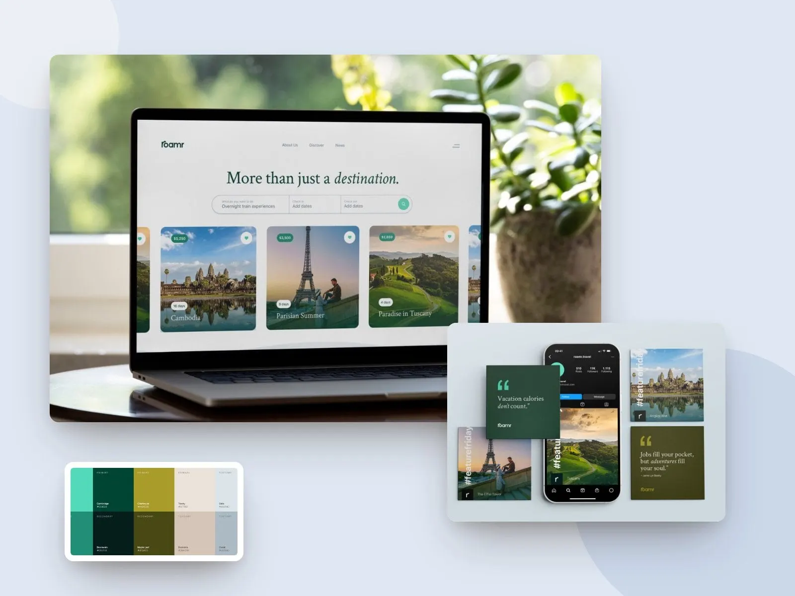
List each colour with its values for every use: HEX and RGB for screens, CMYK for printing, and a Pantone (PMS) match for spot colour printing where needed. Then show proportions. A brand that’s mostly white with a single accent colour looks very different from one that’s mostly that accent colour, even with the same palette.
Include accessible pairings too: which text colours can sit on which backgrounds while meeting contrast standards. It saves your web team from guessing.
4. Typography
Name your typefaces and the weights you use, then show a type hierarchy: how headlines, subheads, body text, captions and buttons look. Include fallbacks for when the brand font isn’t available, such as in emails, Google Docs or PowerPoint, and note where the font licences cover web use.
5. Imagery and graphic elements
Describe and show the photography style: natural or staged, light or moody, people or products, cropping and colour treatment. Do the same for illustrations, icons, patterns and any graphic devices that belong to the brand. A few strong examples and a few clear "not like this" examples will do more than a page of adjectives.
6. Voice and tone
Explain how the brand sounds, with three or four personality traits and what each one means in practice. Include before-and-after rewrites, words you use and words you avoid, and how the tone shifts between, say, a social post and an apology email. If you work in English and French, cover both.
7. Applications
Show the brand in use: the website, social media templates, business cards and letterhead, email signatures, presentations, signage, vehicles, uniforms and packaging, whatever applies to you. This is often the most useful part of the guide, because people copy examples more readily than they read rules.
Brand guidelines examples
Some well-known organizations publish their brand guidelines, and they are worth studying:
- NASA’s 1975 Graphics Standards Manual, for the "worm" logotype, is a classic of clear, systematic rules and has since been reissued as a book.
- The Government of Canada’s Federal Identity Program shows how a brand system holds together across hundreds of departments, in two official languages.
- Mailchimp’s Content Style Guide is a public example of a thorough voice and tone section.
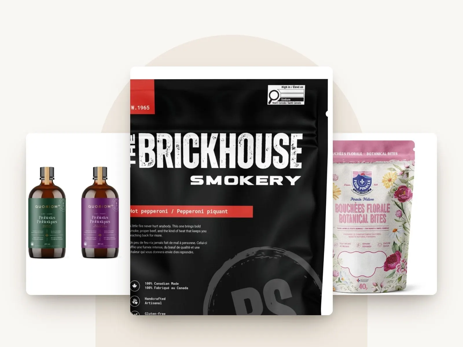
For product companies, a separate packaging guide can sit alongside the brand guide. For Mistral, we created a brand guide, a packaging design guide and new packaging across its range of kitchen, household and electronics products, so new products follow the same system. You can see it in our Mistral case study.
How long should brand guidelines be?
As long as they need to be and no longer. A start-up might need 10 to 20 pages covering the essentials. A company with many products, locations or partners might need 60 pages or more, often split into a core guide and separate guides for things like packaging or signage. If a section never gets used, cut it. If people keep asking the same question, add a page.
Making brand guidelines people actually use
- Make it visual. Show, don’t describe.
- Make it easy to find. Share it as a PDF or web page alongside a folder of organized logo files, fonts and templates.
- Give it an owner. Someone needs to answer questions and approve exceptions.
- Keep it current. Update it when you add products, change your website or rebrand.
If your brand has drifted over the years, the guide may not be the problem; the brand might need a refresh first. Our branding and rebranding work can include guidelines and files your team can use from day one.
Ready to build something worth envying?
Frequently asked questions
What is the difference between brand guidelines and a brand style guide?
They are usually the same thing. Some companies use "style guide" for the visual and writing rules and "brand guidelines" for a wider document that also includes strategy and values.
What should be in a brand style guide?
Logo use, colour palette, typography, imagery, voice and tone, and examples of the brand applied to real things like your website and print. Most also include a short brand foundation section and links to files and templates.
How many pages should brand guidelines be?
A small business might need 10 to 20 pages. Larger companies with many products or locations often need 60 or more, sometimes split into several guides.
Who should create brand guidelines?
Ideally the designers who created the brand, because they know the reasoning behind each rule. A guide written after the fact often misses why things were done, which makes it harder to follow.
Are brand guidelines included in a branding project?
At Envy Design Co., brand guidelines can be part of a branding or rebranding project, or created on their own for a brand that already exists.
Keep reading