Case study · Vitalis Health & Aesthetics
Vitalis Health & Aesthetics
Brand identity and website design for Vitalis Health & Aesthetics, a nurse-led hormone therapy and medical aesthetics clinic in Kingston, Ontario.
01 — The clinic
Hormone health and aesthetics, under one name
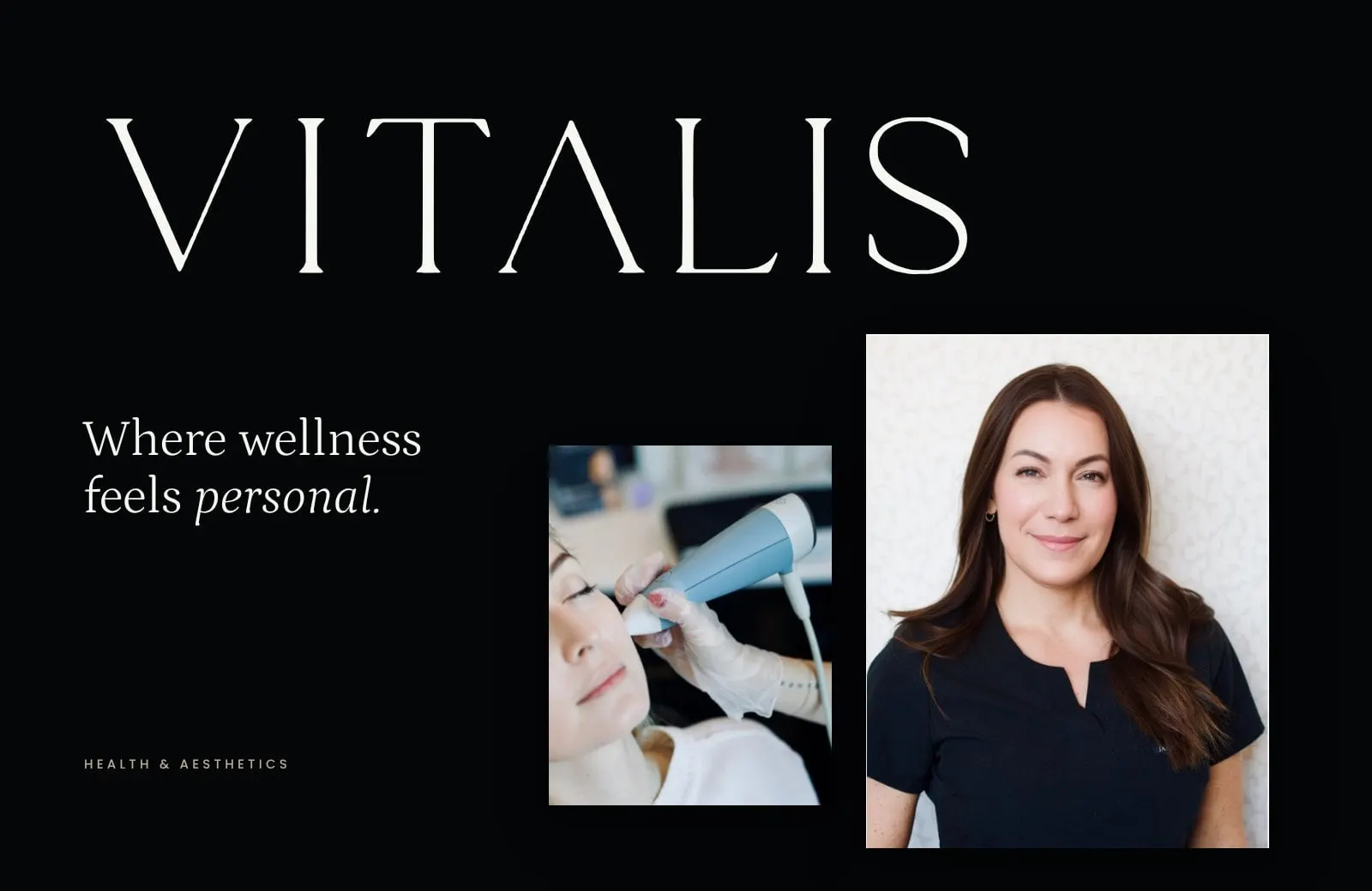
Vitalis Health & Aesthetics is a nurse-led clinic in Kingston, Ontario. Founder Angela McGregor is a Master's-prepared Nurse Practitioner with more than 20 years in Canadian healthcare, and her clinic brings together two things that are usually sold separately: hormone therapy for women and men, and advanced aesthetics like neuromodulators, fillers and radio-frequency skin treatments.
That combination is the whole point of Vitalis, and it was also the design challenge. The brand had to feel as calm and considered as a luxury skincare label, while making it obvious that every treatment is clinically led. We created the brand identity first, then carried it into a full website.
02 — Identity
A wordmark with editorial calm
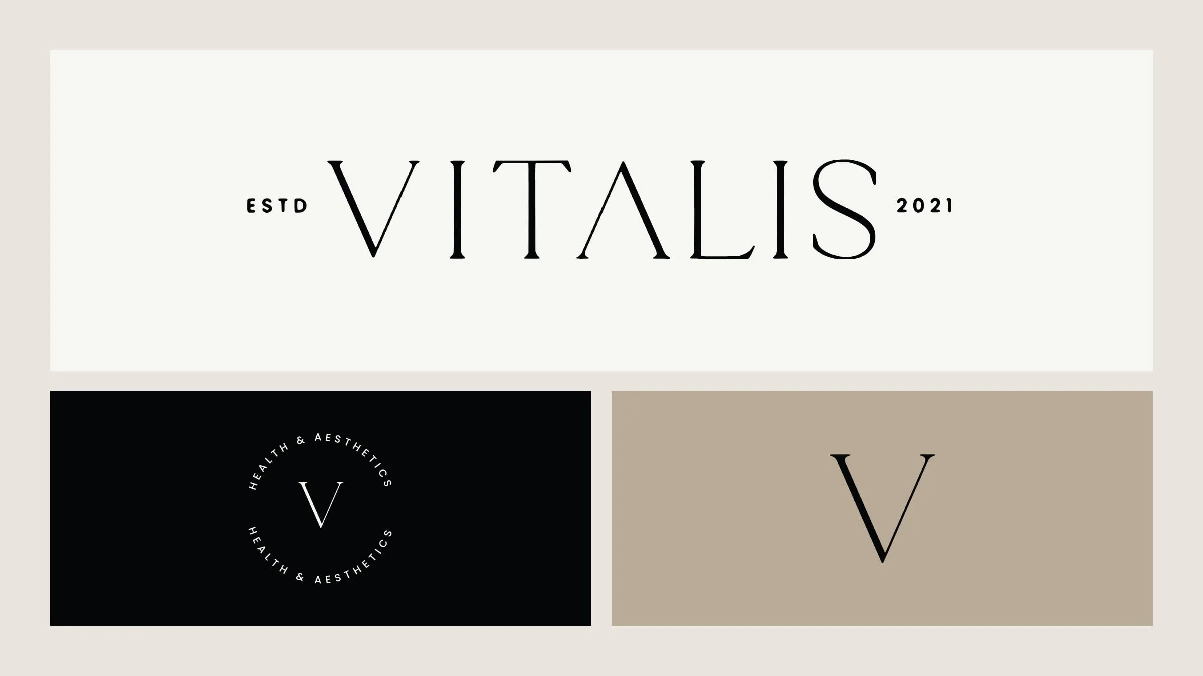
The VITALIS wordmark is set in tall, fine-lined capitals with one distinctive detail: the A loses its crossbar and becomes a clean peak. It reads like the masthead of a fashion magazine, which is exactly the shelf the clinic wanted to sit on.
Around it we built a small, flexible system. A circular seal reads Health & Aesthetics around a single serif V, for stamps, stickers and social avatars. The V alone works as a favicon and a monogram. Because the marks are restrained, they hold up whether they're printed in black on linen or reversed out of a dark photo. We explain why we prefer this kind of mark in why literal logo marks fall short.
03 — Palette and type
Stillness, Driftwood and Linen
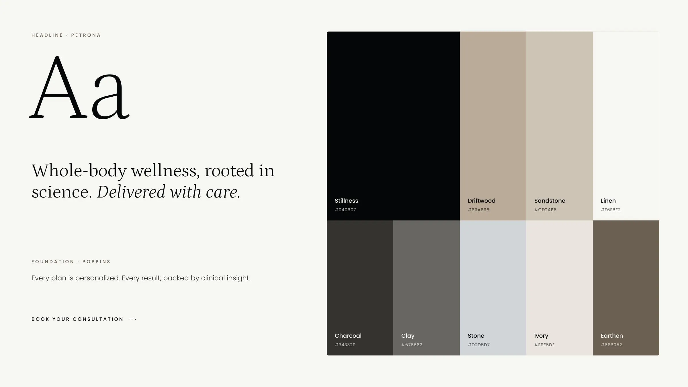
The palette is deliberately quiet: a near-black called Stillness, warm Driftwood and Sandstone, and a soft Linen that does most of the work on screen. Supporting greys and Earthen give designers room without ever reaching for a bright colour.
Headlines are set in Petrona, a light, literary serif that looks especially good in italics. Poppins handles everything else, from body copy to the small, widely tracked labels on buttons. We documented it all on a one-page brand board so the clinic and its partners can use the identity consistently.
04 — The website
Built like a magazine, booked like a clinic
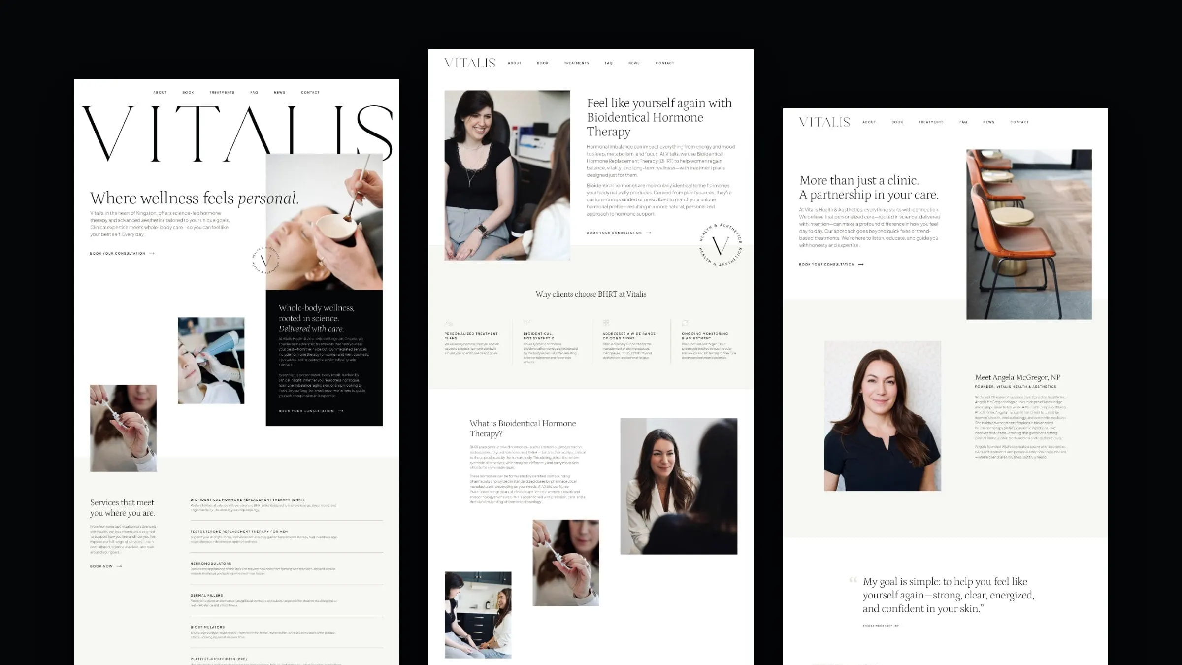
The homepage opens with the wordmark at full width, oversized and cropped by photography, just as a magazine cover lets the masthead sit behind the model. Below it, images are staggered rather than boxed into a grid, and a black panel sets out the clinic's promise: whole-body wellness, rooted in science, delivered with care.
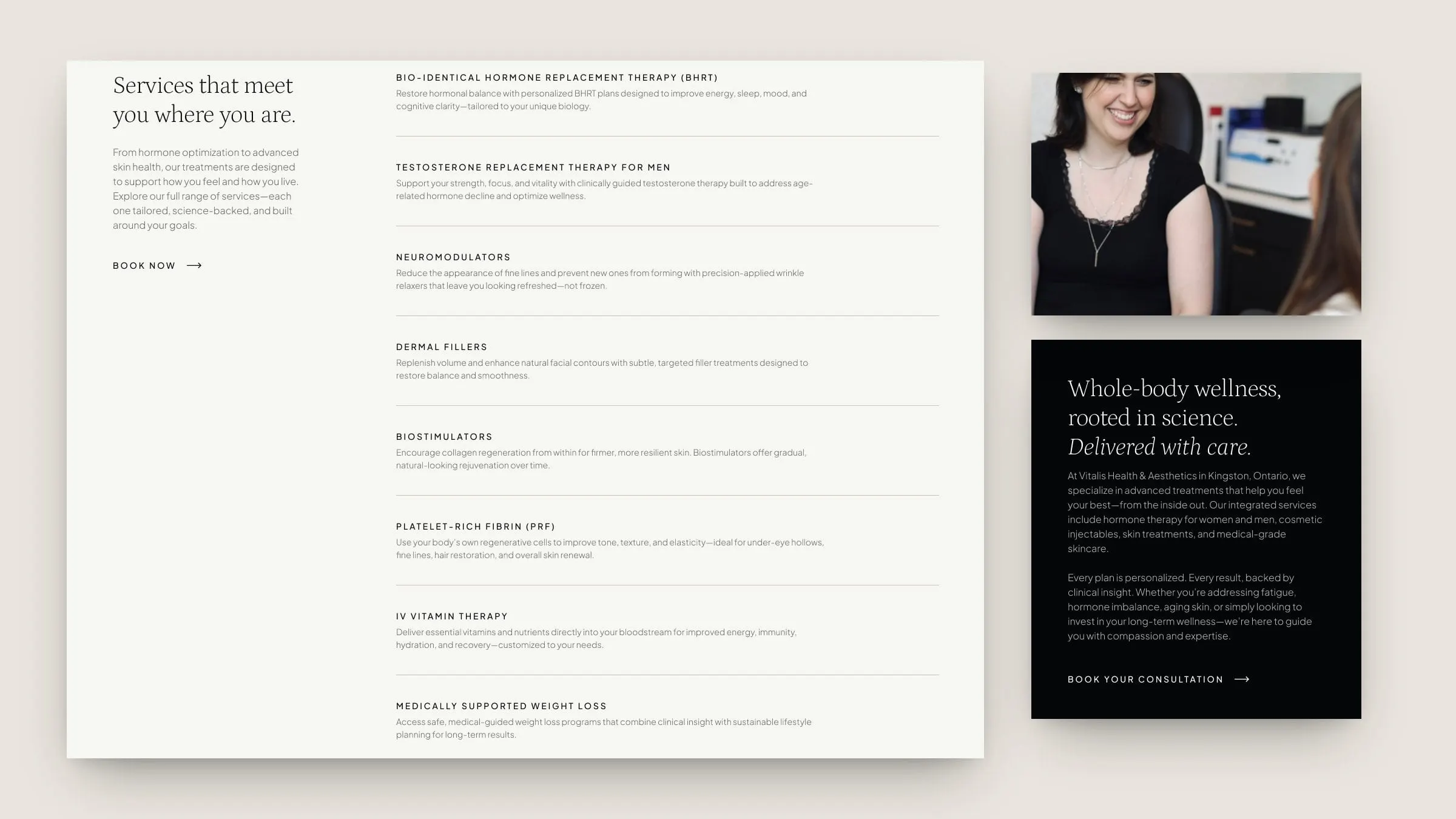
Every page then gets practical. Treatments are listed with a one-line explanation each, a four-step process shows what happens from the first consultation onward, and "Book your consultation" is never more than a scroll away. We designed 20 pages for the website, including 10 treatment pages, an About page built around Angela, FAQs, a news section and contact.

05 — Treatment pages
Clear answers for personal questions
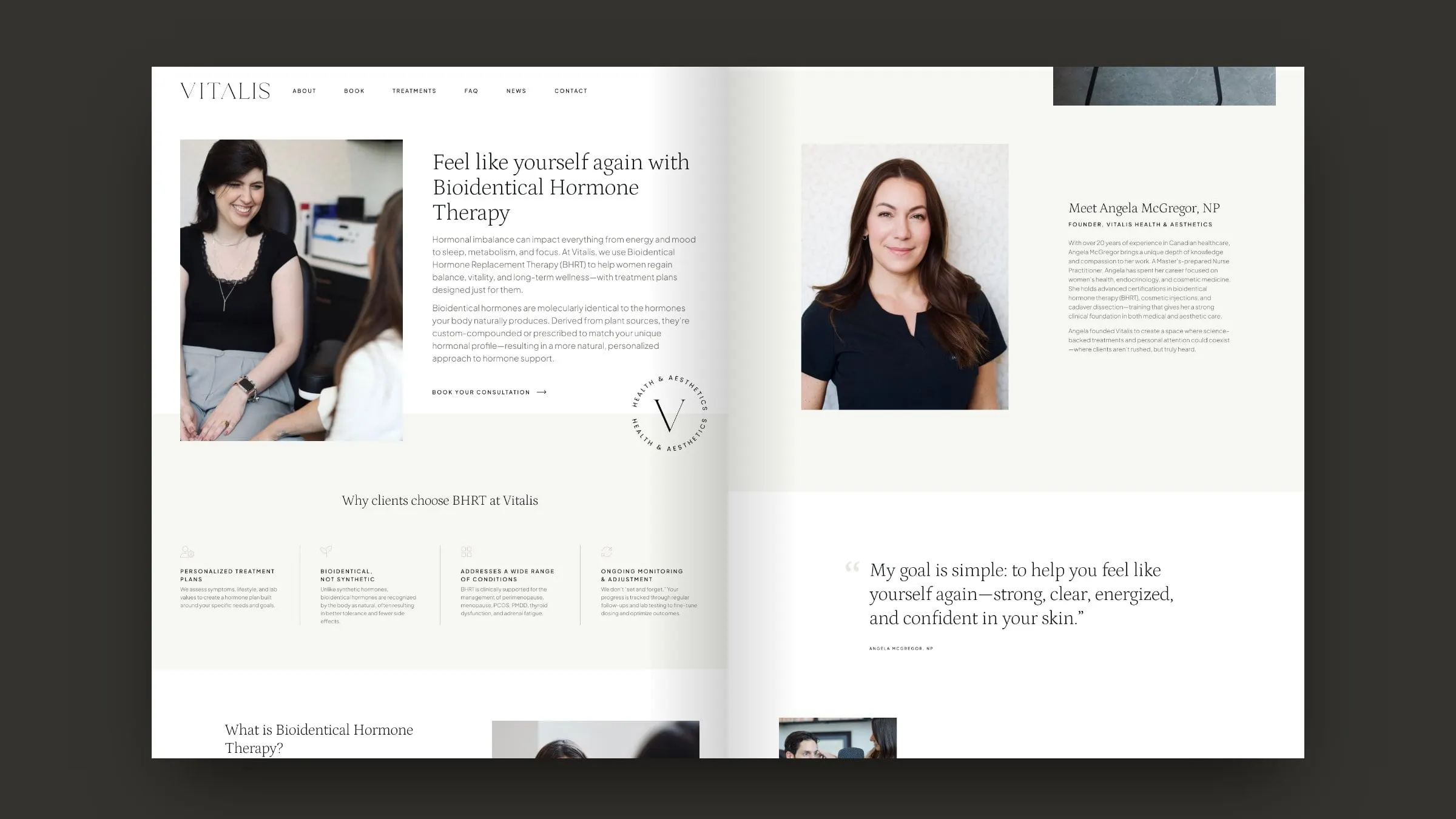
Hormone therapy is a sensitive subject, and people usually research it quietly before they book. So each treatment page follows the same calm structure: a warm introduction, why clients choose the treatment at Vitalis, a plain-language explanation, the symptoms it can help with, and an FAQ that answers the questions people are often shy to ask.
The shared template makes a growing menu easy to manage, a topic we cover in structuring a medical site with many services. Credentials from the Ontario Nurses' Association and the Canadian Board of Aesthetic Medicine sit near the footer, so trust is built in on every page.
Vitalis by the numbers
A full clinic, one calm system
- Page designs
- 20Home, About, treatments, FAQ, news, contact and more.
- Treatment pages
- 10From BHRT and testosterone therapy to radio-frequency skin rejuvenation.
- Brand colours
- 9Four primaries and five supporting neutrals.
- Years in healthcare
- 20+Angela McGregor's experience as a nurse and Nurse Practitioner.
06 — The result
A clinic brand that feels personal
Vitalis now looks the way its care feels: unhurried, personal and clinically sound. The identity gives a small, independent clinic the presence of a much larger brand, and the website turns a long menu of medical treatments into something a nervous first-time client can read with confidence.
For more of our work with clinics, see our healthcare design projects, including Conceive Health, or read what to say on every page of a medical website.
What we delivered
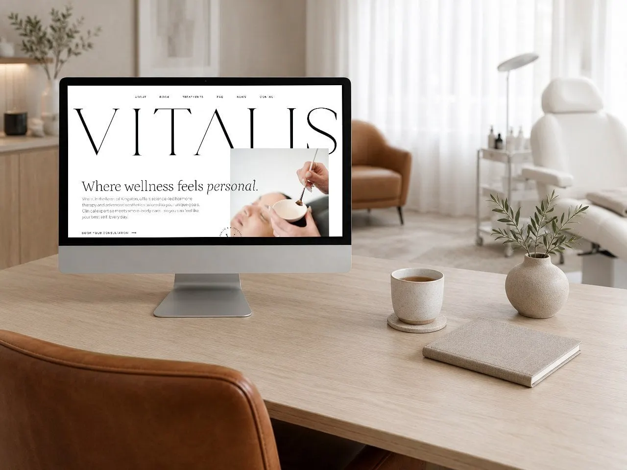
A complete identity and website for a nurse-led health and aesthetics clinic in Kingston.
- 01Brand identityVITALIS wordmark, Health & Aesthetics seal and V monogram.
- 02Brand boardPalette, typography and logo usage on a single page.
- 03Website design20 page designs, including 10 treatment pages, About, FAQ, news and contact.
- 04UX/UI designA repeatable treatment-page template that makes sensitive topics easy to read.