Case study · Consolidated Packaging Group Inc. (CPGI)
CPGI
Branding and a new website for Consolidated Packaging Group Inc. (CPGI), a co-packing and logistics partner in Toronto and the GTA with more than 25 years in the business.
01 — Context
Twenty-five years of packing, a brand to match
Consolidated Packaging Group Inc. (CPGI) is a co-packer and logistics partner in Etobicoke, serving brands across Toronto and the GTA. With more than 25 years in the business, CPGI handles automated cartoning, retail-ready displays, shrink wrapping and bundle packing, flow wrapping, display assembly and kitting, and warehousing and fulfillment, backed by SQF certification for food safety.
The work had grown up; the brand hadn't. CPGI asked us for a new identity and a website that would look as organized and dependable as its packing lines, and speak to procurement and operations teams at much bigger companies. We started with the brand identity and carried it straight into the site.
02 — The mark
Built from boxes
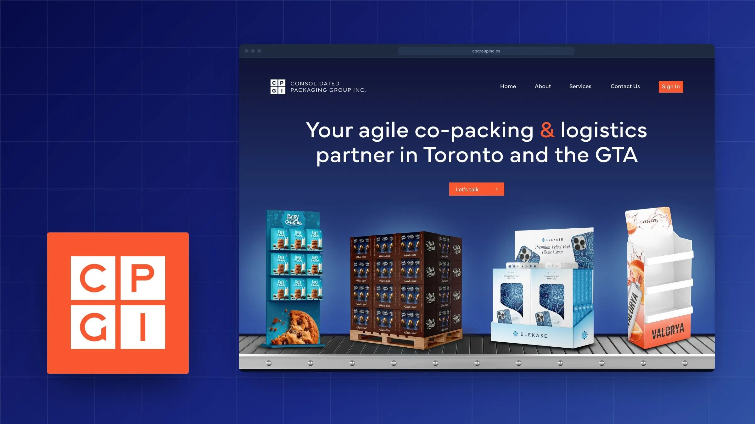
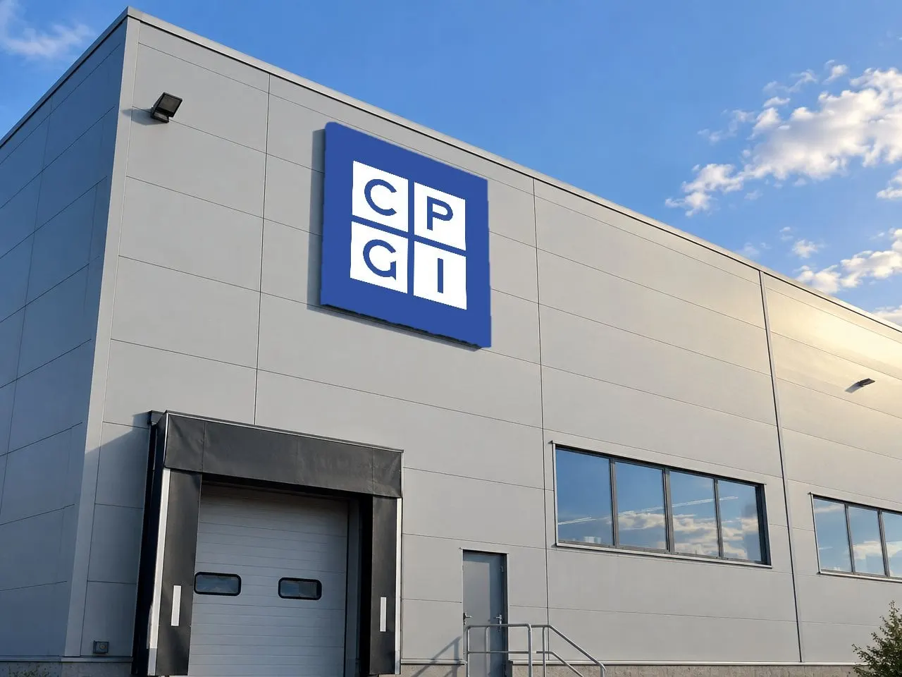
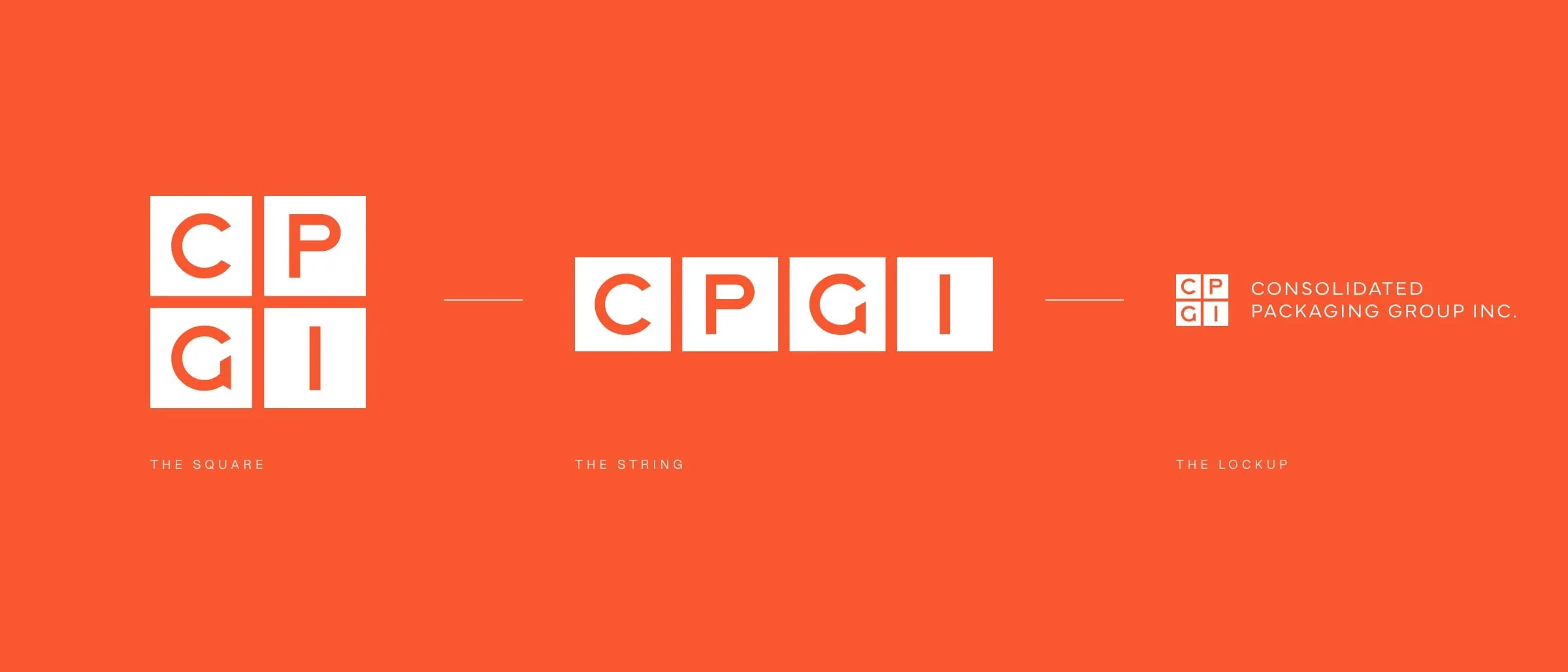
CPGI's business is boxes, so we built the logo out of them. Each letter sits in its own square, and the four squares lock together like cartons on a pallet. The letterforms are clean and geometric, with a G that turns in on itself like a fold.
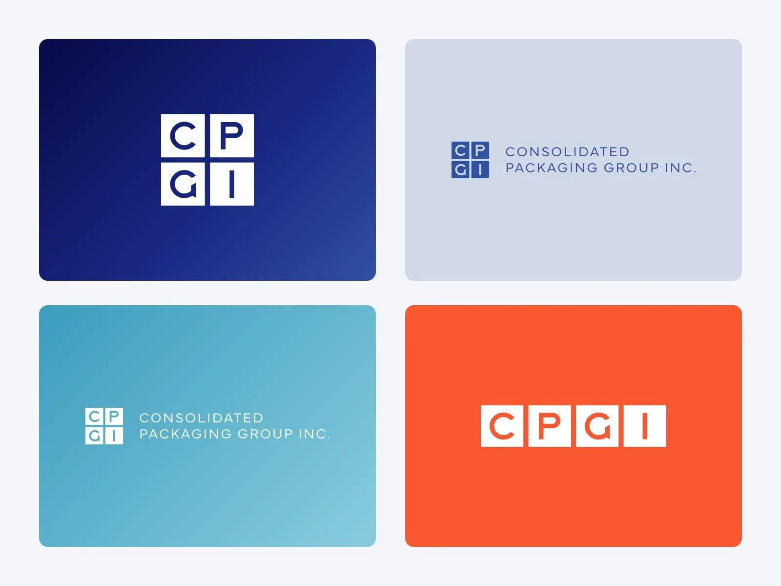
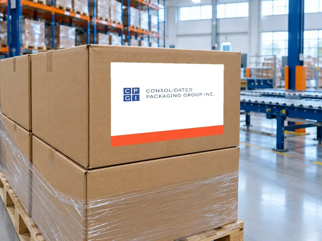
Because the boxes are modular, the mark rearranges itself for the space it's given: a compact square for embroidery, favicons and signage, a single string for pens and banners, and a lockup with the full name for letterhead and the website header. One idea, every format.
03 — Colour
Corporate blue, with a little heat
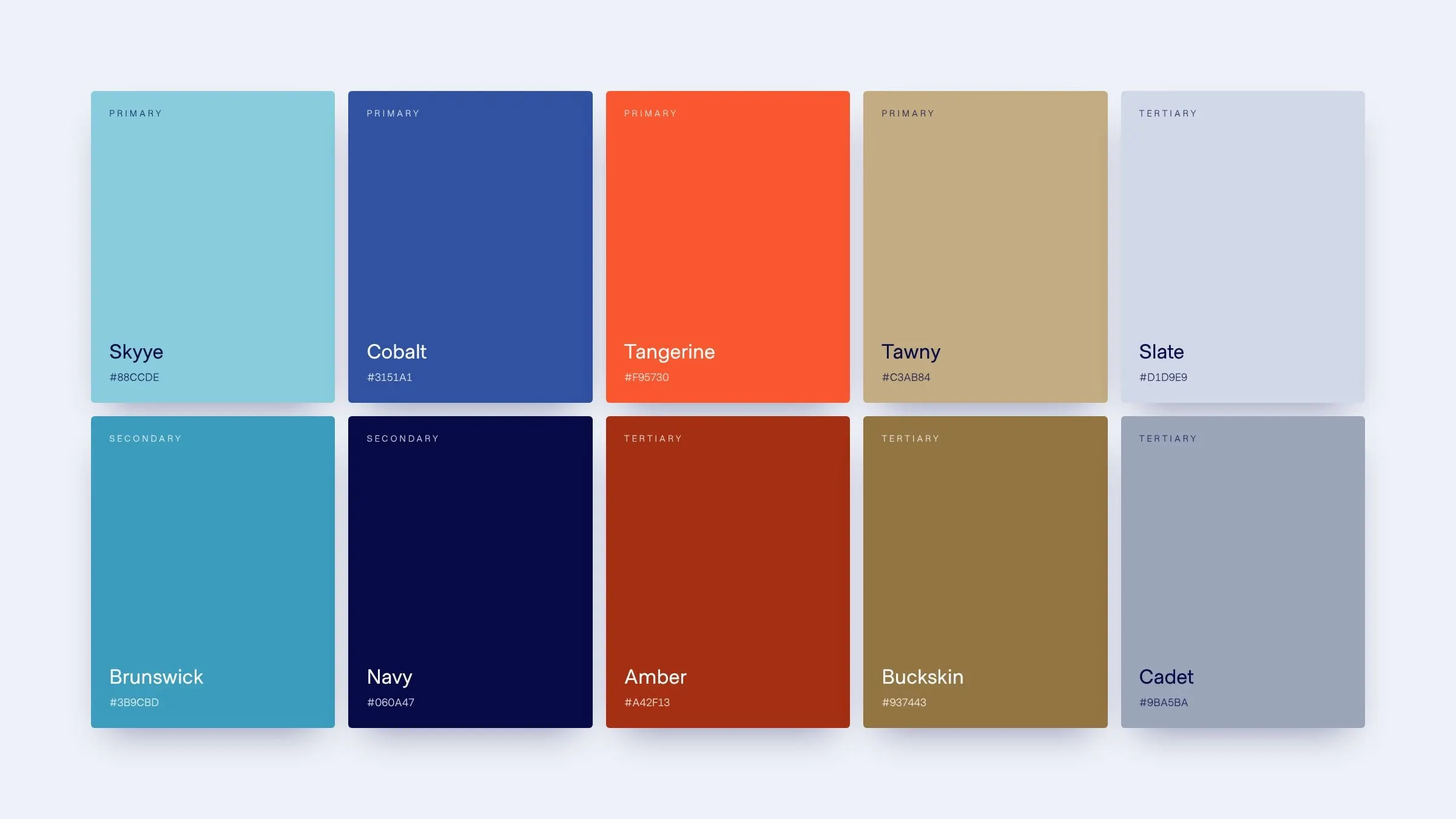
Packaging and logistics brands tend to land in safe navy and stop there. We kept the trust that comes with deep blues (Navy and Cobalt carry most of the system) and added Tangerine as a confident signal colour for calls to action, highlights and the moments CPGI wants you to notice.
Skyye and Brunswick bring a cooler, more technical feel that suits CPGI's automated lines, while Tawny and Buckskin nod to kraft paper and corrugated board. Soft gradients across the blues add depth on screen without getting busy. It's a palette that feels modern but still belongs on a pallet label.
04 — The website
A site that moves like a line
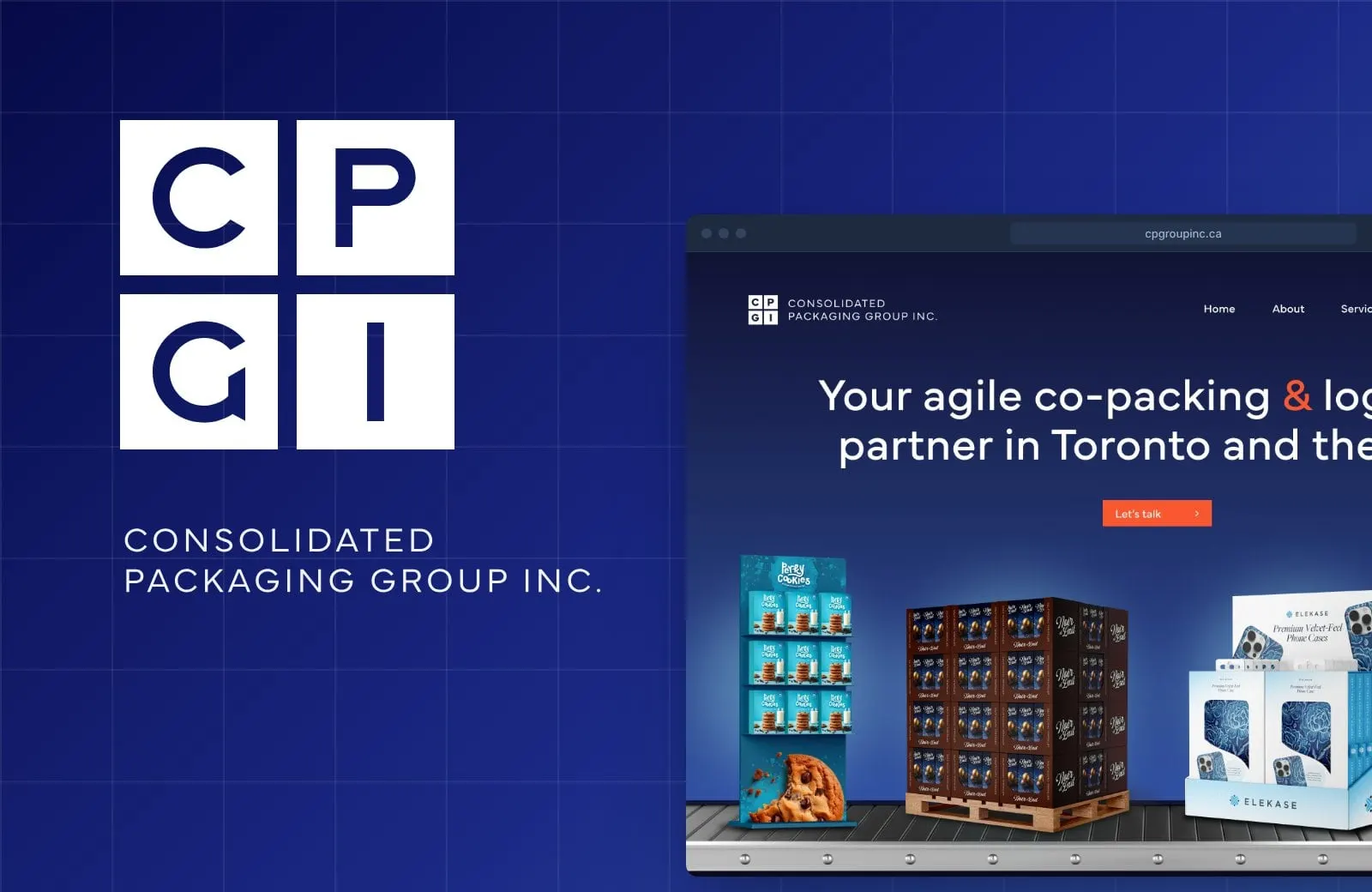
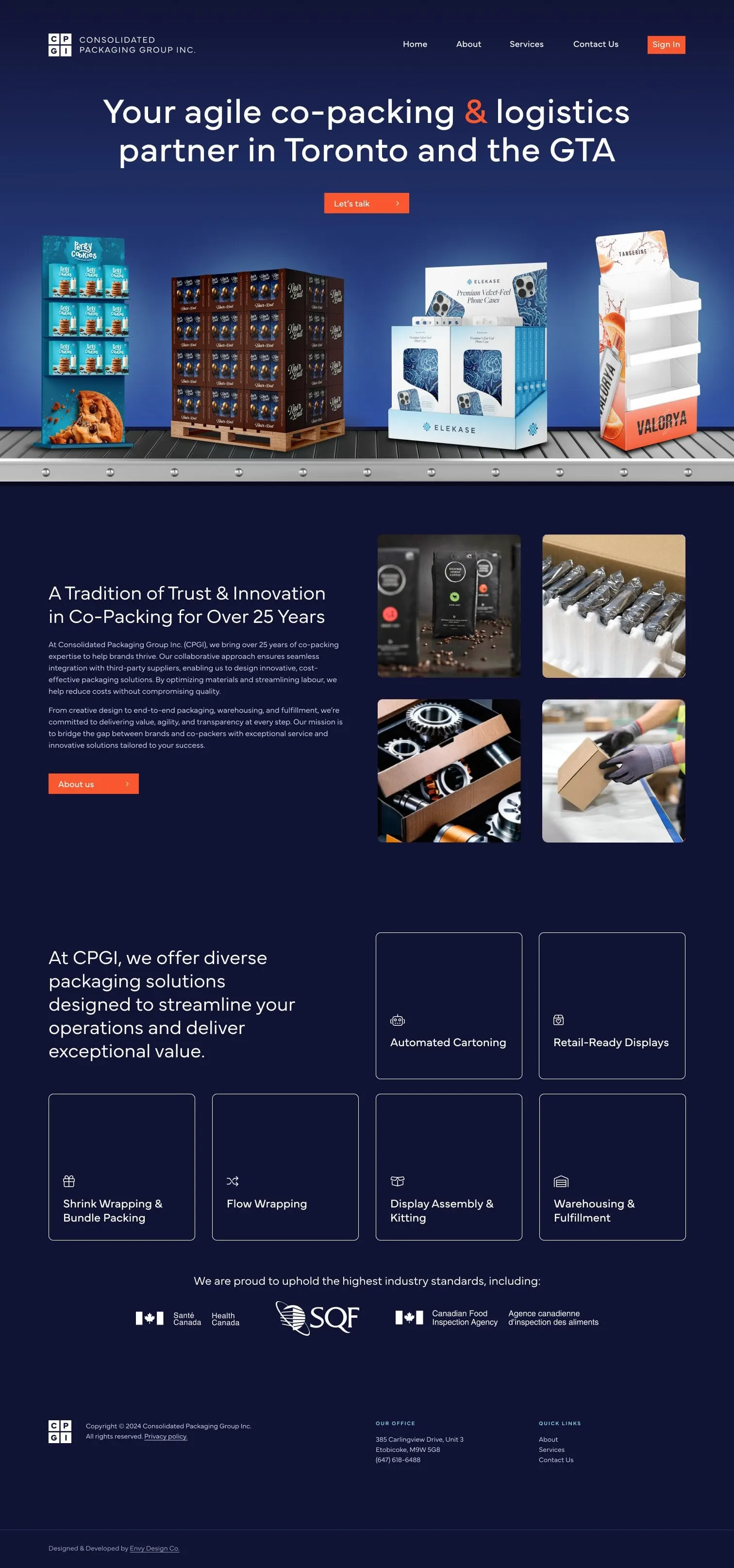
The homepage opens on a conveyor. Finished displays and pallets roll across the hero under one clear promise: an agile co-packing and logistics partner in Toronto and the GTA. Below it, the story moves in the order a buyer thinks: who CPGI is, what it can pack, the certifications that matter, and proof in the form of real projects.
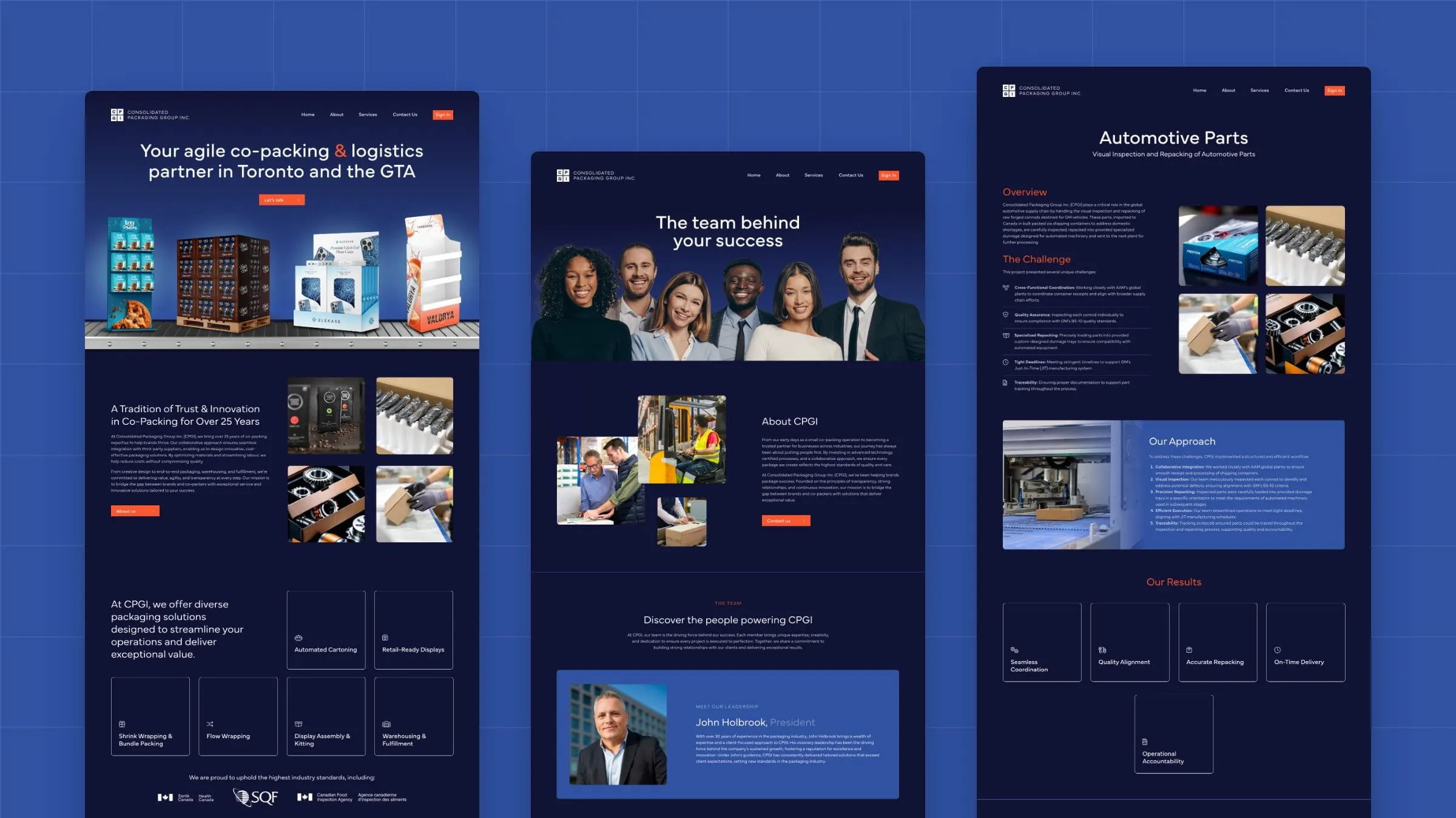
We designed the site in a deep navy so product photography pops, with Tangerine buttons guiding every next step. After five early concepts, the final design covers the homepage, About, Services, Contact and a reusable case study template. We designed and developed it as one system, so new services and case studies slot straight in.
05 — Proof
Case studies that show the work
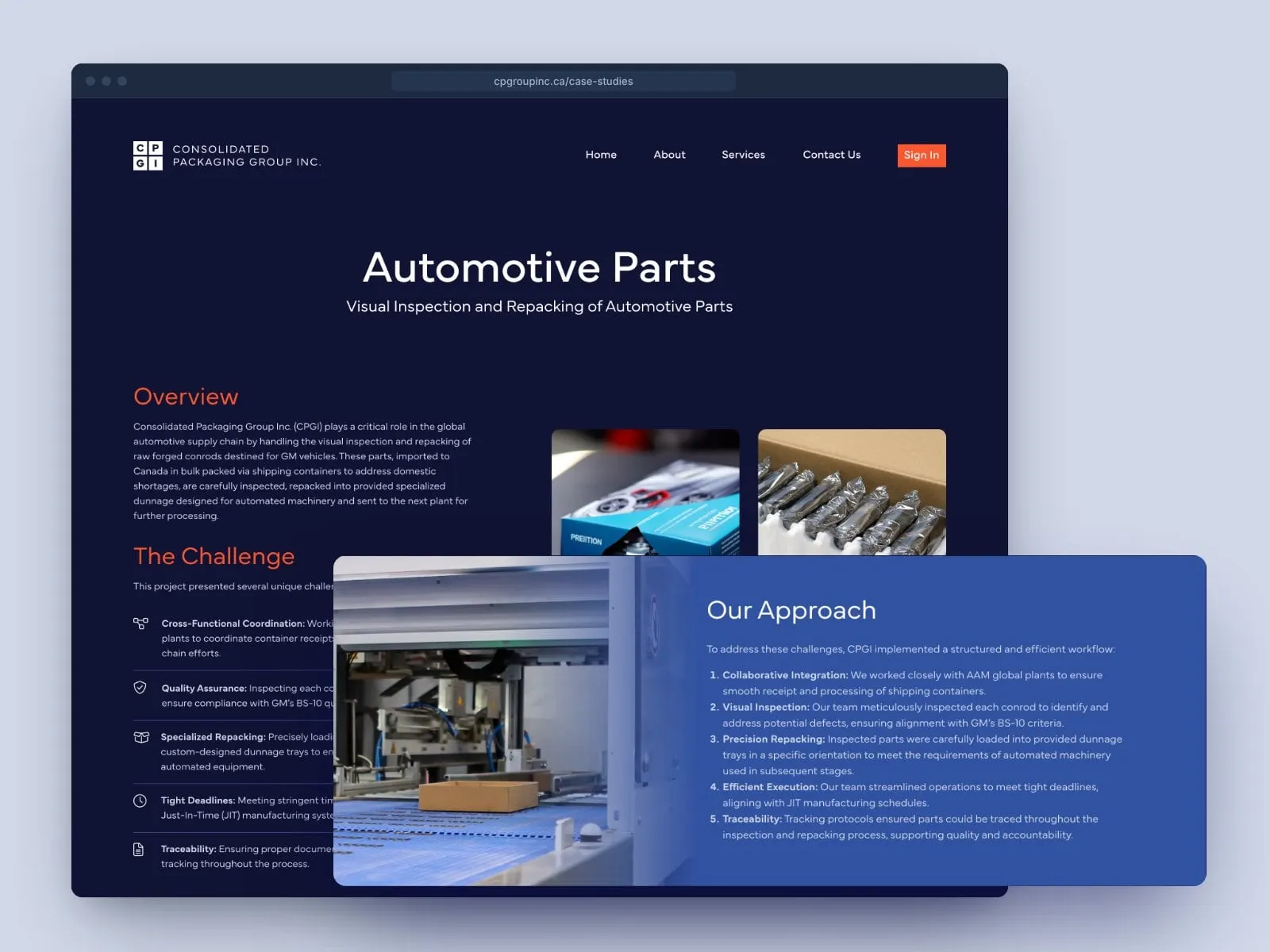
For a co-packer, proof beats promises. Every case study follows the same clear arc: overview, the challenge, the approach and the results, with icons doing the heavy lifting for busy readers. The automotive parts story walks through visual inspection and repacking of forged parts, step by step.
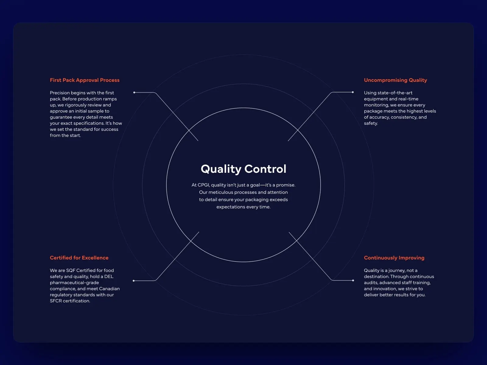
On the Services page, a Quality Control diagram turns certifications and processes into something you can see at a glance: first pack approval, uncompromising quality, certified for excellence and continuous improvement. It's storytelling through web design, built for operations people.
06 — The result
A brand that stacks up
CPGI now has an identity as orderly as its operation: a modular box mark that works on a building, a carton label or a favicon, a palette with some warmth in it, and a website that walks buyers from first impression to real proof. Most importantly, it finally looks like the experienced, certified partner it's been for 25 years.
If you run an industrial or B2B business that's outgrown its look, see how we approached Buchner MFG, or read how branding impacts your bottom line. More B2B and professional services work lives here.
What we delivered
- 01Brand identityA modular box monogram, lockups and a logo family for every format.
- 02Colour paletteTen colours, from Navy and Cobalt to Tangerine and kraft-inspired neutrals.
- 03Brand applicationsSignage, uniform and lanyard concepts to show the system at work.
- 04Website designFive concepts, then a final design for Home, About, Services, Contact and case studies.
- 05Case study templateA reusable overview, challenge, approach and results layout.
- 06Website developmentA build that lets CPGI add services and case studies over time.