Case study · Viacern Group
Viacern
Logo, brand system, business cards, social templates and a first website for Viacern, a leadership consultancy that helps executives and boards make better decisions with evidence from decision science.

01 — Context
Better decisions, by design
Viacern helps senior leaders and boards make clearer, more confident decisions. Founder and CEO Sandra Walker spent decades in leadership roles before going back to school for her MBA at Royal Roads University, where she saw how often hidden cognitive biases and weak decision processes cost organizations their best opportunities.
Viacern turns that research into practice: decision making and change design, organizational transformation, leadership for the future of work and board effectiveness, all grounded in psychology, neuroscience and evidence.
A firm that sells rigour needs a brand that looks rigorous, but it's also selling to people. Viacern asked us to build a brand system that felt credible in a boardroom and warm enough to start a conversation, then carry it into print, social media and a first website.
02 — The mark and the cards
Many directions, one centre
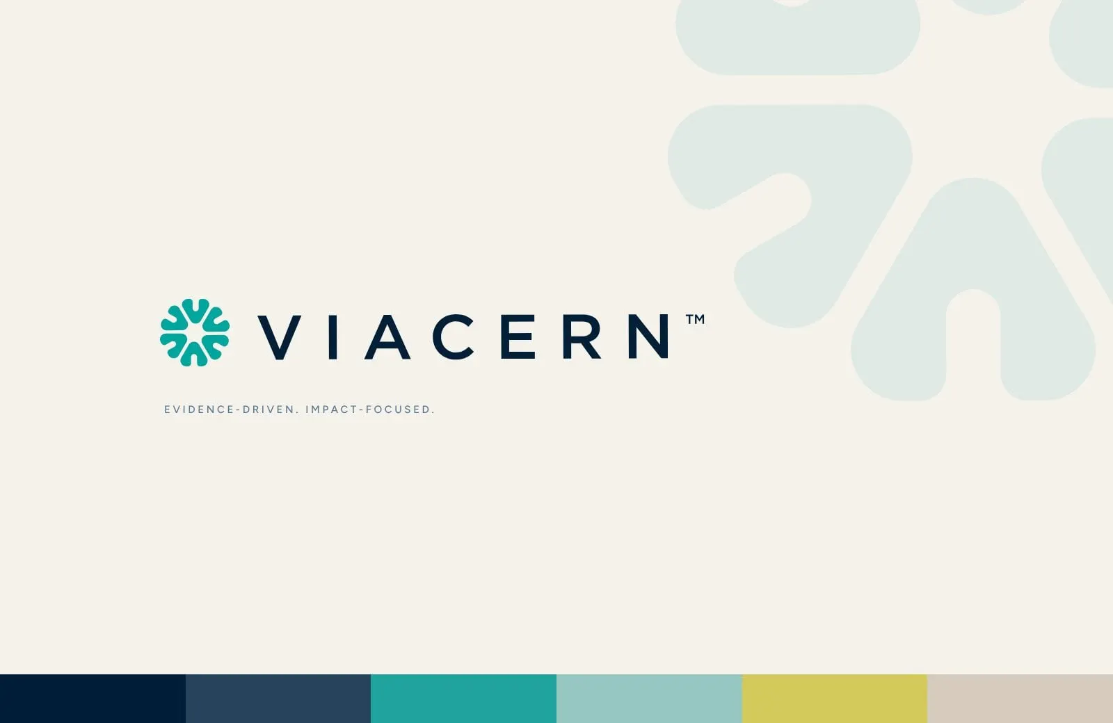
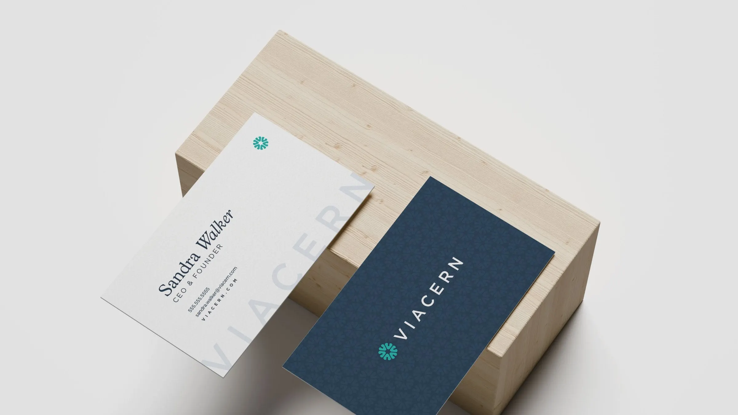
We designed the Viacern logo from scratch: a ring of six rounded arrows, all pointing in toward one point. It reads as a bloom, a compass, or a team turning to face the same decision, which is exactly the job Viacern does. We paired it with a widely spaced, all-caps wordmark, so the whole logo feels calm and assured.
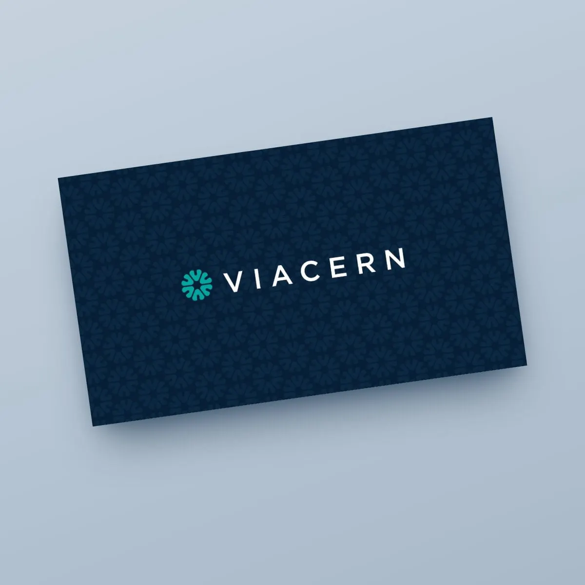
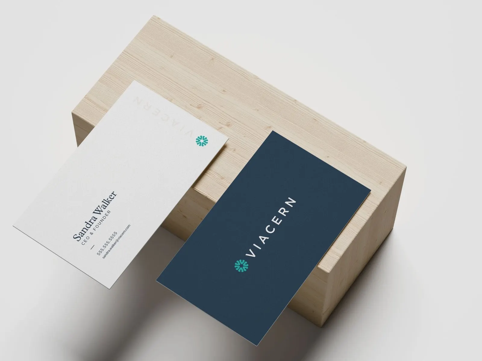
On the business cards, the mark becomes a pattern. The navy front repeats it as a subtle tone-on-tone texture behind the logo, and the back sets the founder's name in an elegant serif with an italic surname, with VIACERN running large and pale along the edge. These are the small print details that people notice when a card is handed across a table.
03 — Colour
Warm neutrals, cool confidence
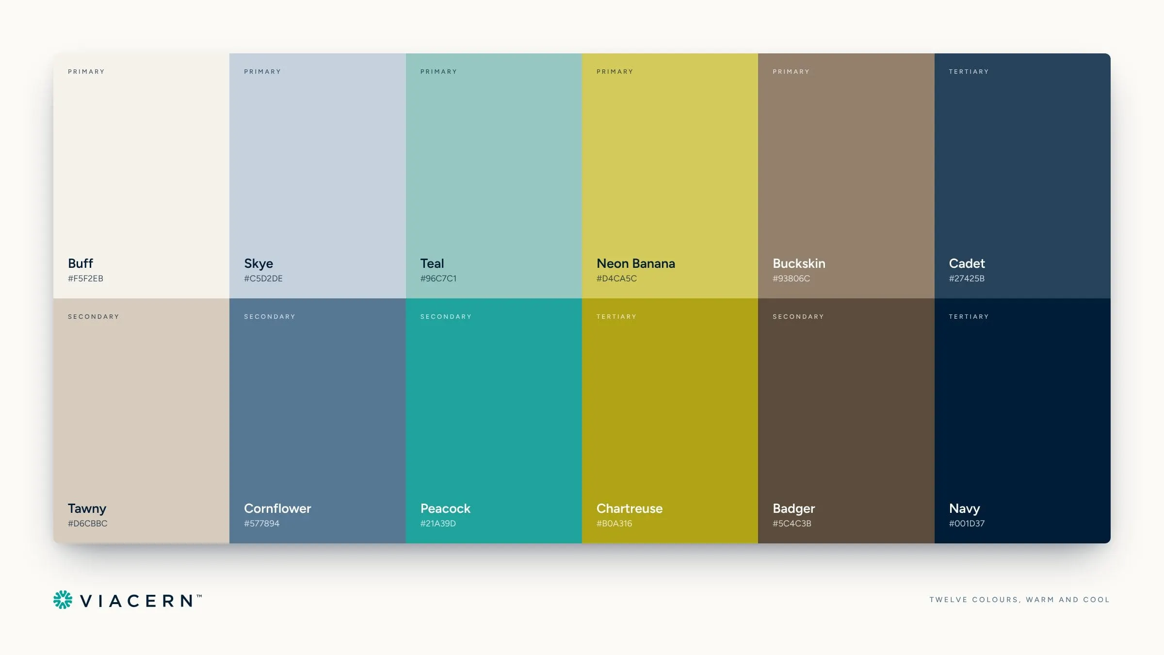
Consulting brands often go one of two ways: corporate navy or startup neon. We built Viacern a palette that sits comfortably in between. Navy and Cadet carry the authority. Teal and Peacock give the brand its signature, the colour of the mark and of every call to action. Buff, Tawny, Buckskin and Badger are warm, earthy neutrals that make the system feel human, and Neon Banana and Chartreuse add a confident, slightly unexpected accent for highlighted words.
Twelve colours sounds like a lot, but each one has a role, and the palette gives Viacern room to vary layouts without ever looking off-brand. It's the kind of groundwork we explain in how branding impacts your bottom line.
04 — Social
One tip, six ways to say it
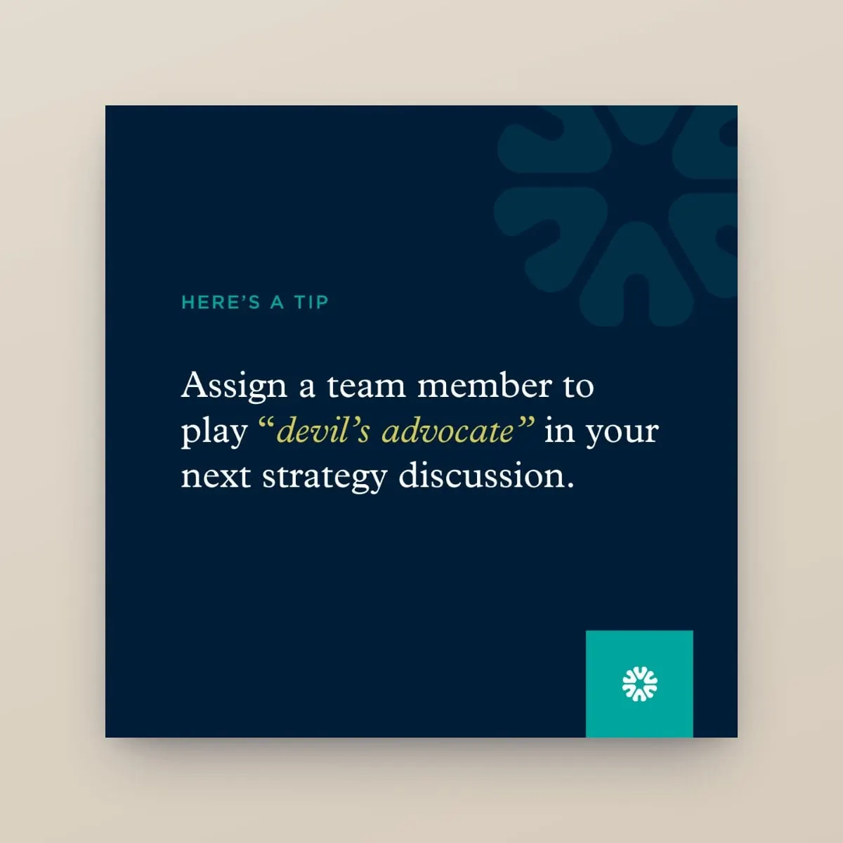
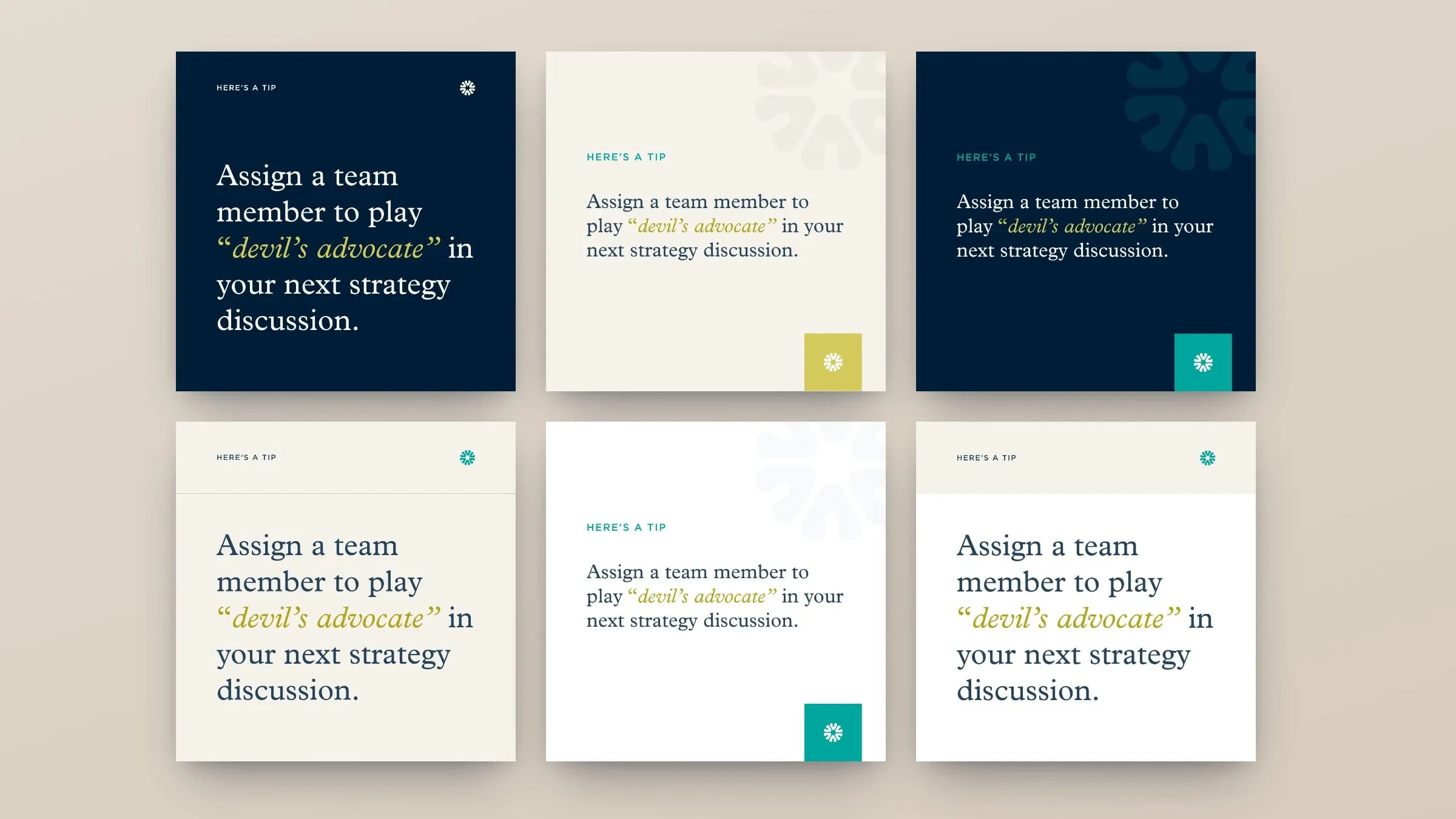
Viacern shares practical leadership advice on social media, so we designed a set of social templates the team can reuse. Each post leads with a short tip set in a classic serif, with the key phrase in banana or chartreuse italics, a small "Here's a tip" label and the mark as a sign-off.
The six layouts move between navy, buff and white, with or without a large, faded mark in the corner. Over a month of posts the feed stays varied, but every tile is unmistakably Viacern.
05 — The first website
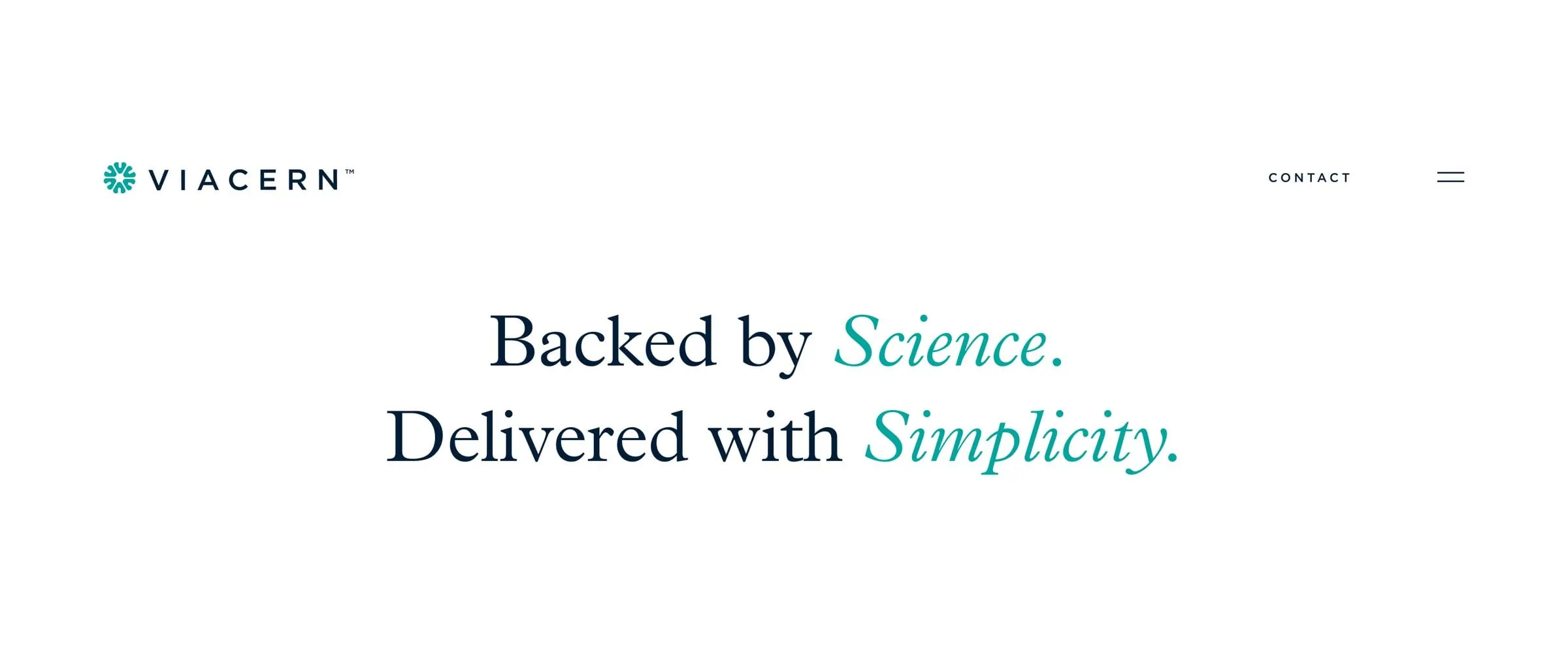
Backed by science, delivered with simplicity
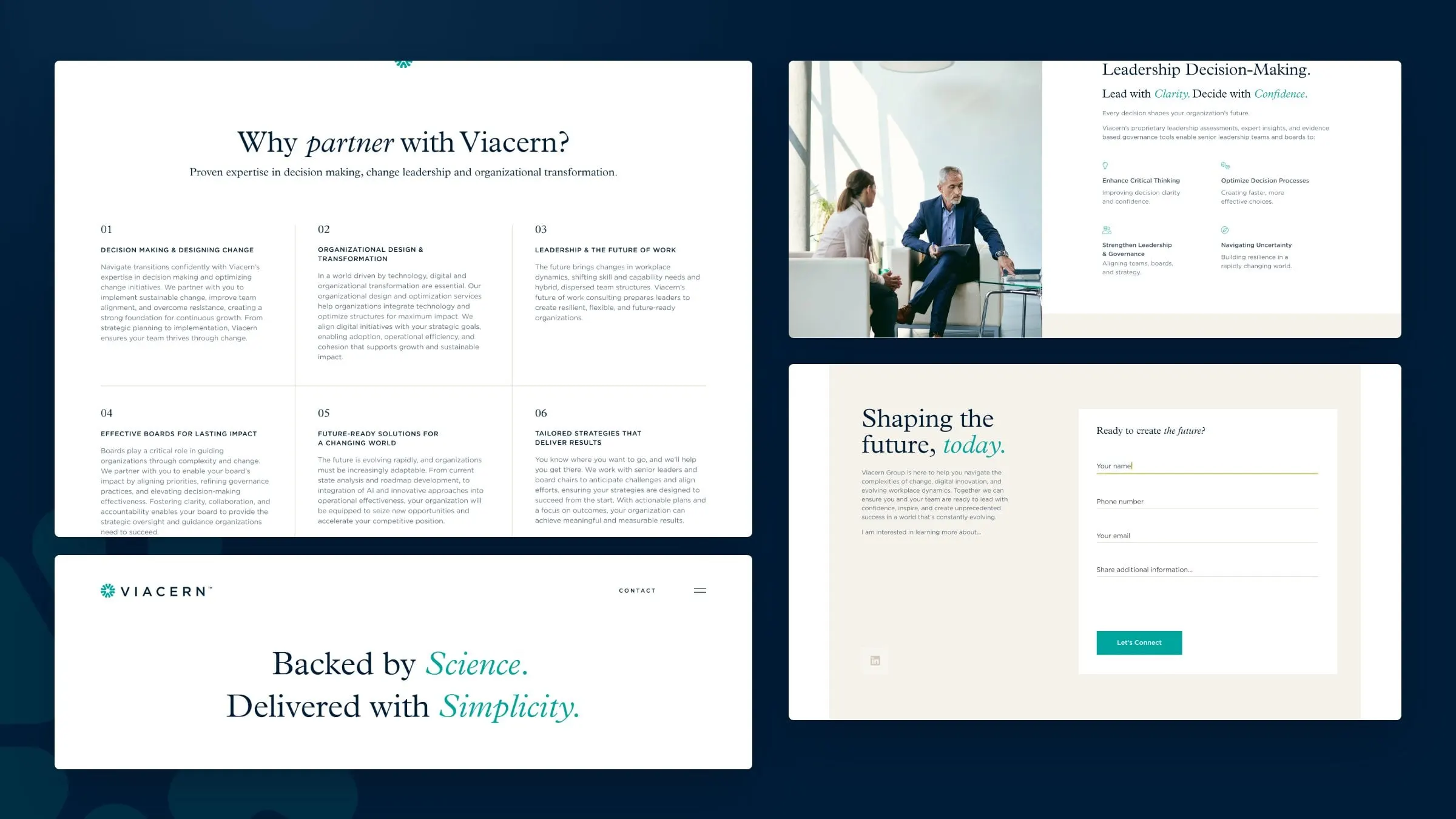
Viacern's first website is a focused, single-scroll MVP that does three things well: says what Viacern believes, explains what it does and makes it easy to start a conversation. The headline sets the tone in a serif with teal italic accents, and six numbered services sit in a clean grid, from decision making and change design to effective boards.
A Leadership Decision-Making section introduces Viacern's assessments and governance tools, a section on the evidence-based approach follows, and a simple contact form closes the page on warm buff. There's room to grow, with templates for About, Insights articles and Contact already designed.
06 — Result
A calm brand for hard decisions
Viacern now has a brand that feels as considered as its advice: a distinctive logo of its own, a palette with range, stationery worth keeping and a social and web presence that all look like they came from the same thoughtful place. Just as important, the system is easy to use. The team can post a new tip, print a new card or add a page to the site without calling a designer, and it will still look like Viacern.
If you run a consultancy or advisory firm, see more of our professional services work, including Kennion Benefits, or talk to us about branding and identity design.
What we delivered
What we created for Viacern.
- 01Logo designThe six-arrow mark and the spaced, all-caps wordmark.
- 02Brand systemColour palette, type pairing and the mark used as a pattern.
- 03Business cardsTwo front-and-back card directions for the founder.
- 04Social media templatesSix reusable post layouts for leadership tips.
- 05WebsiteA single-page MVP homepage, plus About, Insights, article and Contact templates.