Case study · LifeSciHub
LifeSci Hub
Brand identity and website design for LifeSci Hub, a marketplace that connects pharmaceutical sponsors with independent drug development experts through task-based work and a single MSA.
01 — Context
Pharma expertise, in flexible chunks
Drug development doesn't run at a steady pace. A late-stage trial might need a biostatistician for five hours a month, a regulatory specialist for a single submission or a supply chain expert for one critical quarter. Hiring full-time for every spike doesn't make sense, and managing a crowd of freelancers is its own headache.
LifeSci Hub, created by Sheila Mahony-Jewels, solves that. It's a community and marketplace of independent life sciences R&D experts and small businesses. LifeSci Hub holds one master services agreement with the drug sponsor and subcontracts the work to its vetted members, so companies get the right expert for the right task without the paperwork.
The company asked us for a brand and a website that could make that model easy to understand for pharma project leads, HR, procurement and legal teams alike.
02 — Identity
Three cubes, one hub
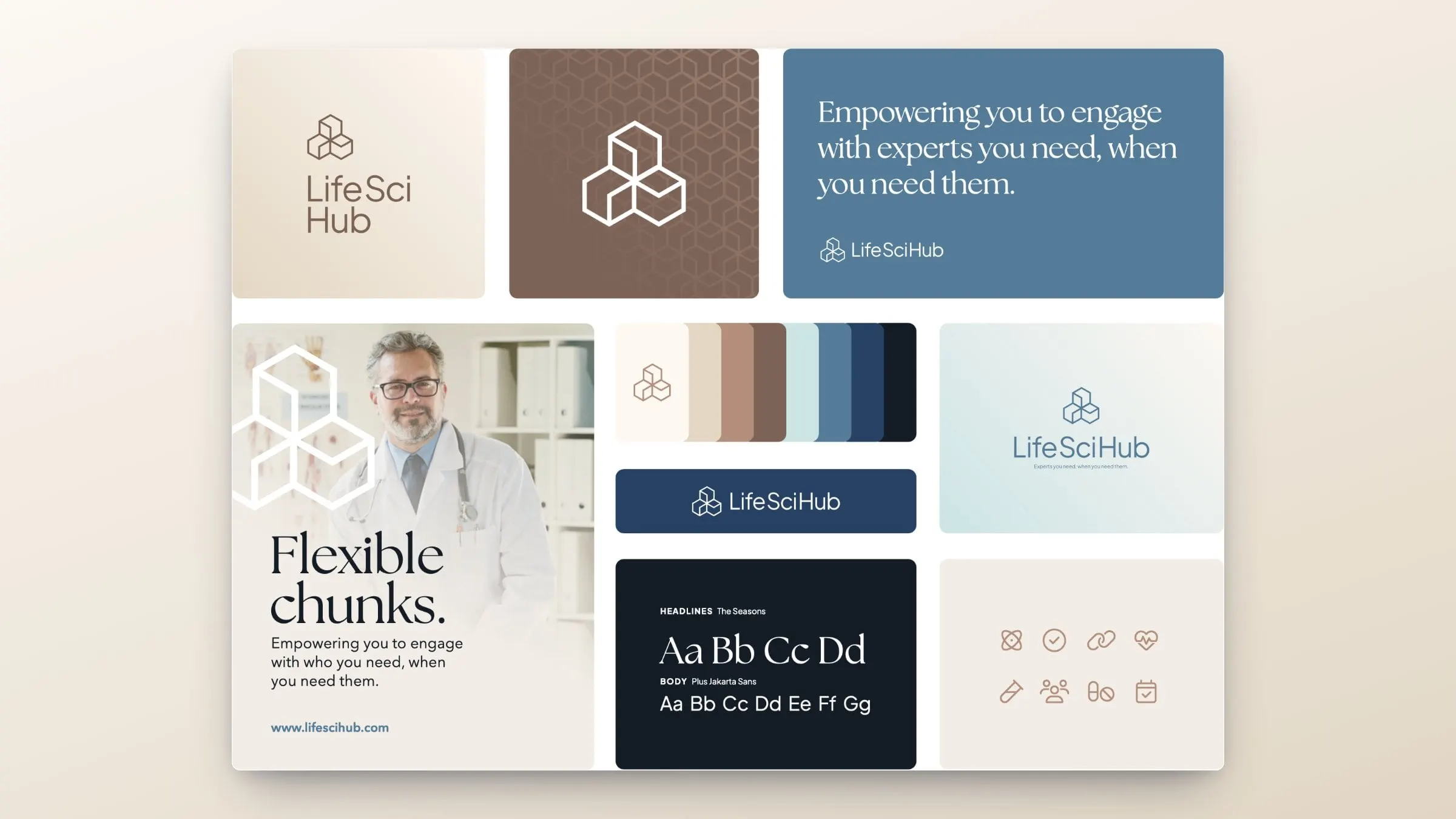
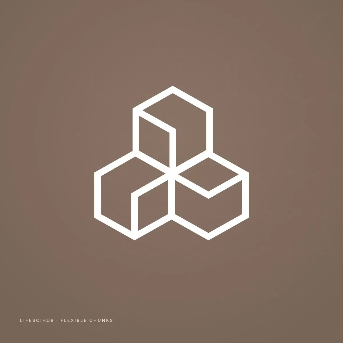
The LifeSci Hub mark is built from three outlined cubes that lock together into a single cluster. Each cube is a chunk of expertise; together they form a hub. It's a simple, modular idea that mirrors the business: specialists fitting together around exactly the task at hand. Repeat the cube and it becomes a hexagon pattern that runs through the brand.
The concept pairs The Seasons, an elegant high-contrast serif, for headlines with Plus Jakarta Sans for body copy, and a palette that moves from warm cream, sand and clay into steel blue, navy and near-black ink. A set of clean line icons covers science, compliance, partnerships and people. As our branding work often does, the identity gave the website its starting point.

03 — The website
Dark, editorial and easy to scan
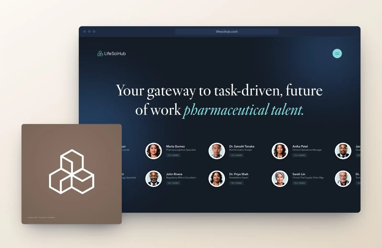
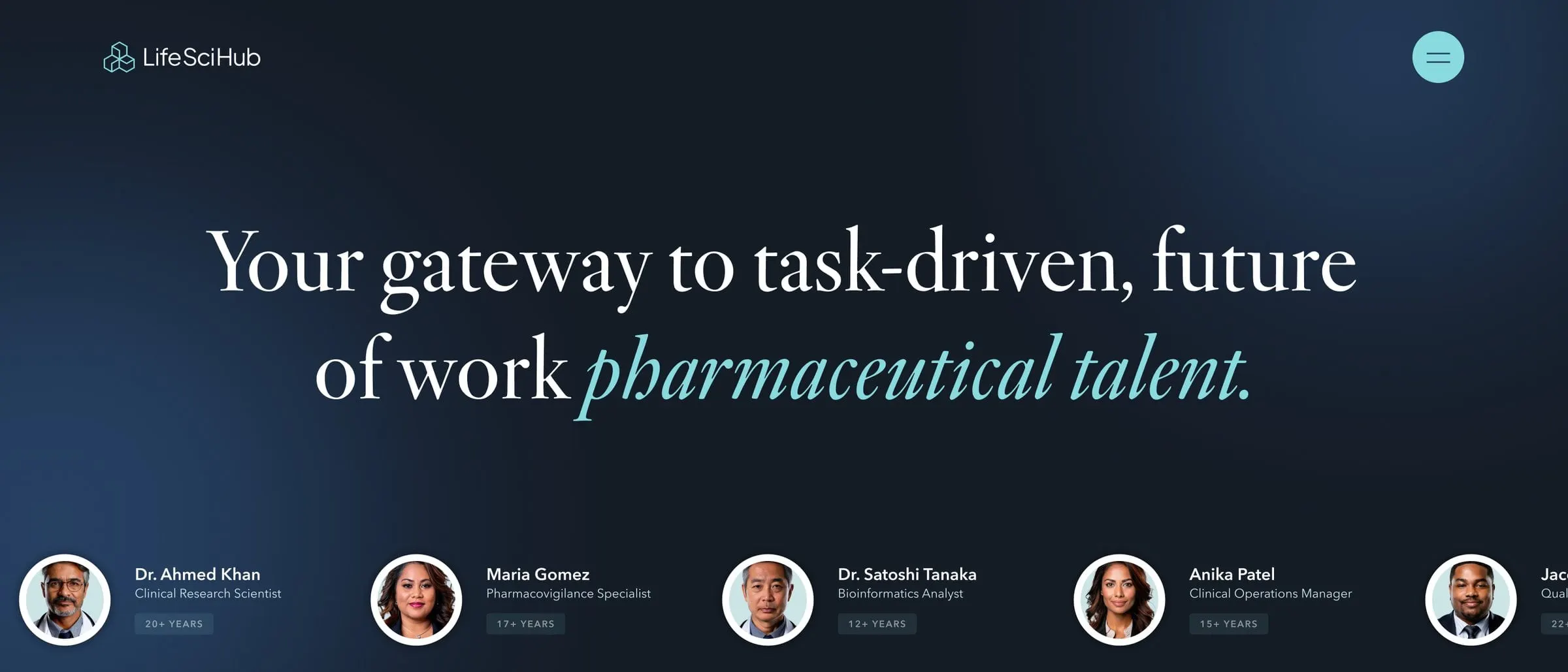
For the website, the brand goes after dark. Deep navy pages with soft blue light give LifeSci Hub a confident, premium feel that stands out from the white, stock-photo look of most staffing sites. Headlines are set large in the serif, with key phrases in aqua italics, and aqua buttons mark every next step.
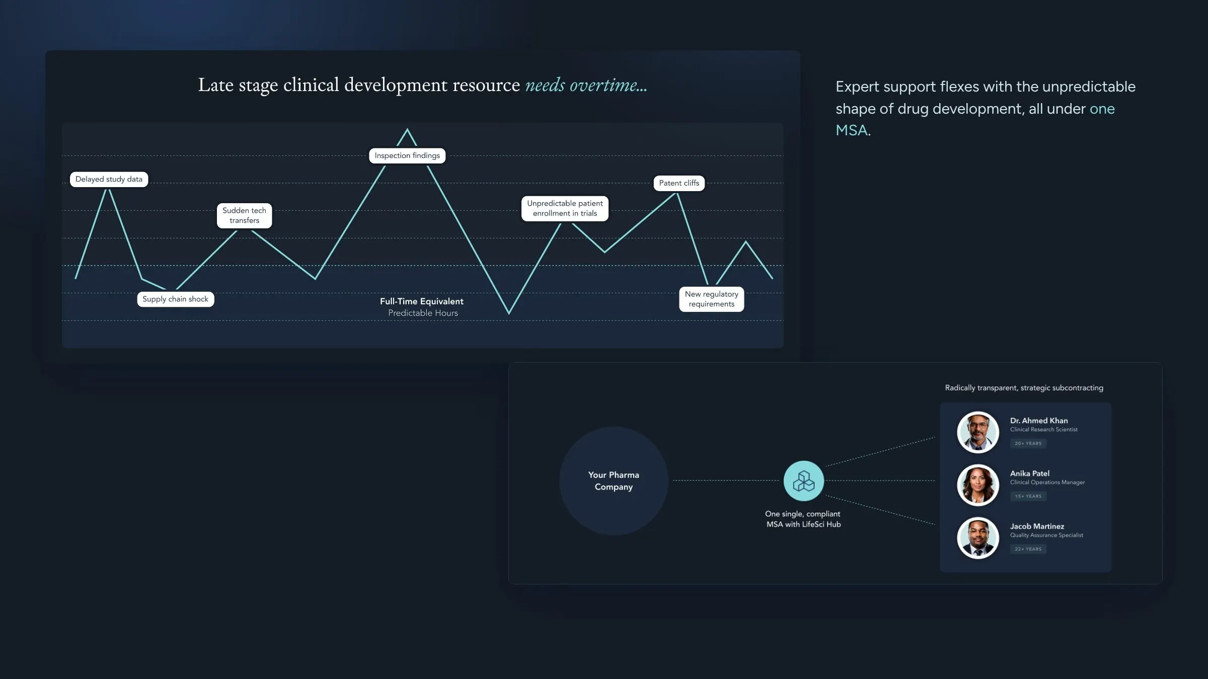
The homepage tells the story in order. An animated band of expert profiles shows the depth of the network straight away. A chart of late-stage resource needs shows why flexible support matters. A three-step path explains how it works, a section speaks to all four enterprise stakeholders, and a simple diagram shows the single MSA between the sponsor, LifeSci Hub and its experts. Twelve areas of expertise, from Biometrics to Real World Evidence, round it out.

04 — Details and mobile
Built for busy people in pharma
The Insights section works as a resource hub, with featured posts, a card grid and filters for Workplace, Clinical, Talent, Innovation, Regulatory, Data & AI, Trials and Trends. Article pages are designed for long reads, with pull quotes and a newsletter signup. A full-screen menu doubles as a contact panel, and every page ends with the same short form.
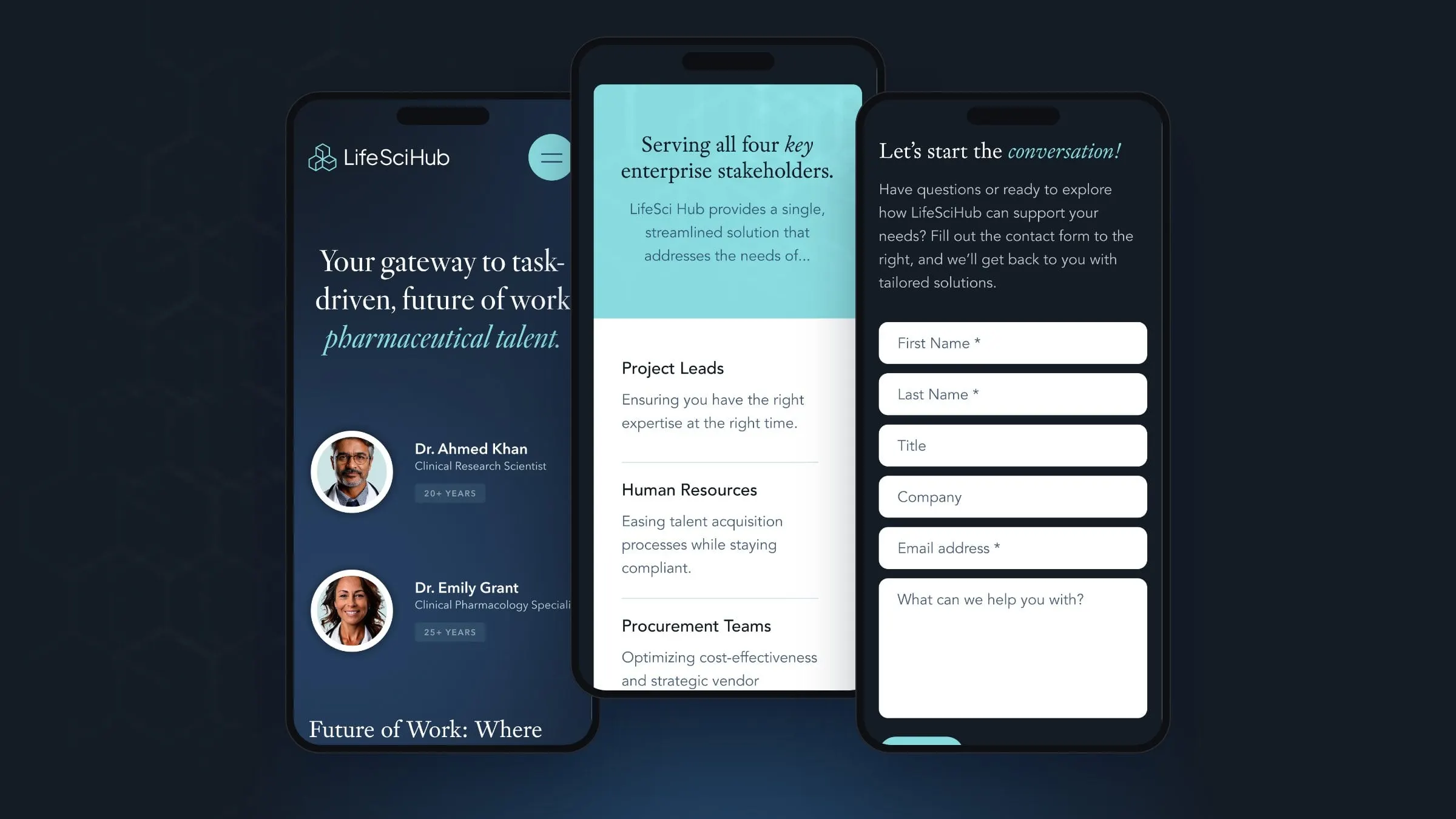
We designed the mobile layouts alongside the desktop pages, so the expert cards, stakeholder lists and forms all stack cleanly on a phone. That matters for an audience that often reads between meetings, a point we make in why mobile-first design is a must. The whole UX/UI system sits on a shared component library, from buttons and filters to blog cards and pagination.
05 — Result
A new way to work, made clear
LifeSci Hub now has a brand with a clear idea at its centre and a website that explains a new way of working in a few confident scrolls. Sponsors can see who's in the network, how the model works and who it helps, and get in touch from any page.
Branding and website came from the same thinking, which is why they fit so well. It's the approach we describe in why branding and web design should happen together. For more work with emerging companies, see our startups and emerging brands page and our work for Faeth Therapeutics.
What we delivered
What we designed for LifeSci Hub.