Case study · Thomas Kevill Advanced Vitreoretinal Imaging Lab
Thomas Kevill AVIL
Brand identity concepts for the Thomas Kevill Advanced Vitreoretinal Imaging Lab, a retinal imaging research lab at St. Joseph's Healthcare Hamilton, with two logo directions, a palette and business cards.

01 — Context
A lab built on restored sight
The Thomas Kevill Advanced Vitreoretinal Imaging Lab sits within the Regional Eye Institute at St. Joseph's Healthcare Hamilton's King Campus. Led by Dr. Varun Chaudhary, chief of ophthalmology at St. Joe's and a professor of surgery at McMaster University, the team studies detailed retinal images to find biomarkers that predict how diseases like age-related macular degeneration and diabetic retinopathy will progress, and how patients will respond to treatment.
The lab carries the name of Thomas Kevill, a former patient whose retinal detachment surgery restored his sight and who has since given generously to equip it. As its research grows, including work with AI and international collaborators, the lab asked us for an identity that could hold its own on journal pages, conference stages and clinic walls.
The lab, in numbers
Research that matters to millions
- Given by Thomas Kevill to equip the lab
- $1M+Followed in 2025 by a $10M gift to St. Joe's.
- Canadians living with AMD or diabetic retinopathy
- 3.5MThe two conditions the lab's imaging research focuses on.
- Identity directions
- 2The Keystone and Forward Motion, presented side by side.
- Colours in the palette
- 11From Iris and Anchor to Scleral and Graphite.
02 — Forward Motion
An eye hiding in plain sight
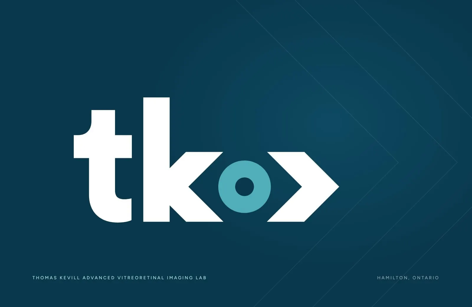
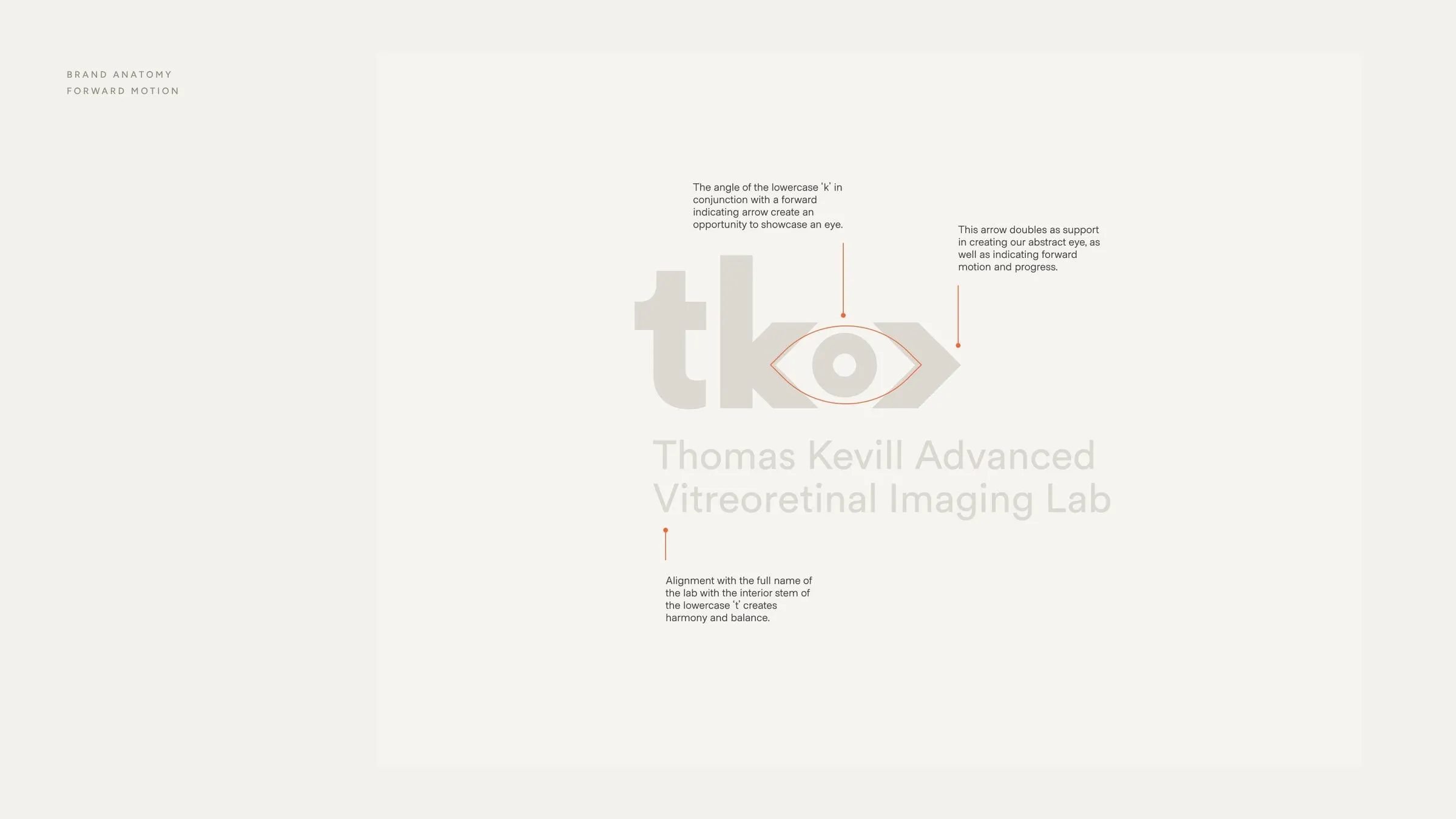
The first direction, Forward Motion, starts with the lab's initials in lowercase: tko. Look closely and the angled arm of the k meets a forward arrow to frame a circle, and that circle becomes an iris. It's an eye, built from letters, pointing ahead.
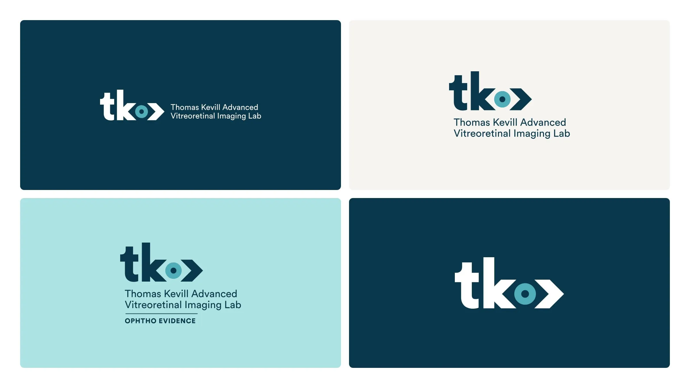
That double meaning does a lot of quiet work. The eye ties the mark to ophthalmology without falling back on a cliché, and the arrow speaks to discovery and progress. The full name of the lab sits beneath, aligned to the stem of the t so the whole lockup feels balanced. A version with "Ophtho Evidence" underneath shows how the system can carry the lab's research programs too.
In use
Business cards and a front door
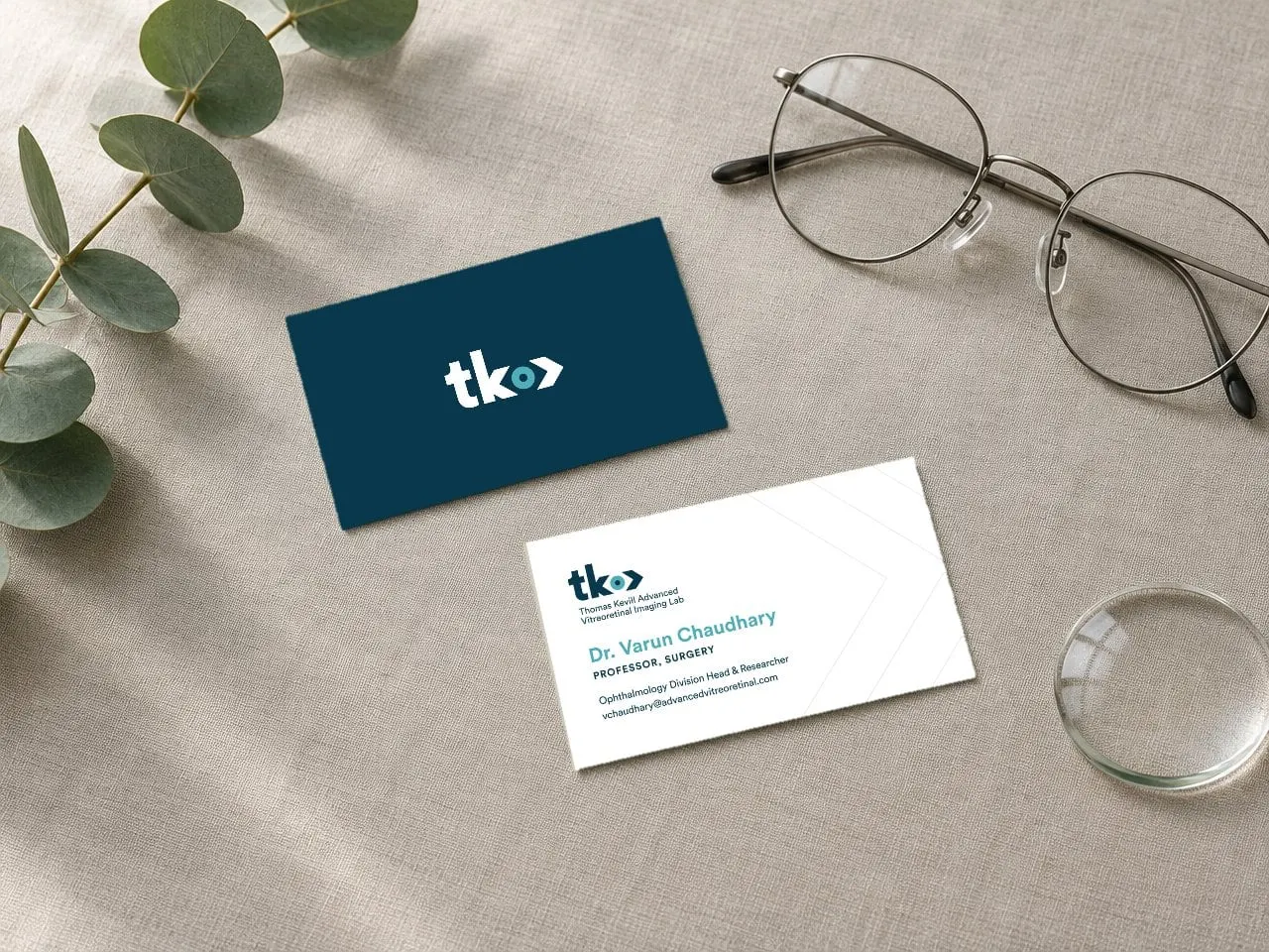
We designed business cards for each direction. For Forward Motion, a solid navy front carries the tko mark alone, and the back pairs the full lockup with Dr. Chaudhary's details on clean white, with faint chevrons echoing the arrow.
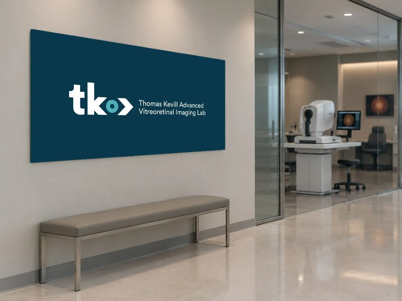
To show how the mark scales up, we also mocked it up as a wall sign at a lab entrance. Good identity design should work as well at two inches wide as it does across a wall.
03 — Colour and type
Clinical clarity, without the chill
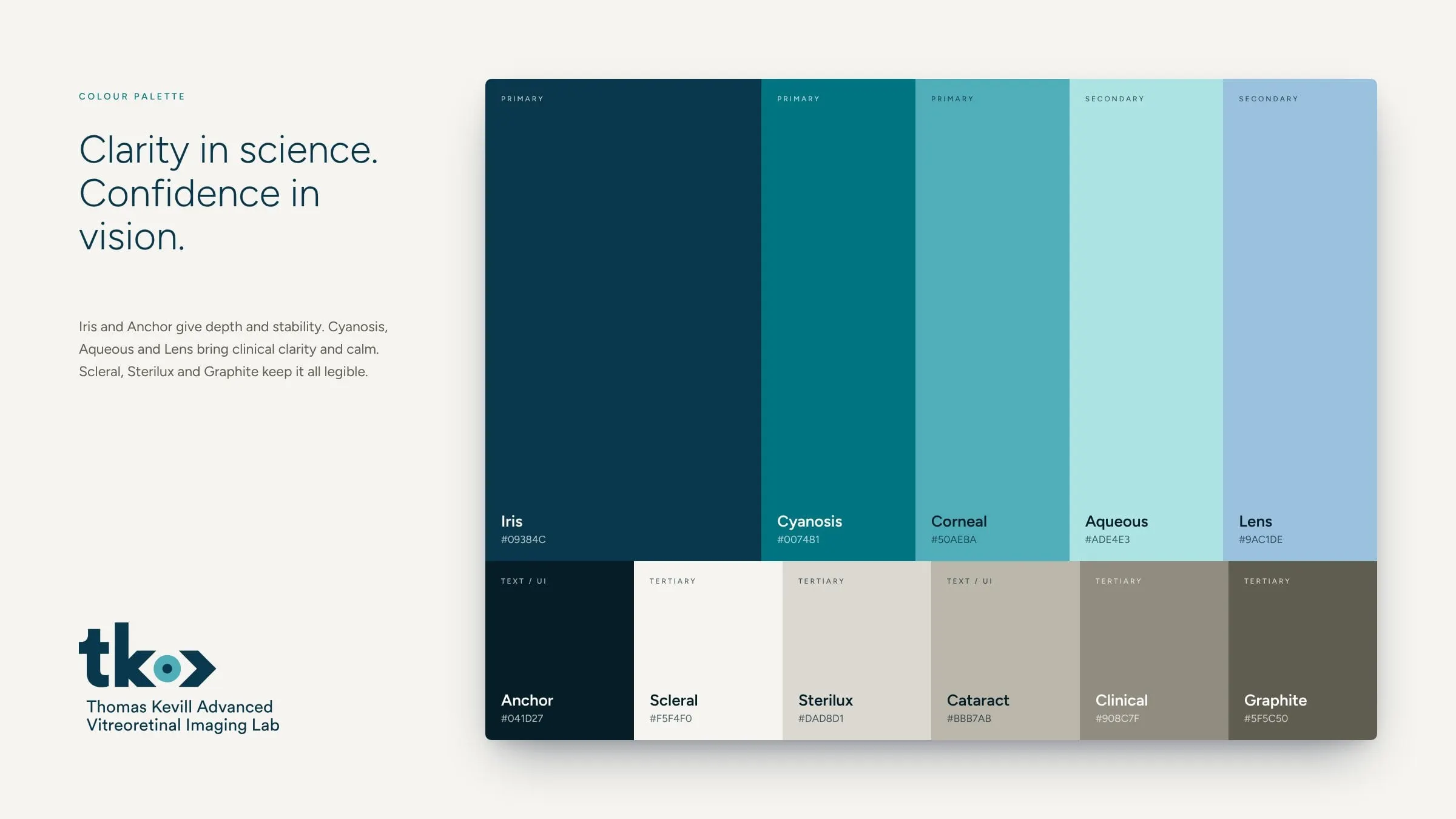
Both directions share one palette, named after the eye itself. Iris, a deep teal-navy, and Anchor, almost black, give the identity depth and authority. Cyanosis, Corneal, Aqueous and Lens bring in the calm blues and aquas of clinical imaging. Scleral, Sterilux, Cataract, Clinical and Graphite are warm, quiet neutrals that keep layouts legible and stop the brand from feeling cold.
Circular Std is the single typeface, chosen for its geometric precision and friendly proportions. It reads clearly in a dense research report, a slide at a conference or a small caption on a figure.
04 — The Keystone
Two initials, one steady mark
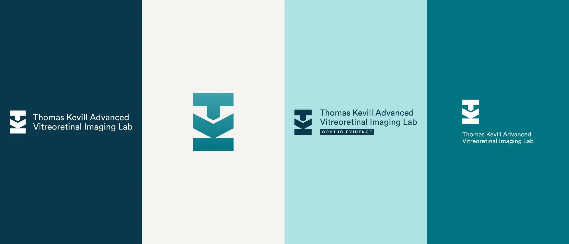
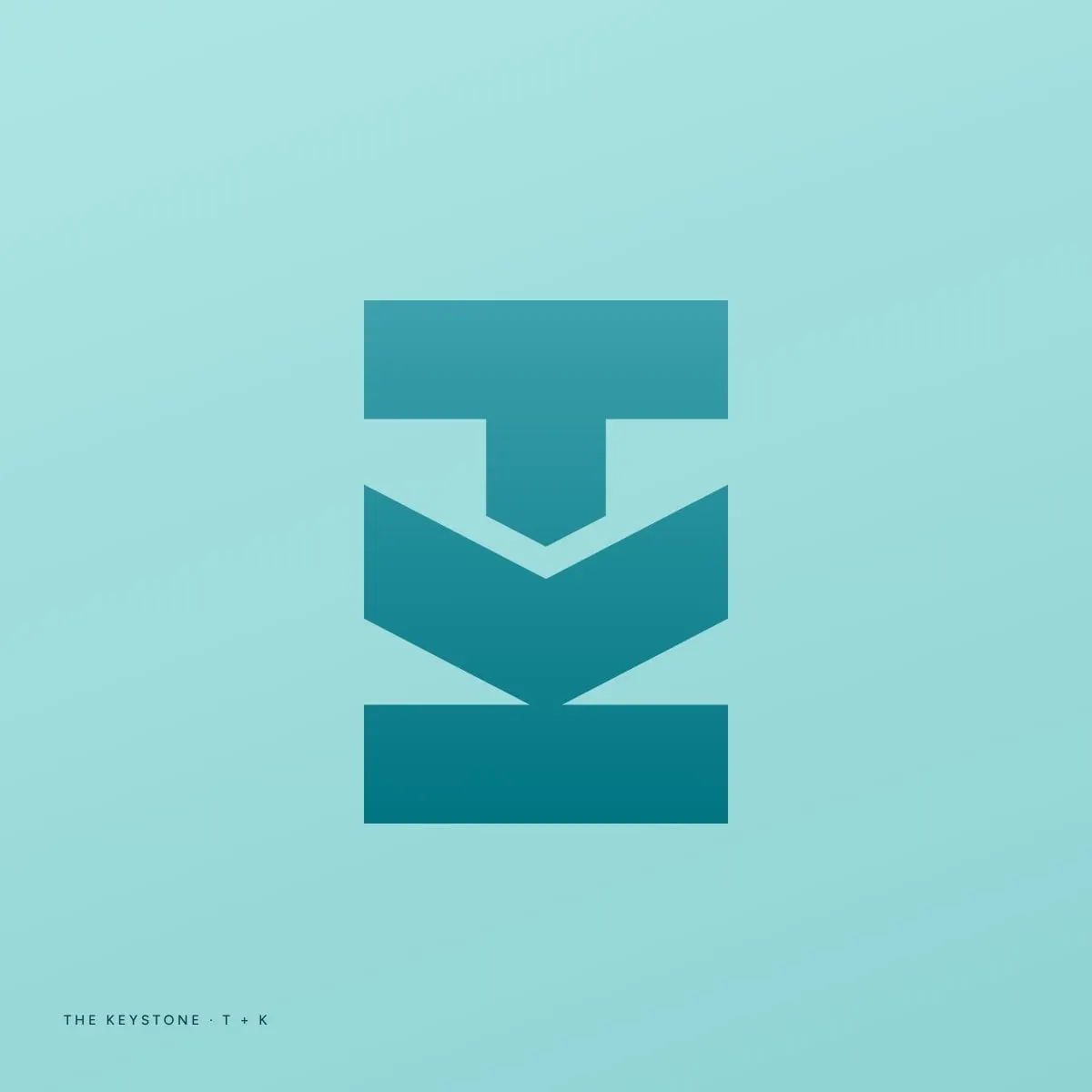
The second direction takes a more architectural route. The Keystone joins a capital T and K into one bold geometric symbol. Turned on its side, the form also suggests an anchor, a nod to the lab's steady leadership and its role as a hub for collaboration.
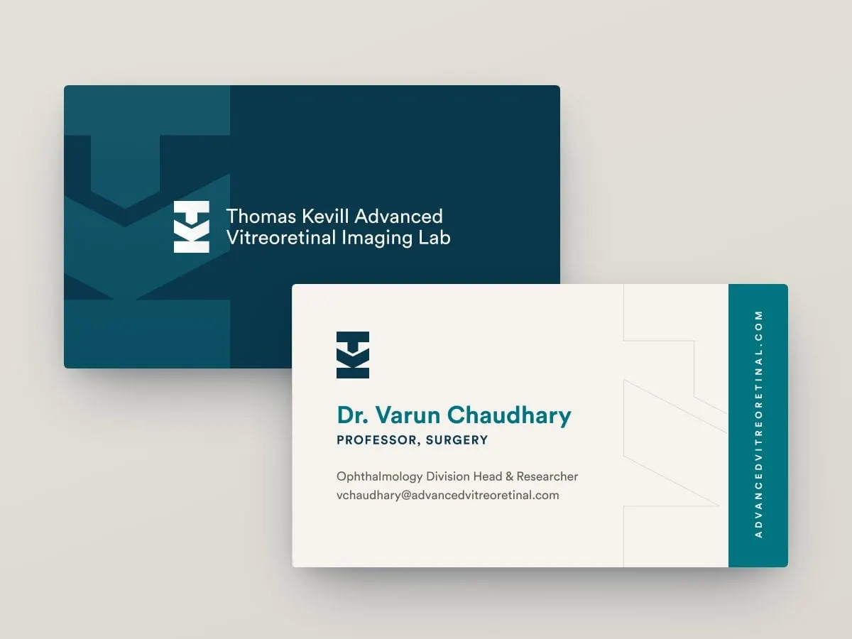
It's paired with the same clean wordmark and palette, and it has a full set of lockups for journals, slides and signage. Its business cards crop the symbol large across the front, with a teal band running the web address up the side of the back. Seeing both directions applied makes the choice clearer, and it's why we keep the whole brand consistent from the first sketch. We wrote about why a cohesive brand matters.
05 — What's next
Two strong options, one clear story
We presented both directions as a complete package for each: the logo and its rationale, the anatomy, the palette, the typography and business cards. That way the lab's team could judge them as working identities rather than logos on a white page.
Whichever direction moves forward, the lab has a brand rooted in what it does: looking closely at the eye to see what's coming. If you're working on a research or healthcare brand, see our work for Faeth Therapeutics or get in touch about print and stationery for your team.
What we delivered
The identity concepts we prepared for TKAVIL.