Case study · Seaquyl Supply Chain Technologies
Seaquyl SCT
Brand identity exploration for Seaquyl Supply Chain Technologies, a seafood traceability software company: three logo directions, a shared colour palette and business cards.
01 — Context
Software for the journey from ocean to table
Seaquyl Supply Chain Technologies builds software for seafood traceability: tracking product, data and logistics as fish move from the water through processing and distribution. Even the name does some work. It stands for smart, efficient and accurate quality yield and logistics, S.E.A.Q.U.Y.L.
The company needed an identity before it had much else. It had to look credible to processors and enterprise buyers, feel at home on dashboards and reports, and still say "seafood" without falling back on another fish-and-wave logo. We started with a colour board and three distinct logo directions, each built on a different idea, and presented them side by side so the team could choose with a clear view of the options. It's our usual branding and identity process: strategy first, then form.
02 — Colour
Deep water, bright data
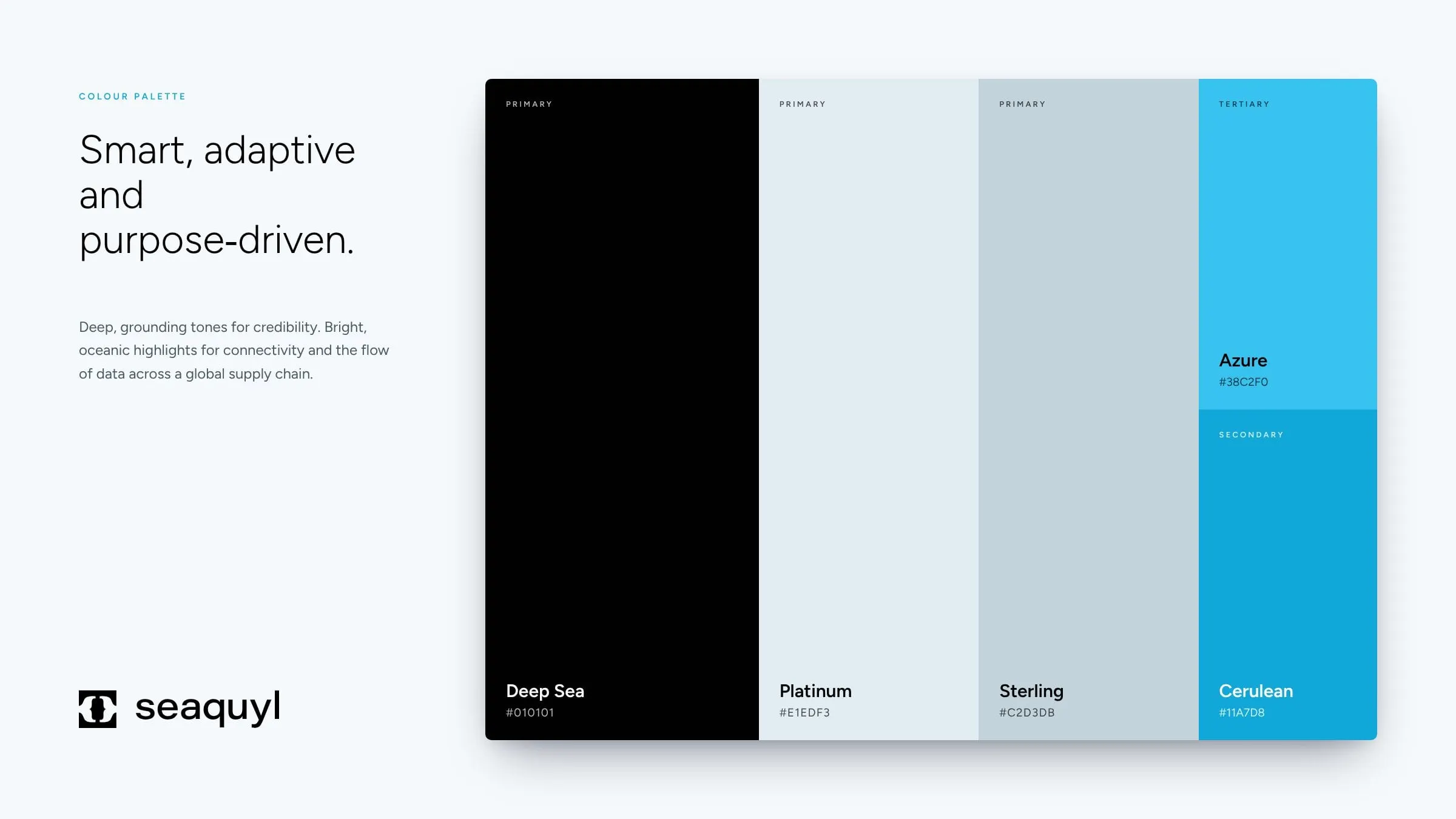
All three concepts share one palette. Deep Sea, an almost-black, carries authority and lets the marks glow. Platinum and Sterling, two cool greys with a hint of blue, keep layouts clean and readable, the way good software interfaces should be. Azure and Cerulean bring the ocean back in, and they double as highlight colours for charts, alerts and calls to action.
The aim was a system that works as well in a dashboard or a report as on a business card or a shipping label. Dark grounding tones say expertise; bright accents say connection and movement, the flow of information across a global supply chain.
Concept A
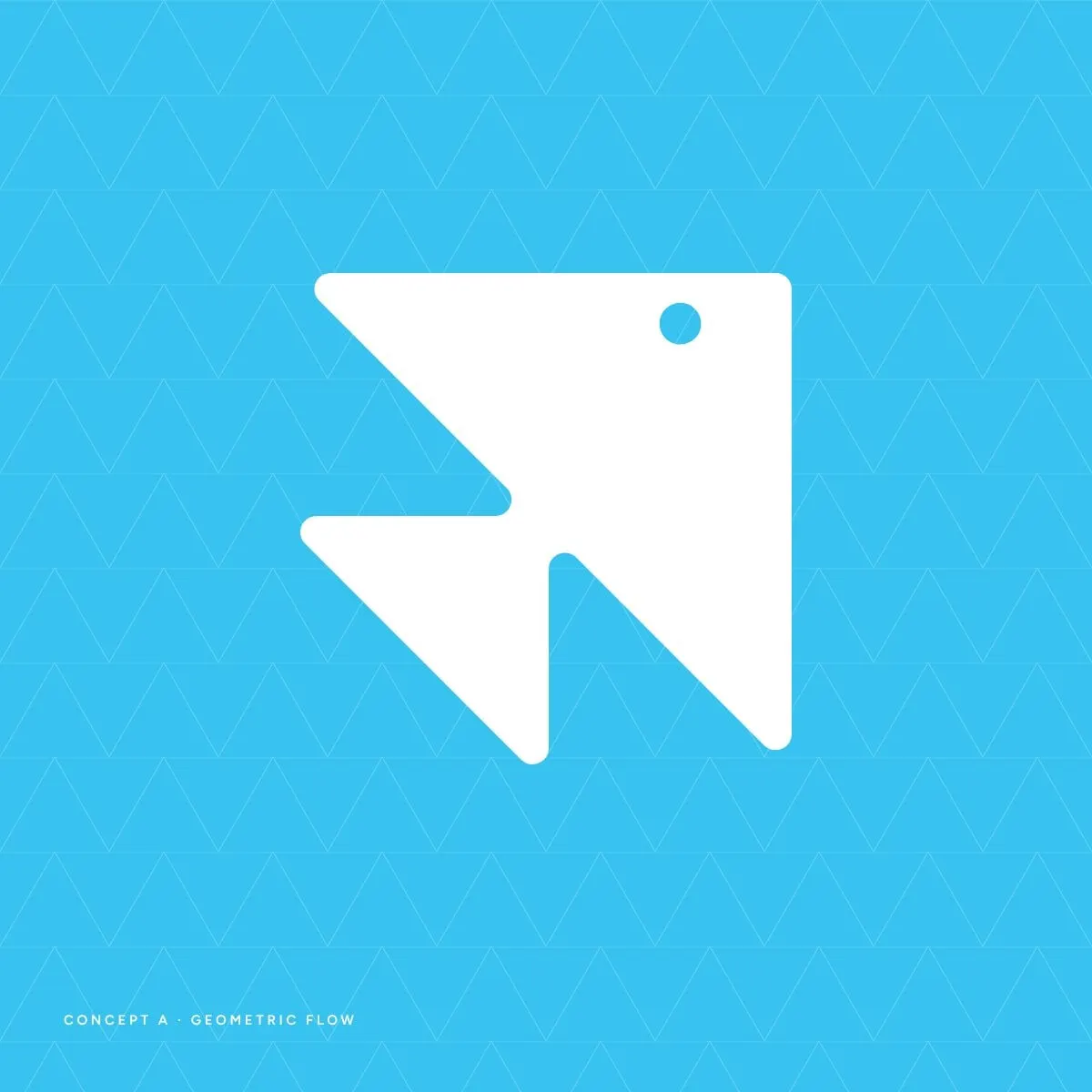
Geometric Flow, a fish made of data
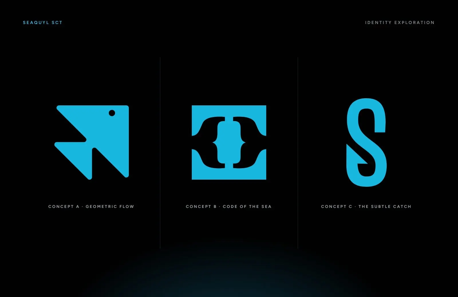
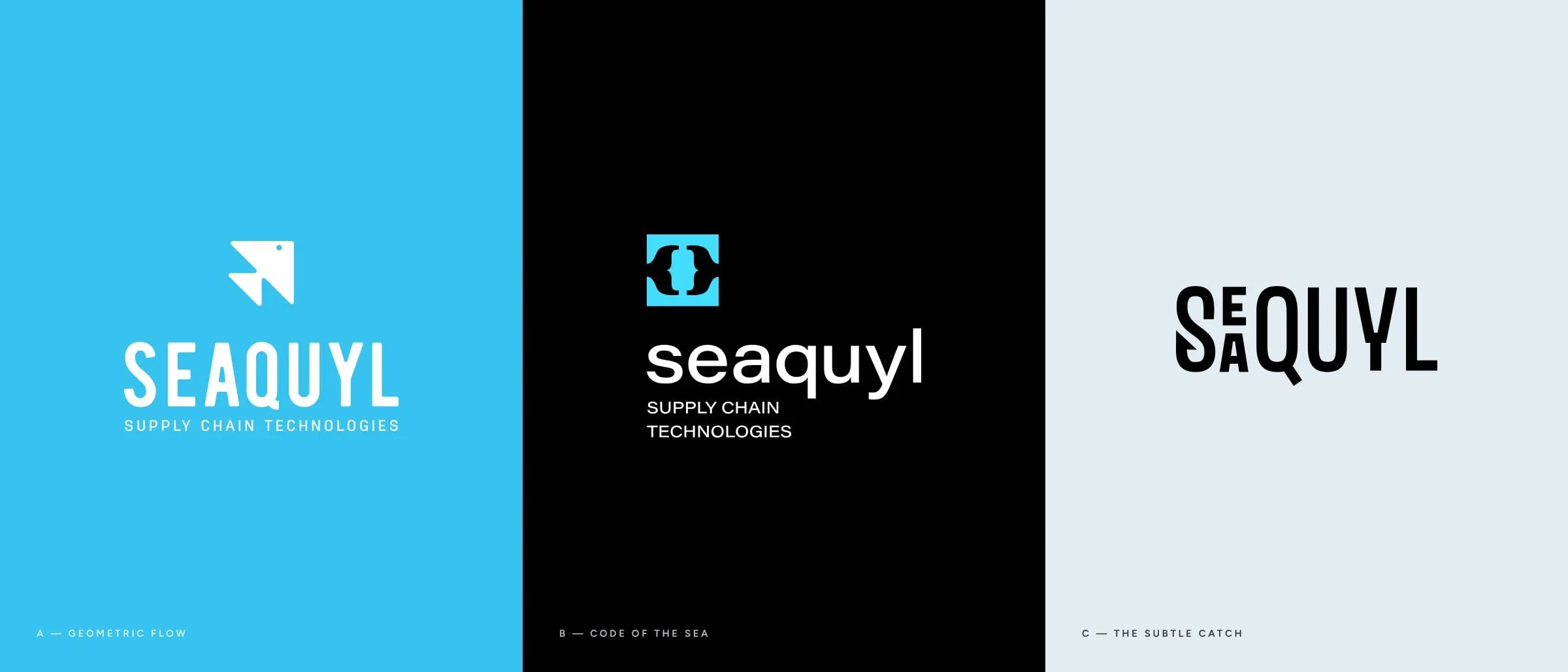
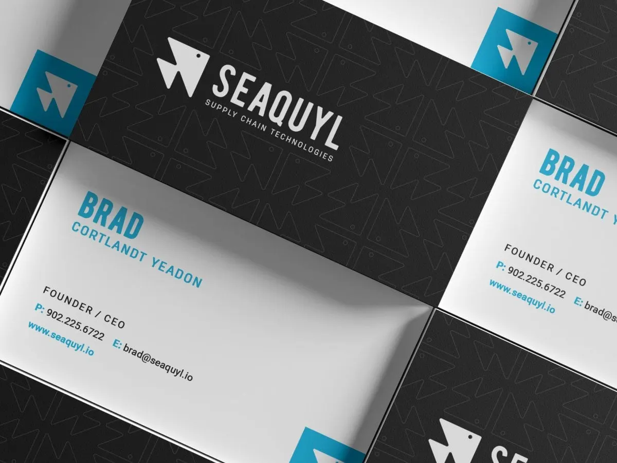
The first direction builds a fish from repeated triangles, one segment leading into the next. It reads as a fish at a glance and as a structured, almost mathematical system on a second look, a nod to the logic behind Seaquyl's platform and to the way traceability tracks every step in a chain.
A condensed, all-caps wordmark keeps it strong and technical, and a small eye gives the mark just enough personality.
Concept B
Code of the Sea, where software meets seafood
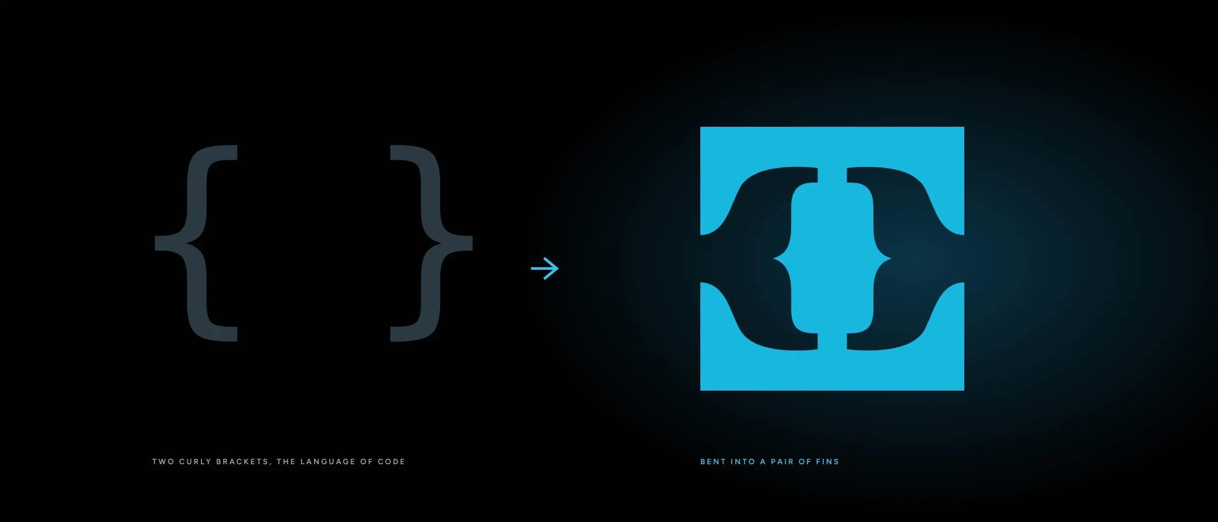
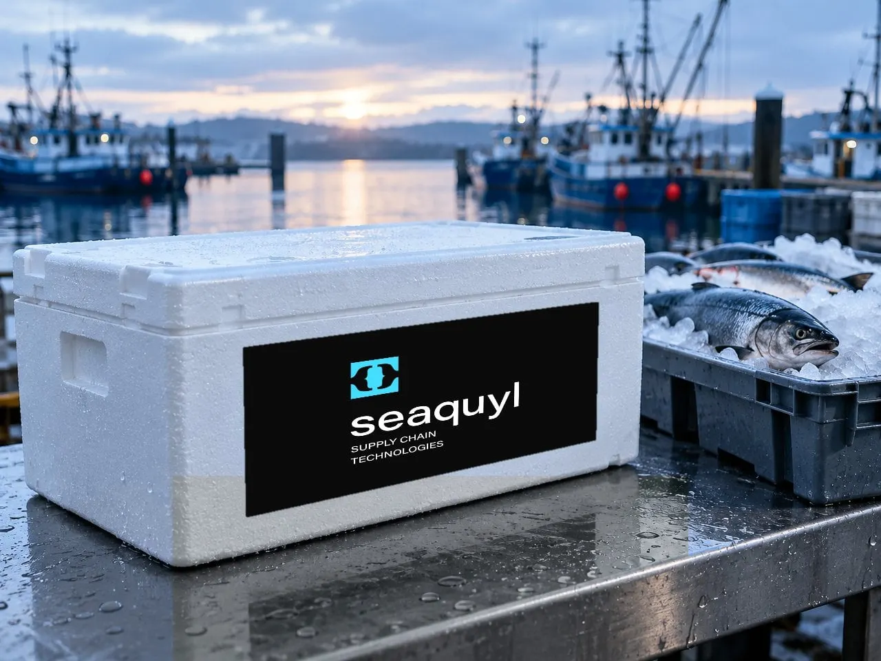
The second direction is the most literal about what Seaquyl is: a software company. Two curly brackets, the universal sign for code and structured data, face each other inside a square. Their outer edges curve into fins, so the same mark says custom software and seafood at once.
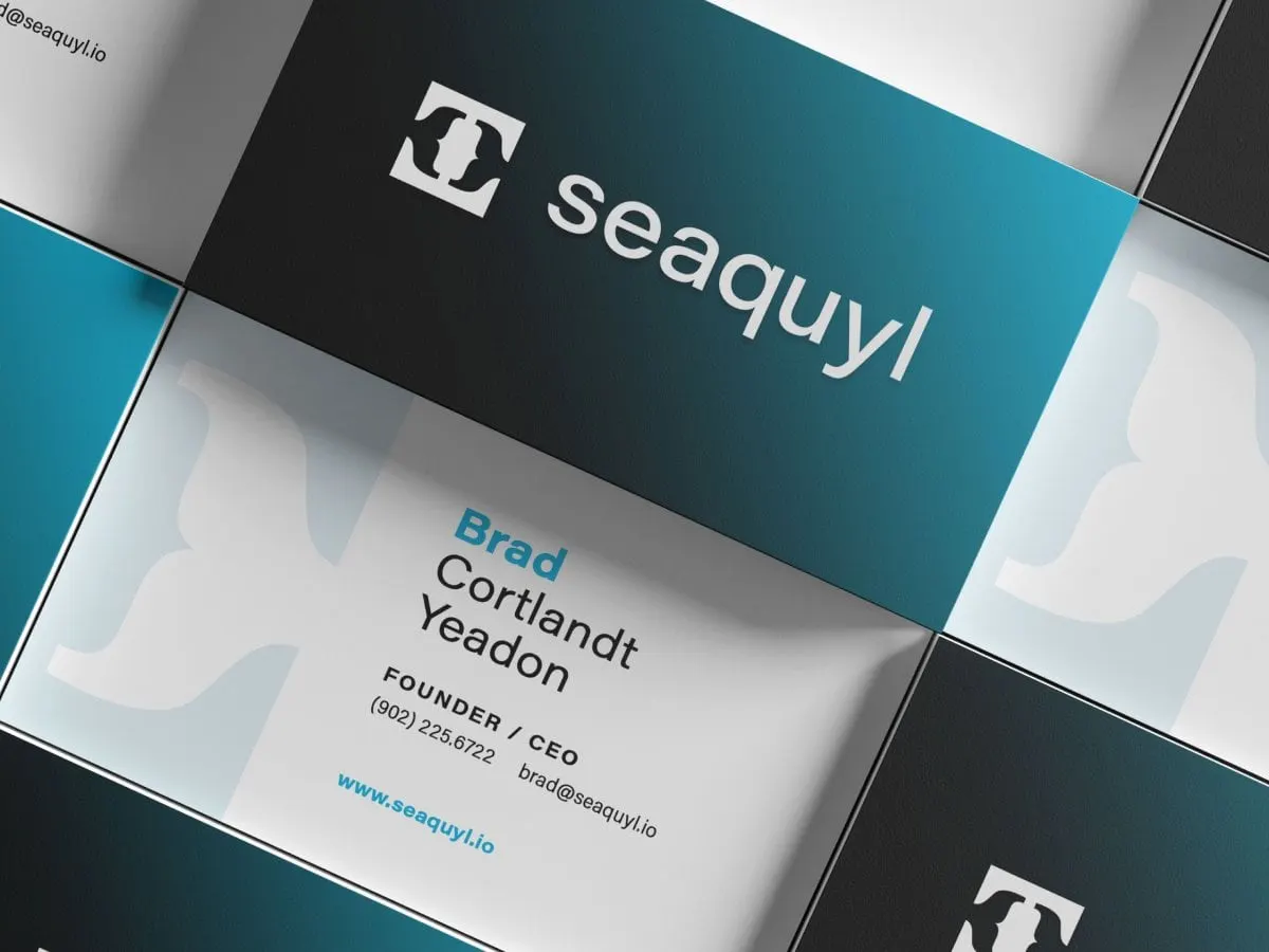
A friendly, lowercase geometric wordmark balances the precision of the icon. It's simple enough to work as an app icon or a favicon, and distinctive enough to own a shipping label.
Concept C
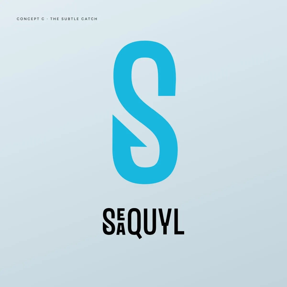
The Subtle Catch, a hook you might miss
The third direction moves away from seafood imagery almost entirely. The S ends in a sharp barb, a quiet reference to fishing hooks that never gets in the way, and the E and A stack beside it like modular components. It's the kind of mark we argue for in why you should avoid literal logo marks: clever on a second look, and not limited by what it shows.
The barbed S stands alone as an icon, and the wordmark comes in stacked and horizontal versions.
03 — What's next
Three good answers, one decision
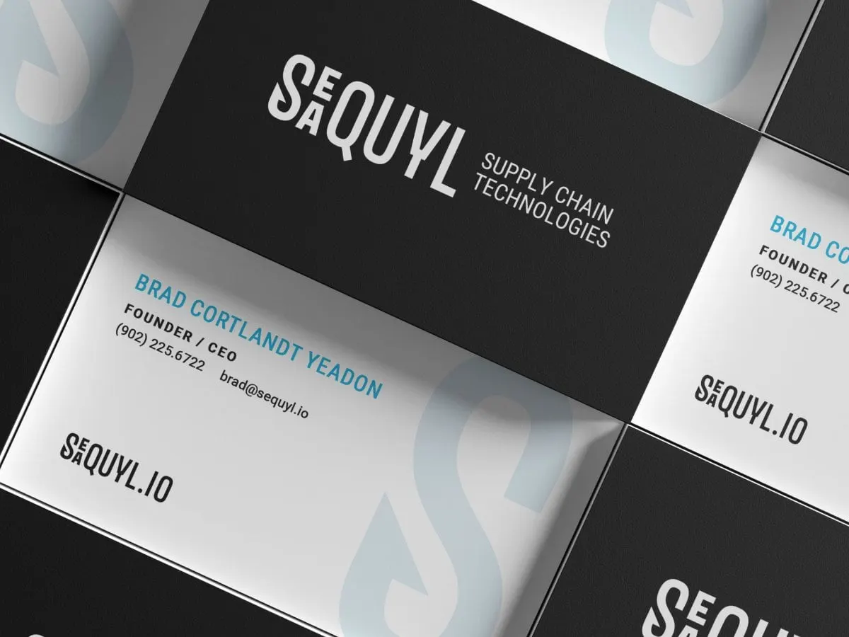
Each direction comes with the full kit for comparison: logo lockups on light, dark and colour, the standalone icon and a set of business cards. Seeing the options applied, rather than floating on a white page, makes the choice easier and more honest.
Whichever direction Seaquyl takes forward, the groundwork is done: a palette built for software and the sea, and a clear story for every mark. If you're building a technology company, our startups and emerging brands page and our work for Precision Biomonitoring are good next reads, along with why branding without strategy is just expensive art.
What we delivered
The identity exploration we prepared for Seaquyl.