Case study · Sabra
Sabra
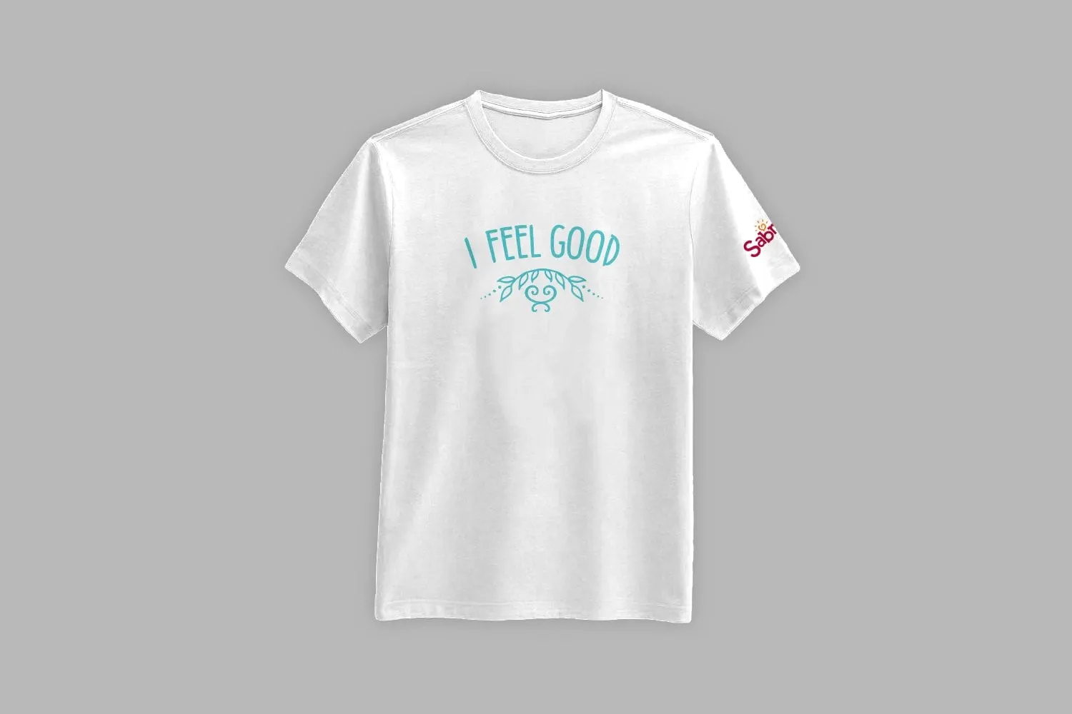
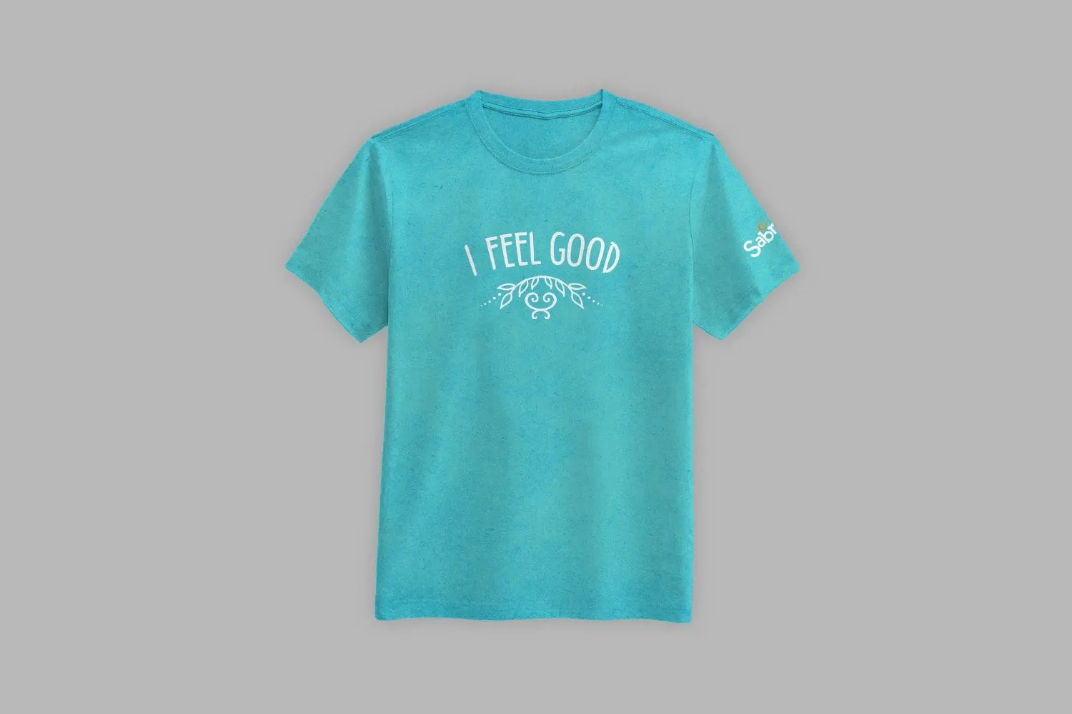
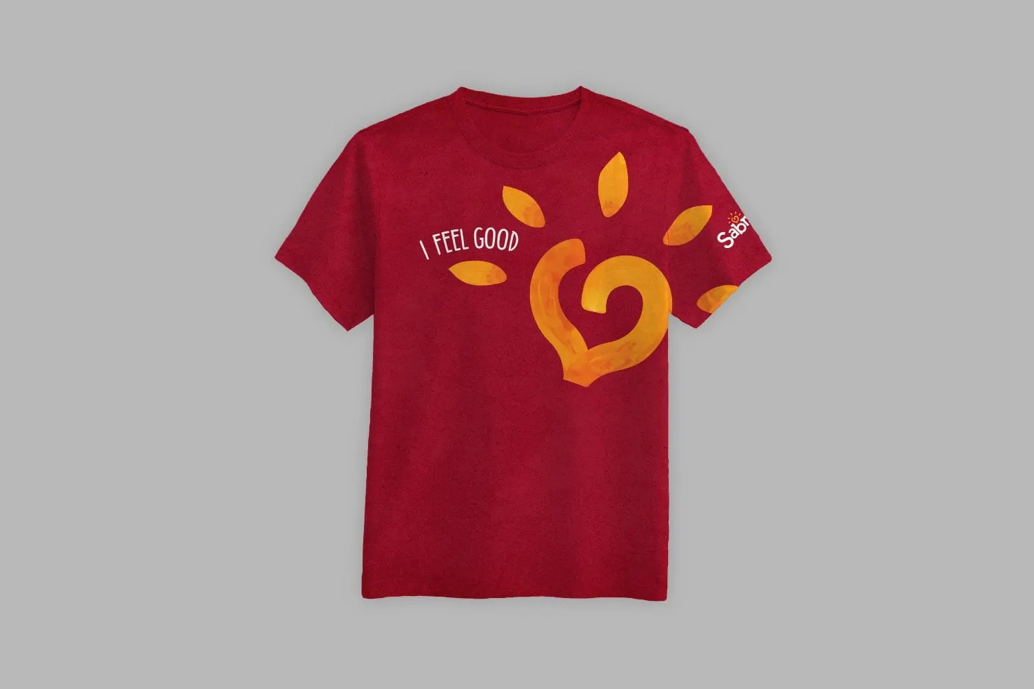
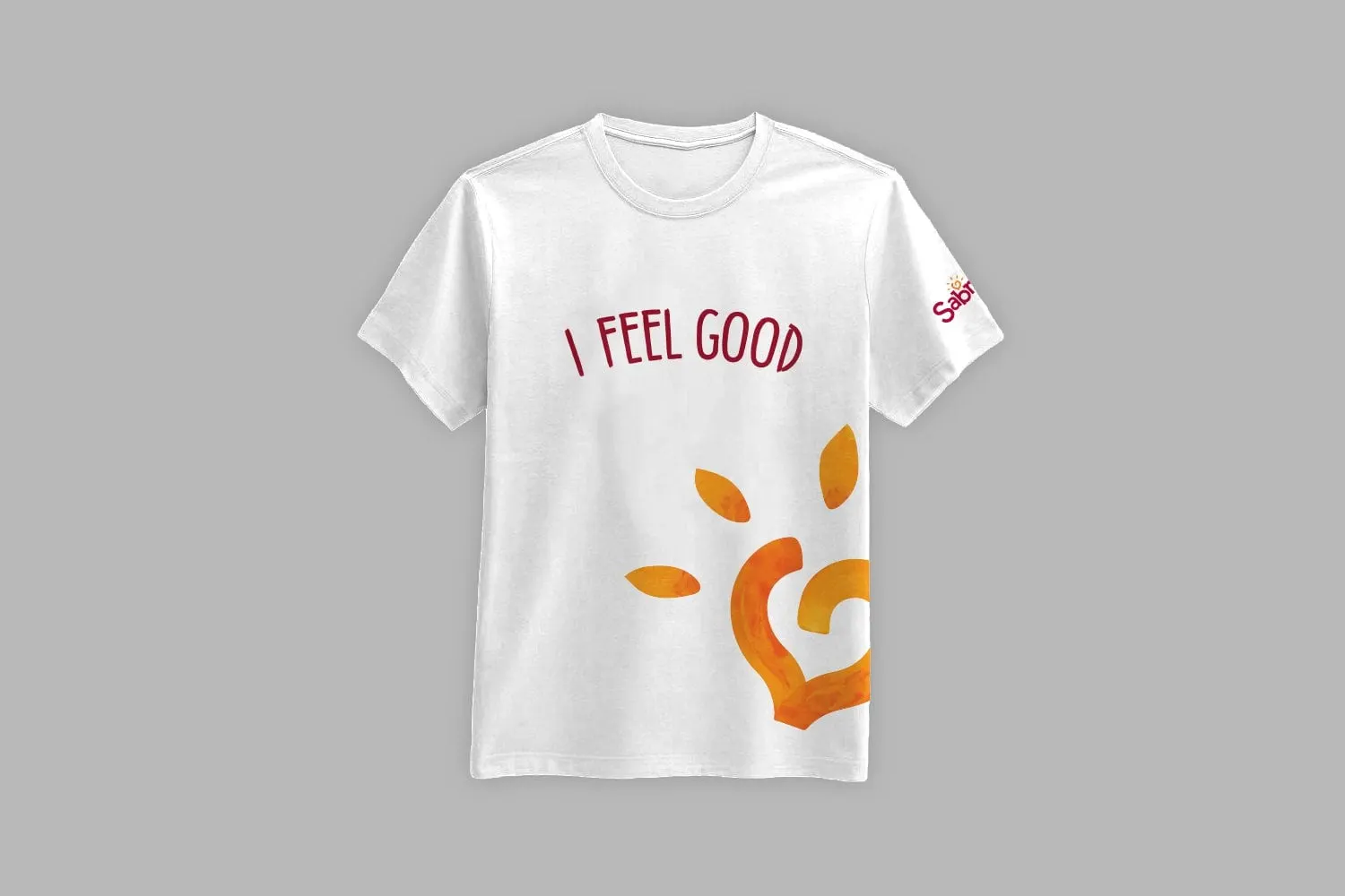
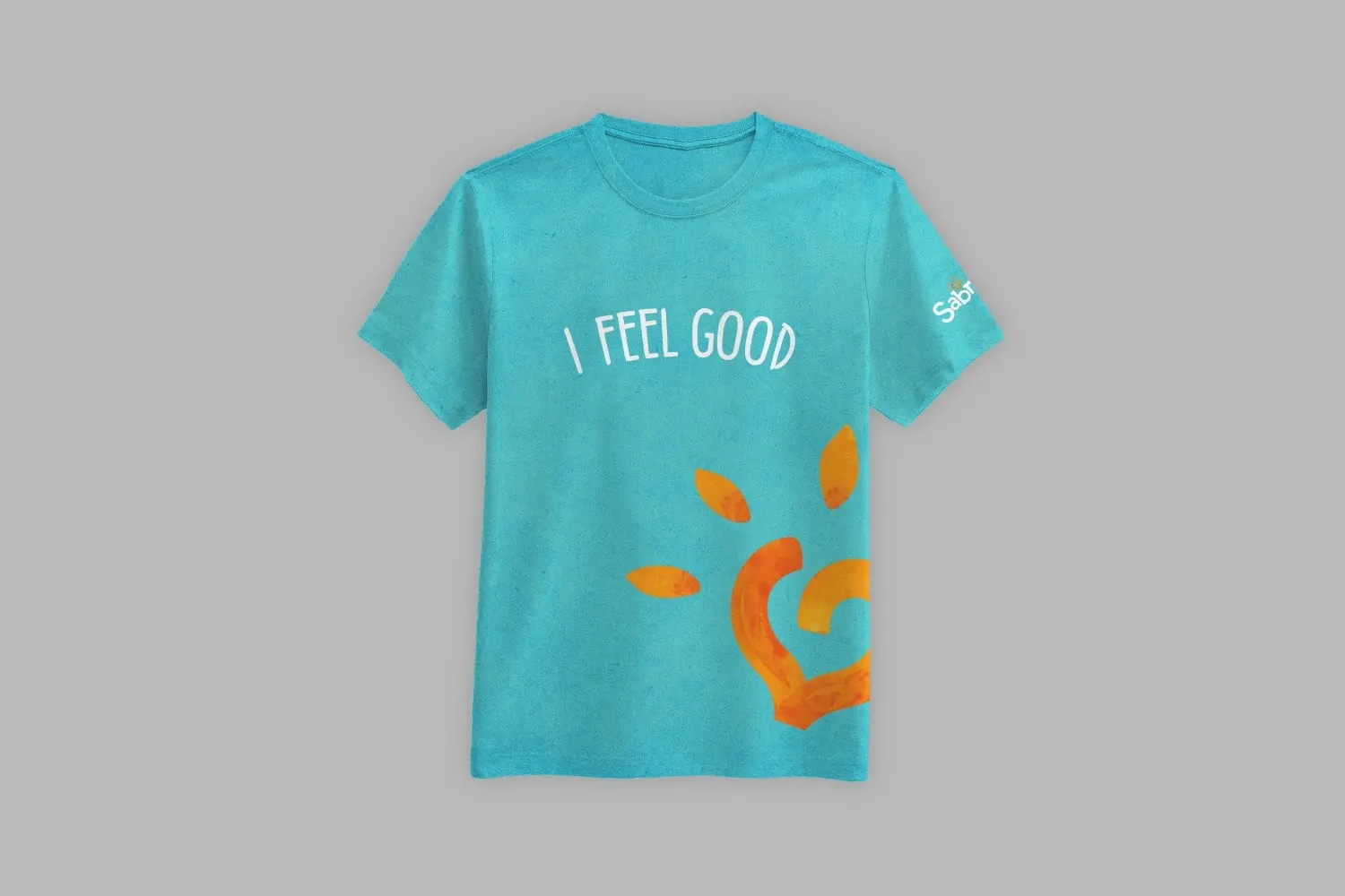
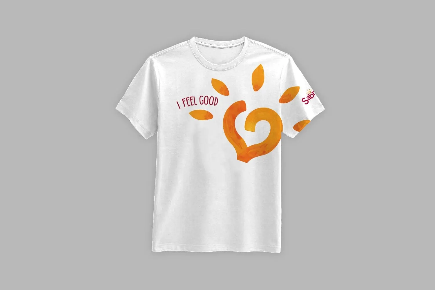
Staff t-shirt designs for Sabra's I Feel Good summer campaign, built around a hand-painted heart and hand-lettered type in two directions and three shirt colours.
01 — Context
Campaign t-shirt design for a summer of Sabra events
Sabra, the dip and spread brand, was planning a series of summer marketing events under the line I Feel Good. Its staff would be out in public all season, and the team wanted shirts that would make them easy to spot and carry the campaign's mood.
We were asked for the campaign t-shirt design. It is a small brief with real constraints: the artwork has to read from across a crowded venue, print cleanly on several shirt colours, look good in photos, and sit comfortably alongside Sabra's own brand without trying to redesign it. The Sabra logo stays exactly as it is, placed on the sleeve.
We developed two directions so the team could choose between a bold statement and something quieter.
02 — Direction one
A hand-painted heart that feels like summer
The first direction centres on a large heart, painted in warm orange and yellow with visible brush texture, drawn as one looping stroke. Leaf-shaped rays fan out around it, so it reads as both a heart and a sun. The painted finish matters: it keeps the shirt feeling human and handmade, which suits a campaign about feeling good, rather than looking like corporate merchandise.
We tried two placements. In one, the heart sits low at the hem, cropped by the edge of the shirt, with I Feel Good set across the chest. In the other, it climbs up toward the shoulder and wraps onto the sleeve, with the lettering tucked beside it. Both use hand-lettered condensed capitals, in burgundy on white and white on darker shirts.
Colour choices came from the artwork outward. Orange and yellow needed a background that would let them glow, so we tested the heart on white, a bright aqua and a deep red. The red version is the most striking from a distance; the aqua feels the freshest in summer light; the white is the most versatile. Showing all three let Sabra's team match shirts to different event settings rather than committing to one.
03 — Direction two
A lighter touch for everyday wear
The second direction is quieter. I Feel Good arches gently across the chest above a small, leafy flourish with a heart at its centre. It works in a single ink colour, aqua on white or white on aqua, which keeps printing simple and gives staff something they would happily wear again after the events.
Across both directions we kept the system consistent: the same lettering, the same three shirt colours, and the Sabra logo always on the left sleeve. That consistency is what makes a team look like a team at an event. It is a point we come back to often in graphic design for promotions, and one we explore in why a cohesive brand matters.
For more food and beverage work, see our Artisan Kettle sell sheets.