Case study · Pinpoint Advisors in Capital
Pinpoint Advisors
Brand and website design for Pinpoint Advisors in Capital, a Toronto investment bank specializing in wireless towers, fiber and data centres.
01 — Context
A specialist bank for the infrastructure under everything
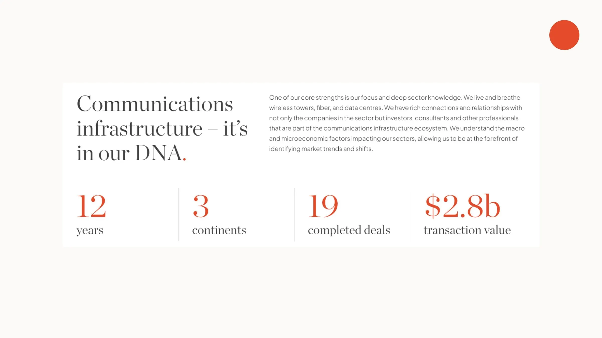
Pinpoint Advisors in Capital is a boutique investment bank focused on digital infrastructure: wireless towers, land under towers, fiber networks and data centres. From its head office in Toronto, the team advises small and mid-market companies, investors and developers on capital raising, business sales, mergers and acquisitions, valuations and restructuring, and it has completed 19 deals in its first dozen years.
Pinpoint's edge is depth, not size. It needed a website that would feel as precise and senior as its advice, and a visual identity that would carry from the site to the research reports the team publishes every quarter. We handled both, from the identity system to website design.
02 — Identity
One red dot, exactly where it counts
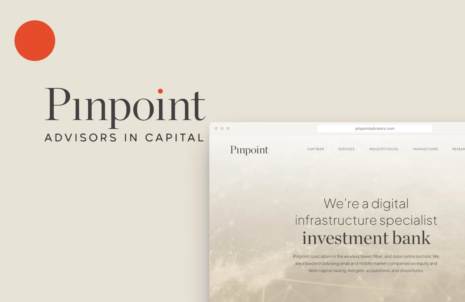
The name says it all, so the identity does too. The Pinpoint wordmark is set in a refined, high-contrast serif with a single signal-red dot placed over the i in point, while the first i goes without. It's a small, confident detail that literally pinpoints the name, with ADVISORS IN CAPITAL set in wide, tracked capitals underneath.
That red dot becomes the brand's one accent. Everything else stays calm: warm sand, soft paper whites and a deep charcoal for type. In a sector full of navy and stock skylines, restraint is what makes Pinpoint look senior.


03 — Design
Editorial calm for a technical business
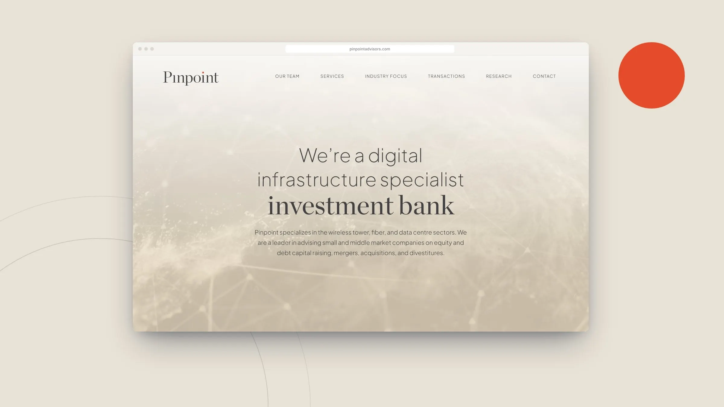
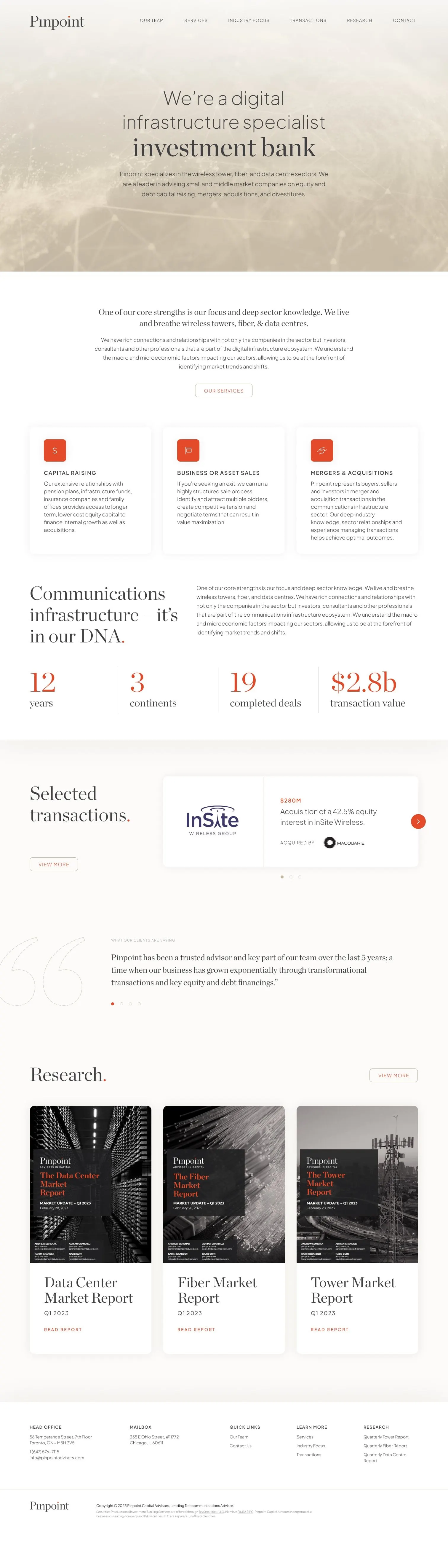
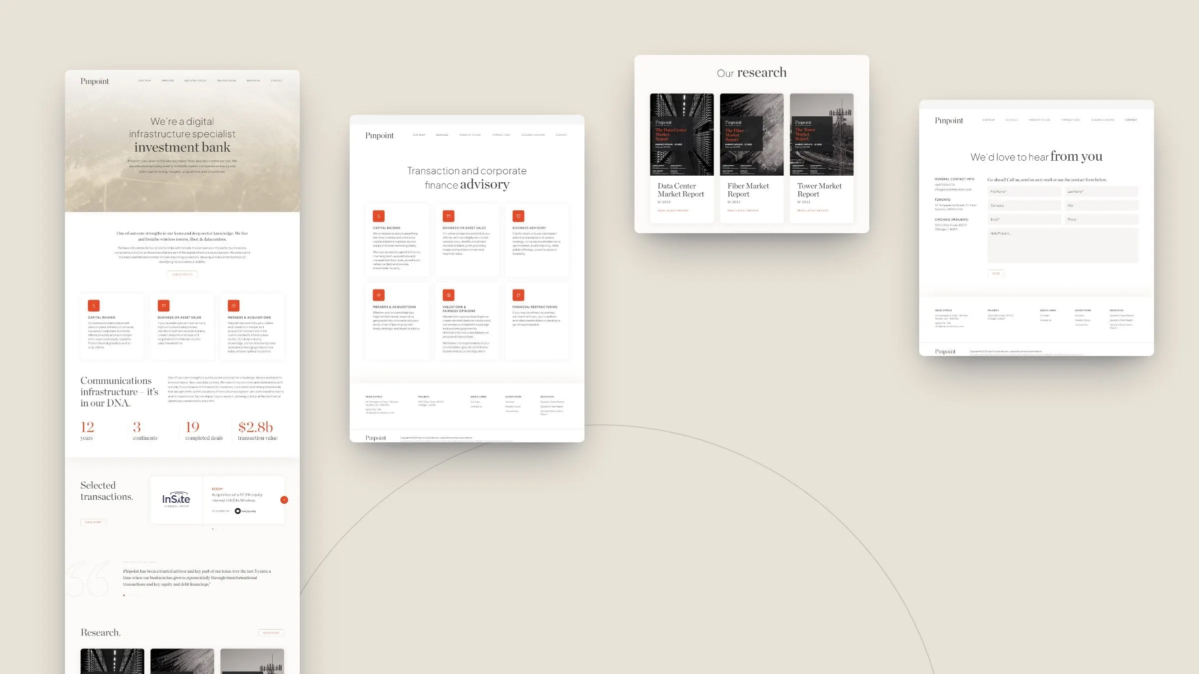
Digital infrastructure is technical, and the people who buy Pinpoint's services are experts. So we designed the site like a quality financial publication rather than a tech brochure. Headlines mix a light sans with a serif in a single line (investment bank, expertise, advisory) so the important word always lands.
The homepage hero sits on a soft, sand-toned network image that hints at connectivity without shouting. Generous white space, thin rules and big red serif figures for the firm's track record do the rest. It's a good example of minimalism used with purpose: fewer elements, each one doing more.
04 — Structure
Built around what clients ask first
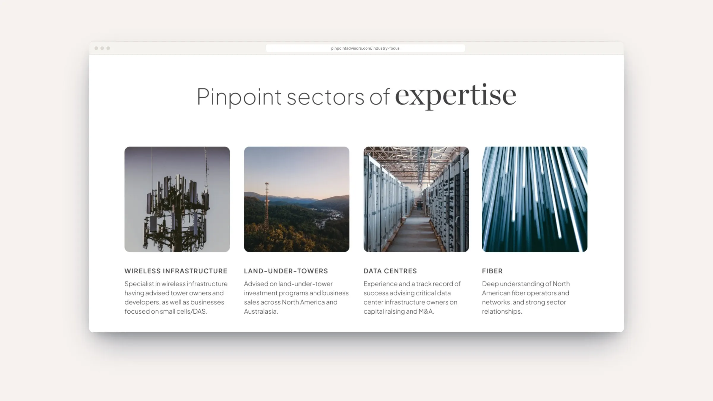
We organized the site around the questions a CFO or founder asks in a first meeting: Who are you? What do you do? Which sectors do you know? What have you done? The navigation follows that order: Our Team, Services, Industry Focus, Transactions, Research and News, and Contact.
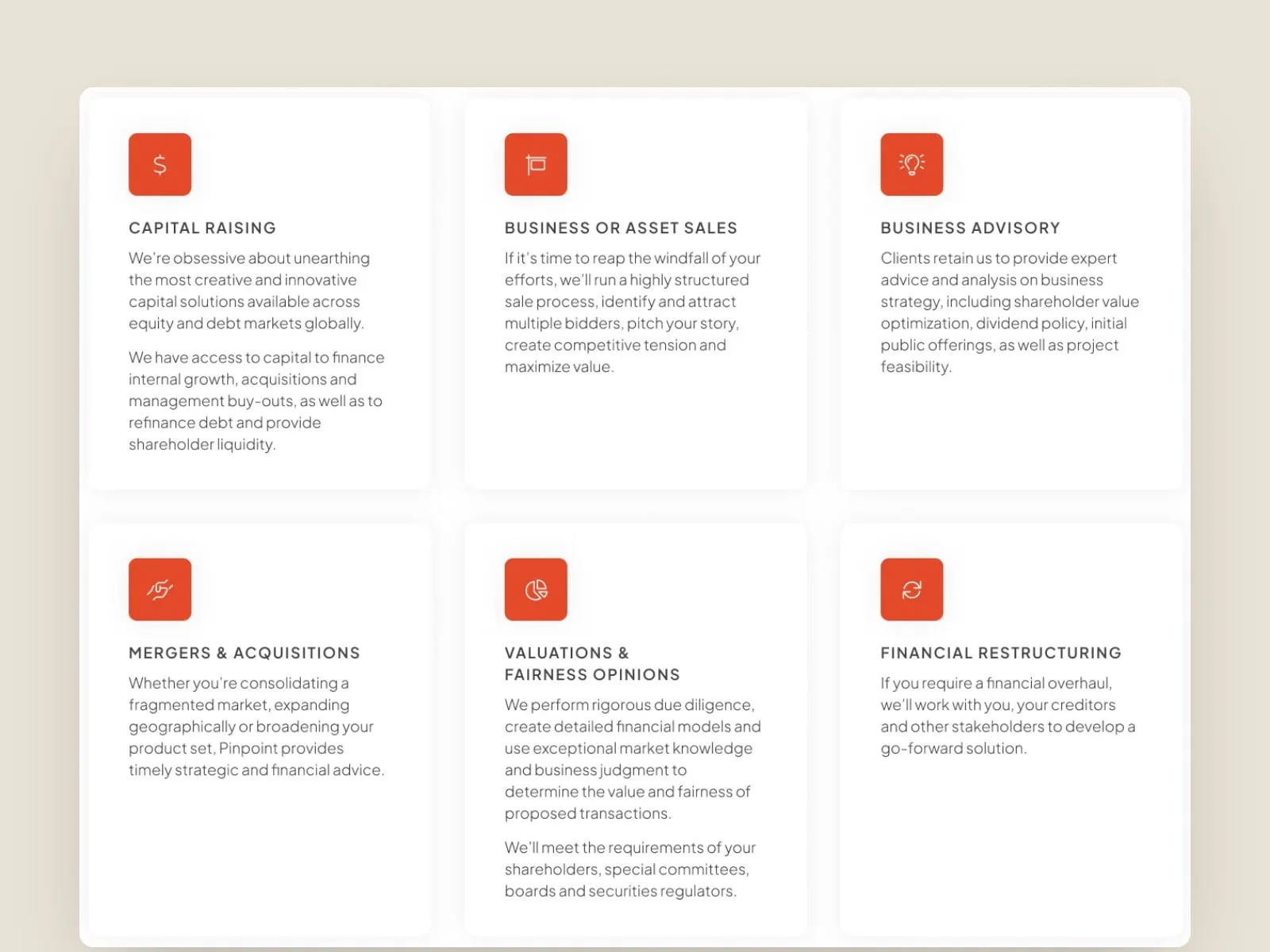
Six services each get a clear card and plain-language description, from capital raising to valuations and fairness opinions. A transactions archive presents completed mandates as tidy, consistent cards, and individual team bios open in an overlay so visitors never lose their place.

05 — Research
Thought leadership, with a home
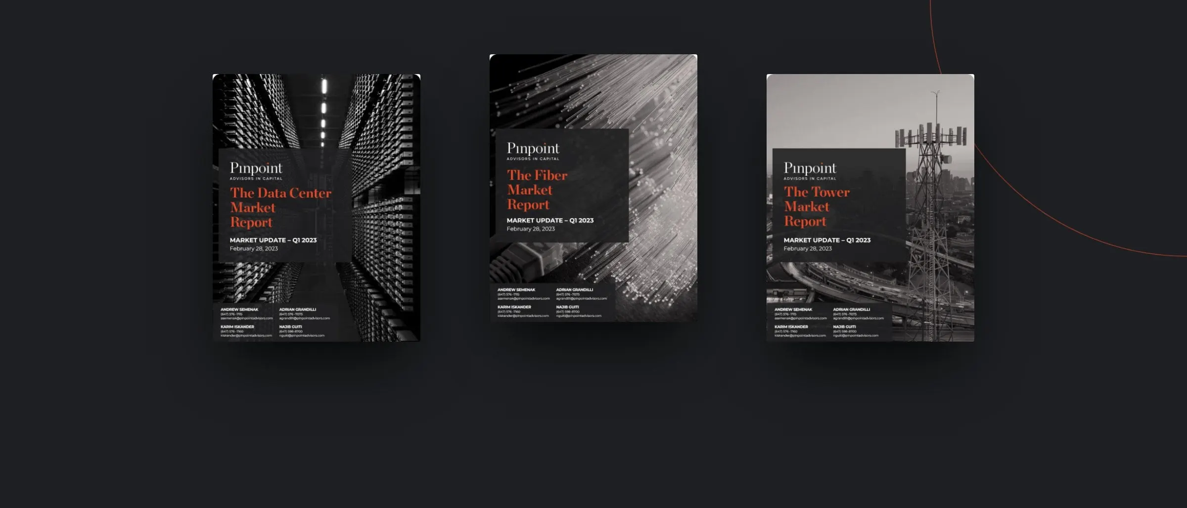
Pinpoint publishes market updates on the sectors it covers, and those reports are some of its best marketing. We gave them a proper home: a Research and News section with a consistent report cover system, featured on the homepage and filed by sector, plus a news feed for team and deal updates.
The covers follow the brand: black-and-white sector photography, the wordmark in a dark panel and report titles in signal red. Whether a prospect finds Pinpoint through a report or a referral, the experience feels like the same firm. That consistency is why a cohesive brand matters.
06 — The result
Precise, senior and unmistakably Pinpoint
Pinpoint now has a digital presence that matches the calibre of its advice: a restrained identity with one memorable detail, a site organized around how clients actually evaluate a bank, and a research system that keeps the firm top of mind between deals. It's quiet design for a firm that would rather let its work do the talking, and that's exactly the point.
Planning something similar? Our guide to aligning your website with your business goals is a good place to start.
If you work in finance, see more of our finance and insurance work, including ILA Capital.
What we delivered
- 01Visual identityWordmark presentation, the red-dot accent, colour and typography.
- 02Research report coversA cover system for quarterly data centre, fiber and tower reports.
- 03Website designSeven pages: home, team, services, industry focus, transactions, research and contact.
- 04Information architectureNavigation and page structure built around how clients evaluate a bank.
- 05Hero testingAlternative homepage hero treatments to find the right first impression.