Case study · Northern Equity Partners
Northern Equity Partners
A corporate website for Northern Equity Partners, a Burnaby holding company that owns and grows trucking, concrete, equipment and grocery businesses across B.C.
01 — Context
Five rugged businesses, one head office
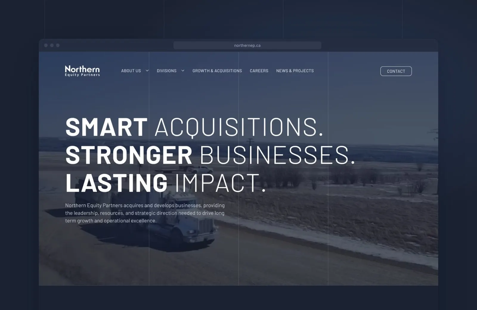
Northern Equity Partners is an owner-driven holding company based in Burnaby, British Columbia. It acquires and develops businesses, then serves as the corporate head office for them, providing finance, human resources, strategic planning, capital investment and general administration so each company can focus on its work.
The portfolio is varied and very real: NVT Logistics, hauling for the oilfield in Fort St. John since 1968; Wilson Concrete & Gravel and Grosso Precast in Northern B.C.; Gegra Equipment, with rentals and sales in three B.C. locations; and Aura Natural Market in Langley and Surrey. NEP needed a website that tied all of that into one confident story, for business owners thinking about selling as much as for future employees.
02 — Direction
Big type, steady grid
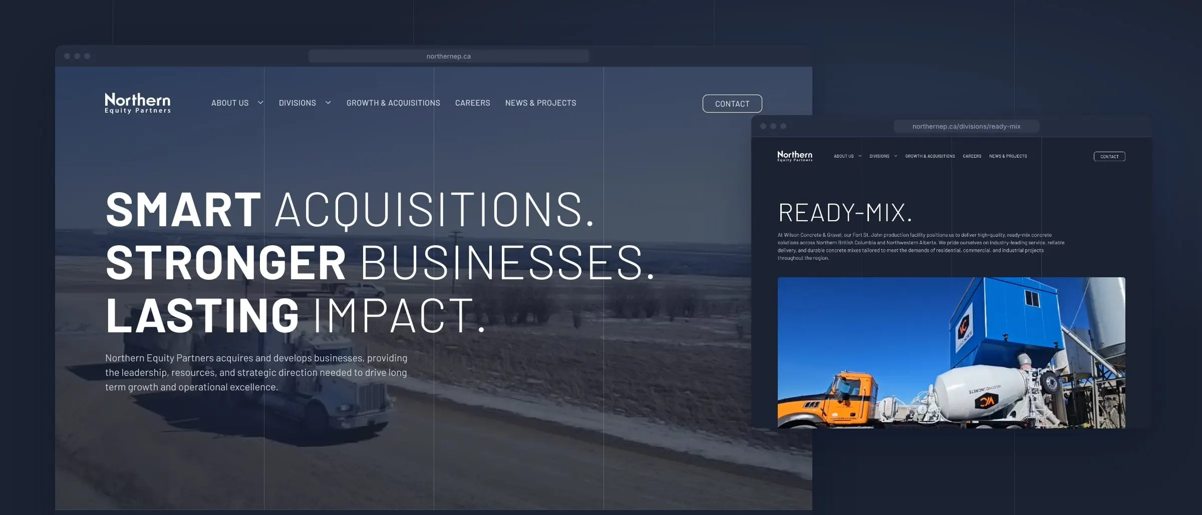
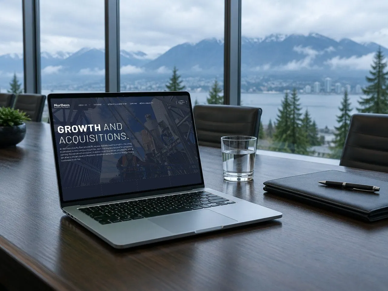
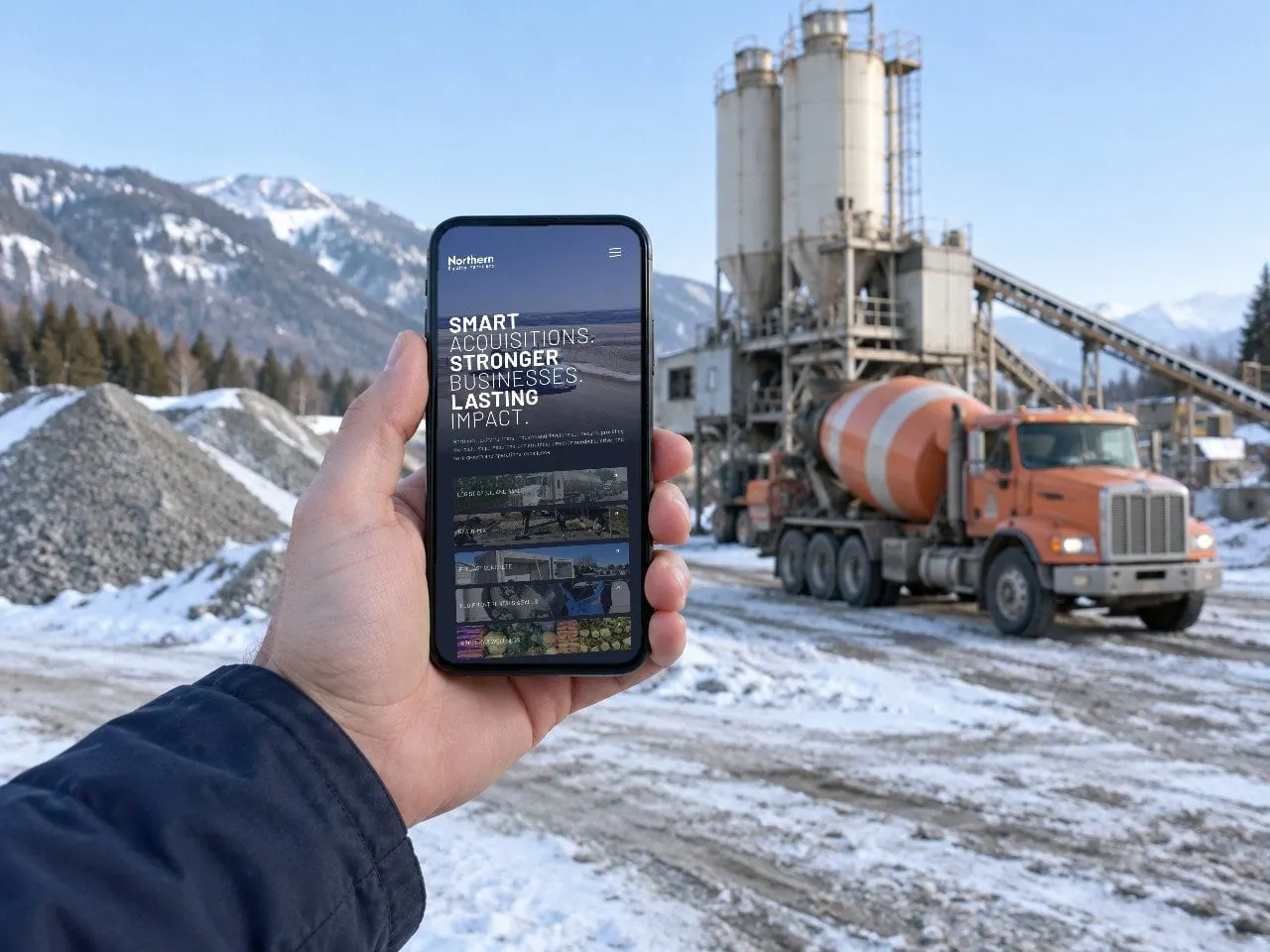
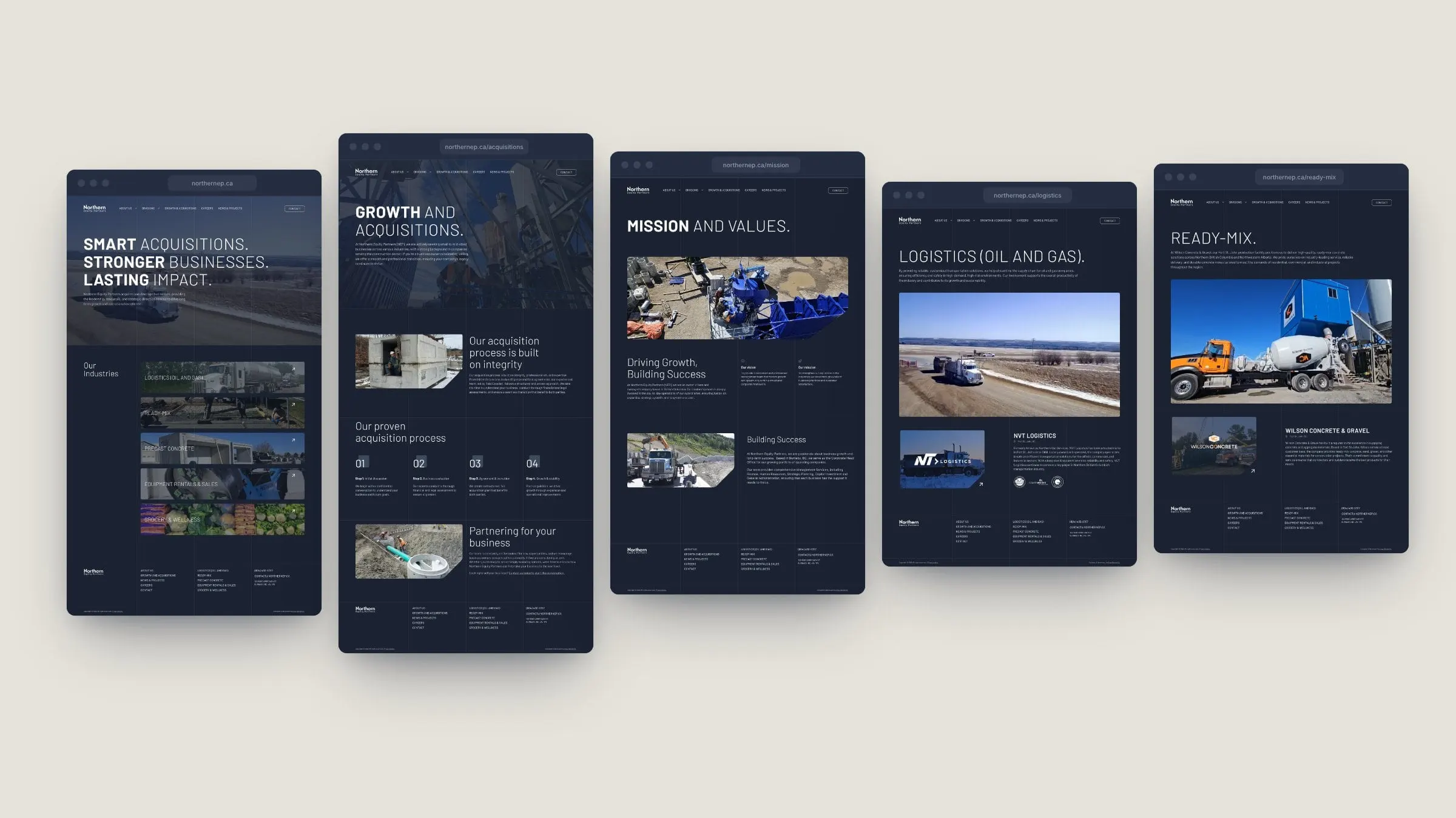
We wanted the site to feel like the company: plain-spoken, solid and a little bit industrial. Headlines are set in wide, all-caps type that pairs a heavy word with a light one, so "Smart acquisitions" reads with weight and calm at the same time. Everything sits on a deep navy, with fine vertical grid lines running through every page like survey lines on a site plan.
Real photography from the portfolio does the rest: trucks on frozen roads, precast vaults, batch plants and mixers. Images are cropped with one clipped corner, a small detail repeated across the site that makes it unmistakably NEP. Simple, confident choices like these are what good minimalism is about.
03 — Divisions
Every company gets its own page
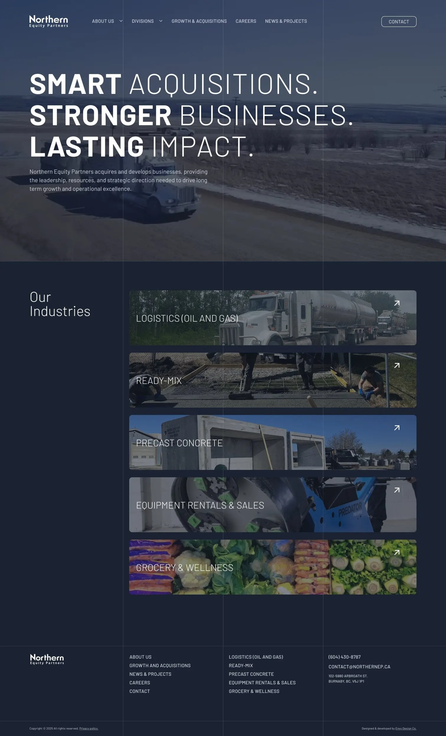
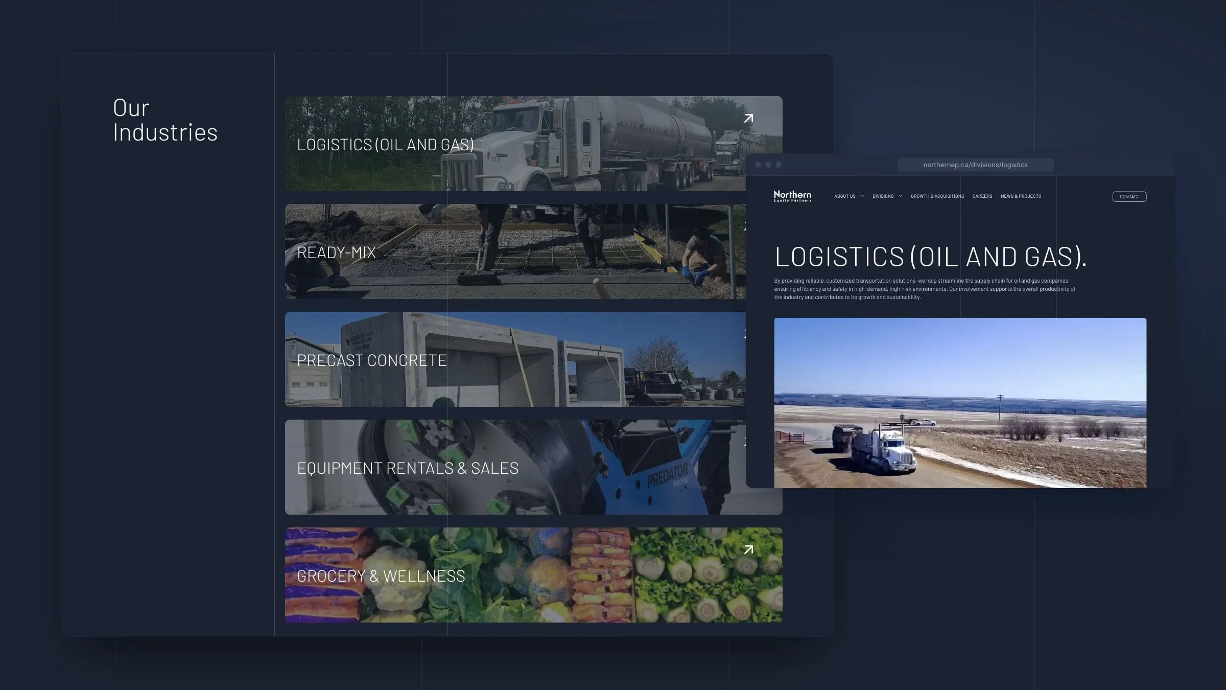
The homepage leads straight into the portfolio. Five full-width photo rows, one per industry, open into division pages that explain the industry, then introduce the operating company with its location, history and logo. The same structure works for an oilfield hauler and a natural grocery store, which is the point: NEP is the common thread.
A Divisions menu in the main navigation and a full division list in the footer keep every company one click away.
04 — Acquisitions
Talking to the next seller
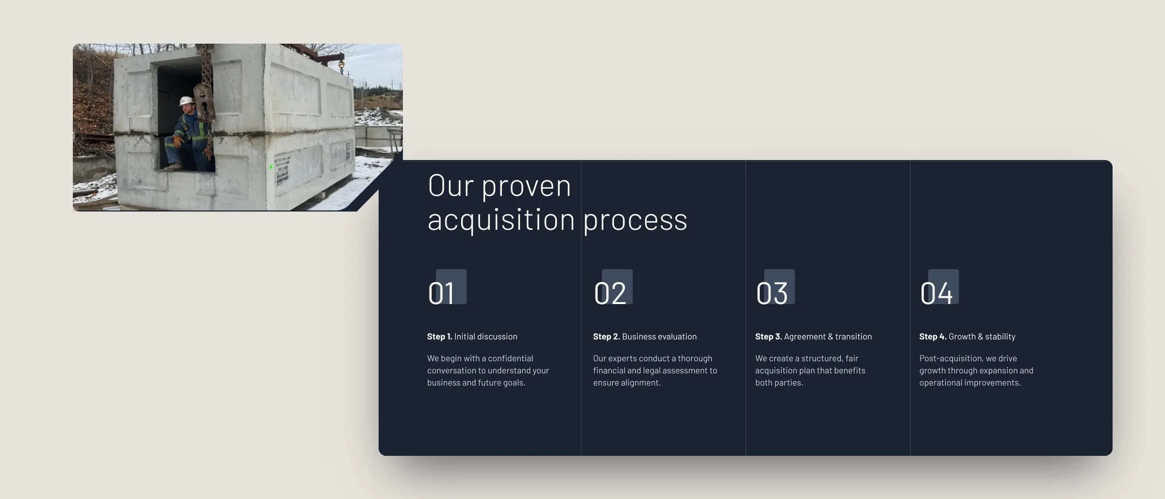
NEP is actively looking for small to mid-sized businesses, especially in the construction sector, so the Growth and Acquisitions page is one of the most important on the site. It speaks directly to business owners thinking about an exit, explains that the process is built on integrity, and lays it out in four plain steps: initial discussion, business evaluation, agreement and transition, then growth and stability.
Mission and Values, Our Team with leadership bios, Careers with job listings, News & Projects and Contact round out 14 page designs. We designed and developed the site, and the clear structure follows the ideas in aligning a website with business goals.
05 — Result
A holding company that looks the part
The finished site gives Northern Equity Partners a front door that matches the scale of what it owns. Sellers see a serious, organized buyer. Job seekers see a group of companies with room to grow. And the operating businesses each get a proper home under one name, with room to add the next acquisition without redesigning anything. A new division is simply one more photo row on the homepage, one more page built from the same template and one more line in the menu and footer.
For more work with construction and industrial companies, see our construction and engineering projects, including The Miller Group.
What we delivered
A corporate website for a B.C. holding company and its five operating divisions.
- 01Website designFourteen page designs, from the homepage and acquisitions page to five division pages, careers and blog.
- 02UX and UI designDivision navigation, team bio pop-ups, job listings and a consistent clipped-corner image system.
- 03Website developmentA site the NEP team can update as the portfolio, team and job openings change.