Case study · Inter Atlanta FC
Inter Atlanta FC
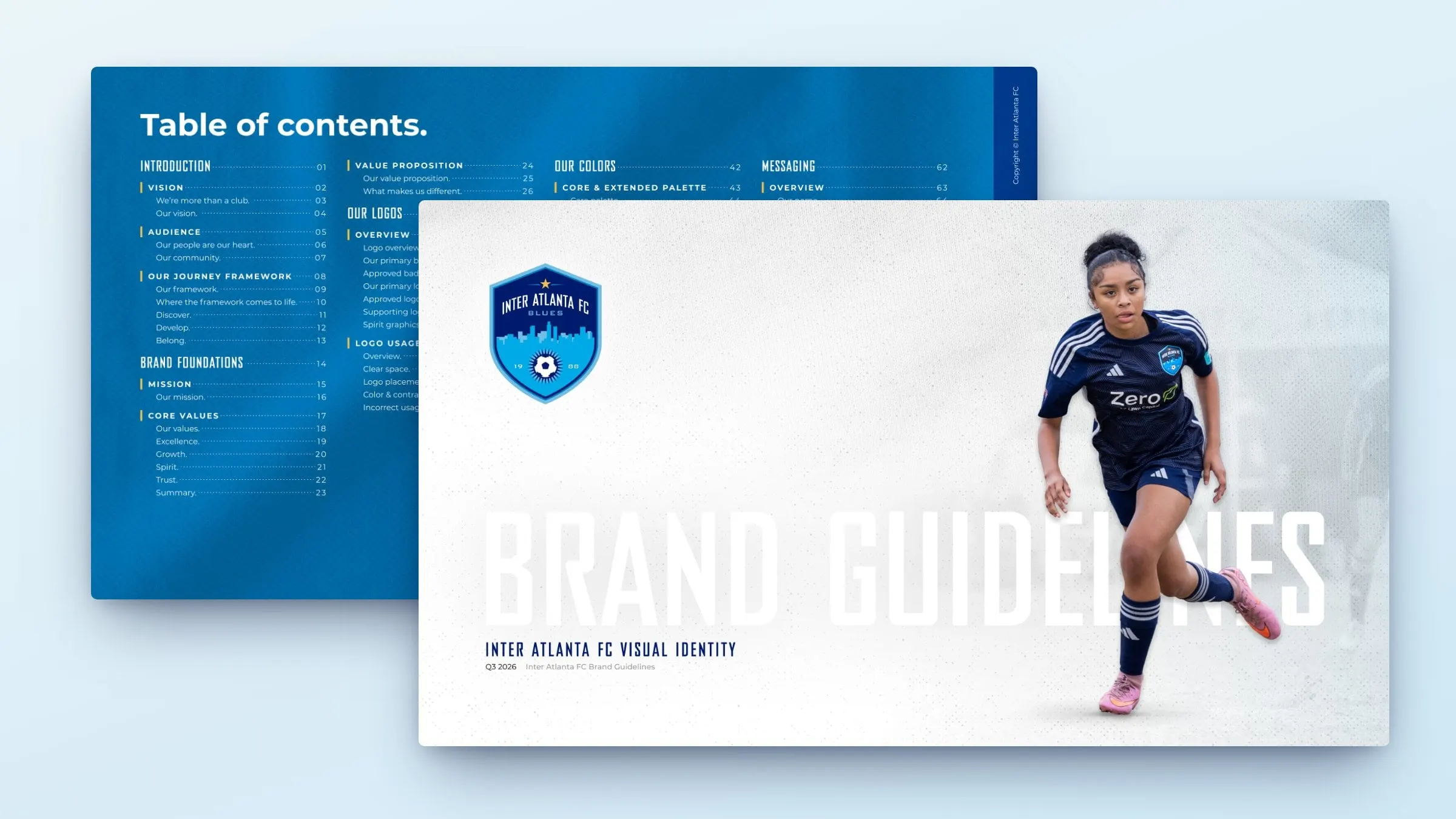
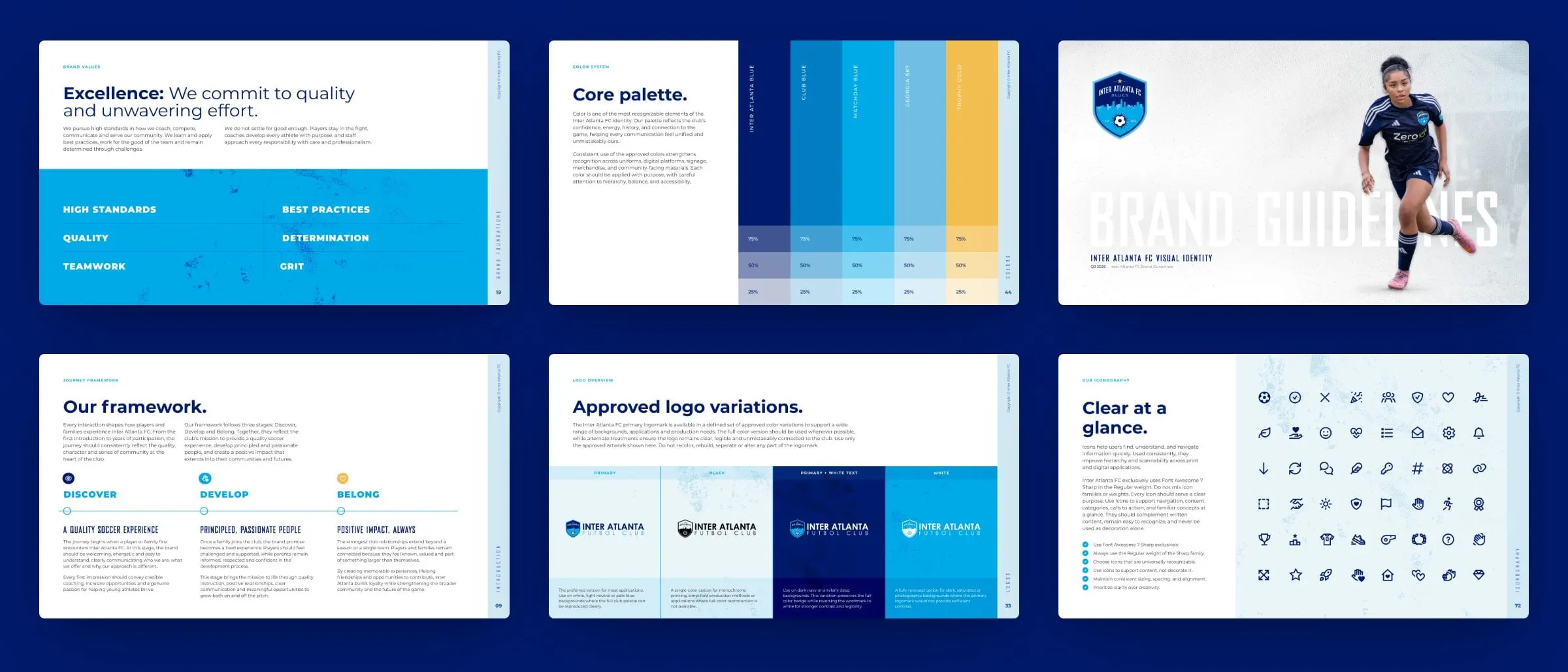
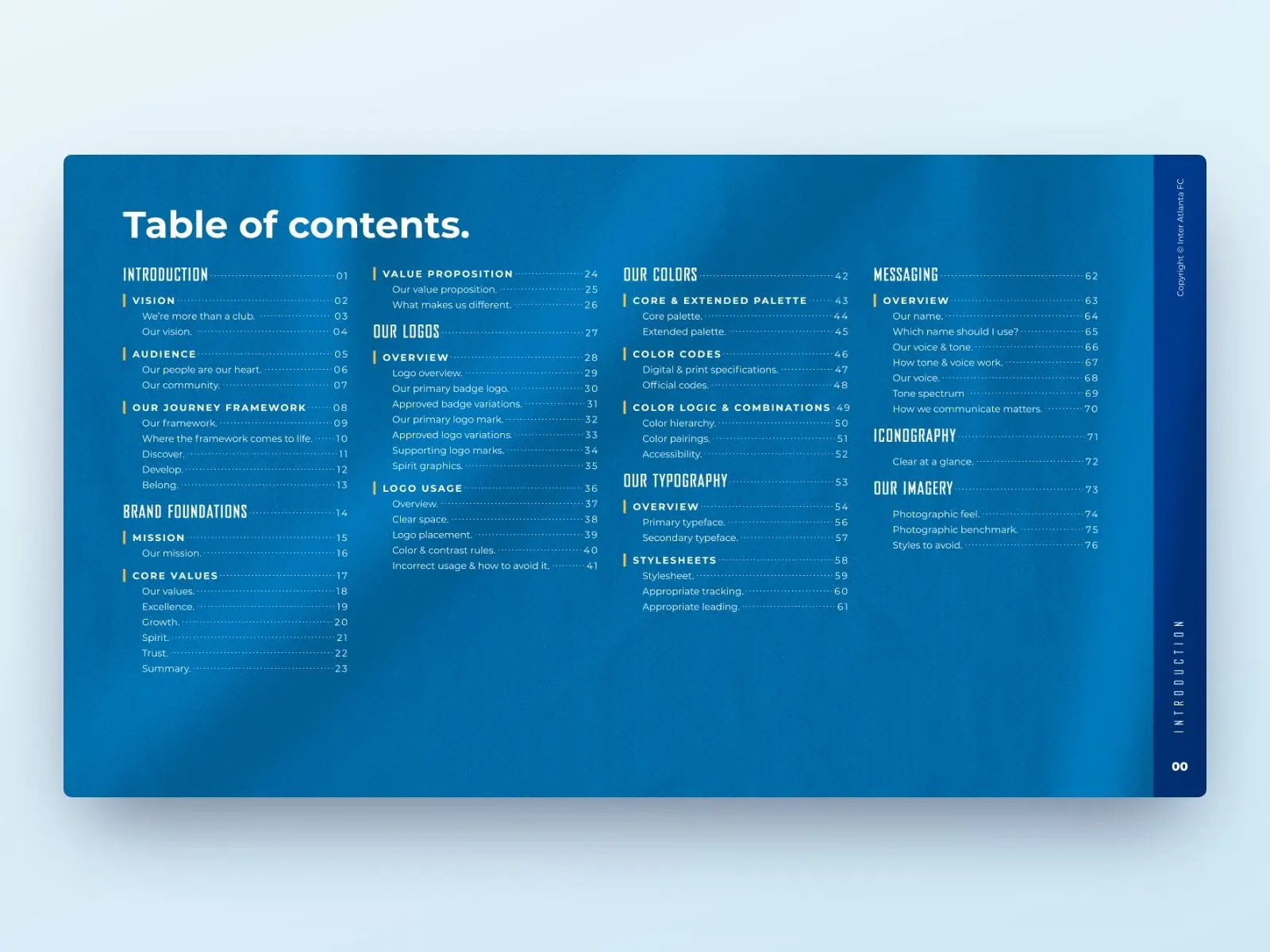
A 77-page brand guidelines document for Inter Atlanta FC, the in-town Atlanta youth soccer club founded in 1988, covering strategy, logos, colour, type, voice, icons and imagery.
01 — Context
More than a club
Inter Atlanta FC started in the fall of 1988 as a recreational program for 40 kids, run by volunteer founders in in-town Atlanta. It was called the Atlanta Youth Soccer Association back then. Today the Blues field recreational and competitive teams for kids from neighbourhoods across the city's core, and the club's crest still carries that 1988 date.
After more than 35 years, the club had a well-loved crest and plenty of heart, but nothing that told coaches, staff, volunteers and partners how to use them. Every flyer, uniform order and social post was a fresh judgment call.
Inter Atlanta FC asked us to write that down properly: a complete set of brand guidelines that starts with what the club believes and ends with how it should look.
The system in numbers
A complete playbook
- Year the club began
- 1988With a recreational program for 40 kids.
- Guideline pages
- 77From vision and values to imagery do's and don'ts.
- Core colours
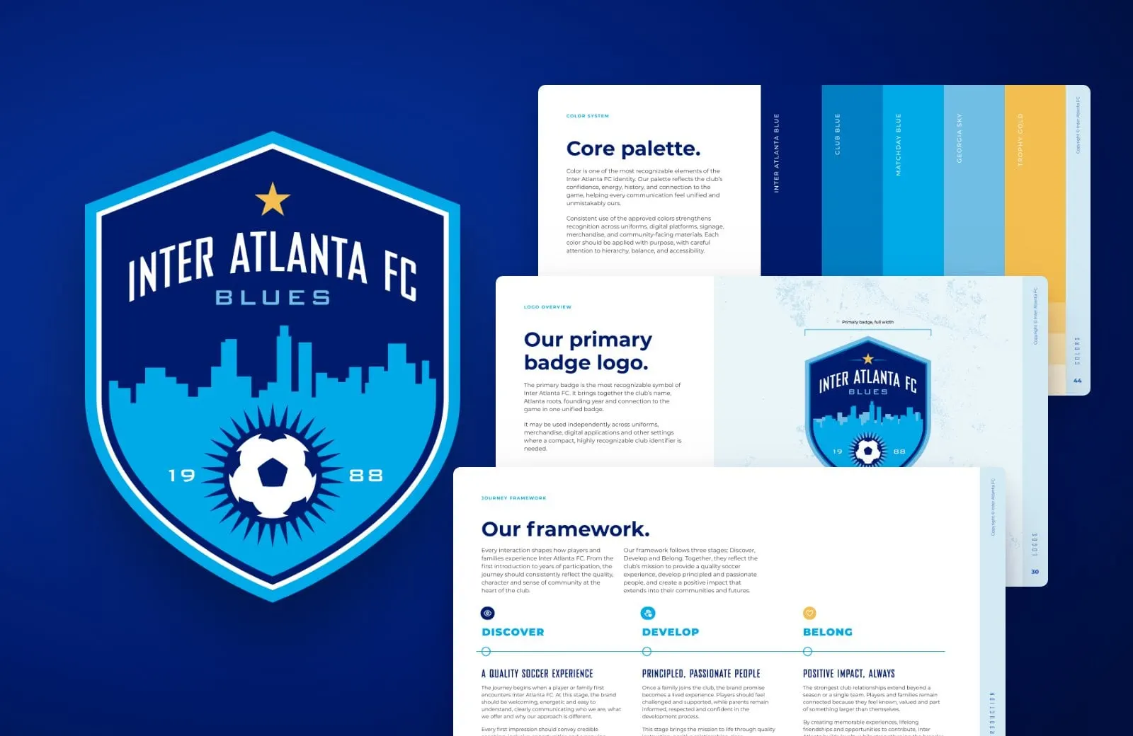
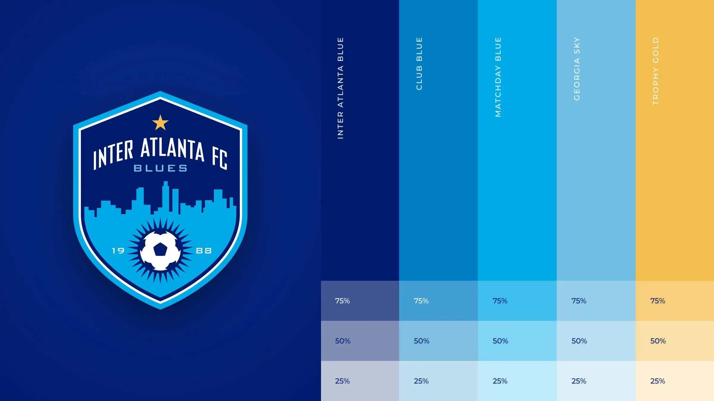
- 5Inter Atlanta Blue, Club Blue, Matchday Blue, Georgia Sky and Trophy Gold.
- Journey stages
- 3Discover, Develop and Belong.
02 — Strategy first
Discover, develop, belong
The guidelines open with strategy, not logos. We put the club's mission into one line: developing principled, passionate people through a quality soccer experience. Then we gave it a value proposition, quality soccer that develops the whole player, and four core values: Excellence, Growth, Spirit and Trust.
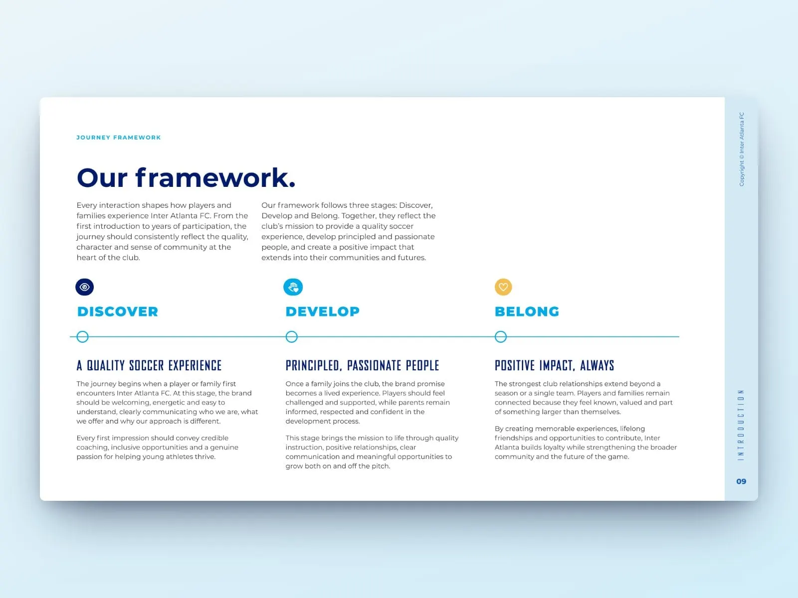
The heart of it is a journey framework. Every family moves through three stages: they Discover the club, players Develop on and off the pitch, and everyone comes to Belong to something bigger than a single team. Each stage has its own promise and its own job for communications, so a tryout flyer and an end-of-season email both know what they're for.
It's the part most clubs skip, and the reason branding without strategy is just expensive art.
Brand foundations
Values you can coach to
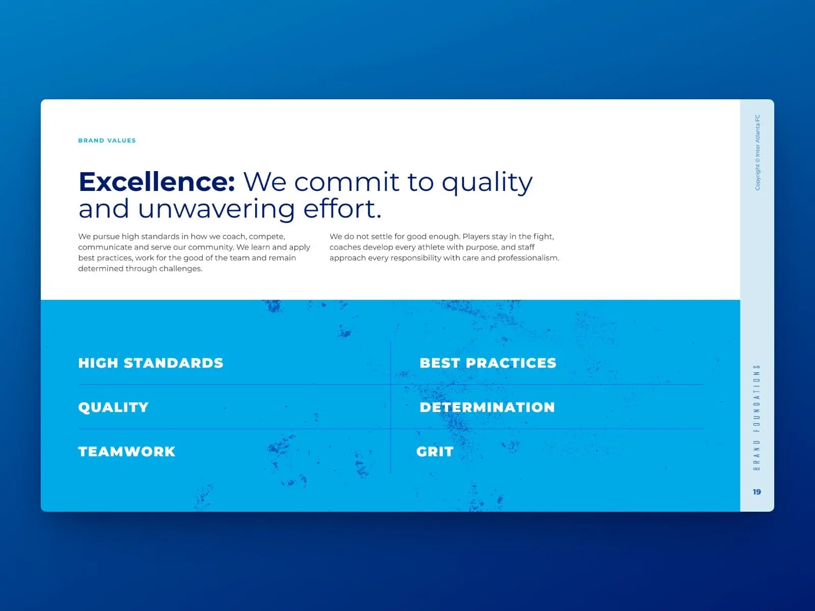
Each value gets its own page with a plain-language promise and the behaviours behind it. Excellence, for example, means high standards, best practices, quality, determination, teamwork and grit. They're written so a coach can use them at practice, not just a board at a meeting.
03 — The crest
A badge built for real life
The Blues crest is a shield with the Atlanta skyline, a star, the club name and a soccer ball bursting between 19 and 88. People love it, so the job was to protect it, not replace it.
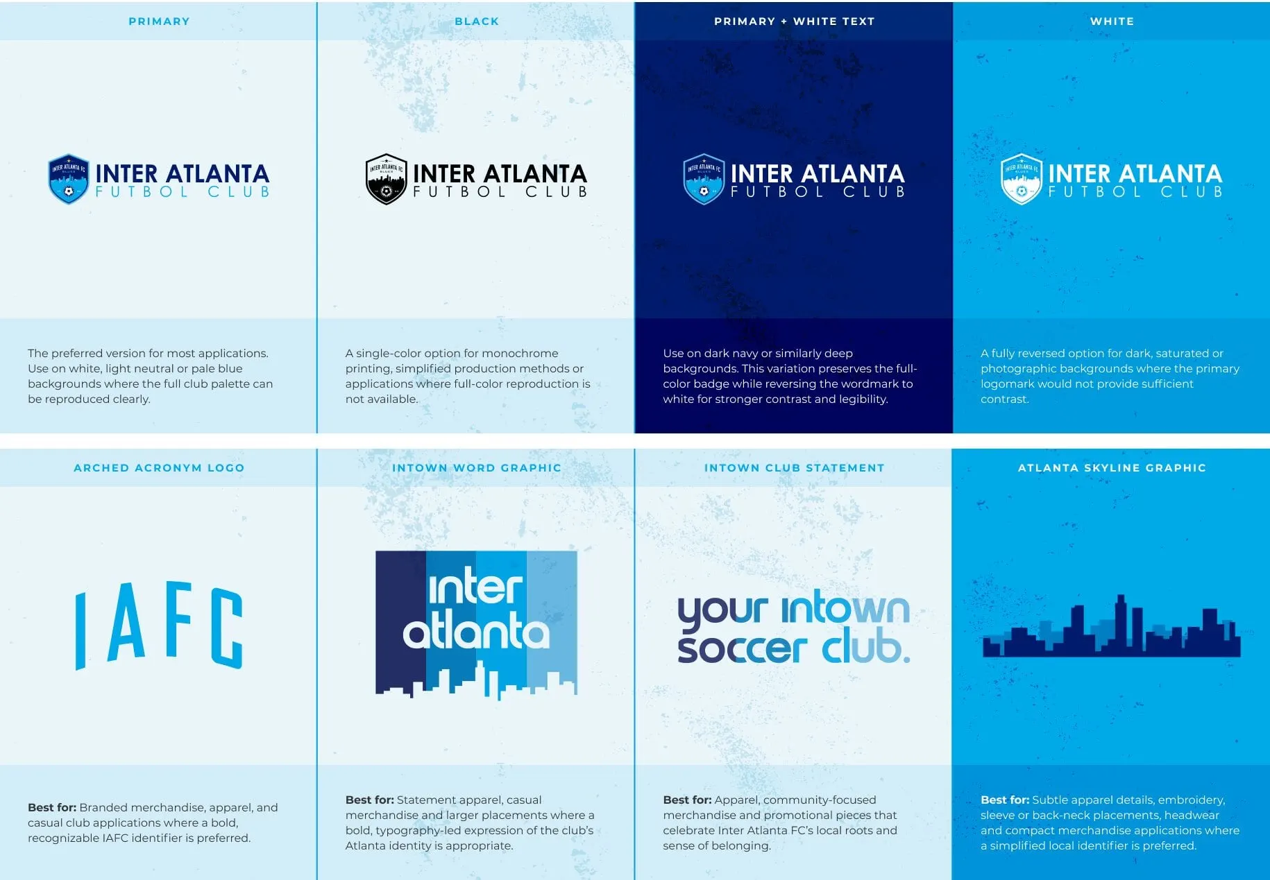
The guidelines set out the primary badge, the horizontal logo with Futbol Club lockup, four approved colour versions, clear space, minimum sizes, placement and contrast rules, plus the most common mistakes to avoid. They also show how to use the club’s spirit graphics for apparel and merchandise: an arched IAFC acronym, an Inter Atlanta word graphic, a your intown soccer club statement and a simple skyline. They give the club room to have fun without touching the badge.
Type and detail
Athletic, but easy to read
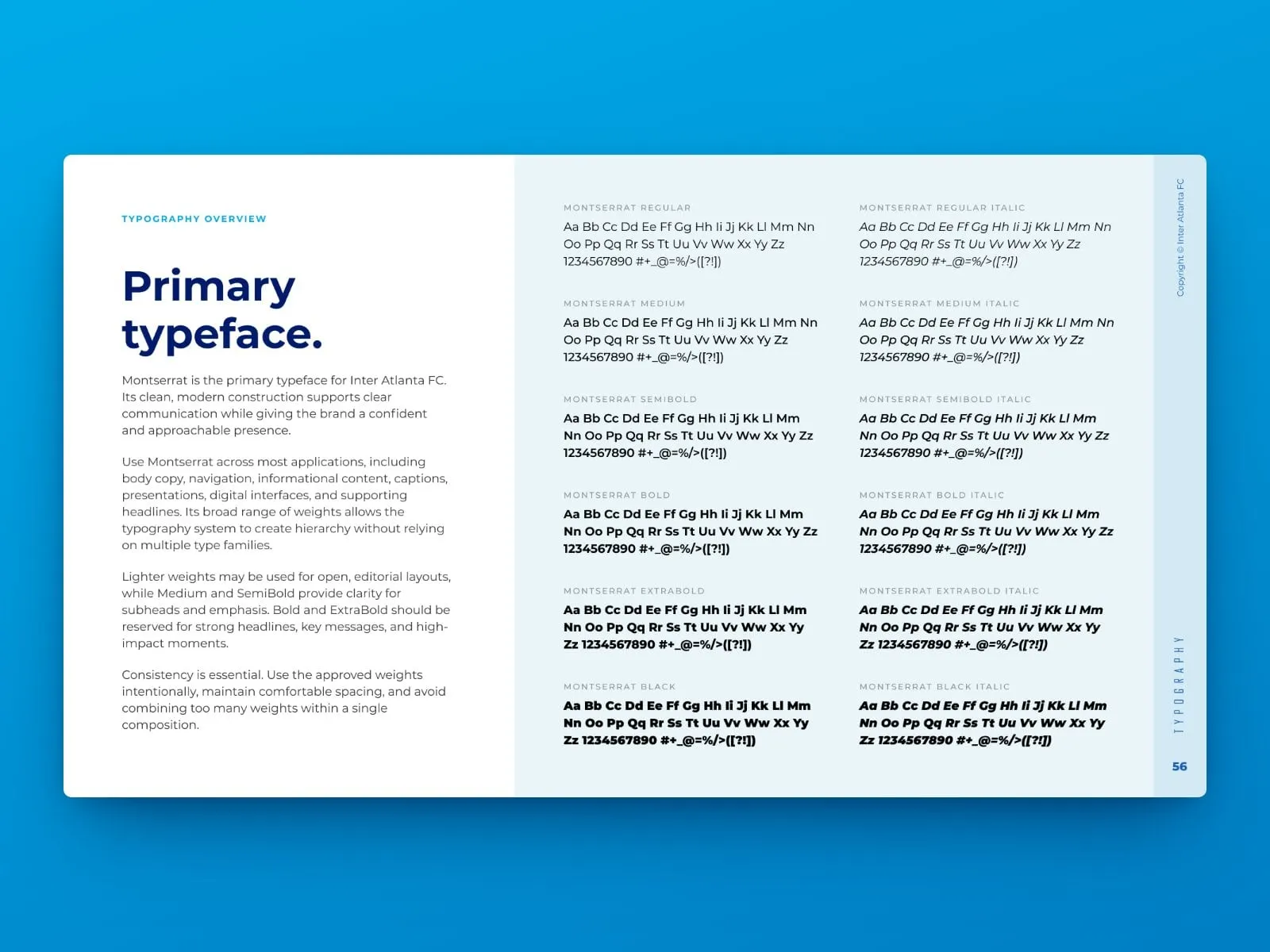
Montserrat does the everyday work: body copy, navigation, captions and most headlines, across a full range of weights. Bureau Agency FB, a tall condensed face, is saved for big display moments and short labels, where it brings the energy of a match-day poster.
04 — Voice and visuals
Every page pulls its weight
The back half of the guidelines covers the rest of the system: a core and extended palette with print and digital codes, colour pairings and accessibility rules; type stylesheets with tracking and leading; a naming guide that answers which name should I use; a voice and tone spectrum; one consistent icon set; and photography direction built around authentic moments, emotion and action, and the coach's point of view.
Nothing is in there for decoration. Each page answers a question a volunteer will actually have, and that's what keeps a brand cohesive once it leaves the designer's hands. For more sports work, see our Toronto Football Club project.
In use
Ready for the sideline
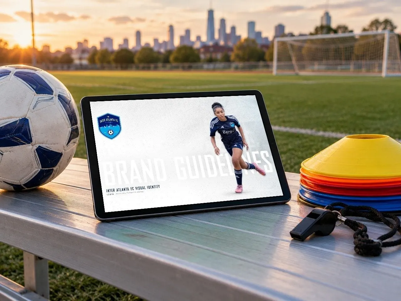
The guidelines are built as a presentation, so they're as easy to flip through on a tablet at the field as they are to share with a printer or a kit supplier.
What we delivered
<p>Running a club, school or non-profit with a brand that needs some rules? See more of our <a href="/industries/non-profits">non-profit work</a>, or see how we put together <a href="/services/brand-guidelines">brand guidelines</a>.</p>
- 01Brand guidelinesA 77-page guide, from mission and values to imagery.
- 02Brand foundationsMission, value proposition, core values and the Discover, Develop, Belong journey, written down.
- 03Logo usageRules for the existing crest: approved versions, clear space, sizes and common mistakes.
- 04Colour, type and voicePalette, type stylesheets, naming, tone, icons and photography direction.