Case study · Cultivate
Cultivate
Website and blog design, a remote-work manager's guide, customer case study sell sheets and social graphics for Cultivate, a leadership development platform for the digital workforce.
01 — Context
Coaching managers through a sudden shift
Cultivate is a leadership development platform for the digital workforce. It uses the signals in everyday digital communication to coach managers on how they lead, and its customers include large organizations such as SAP, BASF, PwC, McKesson, Qualtrics and Samsung NEXT.
Then the pandemic arrived, and almost overnight every manager became a remote manager. Cultivate's message suddenly mattered to far more people, and the team needed a lot of material, fast: internal and external messaging, a refreshed take on how the brand showed up, a new homepage and supporting pages, a blog, a manager's guide, customer case studies and social media assets. This Cultivate website and marketing design project covered all of it.
02 — Website and blog
A homepage that leads with customers
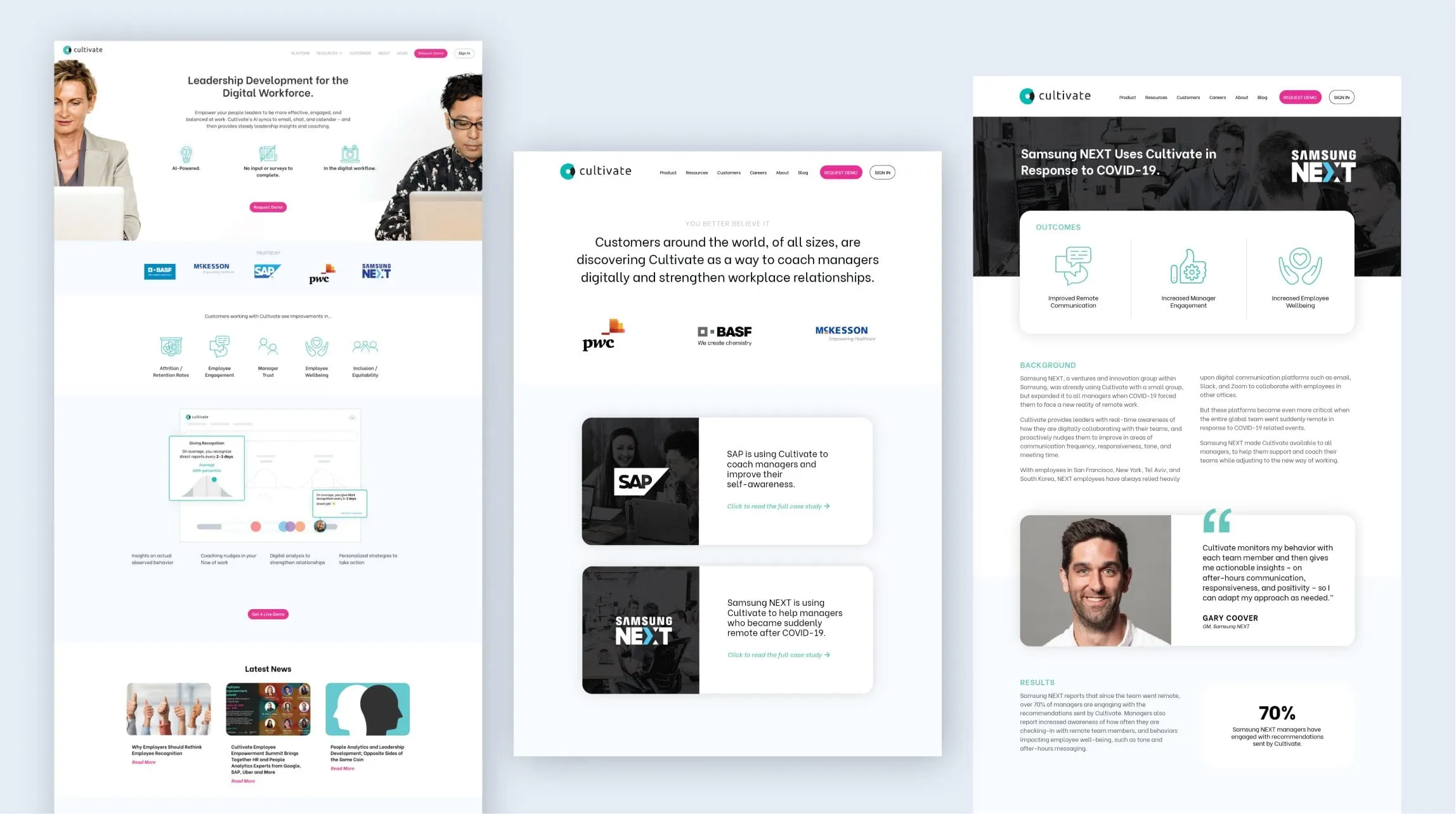
For a B2B platform, the fastest way to earn trust is to show who already uses it. Our website design puts the promise first, "Leadership Development for the Digital Workforce," then follows it straight away with a strip of recognizable customer logos. Below that, simple teal icons explain what the product helps with, a clean screenshot shows the product itself, and a Latest News section feeds in fresh posts.
A dedicated customers page groups stories by company, each on a dark card with the customer's logo and a short summary. Each story opens into a full case study page with outcomes up top, background and results in two columns, and a pull quote with a portrait.
We designed and built the blog as part of the website development, giving Cultivate's team a place to publish timely leadership content as remote work kept changing. Telling the story in a clear order, from promise to proof to product, is a pattern we come back to often, and we've written about storytelling through web design.
Visually, we kept the existing C mark and teal accent and tightened how they were used: generous white space, crisp sans-serif type, black panels for impact, and teal reserved for the words that matter.
03 — The manager's guide
A practical guide with a sense of humour
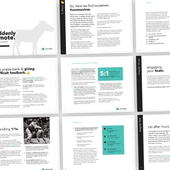
One of the most useful pieces we produced was a manager's guide for leading remote teams. The title is blunt and memorable: "Suddenly remote. Don't be an ass." A grey donkey silhouette on the cover makes the joke visual, and a teal bar ties it back to the Cultivate brand.
Inside, our publication design keeps advice easy to scan. Each chapter opens with a vertical black band and a large lowercase title, covering topics like the praise bank and giving difficult feedback, engaging your team, handling 1:1s and letting after hours be after hours. Pull-out boxes in teal highlight key ideas, checklists break down how to run a better one-on-one, and photography adds a little levity.
The tone of the design matches the tone of the writing: friendly, direct and a bit irreverent, which is exactly what stressed managers needed at the time. It's a similar challenge to the guide we designed in our Deloitte LinkedIn booklet project: practical advice that people will actually read.
04 — Sales and social
Case study sell sheets for a sales team on the move
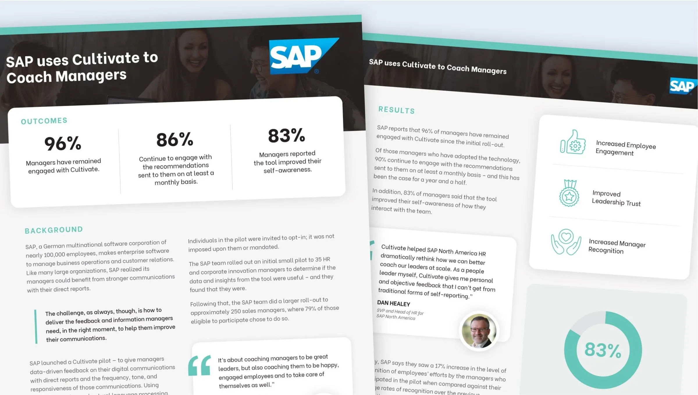
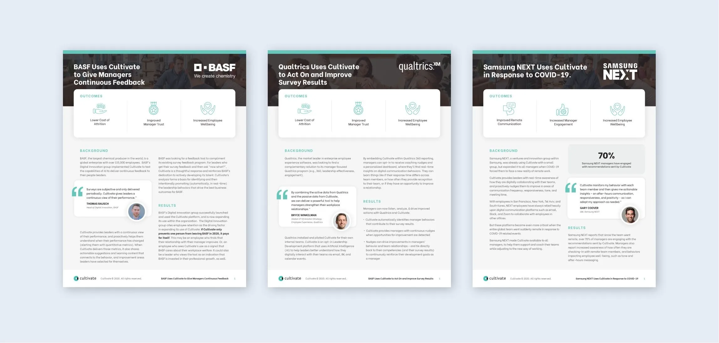
Cultivate's sales team needed proof they could send after a call or leave behind after a meeting. We created a template for customer case study sell sheets as part of our marketing collateral design work, and applied it to stories from SAP, BASF, Qualtrics and Samsung NEXT.
Each sheet opens with a photo header, the customer's logo and a plain headline that says what they used Cultivate for. An outcomes panel sits right below, using big numbers where the customer reported them and icons where they didn't. The body follows the same background and results structure as the website, with a pull quote and portrait from someone at the customer. Because the structure is fixed, the team can drop in a new story without starting from scratch, and the print sheets match the web pages they link to.
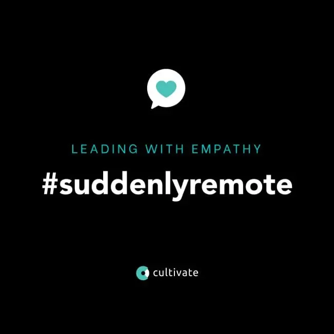
For social, our social media design carried the same black, white and teal into short, punchy graphics like the #suddenlyremote campaign, built around the idea of leading with empathy. The result is a professional services brand that speaks with one voice across website, blog, guide, sales sheets and social feeds.
What we delivered
A full set of web, print and social materials for a leadership development platform.
- 01Homepage and pagesHomepage, customer stories and case study page design.
- 02Blog buildBlog design and development for ongoing content.
- 03Manager's guideThe Suddenly Remote booklet for managers of remote teams.
- 04Case study sell sheetsA reusable template applied to multiple customer stories.
- 05Social media assetsCoordinating graphics for campaigns and announcements.