Case study · Coachstack
Coachstack
A brand built from the ground up for Coachstack, an online lessons platform: logo, business cards, and the web and course page design for its platform.
01 — Context
Online course platform design, from the logo up
Coachstack is an online lessons platform: courses from expert coaches on everything from business to parenting, coffee to photography, captured in high-quality video. Its promise is "Simple online lessons for your next hobby or hustle."
When Coachstack came to us, it needed a brand built from the ground up. We started with the brand identity and business cards, then moved into the online course platform design: the user interface for its website and course pages. Doing both together meant the brand was designed for screens from day one.
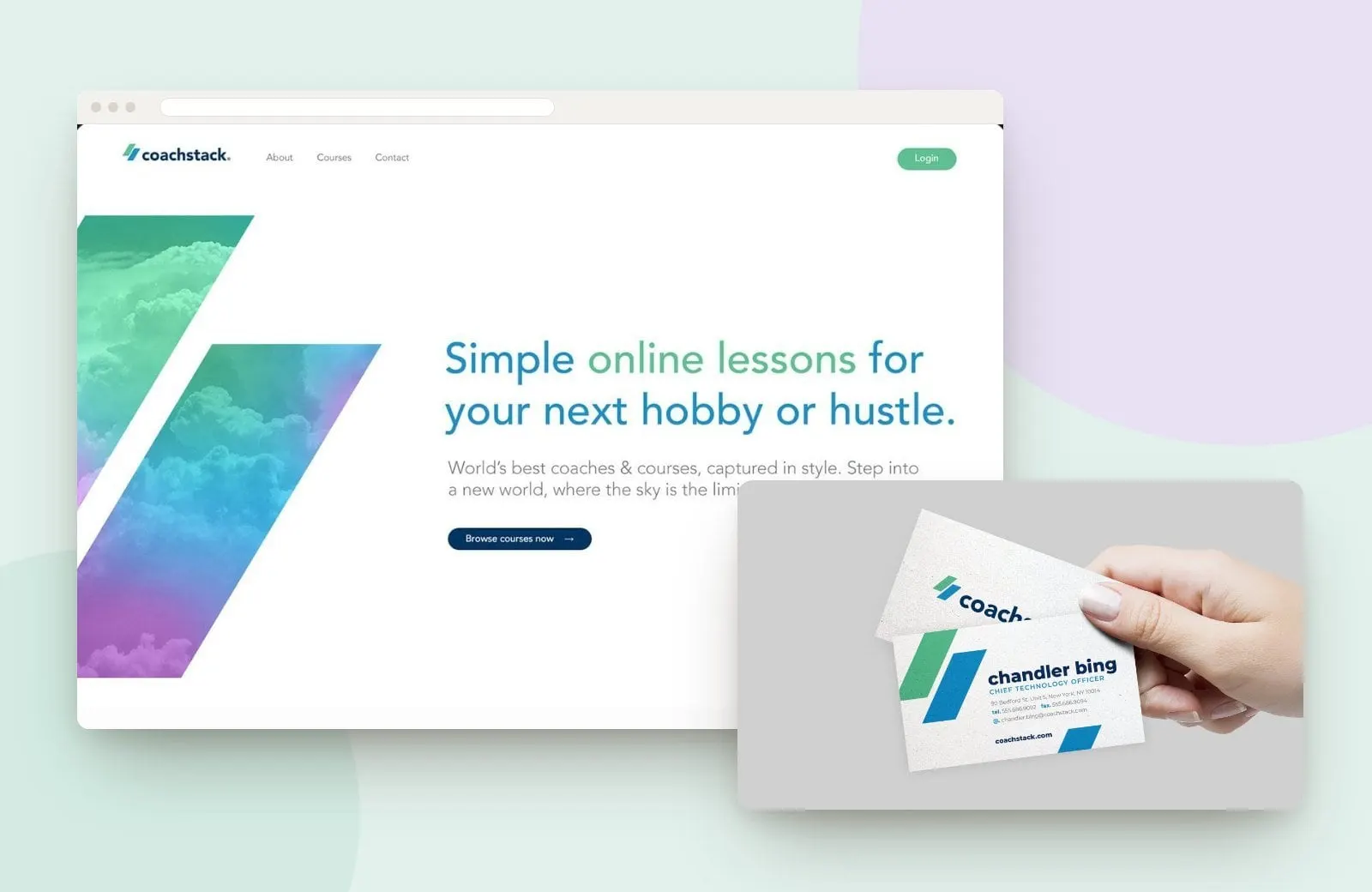
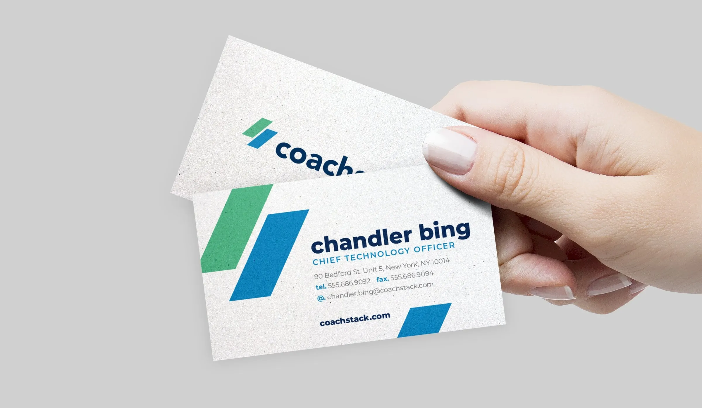
The mark is two parallelograms, one green and one blue, stacked at an angle. It is a literal stack, but it also reads as forward motion, which suits a platform about learning something new. Beside it, a rounded, lowercase wordmark in deep navy keeps the brand friendly and approachable. On the business cards, oversized versions of the shapes bleed off the edge, giving a small piece of print the same energy as the website.
02 — Website and platform
A homepage that sells the idea, a course page that sells the course
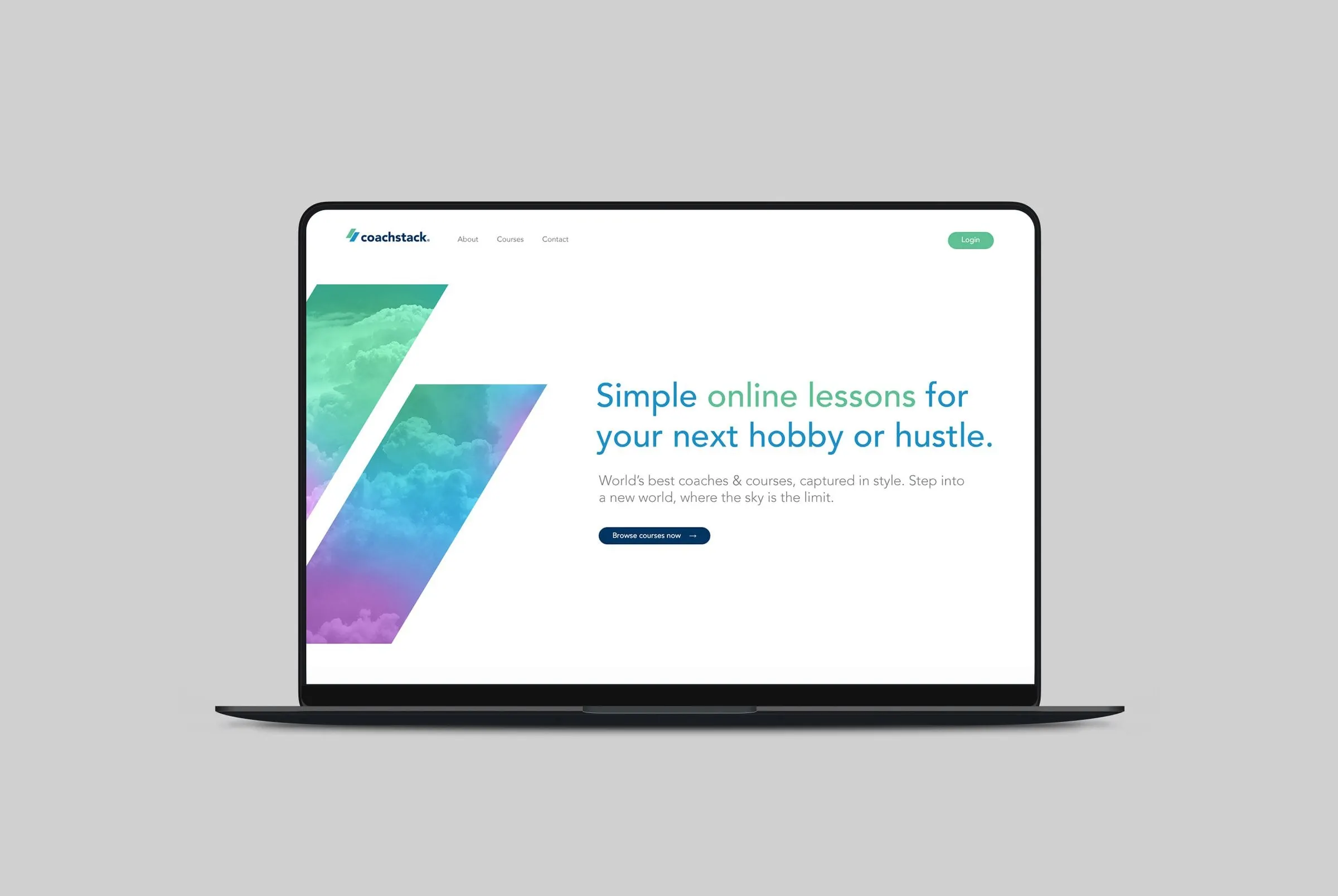
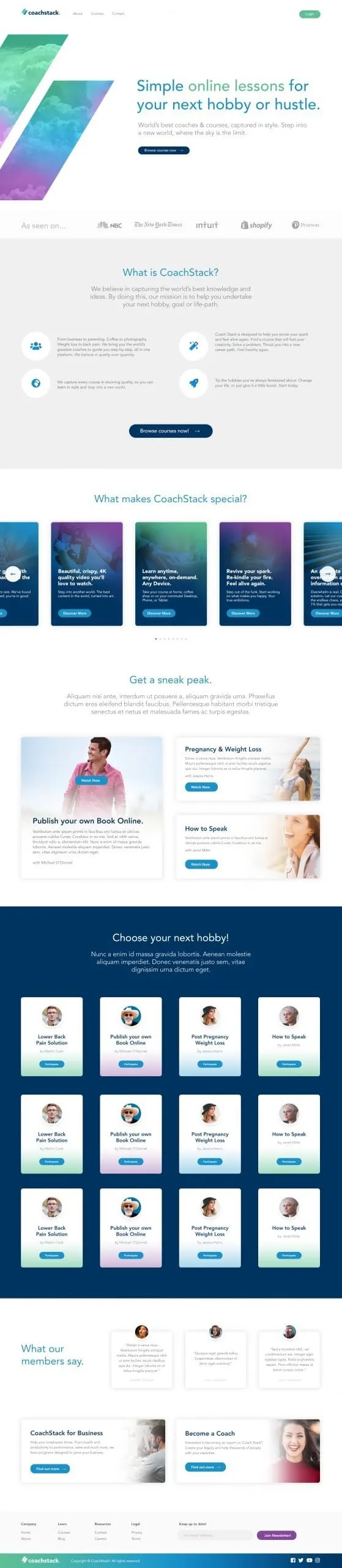
The homepage hero takes the two parallelograms from the logo and fills them with a dreamy sky of clouds in a mint-to-violet gradient, next to the headline and a single "Browse courses now" button. The copy beneath, "step into a new world, where the sky is the limit," ties the image to the message.
Below, "What is CoachStack?" explains the mission in four short points with circular icons. "What makes CoachStack special?" becomes a carousel of gradient cards, each with one benefit, such as 4K video or learning anytime on any device. A "Get a sneak peek" section previews individual courses with Watch Now buttons.
The course page template is built to convert a browser into a student. It opens on the course title and a video, then a bar of key details and three clear actions: start the course, give it as a gift, or add it to a wishlist. A deep blue section frames the course promise, an accordion lists the curriculum week by week, and alternating image-and-text rows give the reasons to enrol. Our UX and UI design kept that structure repeatable for every course on the platform.
03 — What it enables
One system for every new course
Coachstack now has a complete brand and a design system for its platform. New courses drop into a proven template, the gradient and parallelogram motifs carry from print to screen, and the navy, blue and green palette keeps everything consistent as the catalogue grows. A mint Login button and navy calls to action sit in the same places on every page, so returning students always know where to go.
For founders starting from scratch, we recommend this order of work, and explain why in why branding and web design should happen together. See more of our education and learning work, including Further Learning Group, or our website design services.
What we delivered
A new brand and platform design for Coachstack.