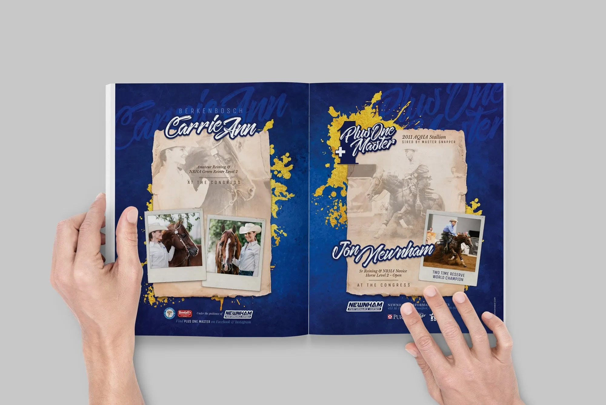
Case study · Carly Epp & PF Shy Guy
Carly Epp & PF Shy Guy
A series of full-page magazine ads for amateur rider Carly Epp and her champion gelding PF Shy Guy, created for the Equine Chronicle and the AQHA Journal.
01 — Context
Promoting a rider and her champion
Carly Epp competes in amateur all-around events with her grey gelding, PF Shy Guy. Together they've earned titles including Congress Champion, L1 West Coast Equitation Champion and Reserve NSBA World Champion. In the American Quarter Horse world, results like those are worth celebrating in print, and the place to do it is in the breed's trade publications.
Carly asked us for a series of ads to promote the pair in the Equine Chronicle and the AQHA Journal. This kind of equine magazine ad design has a specific job: stand out on a crowded page, flatter both horse and rider, and get the titles across at a glance to an audience that knows exactly what they mean.
02 — The series
Three looks, one star pairing
Readers of these magazines see a lot of horse-and-rider photos, so each ad needed its own mood while still being recognizably about Carly and Shy Guy. Our print design approach was to keep the photography as the hero, cut the horse and rider out cleanly, and build a different atmosphere around them each time.
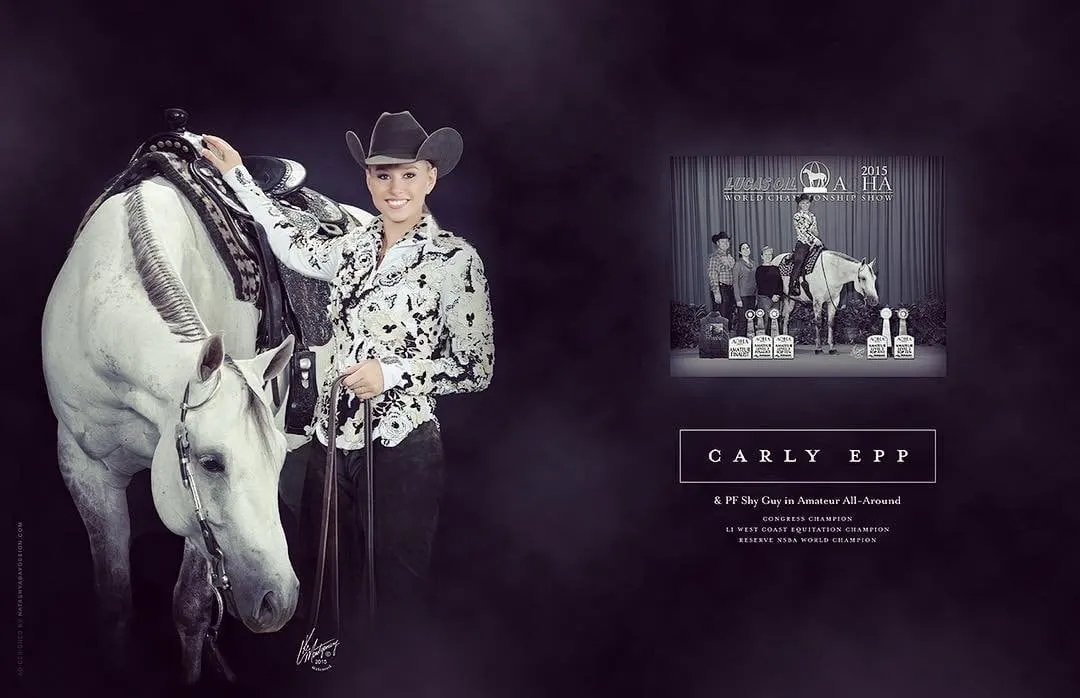
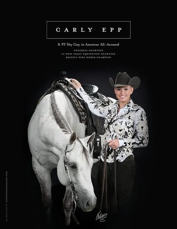
The first is classic and formal. Carly stands beside Shy Guy in a black hat and an ornate black and white show jacket, against a deep black background. Her name sits in widely spaced serif capitals inside a thin rectangle, with the titles stacked in small caps below. A two-page version adds a framed photo from the 2015 AQHA World Championship Show on the facing page, so readers see both the polish and the proof.
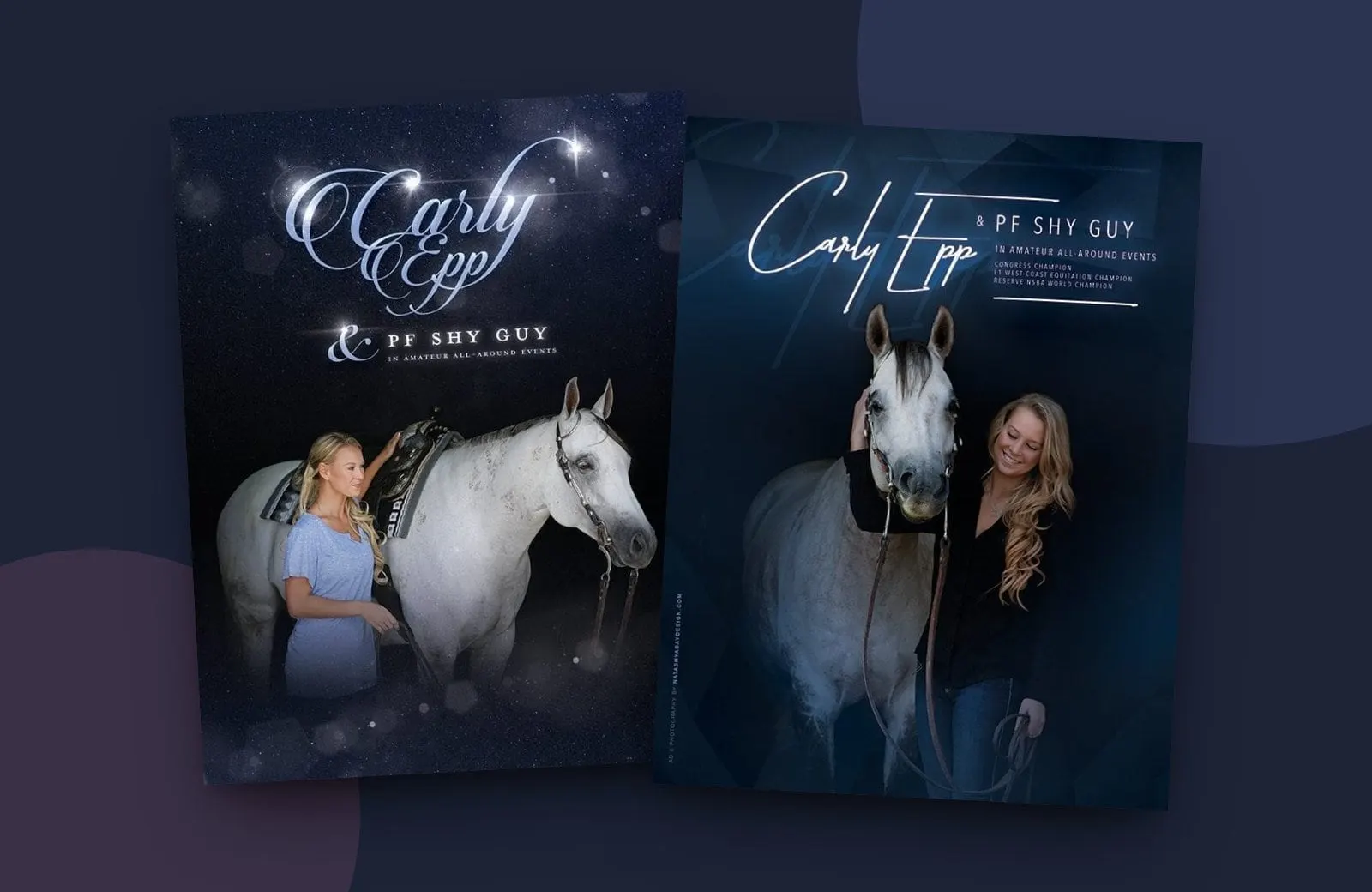
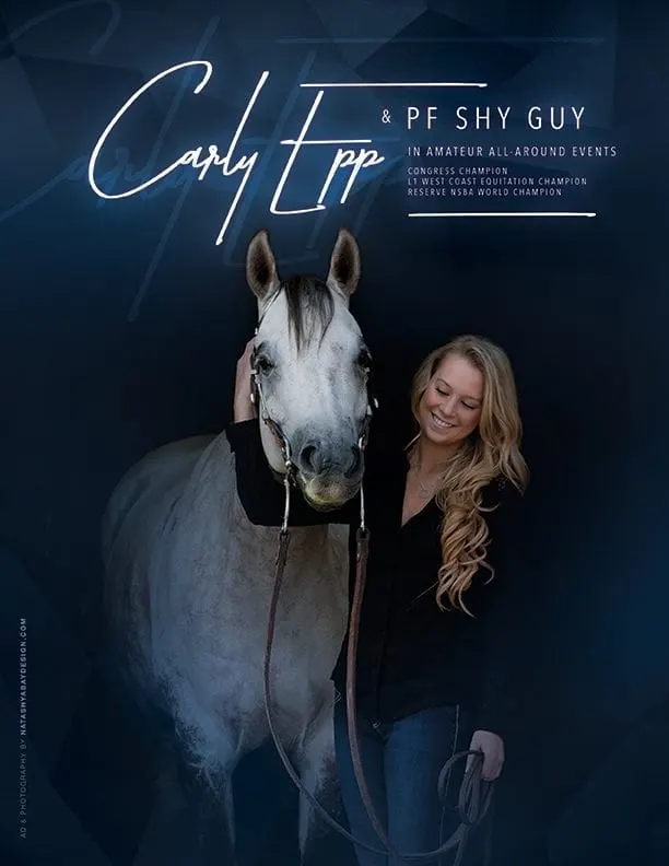
The second is more modern and personal. A relaxed portrait of Carly with her arm around Shy Guy's head sits on a deep blue background, with her name written in a glowing hand script and the details in spaced sans-serif capitals. We also handled the photography for this ad.
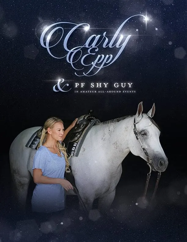
The third leans into the drama. A starry, softly lit night sky surrounds the pair, and Carly's name appears in flowing calligraphy with sparkling highlights, above an elegant ampersand and PF Shy Guy in classic serif caps.
03 — Craft
Details that matter to horse people
Equine audiences notice things other readers wouldn't: the set of a horse's ears, the shine on a show saddle, the line of a braided mane. Much of the graphic design work happened in the photo editing, keeping Shy Guy's grey coat bright and clean against dark backgrounds and making sure tack and attire looked crisp in print.
Type does the rest. Every ad keeps the titles short and in the same order, so a reader flipping pages can take in the achievements in a second. The dark backgrounds help the ads hold their own next to busier pages, and they make the grey horse almost glow. It's a reminder that good ads are built for the reader, a point we make in designing for your audience, not yourself.
We've designed many equestrian pieces over the years, including magazine ads for PleasureHorse.com and a brand for groomers Winning Edge Equine Services.
What we delivered
A series of print ads for equine trade publications.