Case study · INVIRO Engineered Systems Ltd.
INVIRO Engineered Systems
A brand evolution and new website for INVIRO Engineered Systems, a Canadian mechanical, electrical and sustainability engineering firm founded in 1968.
01 — Context
Fifty years of engineering, behind the walls
INVIRO Engineered Systems is a Canadian engineering and sustainability firm. It started in Toronto in 1968, when Dirk Lubker founded the company to design mechanical systems for office buildings, and grew into a multi-disciplinary, multi-generation firm with offices in Toronto, Ottawa and Calgary.
Today INVIRO designs mechanical, electrical, fire protection and process systems for commercial, industrial, institutional and residential buildings, and helps clients through LEED, zero carbon, energy modelling and commissioning. It's work most people never see, which is exactly why the brand needed to explain it well.
INVIRO asked us to refresh its identity without losing decades of recognition, then build a website that makes invisible systems feel tangible.
INVIRO by the numbers
A firm built on experience
- Year INVIRO was founded
- 1968In Toronto, by Dirk Lubker.
- Projects completed nationwide
- 10,000+Commercial, industrial, institutional and residential.
- Buildings certified
- 100+Under sustainability certification programs.
- Offices
- 3Toronto, Ottawa and Calgary.
02 — The mark
An evolution, not a reinvention
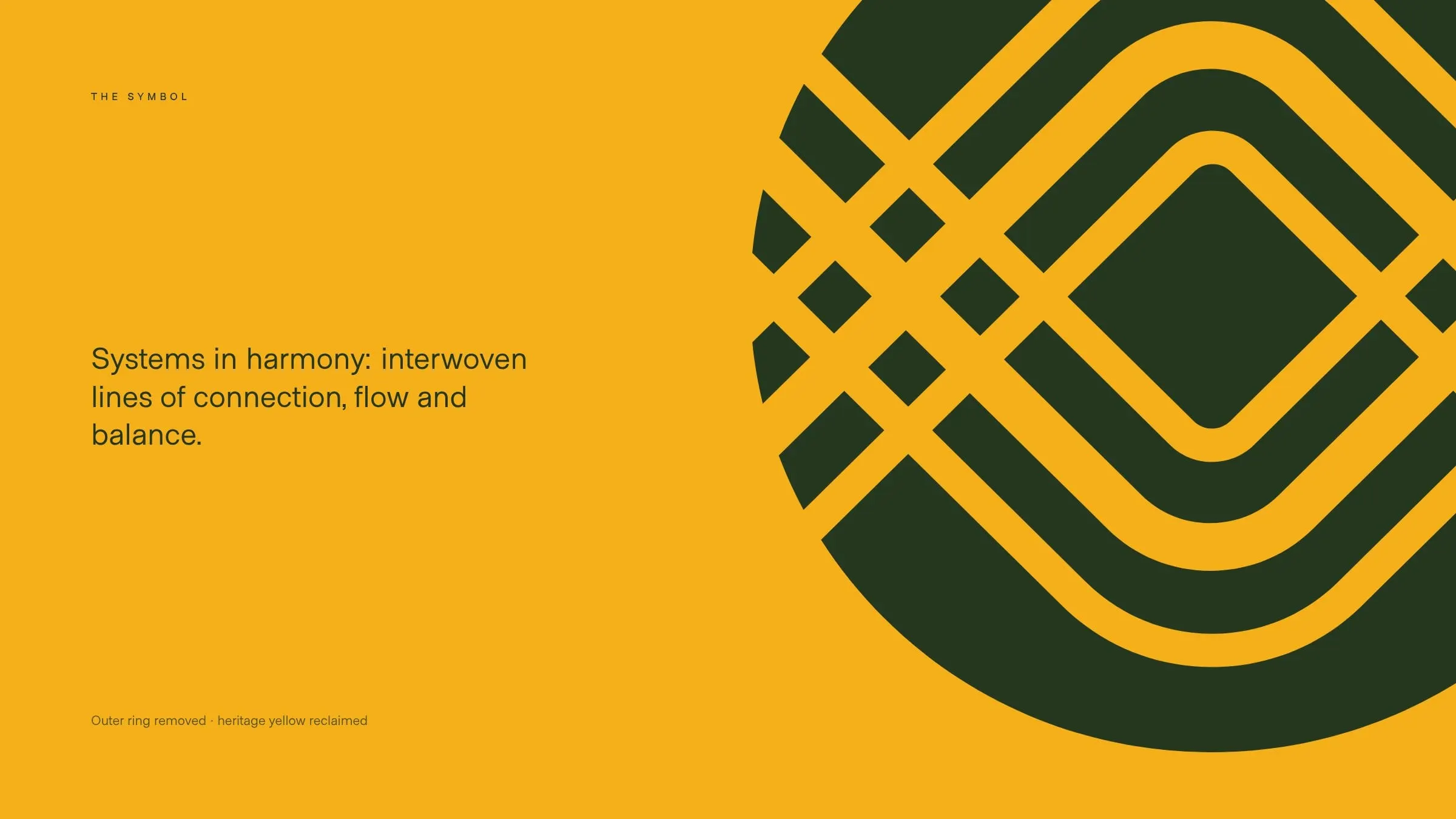
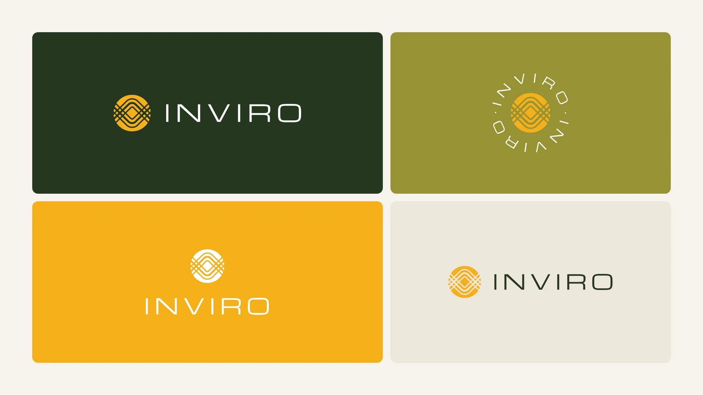
INVIRO's existing symbol already carried real meaning: interwoven lines that stand for systems working together. Throwing it away would have thrown away years of recognition with developers, architects and contractors. So we refined it instead.
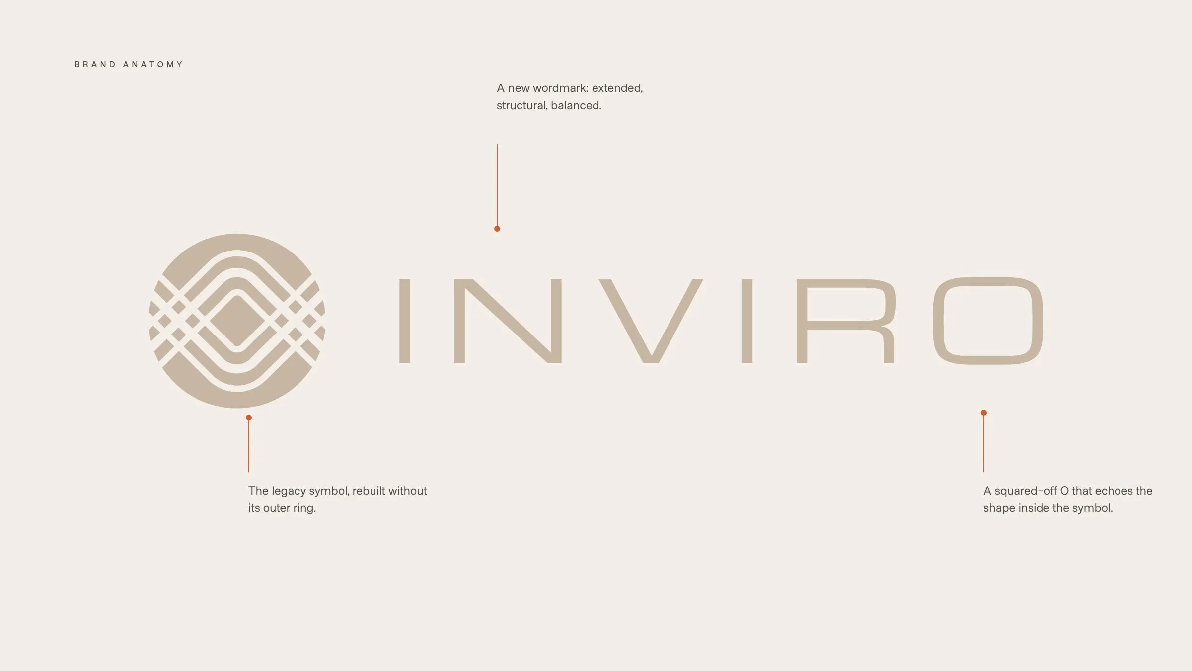
We rebuilt the inner workings of the symbol and removed the outer ring that boxed it in, which lets the mark breathe and work at any size. We drew a new extended wordmark with a squared-off O that echoes the shape inside the symbol. And we brought back the yellow from INVIRO's past as the brand's signature colour.
The result is a full logo family, horizontal, stacked and circular, that feels new and familiar at once. We wrote about why we prefer marks like this in avoiding literal logo marks.
03 — Colour and type
Built from heritage, engineered for now
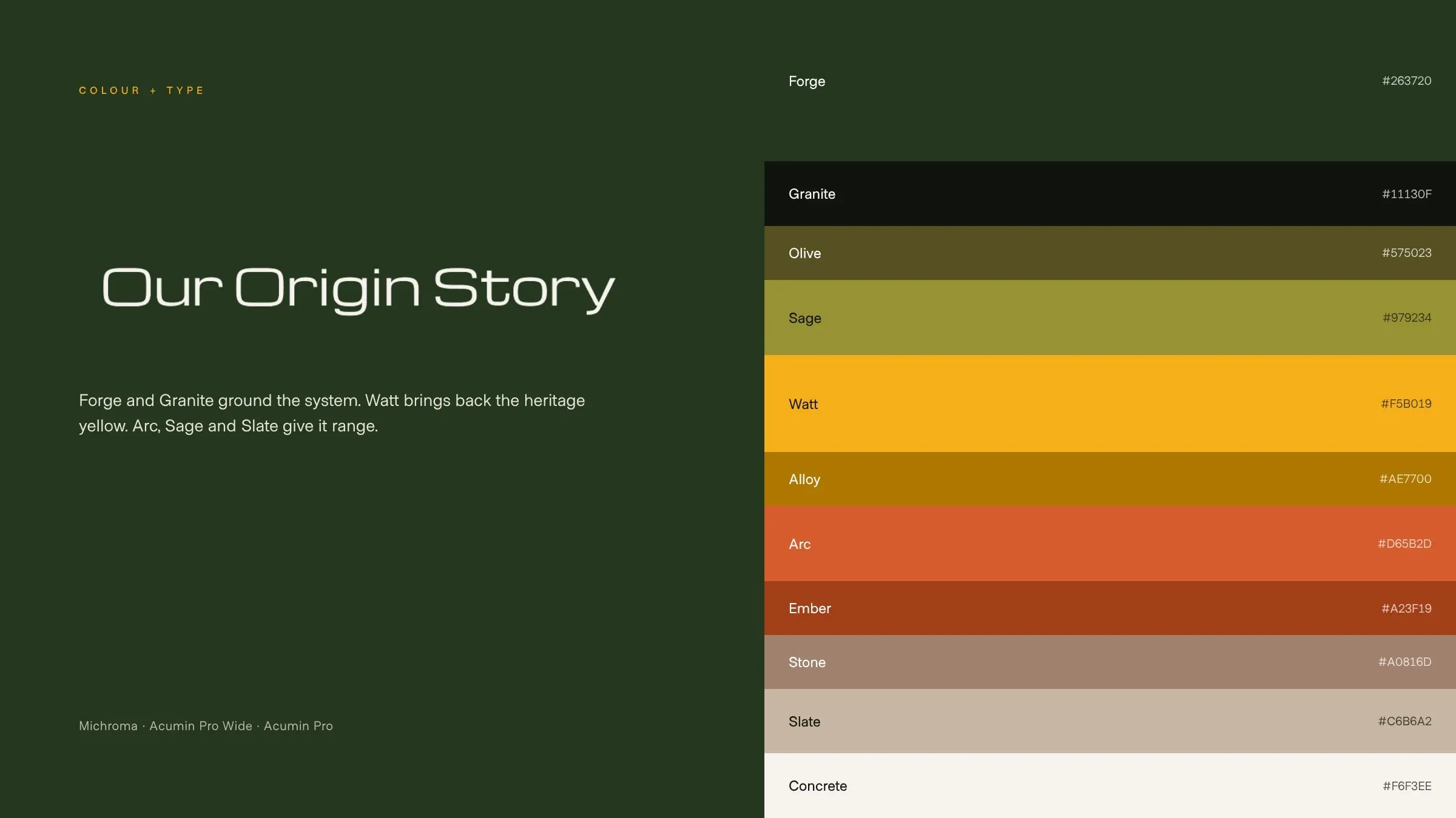
The palette starts with Forge, a deep green that feels grounded and architectural, and Granite for text. Watt, the heritage yellow, adds energy and ties the new brand to the old one. Arc, Sage and Slate give designers range, from warm and earthy to cool and refined, with deeper tones like Alloy, Ember and Olive for depth.
Type follows the same logic. Michroma, a squared, modular face, links straight back to the wordmark and leads headlines. Acumin Pro Wide and Acumin Pro handle everything else, so proposals, reports and web pages stay sharp and readable.
04 — Graphic language
Lines, circles and real buildings
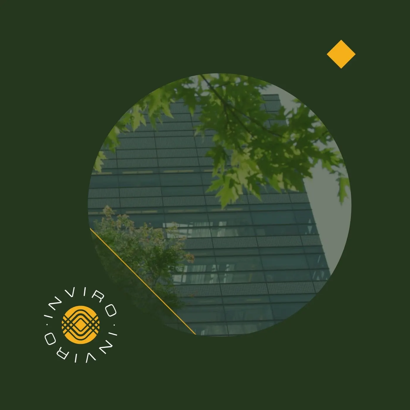
The symbol gave us the rest of the visual language. Fine linear frames and a recurring diamond come from its geometry. Circular cutouts frame architectural photography, so a single image can say "buildings" and "INVIRO" at the same time.
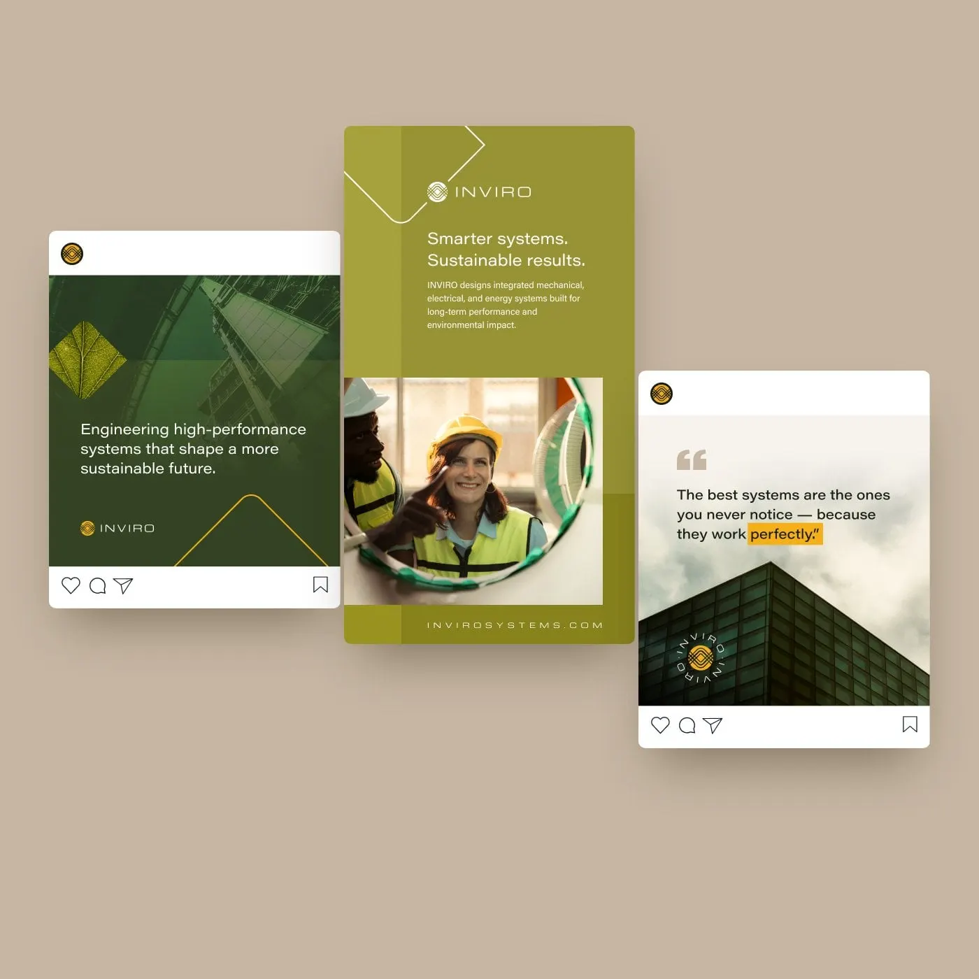
We put the system to work on social posts and digital ads: bold statements on Forge green, a vertical ad in Sage, and quote cards over moody architecture, each signed with the circular badge.
05 — The website
Making the invisible visible
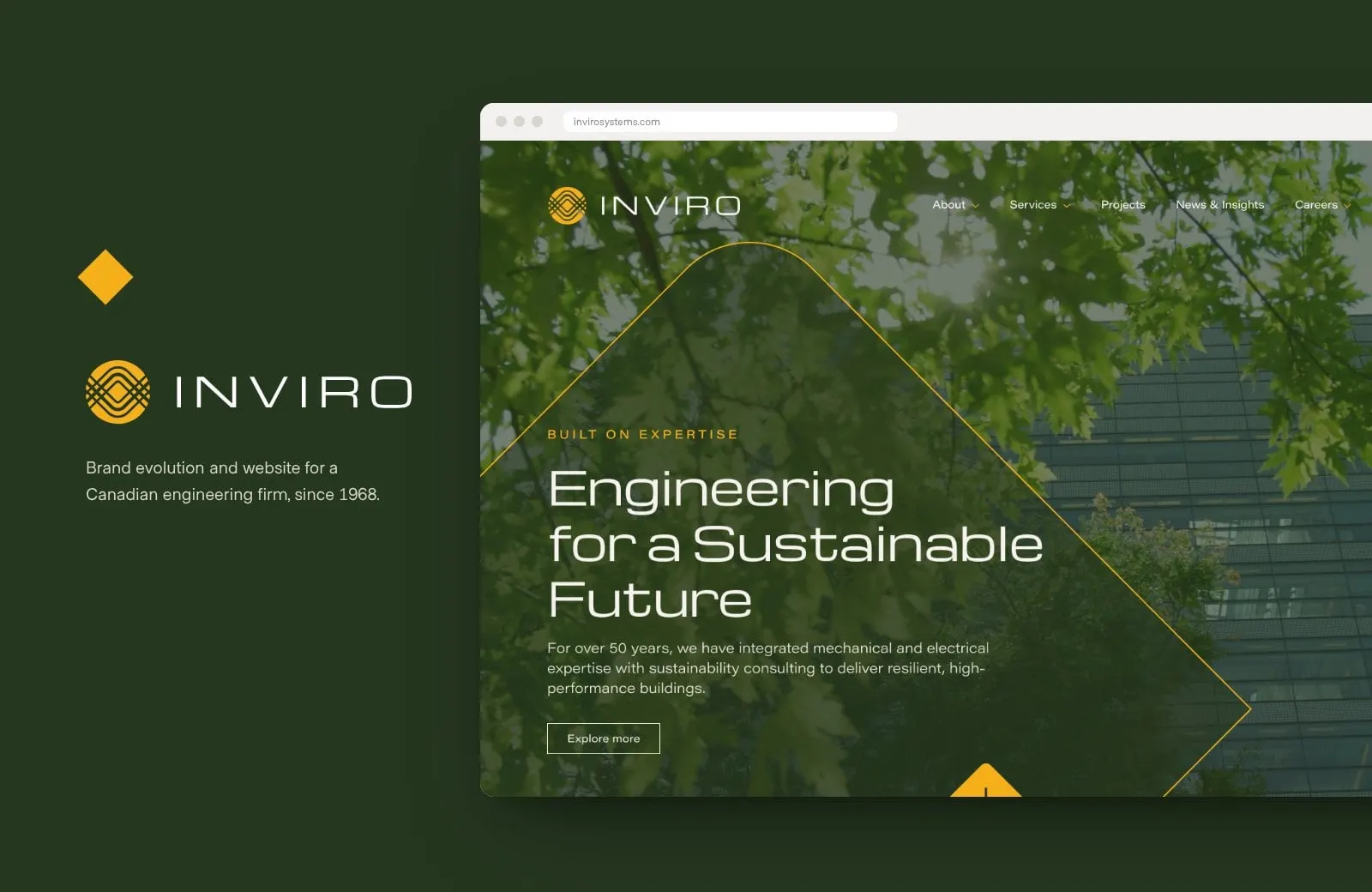
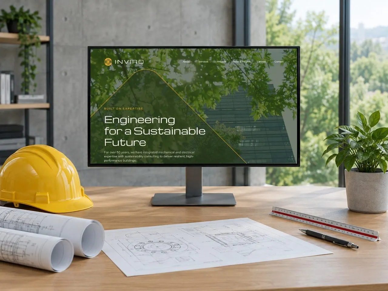
Engineering firms have a photography problem: the best work is hidden inside walls and ceilings. So the new site leads with the buildings themselves. The homepage opens on a glass tower framed by trees and a fine yellow line, with "Engineering for a Sustainable Future" in the new wide typeface.
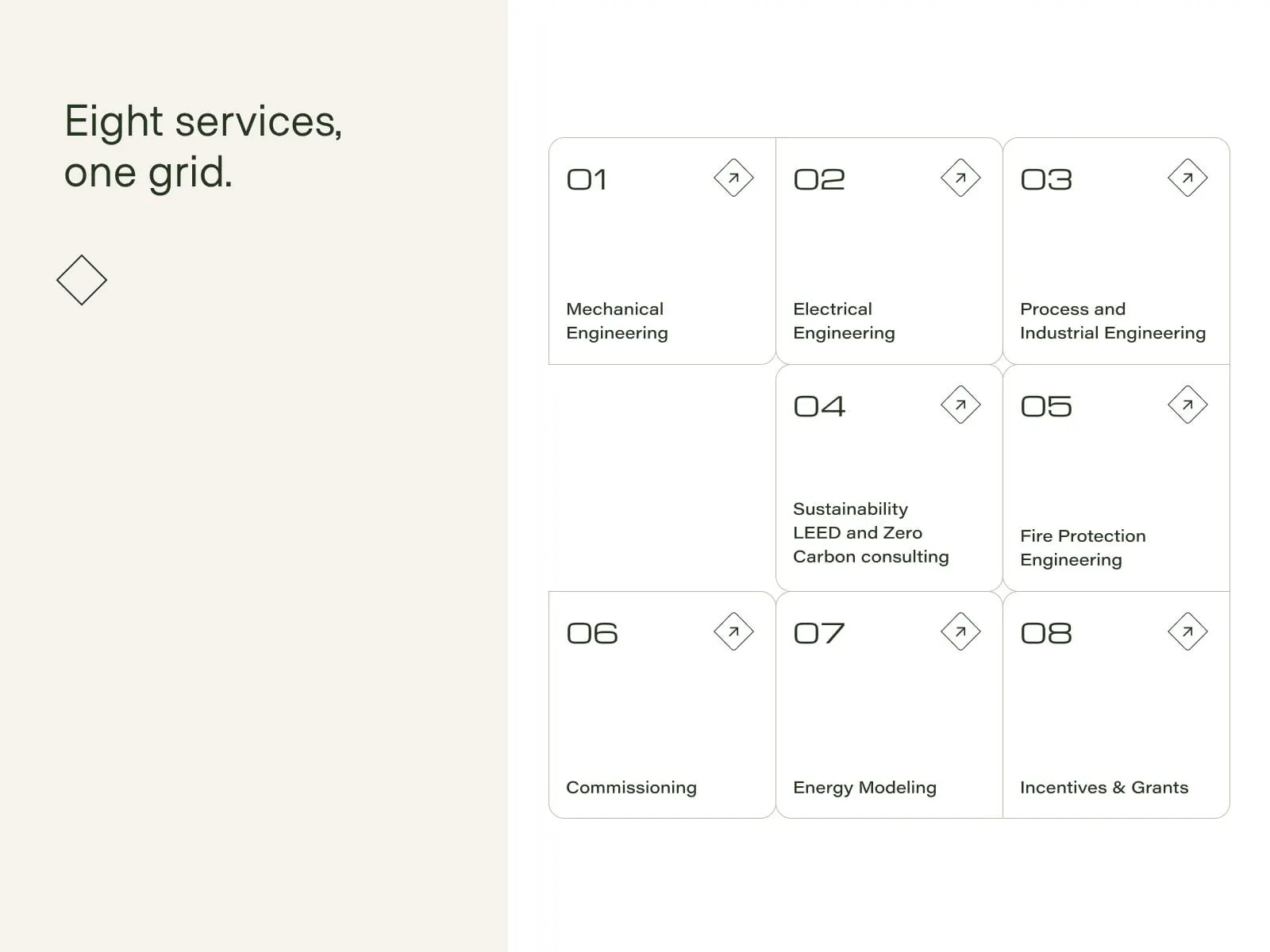
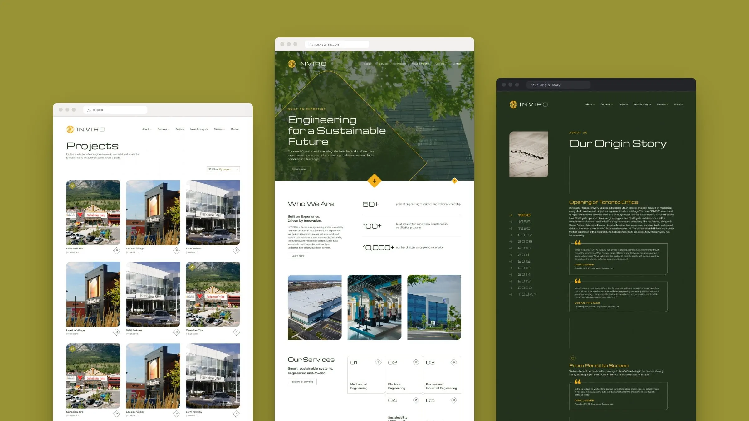
From there it moves quickly: the numbers that prove experience, eight numbered services in a clean grid, a carousel of recent projects with locations, INVIRO's mission, vision and focus, the latest insights, and a warm Arc-orange invitation to join the team. It's a page that earns trust in the first scroll, the way a great homepage should.

06 — Structure
Built around services, projects and people
Behind the homepage is a site organized the way INVIRO's clients think. Mega menus open up About, Services and Careers. Each service has its own page, and projects can be browsed by type, from new construction and tenant improvements to laboratories, automotive centres and mixed-use.
Project pages, an insights hub with articles, a leadership page, careers, Life at INVIRO and contact details for all three offices round it out. Every template uses the same grid, lines and diamonds, so the site feels like one carefully engineered system.
07 — The story
From pencil to screen
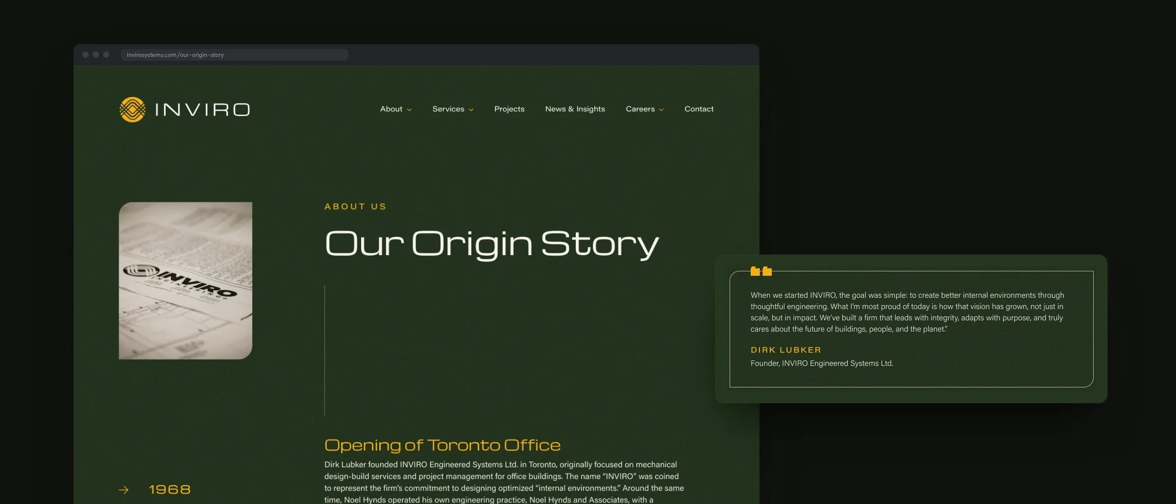
A firm that's been around since 1968 has a story worth telling, so we gave it a page of its own. Our Origin Story is a dark Forge-green timeline that runs from the opening of the Toronto office through the move from hand drawings to AutoCAD, the launch of building automation, energy modelling and LEED consulting, new offices out west and in Ottawa, BIM, fire protection and WELL Health-Safety. A sticky list of years lets visitors jump to any decade, and quotes from the people who built the firm bring it to life.
It's a good example of storytelling through web design: proof of experience that's actually enjoyable to scroll.
08 — The result
Familiar, and finally modern
INVIRO kept everything that made its brand recognizable and lost what was holding it back. The refined symbol, heritage yellow and new wordmark now run from business cards and social posts to a website that explains complex engineering in plain, confident terms.
Doing the brand and the site together kept every decision connected, which is why we recommend branding and web design happen together. See more construction and engineering work, like our project for Buchner Manufacturing.
What we delivered
- 01Brand evolutionA refined symbol, new extended wordmark and a full logo family.
- 02Colour and type systemEleven named colours and a three-typeface hierarchy.
- 03Social and digital adsPost, story and quote templates built on the new graphic language.
- 04Website designHome, about, timeline, leadership, services, project types, projects, insights, careers and contact.
- 05Website developmentMega menus, filterable projects and an insights hub.
- 06UX and structureAn architecture built around services, project types and three offices.