Case study · Synergyne ART Analytics
AIM by Synergyne
Website design and development for AIM by Synergyne ART Analytics, a Canadian AI-powered endometrial receptivity test, with clear paths for fertility clinics and for patients.
01 — Context
Better timing, backed by science
For anyone going through IVF, timing matters. An embryo transfer has the best chance when the lining of the uterus, the endometrium, is ready to receive it. Synergyne ART Analytics built AIM to help answer that question: a non-invasive endometrial receptivity test that uses machine learning to read the ultrasound images clinics already take.
AIM grew out of Synergyne's Matris test, the result of decades of reproductive health research, and was developed with Cybera's Applied Data Science Lab. Clinics upload ultrasound images, AIM generates a receptivity score, and experts review the results.
It's serious science with a very human outcome. Synergyne asked us to design and build a website that could explain it to two very different audiences without losing either one.
02 — Two audiences
One test, two front doors
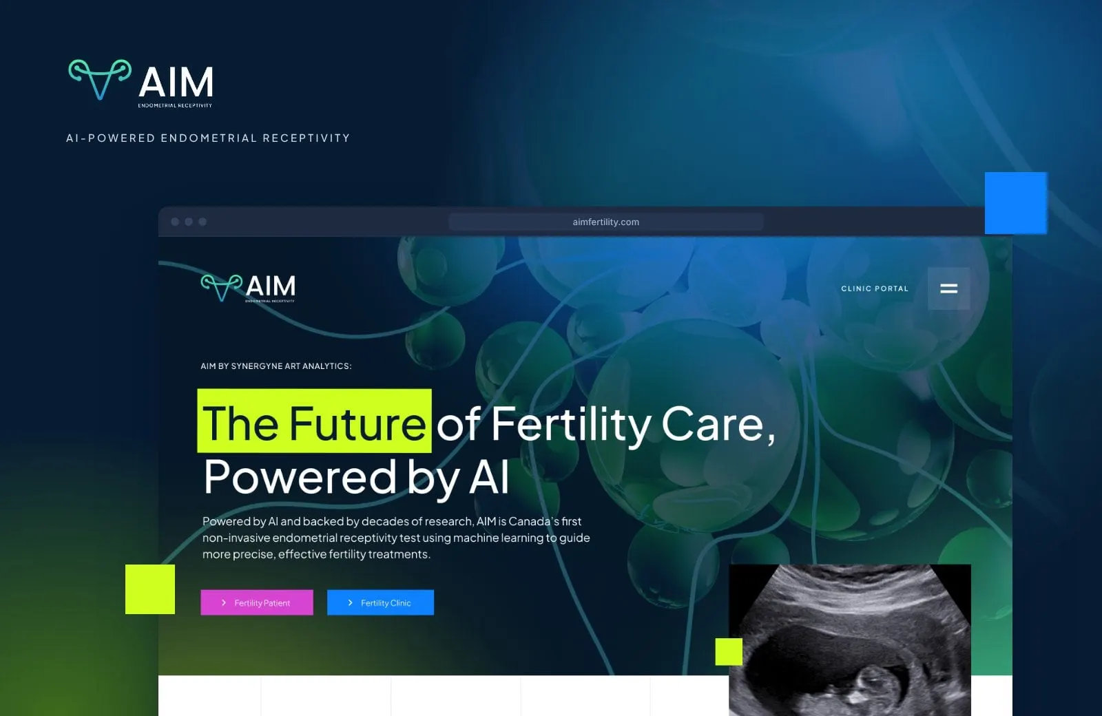
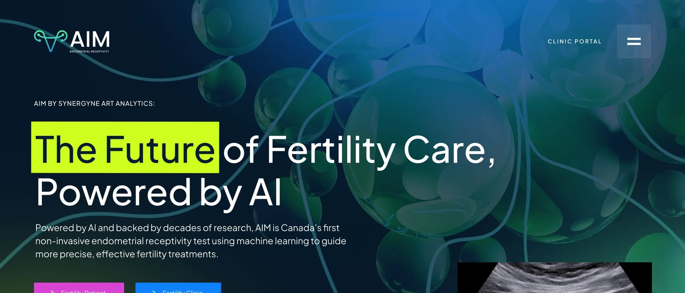
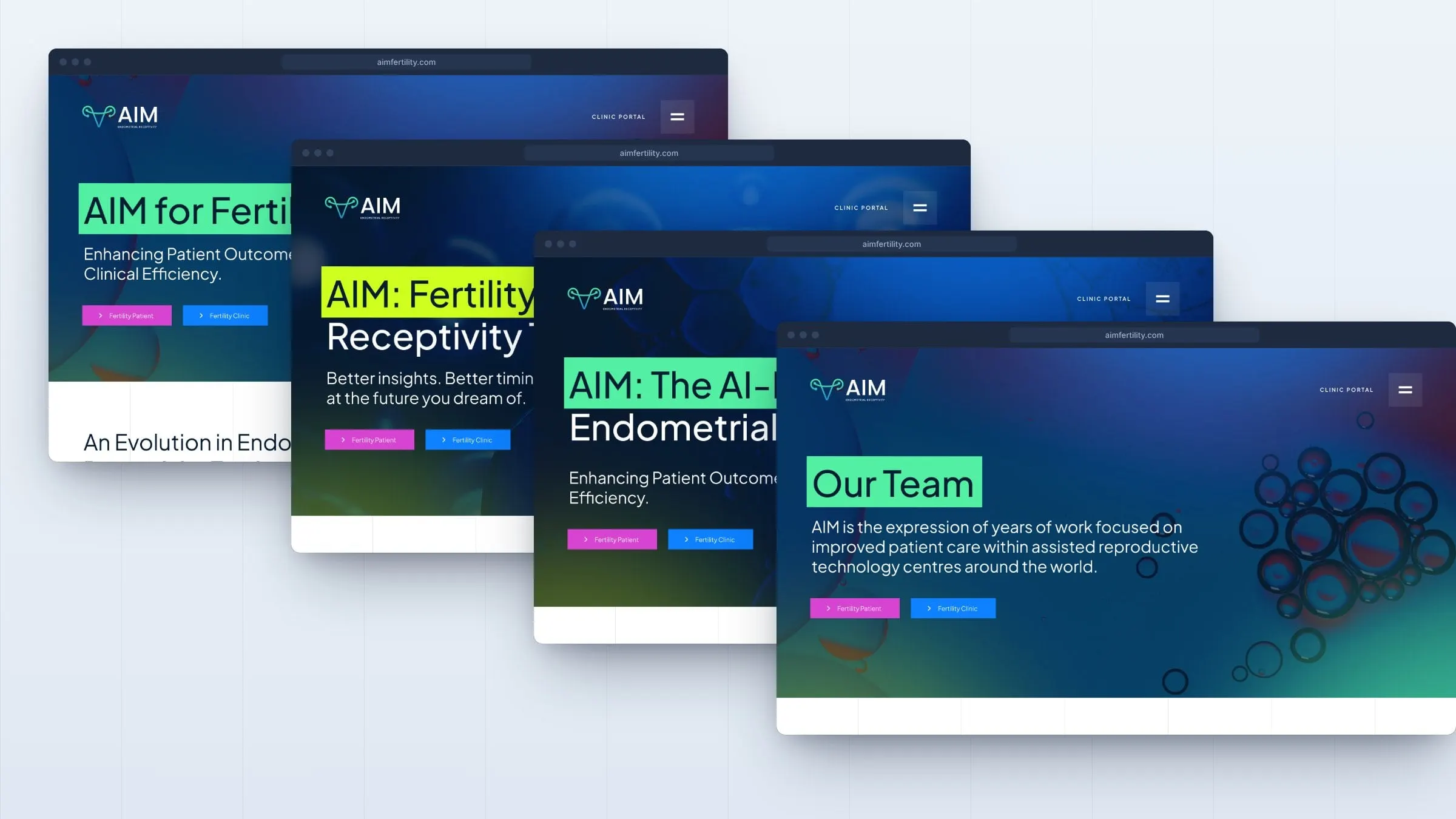
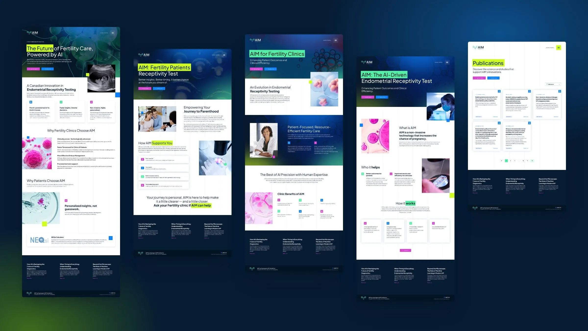
Fertility specialists want evidence, workflow and outcomes. Patients want to know whether AIM could help them, in plain language. So the site splits early. Every hero carries the same pair of buttons, Fertility Patient in orchid and Fertility Clinic in blue, and each audience gets its own page written for them.
The clinic page talks about receptivity scores, embryo management and protocols. The patient page talks about better insights, better timing and asking your clinic if AIM can help. It's the approach we recommend in medical website copy that converts: say the right thing to the right person.
03 — Design
A lab notebook with a pulse
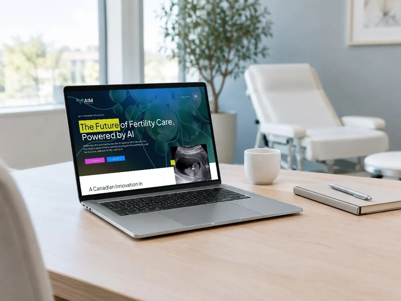
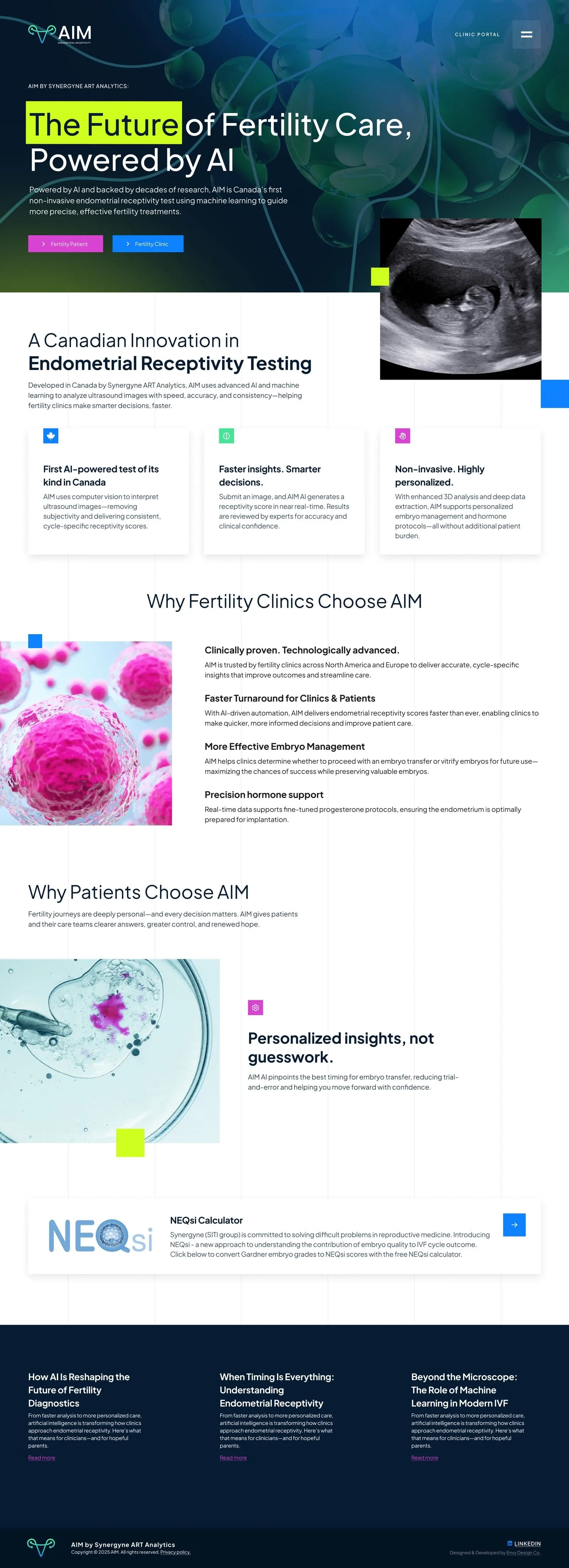
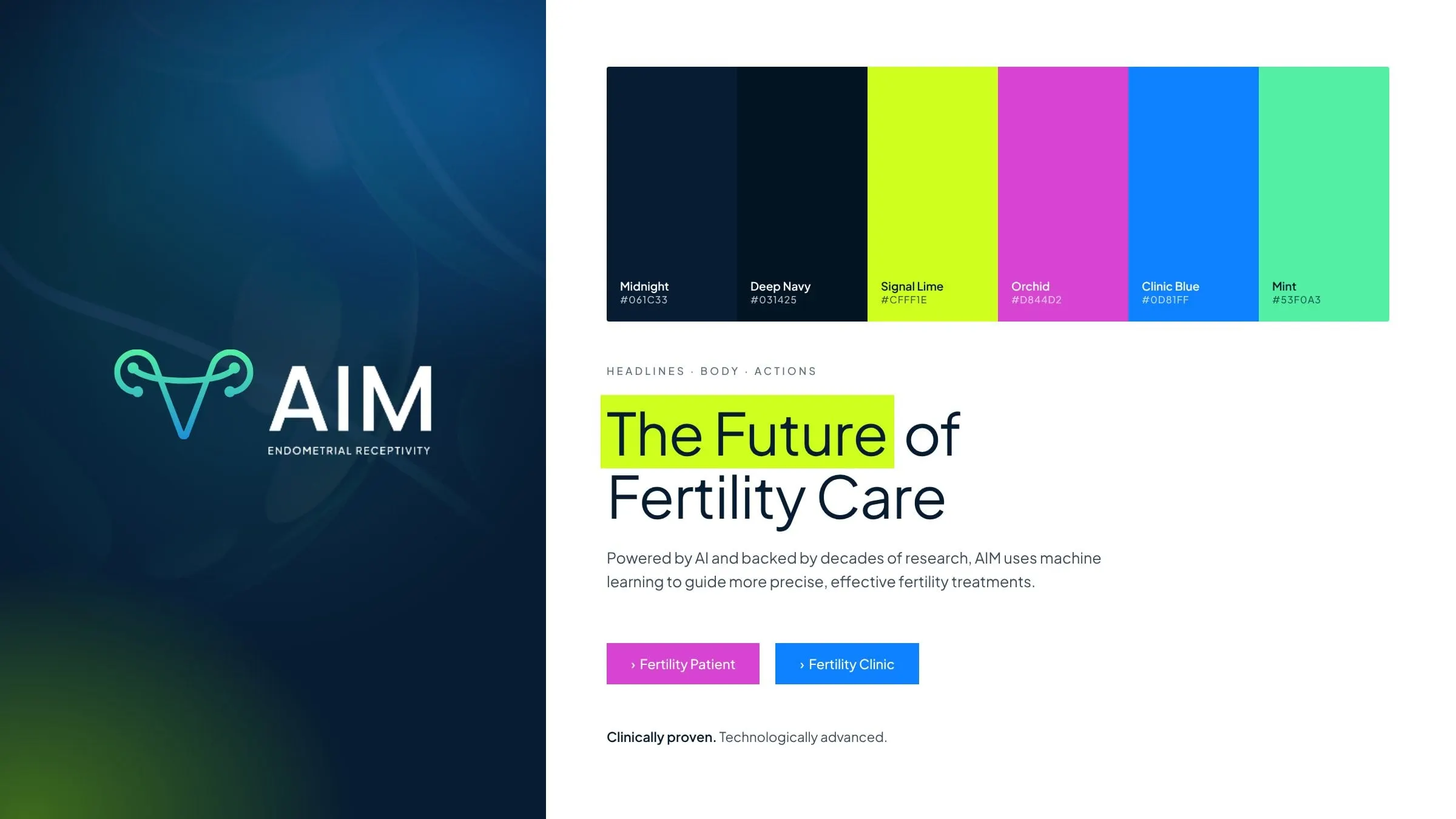
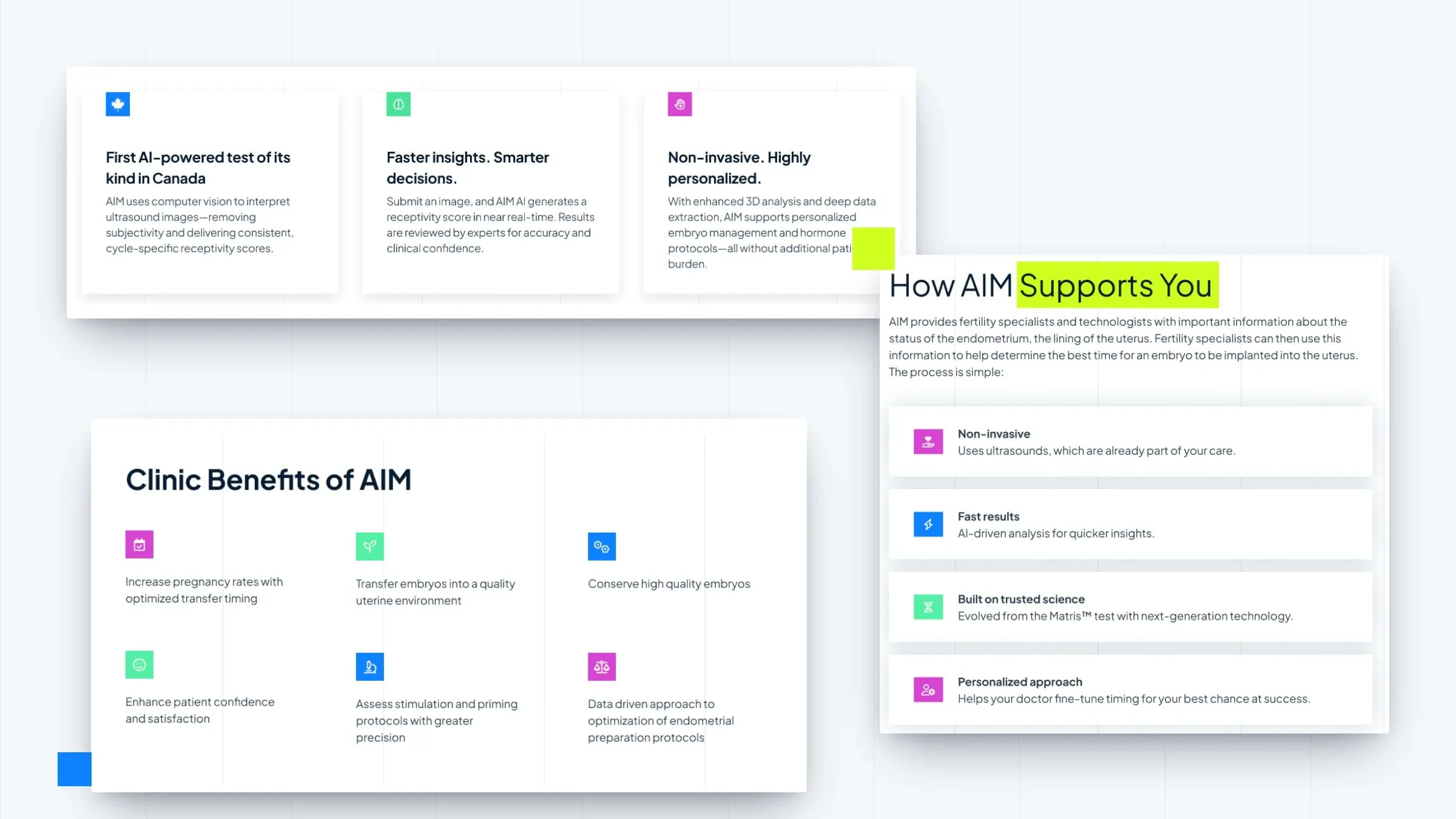
Fertility websites often go soft and pastel. AIM is a technology company, and we wanted the site to feel like one. Heroes sit on deep navy with glowing cell imagery that drifts from blue into green. Key words in each headline are marked with a block of signal lime or mint, like a researcher's highlighter, so the most important idea lands first.
Below the fold, the pages open up into white space with a faint column grid, a nod to lab paper. Small square icons in orchid, blue and mint mark each benefit, and the same coloured squares float at the corners of photos to tie the system together. A clean geometric sans keeps everything readable, from big headlines to long research summaries.
04 — The details
Research up front, help one tap away
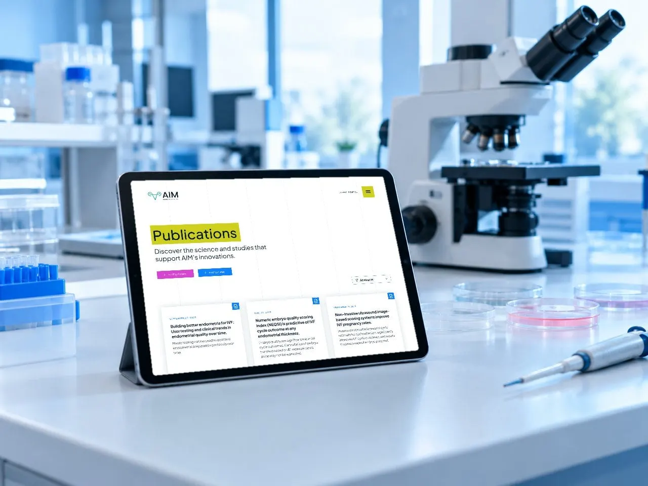
Credibility matters in reproductive medicine, so the evidence is easy to find. A Publications section lists abstracts and manuscripts as cards, each with its date, a short summary and a download link, plus filters and sorting. Company News keeps announcements in one place, and a Team page introduces the scientists and leaders behind AIM.
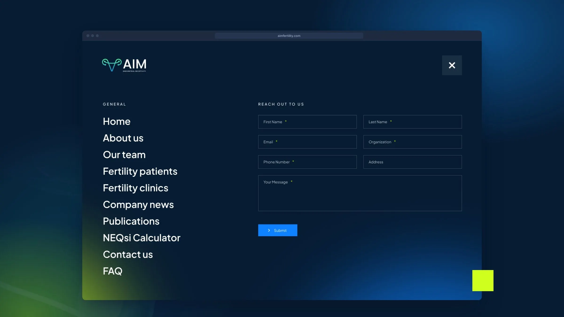
The menu opens into a full-screen navy panel with every page on the left and a short contact form on the right, so a clinic can reach out from anywhere on the site. There's also a home for the NEQsi calculator, Synergyne's free tool for converting Gardner embryo grades. We designed the templates and then developed the site, with the same attention to UX on every page.
05 — Result
A clear story for a complex test
AIM now has a website that matches the ambition of the technology: confident, modern and unmistakably scientific, but warm where it counts. Clinics can get to the evidence quickly, and hopeful parents can understand what AIM does without a glossary. And because every page is built from the same small set of parts, new studies, news and pages slot in without the site losing its shape.
If you're working in health tech, have a look at our work for Conceive Health and Precision Biomonitoring, our healthcare page, or our round-up of the best medical website design examples.
What we delivered
Everything we designed and built for AIM.
- 01Website designHomepage, clinic and patient pages, About, Team, Publications, News, FAQ and Contact templates.
- 02UX/UI designTwo audience paths, benefit components, publication cards, filters and a full-screen menu with a contact form.
- 03Website developmentA site the Synergyne team can update as new research and news come in.