Case study · Right Time Group of Companies
Right Time Group
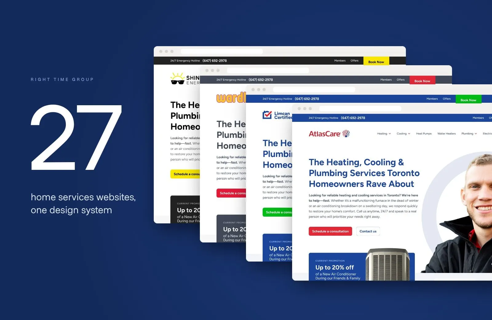
One recolourable website system that powers all 27 Right Time Group subsidiary websites, led by AtlasCare, plus brand refresh concepts for the home services group.
01 — Context
A family of local names, one group behind them
Right Time Group of Companies is one of Canada's leading independent residential HVAC contractors. It grows by bringing well-loved local heating, cooling, plumbing and electrical companies into the family, from Ontario to British Columbia, and letting each one keep the name its neighbours already trust.
That creates a real web problem. Every company needs its own site, with its own logo, colours, phone number, service area and history. But running dozens of one-off websites means dozens of designs to maintain, dozens of places for things to break, and no shared way to get better over time.
Right Time asked us to solve it once, properly: one website system that could launch every brand in the group.
The system in numbers
One build, 27 websites
- Subsidiary websites
- 27Every Right Time company site, built by Envy on one system.
- Colourway themes
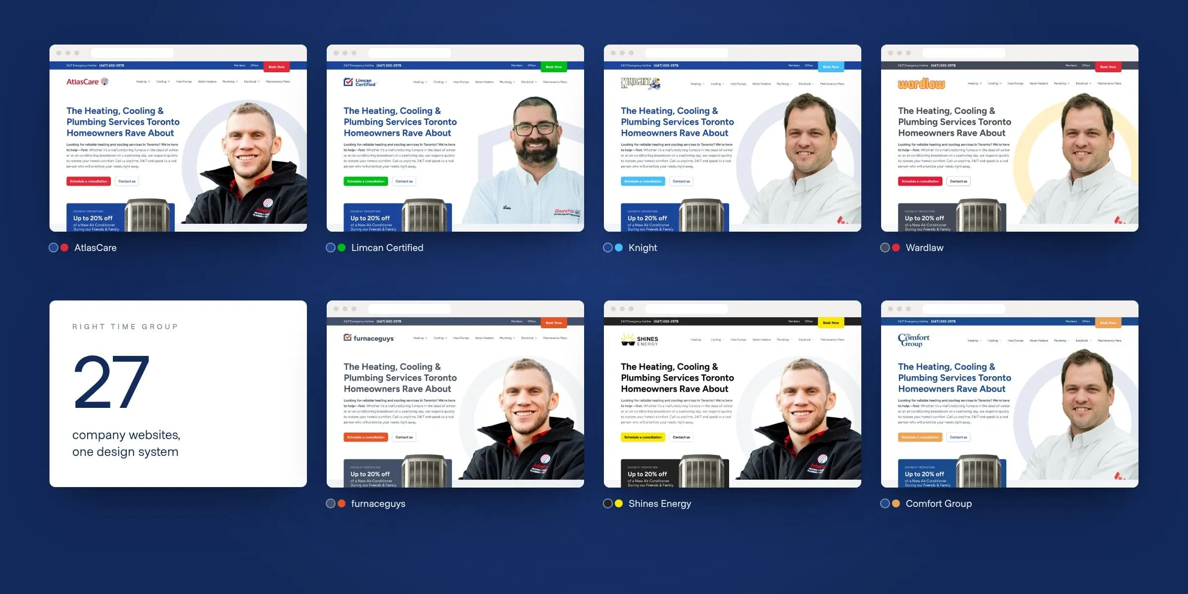
- 7Recolourable templates for each brand's palette.
- AtlasCare's founding year
- 1932The flagship, and the first site in the system.
- Design system
- 1Shared components, shared improvements.
02 — The system
One template, 27 front doors
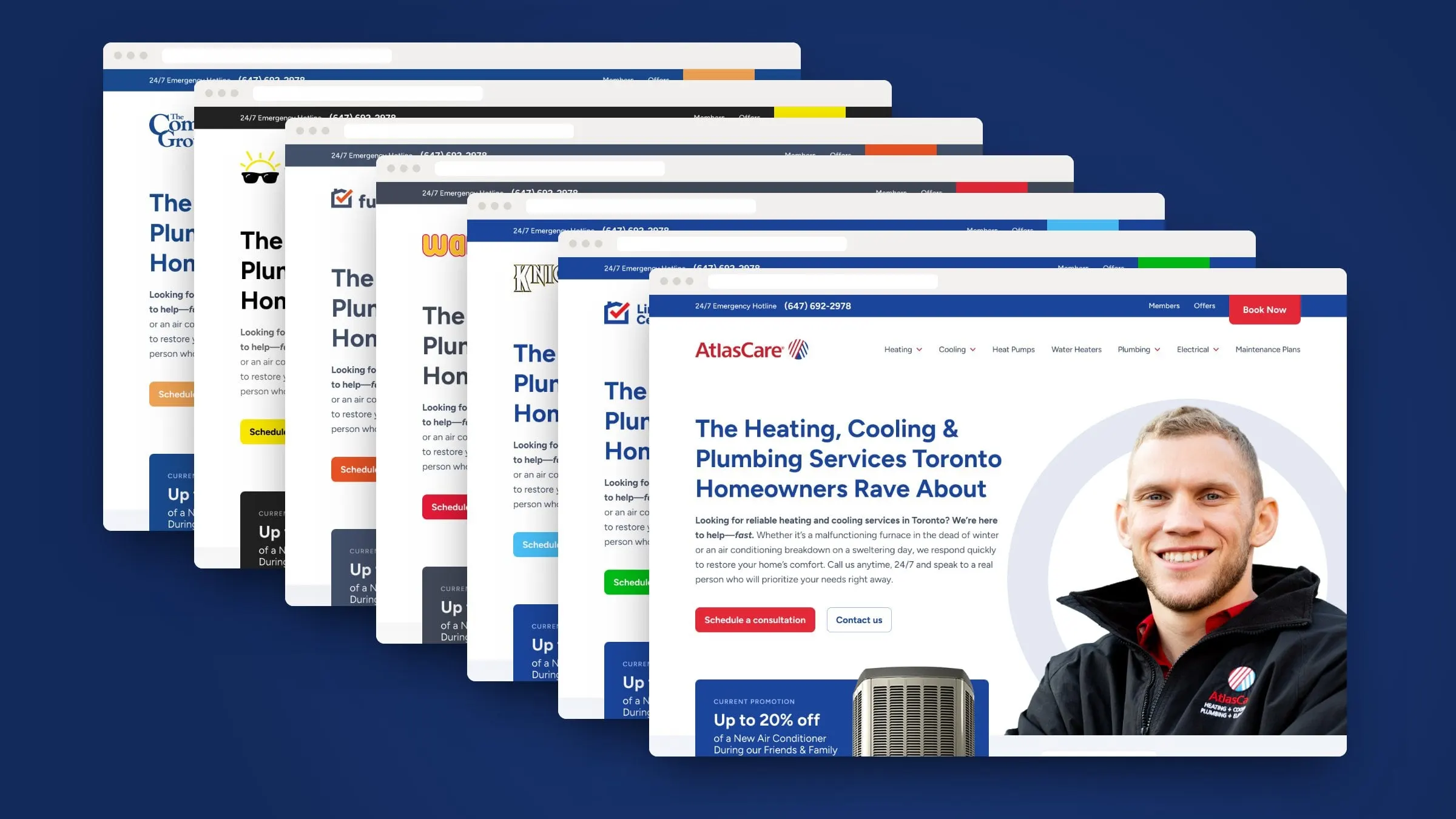
We designed a single, complete home services website and built it as a flexible WordPress theme. Then we turned everything brand-specific into settings. Each company gets a colourway (blue and red, blue and green, grey and orange, black and yellow, and more), its own header and footer logo, favicon, awards, social sharing image and a years-in-business badge.
Everything else is shared: the emergency hotline bar, Book Now button, mega menus for heating, cooling, plumbing and electrical, current promotions, service grids, reviews and service-area lists. So when we improve a component for one company, all 27 get it. And when Right Time welcomes a new company, its site starts from a proven design instead of a blank page.
03 — The flagship
AtlasCare, since 1932
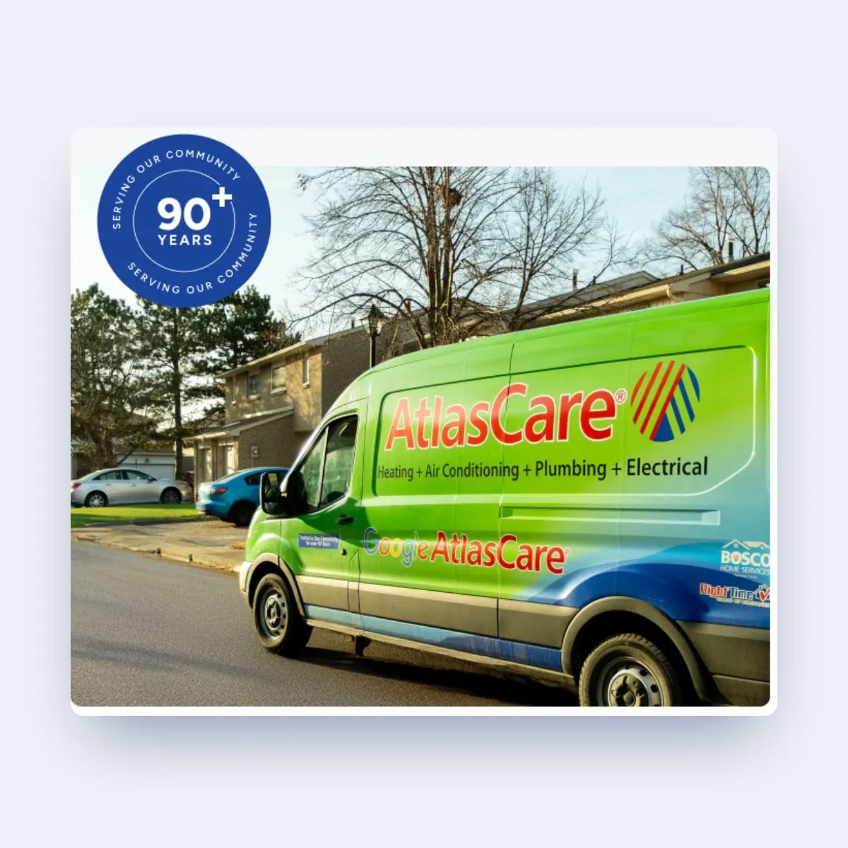
AtlasCare was the first site in the system and sets the standard for the rest. Founded in 1932, it provides residential heating, cooling, air quality, plumbing, hot water and electrical services across Toronto and the GTA, and its bright green trucks are a familiar sight.
The homepage leads with a real technician, a clear promise and two buttons: schedule a consultation or contact us. Below that come the current promotion, reviews, a full service grid, the service area, a 24/7 emergency section and a deep library of services, from furnace repair to EV charger installation. A "90+ years" seal and truck photography tie it back to AtlasCare's long history. It follows the same thinking as our HVAC website checklist.

04 — Service pages
Built for the 2 a.m. furnace call
Home services websites are used in a hurry. Someone's furnace has stopped or the basement is wet, and they need to know two things: can you fix it, and how fast can you get here?
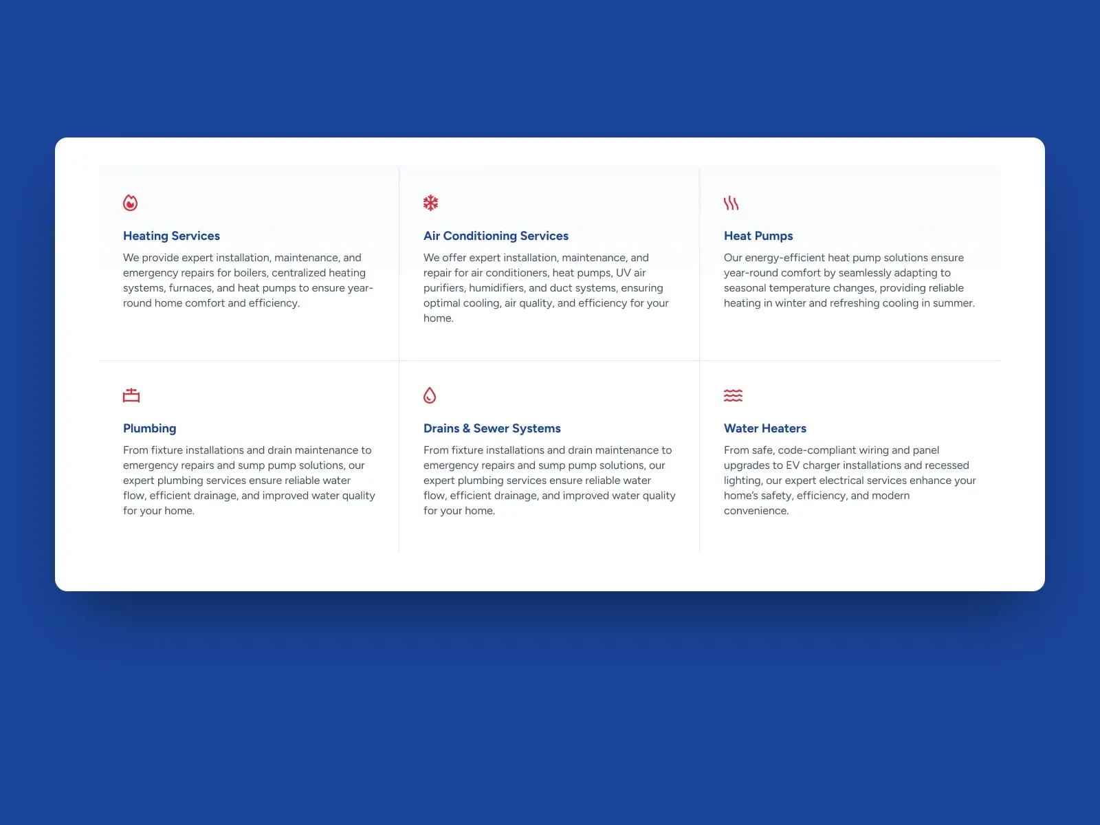
So the system puts the phone number and Book Now button in the top bar of every page, and organizes services the way people describe their problems: heating, air conditioning, heat pumps, plumbing, drains and sewers, water heaters and electrical. Each service has its own page, written to rank locally, a structure we explain in HVAC service pages that rank.
05 — Mobile
Most emergencies start on a phone
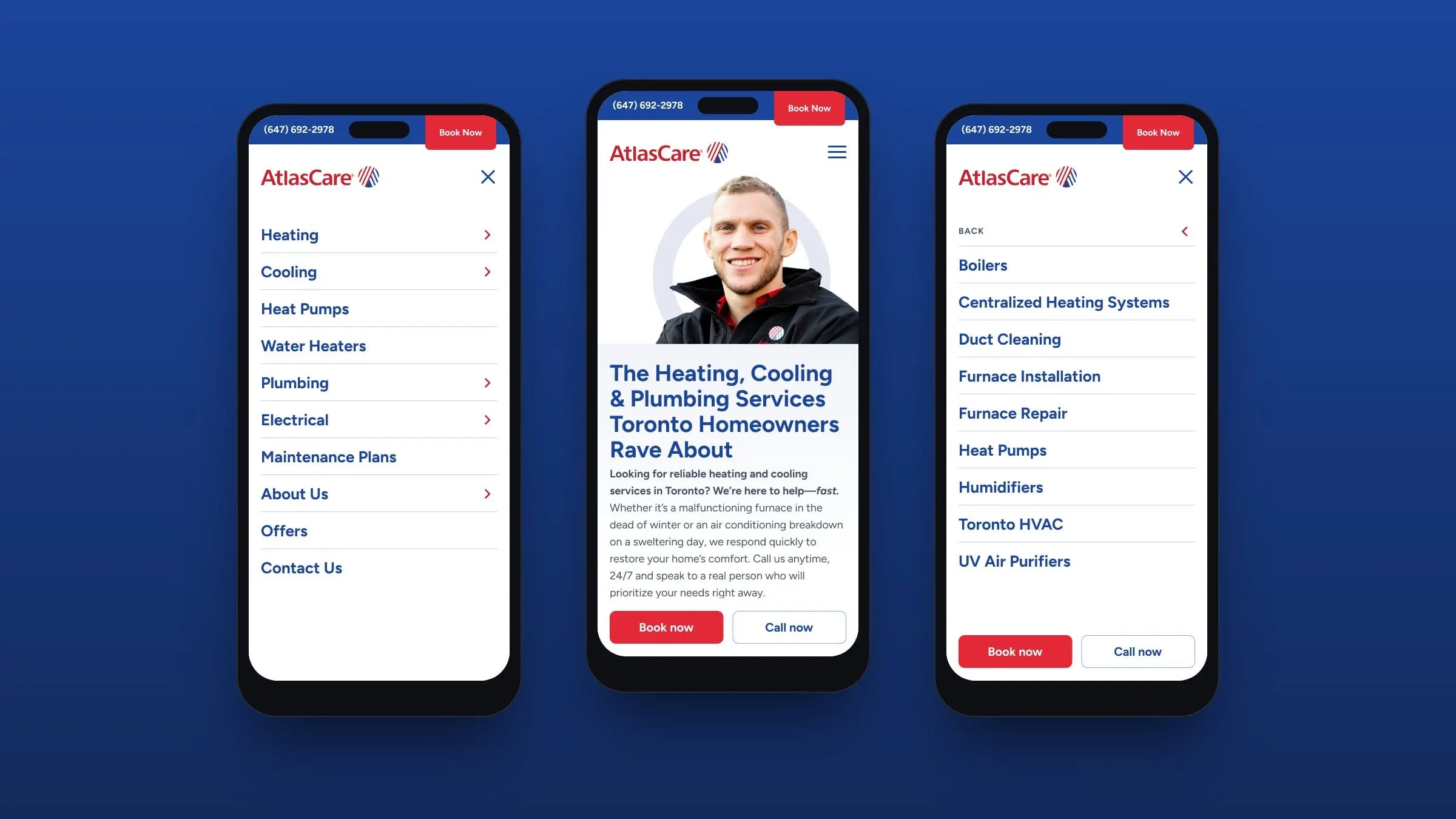
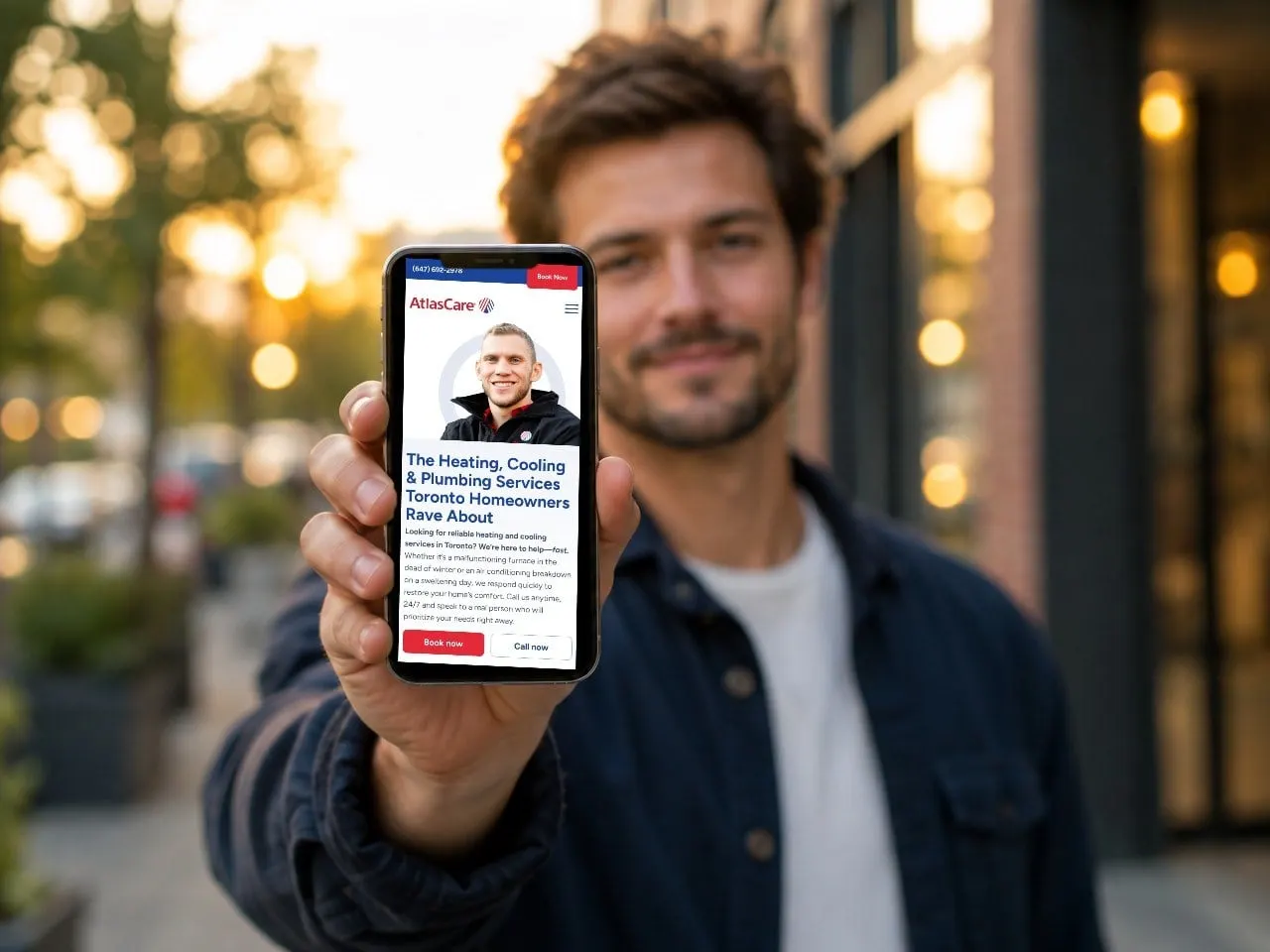
We designed the mobile experience screen by screen, not as an afterthought. The hotline and Book Now stay pinned at the top. A full-screen menu opens into each service category, so a homeowner can go from "Heating" to "Furnace Repair" in two taps. Big Book now and Call now buttons sit within thumb's reach at the bottom.
Because it's part of the shared system, every company in the group gets the same mobile experience in its own colours. More on why that matters in why mobile-first design is a must.
06 — Brand refresh
A refined evolution of Right Time blue
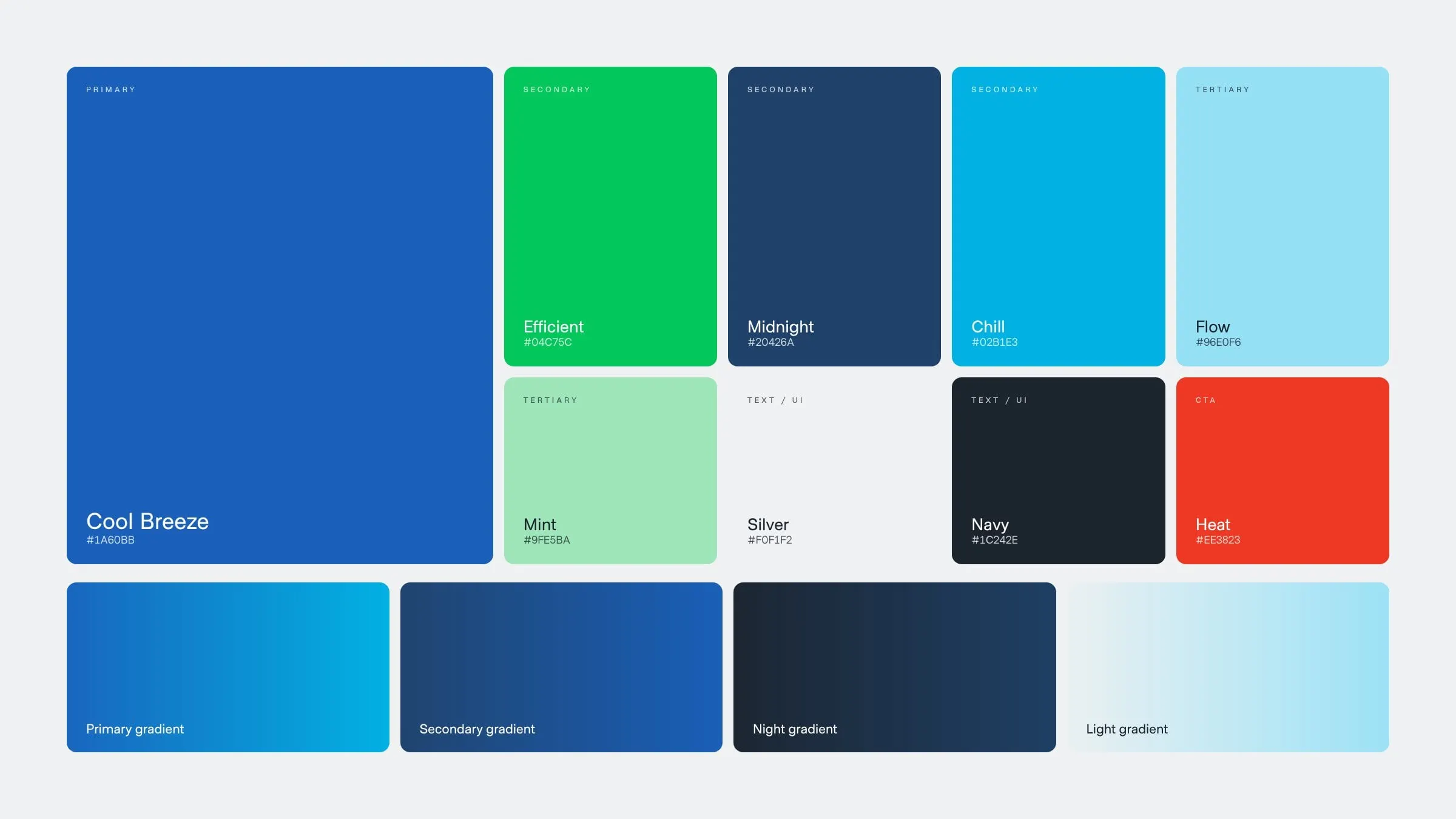
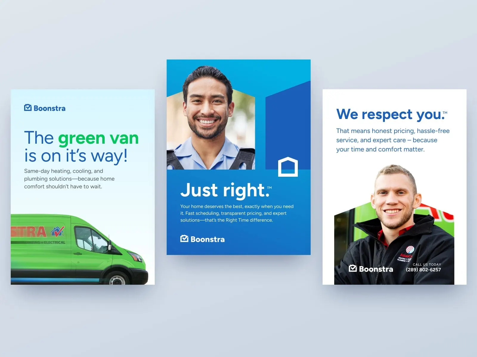
Alongside the web system, we explored a refresh of Right Time's visual identity. Rather than start over, the new palette builds on the colours customers already know: a primary Cool Breeze blue with a subtle shift toward green, supporting greens and blues for interfaces, and Heat red kept for calls to action. A set of brand gradients adds movement for print, digital and vehicles.
We tested the system on real applications, from posters and social posts to Zoom backgrounds, image templates and a photo-day guide for shooting technicians and trucks, so the brand can stay consistent across every company in the family. It's a lesson in why a cohesive brand matters.
07 — In the world
From the poster to the pocket
The refresh concepts carry the same confident blues, real technicians and plain-spoken promises into print and social: "The green van is on its way!", "Just right." and "We respect you."
And because each company's website is built on the same system, a customer sees one consistent, trustworthy experience whether they spot a poster, scroll past a post or pull up the site on their phone.
08 — The result
A system that scales with the group
Right Time now runs all 27 of its subsidiary websites on one design system that we designed and built. Each company keeps its own name, colours and history. Behind the scenes they share the same tested layouts, components and improvements, and new companies can launch quickly.
If you run a multi-brand or multi-location home services business, this is what good website development looks like at scale. See more of our trades and HVAC work, including AC Thermal.
What we delivered
- 01Multi-brand website systemOne recolourable template powering 27 subsidiary websites.
- 02WordPress themePer-site settings for colourways, logos, badges, awards and sharing images.
- 03AtlasCare flagship siteHomepage, service library, promotions, reviews and service areas.
- 04Mobile UXMobile homepage and full-screen category menus.
- 05Brand refresh conceptsAn evolved palette, gradients, typography and graphic devices.
- 06Social, print and image templatesPosters, social posts, Zoom backgrounds and a photo-day guide.