Case study · Quiznos
Quiznos
Website design for a well-known sandwich brand.
01 — Context
Restaurant website design for a rebrand
Quiznos is a North American sandwich chain known for its toasted subs. As part of a wider repositioning of the brand, the company needed its website to look and feel like the new Quiznos. The rebrand itself came from the client; our role was restaurant website design that carried it online, starting with the homepage.
The aim was to make a familiar name feel fresh and hungry again, while keeping the practical paths diners rely on: the menu, catering, locations and ordering.
02 — Design
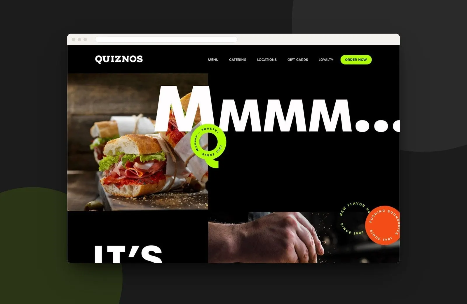
Black, bold and toasty
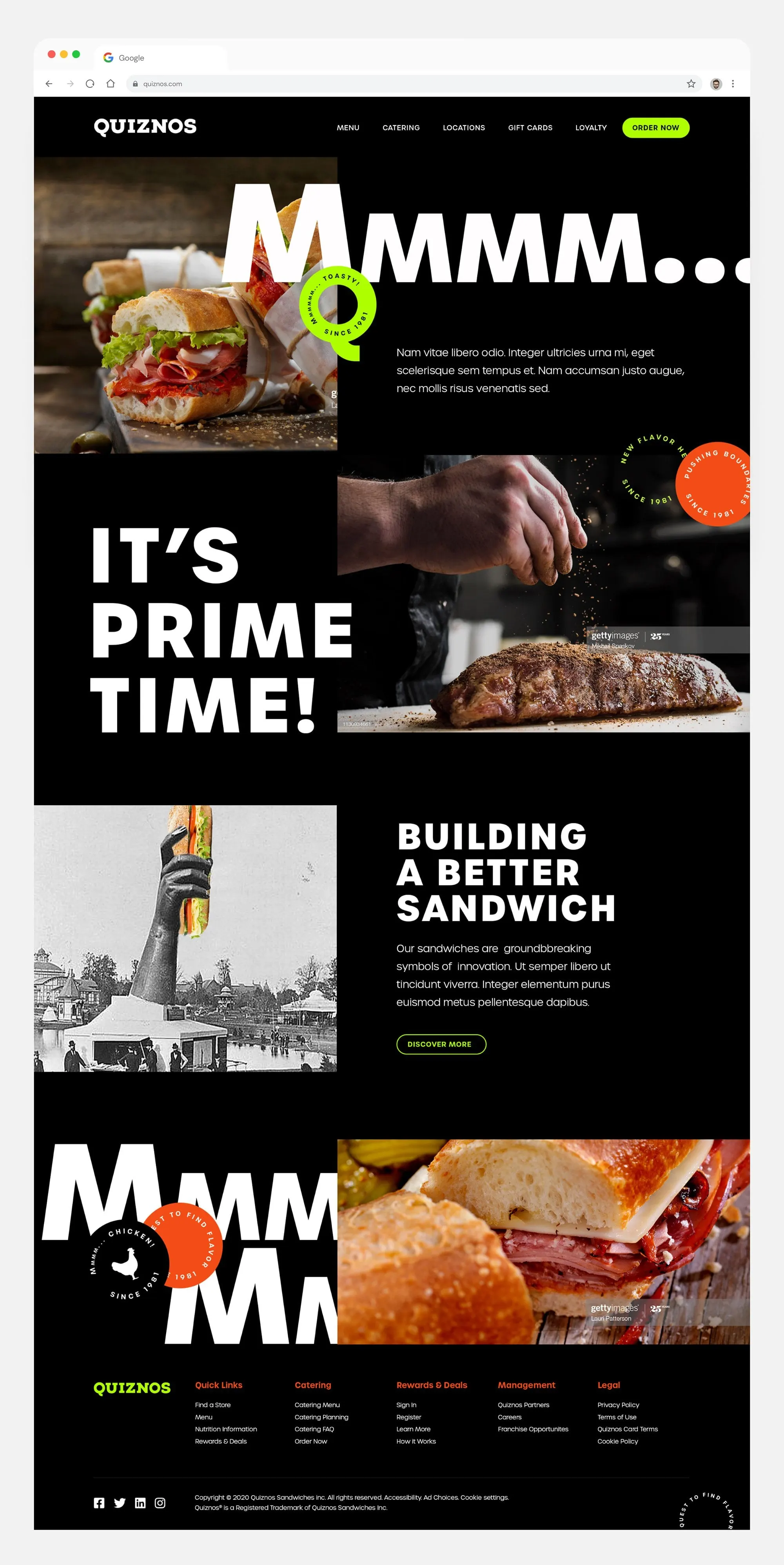
We set the website on a black background so the food photography could glow. The homepage opens on a toasted sub and a headline that simply says Mmmm..., in white letters so large they run off the screen. Circular badges in lime green and orange, carrying lines like Toasty! and Since 1981, add rhythm and a nod to the brand's history.
Sections alternate image and type in a loose grid: It's Prime Time! beside a seasoned cut of meat, and Building a Better Sandwich beside an archival black-and-white photograph. A lime green Order Now button stays in the header next to Menu, Catering, Locations, Gift Cards and Loyalty, and a clear footer groups quick links, catering, rewards, franchise information and legal pages. That structure is the UX backbone under the big visuals.
03 — Why it works
A website that tastes like the brand
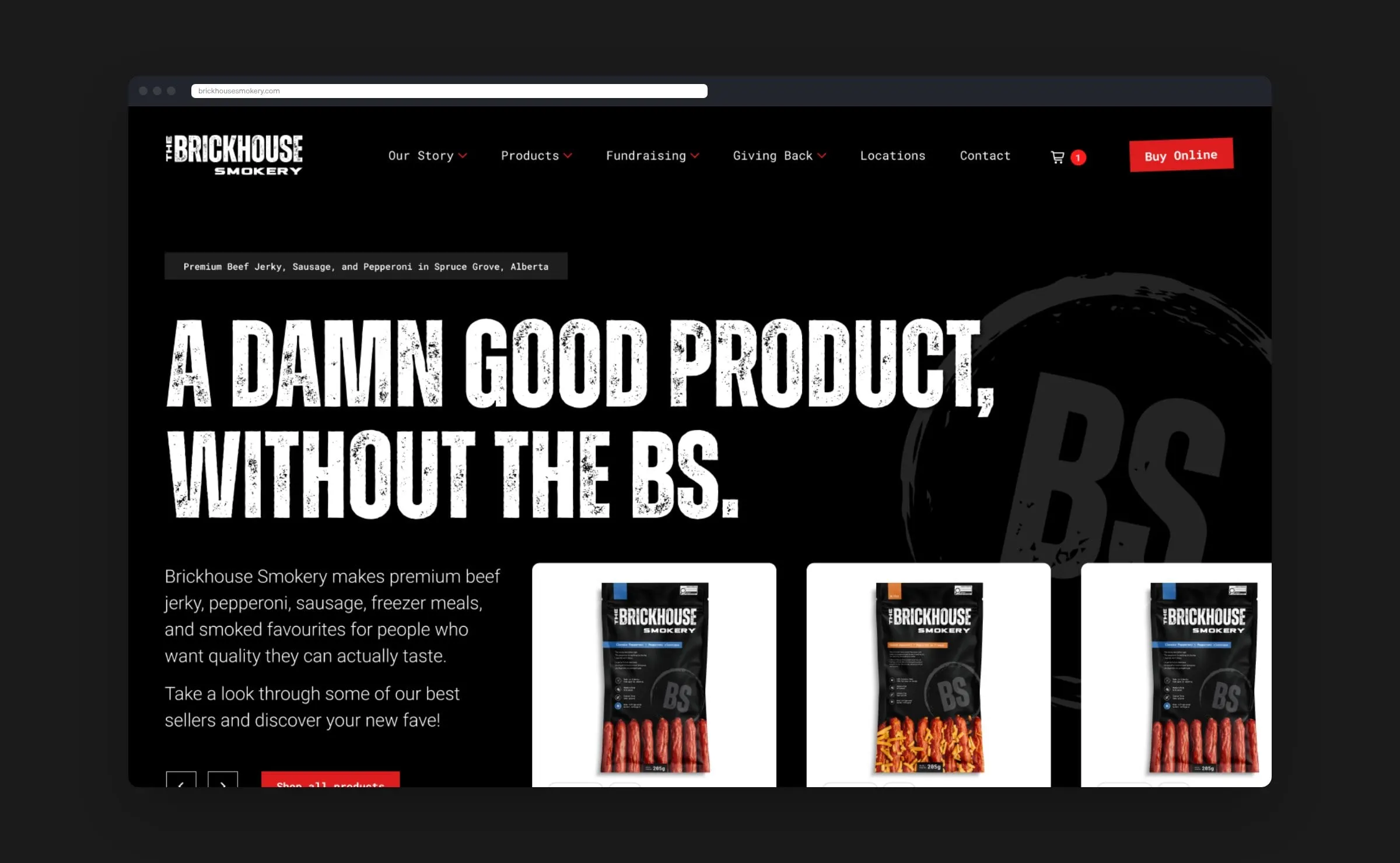
A rebrand only lands when every touchpoint carries it, which is why we believe branding and web design should happen together. Here the website speaks in the same voice as the new identity, giving restaurant guests a reason to linger and an obvious way to order. For more food and beverage work, see Brickhouse Smokery.
What we delivered
A redesigned website for Quiznos, aligned with its rebrand.