Case study · Imagine H2O
Imagine H2O
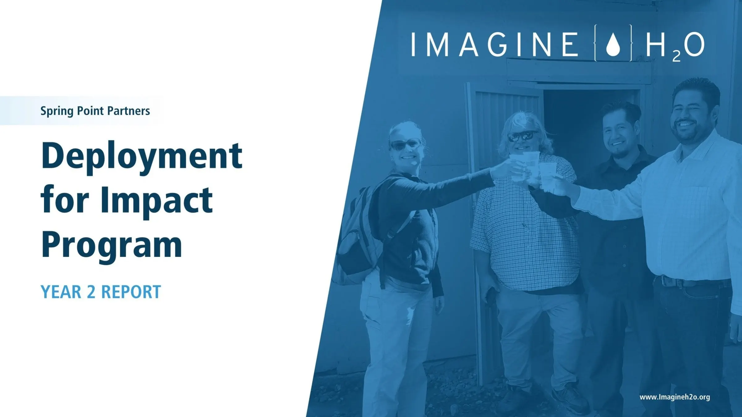
A Year 2 report for Imagine H2O's Deployment for Impact program, designed as a presentation for the board and built so the team can reuse it.
01 — Context
Non-profit annual report design for water innovation
Imagine H2O supports water innovation, and its Deployment for Impact (D4I) program helps start-ups put their technology to work in municipalities and communities that might not otherwise get access to it. At the end of the program's second year, the team needed to report back to its board and other stakeholders on what had been funded, what had been learned and what came next. It called for non-profit annual report design that the board could take in quickly.
They asked for a report that was easy to digest and on brand, and that they could replicate themselves in future years. That made this a report in presentation format: a deck that reads like a report, can be presented in a meeting, and works as a template for the next cycle.
Reports like this share a common challenge. The board wants evidence, but the story of real people and real projects is what makes the work stick. Our annual report design approach is to give both a clear, repeatable structure.
02 — Structure
From program goals to pilot stages
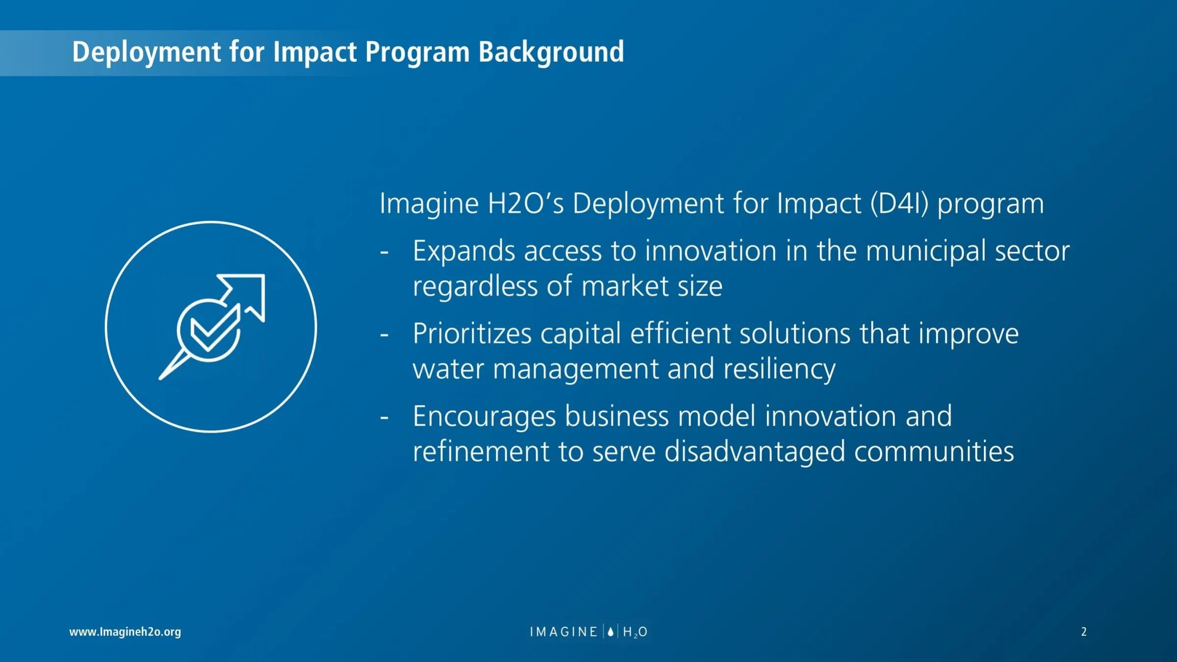
The report opens with the program's purpose in three plain statements: expand access to innovation in the municipal sector regardless of market size, prioritise capital-efficient solutions that improve water management and resilience, and encourage business model innovation to serve disadvantaged communities. We set these on a deep blue slide with a single white line icon, so the intent reads before any data appears.
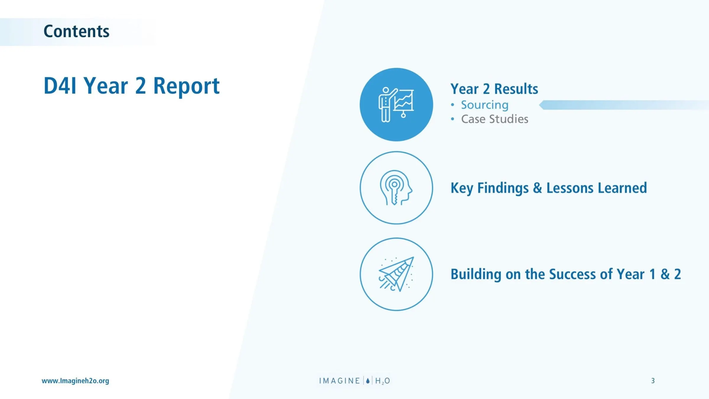
A contents slide follows with three sections: Year 2 results (sourcing and case studies), key findings and lessons learned, and building on the success of years one and two. Each gets its own circular icon, with the current section highlighted in solid blue.
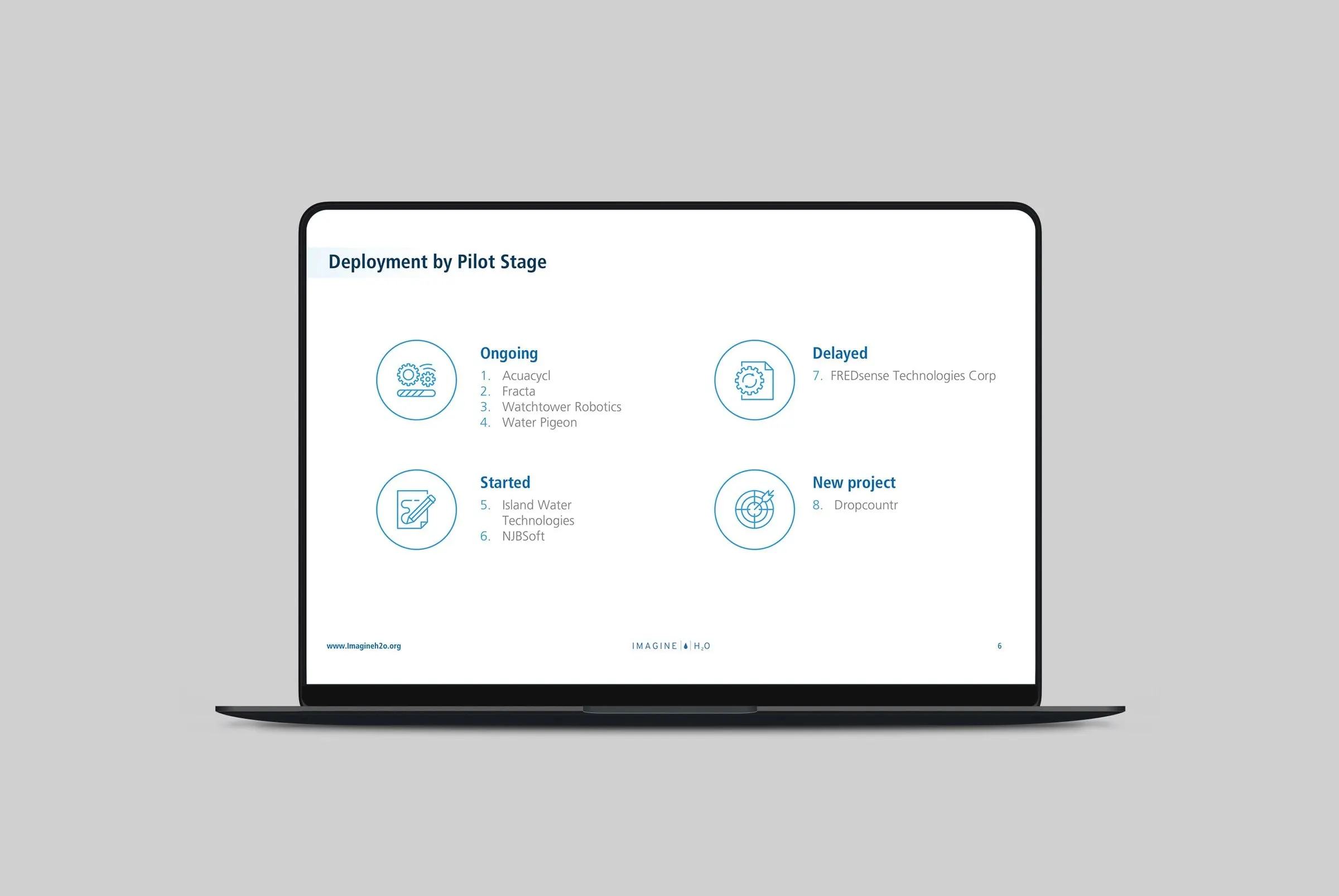
Then comes an overview of every company in the cohort, grouped by pilot stage: ongoing, started, delayed and new. Eight companies, from Aquacycl and Fracta to Water Pigeon and Dropcountr, fit on one slide, each group with its own icon. It gives the board the whole portfolio at a glance before the detail starts.
03 — Case studies
A repeatable template for every pilot project
The case studies are where the report earns its place. Each company gets the same sequence of slides, which makes the report easy to read and easy for the Imagine H2O team to extend.
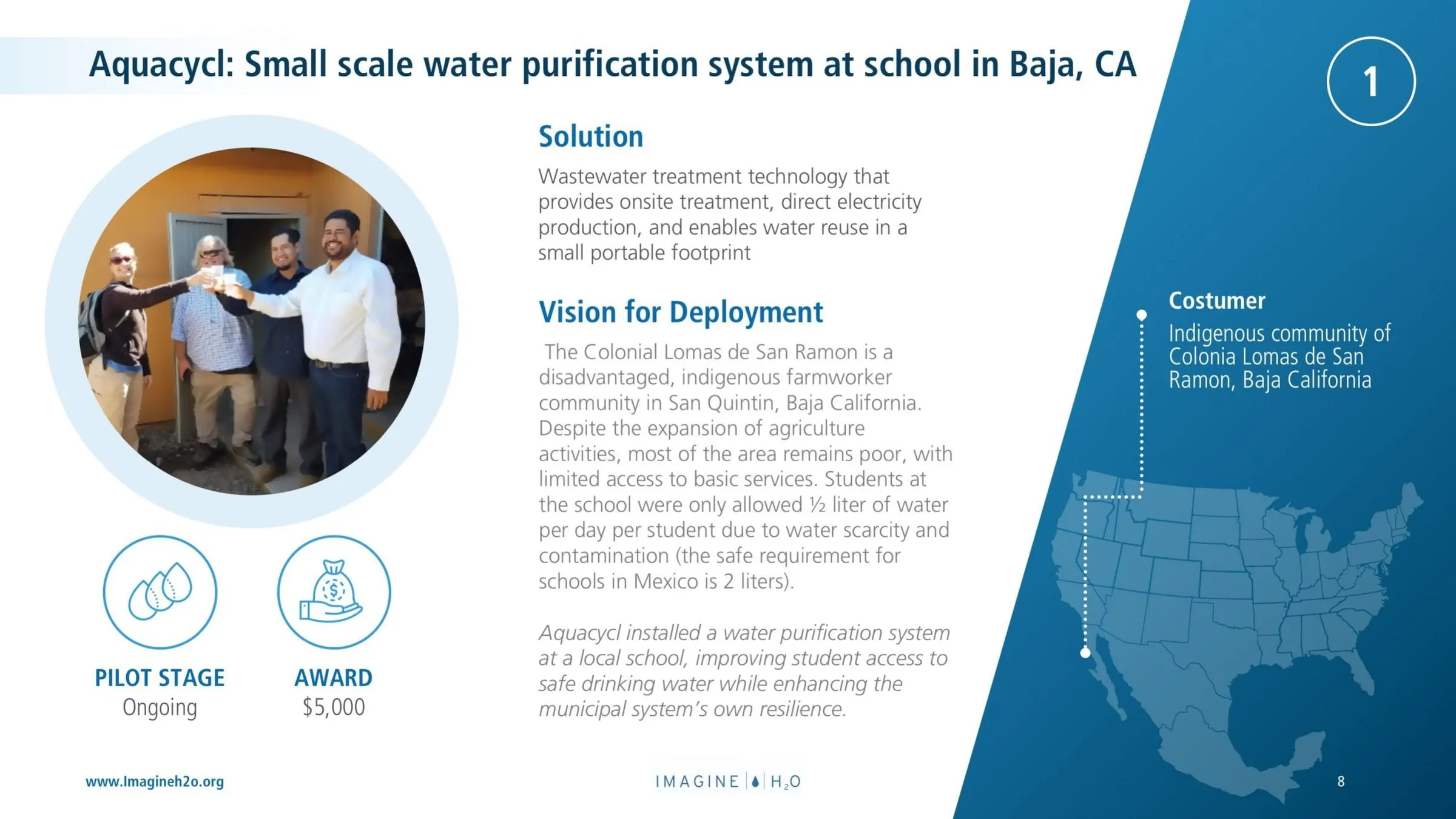
A divider slide introduces the company with its logo on a blue gradient and a numbered circle in the corner that matches its position in the pilot list. The first content slide sets out the solution, the vision for deployment and the customer, with a map pinpointing the location. For Aquacycl, that was a small-scale water purification system at a school in an Indigenous farmworker community in Baja California.
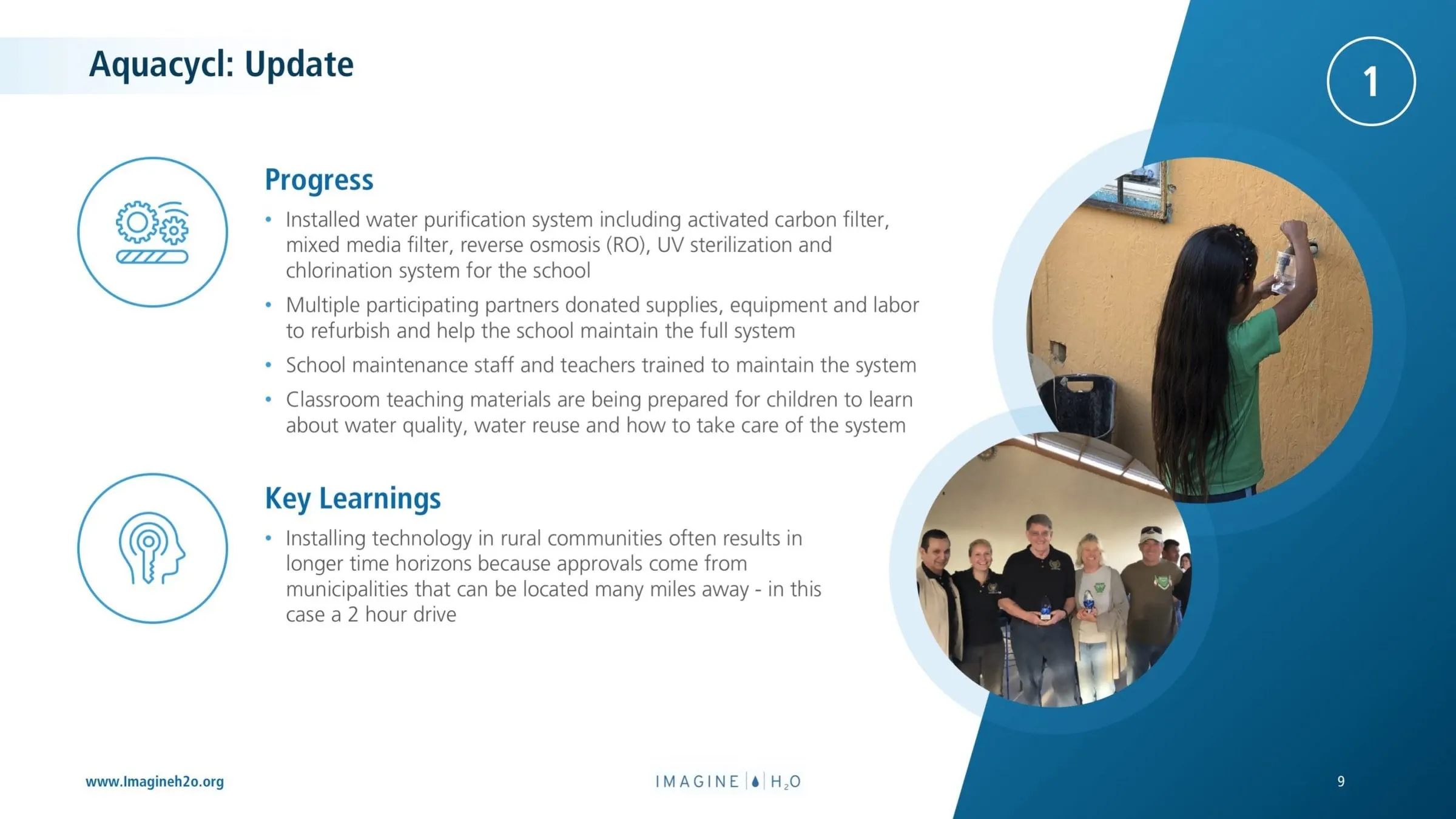
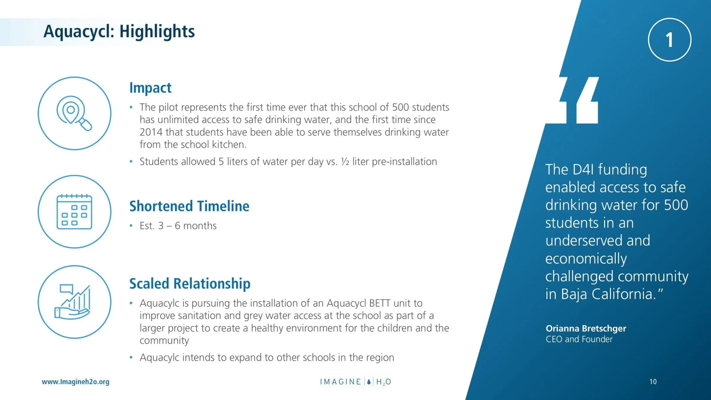
An update slide covers progress and key learnings, with round-cropped photos from the site. A highlights slide closes the case study with impact, timeline and next steps, plus a pull-quote from the company's founder on a blue panel.
Throughout, we used a single family of thin-line circular icons for pilot stage, award, progress and learnings. That consistent iconography lets readers find the same information in the same place on every case study.
04 — Reuse
Designed to be replicated, not rebuilt
Because Imagine H2O wanted to produce future reports in-house, we kept the system deliberately simple. Light slides use a pale blue tab behind the title at top left; feature slides switch to the deep blue gradient. Every slide shares a footer with the web address, the Imagine H2O wordmark and the page number. Photography is either toned blue on the cover or cropped into circles inside, so new images from future pilots will fit without extra work.
That is the value of presentation design done as a system rather than a one-off: the next report starts from a finished framework. For another non-profit deck, see our presentation for Academic Opportunity of Arizona, or the strategic plan we designed for Outreach.
What we delivered
A Year 2 program report in presentation format, ready to reuse.